
Combining 3 gels for awesome results and even white light
Colors can be mixed, Color Manipulation part 2
In the previous blog post you could see that colors are all connected.
So today we are going to play with this.
Additive and Subtractive colors
Often this leads to a lot of confusion about what primary and secondary colors are.
For photography and video we are using Red Green and Blue to create the color we see.
A printer uses CMYK to print the colors we see.
These are two different ways of working with colors we call those additive and subtractive.
Additive colour is created by mixing light. Subtractive colour is created by mixing materials.
For today we are going to work with 3 colors Red, Green and Blue.
And I mean that literally
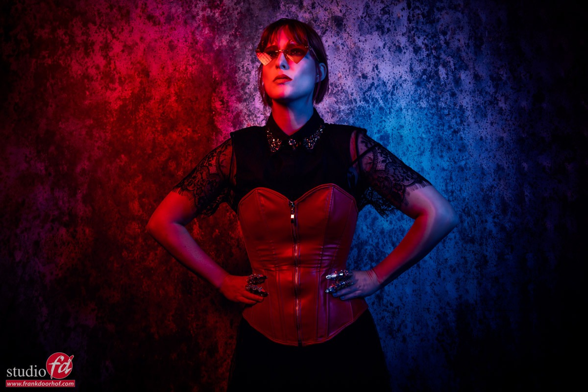
When we combine a Red, Green and Blue gel and aim it at a subject we will get an awesome effect.
You will see a mix of the colors in the shadows, but the fun thing is that where all 2 colors overlap you get a “white” light.
This is how gels actually work, so you can create some truly stunning shots with this.
In this setup I’m using three strobes with gels.
Let’s first take a look how it looks without green.
As you can see it doesn’t really look right. There is a harsh shadow line and it doesn’t really pop.
So let’s throw in the green.
The green strobe is aimed directly on the model, while the red and blue are coming from the sides.
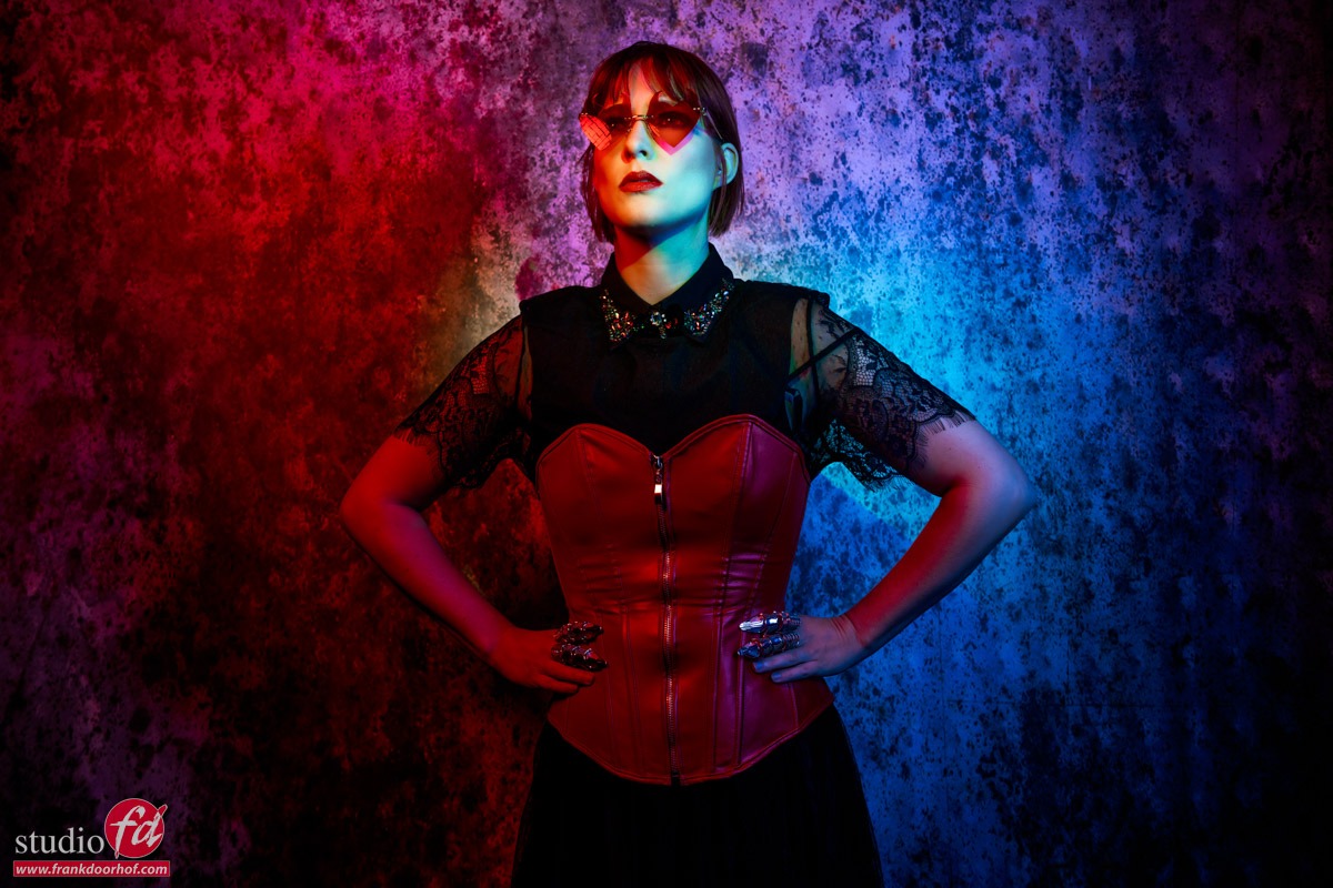
Now let’s start to play a bit with poses but more importantly our own position.
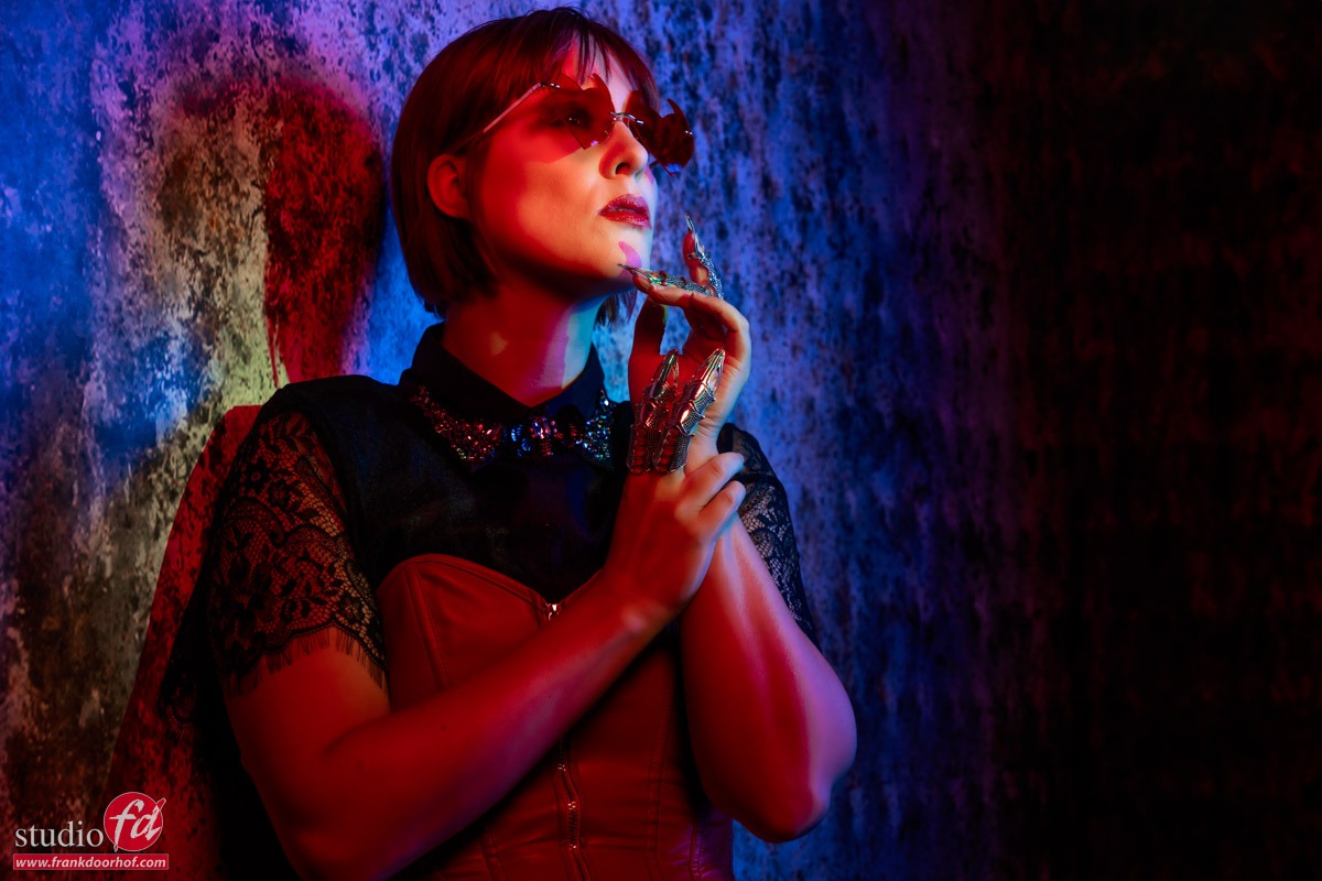
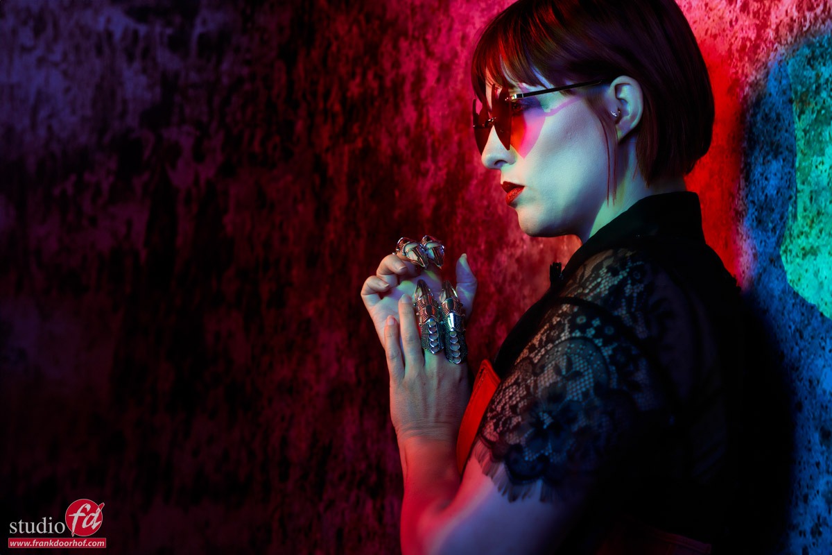
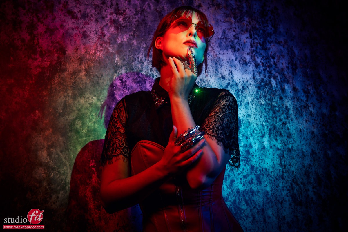
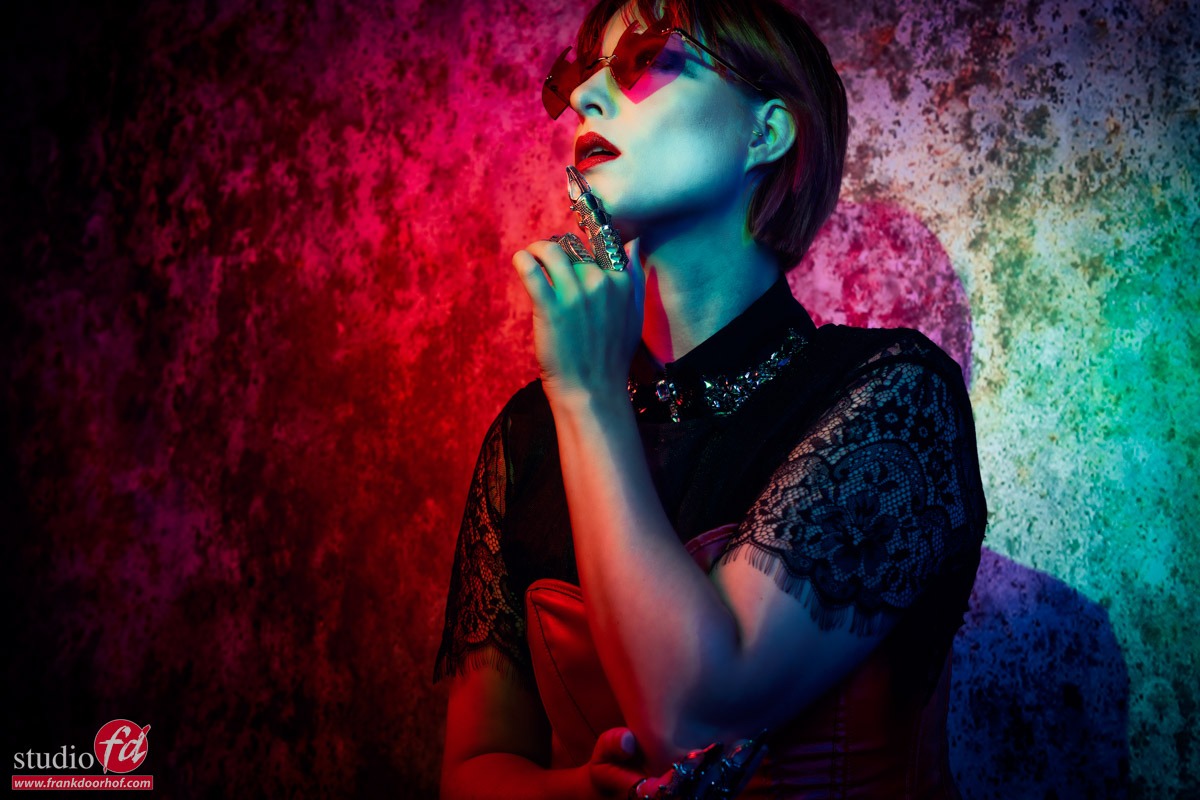
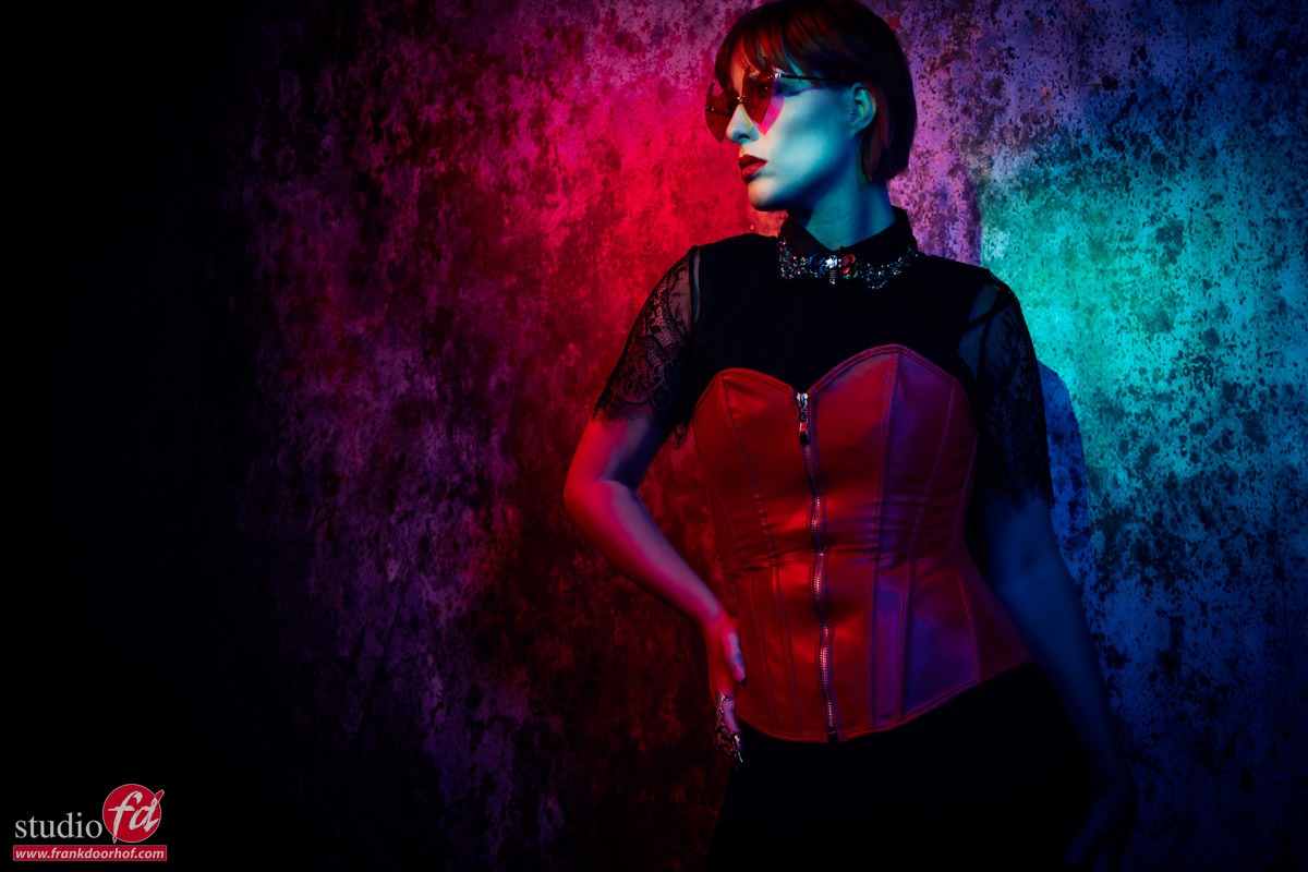
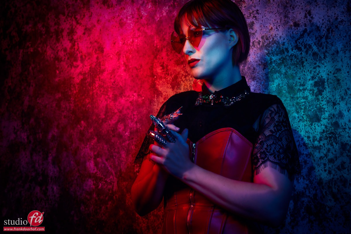
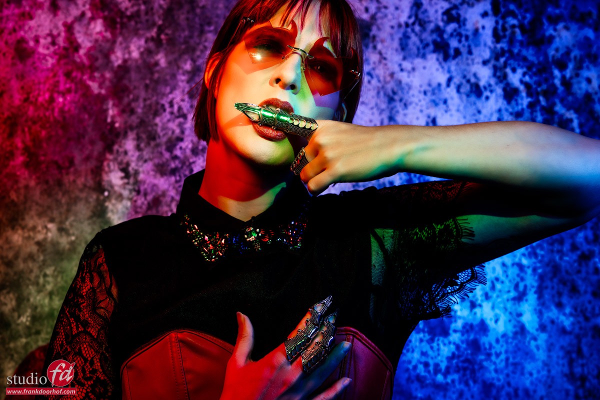
As you can see by changing the angle under which the model poses and where you shoot from you can play with the colors and get very different results.
This is without a doubt a very creative solution, but… do remember this is not something you shoot for a client without showing the result before hand, I love it, but it’s not for everyone 😀
An extra tip
As you have read Key is the luminance of a color.
This means that if you don’t have a correct exposure of your shot the colors will not look accurate.
Now of course sometimes you want a more moody look, but it’s important to understand the basis of color to be able to manipulate them the way you want.
To be able to judge your colors correctly you need a proper workflow.
For me this contains a lightmeter and colorchecker.
This means I get my exposure correct and with the colorchecker I can create a profile and white balance for that series.
And do remember this is just to get all the images looking the same so that all the presets you run or anything else in your workflow has an expected outcome.
On the side of the monitor I’ve been using BenQ monitors for years and can highly recommend them.
They have a great line up of professional monitors and a great line of P3 colourspace monitors (in between sRGB and Adobe RGB) for very affordable prices.
Besides great quality most BenQ’s also support hardware calibration. Which means you don’t calibrate your operating system but straight into the monitor.
This is a much better way of calibrating your screen than via standalone software and of course the software is delivered for free.
We have a few 10% discount codes for our European vistors, please contact me for more info.
 (4)")


