Calibrations demystified
Calibrations are essential and easy
Let’s first take a look at what a calibration is.
I’m writing this blogpost in English.
I chose English because I know that most people in the world understand English better than Dutch. And the fact I don’t speak any languages as good as Dutch and English.
So because I’m writing this in English everyone reading this understands me.
And this is because we use rules and letters in combinations that we agreed upon as the English language.
And with calibrations it’s the same.
We have many different devices ranging from your camera, to your printer, monitor and scanner.
Some devices are capture devices, some are output devices, but they all use different techniques, and still you want your images to look exactly the same on all devices right?
Luckily there is a solution for this.
Home Theater
When we look at the home theater market calibrations are done to get the optimal image quality out of your tv or projector setup. During these calibrations high-end calibration devices and software are used costing thousands of dollars, and in most cases there is no auto-mode 😀
Now you might wonder, “what is optimal image quality?”
Is this “max light output?”, “the best colors?”
And what is best, or max?
Well luckily there are rules for this.
For most TVs and projectors we use the REC709 colourspace for SDR material (normal HD material) and BT2020 or P3 for the new HDR material.
For the correct colors in the ISF (Imaging Science Foundation) setup we use the D6500 standard.
During a calibration for a tv or projector we look at the following settings.
User settings like Contrast and Brightness to set the perfect dynamic range.
Grayscale for the correct color temperature
CMS (Color Management System) for the correct colors per colourspace.
Gamma for the brightness curve
Extra features like sharpness, iris, motion flow etc.
Because the same rules the calibration follows is also followed by everyone that makes professional movies we can now see the movie exactly as the director intended on our projectors or TVs. And we all know that color evokes emotion, so seeing the correct colors and colortone can have a huge impact on the movie experience.
For Photography and video
Now for Home Theater the process can be complicated and you need to know what you’re doing (I’ve been doing it since 2001 and still have to learn every new format and display) but the workflow is very basic and simple. We just follow what the movie industry follows. For photography it’s the other way around almost.
For photography the process itself is super simple but we have a lot of different devices and things we have to take care off to get it all working together.
So lets take a look at what we can encounter.
First off we have the input devices
Cameras, scanners etc are input devices. This means we have a file that has to be used as our reference file.
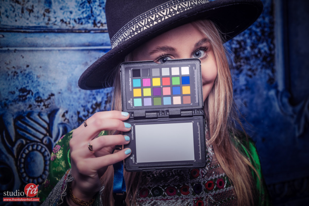
One of the tools that’s essential for a fast calibration is the Calibrate Colorchecker passport.
The process is very simple, you just shoot the colorchecker with proper lighting (use a lightmeter) and you can use the included Lightroom plugin or the standalone version.
Now we have to make sure we follow the workflow
After you restart Lightroom you select the colorchecker profile you created from the custom profiles and sync this to the rest of the images you shot with this setup. And indeed when you use the colorchecker with your camera it’s highly recommended to shoot a new colorchecker image with every change in your setup. If you are not incredibly critical you can also create one profile for your camera/strobe combination. It will not be 100% correct but it will be close.
One thing I always do is when I select the profile from the menu you see here, just before syncing I’ll do a quick colorbalance with the colorbalance tool in Lightroom.
Now lets look at the output devices
Output devices can be for example a monitor or printer.
Now we already looked at the colorchecker for the input devices and believe it or not for the output devices we use a similar technique with one difference, now we need a device to meter what the monitor or printer outputs.
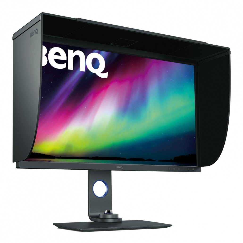
I personally really like the Calibrite products due to their ease of use and quality, plus they work with the hardware calibrations on the BenQ monitors I use.
But you can also use other brands of course, just make sure you replace your analyser every few years because they will deteriorate over time.
For the printer we need a so called spectroradiometer and for the monitor we can use the same technique but also a much cheaper solution like for example tristimuls meters. But without getting to technical.
The calibration is very simple.
I’ll walk you through the more advanced version.
You start the software.
Use the following settings:
Color Temp D6500 (some setups depend on D54 but you will know if that’s you)
Gamma 2.2 (2.4) depending on your preference and room.
Lightoutput 110-130cdm depending on your ambient light conditions.
Profile V2
These are the settings you will find in almost all software, and will give you a perfectly calibrated screen.
Now the software will ask you to activate this profile and send you a reminder after X weeks, please don’t ignore that because calibrations do change over time. After you activate the calibration you’re done.
Different profiles, so now what?
By now we have created several profiles.
The colorchecker creates both DCP (Adobe) and ICC profiles.
The monitor calibration creates an ICC profile etc.
But luckily we don’t have to worry about them anymore. The profiles are now exactly where they should be. In the operating system for the monitor and in Lightroom for your camera where you can now select it and sync to the photos shot with that combination.
Why do I mention this?
A lot of people ask me which profile to use when opening files in Photoshop from Lightroom, the monitor profile or the camera profile?
Well both are wrong, how weird it might sound, you can’t use any of them.
When you open up a file in Photoshop you should always select the colourspace that you want to work in, being sRGB, AdobeRGB or ProphotoRGB.
If your monitor is capable of showing 99% AdobeRGB, thanks to the calibration you will now see all the colors as close to accurate as possible, but also when you have to work in another colourspace the monitor and calibration will make sure you are still seeing the correct colors.
Some things to make sure are in place
For a correct and easy workflow there are some things you have to take care off.
When using HDMI make sure your monitor is setup for 0-255 as dynamic range. (16-235 is for video)
Make sure there is no light hitting your monitor, BenQ delivers a nice hood with most of their photography monitors and these can make a huge difference.
As mentioned before a color analyser deteriorates over time, so make sure to replace it every once in a while. The same goes for the colorchecker, and for the colorchecker you can extend it’s life a lot by keeping it out of the sun when not using.
This is one part in the series on calibration and colorprofiles, make sure to check the blog for much more.
If you’re in the market for a new monitor, we have some 10% discount codes for BenQ monitors for European customers, mail us for more information.


