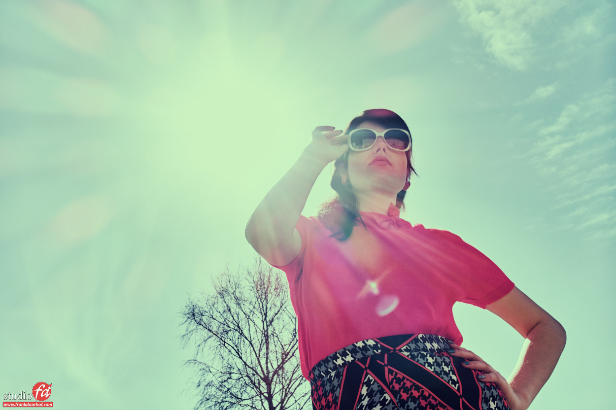
Tip : The most simple location can be awesome
Often I hear photographers complain about the lack of great locations…
I always tell them “the best locations are in your head, and often right in front of you”.
Somehow it sometimes seems that if there isn’t a great location the creativity is gone, or is it just that……
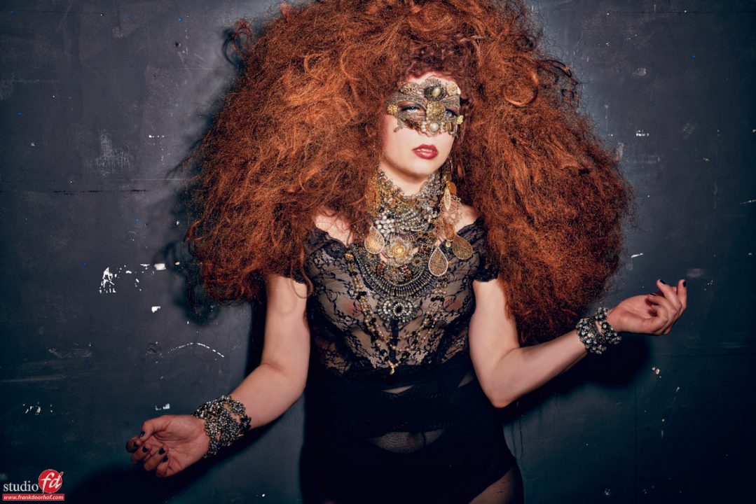
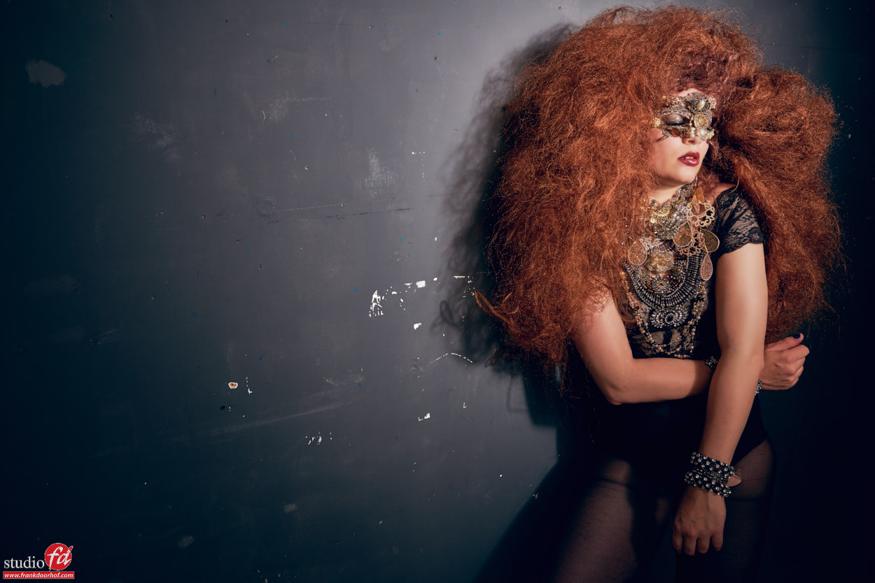
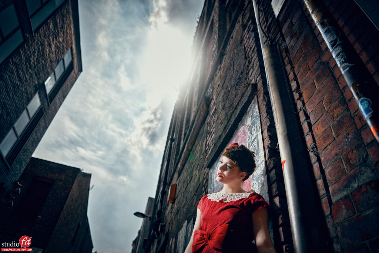
In my opinion every location is great to photograph, but I often do look for certain extras like contrast, grunge (rough) and color, OR the lack of it. The more rough the better in all honesty, on the other hand something really static and modern can also be awesome, as you can see there is always something if you WANT to see it.
As I joke I sometimes say “put on your photographers eyes and hunt, don’t look for opportunities but try to find uses for what you see” this is a different mindset but often helps a lot.
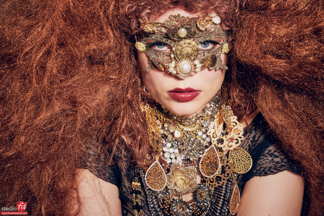
Now if you add a little bit of styling to it (or a lot like in this case) you’re on the way to a great shot.
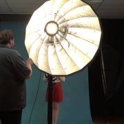
These shots were done during a workshop in Manchester with Nadine, a very simple light setup with one Elinchrom beauty dish with grid straight at Nadine. The wall didn’t look like much but I loved it, and seeing the responses from the attendees as soon as the images came in… they did too.
