Competition winners
When the guys from CameraNu.nl asked me to be the judge for their fotowedstrijd.nl competition I did not have to wait long with my answer. I love the store and a lot of my gear is delivered by them, I’ve know the owner like forever (he brought me my first 10D in person at my house). In the last few years their company has grown into a “monster” camera store with good reputation on service and knowledge, but enough of the promotion…. In this blogpost I’ll show you the winners (and one runner up) and will give you my motivation in what I look for in a winning shot.
For me this image from Steve Gomperts was the winner.
But let me first explain where I look at.
A lot of great images
Some competitions will showcase a lot of “standard” images and a few that are really great, judging can be a little bit easier that way, but most of the time 1-2 will REALLY jump out and catch the attention of the juror, in this case however the quality of the images was without lying stunning. I’ve seen some great landscapes from real landscape experts, but I have to say that some of the images in this competition could compete with those images. I’m also a lover of light, and let’s be honest backlit images are always great and also in this competition there were some real stunning images with backlit looks, because the guys at CameraNu already did a preselection I was left with 64 images from which I had to select 2 winners. And trust me that’s hard and you never choose the ones that others would have chosen, and indeed the first response via Twitter was from someone who would have selected other images, so I decided to dedicate a blog post to how I judge a competition like this.
Some great images, are just great….
Yep I know that sounds weird, but bare with me.
I think the best comparison can be made with a great model, you can have a stunning model, great styling, great hair, breathtaking location and total control over your light and of course the end result will be jaw dropping. However does it move you, take you to another place, motivate you to do the same, put a smile on your face…. etc. well no.
In a lot of competitions I see (as mentioned before) the most stunning landscapes, and if it was a competition where I would only look at that kind of shots I would have had a hard time because to me the selection I got were almost all perfect landscapes, all in their own way of course, but the light was stunning, great colors, great angles of view etc. etc. But also the backlit nature shots were just giving me goosebumps (the good ones), but when I’m honest they are all “perfect” but not “unique”, if someone would have stood at the same location they could have made the same shot, in other words… all the rules are followed, the right lens is choose, the right focus, the right color, everything is great…. but that’s it, it’s a perfect shot of a beautiful location, and if those were the only shots in the competition I would without a doubt chosen one of those, but there is something missing….
Some great images, are not that great but…..
What I look for in an image that I label as a winner is something unique, something that shows that you can control your camera, but more that you understand the moment or the story. In my opinion we as photographers are not “picture takers” but we are story tellers. For example a standard landscape image is great, but I’m over the moon when there is something happening in the landscape that is “off beat” something you don’t expect. For example look through the portfolio of one of my friends Moose Peterson when you look at most of his work you see some of the most stunning landscapes, but when you look closely you see that there is an enormous eye for detail, for example one stone will jump out at you, a shadow will catch your eye, or somewhere you will see something that breaks the composition in a positive way. And that is something that really moves me, however that’s landscapes.
The first shot I choose not because it was perfect, but because it “breaths” fun and action, the use of the wide-angle lens is something I love when it’s used this way, but the reason I think the shot is a winner is because not only one person is captured, but both are captured in a great way…. PLUS the light in the back completes the image for me. Of course the shot is far from perfect (especially when compared to some of the landscape and backlit shots), but that’s not a bad thing. For example I would have cloned out the two people at the extreme sides of the image, and it’s a shame that one arm is missing, but….. the whole look of the shot combined with the use of technique and light makes it the absolute winner for me.
For second place I choose this image by Jeroen op den Kelder.
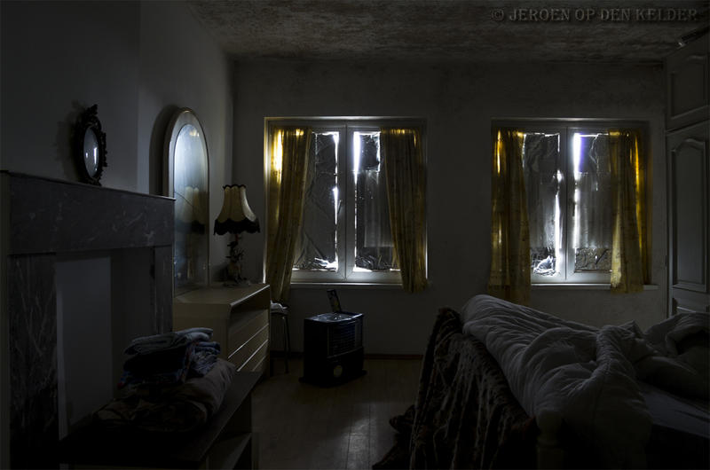 The nice thing about this image for me is that I just love the way the light is playing around the room, just enough detail to see what’s going on, but not too much, it’s just enough. But not only that. The chosen angle is correct, the way you see the room is nearly perfect, but….. as mentioned before I’m always looking for something unique or a story and in this case I just loved the title “the hidden room” That immediately triggered my imagination, what’s going on here. Why are the windows covered?, what is that radio/tv doing there, why is there a crack in the mirror, and who has slept in the bed and is leaving their laundry there? as you can see there is more than enough to see in the image but also questions are born from that.
Is this image a still from a new Zombie movie? is that why the windows are covered up?
Or is it closer to home and does is represent the loneliness that is connected with getting older, is this the room of someone that is forgotten by the outside world?, is that why the mirror has a crack (not being used anymore), is the laundry just dumped there by the nurse, and are the windows covered up because nobody wants to see what’s going on, or does the person her/himself doesn’t want to look outside anymore.
This were just some of the thoughts that haunted me while looking at the image, again this was not the technical best image, not the best eye candy but for me it has an impact.
There is always someone that just did not make it 🙁
I always have a runner up, or in other words the image that had to be cut from the two best. In this case it was this image:
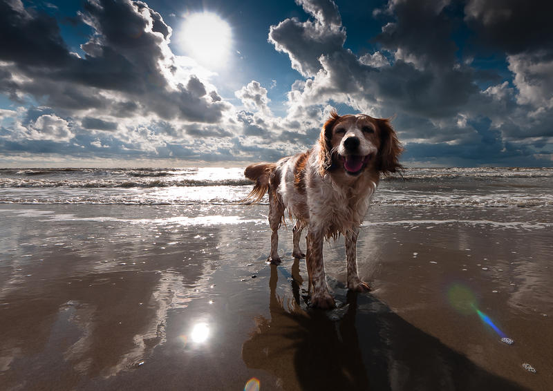 This image by Dirk Steenvoorden has some very nice elements. I love the sun in the back, the nice clouds and the great reflections in the water on the land, but also the hint of lens flare on the right, it’s just a great shot, far from perfect however as a landscape this image got my attention thanks to the dog. No just a dog running or far away… no he/she is looking straight in the camera with a great expression and the light on the dog is great, there is a great sense of depth (3Dness) in the image and that’s something I love to see, not too much flash (what you see a lot with these kind of shots) so it destroys the “realness”, but a wonderful play with light that looks very natural although you know that it’s probably manipulated 🙂 However overall the shot gives me a sense of being there, feeling the wind and feeling the water and sand and that’s something I think is important in a photograph, taking you there, telling a story….
Ok a few more:
One of the landscapes I really loved is this one by Ton Drijfhamer:
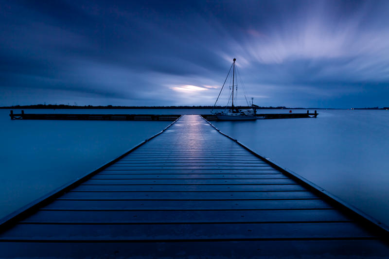 I love the leading lines and the lights in the sky, the toning is spot on for me and the images has a great sense of depth. I call this a wow landscape.
As you all know I love to play with light, and when I saw this one by Patrick Brouwers it was one of my favorites for a long time.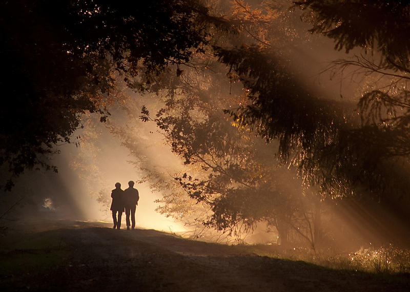
I just love the layered light looks and the backlit trees in the front, the two people make the image complete for me.
And finally I really loved this one by Dik Kwakkel
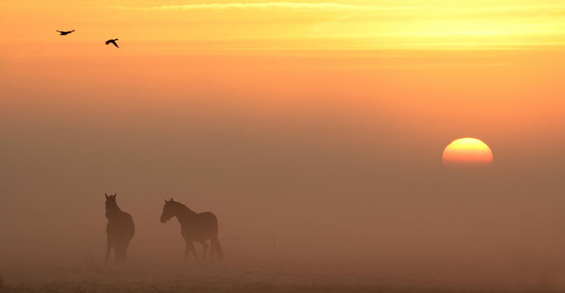 The crop makes it wonderful, almost like a scene from a movie, and the combination of the two horses, the birds and the sun going down makes the image very interesting to look at, I wonder if it was a composite because the birds in the sky are much sharper (less affected by the mist) than the horses which are caught in the mist but seem to be closer in the image. But to be honest I just love how the image looks and for me this is one of those landscapes that is telling me something unique, I would have probably only removed some of the “blacks” in the birds to be honest to make them more fitting with the horses.
Hey, it’s all personal.
Did I see bad images…. well actually no.
The quality of this competition was really VERY good (the 64 I got at least). And people will always have different opinions. My selection for example scored almost no points by the public jury who selected this image as the winner :
 What people have to remember is that being a photographer and being in a jury for a competition is maybe one of the hardest things you can do, as mentioned at the start of the blog I strongly believe that a good photographer must always have something of a narrative side to the images, telling a story is maybe a strong expression but at least I think there should be something “going on”, this is what I look for in a winning image. The funny thing is that I will in most cases end up with the images that are not “perfect”, that according to some are “much less” than the other images… but somehow the perfect images just don’t work for me, I want to see something that sets the photographer apart from the batch and makes him/her recognizable in style but most of all shows that he/she knows how to tell a story instead of following all the rules and making the perfect shot.
I hope that this inside look into my head/opinion on “jury duty” will give a slight edge when you enter your next competition…..
Good luck.




good opinion from a judging point of view… job well done Frank.
Just from what you posted, I’d have not wanted to be a judge. I’d have picked them all, 🙂
dead on! That seagull isn’t even that great an image: check out the nature and macro department of some well known forums and you ‘ll see a ton of “better” images (technically but also totally because of a harmony in toning, colour contrast, DOF,…). Mastering techniques is one thing, but getting the right picture is another. That’s why I started follwoing a course at the art academy… to get better in picking, seeing, telling a picture. And by that I don’t mean those pictures where you have to tell the viewer what it’s all about. That might be art, but it’s not about “writing with light”.