Working with backgrounds in the studio
Ok I promised to to blog till Monday, but hey…..
I decided to do an in between blog post about some of the questions that were asked in the last few days, so let’s go.
About backgrounds
Maybe this is one of the most asked questions.
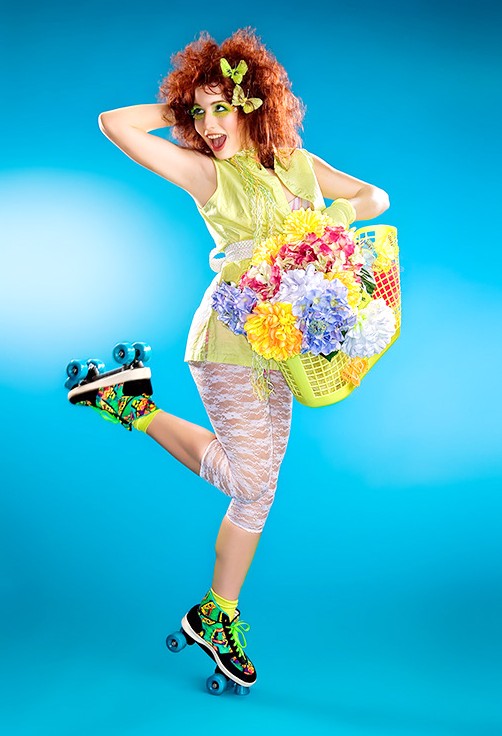
A lot of photographers use seamless or canvas backgrounds, and although I love those also I’ve found that over the years I’ve been more and more drawn towards the “real” backgrounds. When you place your lights correctly you really show structure and details that you can’t with canvas. You can buy the most beautiful canvas backgrounds, but let’s be honest they are in most cases “boring” after a few shots, or in other words they always look the same. I know you can shoot on different positions of the canvas and use different lights on it, but in essence it’s the same canvas. With scenic canvasses it get’s even worse and I would probably never use one in our studio, however I think there is a HUGE benefit for portrait studios for those canvasses of course, but for me the drawback would be that all images look the same only with another person in it.
The advantage of seamless is that there is no “pattern” on it, it’s a color, you can light it with a strobe, use spill light on it, or make it go black or white. So from the choice between canvas and seamless paper I think I would go for seamless paper, and my favorite one is gray. I love my gray to be just a bit on the medium side a bit towards lighter, so not too dark and not too light. Let’s say this one : Gray background The nice thing about this tint of gray is that you can make it black very easily but with enough power also white, and anything in between, someone once said that gray is the new white and I 100% agree, I love working with gray.
But also other colors can be cool of course, however if you want just one background, go for gray.
If you want two go for white and gray.
The nice thing about white is that when you don’t light it, it falls back into a beautiful tint that’s very pleasing for portraits, add a little bit of tone adjustment and get something like this:
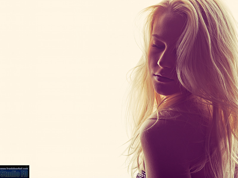
Of course you can play with colors and I love that, but for most colors I often find that I can’t use them too often because my the image is too much dictated by the background color.
So If I must give you a starting an advice it would be to go for gray seamless paper and add white.
you can use a system like this for mounting : Background system
However it can be more interesting without breaking the bank.
Think about real life, what are the most interesting places to shoot ?
Right, walls, old buildings, patterns, stones etc. etc.
So why not make that in your studio ?
Covering a wall with wallpaper you can’t get much cheaper.
For our studio we choose a slightly different approach, we have several walls covered in wallpaper that can be moved and turned (both sides have different wallpapers), but we also asked some painters to think about our studio and paint some of our walls in custom paints, the assignment however was very simple, it had to be as versatile as possible, meaning no real patterns, more abstract than recognizable. This means we can maximize the way we use the walls and areas. In total we now have 17 different background areas in our studio that we can mix and match, if you want to see how a wall like this is made…. see these two videos.
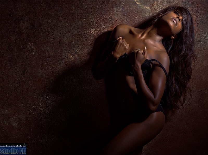
And some of the results you have seen many times, but let’s share a few of my favorites.

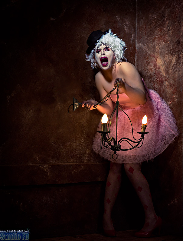 By using different light setups and tonings you can literally use the walls over and over again.
Recently we also added a wall with some torn wallpaper which is really grown into one of my favorites.
With this wall we worked much more with structure which I love to use by placing the lights under an angle and get shots like this.
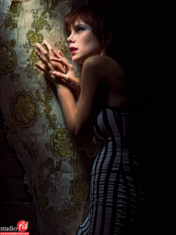
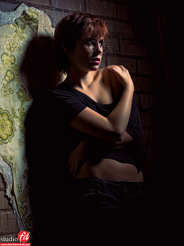 With this background we also run the risk of repetition and that’s why I don’t use it that much, but I do love to use it for personal projects, and soon we will expand this part of the background.
I hope this blog post will be helpful for building your own studio and feel free to discuss it and share it online.
If you like what we do here, and want to support the blog please buy from our affiliate companies by following the links or the links below.



Excellent trompe l’oeil effects. Thanks for showing how this was done. Very interesting.
Thanks
Very good article. I actually saw one of those youtubes of the painting in real time streaming. Love the one with Corine oh and the background is cool as well 🙂
We did stream that one live indeed 😉
Thank you so much for this, Frank 🙂 It was very helpful, love your creativity and how you make your own walls. About the grey bacground, thanks. I have been thinking to buy one for a while, and now itu00b4s easier to choose the right “color”. It is only one place on “my” island that they sell paper background and the mark they sell is Multiblitz. In stock they have two greys, the Thunder Grey and Gray Stone http://www.multiblitz.com/fileadmin/_temp_/widetonemodel.swf Itu00b4s a little bit difficult to choose, but hey, they are cheep, so I can try both of them and see who I like best. But I start with the Graystone I think. nnHave a nice evening, looking forward to a new week with my own photography and your blogposts!
A-mazing 🙂
Love it. I hope to have something special in my studio by the time you get here.
Can’t wait. I think it will be busy. Maybe add a week 😉
JUST AMAZING! 😀