This Photoshop tip will save you clients and embarrassment
Did it ever happen to you?
A client told you that you missed something in a shot.
And of course it happens to everyone, and in most cases it’s something in the skin, maybe a small speck on clothing etc.
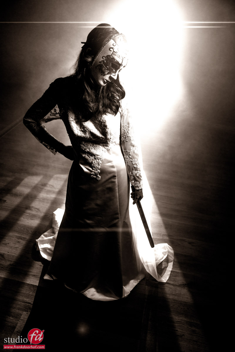
And there’s nothing wrong with that; it’s often a matter of opinion or simply something you missed. However, all these changes are cosmetic and could also be left in without harming the image. In this blog, a Photoshop tip about shadow detail.
The things you missed I’m talking about are much more frustrating.
So let’s see what they are and how to solve them.
Calibrated screens are a must, but….
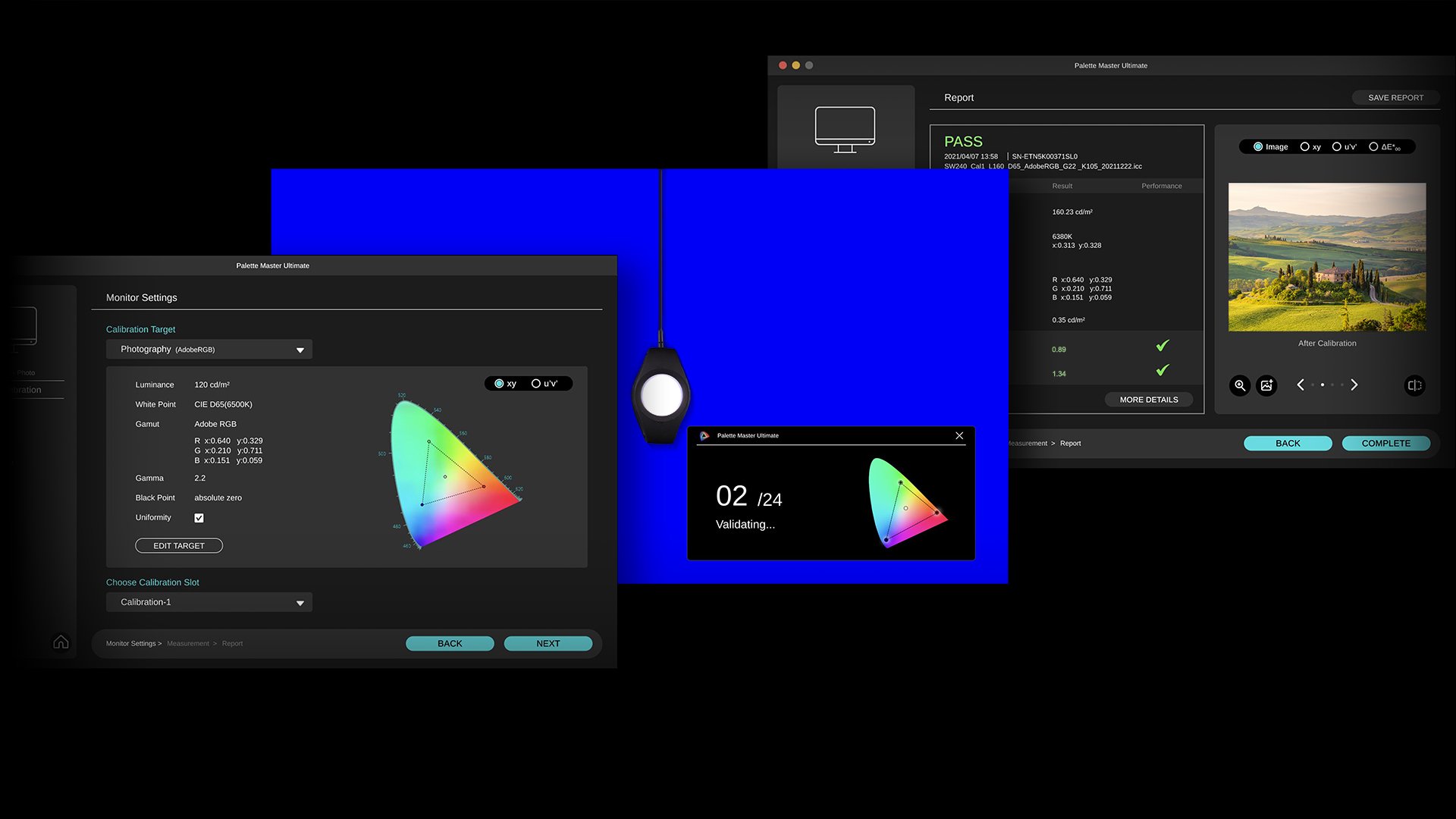
I’m a huge advocate for a proper monitor and calibration.
This is one of the reasons I’m using the BenQ line of monitors; they are very color accurate and offer hardware calibration. In short, you get the best possible performance for your money. But although on your side everything is 100%, it doesn’t mean your client has a properly calibrated screen.
In most cases, this is actually not really a problem.
When we judge images, we have a proper reference point, in my case, the BenQ monitor.
For me, this means when I edit on my laptop, I know how the reference images look compared to the BenQ, and I can do a lot of my work, but I always go back to my reference before I send something to a client or put it online.
Your client has a similar thing.
He/She knows actually how images look on their screen, meaning that’s their reference.
If the monitor is too blue or too red, it will mess up the original colors, but for your client, it will look like everything else.
However, when you work with a brand that needs color-accurate images, it can be a good idea to set something up for your client to judge your images on.
Educate/help your clients
When we shoot for a client that has color-critical work, I will advise my client to calibrate their screens. Or at least visit our studio to check the images on color accuracy.
It can often happen that you send in images that are rejected due to color issues, while there were no issues on your side. Especially when you just start out, or this is the first time you work for that client, you want to make sure that the first impression is spot on.
The problem is mostly that the client compares the colors on his screen with the fabric in his/her hands.
This will not work unless the monitor is 100% color accurate.
Also, a monitor and fabric both create the colors we see differently, so there will always be a part that will differ.
One way to prevent this is to educate/help your clients, especially when you start working for a brand. It’s a good start to talk to them about the way they judge images.
This will always be considered a big plus for your client.
It shows them you know what you’re doing, but also have passion for what you’re doing.
Both are great benefits to have.
You could for example, offer to calibrate one screen for them to check color accuracy on.
Calibrite has great, simple color analyzer that will work like a charm for this. You show it once, set the timer, and check from time to time (vital part :)).
If they don’t have a proper screen, BenQ has a great lineup that can be used for this kind of work.
Their P3 or AdobeRGB screens, for example, are great for this.
(If you live in the EU, drop us an email for a 10% discount on BenQ screens)
If you work with prints, think about this awesome tool from Pantone.
I can’t tell you enough how great those work. If you send in prints, and the client isn’t happy with the quality, in most cases, this is due to wrong lighting.
By using these stickers, you can super easily assist your client to get the perfect lighting.
But what was that tip about Photoshop about shadow detail? Continue reading.
But then….
You did everything right. Every little skin detail is perfect. There is nothing on the clothing that could be improved. And still you get the message “you missed something”.
You check your images again and again, it drives you almost insane….”What.. WHAT did I miss?”
I did forget to mention one thing.
Color is not the only thing that can mess up your image on a non-calibrated screen.
Also, black level and contrast are MAJOR killers.
When we edit images, we are working in a calibrated environment, which means :
1. Our grays are neutral (grayscale)
2. Our colorspace is correctly rendered (CMS)
3. The difference between black and white is even according to room lighting (Gamma)
4. We see the proper shadow detail and white detail (Contrast)
And this last one is where we have a problem when we send in images.
When a client has a setup where the brightness is too low, you will probably hear that there is not enough detail in the dark areas.
And when a client has a setup where the contrast setting is too high, you will probably hear that there is no detail in the whites.
When a client has a setup where the brightness is too high, you might get remarks like, “your work looks incredibly sloppy in the backgrounds”, or your client simply doesn’t call you back after the test session because it’s so bad.
The first two are easy to solve on your client’s side.
When I teach a workshop somewhere and I don’t know the screen setup, I always bring this pattern.
You can also send this to your client and ask him/her to set up the monitor’s brightness and contrast settings so they can see all the steps in the pattern.
This will already solve a lot of issues, on most monitors, the brightness and contrast settings are way off for color accuracy.
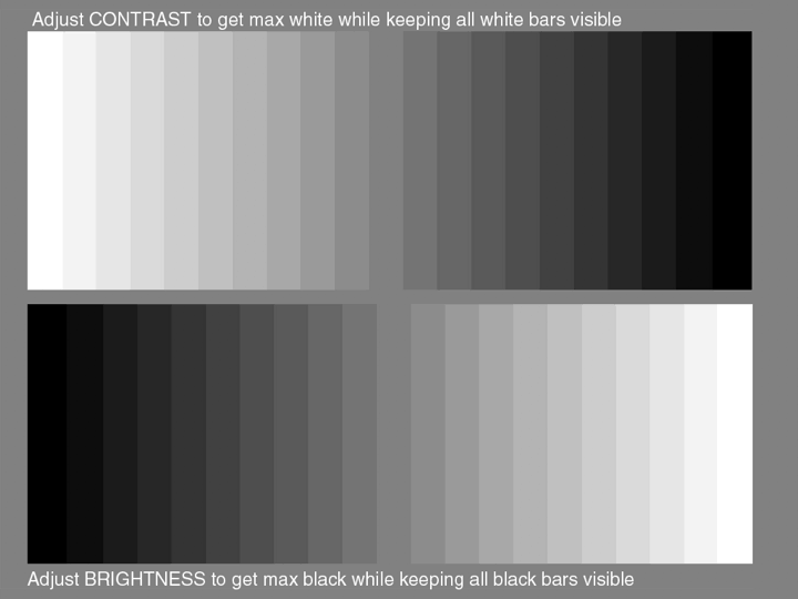
I always give this image ot my clients to check shadow detail
So we are left with that final one.
It’s actually the problem that the client sees MORE detail than you in that case.
You don’t want to know how many times I thought I took out all the power cables, and still found one when I used the trick I’m going to end this post with.
Fix it before
When I started with my studio, I thought it was a great idea to use black power cables.
A dark studio, black power cables. What could go wrong?
Ok, well that luckily didn’t happen (a lot), but what I actually mean, is that when you have to retouch an image, for example, with a dark background and black cables, it’s very easy to miss something in the deepest shadows, and now imagine your client does see this detail.
To make it easier to clone out cables, I found out that it was much easier to take out light gray cables compared to the black ones, and it’s safer.
So, how can we make sure nothing is lurking in the shadows?
I hope you liked this quick tip about shadow detail in Photoshop
If you have any questions for a future episode, drop us an email at info@frankdoorhof.com
Always appreciate a like and a subscribe on our YouTube channel.