Tag Archive for: Adobe

Sit down and listen it’s about workflow in Lightroom

Workflow is key. That is why I use Lightroom

I absolutely love photography, and retouching is a nice, relaxing process for me.
During the workshops, I’m often a bit surprised by people telling me they don’t use Lightroom because it’s too difficult.
Or they are unsure what the perfect order is for developing a RAW file.
So today, we are doing exactly that. Let’s walk through the workflow and how it works.

How was this triggered?

Recently, a friend of mine showed me a diagram for the “perfect” workflow in Lightroom.
It started with merging images in HDR/Panorama, then noise reduction, and then adjustments.
In all honesty, this triggered the blog post: noise reduction as a first step…

Your RAW developer is not dumb

So my advice is very simple: follow the workflow in your software.
Unless you know what you’re doing, of course 😀
Now this could be the end of the blog post, but I want to dive a bit deeper so you also understand the way I build a workflow.
Do remember that a workflow is very personal, so I try to keep it as mainstream as possible.

How I work in Lightroom: step by step

Importing images from my camera

The first thing we do is, of course, import the images.
This is already a vital step, because it can be done in a few ways.
Personally, I strongly advise copying your images to external storage (like a NAS) and using Lightroom to import them by ADDING them, not copying.
This way, the images always stay in the same place, even if Lightroom might one day crash, and you lose your database in a worst-case scenario.


Make your base right

After this, it’s really just following the workflow.
The first thing I always do in a workflow is make sure my base is correct.
This means that I will crop my images and, if needed, straighten the composition.
This is also the part where I will boost my shadows to insane and look over the image for any problems that I take out with the healing, clone or Ai.
After this, I reset the shadow slider, of course, and continue.
The reason I’m boosting the shadow slider is to make sure I don’t miss any details in the darker areas of the image.

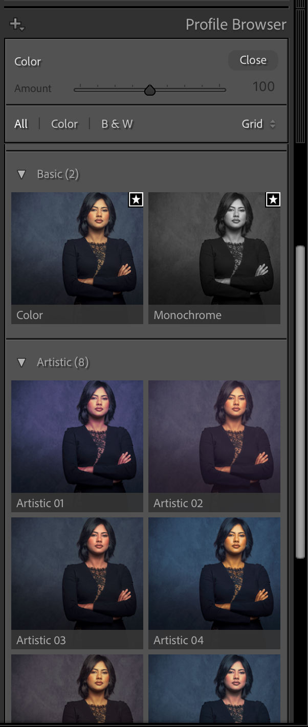
This is where you select the basic look for your images, or you select the created profile from a colorchecker to get accuracy. This can be a creative section or pure accuracy.

Let’s take a look

The first thing you do is select the profile you want to use.
This can be a profile from a colorchecker you created, or just one of the Adobe profiles.

We now have the RAW file all set up for the rest.
You can now, for example, merge your images for HDR/Panorama.

In the next section, we adjust the basic image.
Here we set the white balance and add some contrast to your image, play with highlights and shadows, etc.
Color balance can be set with the picker by clicking on a white balance card (and syncing this setting to your other images).
Or you can select one of the settings, or play around with the sliders.
Personally, I always use a white balance card to set the color balance.
Not because I always keep my color accurate, but because when the base is always the same, I can very easily create presets or automated workflows where the end result is always predictable.

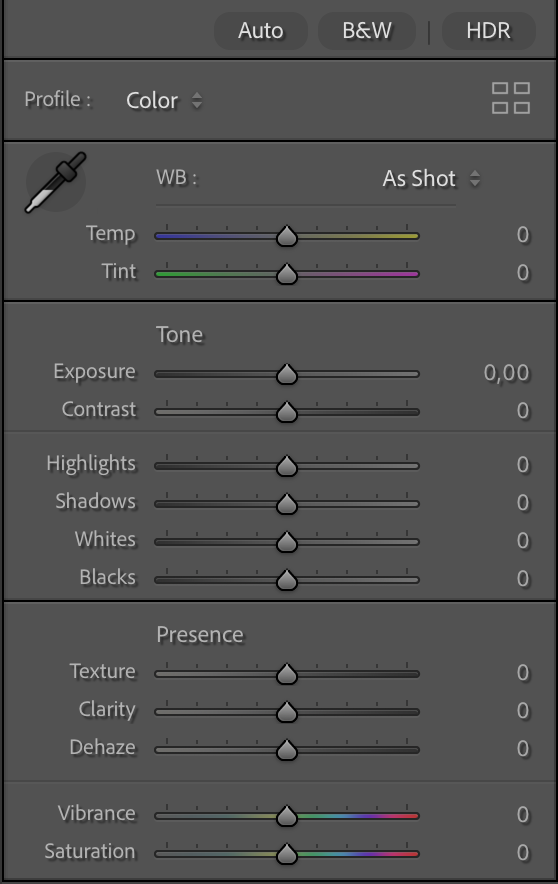
This is where you make the first adjustments to your images, the best you set up your lighting, the less you have to do here, but adding some contrast is with RAW files something we do often have to add.

Colors

After this, I mostly adjust the colors.
This can be done via curves, sliders, HSL, etc.
This is not a part for the accuracy, but already for the look I want in my final results.
This is the part where we build the look for the shot.

Sharpening

Now it’s time for some sharpening.
In Lightroom, we have very powerful options in the case of texture (fine detail) and clarity (a more contrast-based look)
In this section, you can also adjust the look of your image with Dehaze, and trust me, you don’t have to use it to control haze only; it can be an awesome creative tool.

After sharpening, I’m mostly done with my image.
I’ll go through the complete process again, starting at the develop stage and fine-tune contrast/shadows/highlights, etc.

When I’m done with everything, only then will I start denoise, if necessary, of course.

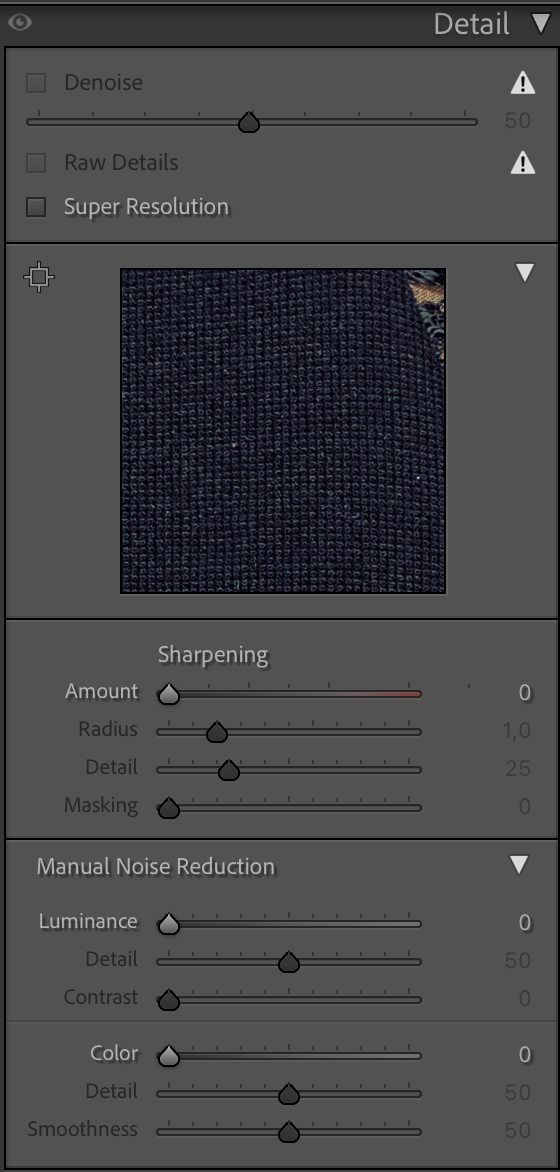
The final step in the adjustments workflow is Sharpening, upscaling, and denoising

Why denoise not at the start?

You can, of course, run denoise at the start of your process.
However, when you open up the shadows, sharpen your image, play with colors, use super resolution, etc. ALL these settings can and will introduce noise.
Meaning you keep going back and forward to your denoise, in all honesty, for me, that doesn’t make any sense.
And brings me back to the start.

Lightroom and most RAW developers have a certain workflow for a reason.
If you are starting out with software like this, it can be incredibly intimidating when you see all the sliders and often names that might or might not ring a bell.
My advice is super simple… follow the workflow from top to bottom and ONLY when you start to feel confident, it’s when you can start to skip parts, or jump towards parts.
Lightroom is so incredibly user-friendly I’m sure you can get awesome results when you follow the standard workflow.

But Frank, there is more…

Yes, after this, there are several other options.
But they don’t influence the noise anymore.

However, they can be important.
First of all, you are probably aware that not all lenses are created equal.
In essence, no lens is perfect, but luckily, Adobe created a huge database of lens correction files that can really change the look of your images positively.
If you have never tried this, make sure you check it out.

In this section, you can also adjust the image in a very flexible way.
“No more” distorted buildings due to wide-angle distortion and a lower angle.

a screen capture of my workflow in Lightroom

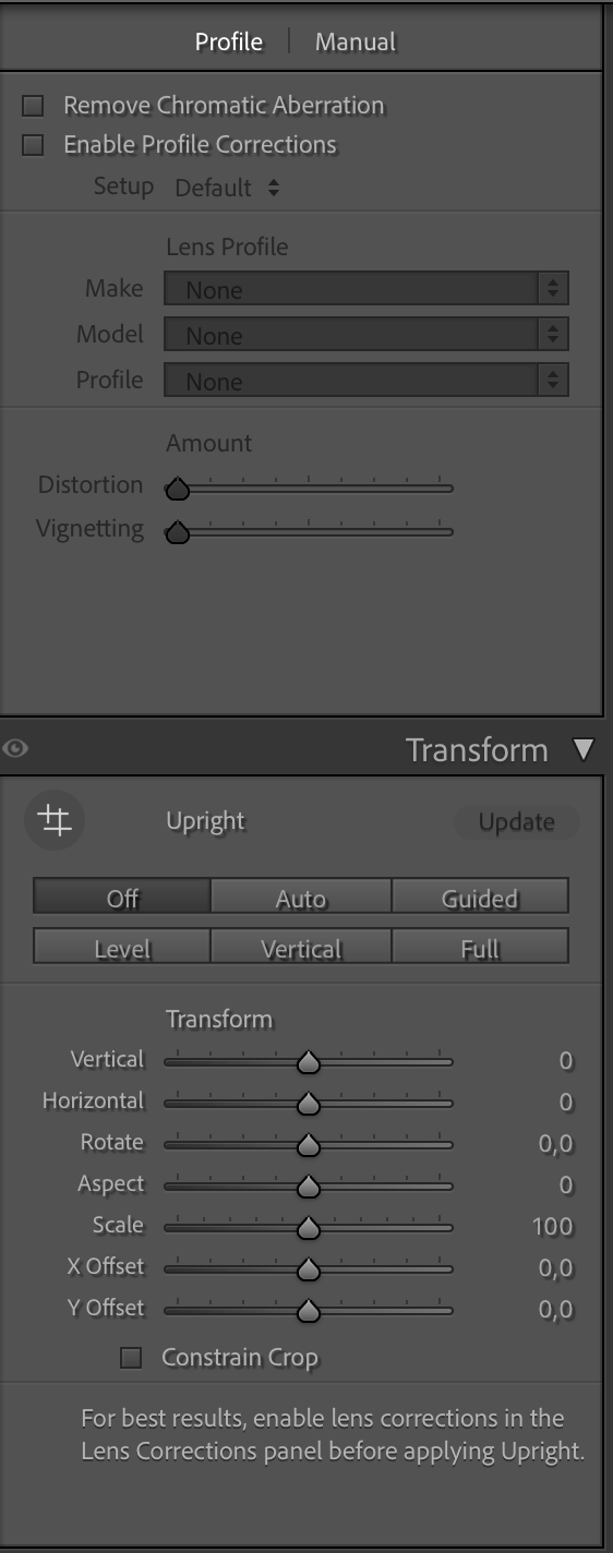
Choose your lens and voila

But you can also play around with lens blurs.
Which can be used for some cool, creative effects. Just play with it, and you’ll see the differences the bokeh makes.

a screen capture of my workflow in Lightroom

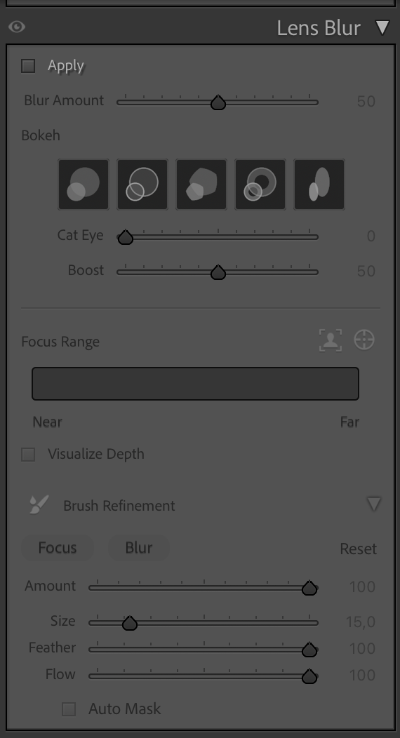
You can use this to create some really nice effects in your images.

Vignette

This is also the part where you can add a vignette to your images, which really draws the viewer in.
Or you can use this to take away vignetting added by your lens; I think it was originally intended for that. To be honest, I use it mostly to add a general vignette on the photos, hardly visible, but when you take it out, you miss it.
(BTW, you can also create a vignette perfectly fitting for your subject with the local adjustments, just paint a feathered circle, inverse selection, and use exposure to create the perfect vignette. I also show this in the video.

By the way, do you see that adding grain is down here in the workflow, AFTER denoise….
Makes sense, right? But one thing that you might not know, or have tried yet, is to add grain to an image that was very noisy and after noise reduction looks a bit like a painting. By adding some grain, you can bring those images back to life. In most cases, our brains are sometimes easily fooled.

a screen capture of my workflow in Lightroom

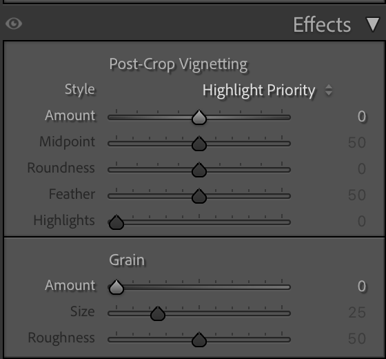
Here, we can add or remove the vignette and add grain, if needed.


Conclusion, Workflow = Lightroom

Lightroom is an awesome addition to every workflow.
As with most RAW developers, they created the software with the workflow that works best in mind.
This means it’s often best to just sit down and slowly work your way down, try every setting, and see what it does.
I’m 100% sure you will get used to using Lightroom in a few hours and feel right at home in a few days, and say you never want to be without it in a week or two 😀

And because videos are sometimes easier, I have recorded a 2-hour Lightroom for beginners Digital Classroom.
And if you want even more information about Lightroom and Photoshop, get my 7.5+ hours tutorial via our webshop
If 7.5 hours is a bit too much, I also have a shorter video 100% aimed at Lightroom
And if you already use Lightroom, you can also order my full Lightroom Preset pack here.
It’s the same pack I use myself.

How close are Photography and Music?

I’m a very lucky guy! I am into photography and music.

Being able to do and share the stuff I love to do.
Photography and Home Theater might be my profession, but they are also huge passions.
And as many of you know, recording music is another passion of mine.
In fact, the first company I ever started was a “professional” recording studio.

At one point, I had to choose between earning money and chasing a passion.
I chose the latter, and stopped playing/teaching and started a computer company. Don’t get me wrong, I love computers and have been using them since my youth, but they didn’t give me the same satisfaction I get from music. We call it growing up. So, what does this have to do with photography and music?

Music

Besides music, I always loved photography and movies. I was already experimenting with 4 speaker setups in my mom’s attic.
In the 90s, we started a Home Theater department within the Computer Company. People thought we were mad, “Who wants a projector in their home?”…. We saw the future. (and wanted to build our own Home Theater).
I loved the Home Theater part, but always was tweaking the colors on projectors and TVs, which led me to be in the States on 9/11 2001 for my ISF certification (Imaging Science Foundation). Yeah, I will always remember where I was that day.

Back home, we started to actively educate people about the need for color calibration in their home theater, and of course, we did a lot of calibrations.
The difference between a standard screen and a calibrated screen is day and night.

Why calibration in your home theater matters

It’s simple.
How many of you shoot images and just upload them straight out of the camera?
And how many of you tweak the shots a bit, add some colors, change the contrast etc.?
I think/hope the second group is a lot larger than the first 😀

During workshops, I always teach people that “Color evokes emotion”.
Think about the color red, it can be connected to the emotions “warmth”, “safe”, “love”, but also “danger”, “hate”, etc.
So, using colors in any form of art is used to enhance the story/image on the screen.
I don’t know how you guys are, but I take the tinting of my images very seriously. When I visit a city and shoot images on the streets of New York or Los Angeles, I will probably choose two totally different looks.
However, I’m not someone who will overdo it, but maybe you are, or you are much more subtle?

The movie looks like intended

The fact is, when we want to experience the movie exactly the same way the maker intended it, we need a display that matches “exactly” what the creator used.
“So do we need to know which monitor he/she used and get the same one?”

No, luckily not.
This is where the calibration comes in.
For Home Theater setups, we calibratethe  display to the industry standard of D6500, Gamma 2.4/EOTF, REC709/P3/BT2020
If I lost you, don’t worry… as they said in Bugs Life “we are trained professionals”.
In the end, it means that your display will show you the movie as much as possible to the intended colors and dynamic range.
This is a manual process and can take up to several hours.

Can we make it easier?

As a creator, you might be very interested in the whole theory behind color theory and calibration (like me), but most of the creators I talk to are very interested in the creative use of colors. But somehow, when we talk about calibration of the monitor, it’s often a forgotten part of the workflow. Or when it’s done, it’s not done regularly.
And let’s be honest, we want to create, and not spend hours tweaking our screens to be able to show the colors the right way.


Automation

This is where automation comes in. If you buy a proper monitor, it’s actually very easy to achieve “perfect” colors without doing a lot of work.
On most monitors, it’s possible to use a so-called calibrator. You place the calibrator in front of the screen and start the software. Just follow some easy steps,  and everything is done automatically.
If you want even better results, get a monitor with so-called hardware calibration software. The difference is more accuracy and fewer artifacts in the final results. And if you already feel too much stress by thinking about calibrations, there are even monitors that will do it all for you with a built-in calibrator.

An ambassador’s meeting

Last week, Annewiek and I were invited to the BenQ Ambassadors meeting.
Funny fact we found out, I was the first Ambassador in the program.
The reason I chose BenQ was the fact that their whole approach was aimed at color accuracy, and over the years, I’m really impressed by the improvements they have implemented, not only in the performance of the software but also in the accessories.

Take, for example, the hood. It’s not that hard to assemble and place on the monitor, but in practice, it can be a bit of a frustrating experience. During the meeting, we could experiment with the new hood. The new hood uses a magnetic system, and it just clicks on; you can now even place it on in the dark.
On the first monitor, you can see a small device on the top. That is the auto calibrator. So if you want everything to go smoothly and automatically, this is a great option for you.
And don’t worry, you can still use an external calibrator, of course.

So what is the link between photography and music?

During the ambassadors’ meeting, one of the questions was “in which market do you feel BenQ should be active?”
And I immediately thought of music.

BenQ has great monitors dedicated to Designers, Photographers and Video.
But Music is a huge part of the creative part, so why is there hardly any attention in advertising for this group?

Let’s take a look at why a proper monitor can be vital for your musical workflow and health.

Musicians are very creative people

And inspiration can strike at any moment, and before we know it, we are 12 hours further, and it’s deep in the night.
Having a monitor that emits loads of blue light can be very tiring and actually make the whole creative process a lot harder.
When you calibrate your screen to 120nits and D65, you will find out that there is no more eye strain and you can work hours in a row. See it as changing those harsh-sounding near fields for new ones with a lot more headroom and better bass. You can now work a lot longer without ear fatigue, the same happens with your monitor.

Photography and music software

Personally, I love real estate.
I work with Logic, and although the layout looks nice on my laptop, as soon as I connect the 32″ 4K screen, I can see the whole interface and side areas. This doesn’t just speed up the workflow but also takes away eye strain connected to constantly scrolling and opening windows. Once you work on a 32″ screen, going back to 27″ is a real step back.

When I edit my photos, I can do this in almost every location, although I prefer a low light level, and of course, no lights hitting the screen.
When I record, I love to have the colored lights on, and lights behind me, lighting amps and guitars, it gets me into a creative state that is hard to achieve without.
But that also means the chance of reflections on the screen can be a problem. So, make sure when you select a screen, you don’t go for the most shiny surface. One of the things I love about the BenQ SW321C I’m using myself is the coating on the screen; it is very forgiving with lighting in the room, and again, it prevents eye strain, meaning I can work for a longer time.

Photography and music

So far, I have not yet explained the calibration part

During the recording process, having a proper color temperature is important for eye strain. But in all honesty, if the colors are slightly off, it won’t affect the way your DAW works.
However, when I’m done with my recording, I start the process of uploading my music.
At that moment, I need artwork.
And now the calibration comes into play.
On a calibrated monitor, I know for sure that my artwork looks the way I intended it. It also helps to be able to see great shadow detail.
You don’t want to know how many “commercial” releases you can see editing faults in the shadows or even in clear sight.


Artwork

So, now that I have created my artwork and uploaded my music, in most cases I will start the process of starting a new track.
But as a photographer, I love using video. Our studio specializes in educational videos and business videos, but as a musician, I love creating video clips. So when I have time I will always try to create a small video clip for my music.
Also, here, a properly calibrated screen makes it much easier to get colors right when editing, and of course makes sure that all your followers don’t see you with a weird magenta nose.
With video editing, I also love the extra real estate of the 32″ screen.

When we record tutorials, we often use 4 different camera angles. For some of the video clips I shoot, I end up with a total of 12-16 angles.
You probably already guessed it, on a 32″ screen, working with up to 16 camera angles is very easy.
Because most new cameras support shooting in D-log, it makes editing a lot easier.
But it also makes it more important to have a properly calibrated screen. You are,  in a sense, working on a very flat file.
If you work on a monitor with too much contrast, your result will look very flat, and if you work on a low contrast screen, you will probably blow out a lot of detail or bump the colors the wrong way, and the end result can be even worse.

But let’s get back to the music part, because that’s probably why you clicked.

Don’t forget the music market

I love it when companies ask for input from their users or ambassadors.
When we talk about monitors, it’s often a matter of designers, photographers, and video editors. But I hardly see a brand focusing on the music industry.

When I was young, most artists had record deals, sold out stadiums, or just struggled to get a record deal. The quality was often poor in print shops, and the shirts were printed at home; that was the thing.

Fast forward to 2026, and even the big names are struggling with the new way of distribution, and starting musicians have to be able to do a lot more.
To be successful, you need a lot more than just creating kick a$$ music.
Distribution is becoming a very difficult part, but it also offers a lot more options with social media and channels like YouTube and TikTok.

I only create music for fun, but I also love to share my tracks. When I started it, it already gave me a headache when I found out how many streaming services there are, and how expensive it is and how little the payment is, it’s almost like stealing. Luckily, there are services that combine all streaming services, and you pay one amount, and they take care of everything. I chose Distrokid and can highly recommend them if you want to share your tracks to as many outlets as possible without going bankrupt.

Photography for the artwork of your music

Whatever media you choose, you will need some artwork,  work with a DAW, and plugins.
And unless you have the budget to hire a video team, videoclips are often shot by the bands themselves on iPhones, Osmo pockets, etc.
So, also video editing, live streams, photography, and design are often part of the workflow of a modern musician, covering in fact almost every facet of the creative process.

And this is where the calibration becomes really important.
When we look at the number of devices out there that are used for media consumption, you will probably be shocked when I tell you that literally all those devices will show you the colors slightly (or a lot) different.
Just check your own TV set and switch between the cinema and vivid mode. Now compare a photo on your iPad and iPhone vs Android.  Or a Samsung vs Oppo and…,ok, you got the idea.

I’ve been doing the ISF calibrations since 2001 and can tell you that I never found TV sets or projectors that were 100% correct out of the box.
Some are a bit too blue, some are way too blue, some are reddish, etc. The thing they all have in common…. in most cases, people are used to that screen.

photography and music

There is a standard for a reason

The question most asked has to be “Why should I calibrate my screen when my client/followers are not?”
If you read the text again, you probably already have the answer.

As a creator, we HAVE to follow the industry standard because outside it’s a mess.
By making sure we follow the industry standard, we know for sure it’s “compatible” with “all” displays out there.
Plus, the viewer is used to how the material looks on their “messed-up” screen.

Now you might think the story stops there.
I’m sorry to tell you “no”.
And this is one of the reasons I chose BenQ.

BenQ for photography and music

When you edit your artwork, you have to take into account that it will look slightly different on different displays. Contrast is one of the key elements in design and can make a text totally unreadable on certain devices while it looks fine on others.

BenQ has a very smart preview system, where you can compare the different output devices and how your artworks look on them.
This makes editing so much easier to do yourself.

photography and music

Conclusion

Having a 32″ monitor as the main hub in your home studio has many advantages. For your photography and music.  Having a properly calibrated 32″ monitor in your home studio can boost your creative process and make sure you can create all the artwork/videos yourself that will give a proper viewing experience on a mix of devices.

When we talked about this during the ambassador’s meeting, we started to think which monitor from BenQ would be the perfect budget-friendly entry point.
Of course, I would say, go for the SW321C, but this is a top-of-the-line screen, and I use it primarily for my job.
But we found the perfect musicians’ monitor to start with.

The BenQ PV3200U, we think, is the perfect starting point.
In fact, everything I wrote about in this blog post is available in the PV3200U (and a lot more).
A nice extra detail is the addition of a sound system. Don’t expect nearfield quality, of course, but it’s a great way for some quick video editing if you don’t want to power on the whole system, or wear headphones.

It also included the BenQ puck, which can be programmed to speed up the workflow with the monitor.

A personal touch

After all this talk about photography, video, and music, I think it’s a great way to end this blog by releasing a new track.
It’s called “Short and sweet” and was recorded in my home studio. The clip was shot with the Osmo Pocket 3 and edited on the BenQ SW321C.
Do remember I’m just a hobby musician.

If you are convinced that BenQ is the right monitor for you, contact me for a 10% discount code.
By using the code, you also support our work, just as with the Distrokid link.

Although I’ve been a BenQ ambassador for many years, I 100% stand behind my views on their products, and the reviews I write are not corrected or influenced by BenQ.


Free video tutorial about mixing flash with continuous light

It’s one of those questions

That always comes back, and we’ve discussed it several times on the blog.
But because video is always better, today a free 2 hour tutorial about mixing light sources.

But first I’ll show you the results from the video, and give you a short explanation of the setup.
Due to the different lighting setups I have chosen to edit the final results also with different looks which I think fits the mood.
During the video you see the lighting setups and also part of the retouching process in Lightroom, Photoshop, BorisFX and Luminar Neo

Chandelier

Strobes are fun, but just a chandelier can be great too.

Mixing the chandelier with strobes

In the following shots I started with the Geekoto Lantern, and later switched to the Geekoto Quicky softbox, both on the Geekoto GT400.
As you can see the difference is clearly seen between the more focussed lightsource and the lantern which spreads the light out much more.
In the later shots I compensated with the light output of the chandelier by changing the shutterspeed. (explained in the video)

More focussed lightsource.

And of course it’s always fun to add some extra color.
Here I’m using the Rogue magnetic system on the Geekoto GT200 with a blue gel
The black diffusion filter helps with the lens flare.
You can always add some extra “oomph” to your lens flares with software like BorisFX, which I used in the first shot.
The lens flare is there, but it just gives it something extra.

Back to the chandelier

In the final part of the tutorial I switch back to the chandelier, but with a different setup.
This setup goes into detail about the inverse square law and shadow problems when shooting closeup light sources.

The tutorial

After seeing the results I hope you are looking forward to the tutorial.
The tutorial is part of our Digital classroom series, which you can find on our YouTube channel.
If you want to learn more about lighting in small groups check fotografie-workshops.nl for the Dutch workshops and events.
If you don’t speak Dutch and let us know a few weeks in advance we can switch the workshops to English.
And if you are not able to travel, no problem, we have a great setup for 1:1 (group) workshops online Online 1:1 workshops

Use channels in Photoshop for awesome control

Today another Adobe Photoshop tip

I love to tint my images, in fact tinting is for me a vital part of the final look of the photo.
During the workshops we talk a lot about colors, and how they evoke emotion with people.

Of course you can do a lot of cool stuff with gels and lighting, but did you know that in Photoshop you can really add some serious “oomph” to your images with a relative simple trick with channels?

Today I show you one of the techniques I use a lot on my images for that extra unique look.