My blog, although I don’t see myself as a blogger but as a Photographer I will try to blog some interesting material during the weeks.
Expect at least 2 updates a week.
And it can be hard. It all depends on the gear you use.
How often did we hear that excuse when something didn’t work out?
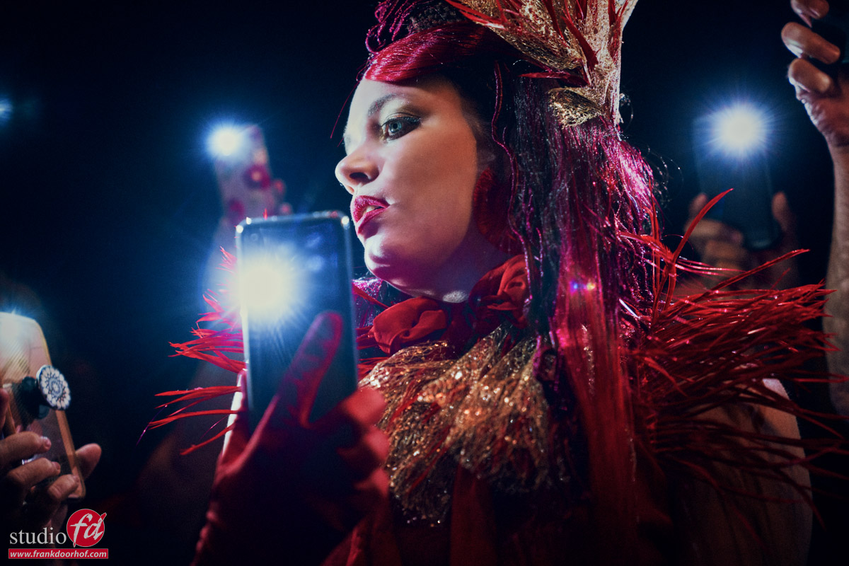
A few years ago I did a workshop during Photoshop World where I started out with 3 strobes and “faked” that one by one the strobes failed and I eventually ended up with a torch that was on the stage, and finally asking people from the audience to use their phones to light my model.
The proof is in the pudding. In essence you can create great shots with almost everything, as long as it emits light is my motto.
In fact, sometimes limiting yourself pushes you to be more creative.
And what is more limiting than….. a standard torch.
A new KelbyOne class
I’ve been working with KelbyOne for quite some time now. In fact, I was their first European instructor, which naturally means that when they request a new video, I want to create something fresh and creative. This time, the class focuses on using household materials to capture stunning photographs.
You can find the class here
A torch
Besides using household items like rescue blankets and a room divider (among other things), I also challenged myself with lighting.
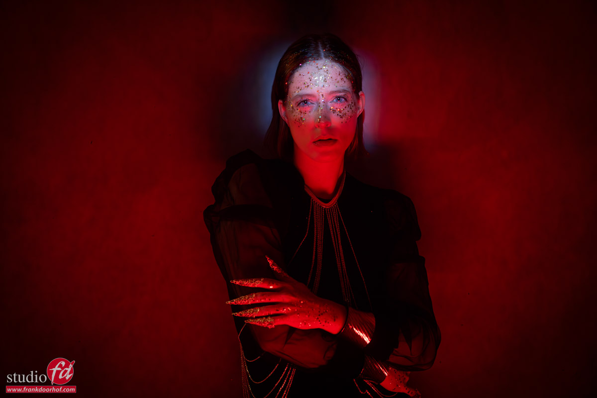
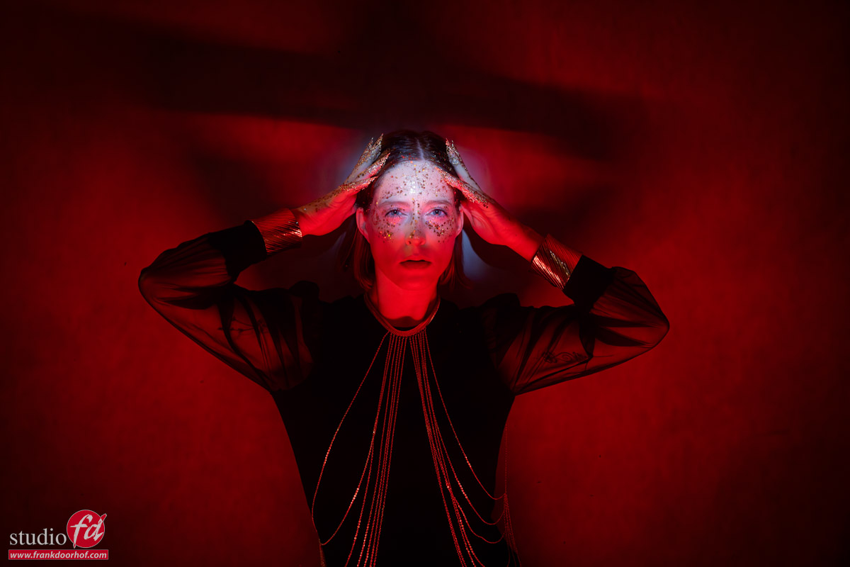
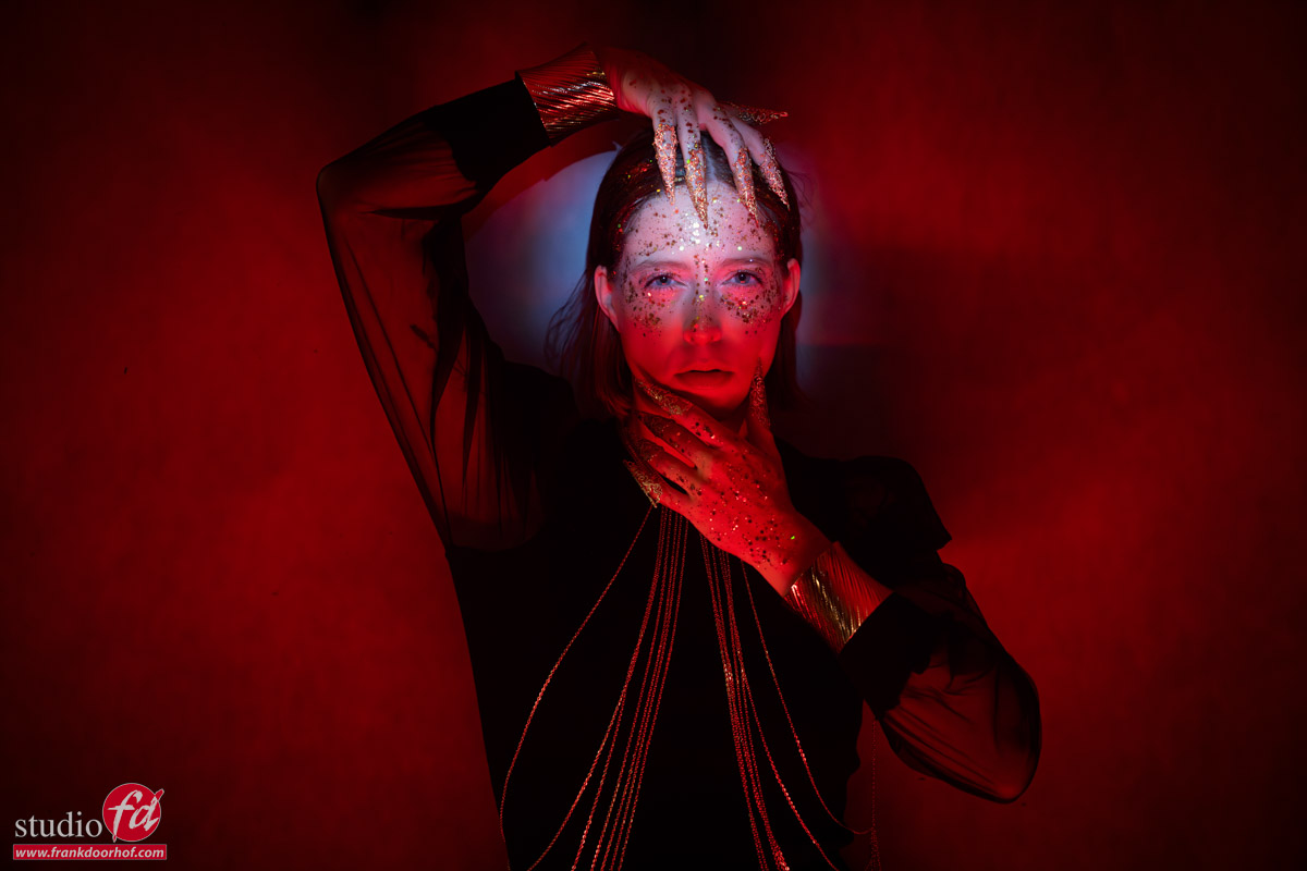
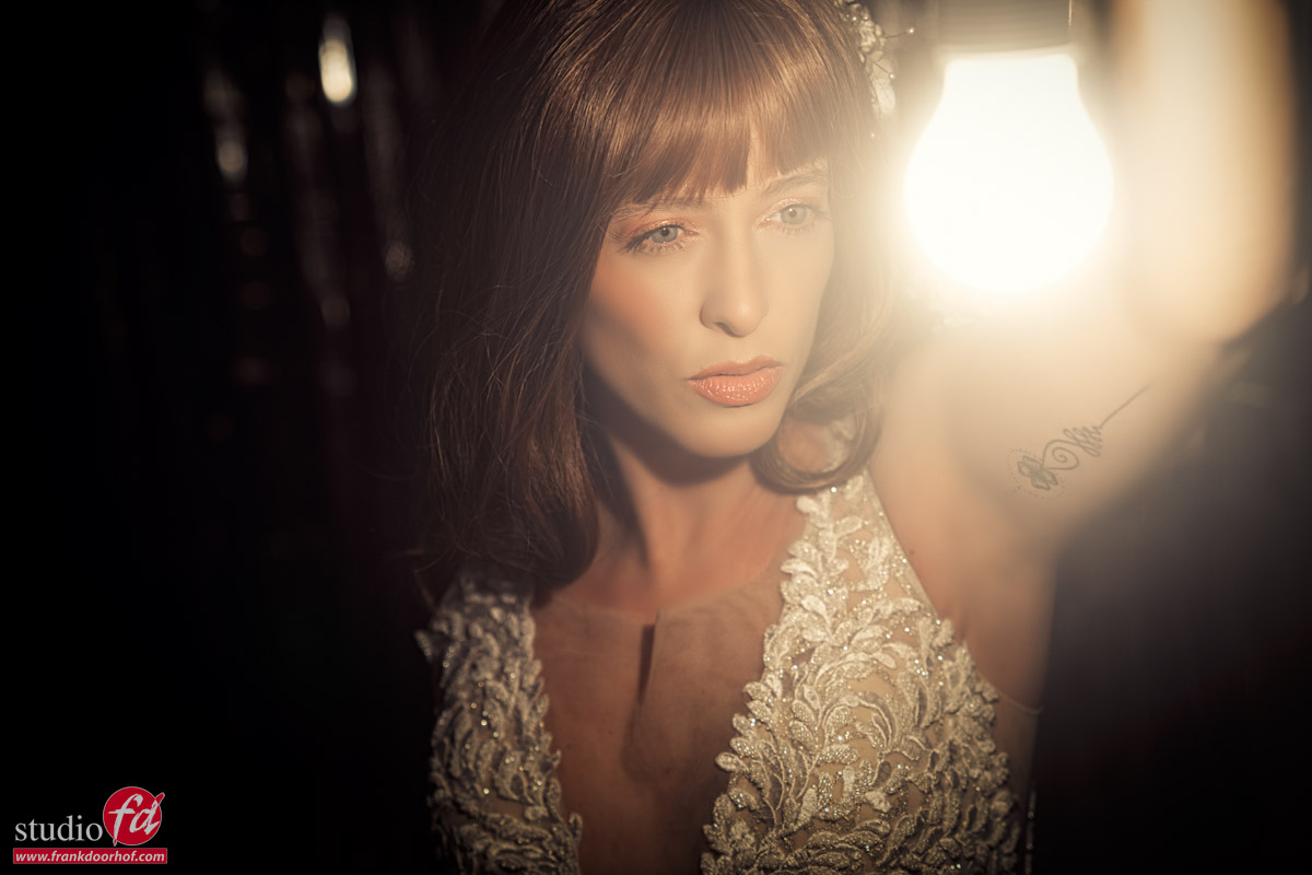
One set we decided to try would be to see what you can achieve with just a simple torch.
We all have one in our phones or a more powerful one.
For this set, I’m using a simple focusable torch.
If you’re using a torch for photography, make sure the batteries are fully charged and use a pretty powerful one in a dark room to avoid spill light.
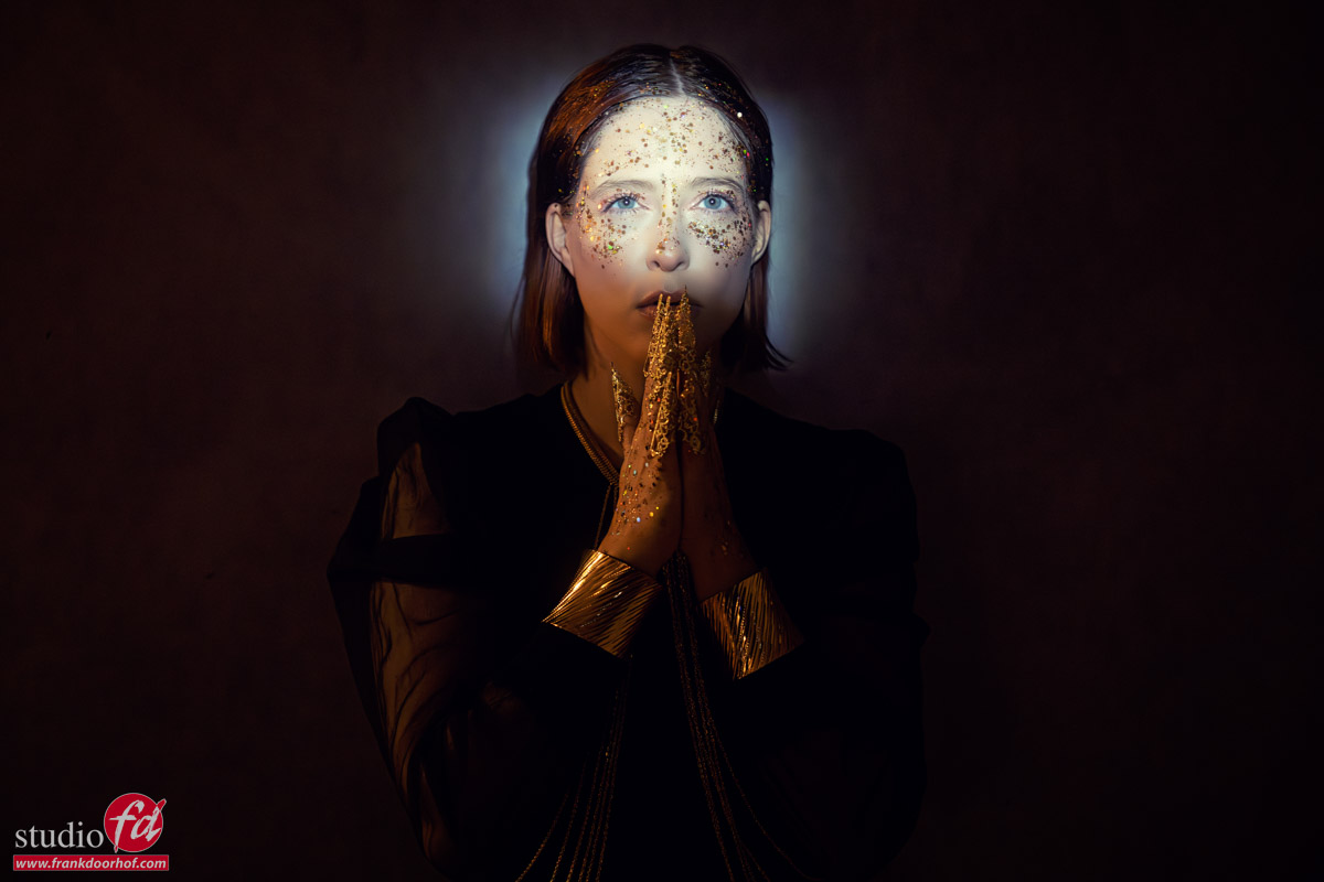
When we began with just the torch, the light was already ok, but I wanted to make it more focused.
However, when you can’t connect grids to a torch, you have to be creative.
So, we used a piece of cardboard and cut out the pattern I wanted on our model.
We started with something like this (I did add some vignetting in Photoshop).
With the cardboard cutout we already get a lot more focus on our model.
I already love this look.
But we can always improve something, Right?
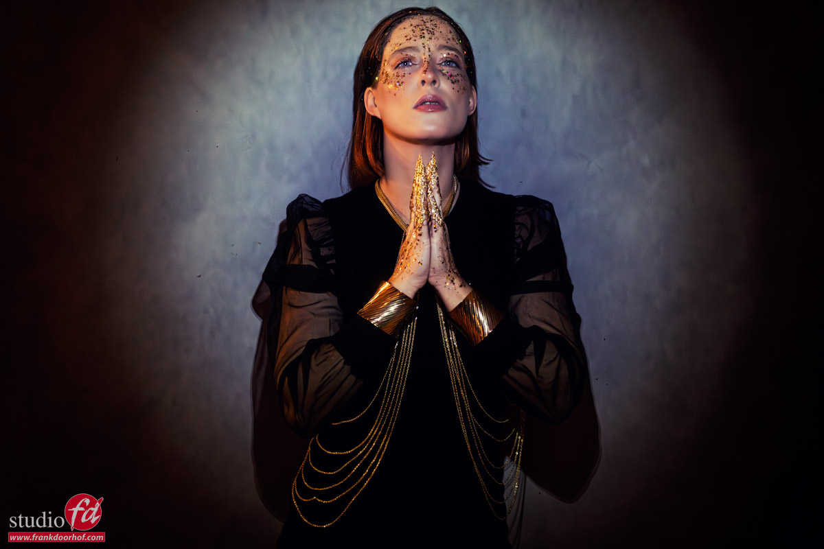
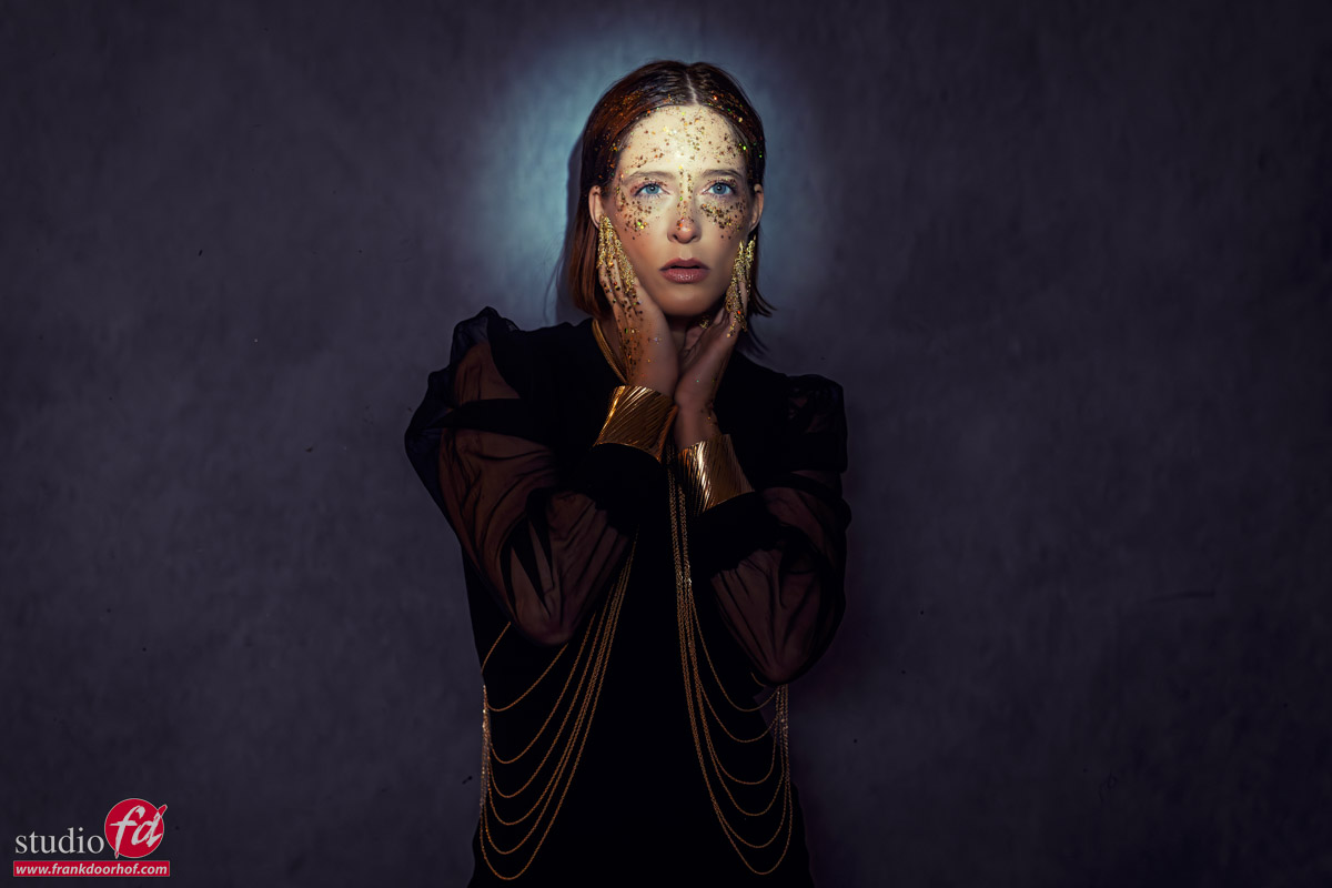
Add some color
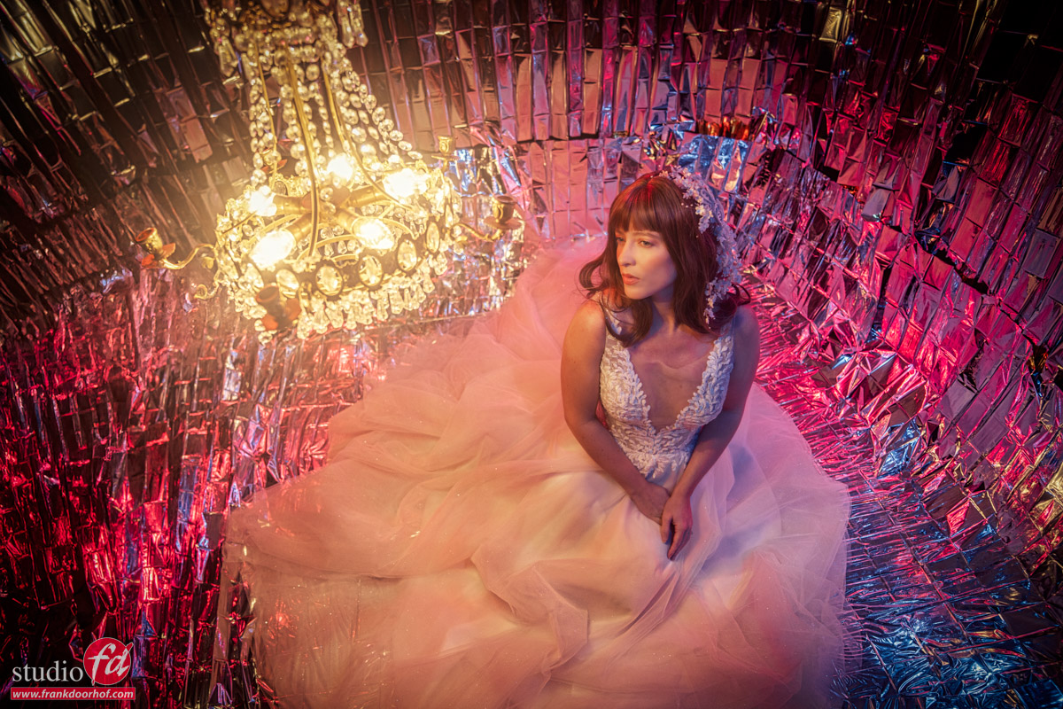
Color evokes emotions, and I believe the color red would be an excellent choice for this shot.
As you can see, I’m still using the torch with the cardboard to illuminate the models’ faces, but I’m also employing a red-colored light source to enhance the shadows.
You can use a strobe with a red gel or, of course, a LED tube.
In my case, I primarily use Nanlite PavoTubes.
These lights can be remotely controlled and offer a wide range of colors and effects.
Now it was up to our model Claudia to create interesting shadows on the background with her poses, and of course she had to stay within the light.
Not an easy task, but she is a great model and I absolutely love these results.
See how we did it
We filmed the KelbyOne class with 3 different cameras to make sure you see the set from all angles, and of course you also see the images coming in during the shoot.
This is just one of the sets we did for the class, so if you want to be inspired and learn how to use simple materials and alternative light to create stunning images, make sure to check out my new KelbyOne class.
https://frankdoorhof.com/web/wp-content/uploads/2026/05/Claudia-Kelby-one-188-Edit.jpg8001200Frank Doorhofhttps://frankdoorhof.com/web/wp-content/uploads/2015/03/studioFD_Logo-1FV.pngFrank Doorhof2026-05-24 18:00:562026-05-16 16:39:51Just a torch some gels and cartboard
I’ve been creating tutorials for a long time now, and to be honest, it never bores me.
Mostly because, besides explaining the theory behind the techniques, I also love to create more creative setups or use gear in ways it wasn’t really designed for.
So when KelbyOne asked me to record a new class, I immediately knew what I wanted to do.
Create a class where I use household materials to create stunning results.
The class is now online on KelbyOne, so make sure you check it out whenever you want to be inspired.
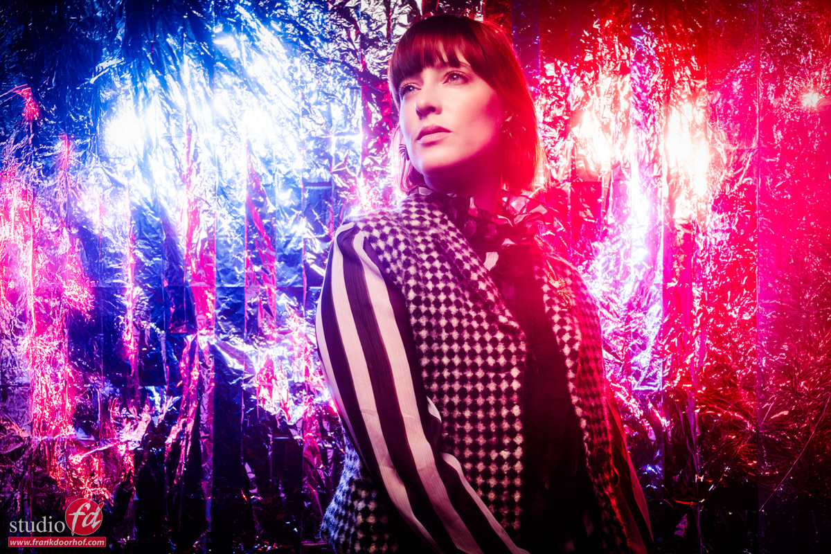
The class is all about using household materials, so we dove into our attic and studio closet to see what we could use.
We ended up with scenes using rescue blankets, a torch with gels and cardboard, a room divider, and a lot more.
This is one of the most creative classes I have ever recorded, so I’m 100% sure you are going to love it.
I show you the lighting setups, the whole shoot (including all the images coming in), and of course, I explain all the techniques and ideas behind the shoot.
And to finish it off, you also get a full retouch session for several of the images.
If you love this class by KelbyOne Class: using household materials to create stunning images, make sure to also check out all the other ones.
Fun and creativity: storytelling
Photography is so much more than just capturing a beautiful model in front of a great background.
All of history, we have been storytellers, and you will find out that you will get much better results when you think more about storytelling than just capturing the light on your subject.
Storytelling can be done with colors, expression, and, of course, lighting.
In this class, I show you that you don’t need to break the bank to create cool sets or interesting looks in your photos.
So next time you are shooting a model, maybe just use a tungsten lightbulb or a torch?
https://frankdoorhof.com/web/wp-content/uploads/2026/05/Claudia-Kelby-one-141-Edit.jpg8001200Frank Doorhofhttps://frankdoorhof.com/web/wp-content/uploads/2015/03/studioFD_Logo-1FV.pngFrank Doorhof2026-05-21 18:33:422026-05-18 17:30:29A new KelbyOne class
In professional photography, speed, precision, and collaboration often matter just as much as creativity.
One workflow has slowly transformed the way photographers shoot in studios, on location, and during commercial productions: tethering. First, I’ll explain tethering and then a few tips on how to protect your camera port and cable.
Tethered photography connects a camera directly to a computer, tablet, or monitor during a shoot, allowing images to transfer instantly for review.
What once seemed like a luxury reserved for high-end studios has become an essential part of modern photography workflows across fashion, product, portrait, and even wedding photography.
I remember that when I started in the studio, I connected my Canon camera with a video connector to a CRT monitor. It was far from perfect, but it worked like a charm.
Nowadays, tethering has come a long way, so let’s take a look at what tethering is and how we can use it, and we end with a tip that will save your camera.
What Is Tethering?
Tethering is the process of linking a camera to another device—typically via USB-C, Thunderbolt, Wi-Fi, or dedicated wireless transmitters.
The moment you shoot, the images will appear on the screen immediately. This is a great way to check focus and composition, or even attach a preset so the client can see the images as close as possible to the result.
You can even project the images inside a cover, for example. Tethering opens up the workflow and takes out the guesswork.
To be honest, I’m not a big fan of the wireless solutions, but if you only need JPGs and have an area without a lot of wifi traffic, it can work like a charm. Personally, I prefer to shoot with a cable.
Instead of reviewing shots on the small LCD at the back of the camera, you can now evaluate full-resolution files in real time.
Software such as Capture One, Adobe Lightroom, and most cameras have their own solutions, making this process seamless, offering instant previews, live adjustments, and organized file management.
At its core, tethering removes uncertainty from the shooting process.
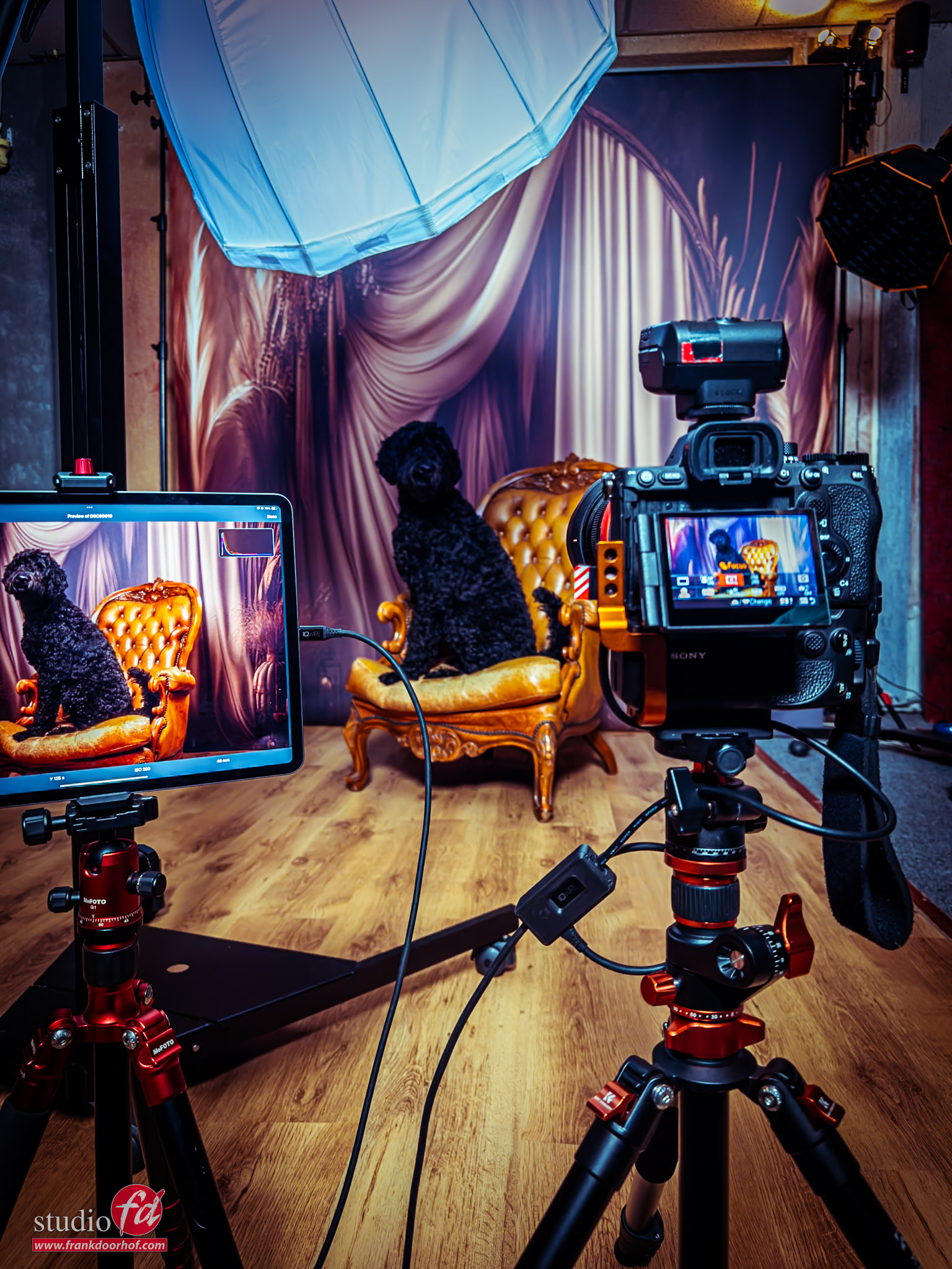
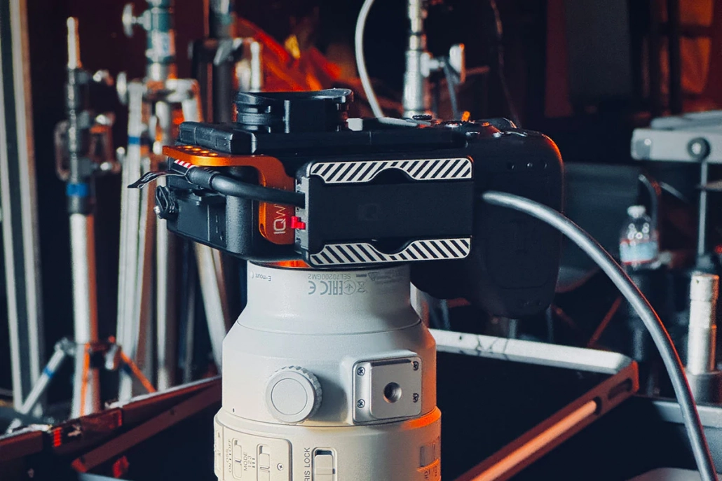
My setup: with the Quick Release Cable Lock with sliders under my camera, and the Advanced Cabel Defensive System
Why Tethering Changes Everything
Instant Image Review
The most immediate advantage of tethering is visibility.
A 27-inch calibrated monitor reveals details that a camera screen simply cannot.
And when you are working on location, you can even use your iPad with software like Cascable or Capture One.
Photographers can instantly inspect:
Sharpness and focus accuracy
Skin texture and makeup detail
Product reflections and imperfections
Lighting
Color accuracy
Composition and styling
Use presets to get close to the final look
Project the photos inside the page/cover to see if it fits the design
This dramatically reduces costly mistakes and reshoots.
In commercial work, where clients expect perfection, identifying issues on set instead of during post-production can save hours, or even entire campaigns.
A better client Experience
Photography is rarely a solo process on professional sets.
Creative directors, stylists, makeup artists, clients, and assistants all contribute to the final image.
With tethering, you can focus on your work while the team or client can see/browse the images and already make their selection.
And this doesn’t just work when they are in your studio. In essence, you can create shared online folders so your client can see the images coming in while you shoot, while he/she is on the other side of the world.
In fact, during COVID, I did a photoshoot with a friend in New York. I remotely controlled his camera and saw the images coming in on my machine the moment I shot them.
Without tethering, feedback is delayed. With tethering, the entire production becomes more efficient.
Faster Creative Decision-Making
Tethering also accelerates experimentation.
Because results appear instantly and at full scale, you can more easily test out :
New lighting setups
Different lens choices
Complex compositions
Color gels and modifiers
Movement and motion effects
Creative risks become easier when feedback is immediate, plus you can see if your images work with different looks.
Sometimes a RAW file looks terrible, but when you start editing, they come to life. With tethering, you can very easily attach a preset to the RAW files coming in. I’ve used this countless times myself, and it’s an awesome tool that really helps with the more creative setups.
This is also especially powerful during editorial or advertising shoots, where subtle changes in mood and lighting can dramatically affect the final campaign image.
Improved File Organization and Backup
Modern tethering software automatically organizes images as they are captured.
Sessions can be sorted into folders, rated in real time, and backed up instantly.
That means:
Reduced risk of lost files
Cleaner workflow after the shoot
Faster editing turnaround
Easier collaboration with retouchers
For high-volume productions, this organizational advantage alone can justify a tethered setup.
Personally, I have my Sony camera setup so that it stores all the RAW files on the card and also inside Lightroom. In essence, you can also attach an external hard drive to your machine to create a third backup. Another solution is using the iPad, for example. On my iPad, I’m using CasCable. With CasCable, I’ve set it up so that the images stay on my camera, inside CasCable, but also inside Apple Photos. This means that when I’m home, my images are already on my Mac, and I can easily drag them into Lightroom. Alternatively, I can work on the files while traveling on my iPad. The flexibility and connectivity between devices are absolutely amazing and have improved significantly over the last few years.
Precision Lighting Control
As you know, I love to get the images right in camera and in studio/location photography, lighting precision is everything.
Tethering allows photographers to check both exposure and shadow play with far greater accuracy than an in-camera preview.
Besides the larger screen, a calibrated monitor also provides a much clearer representation of the final image.
The zoom capability is fantastic, but did you know that Capture One offers an option to check focus from a few meters away? In Capture One, you can use an option that displays all the areas that are “in focus” in a specific color, similar to how your camera displays the focus when you use manual focus.
This is an excellent tool for photographers who frequently use manual focus cameras, such as the RZ67ProII (which I still love).
Tethering on location
While tethering is often associated with studio photography, it’s equally effective on location. When I began teaching workshops on location, I had to bring a laptop, an extra battery, and an umbrella. During a workshop in Los Angeles, my laptop overheated, so we needed an umbrella. Additionally, the screen was barely visible on location, but it still worked.
Fast forward to 2026, and I’m shooting directly to my iPad Pro 12.9” on location. I don’t have to worry about dust or slight rain, and the screen is bright enough that we hardly need a sunhood. Moreover, the battery lasts the entire day without any issues.
Photographers now tether:
Fashion shoots on location
Destination weddings
Automotive photography
Food and hospitality campaigns
Architecture and interiors
Lightweight laptops, high-speed SSDs, and wireless tethering solutions make mobile workflows more practical than ever.
The Gear That Makes It Work
A reliable tethering setup typically includes:
A compatible camera
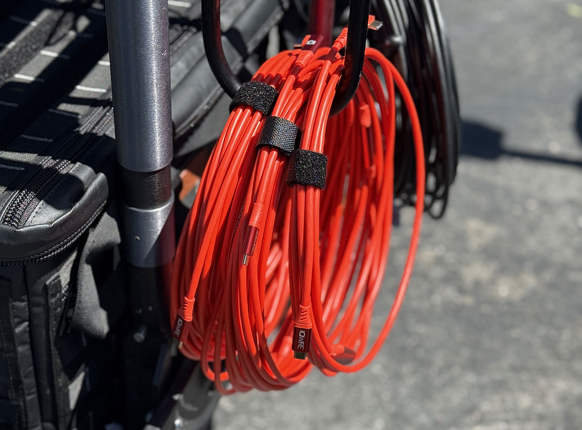
High-speed tether cable or wireless system, I’m using the IQwire 10mtr cables
A laptop or tablet
Tethering software
Cable management accessories
External storage or backup drives
The thing you have to take into account is that a tethering cable is not just a USB-C cable.
When you use a standard or lower-quality tether cable, you run the risk of fire or damage to your port when the cable is damaged.
A dedicated high-end tethering cable is often one-directional and has extra protection against damage from accidents.
I’ve been using the cables and solutions from IQwire for years, and they have never failed me.
In fact, a few years ago we started selling them ourselves because a lot of the attendees of our workshops wanted a 10-15 meter lightweight tether cable with a proper protection system.
And because technology never stops, we are now already on the third generation of cables since I’ve started using IQwire.
Truly the next generation in Tethering, so when you are looking for a reliable system, make sure to check out IQwire.
Reliability matters. A dropped connection during a fast-paced commercial production can interrupt momentum and cost valuable time.
One of the most asked questions
One of the most asked questions is: “Why longer than 4.7 mtr?”
You might think that 4.7 mtr is long enough, but there is one vital thing you have to take into account.
We don’t want the cable to be a tripping risk, so it has to stay flat on the floor.
If we take into account that our laptop is on 1.5 mtr height, and we shoot from 1.5 mtr height, we only have 1.7 mtr room to move around.
When we switch to a 10 mtr cable, this not double but actually gives you 6.7 mtr to move around, a huge improvement.
And if you need more, IQwire delivers up to 15 mtr.
The Psychological Advantage
One of the most overlooked benefits of tethering is confidence.
When you can verify exposure, focus, and composition instantly, you can shoot with greater confidence.
Clients feel more comfortable because they can see progress in real time.
Teams communicate more effectively because everyone is looking at the same image.
That confidence changes the atmosphere on set.
Shoots become more intentional, collaborative, and efficient.
If you discover that the model continues to gaze at the screen, you can always place a flag in their field of view and claim it’s for lighting purposes.
Final Thoughts about tethering
Photography has always been about seeing clearly.
Tethering extends that vision beyond the camera itself.
By enabling instant review, real-time collaboration, accurate color evaluation, and streamlined workflow management, tethering transforms both the creative process and the final product.
But it also gives you a risk.
When you shoot on the card, there is no real risk for the camera.
However, when you shoot tethered, there is always a cable hanging from a small port, and your camera is connected to your laptop/iPad.
So it’s important that before you start tethering, you take care of a few things.
Protect your investment
As mentioned before, I’m using the IQwire system, so let’s take a look at how you can build a proper, protected system.
First, I’ll give you the rundown of my own system. And how I protect my camera port and cable
I’m using the 10-meter IQwire 10G cable.
I’ve used the 15 meter for a while, but found that in our studio the 10 meter is easier to use.
Both cables performed equally well in connecting and speed.
Under my camera, I’m using a slider system called the Quick release Cable lock (version1)
Thanks to the slider, my cable is always locked, preventing wear and tear when I need to route it through another solution (more on those later).
I’m also using the Unpanned Cable Modifications Detterent protector (the orange mount) on the side of my camera. I primarily use this because, during workshops and events, the likelihood of people bumping into me is quite high. If they hit the cable, it could damage the port. The way it’s currently connected, in combination with the shorter connector of the new IQwire 10G cables, makes it almost impossible to damage the cable or the camera.
The tip I promised is in what I always call the PigTail.
You can opt to route your cable through the Quick-release Cable lock, but you can also use a small cable between your camera and the main cable.
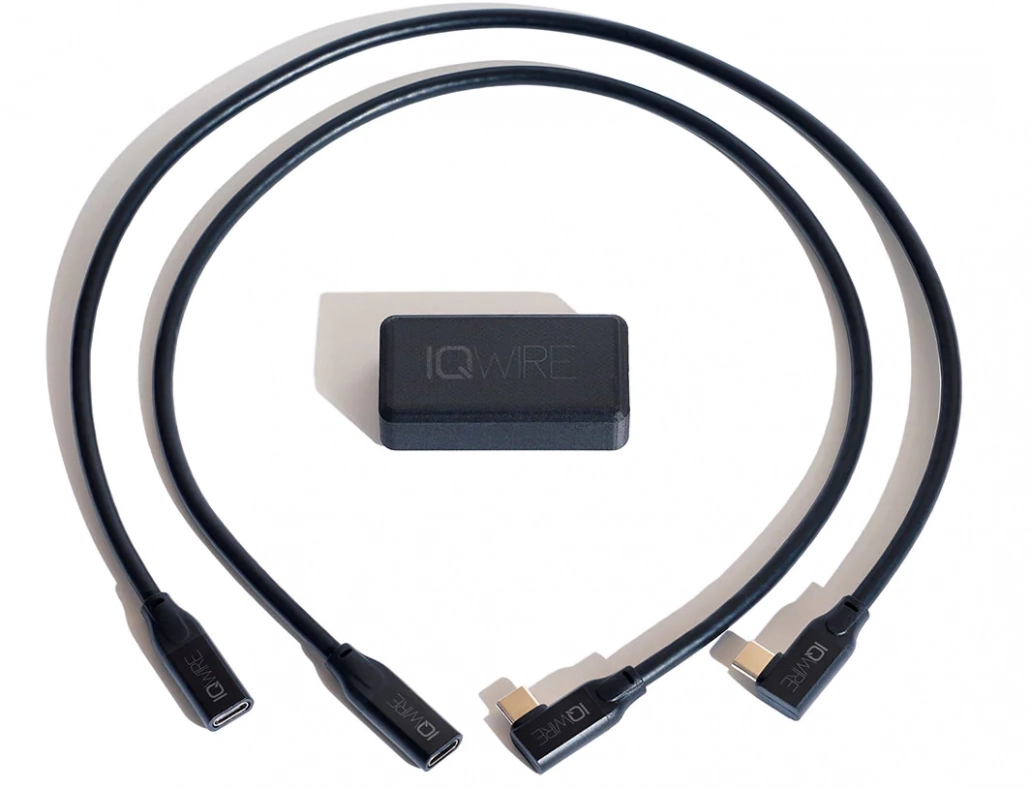
You can of course just use a pigtail, but if you want it nice and also protect your main cable, you can use the IQwire Advanced Cable Defense system,
When you use the pigtails, and someone steps on your cable, the connection will be lost, not because your camera or laptop is on the floor, but because the cable is disconnected from the box. This happens to me at least twice a week, so this system is worth its price in gold for me.
Ok, so now we have seen the pro setup, let’s take a look at a slightly less pro setup.
My advice on how to protect your camera port (and cable)
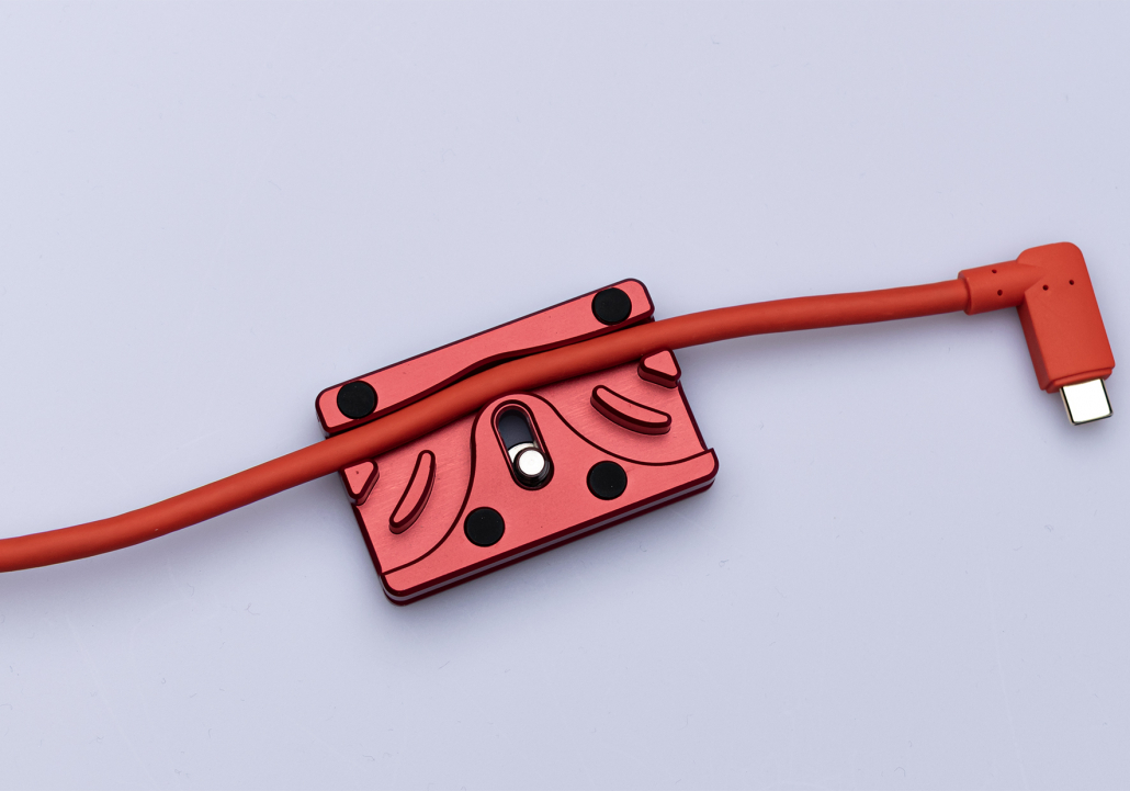
With the CableBlock, the cable is secured to your camera.
I would highly advise the 10-meter IQwire cable.
Also, when you buy the cable, you will get a free cable block.
A super simple but clever solution to secure your tether cable to your camera.
The CableBlock is Arca compatible, smaller in size so you can still open your battery compartment, you don’t need a coin to connect and disconnect it, has soft feet so your camera is not damaged, the corners are rounded for your comfort, and most importantly…. it’s red.
In essence, this is a safe solution, although I would still highly recommend connecting a pigtail on the camera side.
You can use a simple USB-C to USB-C female to male cable. Do make sure it’s NOT a charging cable, but a fully functional USB-C cable.
If you use our cables, I can highly recommend using the Advanced Cable Defensive System
Or you can also get pigtails from our own selection via our webshop
IQwire developed a short cable and a lock to make a breaking point. You can use one cable on the camera side and the other on the laptop side. This set is € 95,00. We also sell the short IQwire cables without the lock for €70,00. But you can use a simple extension cable too (€19,95)
On the software side, I can highly recommend Cascable on the iPad (or desktop).
It has a lot of options to make tethering easy, and it connects great with Lightroom and Apple Photos.
On the desktop, I’m using Adobe Lightroom. Since it added support for the Sony cameras, it has been rock solid for me.
I hope this blog post gave you some more information about tethering.
If you have any more questions about how to protect your camera port and cable, feel free to reach out.
https://frankdoorhof.com/web/wp-content/uploads/2025/08/Chewie-als-model-October-24-2024-5.jpg20481536Frank Doorhofhttps://frankdoorhof.com/web/wp-content/uploads/2015/03/studioFD_Logo-1FV.pngFrank Doorhof2026-05-18 19:40:202026-05-18 19:40:20Read this before damaging your camera
But it can also give a new set of challenges.
Today in the blog, we take a look at the behind-the-scenes video we shot during an awesome location shoot in the Tulips with our model Claudia.
You get to see the lighting setups, the explanation of the technique, and, of course, the final results.
https://frankdoorhof.com/web/wp-content/uploads/2026/05/Claudia-April-30-2026-128-Edit.jpg1200800Frank Doorhofhttps://frankdoorhof.com/web/wp-content/uploads/2015/03/studioFD_Logo-1FV.pngFrank Doorhof2026-05-17 18:00:522026-05-18 17:11:33Watch this before shooting on location