Colors and how they connect
Colors evoke emotion
You probably have been hearing me say that a lot.
And that’s because color is incredibly important to give images/video/film a certain mood. But also for logos, design, cars, buildings, interiors, clothing, colors are used everywhere to get a feeling, or make you feel a certain way. This article is about how colors connect in photography.
Accurate colors
So for us as content creators, it’s vital to make sure that our designs, photos, videos, etc. all look accurate.
So when someone orders a red scarf and a red sweater they look the same as in the brochure or website.
Luckily this is pretty easy.
You probably heard the term calibration regularly on this blog, my books, and videos.
With calibration, you make sure that your camera, printer, monitor, etc. are showing you the most accurate colors.
Because this is a topic that I’ve explained a few times in other blog posts. But always in connection to a technique. I thought it would be interesting as a reference to just explain a color space and the pure basics of calibrations, in a later blog post this week I’ll go deeper into the process and settings.
Primary versus Secondary colors
First, we have to make sure we know that divide the main colors into 2 sections.
The primary colors are Red, Green, and Blue
The secondary colors Yellow, Cyan, Magenta
Now how does this work in practice?
Color temperature
The first thing we must know about the colorspace and calibrations is the color temperature.
When you look at your strobes, sunlight, shade, continuous lighting, etc. you will probably know they all have different color temperatures. And when we talk about calibrations we call this the blackbody curve and a point on or close to that curve.
But when we look at the curve you can see that it runs from blueish white to reddish white.
The blue part has a very high color temperature, whereas the red has a very low color temperature.
Think for reference about a piece of metal you throw in a fire and you will see that the hotter it gets the more it will shift from red to blue.
We agreed upon the value of D65 for the reference white point. (6500 Kelvin)
When we calibrate our monitor or projector you should calibrate to the value of D65.
In some cases, 5400K is demanded. But if you need this, you don’t need this blogpost explaining colorspacee, probably.
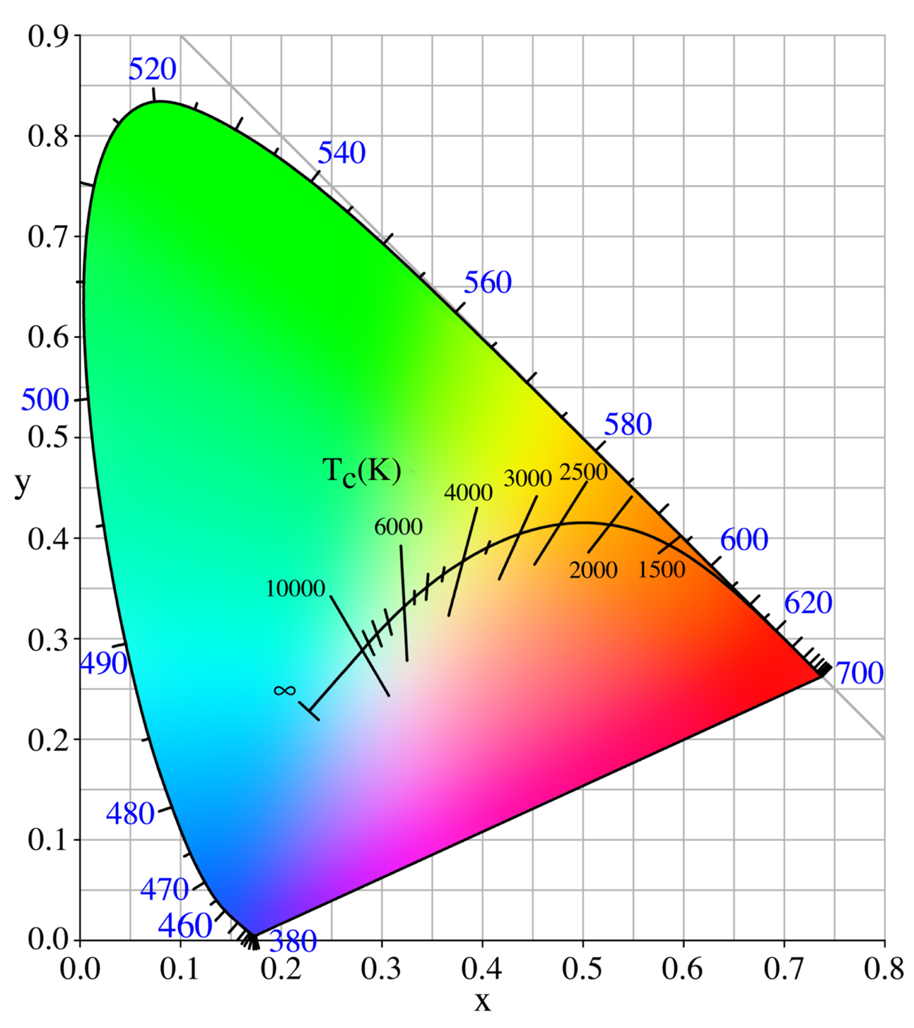
When we look at the color triangle above you can see that the 6500 degrees point is slightly reddish. This means that people sometimes have to get used to calibration at first because white will look a bit reddish, but trust me, this is very short.
Colorspace
Now that we know how the color temperature works, how do we get there?
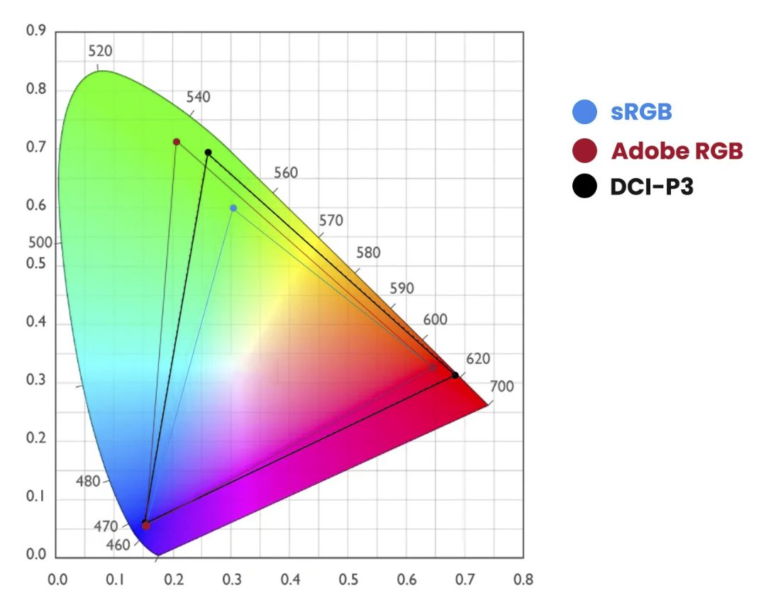
As you can see in the next image there are different colorspaces with different levels of saturation (larger colorspace = more saturated colors)
In this diagram you can see that the primary colors Red, Green, and Blue create the color triangle.
And you probably also notice that the colors are located in different locations.
Luckily for us, those coordinates are known for every colorspace.
Each color has 3 coordinates.
x,y, and Y.
To manipulate these colors we use the settings Hue, Saturation, and Luminance (Y)
You probably know these from Lightroom already.
During the calibration, you are in essence pushing and pulling the colors around till they are in balance with the colorspace you chose. And those corrections are stored in the ICC, DCP profile.
Because for every colorspace we know the coordinates for the primary colors you might wonder, “Where do the secondary colors come in?”
That’s actually simpler than you might think.
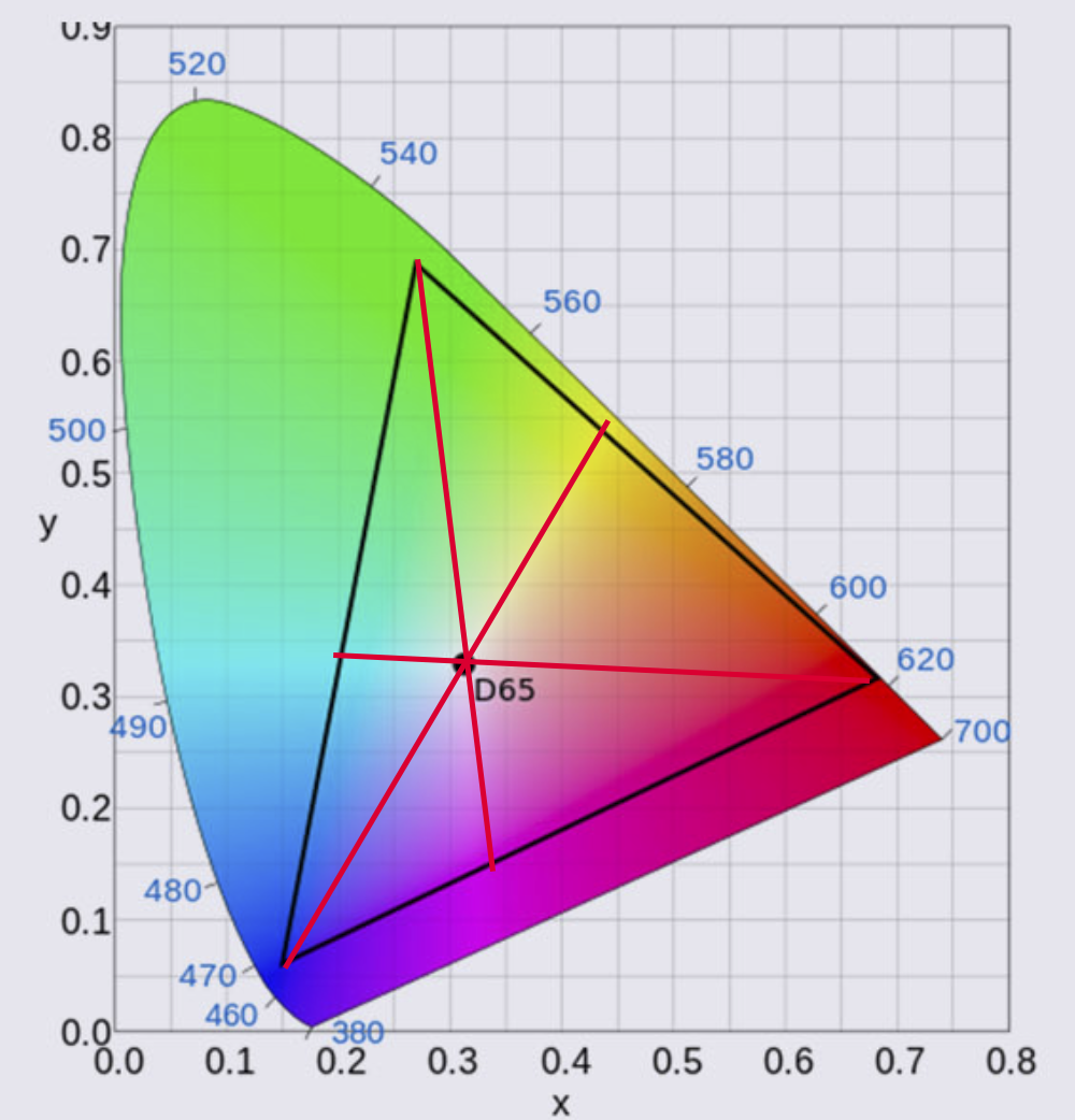
This is how colors connect in photography
When we draw a line from the primary color through the white point we end up with the secondary color of that color.
So Red connects to Cyan, Green connects to Magenta, and Blue finally to Yellow.
You probably understand that this is a very fine balance and if one of these colors or the white point is not correct the whole colorspace will shift slightly or even “collapse” meaning you can’t trust your workflow.
Gamma
There is one thing I didn’t mention yet and that’s gamma.
When we look at for example a 10-step grayscale we want to make sure that all steps are visible but also are visible equal in brightness difference. This is done with the so-called gamma correction, in most cases we use a value of 2.2 or 2.4.
Conclusion on how colors connect in photography
The primary colors Red, Green, and Blue connect through the white point with the secondary colors Cyan, Magenta, and Yellow.
Colors have 3 coordinates, x,y, and Y, and are adjusted by Hue, Saturation, and Luminance, corrections needed are stored in the ICC/DCP profile.
Each colorspace has pre-determined values for Gamma, Colors, and white point. This means the only thing you have to do is make sure your images and monitor show the correct colors, which they never do, so they need to be corrected.
Now that we know how complicated it is, it’s time to tell you the calibration itself is super simple.
For the monitor, I highly recommend the calibrite series of products. The process can be done fully automated and takes between 5-15 minutes.
For the camera, I’ve been using the calibrite colorchecker passport for years. It’s easy to create a profile and the results are very good.
In later blogposts, I will focus on these devices separately.
But one I have to mention right away because it’s essential.
The light meter
When we calibrate the monitor we are guided through the software by a very easy-to-follow workflow. The software actually asks you to adjust the contrast/brightness till it hits a target.
Now the reason we do the calibrations is to create a stable workflow that makes it possible to get constant results in all different lighting situations. As you can see one of the coordinates of the colors is the big Y or in other words Luminance.
Seeing the calibration of the camera is done with a ColorChecker we must shoot the ColorChecker with a light meter and as flat as possible.
I mostly place a large softbox on 3 mts distance when I create a global profile, when I create a profile for a specific set I just make sure there are no gels on the strobes and the ColorChecker is still lit as flat as possible with the main light, even if that means the model has to turn and I shoot it from another angle. Otherwise, the calibration will not be accurate.
If you are in the market for a good light meter make sure to check out the Sekonic range. I’ve been using several over the years and they all performed perfectly in every possible situation. I’m now using the 858 but their whole line is top-notch.
I hope you now better understand how colors connect in photography and if you have any questions, feel free to reach out.
If you’re in the market for a new monitor with hardware calibration options, I can recommend the BenQ line up. For EU customers we have some 10% discount codes available just drop me an email.
Working with colors and gels is fun


