How close are Photography and Music?
I’m a very lucky guy! I am into photography and music.
Being able to do and share the stuff I love to do.
Photography and Home Theater might be my profession, but they are also huge passions.
And as many of you know, recording music is another passion of mine.
In fact, the first company I ever started was a “professional” recording studio.
At one point, I had to choose between earning money and chasing a passion.
I chose the latter, and stopped playing/teaching and started a computer company. Don’t get me wrong, I love computers and have been using them since my youth, but they didn’t give me the same satisfaction I get from music. We call it growing up. So, what does this have to do with photography and music?
Music
Besides music, I always loved photography and movies. I was already experimenting with 4 speaker setups in my mom’s attic.
In the 90s, we started a Home Theater department within the Computer Company. People thought we were mad, “Who wants a projector in their home?”…. We saw the future. (and wanted to build our own Home Theater).
I loved the Home Theater part, but always was tweaking the colors on projectors and TVs, which led me to be in the States on 9/11 2001 for my ISF certification (Imaging Science Foundation). Yeah, I will always remember where I was that day.
Back home, we started to actively educate people about the need for color calibration in their home theater, and of course, we did a lot of calibrations.
The difference between a standard screen and a calibrated screen is day and night.
Why calibration in your home theater matters
It’s simple.
How many of you shoot images and just upload them straight out of the camera?
And how many of you tweak the shots a bit, add some colors, change the contrast etc.?
I think/hope the second group is a lot larger than the first 😀
During workshops, I always teach people that “Color evokes emotion”.
Think about the color red, it can be connected to the emotions “warmth”, “safe”, “love”, but also “danger”, “hate”, etc.
So, using colors in any form of art is used to enhance the story/image on the screen.
I don’t know how you guys are, but I take the tinting of my images very seriously. When I visit a city and shoot images on the streets of New York or Los Angeles, I will probably choose two totally different looks.
However, I’m not someone who will overdo it, but maybe you are, or you are much more subtle?
The movie looks like intended
The fact is, when we want to experience the movie exactly the same way the maker intended it, we need a display that matches “exactly” what the creator used.
“So do we need to know which monitor he/she used and get the same one?”
No, luckily not.
This is where the calibration comes in.
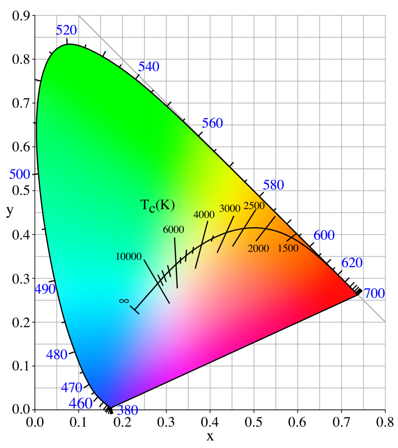
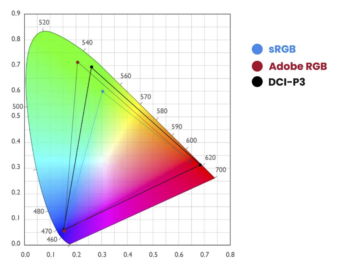
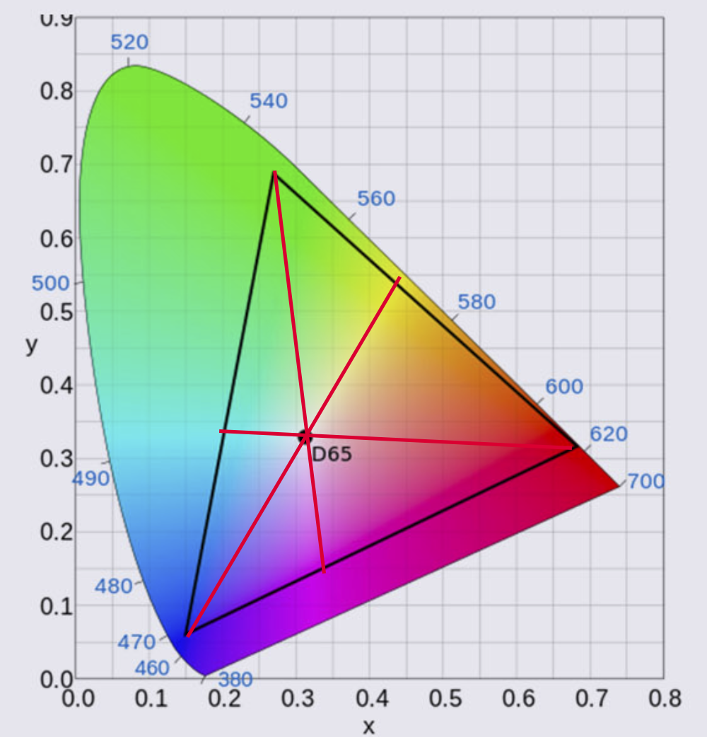
For Home Theater setups, we calibratethe display to the industry standard of D6500, Gamma 2.4/EOTF, REC709/P3/BT2020
If I lost you, don’t worry… as they said in Bugs Life “we are trained professionals”.
In the end, it means that your display will show you the movie as much as possible to the intended colors and dynamic range.
This is a manual process and can take up to several hours.
Can we make it easier?
As a creator, you might be very interested in the whole theory behind color theory and calibration (like me), but most of the creators I talk to are very interested in the creative use of colors. But somehow, when we talk about calibration of the monitor, it’s often a forgotten part of the workflow. Or when it’s done, it’s not done regularly.
And let’s be honest, we want to create, and not spend hours tweaking our screens to be able to show the colors the right way.
Automation
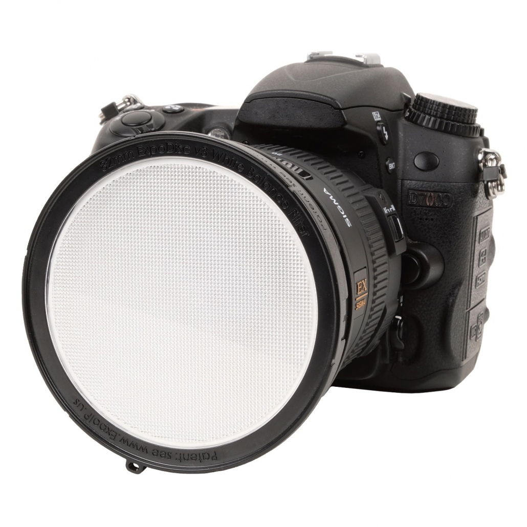
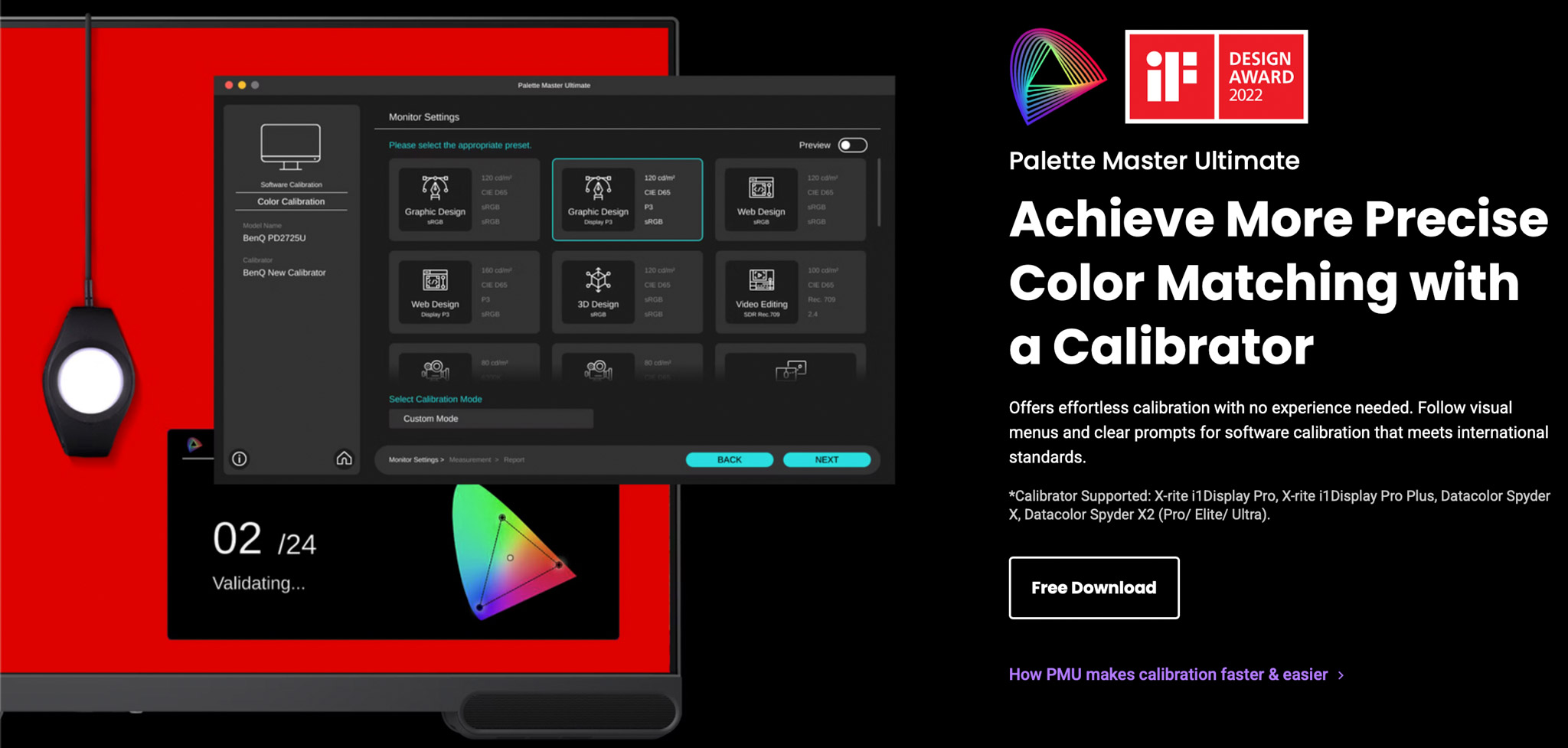
This is where automation comes in. If you buy a proper monitor, it’s actually very easy to achieve “perfect” colors without doing a lot of work.
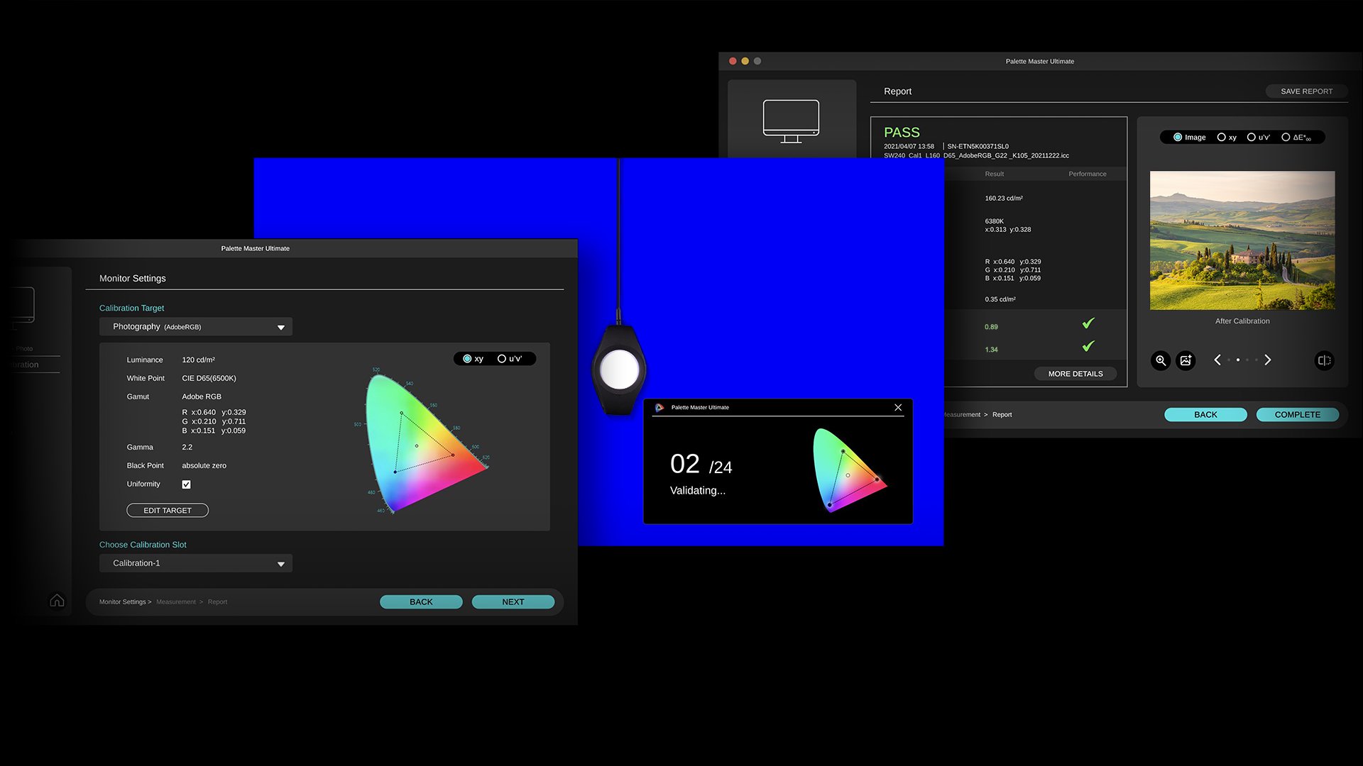
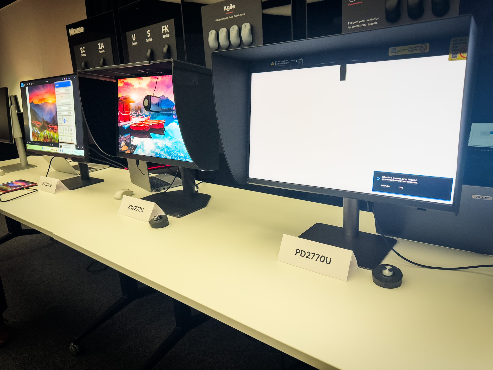
On most monitors, it’s possible to use a so-called calibrator. You place the calibrator in front of the screen and start the software. Just follow some easy steps, and everything is done automatically.
If you want even better results, get a monitor with so-called hardware calibration software. The difference is more accuracy and fewer artifacts in the final results. And if you already feel too much stress by thinking about calibrations, there are even monitors that will do it all for you with a built-in calibrator.
An ambassador’s meeting
Last week, Annewiek and I were invited to the BenQ Ambassadors meeting.
Funny fact we found out, I was the first Ambassador in the program.
The reason I chose BenQ was the fact that their whole approach was aimed at color accuracy, and over the years, I’m really impressed by the improvements they have implemented, not only in the performance of the software but also in the accessories.
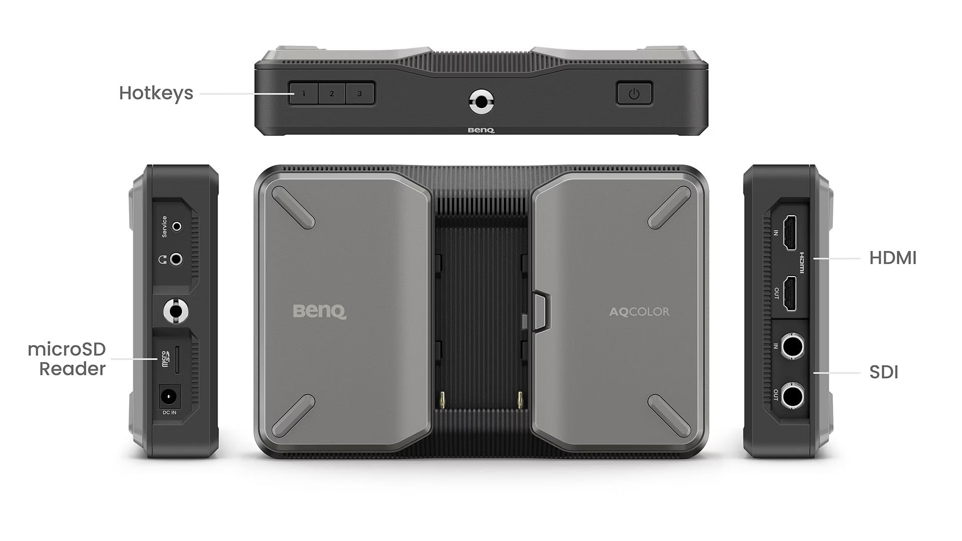
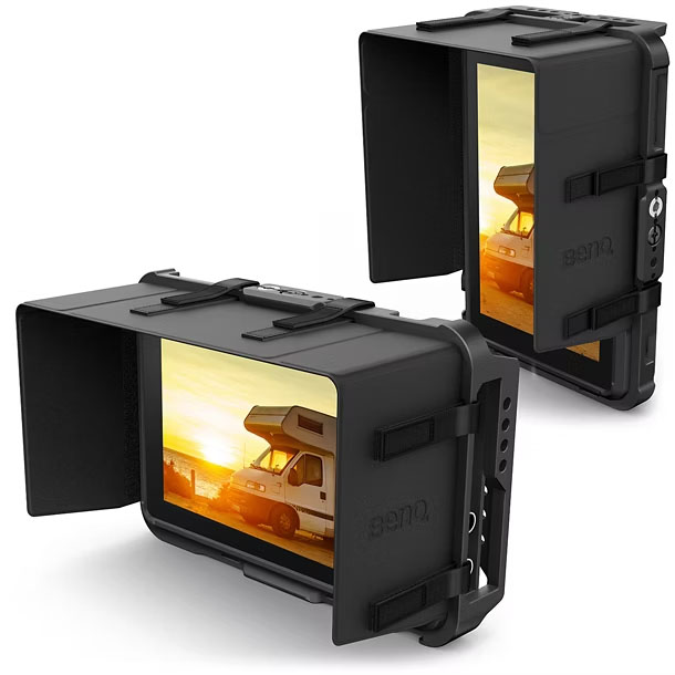
Take, for example, the hood. It’s not that hard to assemble and place on the monitor, but in practice, it can be a bit of a frustrating experience. During the meeting, we could experiment with the new hood. The new hood uses a magnetic system, and it just clicks on; you can now even place it on in the dark.
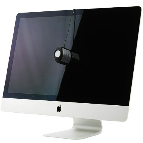
On the first monitor, you can see a small device on the top. That is the auto calibrator. So if you want everything to go smoothly and automatically, this is a great option for you.
And don’t worry, you can still use an external calibrator, of course.
So what is the link between photography and music?
During the ambassadors’ meeting, one of the questions was “in which market do you feel BenQ should be active?”
And I immediately thought of music.
BenQ has great monitors dedicated to Designers, Photographers and Video.
But Music is a huge part of the creative part, so why is there hardly any attention in advertising for this group?
Let’s take a look at why a proper monitor can be vital for your musical workflow and health.
Musicians are very creative people
And inspiration can strike at any moment, and before we know it, we are 12 hours further, and it’s deep in the night.
Having a monitor that emits loads of blue light can be very tiring and actually make the whole creative process a lot harder.
When you calibrate your screen to 120nits and D65, you will find out that there is no more eye strain and you can work hours in a row. See it as changing those harsh-sounding near fields for new ones with a lot more headroom and better bass. You can now work a lot longer without ear fatigue, the same happens with your monitor.
Photography and music software
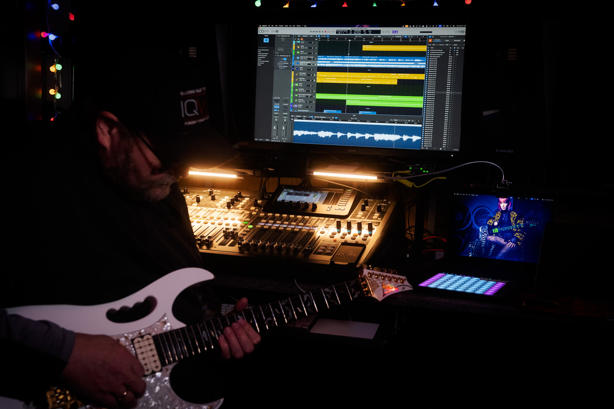
Personally, I love real estate.
I work with Logic, and although the layout looks nice on my laptop, as soon as I connect the 32″ 4K screen, I can see the whole interface and side areas. This doesn’t just speed up the workflow but also takes away eye strain connected to constantly scrolling and opening windows. Once you work on a 32″ screen, going back to 27″ is a real step back.
When I edit my photos, I can do this in almost every location, although I prefer a low light level, and of course, no lights hitting the screen.
When I record, I love to have the colored lights on, and lights behind me, lighting amps and guitars, it gets me into a creative state that is hard to achieve without.
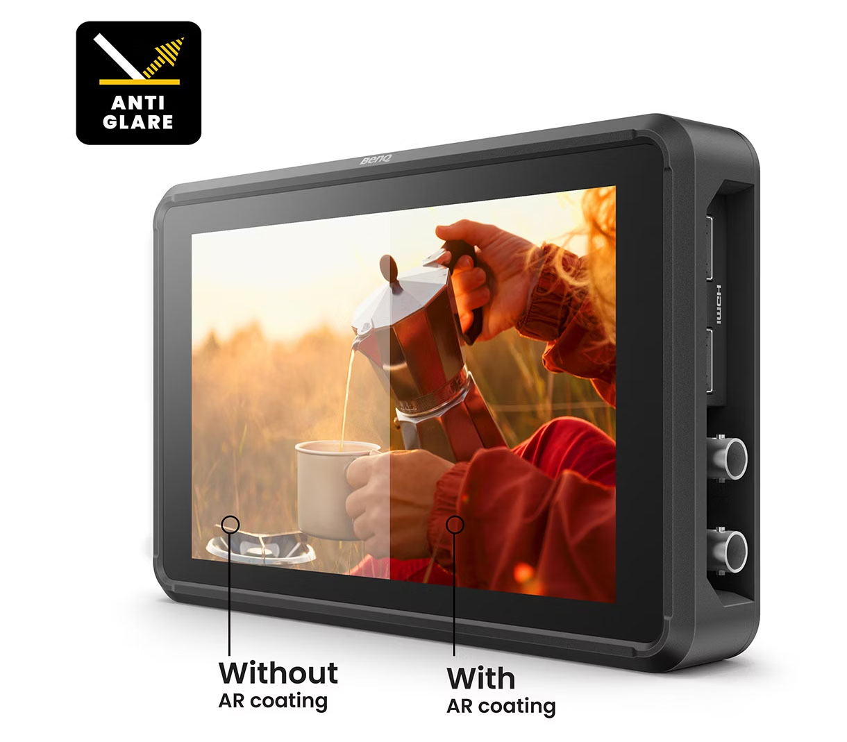
But that also means the chance of reflections on the screen can be a problem. So, make sure when you select a screen, you don’t go for the most shiny surface. One of the things I love about the BenQ SW321C I’m using myself is the coating on the screen; it is very forgiving with lighting in the room, and again, it prevents eye strain, meaning I can work for a longer time.
So far, I have not yet explained the calibration part
During the recording process, having a proper color temperature is important for eye strain. But in all honesty, if the colors are slightly off, it won’t affect the way your DAW works.
However, when I’m done with my recording, I start the process of uploading my music.
At that moment, I need artwork.
And now the calibration comes into play.
On a calibrated monitor, I know for sure that my artwork looks the way I intended it. It also helps to be able to see great shadow detail.
You don’t want to know how many “commercial” releases you can see editing faults in the shadows or even in clear sight.
Artwork
So, now that I have created my artwork and uploaded my music, in most cases I will start the process of starting a new track.
But as a photographer, I love using video. Our studio specializes in educational videos and business videos, but as a musician, I love creating video clips. So when I have time I will always try to create a small video clip for my music.
Also, here, a properly calibrated screen makes it much easier to get colors right when editing, and of course makes sure that all your followers don’t see you with a weird magenta nose.
With video editing, I also love the extra real estate of the 32″ screen.
When we record tutorials, we often use 4 different camera angles. For some of the video clips I shoot, I end up with a total of 12-16 angles.
You probably already guessed it, on a 32″ screen, working with up to 16 camera angles is very easy.
Because most new cameras support shooting in D-log, it makes editing a lot easier.
But it also makes it more important to have a properly calibrated screen. You are, in a sense, working on a very flat file.
If you work on a monitor with too much contrast, your result will look very flat, and if you work on a low contrast screen, you will probably blow out a lot of detail or bump the colors the wrong way, and the end result can be even worse.
But let’s get back to the music part, because that’s probably why you clicked.
Don’t forget the music market
I love it when companies ask for input from their users or ambassadors.
When we talk about monitors, it’s often a matter of designers, photographers, and video editors. But I hardly see a brand focusing on the music industry.
When I was young, most artists had record deals, sold out stadiums, or just struggled to get a record deal. The quality was often poor in print shops, and the shirts were printed at home; that was the thing.
Fast forward to 2026, and even the big names are struggling with the new way of distribution, and starting musicians have to be able to do a lot more.
To be successful, you need a lot more than just creating kick a$$ music.
Distribution is becoming a very difficult part, but it also offers a lot more options with social media and channels like YouTube and TikTok.
I only create music for fun, but I also love to share my tracks. When I started it, it already gave me a headache when I found out how many streaming services there are, and how expensive it is and how little the payment is, it’s almost like stealing. Luckily, there are services that combine all streaming services, and you pay one amount, and they take care of everything. I chose Distrokid and can highly recommend them if you want to share your tracks to as many outlets as possible without going bankrupt.
Photography for the artwork of your music
Whatever media you choose, you will need some artwork, work with a DAW, and plugins.
And unless you have the budget to hire a video team, videoclips are often shot by the bands themselves on iPhones, Osmo pockets, etc.
So, also video editing, live streams, photography, and design are often part of the workflow of a modern musician, covering in fact almost every facet of the creative process.
And this is where the calibration becomes really important.
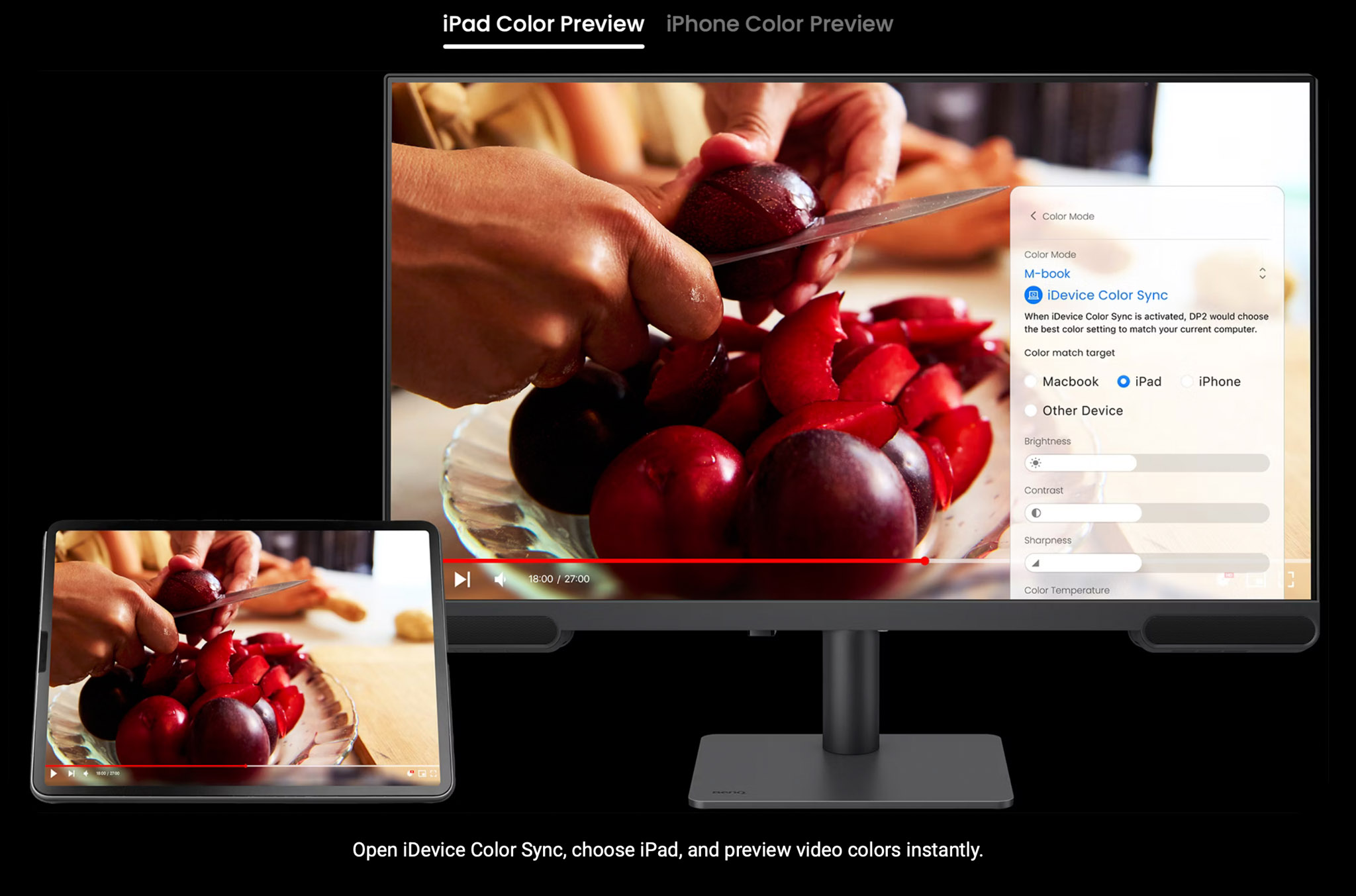
When we look at the number of devices out there that are used for media consumption, you will probably be shocked when I tell you that literally all those devices will show you the colors slightly (or a lot) different.
Just check your own TV set and switch between the cinema and vivid mode. Now compare a photo on your iPad and iPhone vs Android. Or a Samsung vs Oppo and…,ok, you got the idea.
I’ve been doing the ISF calibrations since 2001 and can tell you that I never found TV sets or projectors that were 100% correct out of the box.
Some are a bit too blue, some are way too blue, some are reddish, etc. The thing they all have in common…. in most cases, people are used to that screen.
There is a standard for a reason
The question most asked has to be “Why should I calibrate my screen when my client/followers are not?”
If you read the text again, you probably already have the answer.
As a creator, we HAVE to follow the industry standard because outside it’s a mess.
By making sure we follow the industry standard, we know for sure it’s “compatible” with “all” displays out there.
Plus, the viewer is used to how the material looks on their “messed-up” screen.
Now you might think the story stops there.
I’m sorry to tell you “no”.
And this is one of the reasons I chose BenQ.
BenQ for photography and music
When you edit your artwork, you have to take into account that it will look slightly different on different displays. Contrast is one of the key elements in design and can make a text totally unreadable on certain devices while it looks fine on others.
BenQ has a very smart preview system, where you can compare the different output devices and how your artworks look on them.
This makes editing so much easier to do yourself.
Conclusion
Having a 32″ monitor as the main hub in your home studio has many advantages. For your photography and music. Having a properly calibrated 32″ monitor in your home studio can boost your creative process and make sure you can create all the artwork/videos yourself that will give a proper viewing experience on a mix of devices.
When we talked about this during the ambassador’s meeting, we started to think which monitor from BenQ would be the perfect budget-friendly entry point.
Of course, I would say, go for the SW321C, but this is a top-of-the-line screen, and I use it primarily for my job.
But we found the perfect musicians’ monitor to start with.
The BenQ PV3200U, we think, is the perfect starting point.
In fact, everything I wrote about in this blog post is available in the PV3200U (and a lot more).
A nice extra detail is the addition of a sound system. Don’t expect nearfield quality, of course, but it’s a great way for some quick video editing if you don’t want to power on the whole system, or wear headphones.
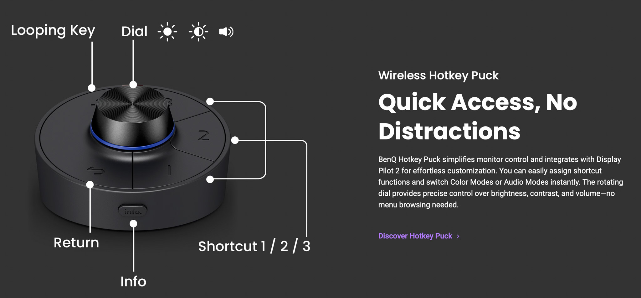
It also included the BenQ puck, which can be programmed to speed up the workflow with the monitor.
A personal touch
After all this talk about photography, video, and music, I think it’s a great way to end this blog by releasing a new track.
It’s called “Short and sweet” and was recorded in my home studio. The clip was shot with the Osmo Pocket 3 and edited on the BenQ SW321C.
Do remember I’m just a hobby musician.
If you are convinced that BenQ is the right monitor for you, contact me for a 10% discount code.
By using the code, you also support our work, just as with the Distrokid link.
Although I’ve been a BenQ ambassador for many years, I 100% stand behind my views on their products, and the reviews I write are not corrected or influenced by BenQ.
 Let’s first take a look at the specs of this monitor