Fashion with the Credo60 and Nadine PartIII
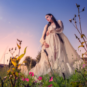
In the final part of this series some outside shots with natural light.
Shooting with the Credo60 in natural light is a really nice thing to do.
As mentioned before in the previous posts about the Credo60, the display is a huge improvement over the previous leaf digital backs but also the speed in which you can work is something I really love, even on the card there is no buffer, meaning you can just keep firing until the card is full (well I think you can, I never tried it but let’s say that if there IS a buffer you will probably NEVER ever fill it up), and with a speed of 1 second per frame there is a really nice flow to the shots. It’s quick enough to nail some shots where the wind is a vital part of the story like in this series and it’s still “slow” enough for the model to get into her “groove”.
I’m a modern day photographer, I love Photoshop, I love digital but I also sometimes still shoot film and in the studio I think the combination of the Mamiya RZ67ProII and a digital back like the Credo60 is just a killer combination, there is no digital DSLR that will beat the quality that that combo will give you.
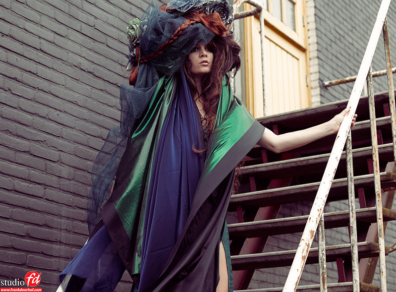
However I also have a passion for the old days of fashion photography, and I don’t mean the really old days but think back to the 60’s, 70’s, 80’s and probably the 90’s I just love the look of those images, in this series I tried to mix some of those looks I really like with modern day techniques and compositions and of course styling (many thanks to Nadine for outdoing herself once again).
For the location I choose an old staircase (yeah I know I love stairs) just outside our studio, I just love the way it looks and the wall and door, the contrast you can create due to the dark gray stones and the yellow door is something that has a very great attraction to me, I think if they ever want to paint that part I’m gonna chain myself to the chairs and protest….. unless they of course let me help out with choosing the look 🙂
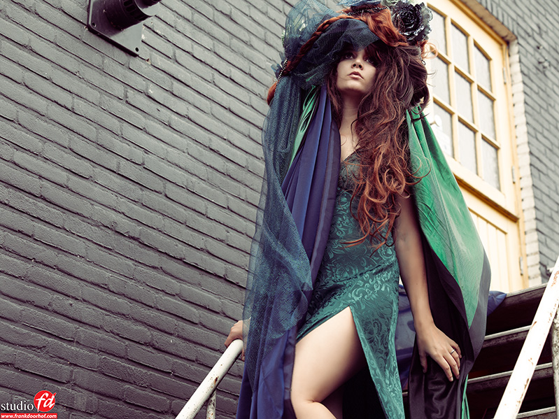
When shooting on location also try to maximize the looks, positions you use, so don’t just shoot the model like the previous shots, but also try to incorporate some different angles.
In my work I always pay close attention to color, the color scheme in which I retouch a series is incredibly important for me, and to demonstrate this I will show you one image in the same series that has a slightly different angle and different color and as you can see it’s a totally different mood and look…. some will love it more (and that’s ok) some will like the original tonings more (and that’s also ok), but it’s just to demonstrate how “proper” toning of your images can just be that ONE thing that changes the look to something that you might or might not like.
Nowadays with Photoshop one should think that this is something that is more and more clear, because now we have so many options with filters like NIK, OnOne and Alien skin, but somehow I get the feeling that for a lot of photographers the knowledge of choosing a tint/color for their images has become less and less important, filters are used without a doubt but often more for enhancement of the images like sharpness, high contrast, tonal contrast, HDR or a complete tonal change…. while in the analogue days it was always clear that one should first choose the right film for the job and processing of that film and than start shooting because people knew that the look was greatly influenced by the choice of film.
One would expect that in todays world this knowledge is taken to a next level, now we can experiment with different film types AFTER the shoot, still when I ask people if they know Alien Skin Exposure 4 they often don’t. This filter set however is 100% aimed at recreating film looks. I know that OnOne has some film stock as does NIK and although I love those two (and use them on a daily basis) Alien skin is without a doubt that filter that’s for most people invisible but still so very visible when you take it away. For me it’s a normal part of my workflow, certain looks need certain tonality, not as an effect but as a mood/film choice.
And that can be very subtle like in this example, for some it might not be that different from the previous images, for the viewer that pays close attention it is however much bluer and for me that takes away a bit of the mood I wanted to create.
So if you don’t know Alien Skin Exposure yet, check out the gearguide and discount page on this website and visit their website at www.alienskin.com
If you like what we do here, and want to support the blog please buy from our affiliate companies by following the links or the links below.

Want to be inspired by the best, make sure to get a subscription to Kelbytraining via this link?
Even the pros get their inspiration from them 🙂

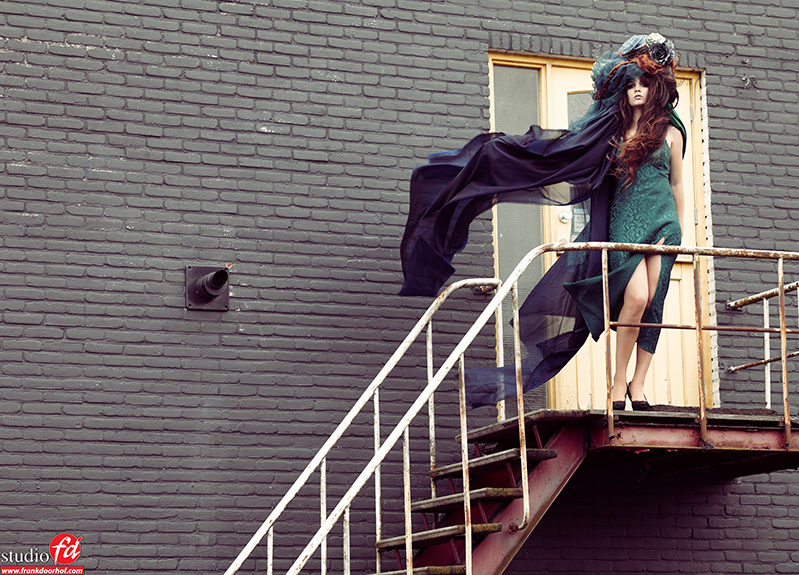
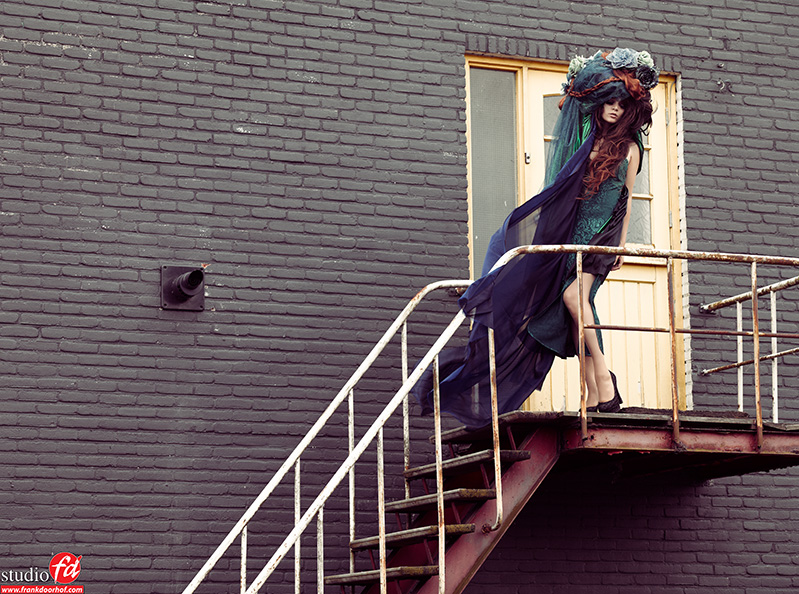
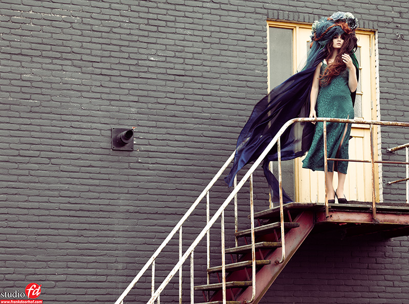
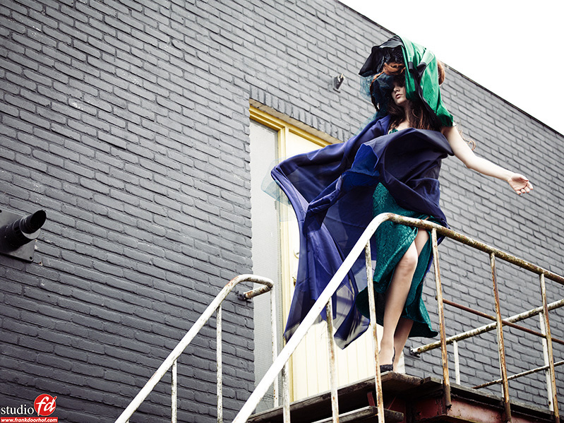

I LOVE it… one thing though, if you don’t get angry at me for this, it took me to fix 0.03 seconds which made a difference I think… you know what I mean from the image I am uploading. The pipe on the wall takes my eyes off of the girl 🙁
Know what you mean however I left it in to not make the wall too “flat”. Simple change of angle could have also solved it. However somehow I like it. Its a personal thing I guess 😉
Yes sir… I totally understand 🙂 I wouldn’t say anything if my eyes wouldn’t just keep sliding that way like a magnet 🙂 I love the model, the bricks, outfit is so crazy, This model reminds me of dreams… somewhat unexplained dreams 🙂
She is amazing 😉
Hé… is this the strairs in your “backyard”? 😉 Love the first shot the most!
PS last week I bought a Sekonic L-758 😉 Can’t wait playing with it!
Yeah it is 😀
Crop out the pipe coming from the wall. Your composition gives it equal weight to the model.