Digital classroom is without a doubt one of the most intense things I do online.
The idea actually started out as just having a camera on during a photoshoot, we did this a few years ago and people loved it, being able to see what we do during a photoshoot. At that time there was not much going on to be honest, it was mostly seeing the model being in makeup, some movement in the studio and of course the Photoshoot, but still people loved it.
Years later we wanted to pick this up again but with todays market you have to do something unique so we thought hard and decided we would let YOU the viewers interact with the shoot, but as soon as the cameras rolled and we were live things changed…. I love teaching and that was exactly what I started doing, explaining what we were going to do, showing the light setups, giving tips and even showing the complete retouch process….. this was a huge succes and now we can do these broadcasts every month thanks to companies like BenQ and Rogue/Expo imaging because without them this would never be possible.
Today I can show the digital classroom we did with Kimberley and watch this space on Monday for the results.
Enjoy… oh and if you REALLY want to do us a favor…. subscribe to our channel via this link…..
Now this is of course free, imaging what you get with one of our instructional videos you can order from our site, make sure to check them out and learn even more in depth techniques and tips.
Topics include : Small flash, the light blaster, Rogue flash benders, how to meter light with a light meter, the new Sekonic 478, how to prevent reflections in walls, windows, glasses etc, how to coach the model, angles, gear, retouching in Photoshop and Capture one, tinting with Aliens Skin X and Capture One, some cool retouch tips and MUCH more…..
Digital classroom is a live broadcast from our studio which we do every month for free.
I started digital classroom to introduce people a bit to what we do with our instructional videos and workshops, of course these go more in depth and are a bit more technical but for a free broadcast I strongly believe it’s a great educational tool.
Digital classroom is not possible to create without the help from some sponsors of course, so we are very grateful for our friends at BenQ and Rogue/Expo imaging to help us out with this.
This time the theme of the Digital classroom is “using small flash”.
It’s a 2 hour instructional video so take your time, sit back, grab your notepad and enjoy.
People always ask “How did you start?”
I was brought up in a family of photographers and videographers, not professionals but just very enthusiastic people. So it was no surprise I also picked up cameras (both video and photography). But model photography came very late actually, I mostly shot birds, nature and sports.
Being a member of a photo club we had to do a workshop and for different reasons I choose model photography although I never had the idea to continue with this, but I did….. so how did my first images look and what can you see repeat.
Well as many of you at first I shot a lot of flat lighting, although I have to be honest I very quickly started experimenting with more focussed light (just love that look), because I had to learn how to properly coach my models I often used little tricks to keep me motivated, this often meant different backgrounds, plexiglas on the floor, smoke (yeah I started to use that very early on), cubes, accessories etc. it was a mess of things to keep images fresh. Let’s take a look at some of those early works, this is all in the first year (2004).
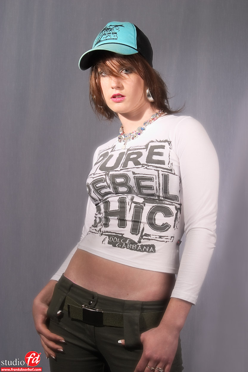
This was actually my first model shoot ever. I even printed a book for myself from this session because I would never shoot something better….. Oh how wrong can you be. Just a simple setup with a small softbox and some material as background because I didn’t have a lot of other options yet and the studio was really small.
A few months later and a very good model, she knew how to pose and I tried some things with cubes (I think this is one of the first sessions I started using cubes) and as you can see some plexiglas on the floor for the reflection and to keep everything white. I just loved weird poses what can I say.
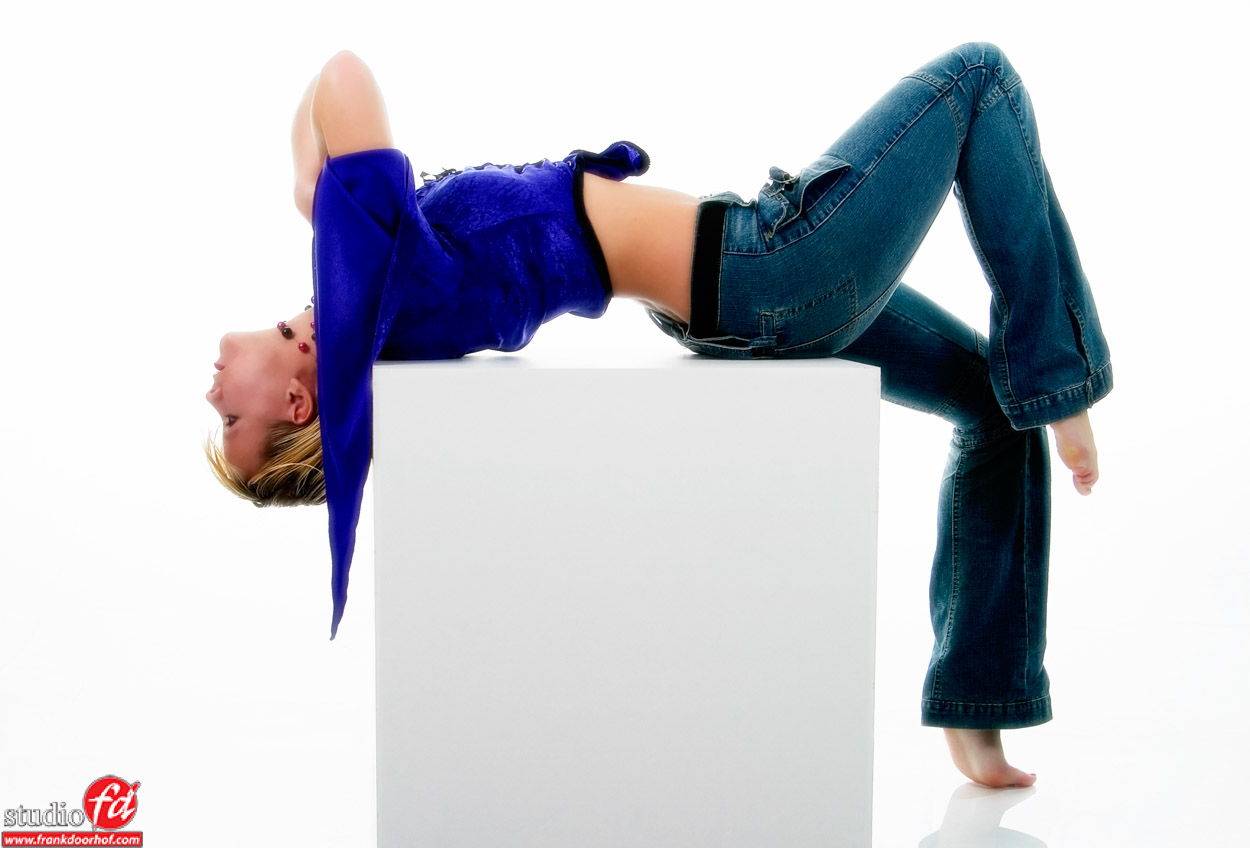
And of course I also loved black backgrounds and plexiglas and some motion.
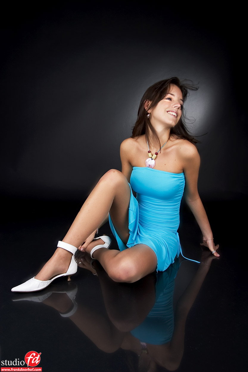
At one point I decided it was not all about weird poses, cubes, plexiglas and yet another color on the background and I started to experiment with styling. This image was one of the first attempts we made with styling, and crazy ideas. We are now in 2005.

I always told myself that if I used something a while and I nailed a good shot with it (or a series) I would stop using it for a while, but at one point the cubes were bound for a comeback. And we did so in 2007 but as you can see at that point I also started to get a bit more heavy into complexer light setups, this was actually a 3-4 light setup and at point very tricky to setup and get it the way I wanted it to be.
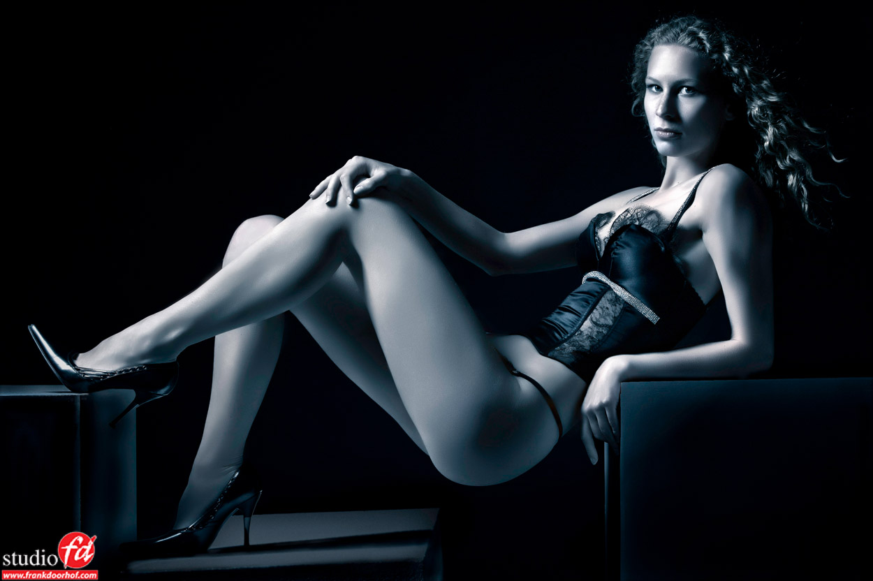
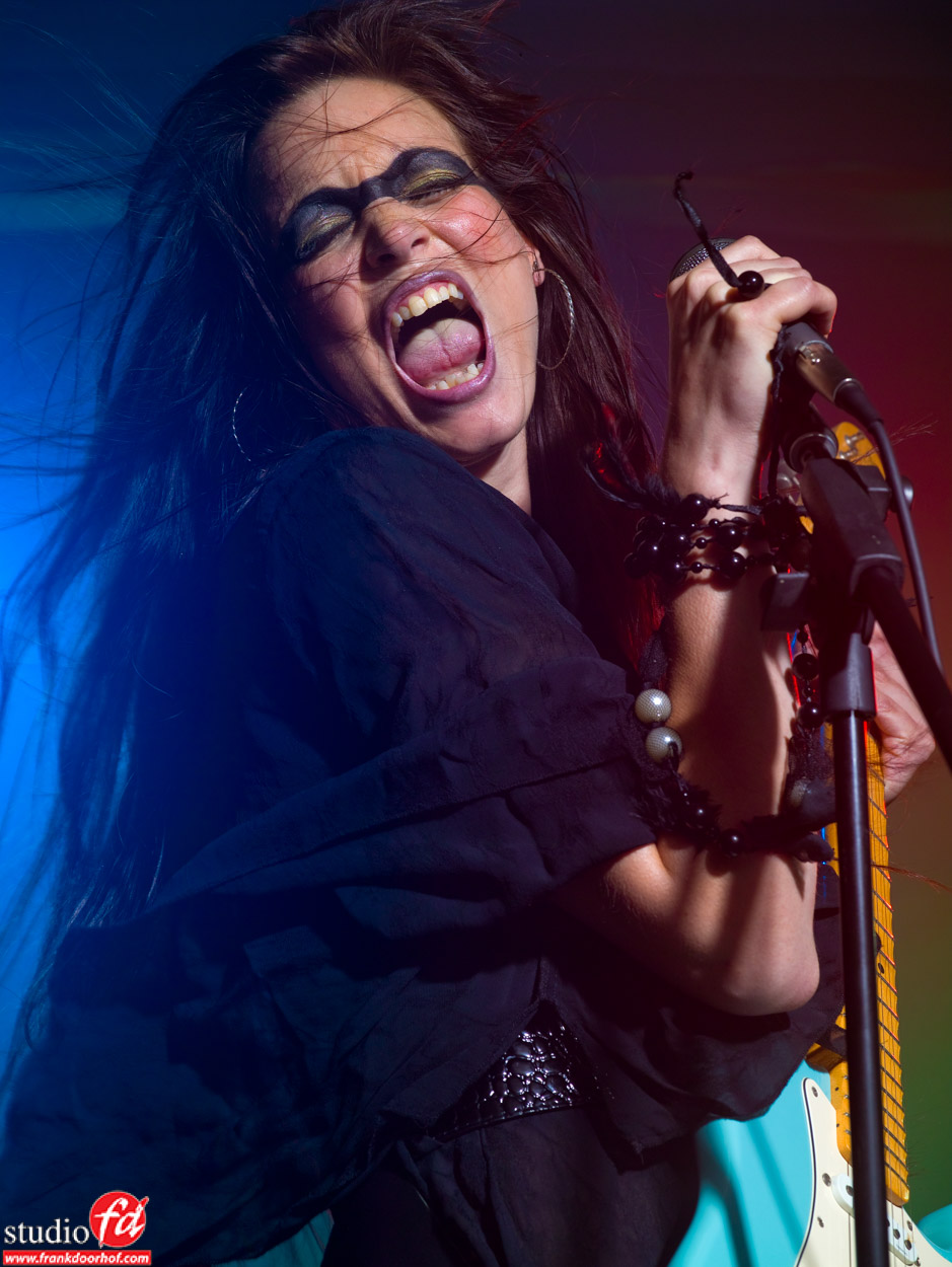
2007 also was the year I needed a model for a show at Professional imaging and Nadine responded, she loved my work and wanted to work with me. As compensation I always offered the models to be paid or to get a TFP shoot, Nadine opted for the last and wanted to impress me, she didn’t want a standard image, now it had to ROCK, so we decided to use the theme ROCKCHICK. I already used some smoke so that was handy and we came up with this shot.
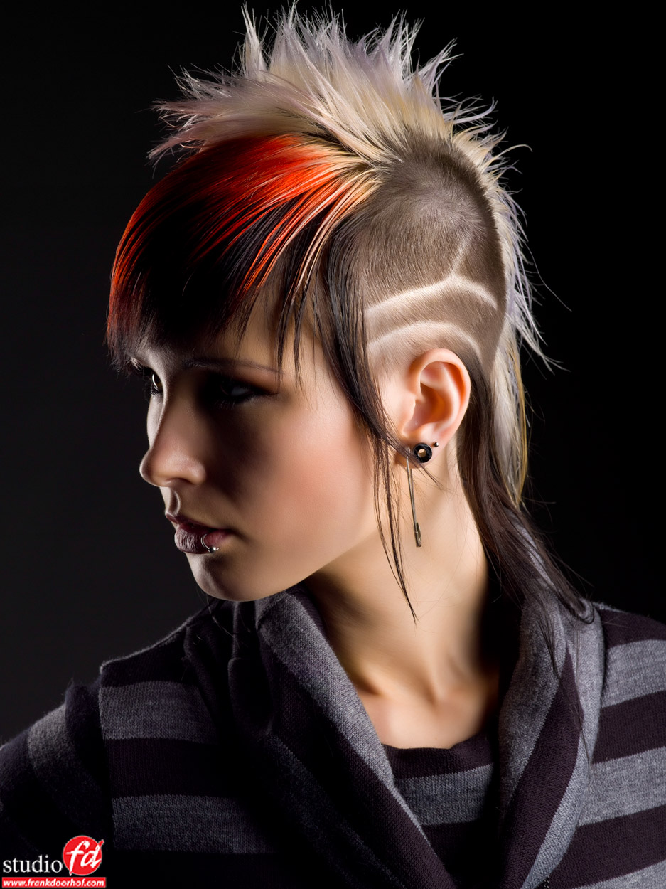
Not much later Corine decided it was time for a haircut a day before a workshop and got me all worried when she told me her choice was a bit edgy…. I don’t have to tell you I loved it.
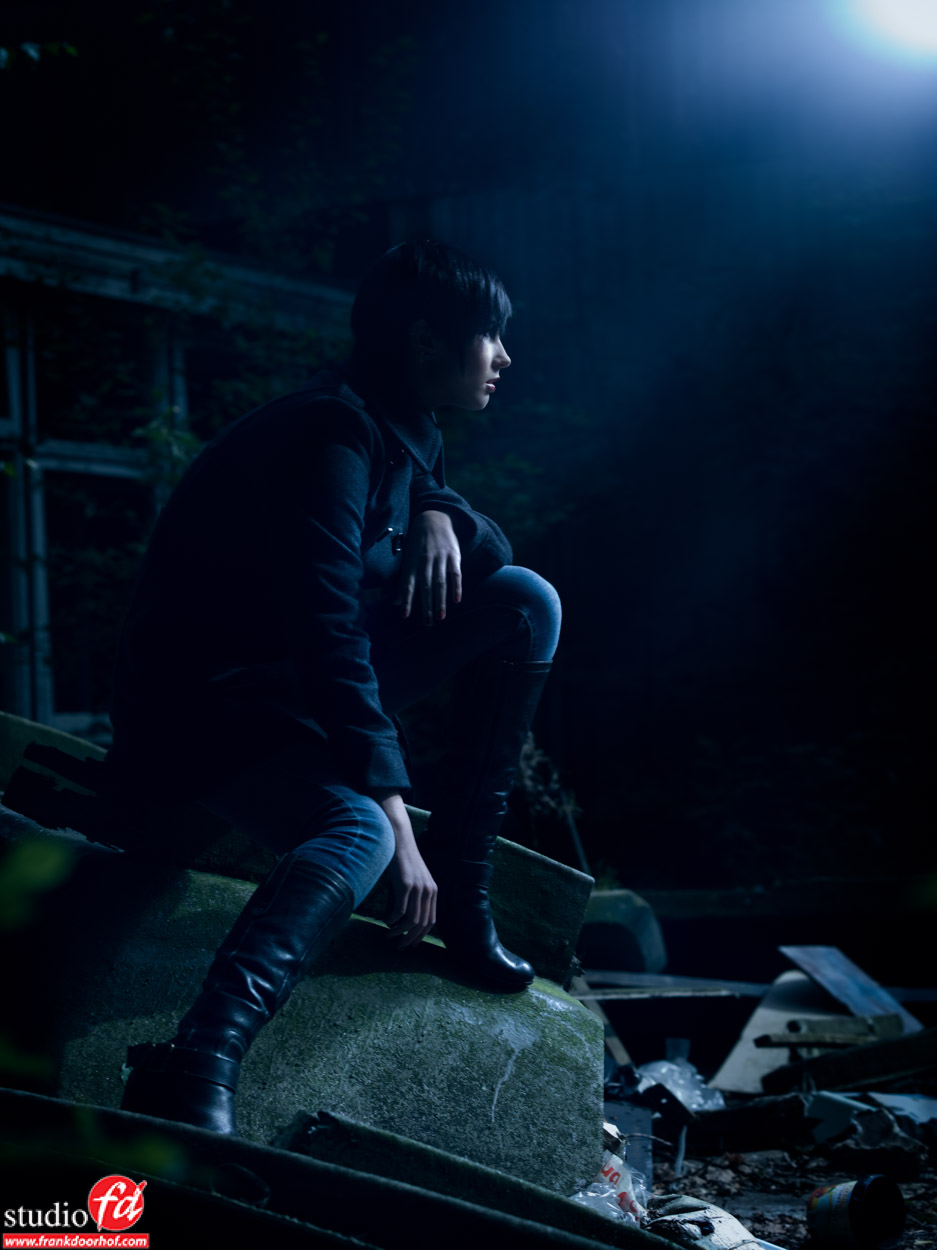
Now a few years later (2008 to be exact) I was venturing more and more outside the studio, for the simple reason my studio was limiting me at that point. And I started experimenting with backlighting and day to night, I think this is actually one of the first day to night shots I did with a model that visited our studio very often (Corine).
The years after this everything went pretty fast.
Nadine and some other models visited the studio a lot and we worked on some free work and the whole group grew, the workshops started to become more and more successful and Nadine once joked that “every shoot I come it will be more extreme” because I loved to play around with styling and extreme things I of course encouraged this to tell her after every shoot “We’re almost there, it was just not perfect” an inside joke that we still play for the simple reason that we promised each other that as soon as we took the perfect shot we would stop.
For modern work visit my portfolio at www.frankdoorhof.smugmug.com and you can see that some elements return and some elements are now much more different but overall I think you can recognize a lot of things.
Now how did technique help me?
Of course it’s all cameras and gear right?
Well actually for me it’s not.
When I look back I think me discovering David Lachapelle and seeing the over the top styling and story telling really changed the way I looked at photography, from that point on it was never about the model and the beautiful clothes (although important), it was about story telling, the styling (the more outrageous the better), the expression and so much more.
Of course technique did have a major impact on the quality.
Strobes like Elinchrom are very precise and stable so I loved it when I made the switch from my first set Jinbei’s to Elinchrom, I also loved the new modifiers I got to play with. On a tradeshow I shot a few images with a Hasselblad (even made a picture of me holding it because this would be a one time deal), when looking at the images back home…. well I was sold and ended up with a Mamiya/Leaf combination. This helped me with dynamic range and higher resolution images for the artists I shot at that time (they needed really big posters and the 6-8Mps were just a bit on the short side sometimes). But it also helped me with a different format, when I started shooting MF I slowly changed from shooting dominate portrait mode to almost dominant landscape mode. Also my love for movies probably helped with this, it just gives a totally different look to the images and gives the model more room.
So technique helped.. but I always strongly believe (till today) that it’s your mind that creates the images, not the gear, the gear is just a hammer or nail to hang the painting/photo. That’s also why questions like “What lens did you use”, “What aperture did you shoot on” are all actually quite irrelevant. If I tell you…. you still aren’t getting that X-factor ingredient.
The last few years the photography market has gotten very interesting, Sony is taking over like a storm with backlit sensors, insane dynamic range, great features and options to use every lens ever made, and that all helps to get better image quality and makes it easier when traveling (smaller camera). But there is more of course, every day you see new products that make my heart beat faster, think about the recent release of the iPad pro with Apple Pencil that will open up so many possibilities for creatives all around the world, I think the scenery will change, Adobe hopefully will pick this up even more and start creating more and more apps for that.But also think about cameras that are totally flat and have several lenses so you can just shoot and the camera uses different lenses to focus on different lengths (like Light and their new camera technology), this makes it possible to later change the DOF in software… all really cool and handy…. but…… it will not change one thing…. give the best gear to the worst photographer and he will make bad images, give the worst gear to a good photographer and he will create art. An iPad pro with an Apple pencil doesn’t make you an artist, people with notebooks and pen can draw better images while on the phone than I do when I concentrate on my iPad pro 😀 but that doesn’t matter….
Technology helps us to enhance our workflow, create better images, give us option to discover parts of our art we never used before, but the real artist… will always be inside YOU.
Now let’s end with a challenge, write a blog post about your progress and your opinion on how technology helped you and send me the link, the best blogs will be featured on my blog.
https://frankdoorhof.com/web/wp-content/uploads/2015/11/Linda-S-studio-30-Mei-2007-11.jpg8321250Frank Doorhofhttps://frankdoorhof.com/web/wp-content/uploads/2015/03/studioFD_Logo-1FV.pngFrank Doorhof2015-11-21 14:00:392015-12-03 18:16:32From old to new but in the end it’s all about YOU
Today again a review on an Apple product, this time the Apple Pencil.
Let me start out by saying that when Apple released the iPad Pro I was not impressed, yeah it’s a bigger iPad and yeah it’s cool but what can I do with it…. who is Apple targeting, up until the point I saw the Apple pencil… at that point I was like “hmmmmm ok interesting for graphic designers, but not for me”
Long story short, I started thinking about how the iPad pro would be beneficial for me and fit in my workflow and (like with most new products) it became clear to me that it could really change the way I work, but most of all the things I would be able to do extra, and…. the Apple pencil was the main reason. So I was unpleasantly surprised I could just walk into a store and pick up an iPad Pro 128GB LTE but not the Pencil… they told me it would be weeks. Now my strategy proved to be successful, that morning I also ordered a whole kit online and that Pencil had a delivery time of 5-7 working days. In the end I ended up cancelling my online iPad Pro order but kept the Pencil, and much to my surprise and joy the Pencil already arrived after 5 days, and the next two days were spend playing with it and giving me the material for this review.
How does it look and feel
Well I can be short…. it’s a pencil.
And this is a good thing, it really looks nice and it’s cool it will always roll over with the logo on top, but overal it’s… well again it’s just a pencil. It feels really nice in my hand and actually when I go back to my trusted Wacom tablet I have to say the stylus feels weird. I never had that before with a product but you really get used fast to the Apple pencil.
One of the things that Apple does awesome is design and the Pencil is no exception, but it’s not without flaws, instead I’m afraid of how long I will be able to not loose parts. The top part disconnects to make it possible to charge the Pencil on your iPad and it claims to be ready for 30 minutes of use after 15 seconds of charging (awesome)
Up till so far, no problem, you can probably keep track of this tip without too much trouble, however there is another tip. This tip makes it possible to charge your Pencil via a lighting cable and I’m in all honesty afraid a lot of people will or loose that tip or the magnetic tip so let’s hope Apple has these as spares for not too much money. It would have been nice to include a sort of carrying box or sleeve, especially seeing the price of 109.00 euro.
It’s expensive
You hear this a lot, but I have to disagree in this case.
When you look at other styluses you also pay a lot of money for the more high-end products, but none of them will interact as well with the iPad pro as the Apple Pencil of course, so I think it’s very hard to say it’s too expensive, let me put it this way…. you do pay a premium price for a premium product. And I don’t think that’s bad. Also seeing all the techniques inside the Pencil I think it’s actually not that expensive.
How does it work
This is of course what you want to know, right?
Let me start of by saying that I never worked behind a Wacom Cintiq longer than a few minutes, I never owned a Companion (but worked with it a few times) and I haven’t drawn or painted in over 25 years…. so am I the reviewer you should trust…..? well I think so and if you read further I think you understand why I say this, and also gave you the heads up 😀
Drawing and painting
When I was young I LOVED to draw, especially cartoon characters. I read books on how to draw and was mesmerized by the styles of Disney and similar styles. When I grew up I simply didn’t have time anymore and fell in love more and more with video and photography and slowly drawing disappeared but my mom still has books filled with drawings I made during my youth. I was always used to first sketching my work and later using a liner to make the lines thicker and finally coloring them, so when I would go somewhere with my parents it was always a lot of stuff to carry with them, maybe that’s also why I just gave up when growing older.
The love for real “hand made” graphic art always stayed, I love the photorealistic work from friends like Bert Monroy and Aaron Blaze which always blew my mind, but I’m also always amazed by the ease that Pete Collins seem to have when drawing his work, amazing artists and I’m not even close to what they probably do with their eyes closed, but…. do you have to, to have fun?
We live in a world that goes faster and faster and sometimes I also feel the urge to do something useful, do something that people can buy, look at, enjoy etc. and sometimes you just forget there are also other things in life, I think that’s also why those books “Coloring for adults” are so popular, just relax, take a deep breath, sit down and get lost in coloring……. yeah I know it sounds weird but according to a lot of people it really works relaxing. With the iPad pro we now have a device that gives us a lot of extra options, we can use Adobe Sketch, Notes or the amazing ProCreate to create simple drawings, paintings or ultra realistic pieces of photorealistic pieces. But most of all…. create something from nothing and without the need to bring all your pencils, coloring pens etc.
The drawing experience is awesome, I really don’t have another word for it.
You REALLY just have to pick up and iPad pro and Apple Pencil to experience it, when you sketch it really feels like your working with a drawing tool instead of a digital stylus, the Pencil is incredibly sensitive and shading is an experience that will give you a real sense of working with the real deal (just tilt the Pencil), the (positive) weird thing is that as soon as you change for example from pens to paint you also feel like your painting, it’s hard to explain but it’s just something you probably have to experience.
Lag is almost not visible, there will always be some lag of course but somehow Apple really did their best to limit it to an absolute minimum, let me put it this way I’ve worked on several “older” cintiqs that lagged a LOT more. Also the palm rejection work flawless (so far as I can see now).
Drawing on glas?
This is also something I thought about, the iPads are incredibly smooth so how does this translate when paining or drawing, don’t you feel like trying to stay in balance on an ice-skate…. well I can say that also here Apple really did their homework, the pen doesn’t feel like to be going over glass, it also doesn’t feel like art paper, but it feels very very nice.
So drawing is nice, but do you want to spend 1200.00 on that alone?
For me it was not, if you read my review on the iPad pro you will get a bit more insight in why I bought the iPad pro, but in essence it really depends on what you do, I think for people that spend hours and hours painting/drawing on an iPad will be in heaven when they try this combination. But also people that now travel with large Cintiqs will probably love it for the simple fact that there is an app for that…..
Astropad, will it change your life… it very well might
When I knew I would order the iPad pro I also knew I would be using it with Astropad, in fact a big part of the reason I bought the iPad pro was Astropad. So what is this “super” app.
Astropad is an app that works on your iPhone, iPad and iPad pro and in essence mirrors your monitor (actually part of your monitor) with some nice added tricks. With Astropad you could say you can run the full versions of Photoshop and Lightroom on your iPad (pro) as long as you take into account that you always need a host computer. Now I hear you say.. “what’s the difference between this and a screen sharing program”, well that’s simple. Astropads supports your Pencil or stylus fully in Photoshop/Lightroom so you could say it adds some Cintiq magic to your iPad Pro.
For me it really adds to my workflow, I’ve retouched on Wacom tablets for years and absolutely love them, but I also always looked at the Wacom Companion which looked like a dream machine for me, if it would run MacOsX but it doesn’t, and the battery life is a bit short for long trips but the idea of carrying a sketch book with Photoshop with me all the time just feels like a cool and handy option. And zooming in on the face of model very quickly and seeing what I do straight from the screen I’m retouching on also has a great appeal to me, but to buy a Companion just for that…. well I’m not a graphic designer or painter so for me I just couldn’t justify the costs vs the benefits, when traveling I would still carry my laptop and iPad with me so it would be another expensive piece of gear I had to bring and insure and keep track off. The iPad pro however really combines a lot of these options. Of course Astropad doesn’t work on the plane (unless you also open your MBP, but when you don’t fly business that will be impossible) but on the plane you can draw/sketch/paint, watch some movies, play some games etc. on the iPad Pro, add the keyboard and type some blogposts or documents, and when you arrive on location you can switch the iPad (pro) to the main hub to shoot tethered to (wireless), and back in the hotel you open up your laptop, connect the iPad pro and just lay on the bed and browse through your images and retouch them via Astropad, or Lightroom mobile.
It’s the feeling of having one device for literally everything that has that great appeal for me, and the combination of the Apple Pencil and Astropad makes the iPad pro for me a tool that is worth every single cent. But words are always nice but a video does more, so check out this episode of Quite Frankly where I show you the retouching process with Astropad.
It’s just a stylus
Every time I see this remark I have to laugh a little bit.
When Steve Jobs said he would never want a stylus he was absolutely right. My first “organizer” used a stylus and it was terrible, I never lost one, but as soon as I got my first iPhone it was a WOW moment, this was the way to operate a smart phone.
When the Pencil was released I immediately saw it for what it was, not a stylus to operate your iPad pro but a graphic tool to boost the uses for the iPad pro to a WHOLE new level, the level where a lot of creatives were already using it but always with limitations, with the release of the Pencil, Apple did not release a simple stylus, not even an advanced stylus… no they released a tool for creatives.
Ok let me explain myself.
There are a lot of tablets out there now a days that claim the same. Some use Wacom techniques, some use other techniques. I also own a Windows Sony tablet/laptop with a stylus and it works perfectly for taking notes, drawing some shapes etc. but as soon as I try to really draw I found out I just “sucked” at drawing and I gave up. Same happened with the Surface Pro, my level of drawing is just not good enough I always thought, and seeing that many people make incredibly art with these tools I always believed that was the problem. When I however started drawing on the iPad pro I saw myself doing stuff I never ever was able to pull off on the other tablets, the difference might be small but it was just enough to keep me up till 1:00AM last night drawing away on my iPad Pro and immensely enjoying it.
I’m convinced that if you give a real artist a Surface pro he/she will draw art, heck I’ve seen Bert Monroy do stuff with his fingers instead of a stylus that blew my mind, but imaging that if the iPad pro and Pencil already boosted my abilities what will happen when real artists start using this…. I’m very much convinced that this might be one of the best and most revolutionary releases from Apple for the graphic industry. Apple is often blamed for forgetting the graphic artists, the group that actually made Apple and in the past was the main focus for Apple (well at least that’s how I experience it) but with the release of the Apple Pencil I think Apple has proven that they love to motivate and inspire people but most of all give them the tools they need to create stunning art.
Conclusion
I have my Pencil for 2 days now and already spend a few hours just playing around in Adobe Sketch and ProCreate and I’m hooked, every free minute I’m now trying to get my skills up and I love the creative process, driving Annewiek mad by constantly showing her stuff I make and new ways that brushes work, for me painting and drawing will stay a hobby but the combination with Astropad makes the iPad pro a serious contender in replacing my trusted Wacom tablet for retouching and thats where I do earn my money and I’m always looking for ways to get a better and faster workflow.
If you’re a graphics artist, or just love to draw and paint without a doubt check out the Apple pencil and the iPad pro I think you will be more than impressed.
https://frankdoorhof.com/web/wp-content/uploads/2015/11/apple6_600x400.jpg400600Frank Doorhofhttps://frankdoorhof.com/web/wp-content/uploads/2015/03/studioFD_Logo-1FV.pngFrank Doorhof2015-11-18 17:35:552015-11-18 17:01:26Review Apple Pencil and video with Astropad
You must be logged in to post a comment.