Tag Archive for: styling

Creating depth and contrast in your model/portrait photography

How to create depth and contrast in your model photography?

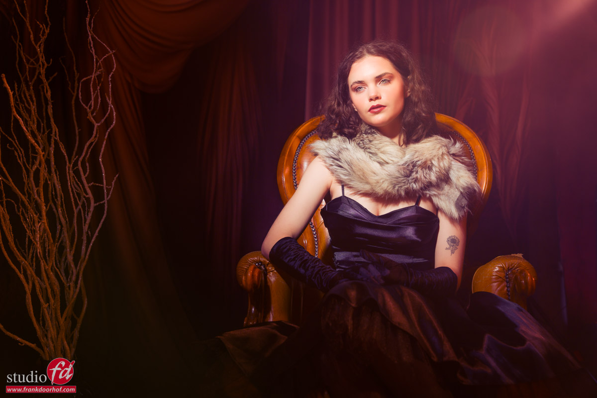
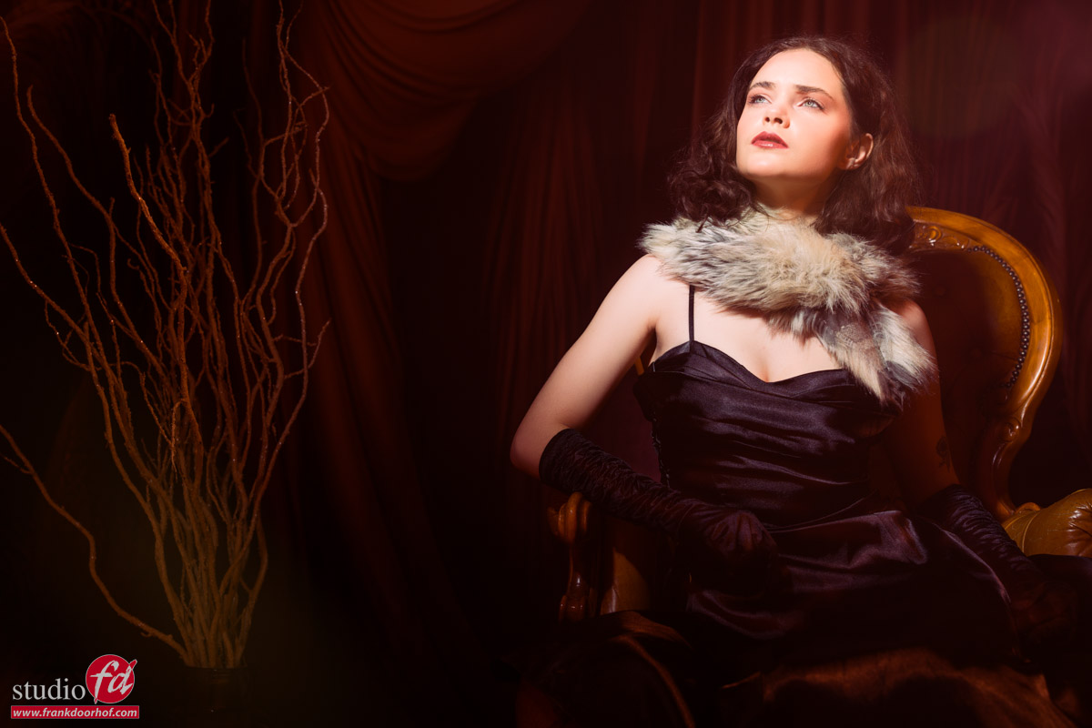
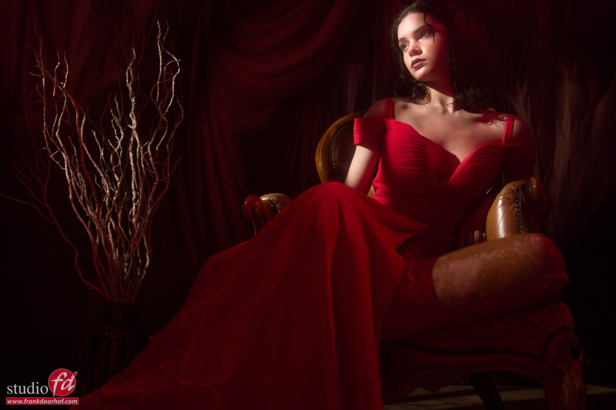
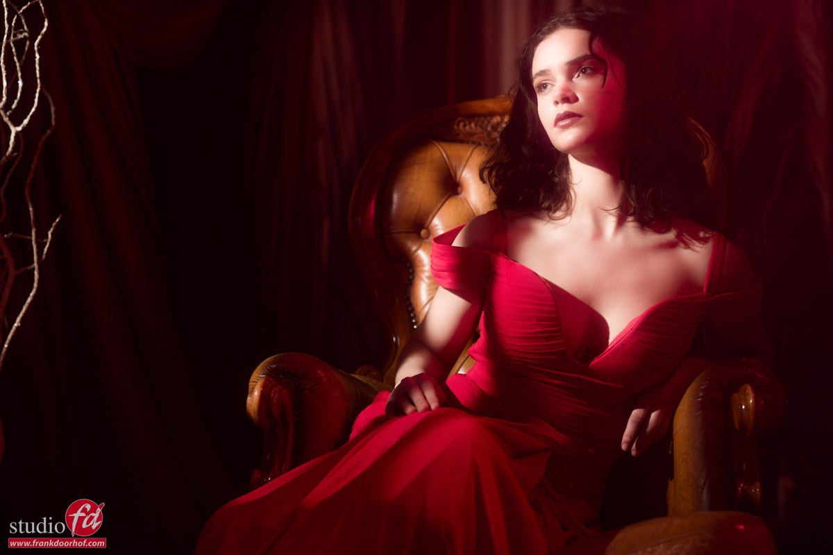
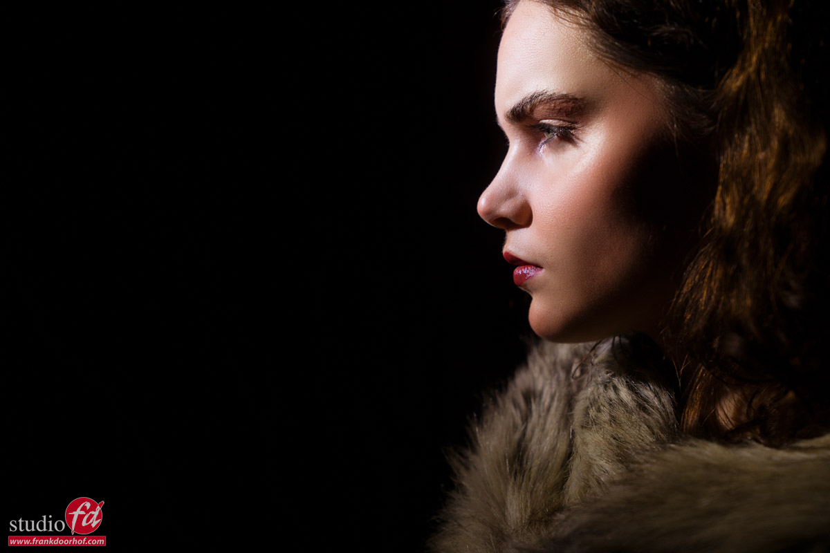
However, if we want to create depth we do need to change the direction of our light. And today we are looking at one of the solutions to open up the darker side and get some really cool effects. Continue reading how to create depth and contrast in your photography

Depth is one of those things

We all know the term “3D looking” And maybe you also struggle with getting your images to look more “3D”
In most cases, it’s “just” a matter of changing your light to the sides of your subject.
The problem is often that the other side of the face becomes really dark. And often also the background creates really bad looking images (unless you love that look).

For me, at least the background should be lit slightly beyond the dark side of the face. This means there is some separation between the model and the background. Letting everything turn black or hardly visible is sometimes cool. But most of the time you are just left with an image that doesn’t feel right.


Accent vs flare or maybe both

When I started out with model photography I loved the Rembrandt setup. But somehow I never liked the darker part of the face. The easiest solution is of course using a reflector. But, a reflector only works when it gets enough light to bounce back. Because I use my lights mostly pretty close to the model there isn’t a lot of light hitting the reflector hence not reflecting enough back to the model.

Inverse Square Law

This is of course due to the inverse square law. This dictates that light falls off over the distance, meaning if you place your lights really close to the model it will fall off really fast and not have enough “power” left to also reflect back on the face and have a major impact.

Solution

So most of the time I solve this by using an extra light source on that side.
Now you can choose to place this behind your model and just hit the side opening up the shadows, moving it slightly back to only light the jawline, etc. This already works like a charm but let’s up the ante.

By using a light source with a more diffuse light source, like for example the Rogue magnetic system without or with the omnidirectional dome we can do a lot more.

We can now not only create a cool lighting effect on our model, but by placing it correctly (slightly more forward or backward, just experiment with very small increments, this really works very precise) you can also balance it so that the side of the light (softer and less output) hits the model. Creating a beautiful soft quality of light. But the main part of the output actually hits the lens creating an awesome lensflare.

If you are not happy with your lens flares, try older M42 lenses. Or even better, get the same filter I use, the K&F concept black diffusion filters, these make it much easier to create great flares without influencing your images when you don’t use backlighting.

Video about creating depth

Ok, because images say more than words, let’s look at a lot of images after each other, which we call video 😀

I hope you now understand better how depth and contrast can change your portrait or model photography.

Visit www.frankdoorhof.com/shop for the gear I use.
Visit www.fotografie-workshops.nl for the Dutch workshops
Mail us for our totally new 1:1 full-day online workshops in English or Dutch.

And some of the results
model: Claudia

Depth and contrast in your photography

Depth and contrast in your photography


A Harley Davidson and a beautiful model and you get to see it all….

Frank Doorhof’s Digital Classroom, model shoot with a motor

Have you ever wondered how they got those shots?

Well, you’re going to love the Frank Doorhof’s Digital Classroom series.
In these broadcasts, we show you complete setups and tell you about the technique but most of all, we also talk about choosing the right angle, styling, adding elements in the set or for example, smoke, working with lens flares, colors, etc.

And this time we had a very special prop, a Harley Davidson.

In two completely different setups, I show you how to light the set and pose the model, but also how to light in zones and understand feathering and light placement for reflections and covering up light sources.

And the coolest part?
I did it all with the Geekoto strobes, the FlashBender in striplight configuration, and the Rogue Magnetic system.
A complete setup everyone can afford and still gives you awesome results both on location and in the studio.
See frankdoorhof.com/shop for the gear I use.

Here is the episode of the digital classroom.

Digital Classroom results

And of course, you also want to see the results.
Do realize these were all shot during a live broadcast, so not the perfect circumstances to get everything 100% right 😀

Frank Doorhof’s Digital Classroom supporters

We have to thank our sponsors for making Frank Doorhof’s Digital Classroom possible.

Frank Doorhof’s Digital Classroom is sponsored by BenQ Photographic Monitors & Rogue Expo Imaging; Photographic Design (FlashBenders & Magnetic modifiers, color, correction, and reflection)

Also powered by Calibrite (calibration done right, the best solutions for photographers, filmmakers, designers, and content creators who love color and demand the very best tools for their color-critical workflow) and Cascable (tethering software for the iPad),

Furthermore, we thank YOU! the viewers and fans of our Digital Classroom from all over the world. We like your questions and remarks in the chat live or below our videos.

Special thanks to our friend Martin, who drove his precious Harley in our studio, and friend and model Claudia for being creative.
You might have seen our little mascot Chewie the Labradoodle, who doesn’t like smoke but was brave enough to be watching from below the desk.

Subscribe to our YouTube channel for more live streams and other videos. 

Frank Doorhof's Digital Classroom, model shoot with a motor Frank Doorhof's Digital Classroom, model shoot with a motor Frank Doorhof's Digital Classroom, model shoot with a motor Frank Doorhof's Digital Classroom, model shoot with a motor


A surreal set and loads of colors

Workshops are always different

Want to know more about colors?
Check the following blog posts about color and color manipulation.
part I
Part II

One of the most important things for me when I teach workshops is that I have to keep challenging myself but also the attendees of the workshops
This means I’m always looking for new creative way to use light, color, backgrounds, sets etc.

Today some images we shot during a workshop with our model Claudia.
The lighting setup might look familiar.
I’m using two Geekoto strobes with a red and blue gel as accents.
To get the lensflare and blue light on top I’m using a Geekoto GT200 with a Rogue blue gel from the magnetic system.
On the model I’m using the awesome Rogue collapsible snoot with a green gel.

To help the lensflare I’m using a black diffusion filter on my lens (Sony A7RIV with 24-70 f2.8)

The set was build with 2 clickbackdrops backgrounds and a floor part.
Add some props and a very cool model + outfit and you just have to find the right angle 😀

And of course we had to take some closeups.

Now let’s take a look at the lighting setup.

Want to visit a workshop?

I teach the workshops in our studio in Emmeloord mostly on Saturday.
The workshops are in Dutch but when you let us know a few weeks in advance we can switch them to English.
Visit fotografie-workshops.nl for more info

An extra tip

As you have read Key is the luminance of a color.
This means that if you don’t have a correct exposure of your shot the colors will not look accurate.
Now of course sometimes you want a more moody look, but it’s important to understand the basis of color to be able to manipulate them the way you want.

To be able to judge your colors correctly you need a proper workflow.
For me this contains a lightmeter and colorchecker.
This means I get my exposure correct and with the colorchecker I can create a profile and white balance for that series.
And do remember this is just to get all the images looking the same so that all the presets you run or anything else in your workflow has an expected outcome.

On the side of the monitor I’ve been using BenQ monitors for years and can highly recommend them.
They have a great line up of professional monitors and a great line of P3 colourspace monitors (in between sRGB and Adobe RGB) for very affordable prices.
Besides great quality most BenQ’s also support hardware calibration. Which means you don’t calibrate your operating system but straight into the monitor.
This is a much better way of calibrating your screen than via standalone software and of course the software is delivered for free.
We have a few 10% discount codes for our European vistors, please contact me for more info.

Getting outrageous skies without Photoshop but with gels

Color manipulation is fun, get outrageous skies without Photoshop

Today another part in our series on color and color manipulation.
part I
Part II

We all love easy to do tricks of course, so I thought today would be the perfect time for just such a tip.

When we look at the color triangle we can see that all colors are connected through the white point.
We talked about this in the first blogpost in this series.

This also means that we can manipulate our white point by choosing a whitepoint that is way off the black body curve and choosing this as a new white point.
So let’s take a look at how this works in real life.

Look at those skies

Let’s take our model Lois on location.

Yeah, well….
There is nothing wrong with this shot but it isn’t really popping right?

So first let’s add some strobe power.

Ok that’s a LOT better, love the sky and the model really pops out.
But what if….we want to push the creative factor up.
Let’s add a green gel to our strobe.
You can use the Rogue magnetic system for this.

Of course it’s vital to shoot a color checker for this.

Now click on the whitebalance part and look at what happens.

Don’t you just love the effect.
In essence it’s very easy what happens.

Normally the white point is on the black body curve.
By using a green gel on the strobe we are now placing the white point above the black body curve, by correcting this to the correct white point everything else drops down, meaning white becomes more magenta. Enhance the colors a bit in your favourite editor and you can have loads of fun with it.


An extra tip

As you have read Key is the luminance of a color.
This means that if you don’t have a correct exposure of your shot the colors will not look accurate.
Now of course sometimes you want a more moody look, but it’s important to understand the basis of color to be able to manipulate them the way you want.

To be able to judge your colors correctly you need a proper workflow.
For me this contains a lightmeter and colorchecker.
This means I get my exposure correct and with the colorchecker I can create a profile and white balance for that series.
And do remember this is just to get all the images looking the same so that all the presets you run or anything else in your workflow has an expected outcome.

On the side of the monitor I’ve been using BenQ monitors for years and can highly recommend them.
They have a great line up of professional monitors and a great line of P3 colourspace monitors (in between sRGB and Adobe RGB) for very affordable prices.
Besides great quality most BenQ’s also support hardware calibration. Which means you don’t calibrate your operating system but straight into the monitor.
This is a much better way of calibrating your screen than via standalone software and of course the software is delivered for free.
We have a few 10% discount codes for our European vistors, please contact me for more info.