Frank Doorhof
  • Blog (articles)
  • Rent our studio space
  • MAIN SHOP
    • MAIN SHOP
      • Orders
      • Account details
      • Downloads
      • Addresses
      • Lost password
      • Cart
      • Checkout
      • Terms webshop
      • Return policy
      • Privacy Policy
      • Privacy Statement in3. Dutch customers only. When you want to pay in 3 parts
  • IQwire Tether Cables
  • Rogue Modifiers
  • Geekoto Flash and Modifiers
  • Platypod
  • Click Backdrops
  • PORTFOLIO
  • Learning with Frank
    • Dutch workshop agenda
    • Workshops
    • A Year With Frank
    • Online 1:1 workshops
    • 1:1 workshops in English
    • Portfolio review by Frank Doorhof
    • Patreon
  • Support our work
  • Merchandise
  • Digital Classroom LIVE
  • Our YouTube channel
  • Biography Frank Doorhof
  • Services
  • Discounts etc
  • I need help
  • Menu Menu
  • Shopping Cart Shopping Cart
    0Shopping Cart
  • Link to Facebook
  • Link to X
  • Link to Youtube
  • Link to WhatsApp

Sit down and listen it’s about workflow in Lightroom

29-03-2026/in blog, Visions and technique/by Frank Doorhof

Workflow is key. That is why I use Lightroom

I absolutely love photography, and retouching is a nice, relaxing process for me.
During the workshops, I’m often a bit surprised by people telling me they don’t use Lightroom because it’s too difficult.
Or they are unsure what the perfect order is for developing a RAW file.
So today, we are doing exactly that. Let’s walk through the workflow and how it works.

How was this triggered?

Recently, a friend of mine showed me a diagram for the “perfect” workflow in Lightroom.
It started with merging images in HDR/Panorama, then noise reduction, and then adjustments.
In all honesty, this triggered the blog post: noise reduction as a first step…

Your RAW developer is not dumb

So my advice is very simple: follow the workflow in your software.
Unless you know what you’re doing, of course 😀
Now this could be the end of the blog post, but I want to dive a bit deeper so you also understand the way I build a workflow.
Do remember that a workflow is very personal, so I try to keep it as mainstream as possible.

How I work in Lightroom: step by step

Importing images from my camera

The first thing we do is, of course, import the images.
This is already a vital step, because it can be done in a few ways.
Personally, I strongly advise copying your images to external storage (like a NAS) and using Lightroom to import them by ADDING them, not copying.
This way, the images always stay in the same place, even if Lightroom might one day crash, and you lose your database in a worst-case scenario.


Make your base right

After this, it’s really just following the workflow.
The first thing I always do in a workflow is make sure my base is correct.
This means that I will crop my images and, if needed, straighten the composition.
This is also the part where I will boost my shadows to insane and look over the image for any problems that I take out with the healing, clone or Ai.
After this, I reset the shadow slider, of course, and continue.
The reason I’m boosting the shadow slider is to make sure I don’t miss any details in the darker areas of the image.
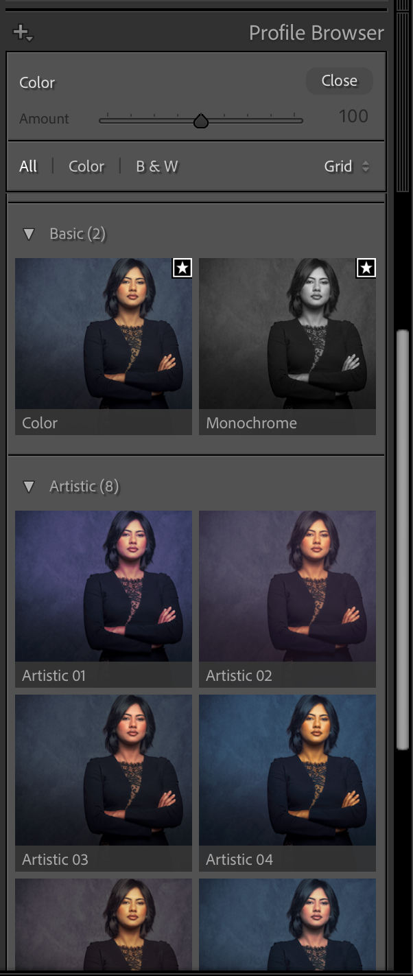
This is where you select the basic look for your images, or you select the created profile from a colorchecker to get accuracy. This can be a creative section or pure accuracy.

Let’s take a look

The first thing you do is select the profile you want to use.
This can be a profile from a colorchecker you created, or just one of the Adobe profiles.

We now have the RAW file all set up for the rest.
You can now, for example, merge your images for HDR/Panorama.

In the next section, we adjust the basic image.
Here we set the white balance and add some contrast to your image, play with highlights and shadows, etc.
Color balance can be set with the picker by clicking on a white balance card (and syncing this setting to your other images).
Or you can select one of the settings, or play around with the sliders.
Personally, I always use a white balance card to set the color balance.
Not because I always keep my color accurate, but because when the base is always the same, I can very easily create presets or automated workflows where the end result is always predictable.
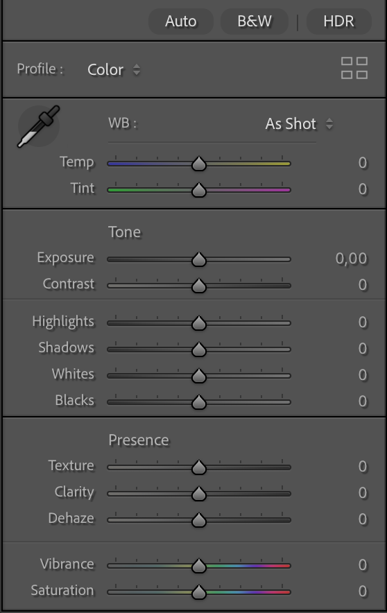
This is where you make the first adjustments to your images, the best you set up your lighting, the less you have to do here, but adding some contrast is with RAW files something we do often have to add.

Colors

After this, I mostly adjust the colors.
This can be done via curves, sliders, HSL, etc.
This is not a part for the accuracy, but already for the look I want in my final results.
This is the part where we build the look for the shot.

Sharpening

Now it’s time for some sharpening.
In Lightroom, we have very powerful options in the case of texture (fine detail) and clarity (a more contrast-based look)
In this section, you can also adjust the look of your image with Dehaze, and trust me, you don’t have to use it to control haze only; it can be an awesome creative tool.

After sharpening, I’m mostly done with my image.
I’ll go through the complete process again, starting at the develop stage and fine-tune contrast/shadows/highlights, etc.

When I’m done with everything, only then will I start denoise, if necessary, of course.
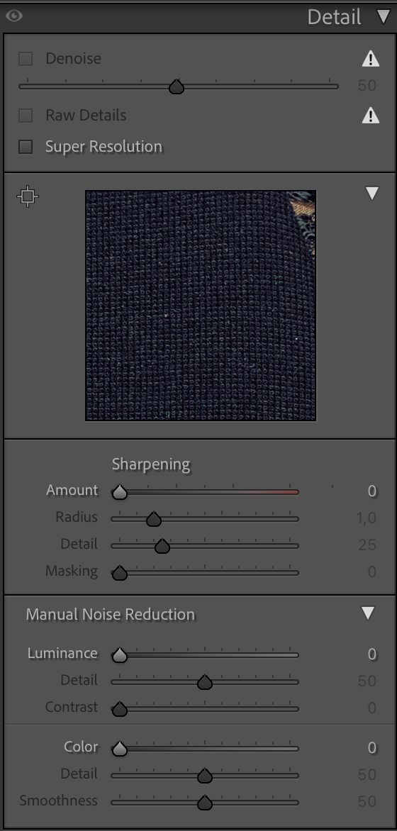
The final step in the adjustments workflow is Sharpening, upscaling, and denoising

Why denoise not at the start?

You can, of course, run denoise at the start of your process.
However, when you open up the shadows, sharpen your image, play with colors, use super resolution, etc. ALL these settings can and will introduce noise.
Meaning you keep going back and forward to your denoise, in all honesty, for me, that doesn’t make any sense.
And brings me back to the start.

Lightroom and most RAW developers have a certain workflow for a reason.
If you are starting out with software like this, it can be incredibly intimidating when you see all the sliders and often names that might or might not ring a bell.
My advice is super simple… follow the workflow from top to bottom and ONLY when you start to feel confident, it’s when you can start to skip parts, or jump towards parts.
Lightroom is so incredibly user-friendly I’m sure you can get awesome results when you follow the standard workflow.

But Frank, there is more…

Yes, after this, there are several other options.
But they don’t influence the noise anymore.

However, they can be important.
First of all, you are probably aware that not all lenses are created equal.
In essence, no lens is perfect, but luckily, Adobe created a huge database of lens correction files that can really change the look of your images positively.
If you have never tried this, make sure you check it out.

In this section, you can also adjust the image in a very flexible way.
“No more” distorted buildings due to wide-angle distortion and a lower angle.
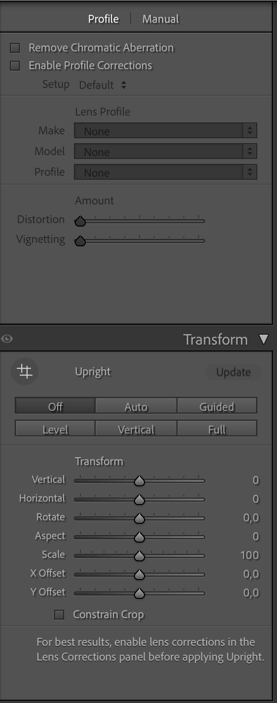
a screen capture of my workflow in Lightroom

Choose your lens and voila

But you can also play around with lens blurs.
Which can be used for some cool, creative effects. Just play with it, and you’ll see the differences the bokeh makes.
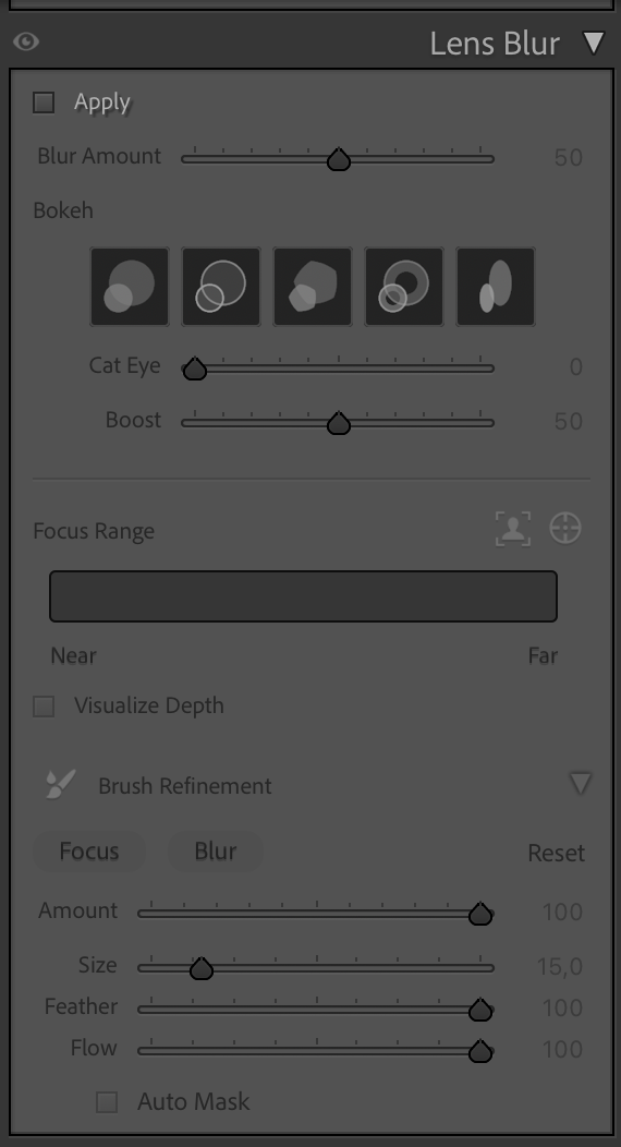
a screen capture of my workflow in Lightroom

You can use this to create some really nice effects in your images.

Vignette

This is also the part where you can add a vignette to your images, which really draws the viewer in.
Or you can use this to take away vignetting added by your lens; I think it was originally intended for that. To be honest, I use it mostly to add a general vignette on the photos, hardly visible, but when you take it out, you miss it.
(BTW, you can also create a vignette perfectly fitting for your subject with the local adjustments, just paint a feathered circle, inverse selection, and use exposure to create the perfect vignette. I also show this in the video.

By the way, do you see that adding grain is down here in the workflow, AFTER denoise….
Makes sense, right? But one thing that you might not know, or have tried yet, is to add grain to an image that was very noisy and after noise reduction looks a bit like a painting. By adding some grain, you can bring those images back to life. In most cases, our brains are sometimes easily fooled.
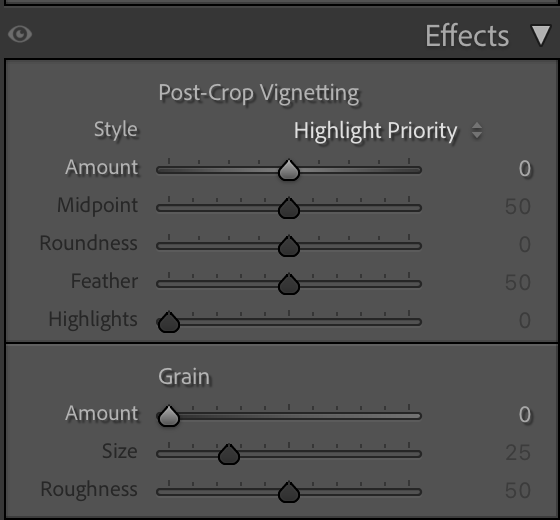
a screen capture of my workflow in Lightroom

Here, we can add or remove the vignette and add grain, if needed.


Conclusion, Workflow = Lightroom

Lightroom is an awesome addition to every workflow.
As with most RAW developers, they created the software with the workflow that works best in mind.
This means it’s often best to just sit down and slowly work your way down, try every setting, and see what it does.
I’m 100% sure you will get used to using Lightroom in a few hours and feel right at home in a few days, and say you never want to be without it in a week or two 😀

And because videos are sometimes easier, I have recorded a 2-hour Lightroom for beginners Digital Classroom.
And if you want even more information about Lightroom and Photoshop, get my 7.5+ hours tutorial via our webshop
If 7.5 hours is a bit too much, I also have a shorter video 100% aimed at Lightroom
And if you already use Lightroom, you can also order my full Lightroom Preset pack here.
It’s the same pack I use myself.

https://frankdoorhof.com/web/wp-content/uploads/2024/09/FRANK-did-you-know-adobe-lightroom-photo-24-1080.jpg 1080 1080 Frank Doorhof https://frankdoorhof.com/web/wp-content/uploads/2015/03/studioFD_Logo-1FV.png Frank Doorhof2026-03-29 12:59:112026-03-29 14:30:40Sit down and listen it’s about workflow in Lightroom

BenQ Creative Pro PD2770U monitor: a totally new workflow

27-03-2026/in blog, Reviews/by Frank Doorhof

BenQ Creative Pro PD2770U review by Frank Doorhof

Workflow has to be easy

When it comes to calibration and backups, we can always talk about backups, but for today, let’s talk about something that a lot of photographers forget or simply never do: calibration. This is the BenQ Creative Pro PD2770U review. It’s the first BenQ monitor with a built-in calibrator.

Let’s first talk a bit about what calibration is, and why it’s important for you and your clients.

But first:
Disclaimer
I’ve been a BenQ ambassador for many years.
I have chosen BenQ due to their dedication to calibration and color accuracy. They did not read the review beforehand and have no input on my opinions.
What I advise my readers is 100% my personal opinion, and I think it is the only way to deliver reliable reviews.

Color Evokes Emotion

When we watch movies or look at art, there is an almost 100% chance that the creator of that piece of art/movie has spent hours determining the exact color he/she uses for a particular scene or work.

Movies

Think about movies like The Matrix, where we see a slight green cast when we are inside the matrix and a slight blue tint in the real world.
Same thing with Terminator, the start-scene is incredibly blue while the rest of the movie has a more warmer tint.
This is not an accident; it’s done 100% intentional.

Photography

But also think about your own photography.
How many of you empty the card, look at the images, and go “done for today, it’s perfect”?
Most of the time, we will adjust the exposure, contrast, and maybe add some sharpness.
So I hear you think “this is my workflow, so I don’t need color calibration”.
Sorry to burst your bubble.

When we talk about the calibration of a device, we don’t just talk about color; we talk about much more.
Including the perfect black point, where we see all the shadow detail, and the perfect white point, where we don’t see any clipping in our images.
And of course, don’t forget about the so-called Gamma curve, which makes sure we see a nice smooth curve from black to white.

Let’s quickly dive further

When we look at colors in the digital domain, we first have to have a base to build on.
When we look at our TV sets, for example, we talk for example a bout REC709 and BT2020 in most cases.
Maybe you have already seen these 2 settings on your screen.
The REC709 colorspace is for standard movies, and the BT2020 colorspace is for HDR movies.
And some TV sets will have the label “Native”, which means literally the native colorspace of the screen itself.

When we talk about photography/design, we mostly use 3 colorspaces.
sRGB, AdobeRGB, and ProPhotoRGB.
The first 2 can be stored as JPGs, ProPhotoRGB must be stored as TIFF.
So why is that?

When we look at color spaces, we are, in essence, determining the maximum “performance” of the colors.
sRGB will show great colors, but it won’t give you the saturated colors of AdobeRGB, and ProPhotoRGB is even more saturated.
For now, let’s focus on sRGB and AdobeRGB.

A color space needs space

As we have seen, we can have several color spaces.
But how do we make sure we use the right one, and how do we make sure …….. loads of questions right?
Don’t worry, it’s actually not that hard.

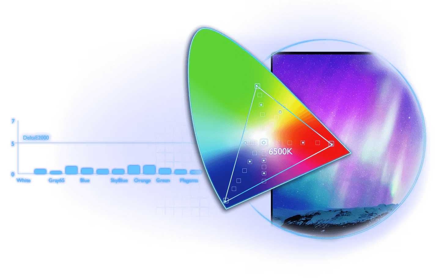
A color space is nothing more than a table where you can find coordinates for the colors inside that space.
You probably already know the names from these coordinates, x,y,Y, or in other words, HSL.
Hue, Saturation, and Luminance.

Now that we know that each colorspace has a table with the coordinates of the colors, it’s important to know in which colorspace we have to work, and how we make sure that what we see on the screen is also what we see in real life.

Horses for courses

When we publish on the web, we use the sRGB color space.
It’s a smaller color space, and this means it’s highly compatible with smartphones of older generations, laptops, TV sets, etc.
In most cases, sRGB will look fine.
Also, when working with a non-colormanaged app or operating system, sRGB is often the only one colorspace that looks right.
So when you deliver to clients… It’s often best to choose sRGB.

Personally, I love to work and store my final results in AdobeRGB.
You can always do a near-perfect conversion in Photoshop from AdobeRGB to sRGB.
Do make sure you are also using a monitor that can display the colorspace as accurately as possible.
Over the years, monitors have gone from 95 to 99% Adobe RGB accuracy, so you can get a perfect result with the new generation screens.

Workflow kills

Now that we know how a colorspace works, we have to choose one to work in, and we need to know the monitor’s colorspace.
The question that remains open is….” how do we make sure this all fits together”.
In fact, that’s the easiest part, to be honest.

When I look at the work I do for the ISF (Imaging Science Foundation), this often means using external software with a high-end calibration tool and making all the adjustments by hand. In fact, in the old times we had to lift the hood of a TV/Projector and use a screwdriver to adjust the drive and bias, which was not safe or fun.

For screens like the BenQ, I’m taking a look at in a moment, it’s literally all automated (if you want).

So why do so many people “forget” to calibrate, or simply don’t see the need?

To get a proper calibration, it’s always necessary to warm up the screen for 15-30 minutes. I guess that we are then already fully at work and forget.
Or the reason is “the client doesn’t calibrate, so why would I?”
That one is easy to explain; the client is used to his/her screen, and doesn’t need to deliver color accuracy in their work.
Simple example.
How often did you order a scarf and a sweater that looked great in the catalogue, but when they arrived, they looked totally different?
Well, that’s why WE as photographers/designers need to make sure our screens are as accurate as possible.

the BenQ logo for the BenQ PD2770U review

Enter the new BenQ Creative Pro monitors

I’ve been a BenQ ambassador for a long time, and you probably already guessed why. Color accuracy and understanding color are not only my profession but also my passion.
So finding a company that lives and breathes color was feeling at home from the first moment.
And I think BenQ did something incredibly smart. Listen to the market, and do exactly what we want, but even better.

The BenQ Creative Pro PD277oU

It took me a while, but here we are. First off, I love the fact that BenQ recognizes that the market is not Photographers vs Designers vs Videomakers vs Musicians.
When I started teaching workshops many moons ago, one of the things I told attendees the moment video arrived in cameras was that they would better learn how to create short videos because before you know it, clients will choose all-around content-creators instead of sending two employees to an assignment. And nothing has changed.
As many of you know, I love creating music, but this also means taking the photos for the band, creating the artwork, and of course, filming and editing the music video.
As a professional photographer, I have to edit my images, create artwork for workshops, and create videos showcasing my work or tutorials.
We are all-round creative pro’s, and it’s awesome that BenQ now labels us as the multifaceted creators we are.
We need it all.
And boy does the Creative Pro PD2770U deliver!

The looks

Beauty is in the eye of the beholder, but I have to be honest.
I really like the design of the BenQ monitors; they are a nice centerpiece on many desks.

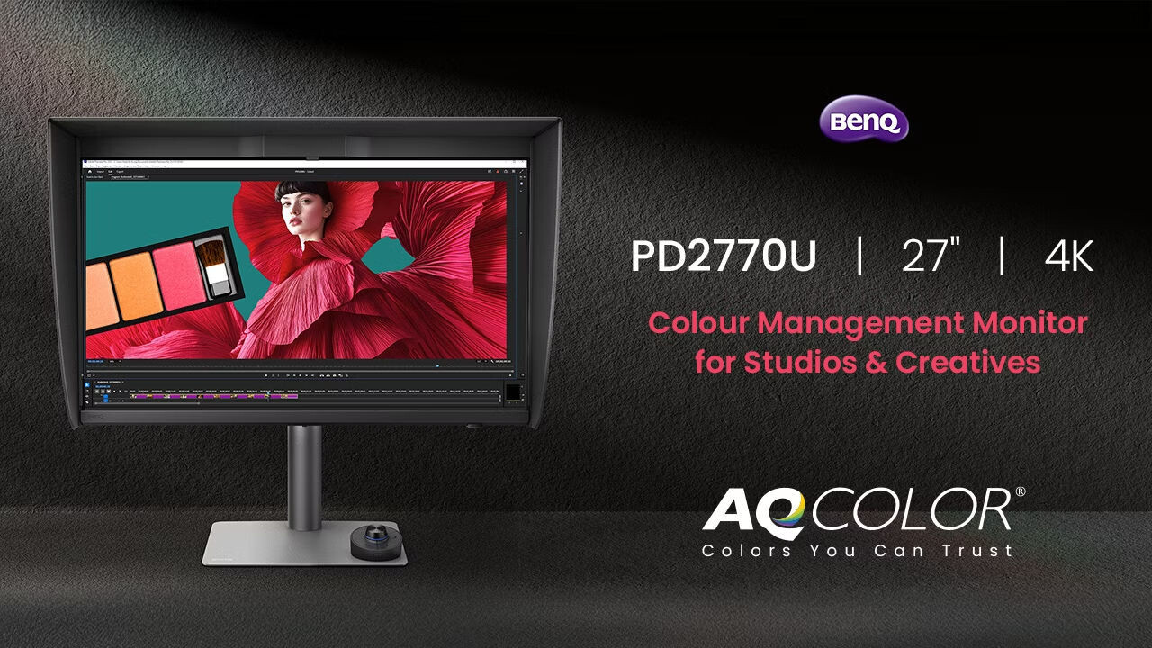
BenQ Creative Pro PD2770U monitor

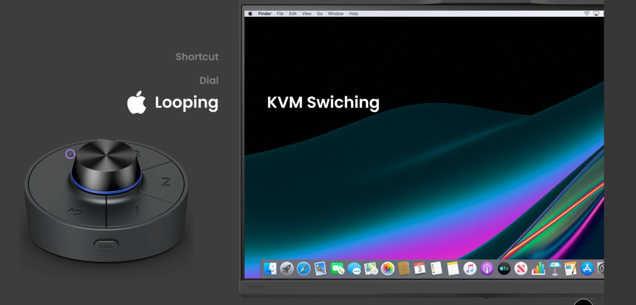
As you can see in the image, the new Creative Pro PD2770U is using the same remote control “puck” as the previous generation.
It’s a very nice addition that can take over the control of the menus, but also is able to switch between color spaces and some more cool tricks.
It’s one of those accessories where at first you think you don’t need it and after a few weeks find out you love it, that’s it’s wireless because you start using it more and more.

the BenQ PD2770 has a wireless hot key puck

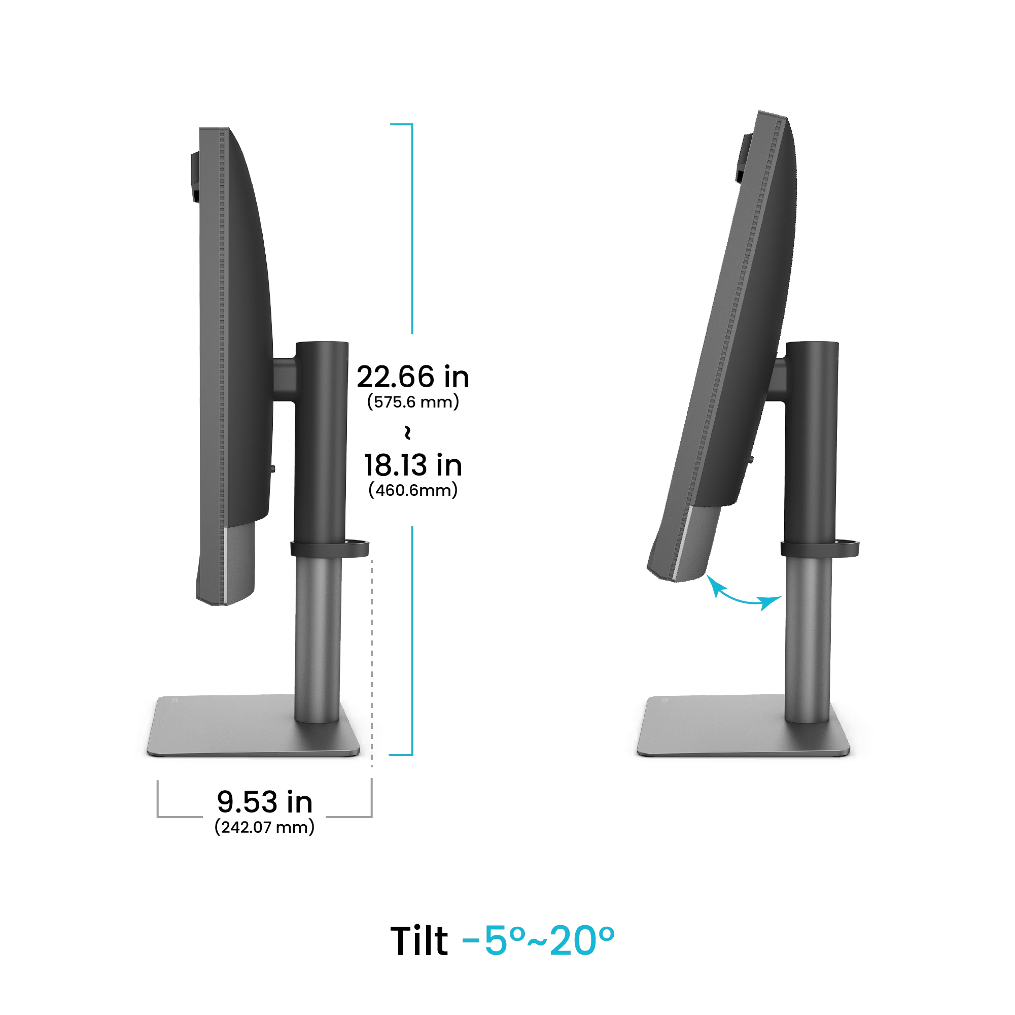
Not every desk and position is the same, so of course, you can adjust the monitor to fit your position.

the BenQ PD2770U kan shift and tiltBut there is one more design change that will make a lot of people really happy.
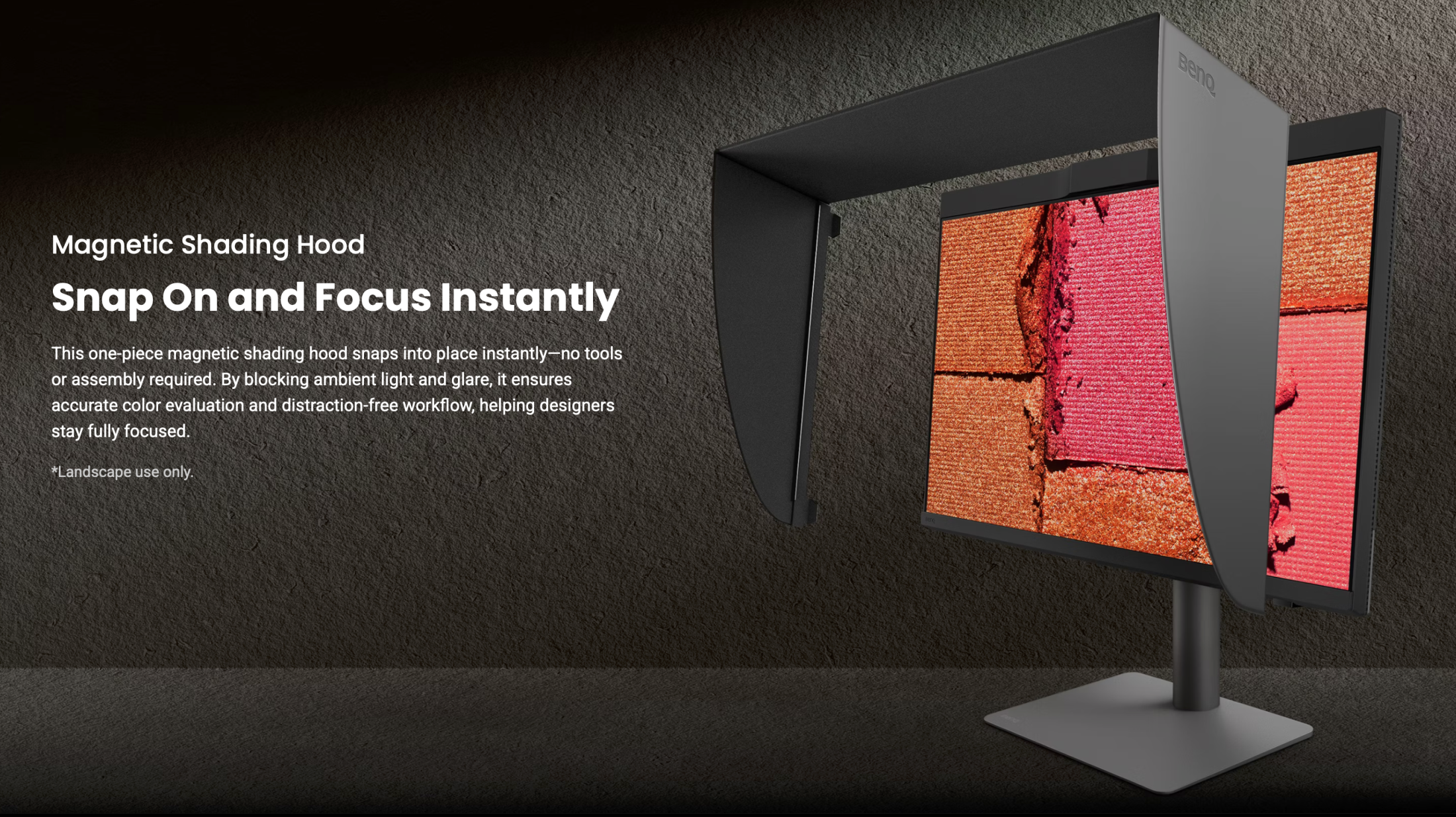
When I ask people, “What is the biggest frustration when getting a new monitor?”, in a lot of cases, you will get the same answer.
“That blxxdy hood”, and I totally agree, it feels sometimes like a puzzle.
And with the new Creative Pro PD2770U, I can honestly say, they solved it.
This is a totally newly designed hood that literally just snaps on via magnets. Love it.

the BenQ Creative Pro PD2770U is the first with a magnetic hood

Specifications of the Creative Pro BenQ PD2770U

The BenQ PD2770U is a 4K 27″ monitor with a 99% AdobeRGB colorspace accuracy.

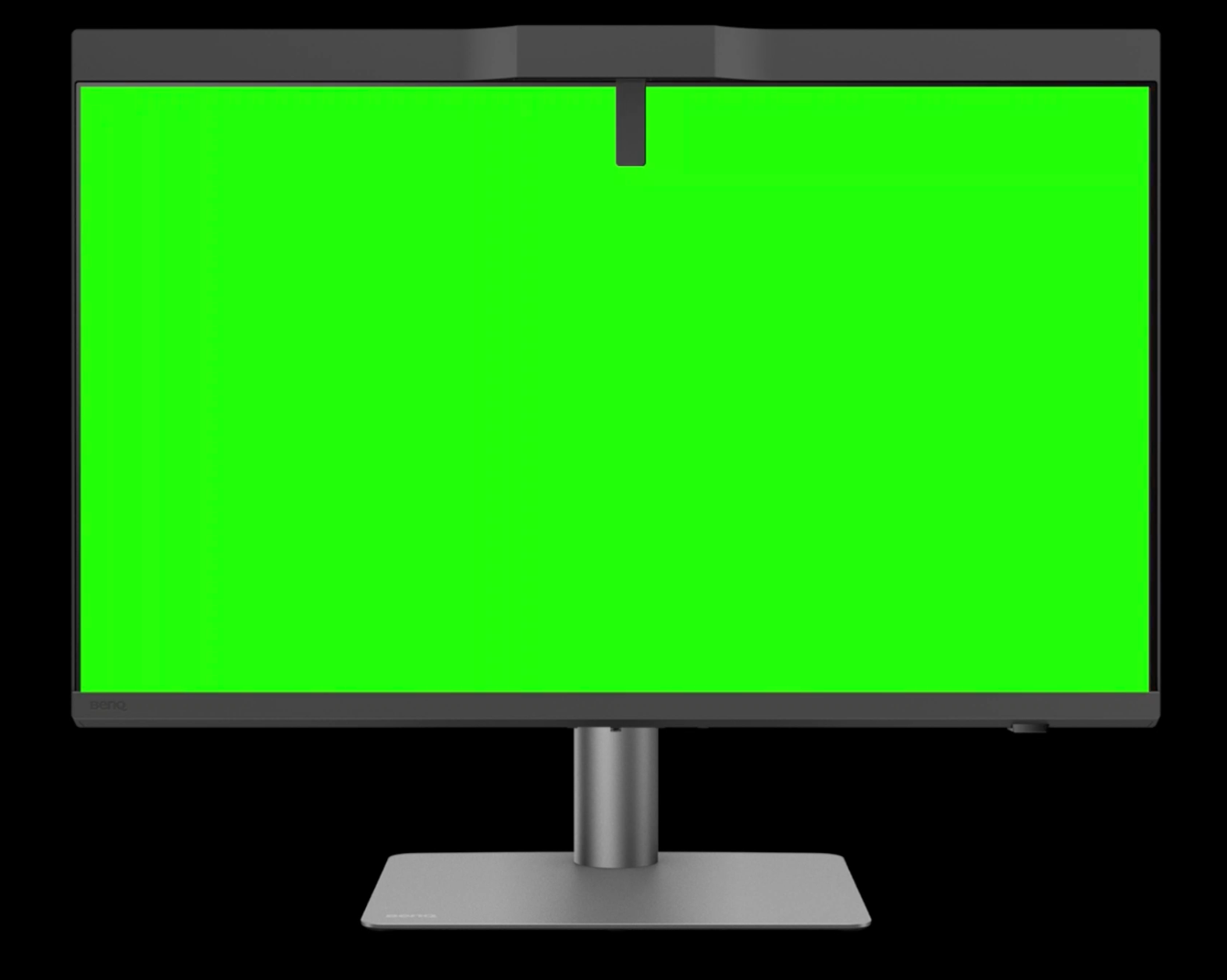
But there is one thing that you have not yet seen on another BenQ monitor. Or did you already wonder what that bump in the middle was?
That’s the brand new color analyzer.
BenQ Creative Pro PD2770U with built-in color analyzer

Indeed, the BenQ Creative Pro PD2770U has the color analyzer built in.
Now, many things can go wrong when a monitor has a built-in calibrator.
The first one is, of course, the position where it measures.
This is why, as you can see in the image, BenQ uses a slightly longer arm, combined with their great uniformity across the screen; this is a perfect way to overcome the biggest issue with built-in calibrators.

But how about deteriorating over time?

This is where you can see BenQ not only understands color, but also the whole workflow.

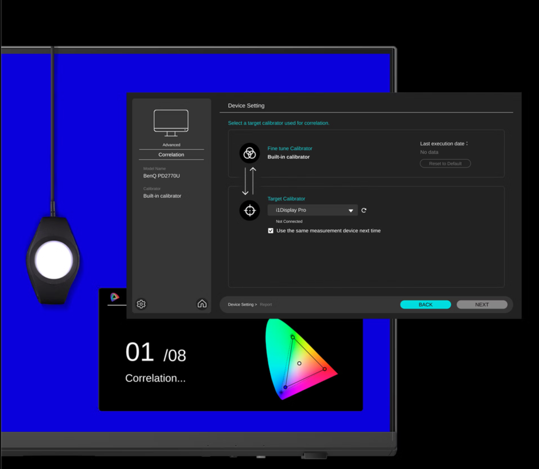
The BenQ PD2770U can also be calibrated with a stand-alone calibrator

As you can see in the image, you can still use an external calibrator and use it to “train” the internal calibrator, if needed.
I cannot express how important this is. When you buy a screen like this, you expect years of perfect performance, and the monitor can deliver this without a problem, but the reality is that both screens and calibrators drift. Never in the same direction for all devices, especially when taking into account the level of detail the meter has to measure. So having a way to keep it all running as accurately as new is a protection of your investment and something other manufacturers would have to take note (or not, of course :D)

Time, and always too late

I know, life runs super fast nowadays. So calibrating your screen is not something you are looking forward to doing, I totally understand.
So what if I tell you, you don’t have to… never again.

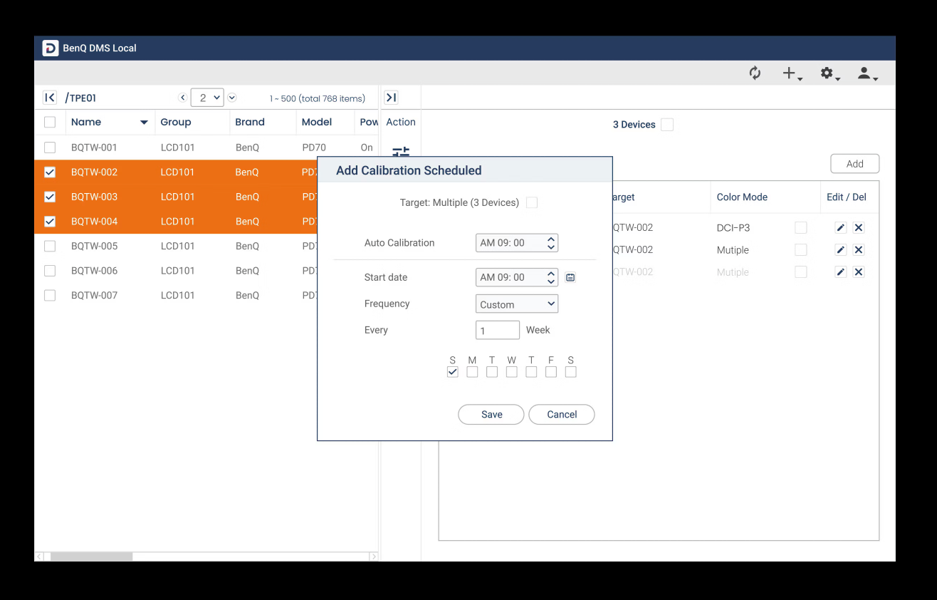
You can enter a calibration schedule in the BenQ PD2770U

Yes, you absolutely see it correctly.
The BenQ PD27770U is part of a new series of monitors that take calibration as seriously as I do.
And that means you can automate the whole process. No more waiting when you don’t want to, no more excuses about forgetting the calibration.
Set the software and forget about it.

But that’s not all, we can make it even crazier.

What do you think about running a whole office building with dozens of screens?
Do you want the design department to be calibrated to setting 1, the photography department to setting 2, etc., etc.?
Just program it in the software, and it will all be done behind the scenes, and nobody will have to think about it.
Never worry about the color accuracy of your intern anymore, or that one photographer who is sloppy with calibrations; it’s now all centrally done.
This is HUGE.

Although I’m a big fan of a “shadowbox” setup, this is not always possible.
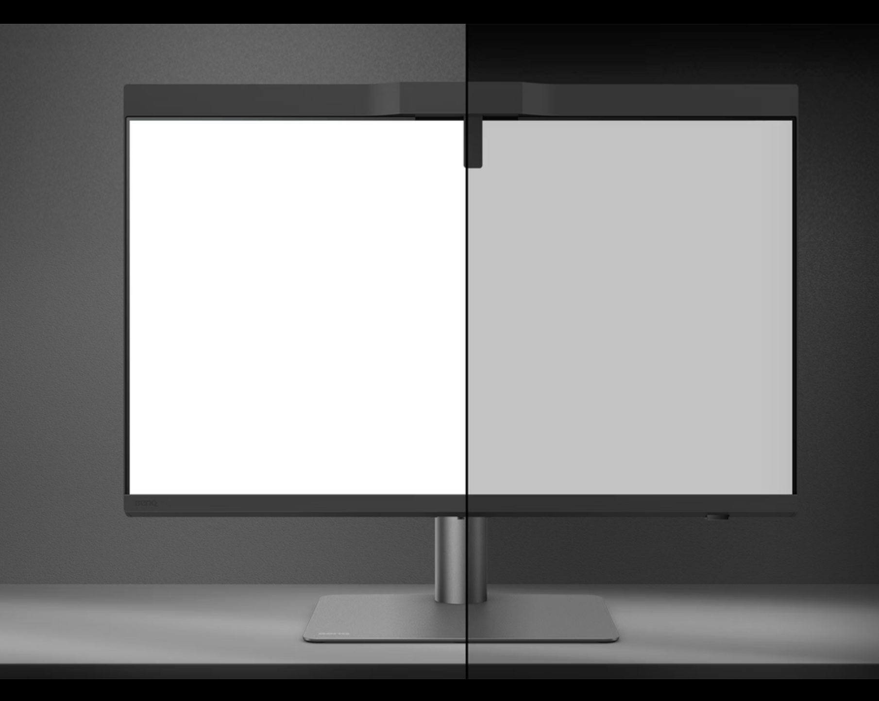
And also there, the BenQ Creative Pro PD27770U has you covered with an available light meter that will adjust the calibration to your surroundings.

BenQ Creative Pro PD2770U

And I’m not done yet

The BenQ Creative Pro PD2770U is full of tricks, as you can see.
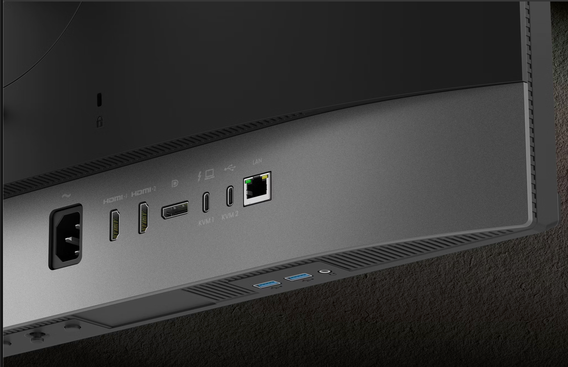
And I did not even talk about the connections.
In the past, I used a desktop and a laptop. But with today’s performance of the MacBook Pro, I don’t see any need for a desktop anymore. So that means I want to connect my MacBook with as few cables as possible, but still use everything I need.

The PD2770U supports the one-cable connect method. (Have to be honest, I thought that up, it’s not an official feature, I think)
Meaning when I’m at my desk, I just plug in the cable from the monitor, and I’m done.
I can scan my images, access my hard drives, and of course use an external keyboard and mouse.

the connections on the BenQ Creative Pro PD2770U

Talking about the mouse and keyboard.
The PD2770U has a built-in KVM switch, which means you can seamlessly switch between machines and use the same keyboard and mouse, very smart and super handy.

Conclusion: Do I like the new BenQ Creative Pro PD2770U?

Normally, I always wonder what to write about a new monitor.
But with the rebranding into Creative Pro, BenQ really raised the bar.
This is an insanely complete monitor with finally a hood that is super easy to put on, a built-in calibrator that can be “trained” as protection of your investment. And I did not even talk about the screen surface that is not only tested and designed for the best possible corner-to-corner uniformity, but also has a beautiful coating for much better blacks and reflection rejection.

It’s a whole list, but I think I covered most.
Of course, you still get a 1-year free Pantone subscription with the Creative Pro monitors.
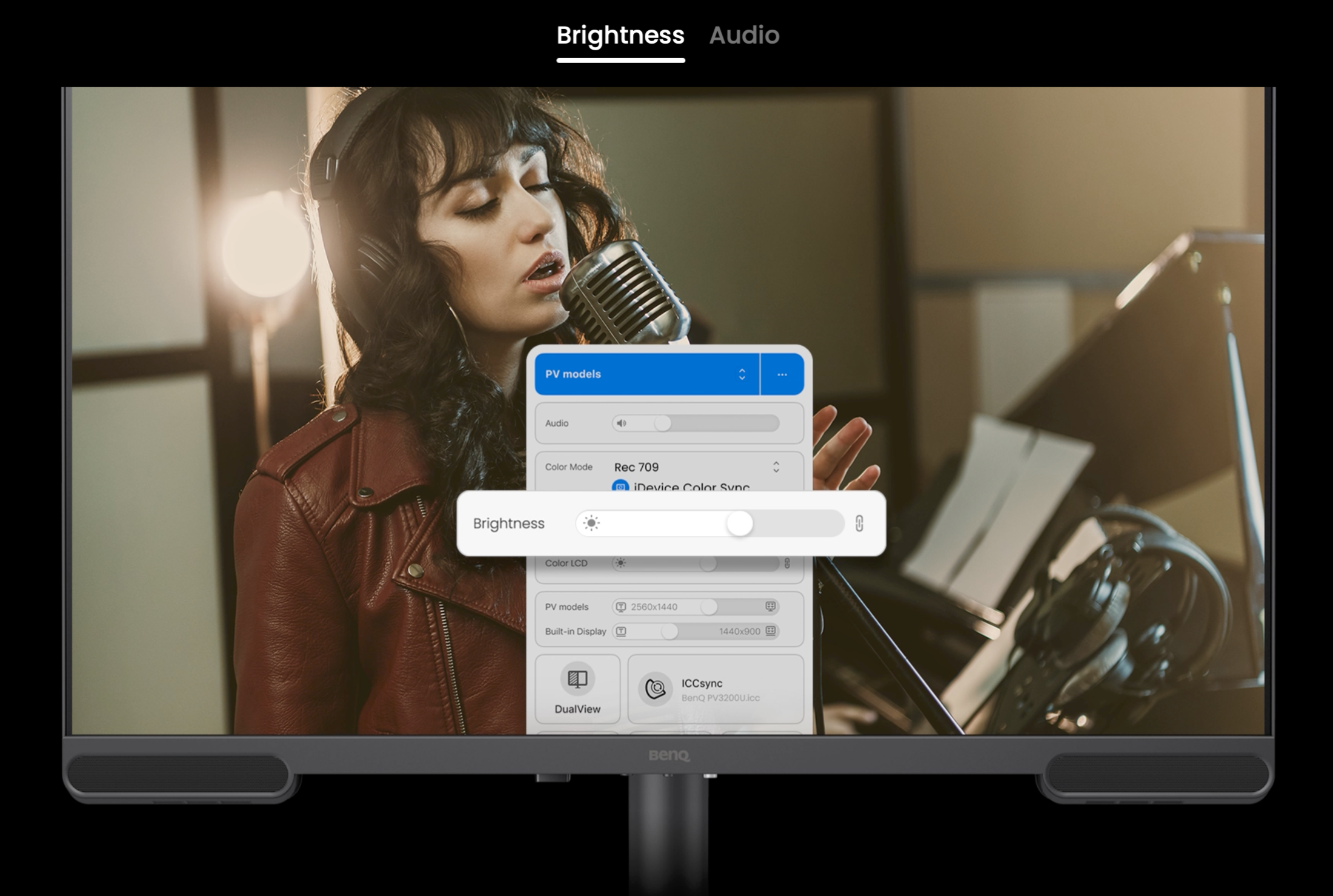
And of course, the BenQ PD2770U is compatible with the Display Pilot 2 software from BenQ.
Read more here.

I think that when you are like us, doing a lot of different things ranging from photography to video editing, the Creative Pro series hits the nail on the head, and I can highly recommend them.

Also want a new monitor and decided on BenQ?

If you live in the EU, drop me an email for a 10% discount code, not only on the BenQ PD277U but on a lot of BenQ Creative Pro monitors.


The BenQ has another monitor specially for MacBooks, with a one-cable connection: the Creative Pro BenQ272U

We are proud that BenQ is a sponsor of our Digital Classroom: a free live shoot from our studio, often with a model shoot. BenQ also supports our explainer videos in the Digital Classroom Playlist

Besides monitors, BenQ also released a tiny monitor to put directly on your camera for viewing your pictures more easily. Check the review of the PVS7 on-camera monitor

https://frankdoorhof.com/web/wp-content/uploads/2026/03/bH8Jn0U8HQ4wCxTh.jpg 720 1280 Frank Doorhof https://frankdoorhof.com/web/wp-content/uploads/2015/03/studioFD_Logo-1FV.png Frank Doorhof2026-03-27 18:00:342026-04-08 13:24:03BenQ Creative Pro PD2770U monitor: a totally new workflow

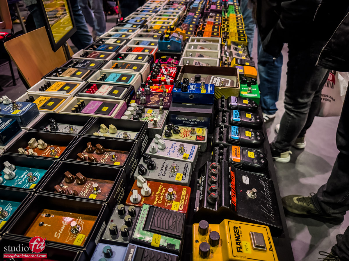
Vintage guitar show Veenendaal

24-03-2026/in blog/by Frank Doorhof

Today, nothing about photography

Well, that’s not completely true, of course.
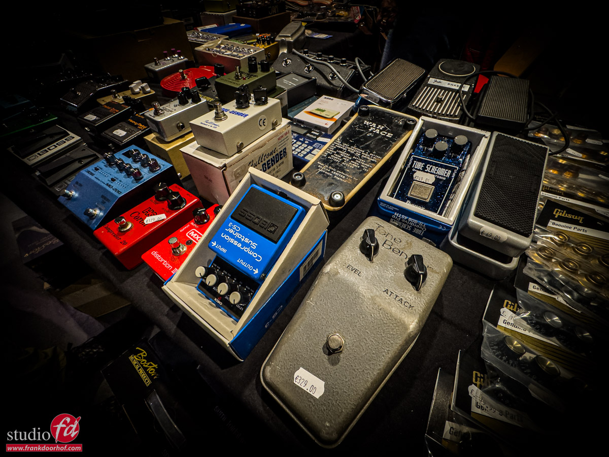
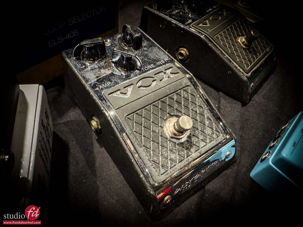
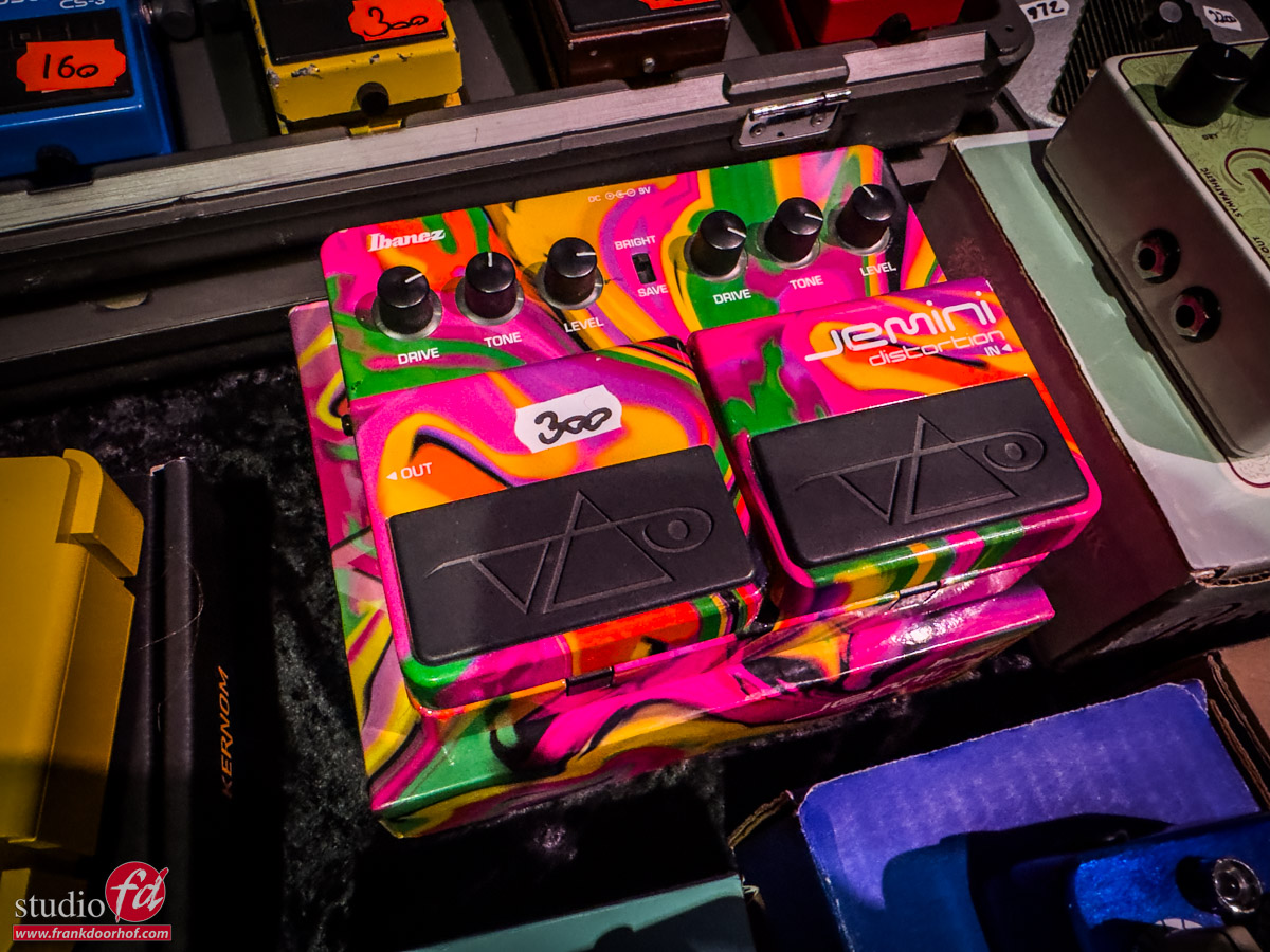
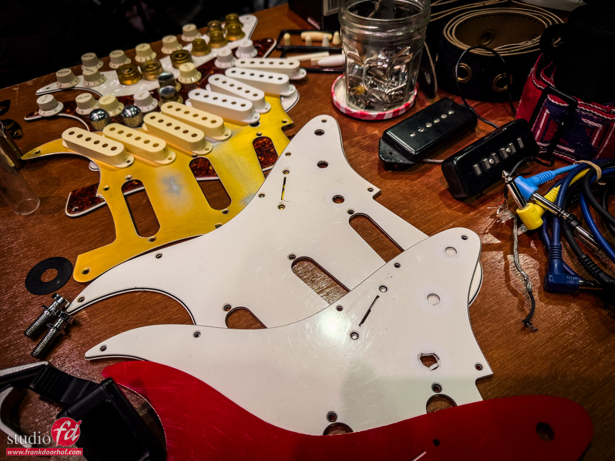
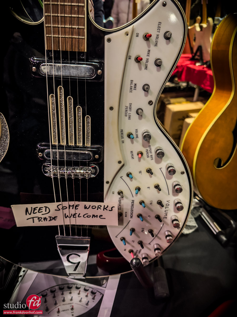
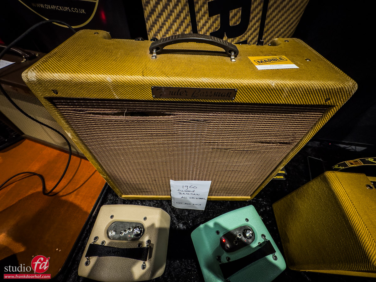
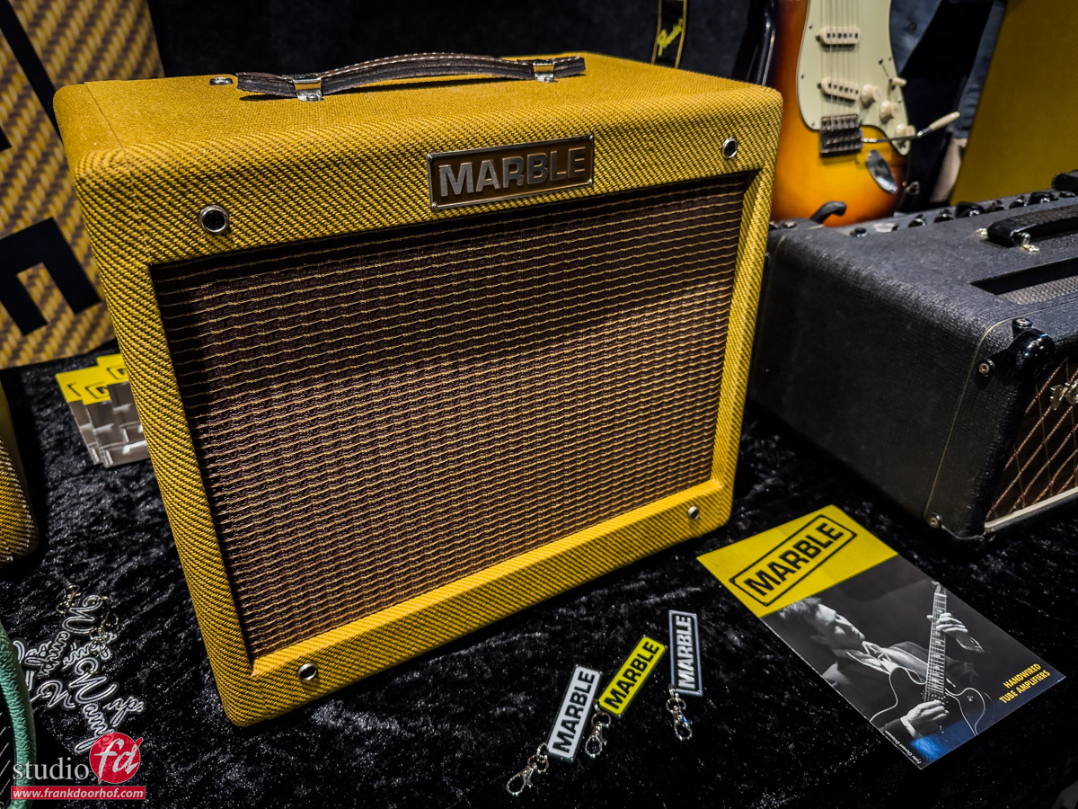
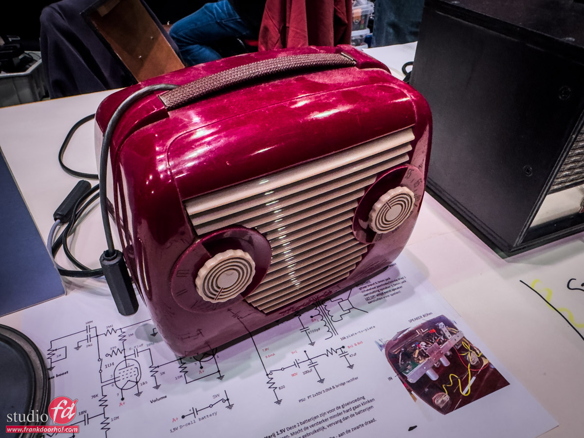
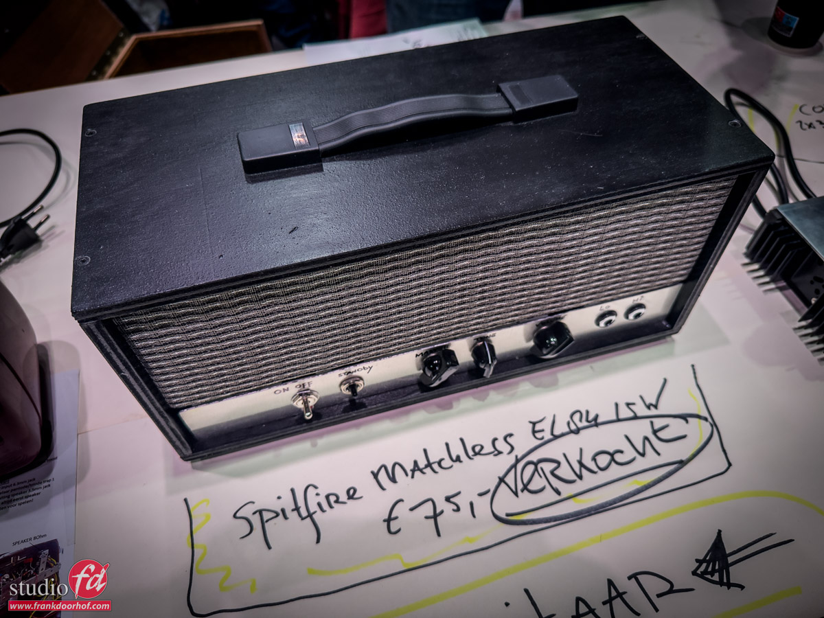
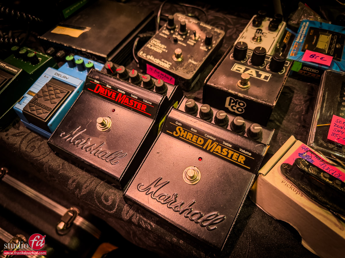
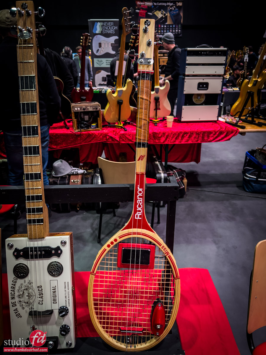
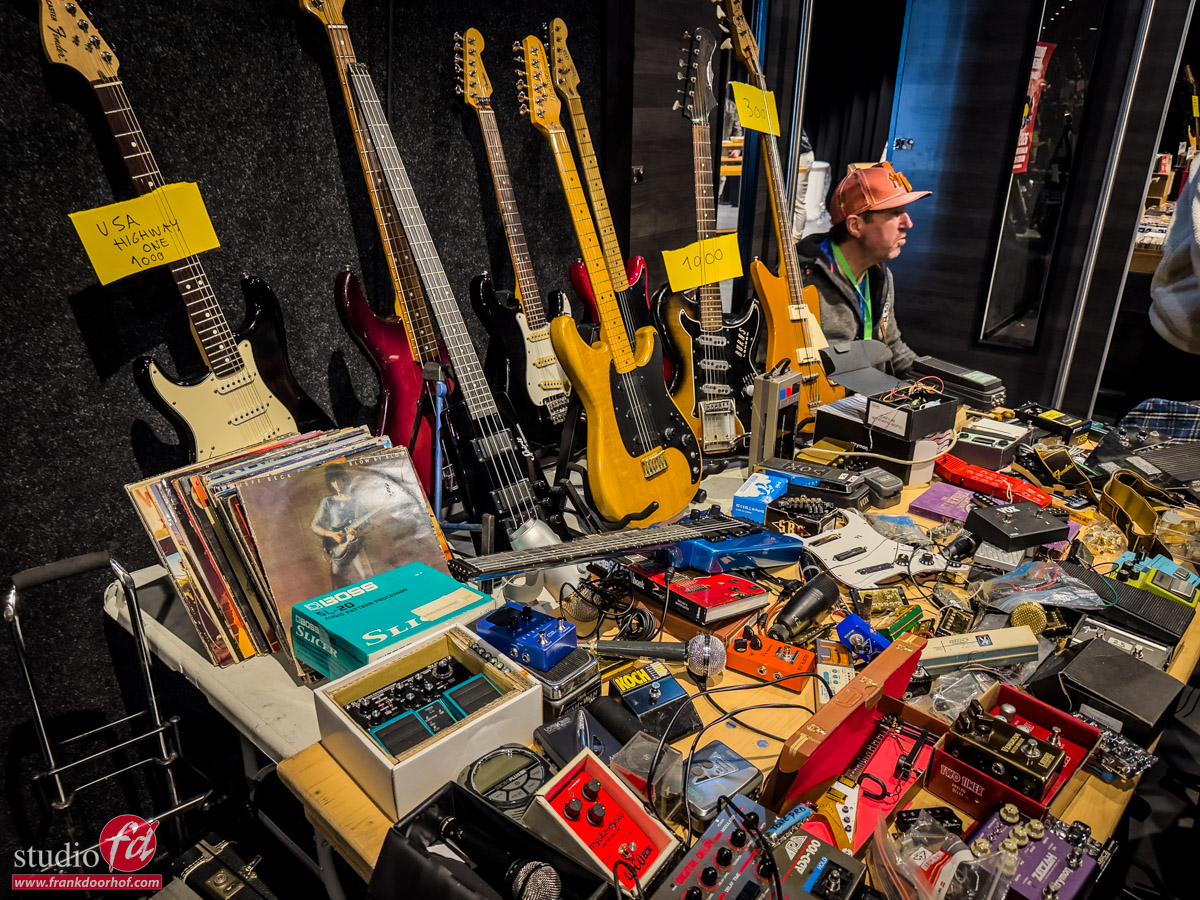
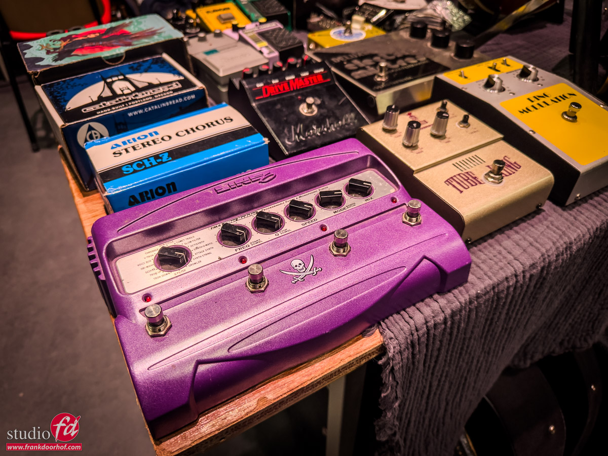
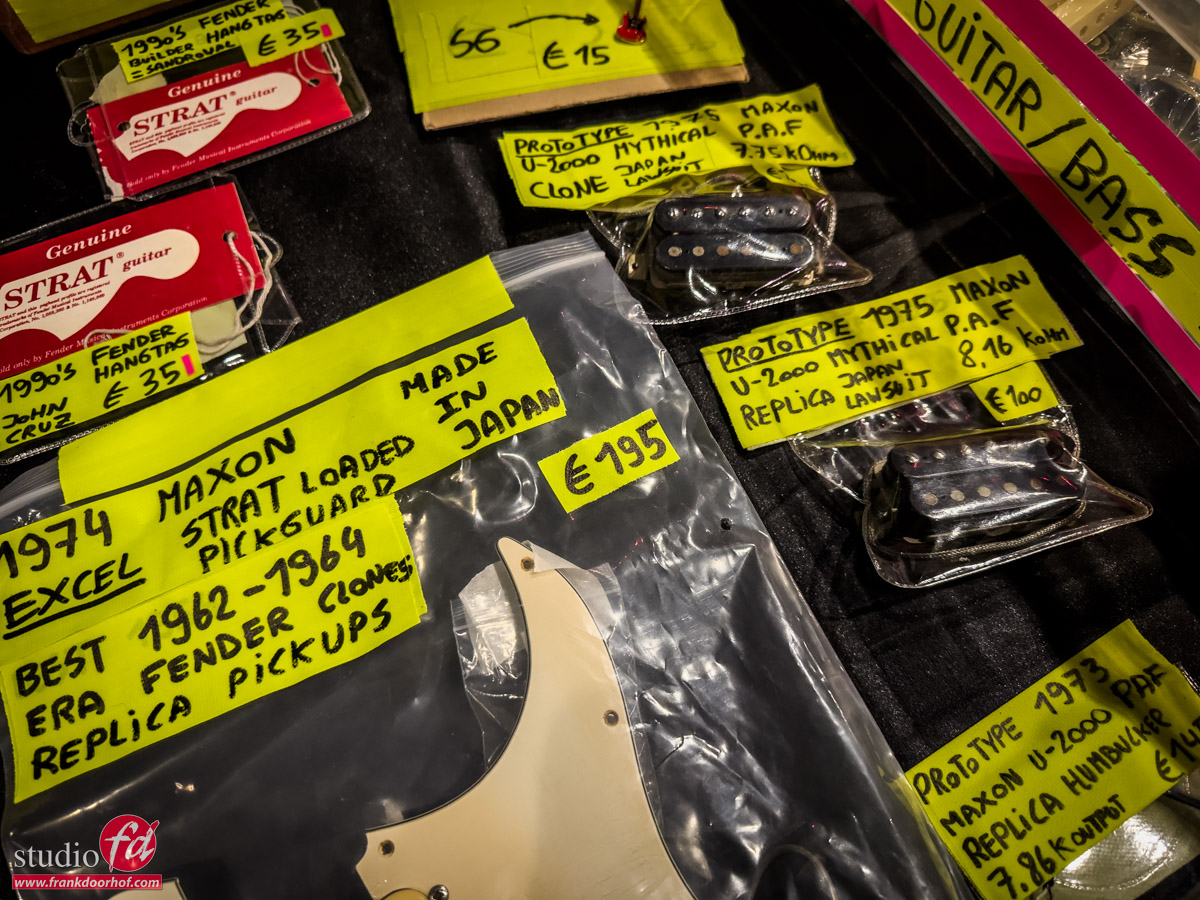
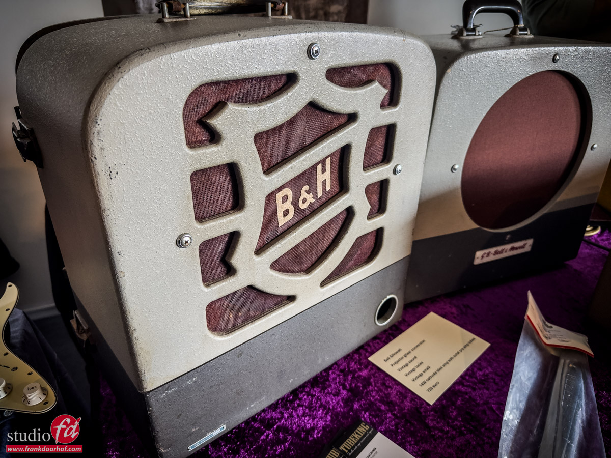
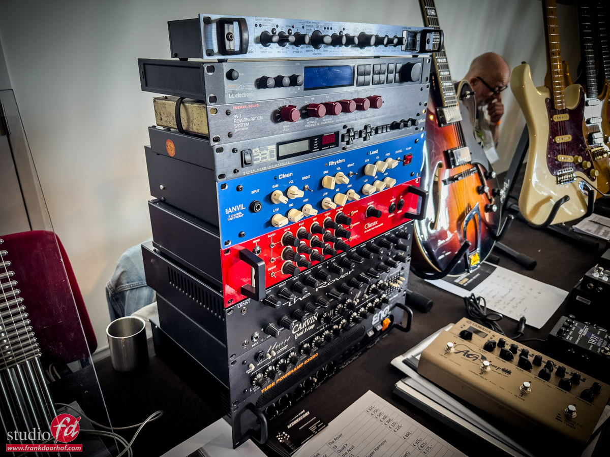
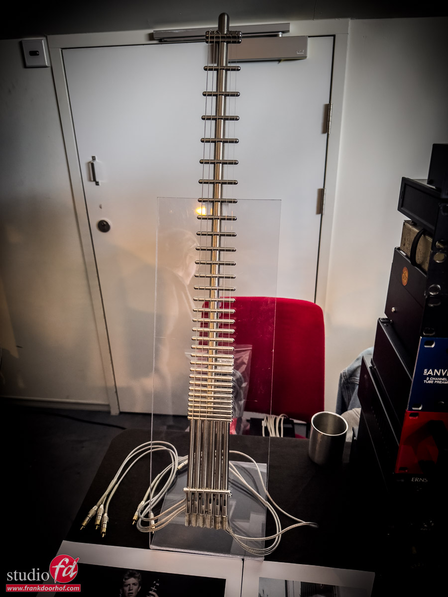
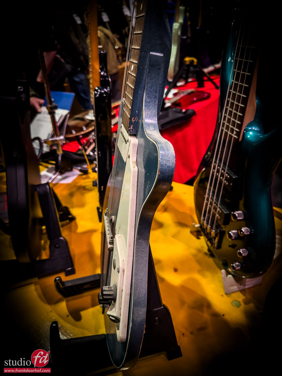
But today, no tips or reviews, but I wanted to share some images I shot with my iPhone during the Vintage Guitar Show in Veenendaal.
A huge collection of mostly vintage guitars, ranging from affordable to…. are you insane prices.
And of course, loads of effects and parts.

So today, some of the images from this awesome event: the Vintage Guitar Show Veenendaal (2026)


https://frankdoorhof.com/web/wp-content/uploads/2026/03/Vintage-gitaren-show-Veenendaal-March-21-2026-40.jpg 1200 900 Frank Doorhof https://frankdoorhof.com/web/wp-content/uploads/2015/03/studioFD_Logo-1FV.png Frank Doorhof2026-03-24 16:24:012026-03-25 16:41:08Vintage guitar show Veenendaal

Lightroom for beginners video

22-03-2026/in blog, Visions and technique, Webinars and instructional videos/by Frank Doorhof

lightroom for beginners

Lightroom is awesome and super easy to use

For me, Lightroom (classic) is the beating heart of my business.
It holds all my photos, I can edit inside of Lightroom, use keywords, and a lot more.
With smart albums, I can quickly create a portfolio or presentation, or just see all the images I shot with a certain camera or setting.
With the map module, I can see exactly where I shot my images. This is a great way to relive your trips, but also to share awesome locations with other photographers.
And…. there is a lot more. (Lightroom for beginners)

And probably this is why some people don’t want to start with Lightroom, because it can look a bit intimidating.
I started with Lightroom from version 1, and in all honesty, there is one thing that stayed absolutely the same over all the years. Lightroom is super user-friendly and has nothing to be afraid of.

I almost dare to say that everyone who can control a camera can work with Lightroom without needing a manual.
But there are, of course, some things you have to be aware of when starting. So in this video, I show you how to start from scratch, share some retouching tips, how to use the smart albums, and a lot more.
And don’t worry if you are an absolute beginner, we really start at level zero.
But I also share some tips for the more advanced Lightroom user. Click below on the image for the free webinar: Lightroom for beginners

Disclaimer: 
Lightroom is updated a lot.
In fact, only a few days after this episode, it already added a lot more AI options.
It doesn’t change anything for the video, but do beware that some things might change over time.

Want more, and I mean A LOT more?
Check out my video about Lightroom and Photoshop. (7+ hours)


Soon, we will host a webinar about Photoshop

My workflow in Lightroom more in depth


https://frankdoorhof.com/web/wp-content/uploads/2026/03/Digital-classroom-social-media-18-feb-8-e1774787624979.png 880 1080 Frank Doorhof https://frankdoorhof.com/web/wp-content/uploads/2015/03/studioFD_Logo-1FV.png Frank Doorhof2026-03-22 18:00:472026-03-29 14:41:24Lightroom for beginners video
Page 1 of 3123

Newsletters

Subscribe to our newsletter for updates, discounts, and much more

English news letter
Dutch news letter

Interesting links

Here are some interesting links for you! Enjoy your stay :)

Snel naar

  • Blog
  • Learning with Frank
  • News etc
  • Reviews
  • Shop products & books
  • Contact

Contact

Studio Frank Doorhof:
Constructieweg 8
8305 AA Emmeloord

The Netherlands
+31-6-14522327

Or Email : info@frankdoorhof.com


© Copyright 2000 - - Frank Doorhof
  • Link to Facebook
  • Link to X
  • Link to Youtube
  • Link to WhatsApp
Scroll to top Scroll to top Scroll to top