The power of composition Pt I
Composition is one of the most powerful tools you have, but also often the one that is hardly used, or the wrong way. Let’s take a quick look today at some very simple things you can do to spice up your shot.
When we shoot an image the layout of the camera is (often) fixed to a certain ratio, the most common ratios are 4:3 and 3:2.
Some cameras will allow you to shoot in different formats but they will (of course) do this by cropping in camera, meaning you use less pixels, and to be honest that’s not something I would advise for the simple reason that you can never get something back that was not there from the start, but you can very easily take something away in Photoshop or Lightroom. So my advise is to always shoot in full resolution.
Landscape vs portrait
A few months ago a client asked me for a shot in portrait mode to represent my work, much to my surprise I had to look really hard, I do have a lot of portrait mode shots of course but somehow the ones that “represent my work” are all in landscape mode. This actually triggered me to write this blogpost. When I look at my old work I see that I often switched between landscape mode and portrait mode, but the more I progressed the more I started shooting in landscape mode, the reason for this is actually pretty simple.
Model vs story vs ……
When you start shooting models the main attention point is often well….. the model, you try to fill the frame with the model as much as possible, you don’t crop the head etc. The more you progress the more you will try to play with this, you will start cropping the top of the head to draw more attention to the eyes etc. Sometimes this can be really tricky to explain to a customer by the way. I always tell them that it is to draw attention to the eyes, and when you show two different shots next to each other it’s often immediately clear…. but in all honesty we don’t need the top of the head, we know it’s there right?
The more you progress the more you will start to give attention to the “story” and you will very quickly find out that the surrounding areas are almost as important (sometimes even more important) as your model. Don’t show the area and you end up with a shot that could have been taken anywhere, show the surrounding areas and you end up with something unique. Very quickly you will also find out that shooting landscape mode is much easier in that case. Now as soon as you start doing that with portraits (headshot) you will find that the images become much more engaging.
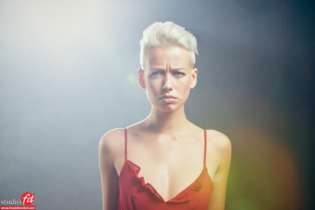
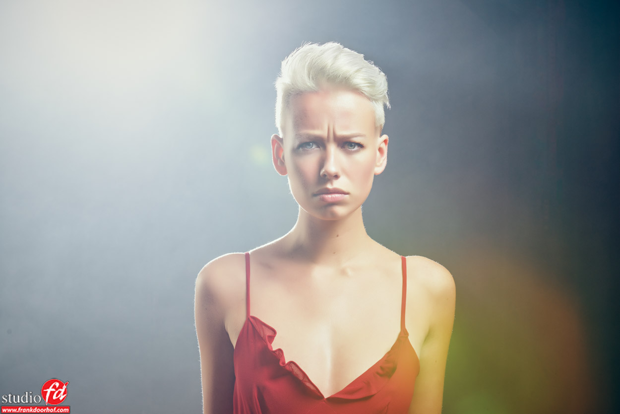
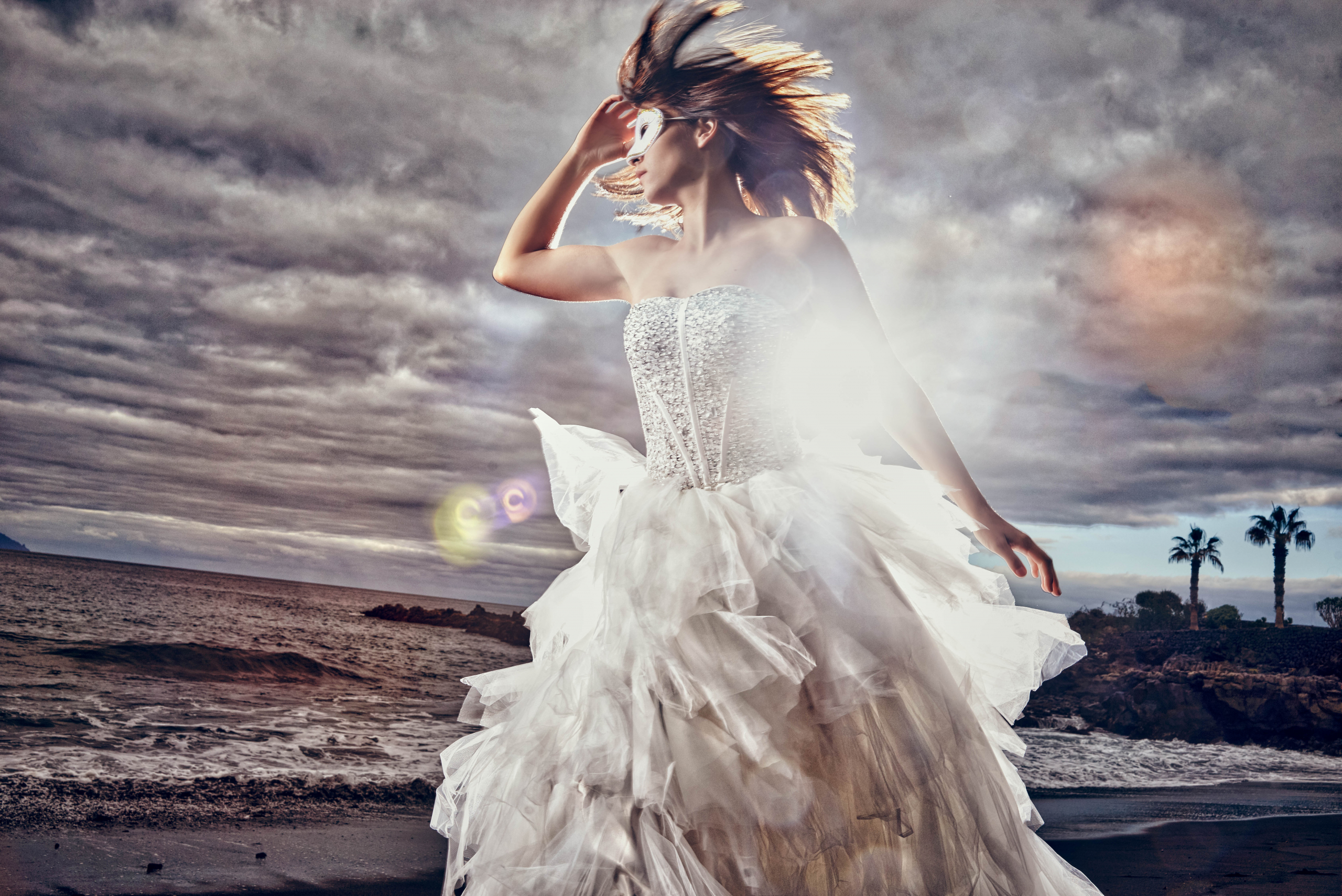
Take for example this portrait from a session with Lenaa.
She is right in the middle of the frame (something I normally don’t do) but because of the area around her, the lens flare, the bright spot on the left you get a very engaging portrait (and the expression also helps).
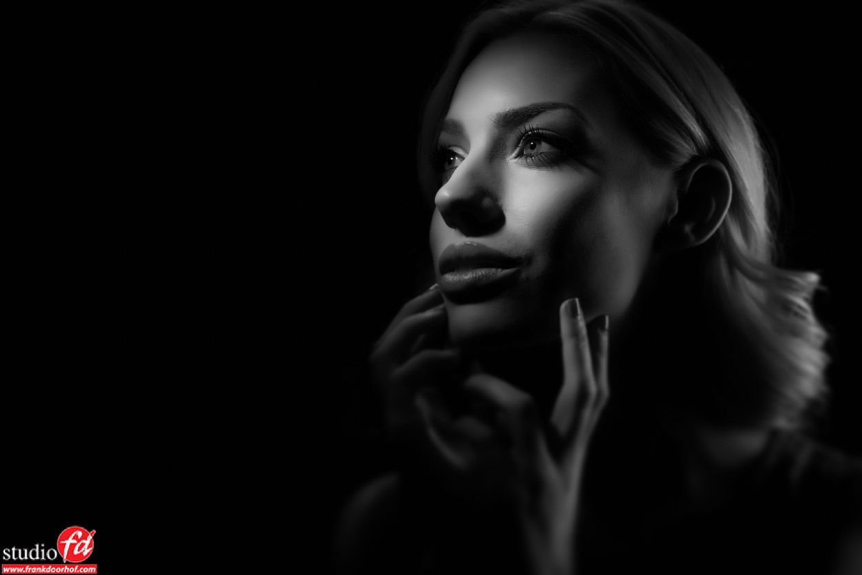
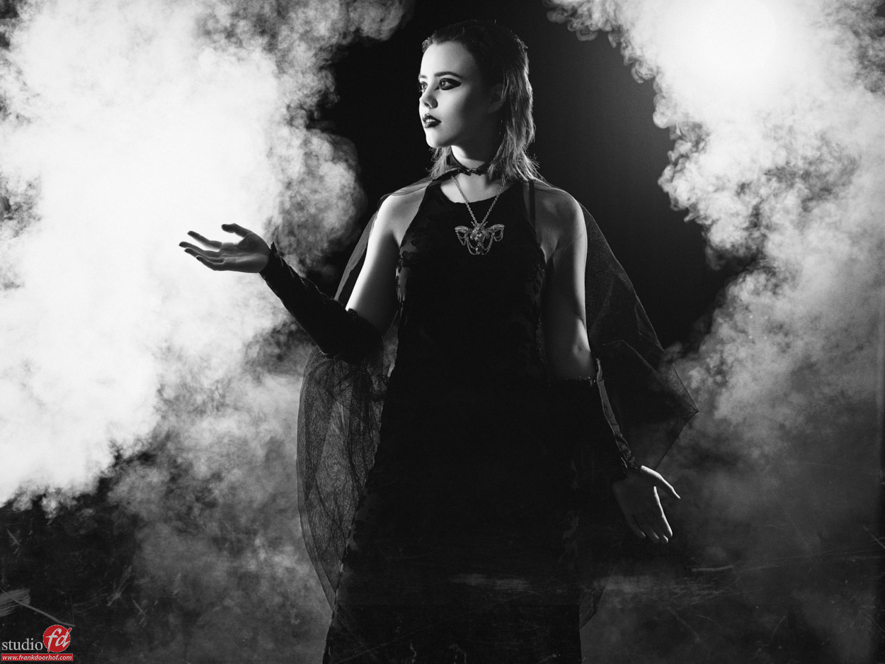
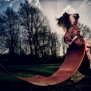
Now if you place the model to the side of the frame and let her look to the left you get something really interesting.
This is what I call “our hardwired brain”
We are hardwired to read from the top left to the bottom right, meaning our eyes are used to this, this also means you can play with this. If you place a real attention grabber in the bottom right for example people will have a problem to leave the image quickly and will be almost forced to look at the image again before leaving it (this is also why our logo is in that area, and the red helps a lot). More subtle is letting the model look to the left, as you ca see in this shot that really helps, the only “problem” is the accent light on her hairs on the back of her head, but in this case I did not crop this because I actually really like it.
More in tomorrows blog.
For more in depth information on model photography, lighting, metering, retouching etc. check out my book “Mastering the model shoot” or the instructional videos you can order via this site, and of course my videos on www.kelbyone.com

Hi Frank,
I am a bit puzzled: you write “We are hardwired to read from the top right to the bottom left”. I always thougth it was the other way round (for European languages).
Then you say: “If you place a real attention grabber in the bottom right” and “this is also why our logo is in that area”. But I see your logo in the bottom left?
Please do not take this as an offense, I merely want to ask some clarification.
Best regards,
Walter
Changed it. Thanks for that I somehow put it in the wrong order.