Working with portrait or landscape mode
Composition is one of the things that is always very important in a shoot, but what is the perfect composition?
Well to be honest… there is no perfect composition.
Of course there are those “rules” like the rule of thirds but let’s be honest they just give you a “this will work” general rule of tumb, but it’s often not the most interesting shot possible. In my opinion it’s incredibly important to play with the way you shoot.
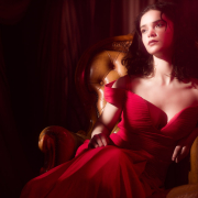
Take for example these two shots.
One is shot in the so called portrait mode.
It draws all the attention to the model and to be honest it looks pretty nice.

However as soon as you change to landscape mode for me the whole image gets way more interesting.

For me the inclusion of the wall really tells a totally different “story” and adds to the image.
This works especially well when you’re on a location that’s interesting, way too often photographers just “focus” on the model and shoot it too tight, don’t be afraid to show where you are shooting, so go a bit wider in lens choice and show some of the backgrounds, and you will find out that often the landscape mode works really well. When I look at my images I have to say that most are indeed in landscape mode 😀
Good luck.




In landscape, the negative space can also be used to add text for commercial use…