Angela composited
Once every few weeks there is a very special workshop called Advanced II.
In this workshop I actually take a giant risk every time I teach it, the topic of the workshop is compositing.
The first 2 hours the students get a theory seminar about getting better shots based on not only model photography but also on street, sports, live and privat photography, this is always a very nice and inspiring part to teach, actually it’s also part of the tour we are doing “why fake it when you can create it”.
After this seminar the model is ready but we first select backgrounds, I want to have most of the shots we use for this seminar from my own library, in other words I don’t want to use stock that much. One can of course easily buy some stock images but for me most of the fun is knowing you have build everything from your own work. I do this first to determine the position and angle of view I place the lights and shoot from. Now the challenge lies in the fact that I set my self the task to do the compositing while the model gets ready for the next outfit, and trust me that’s sometimes not that long. Overal most composites you see in these workshops are done within 30 minutes.
Today I walk you to three of them very quickly we did last Friday (the 13th) with Angela.
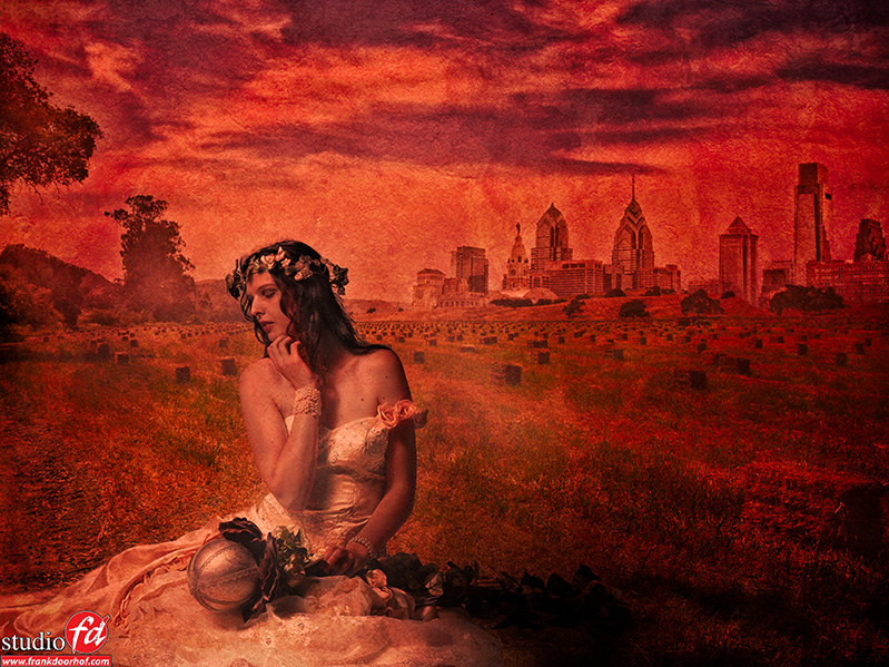
In the first image I used the landscape from one of our trips to the UK/Ireland.
The skyline is Philidelphia.
And the model was shot in our studio in the Netherlands, so a very international image.
In this image I wanted a more painterly look so I created a more tinted and structured background. The structure can be a shot of concrete for example, but you can use anything that has some structure.
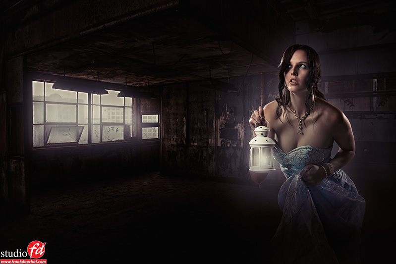
For the second one I used less elements.
The scene was shot as HDR in Boston in an abandoned warehouse where I taught part of my workshops in 2012.
I darkened the area a lot and added some light from the window. The model was placed in the scene and also darkened to create a more “eerie” feel. Finally I added some light to the lamp she is holding.
Photoshop work for this one was the most easy actually, most is done by painting on a new layer and blurring it in several stages to create a “mist” like light quality.
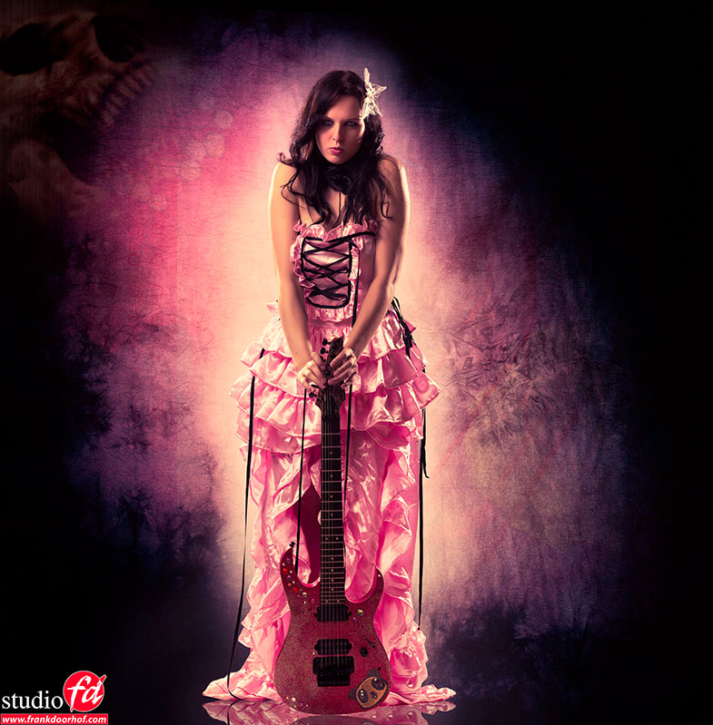
Believe it or not but this one has the most elements.
Although most are so faded you can hardly see them, unless you take them away that is 🙂
The reflection is Photoshop. The model was first placed on a stock pink background, later a background with out of focus lights was used and a background with some flowers. Than a concrete shot with a drawn vignette was used as the main scene. The funny thing is that (as mentioned before) when you take out any of the very faded elements the image lost it’s power/look, although one of the layers was just shining through at 15%, for me it’s in the details, you can do without but somehow it just doesn’t look finished if you know what I mean.
All images were tinted to make the look more “convincing”, this is almost always my final step, you can do this on a new layer with the paintbucket and mix that (overlay modes like multiply or soft-light work great) or use a filter like Alien Skin Exposure 4 (love that one).
Now we have one doubt, which do you prefer?
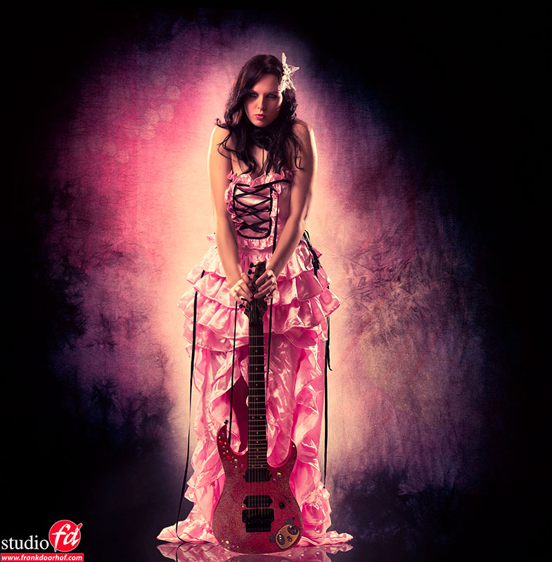
The one you see on top with the little skull in the corner, or this one?


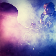


Prefer not the skull, does not contribute to the shot. Angela Dekens is a great posing model. Love to work with her as well.
Hi Frank,
The more I look at both images the more I like the one with the skull (while first impression was not to be honest) for me the story is stronger. First 1 she looks like a prinses but in fact she is the rockbitch. An image which is fooling you
In the second one I still asking myself what she (image) tells me?
That is my emotional reflection 🙂
And yes, she is a beautiful model!
Gr Stefan
Frank, you are beginning to stray into the realm of Highly Destructive Retouching.Instead of pushing photography, you are pushing post production, which is not photography, Please never get bored with teaching those who are novices. How about telling us how you use speed lights on location? Some of us refuse to go “Hollywood”, even if it means saying goodbye to you.
This is absolutely ridiculous. Photographers are artists and artists create things. I suppose you are one of those “photographers” who don’t believe HDR is photography either? Our cameras do not capture reality – they trick our brains (using contrast and shading) into believing that a 2D image has the depth that the original 3D scene contained. If you want “real” photography stick to reading newspapers.
You shoot your way and let other people create what they love.
No need to say goodbye ?
I’m not switching to compositing, just doing it sometimes for creative purposes. The final results will always keep my “stamp” ;). And 99% of my work is “real” so I don’t really get that remark.