Tag Archive for: workshop

What we did during the workshop with Lois

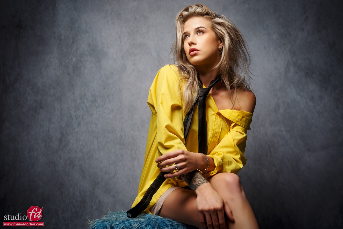
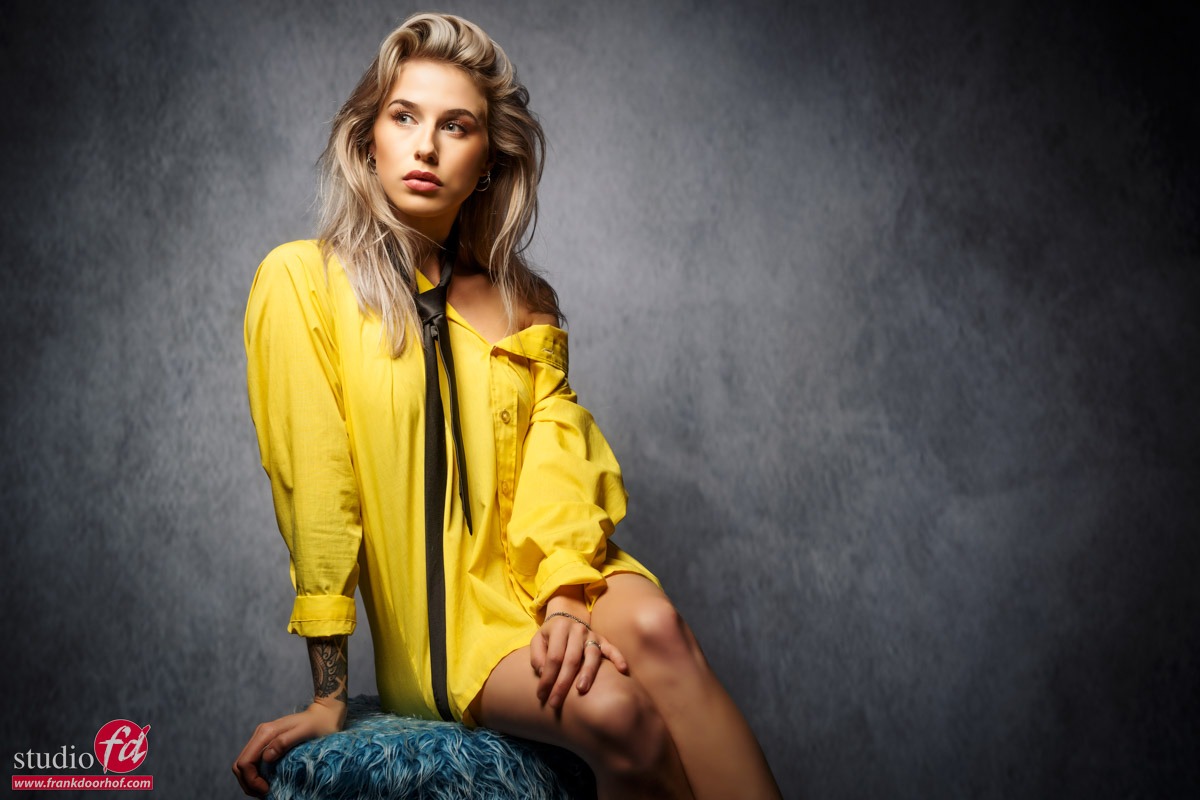
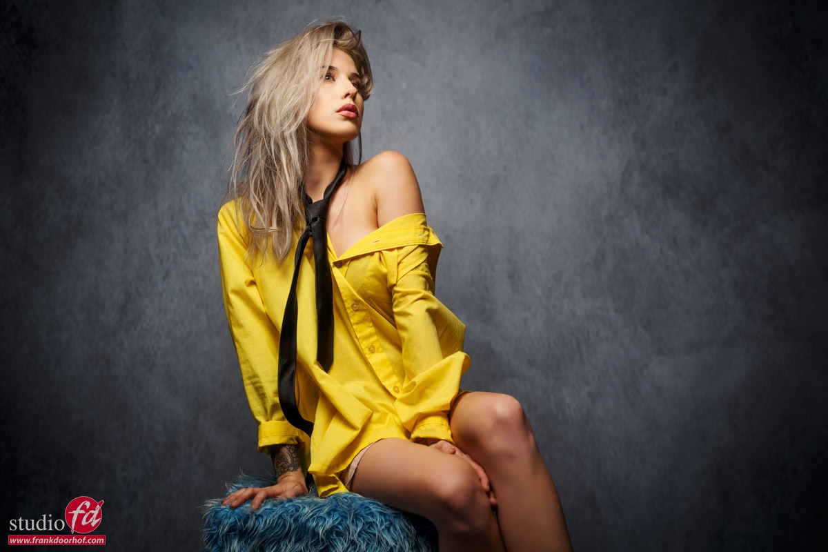
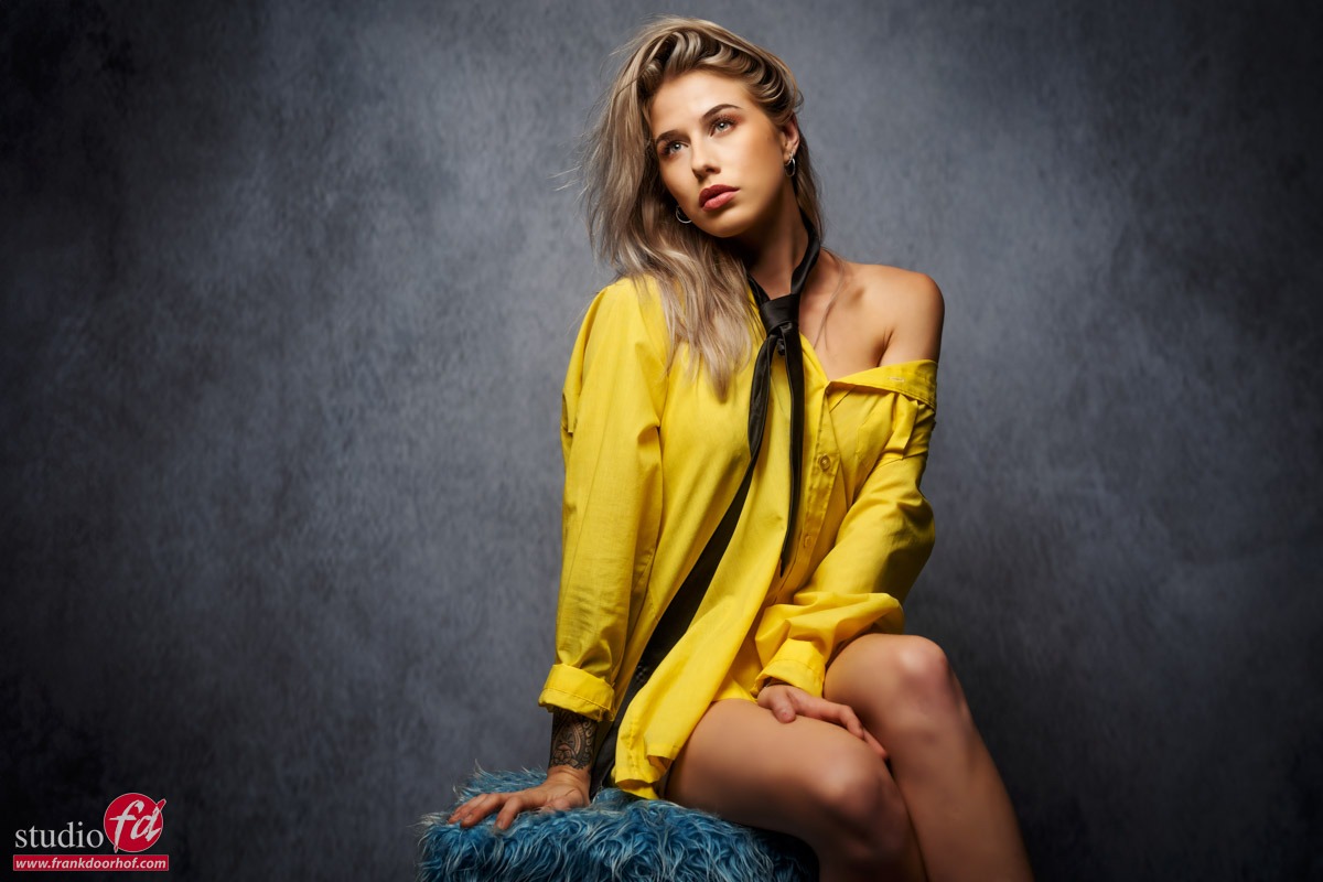
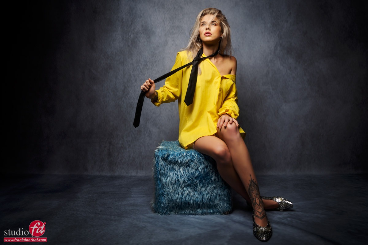
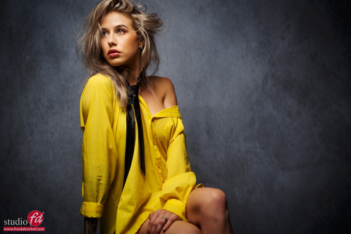
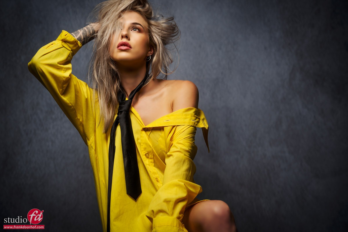
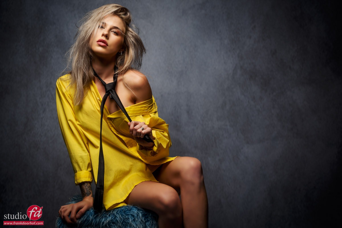
Today a few results of the workshop with Lois.
During the workshops there is always a theme, but within the workshops the rest is free on the base of what the group wants to learn, this way you always experience a workshop that is exactly tailored to your needs.

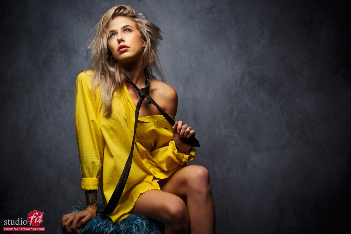
The theme of this workshop was “essential lighting techniques” based on the Tutorial with the same name (I highly recommend getting that one), I sometimes call this the “starters” workshop but actually that is not entirely true, this is the workshop where we work with more standard setups such as the butterfly and Rembrandt but this is often quickly supplemented with adjustments to make the image a bit more spectacular.

During the first set we use a Brown Punch background from Clickpropsbackdrops.
This is a very nice background which can be used in almost any situation.

In this set I only use a softbox from Hensel with grid focused on the model but in such a way that there is also some light in the background.

In the next set we use the Earth stacked master background.
This is a background with a fantastic 3D effect, this is of course fantastic to process in a light control workshop, or always pay attention to how the shadows fall and you can get fantastic results.
As an extra flash I end up using a blue gel here for some extra atmosphere and accent on our model.

With this set it was not only important to make it look like we were really shooting on location, but I also used a technique here where I color the set via a fill in flash with gel. And as you can see from the focus effect, I have used the Lensbaby here. The graffity door 1 background is awesome for this kind of sets. You can really use if for story telling, and I absolutely love that in backgrounds.

This remains one of my favorite setups for beauty portraits.
Of course, there is a bright background, and in this case I have chosen the Sweethearts.
I use a triflection system here to open the shadows, and the sides of the clothes. On both sides are strips with grids that provide a considerable output. By feathering this I get a lot of lens flare, this lens flare is turned on even more by the K&F Concept Black Mist filter. You can see an ascending effect here from no filter to 1/4 and 1/2.

Lets start with no filter.

Now we move up to the 1/4 strength

Ok now lets start to add a bit more lens flare by switching to 1/2 and playing a bit more with angles so we can also get the left strobe in better, due to the added strength both will now be easier to capture.

And the final result with an added vignette.

And finally it was time for the set.
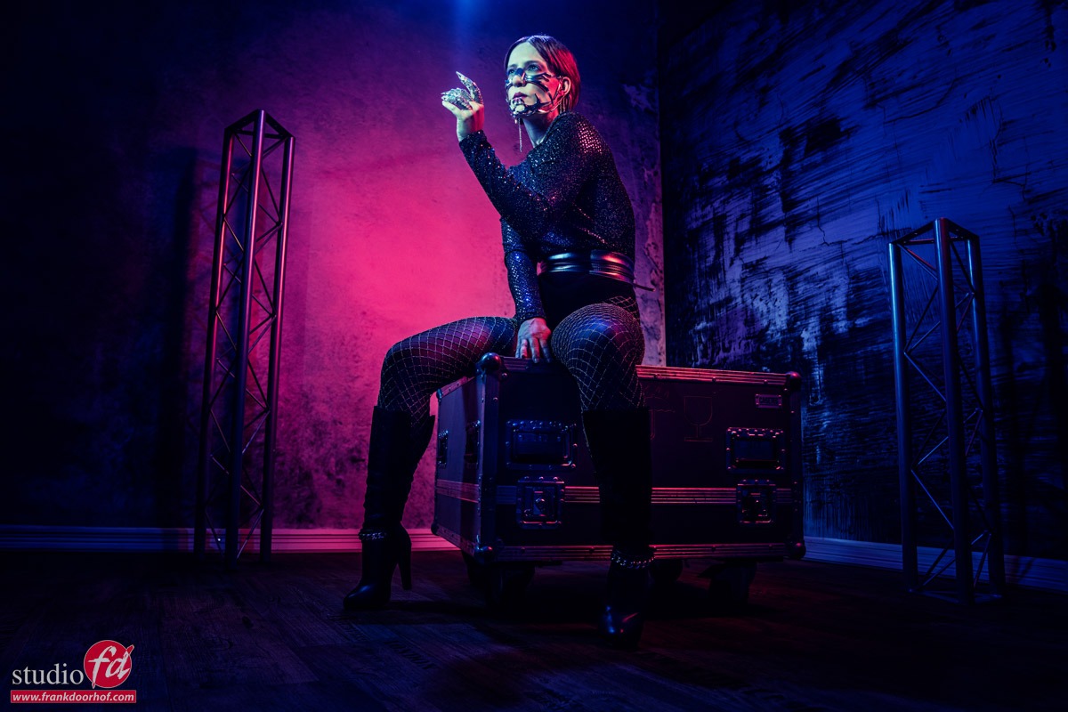
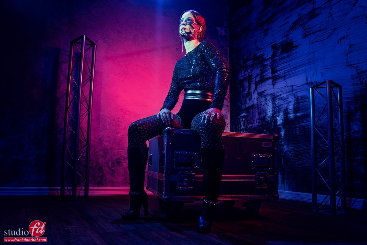
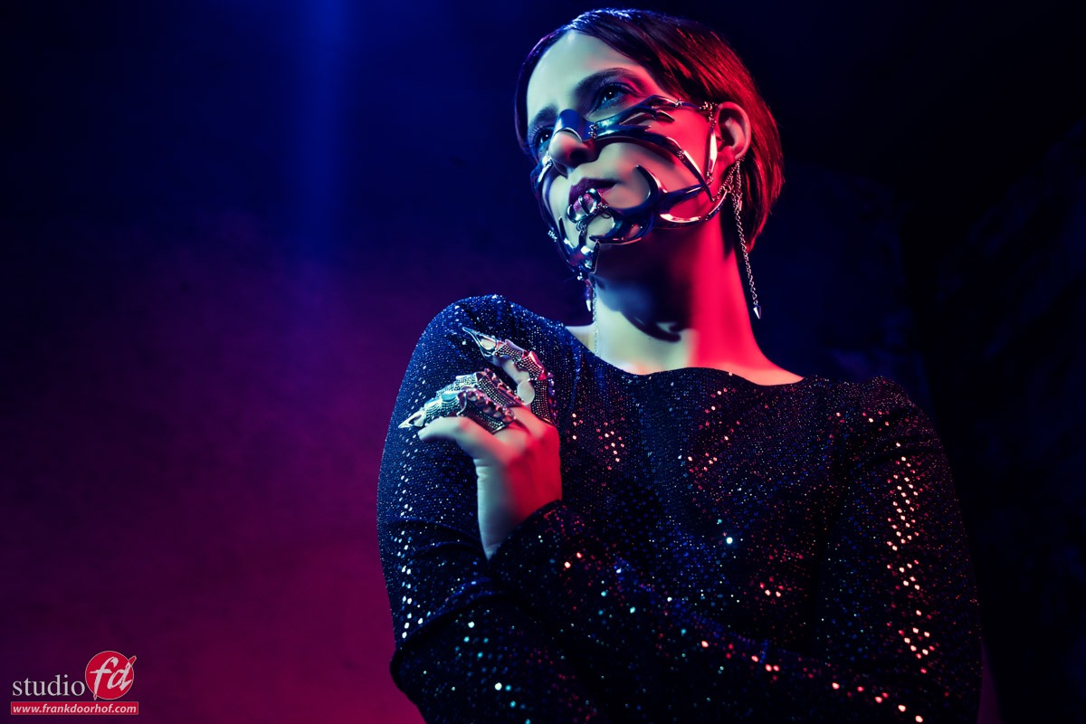
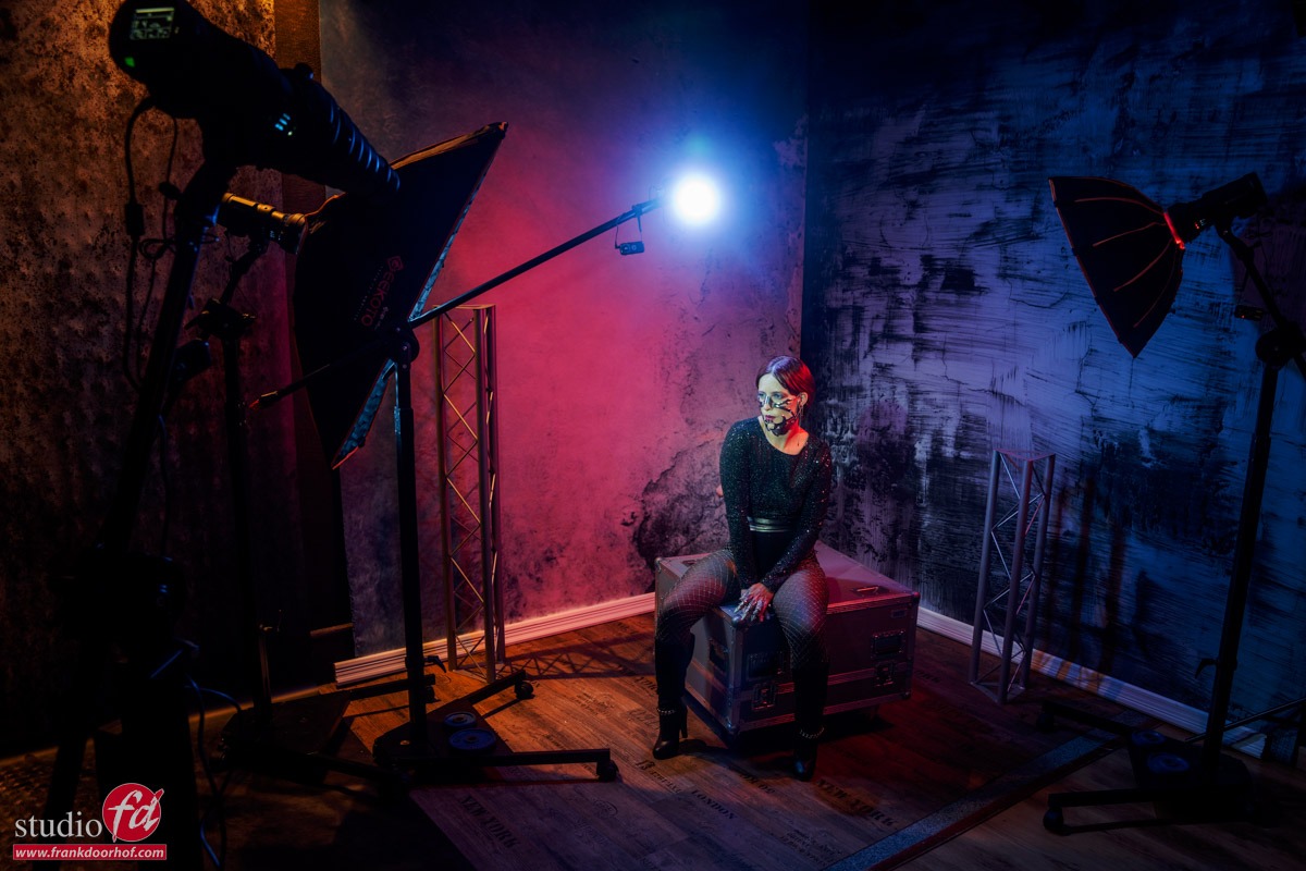
This is a really fantastic part of the studio to get creative. I use the Antique wall navy as “main background” and on the top to create a corner a ProFabric Chintz reclaimed, I chose this because it is quite dark and I can easily use it as a very dark background in the photo but still show some detail due to the print so that the photo / set looks a bit more “organic”. But the material also responds very well to color gels and can even be illuminated from behind, so it gives me a huge amount of possibilities. On the ground I use a floor part from ClickPropsbackdrops. A big advantage of loose floorboards is that you can change freely and thus build up a much larger variety than just the floor that is present in the studio.

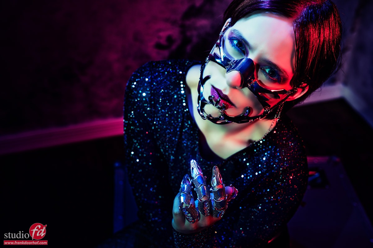
Besides the main light I’m using a red gel here, because the light is pretty far from the model the 1/2 strength KF concept filter really helps with the lens flare. When the lights are close to the model the 1/4 is a great allrounder but when you want a bit more room in the set the 1/2 is absolutely awesome.

The first image is without the red gel, I already love the way the effect of a real location is created. The vinyl prints are really awesome on photos and add to the illusion of being somewhere else.

But let’s start by adding the red gel and see how the background material responds to the light. This is something that is often overlooked, but every material will respond differently on lighting. And I just love the way the Vinyl mixes the colors.

In the coming week we will release a video per set with an explanation of the lighting on our YouTube channel

You can get everything I use in our webshop via www.frankdoorhof.com/shop

Results from the glamour Workshop with Claudia

In todays blog post some of the results from the workshop Glamour with Claudia.

For set 1 we used the triflection system with a large soft box and two extra strips as accents, to give the slight blue hue I used a gelled strobe from the back.

For the next set we used the Westcott Lindsay Adler gobo projector to project a line over the model.

After this setup we switched over the awesome Botanical backdrop from ClickPropsBackDrops for the next images, the first set was done with just a strip light, later we used the same setup with a large soft box and the Triflection system to open up the shadows, an awesome setup I think for fashion shots, it really gives the images a sort of 3D pop.

And the ones with the triflection

And of course I couldn’t resist to do one with a bit different look.

For the final set we used a plastic mirror and the Arrow background from Clickpropsbackdrops, this combined with the mirror gave an awesome almost surreal look to the set and made it look a lot bigger than it actually was 🙂

I’m using the Lindsay Adler gobo projector to project the lines, one snoot aimed via the mirror for the models face and one blue gelled strobe aimed straight at the mirror to get the blue mood in the shots.

I hope you guys enjoyed the results from the workshop.
If you also want to follow a workshop, visit our workshop site at www.fotografie-workshops.nl (also available for 1:1 workshops in English)

For the amazing Clickpropsbackdrops visit the Dutch site at www.clickpropsbackdrops.nl or the international site at clickprops.co.uk

Santa Cruz here we come….

Teaching workshops on location is one of the most challenging and exciting things, not only for me but also for the attendees of these workshops.
On July 15th I’ll be visiting Santa Cruz for a one day workshop in cooperation with our friends of Expoimaging with the theme “The magic of the small flash”.

In this workshop I’ll teach the group a lot of techniques for the use of speed lights in many different situations ranging from inside to outside, fill in flash and fighting the sun (day to night).

This is a small group workshop and at the moment we only have 3 seats left, so head on over to Watsonville Santa Cruz workshop July 15th 2016 on the site to book your seat and find more information.

Tip : The most simple location can be awesome

Often I hear photographers complain about the lack of great locations…
I always tell them “the best locations are in your head, and often right in front of you”.
Somehow it sometimes seems that if there isn’t a great location the creativity is gone, or is it just that……

In my opinion every location is great to photograph, but I often do look for certain extras like contrast, grunge (rough) and color, OR the lack of it. The more rough the better in all honesty, on the other hand something really static and modern can also be awesome, as you can see there is always something if you WANT to see it.

As I joke I sometimes say “put on your photographers eyes and hunt, don’t look for opportunities but try to find uses for what you see” this is a different mindset but often helps a lot.

Now if you add a little bit of styling to it (or a lot like in this case) you’re on the way to a great shot.
These shots were done during a workshop in Manchester with Nadine, a very simple light setup with one Elinchrom beauty dish with grid straight at Nadine. The wall didn’t look like much but I loved it, and seeing the responses from the attendees as soon as the images came in… they did too.

Nadine June 8th 2016 Manchester  0285

Nadine June 8th 2016 Manchester  0289