As you know, I love to play with light. Although I love to use plugins for film looks and sometimes enhance a lens flare here and there, my intent is to always get it right in camera.
By the way, if you want some of the best tinting and special effects software, make sure to check out BorisFX, it’s the best I’ve ever worked with.
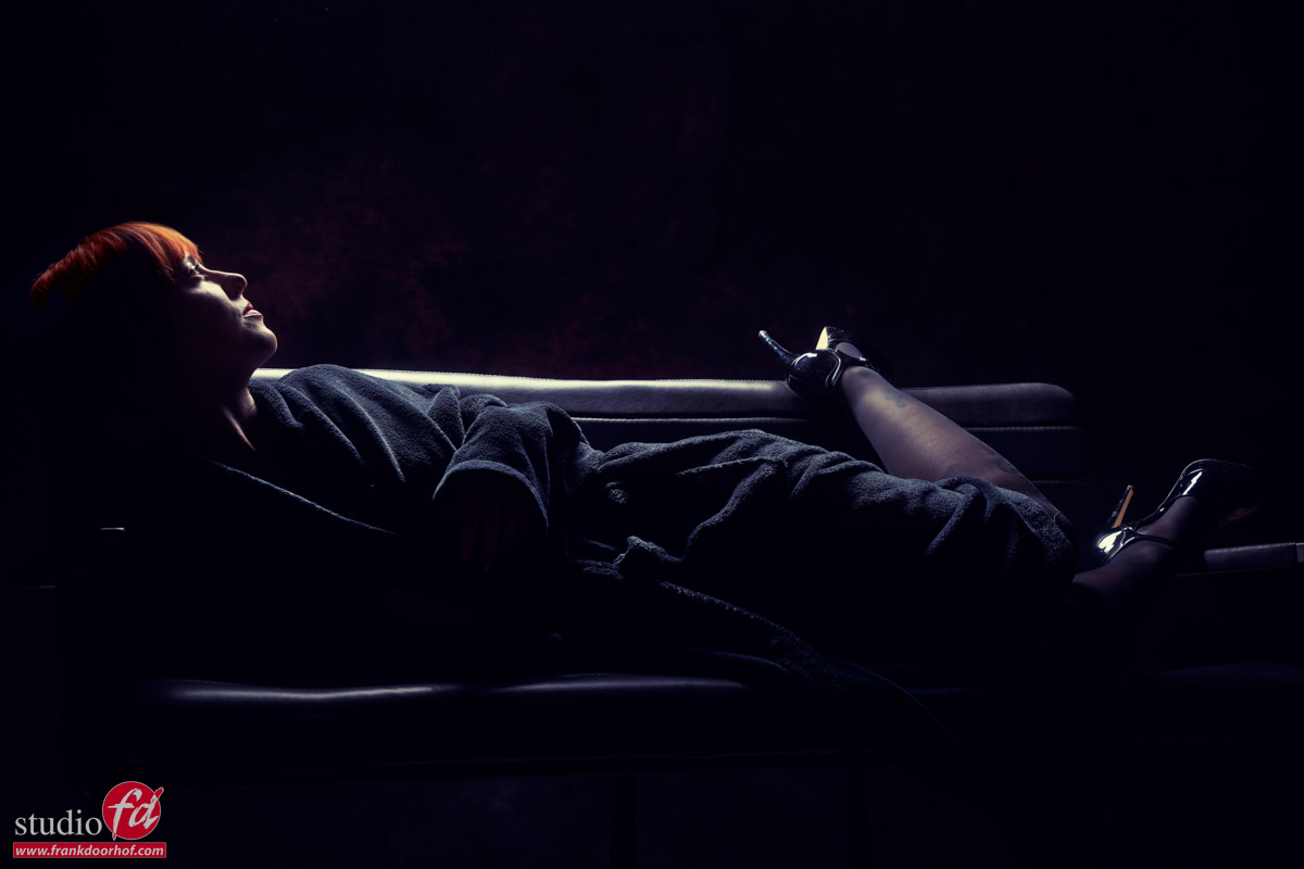
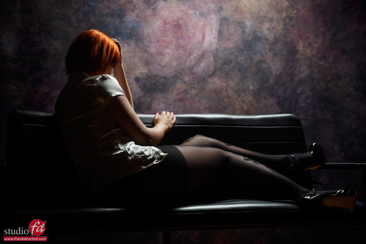
Anyway, today I want to share this image from Claudia
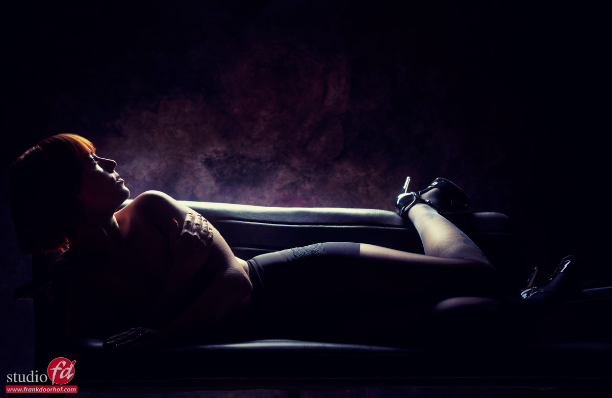
This was shot at the end of one of the sets.
In the images Claudia was lying on the couch and the light was pretty close to her.
On my camera I’m using the K&F concept black diffusion filters which give great lens flares when they are hit with some light.
To get the effect I asked Claudia to look up and by shooting it from a slightly lower angle I could just get the perfect lens flare.
This shot was not planned but it grew quickly into one of my favorites from the set.
So when shooting a set, walk around your model for different angles, but also try some different poses and “freak out” with your lighting, you already got the shot so take it step further, if it doesn’t work you at least know it doesn’t, but if it does you can use it in a next shoot to up your confidence and coolness 😀
Want to learn a lot more about lighting?
Check out our tutorials, books and of course you can find videos on Skillshare, KelbyOne among others.
Or visit one of the Dutch workshops at fotografie-workshops.nl
And if that’s not your thing, maybe book a 1:1 online 😀
But you should always try it.
Shoot from different angles, but also during warm ups, and always treat the shots as if they are real shots.
In most cases these images are great for behind the scenes fun, memories etc. but sometimes you end up with something really special.
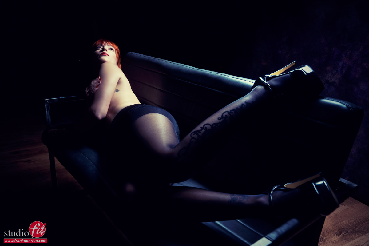
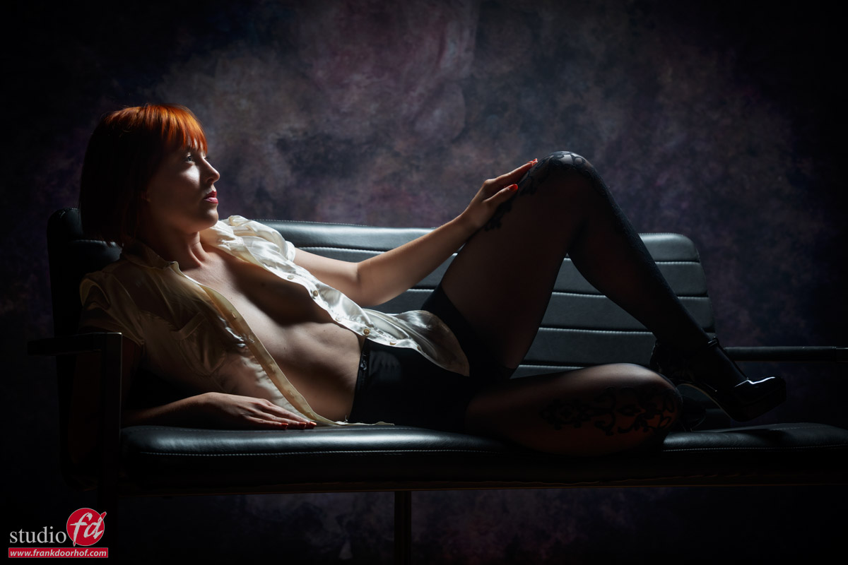
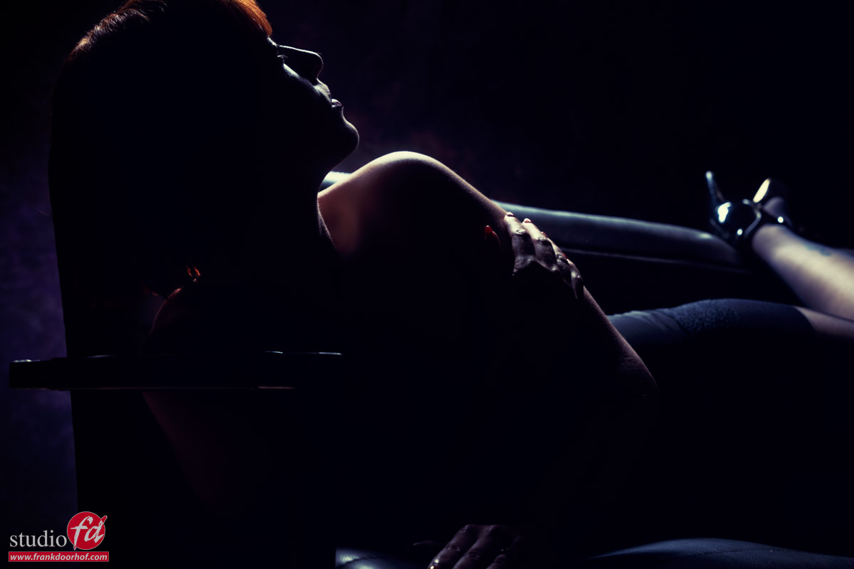
Somehow I just love this shot from Claudia I shot while explaining the lighting setup.
For me it tells a story.
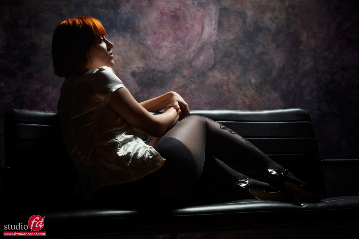
During the workshops I always tell people to walk around the model for shots from different angles, it’s always “surprising” how cool some of the angles can be when you see them. But sometimes you don’t expect it to look cool. Like in the next shot where I was actually explaining that probably due to the way the model was posing the shot from that angle would look really awkward, but somehow the shadows fell right, the pose works and I ended totally loving the shot.
So ALWAYS take images from different angles, even if you don’t think it’s going to work 😀
you might surprise yourself and your model/client.
https://frankdoorhof.com/web/wp-content/uploads/2025/04/Claudia-39-April-19-2025-Edit.jpg8001200Frank Doorhofhttps://frankdoorhof.com/web/wp-content/uploads/2015/03/studioFD_Logo-1FV.pngFrank Doorhof2025-05-01 17:00:582025-04-29 11:40:13You did not expect that did you….
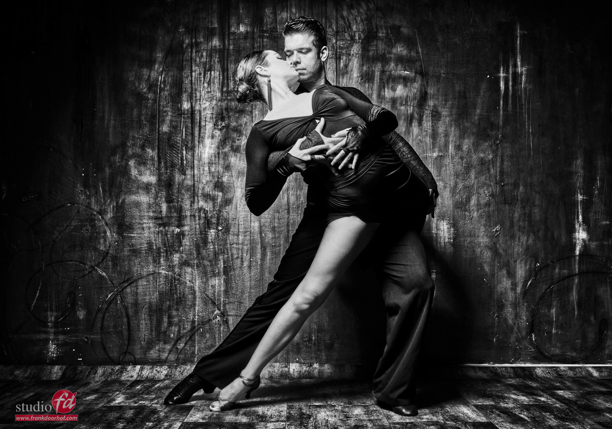
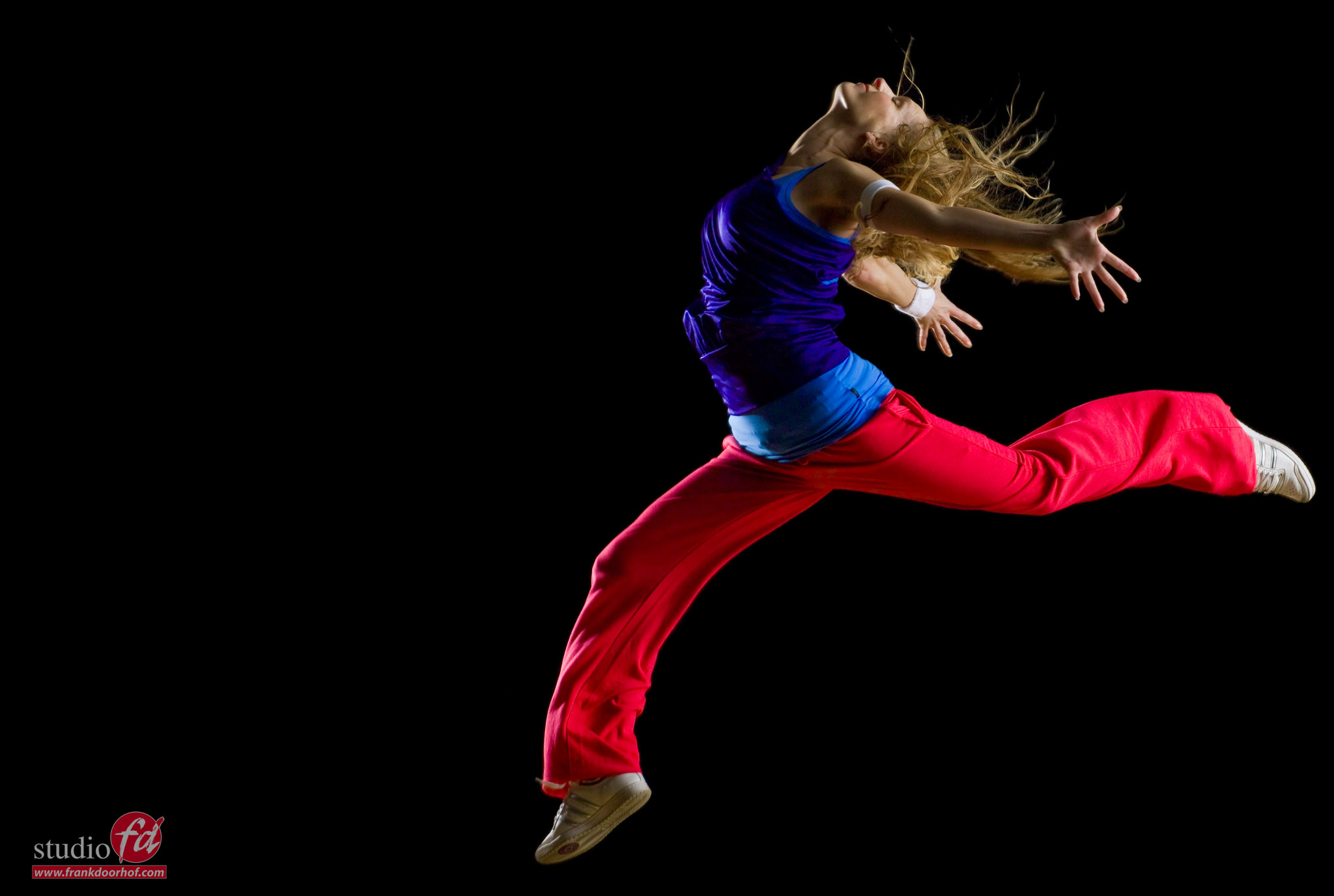
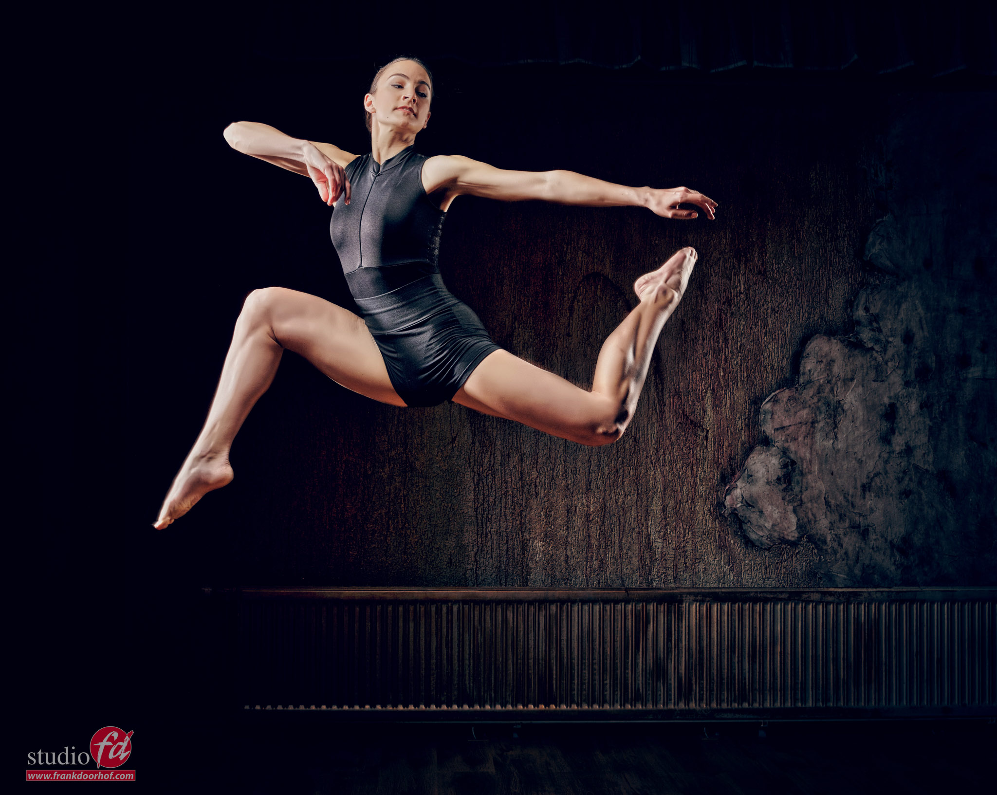
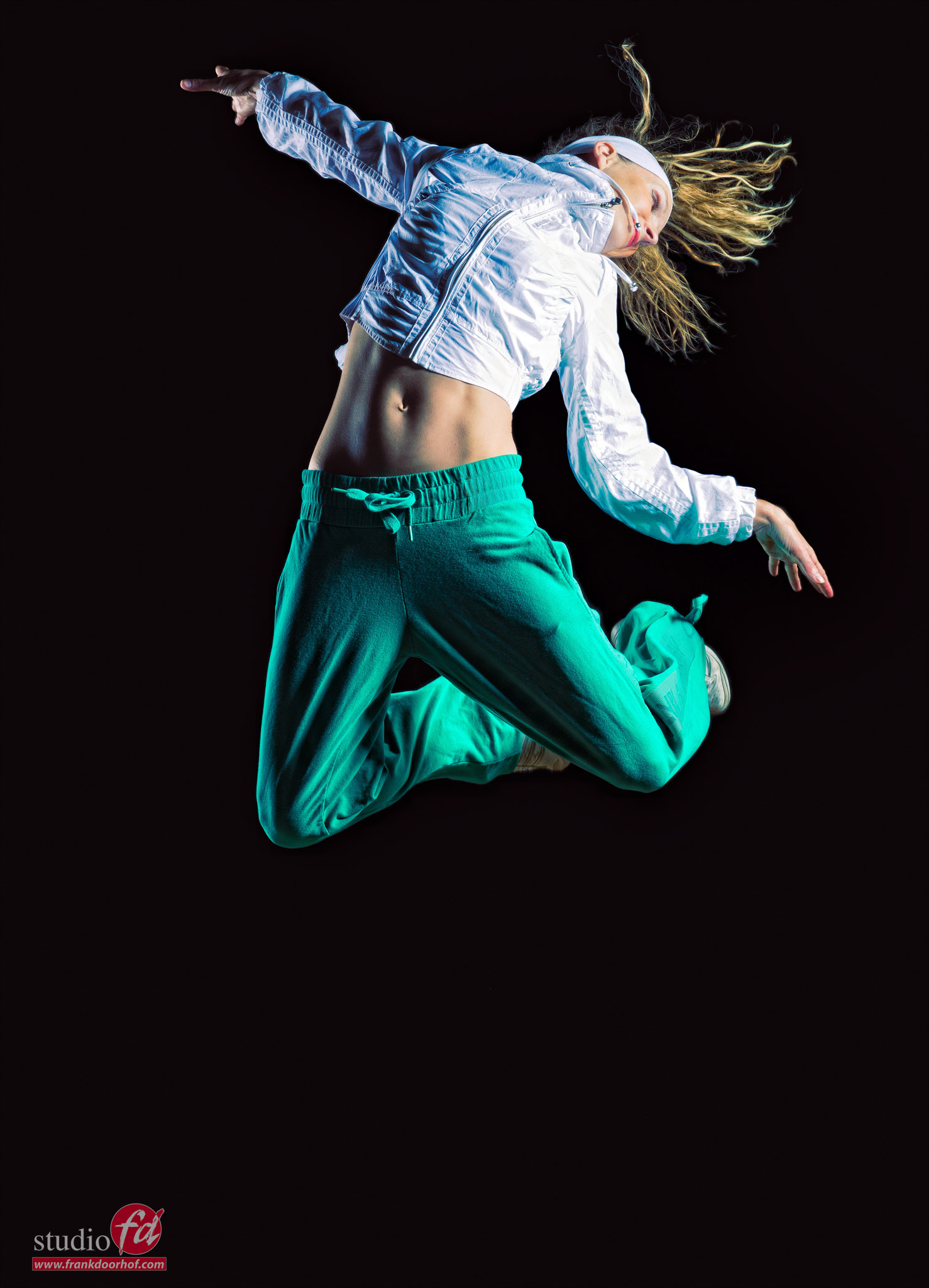
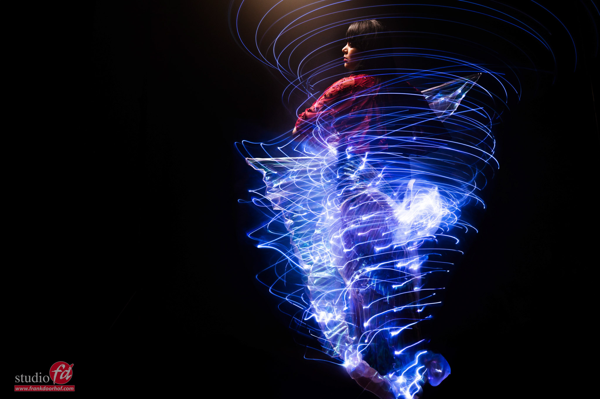
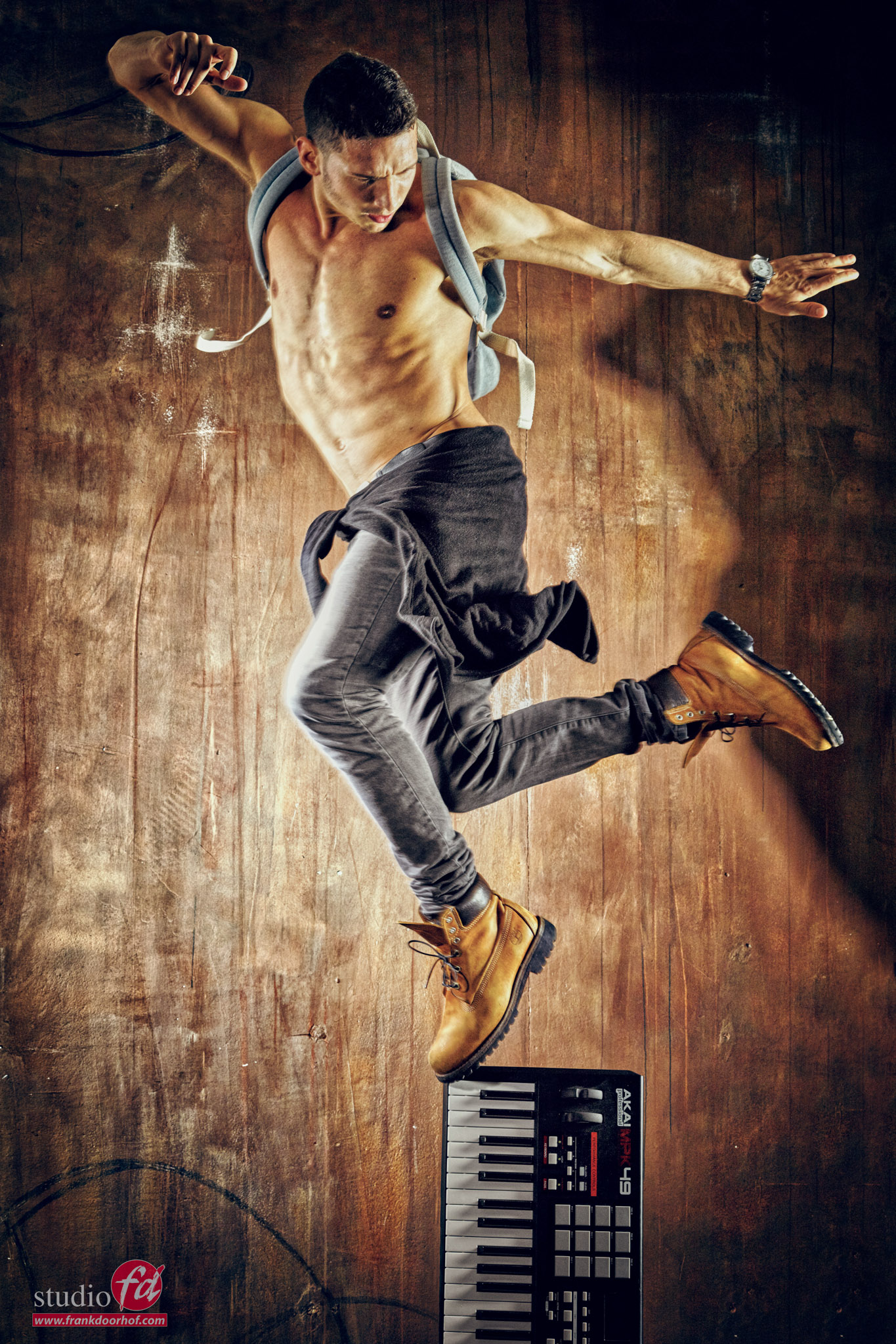
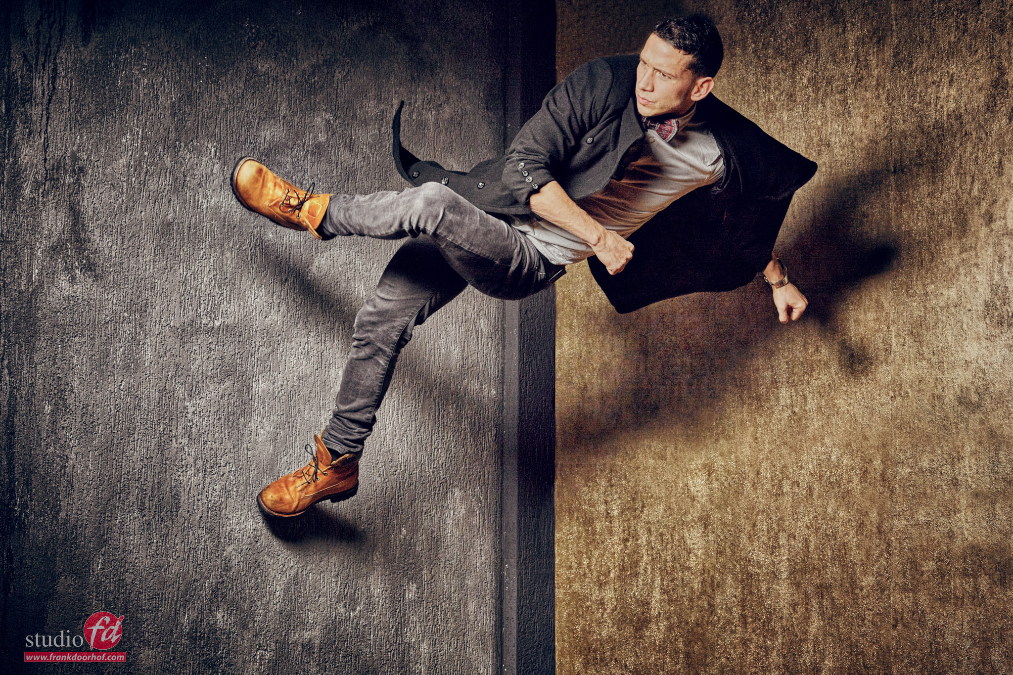
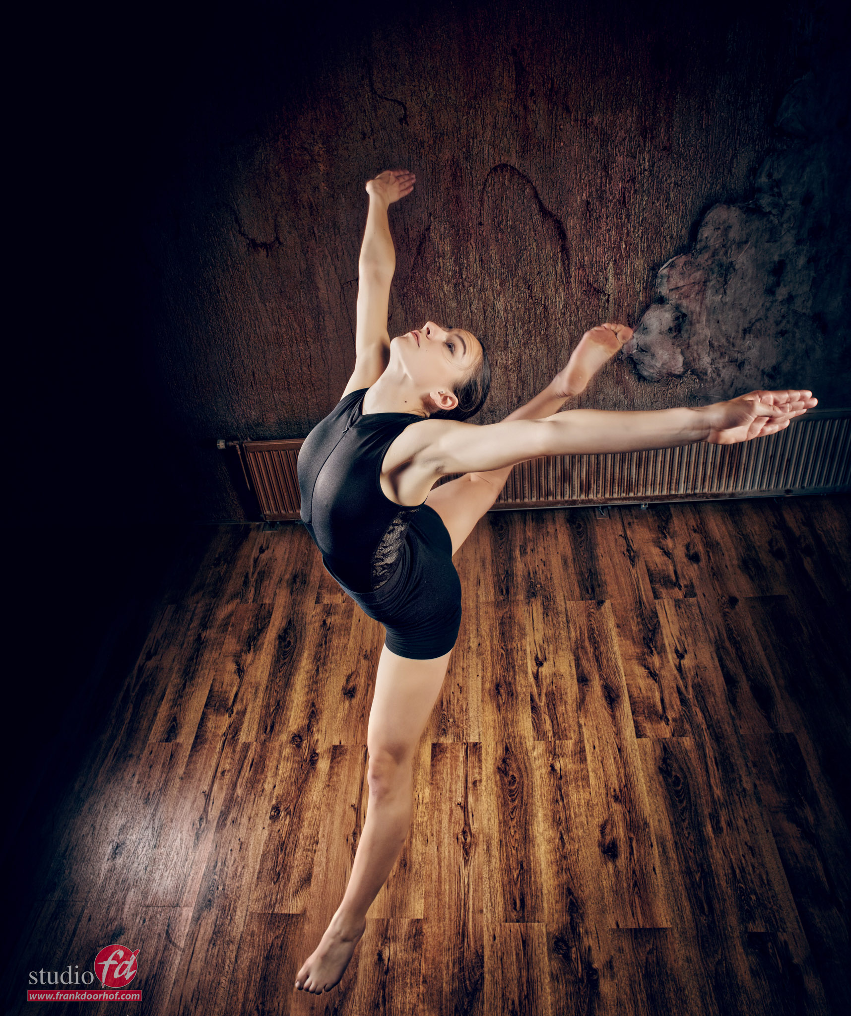
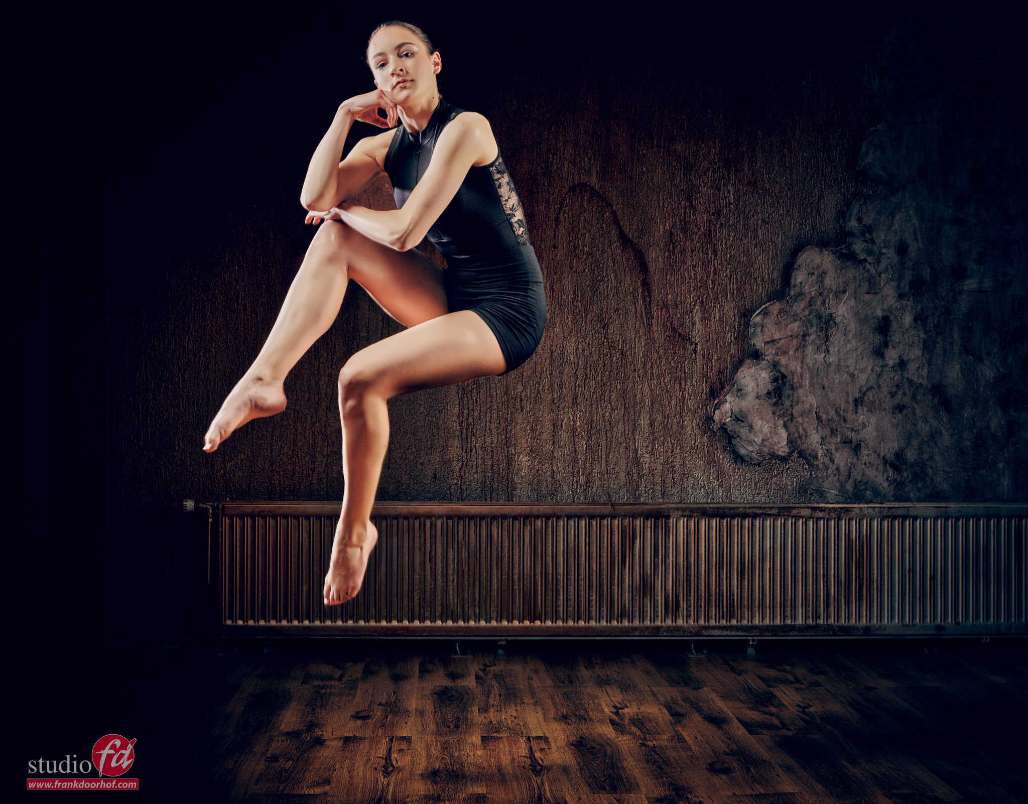
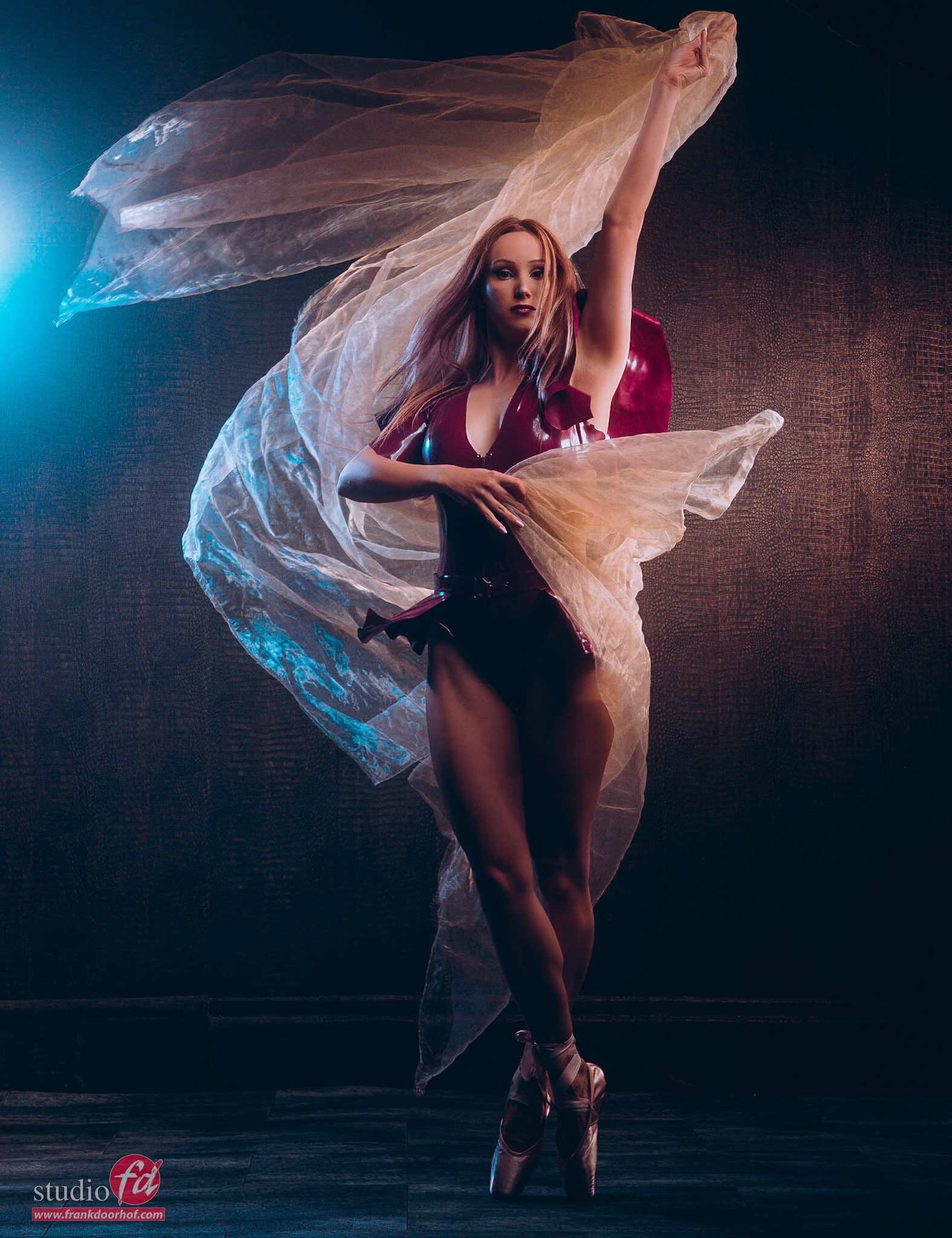
Today we celebrate International Dance Day (click here for more info). So this is a great reason to write a blog post about photographing motion and some tips.
This day was created to celebrate dance as an art form and inspire people worldwide to dance, move, and express themselves through music and rhythm. In the Netherlands and Belgium, a lot of attention is paid to dance on this day. Dance schools organize open lessons, workshops are given for young and old, and performances and flash mobs take place on squares and in theaters. From classical ballet to hip hop, from modern dance to folk dance – today it’s all about the power of movement and connection.
Dance connects people, brings joy, and is a universal language that needs no words. It is an outlet, a form of expression, and a way to come together, regardless of background or age.
I love photographing motion
For me, adding some motion to a photo always adds so much more than just that motion. Somehow, you just keep looking at the image.
To freeze motion with strobes, you have to make sure you use strobes with a fast flash duration. For most situations, a flash duration of 1/2000 is enough for a proper “freezing the action shot”. Of course, you can also play with this technique. For example, use a fast strobe on the face of the model but use a very slow strobe as an accent to get some nice blurs in the highlights.
The best way to use your strobes when freezing motion
To figure out the best way to use your strobes is much easier than you might expect.
If you by accident, own a Sekonic 858 lightmeter, you can actually measure the flash duration (very cool), but don’t worry if you don’t own one, there is another way.
one of the results from one of my first KelbyOne classes.
Use a fan
Yep, it’s that simple :D. Photographing motion by using a fan.
Set up the fan and use the highest setting.
Now shoot images on the lowest setting and build it up per stop on your strobe untill you hit the maximum output. (Don’t forget to change the aperture).
If you look at your images, you will see that on some settings the blades of the fan are sharper than on other settings. You now know on which setting the strobe has the fastest flash duration and the slowest. Always use that setting when freezing motion, and you’re done.
Remember that you don’t do these tests on HSS, only Manual mode.
Also, remember that in the studio, the shutter speed on the camera is always kept at 1/125, to make sure you can freeze the action as clear as possible always take one shot without strobes to make sure you have no spill light in your studio.
One of the problems you can and probably will run into is light output.
The main problem with motion is that you are often stuck with a very limited range on your strobes, and in most cases, the fastest flash duration is not on full power but somewhere between 50% and 75%. Now add to this that you want to avoid shooting on F2.8 but preferably use F11-F16, and you already see that we can run into issues with light output. Luckily, we also have solutions for this.
ISO
The first thing you can do is raise your ISO. With modern cameras, it’s absolutely no problem to use ISO800, and with some proper noise reduction, you can easily use ISO1600.
However, especially with commercial work where fine detail is important, I always choose to solve the issue with a proper light shaper, or the lack off.
Light Modifier
For motion, I love the more harsher quality of light for focus. And of course contrast. This does give me a head start because the light-shapers are already more efficient than for example a softbox. Think about this: with a softbox, you use several layers of diffusion material, which takes away light. With a light-shaper like a reflector, you can already see that the material is shiny. Which means that in the reflector, the light is focused via the reflective layer, which gives you a lot more output.
The size of the reflector is just as important as the material that is used inside.
Some of my favorites over the years were the Hensel 14″ spot and the Elinchrom Maxilight/spot, both gave a tremendous amount of extra light. I used them also a lot for outside sessions, and they saved me a lot of batteries 😀
Nowadays I’m using the Geekoto strobes, and the GT200 is a great strobe for outside use and freezing motion. Due to the fact it used a built-in Fresnel lens you get more light output from a standard flash tube. The compact design, in fact it gives more light output than the Geekoto GT250, which in its defense, uses a different flash tube. The design of a Fresnel gives you extra light output, and when used in a light shaper, also gives you a great quality of light, think about the old theater and movie spots.
Fresnel
Which brings me to my favorite light shaper at the moment.
I use it for portraits, fashion, freezing motion, and outside work. It boosts the light output,t and you can focus the light. I’m talking about the Nanlite FL20G Fresnel
In the past, Fresnels were very expensive, but with the Nanlite, you can now get a Fresnel for a ridiculously low price, and thanks to the Bowens mount, you can easily fit it to most strobes out there. So, if you want a great high contrast and high output light shaper make sure to check out the Nanlite Fresnel. (Or any other Fresnel, of course).
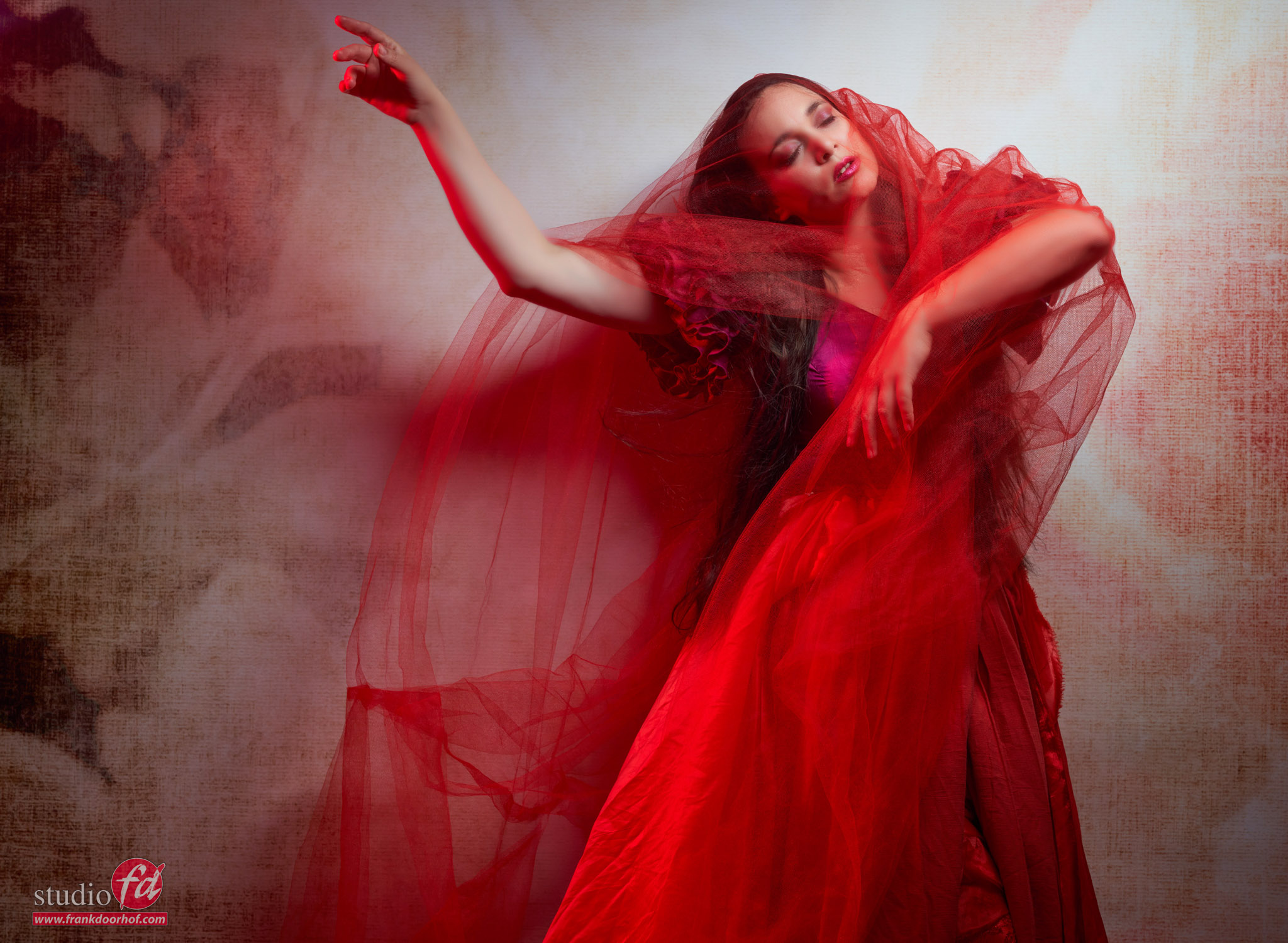
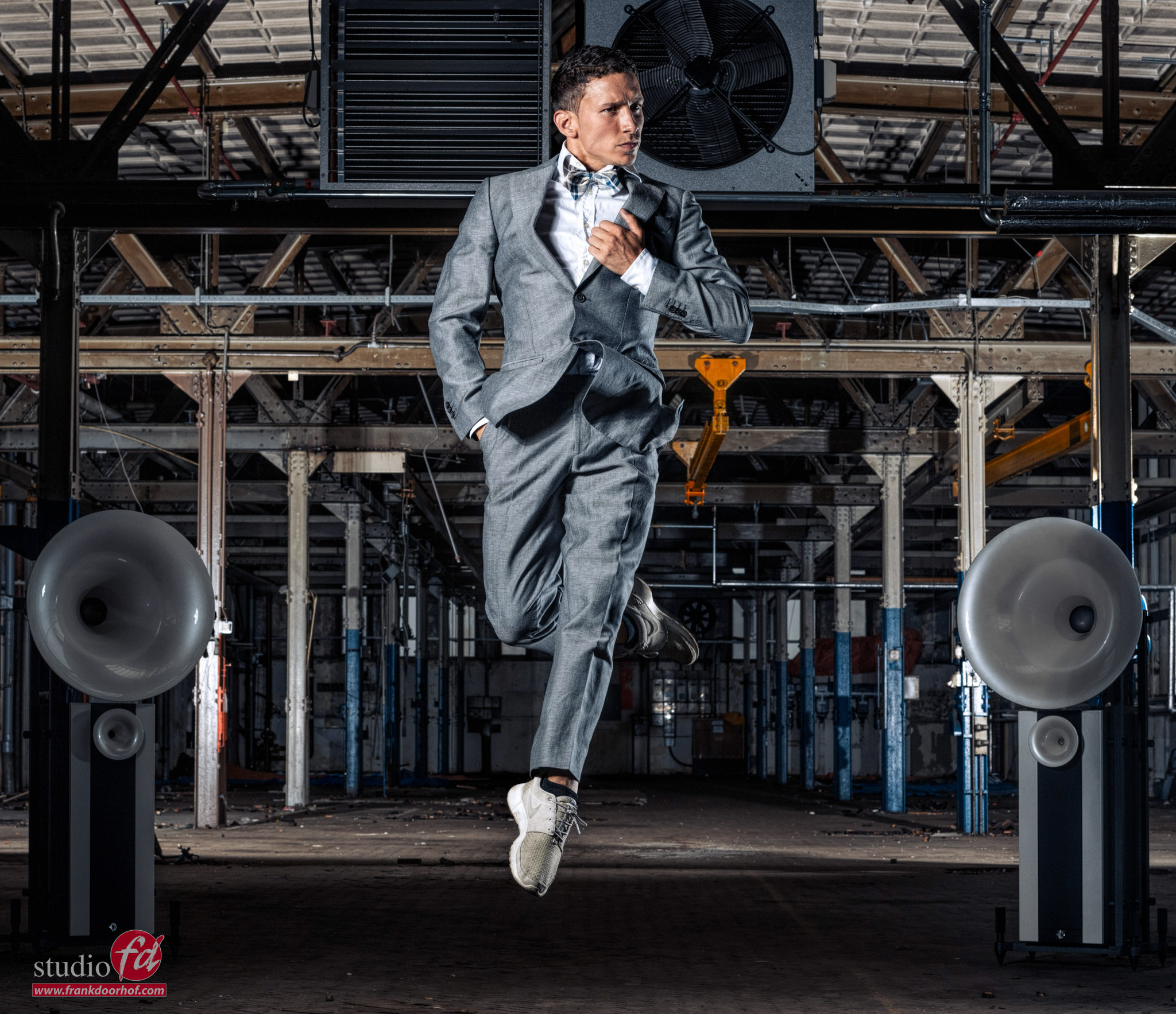
Let’s conclude today’s blog post with some dance/motion-inspired images. I love photographing motion and in my workshops I often show this technique to my students.
https://frankdoorhof.com/web/wp-content/uploads/2025/04/Janine-Aug-07-2021132.jpg20481575Frank Doorhofhttps://frankdoorhof.com/web/wp-content/uploads/2015/03/studioFD_Logo-1FV.pngFrank Doorhof2025-04-29 12:42:112025-04-29 17:52:51Day of the dance, photographing motion
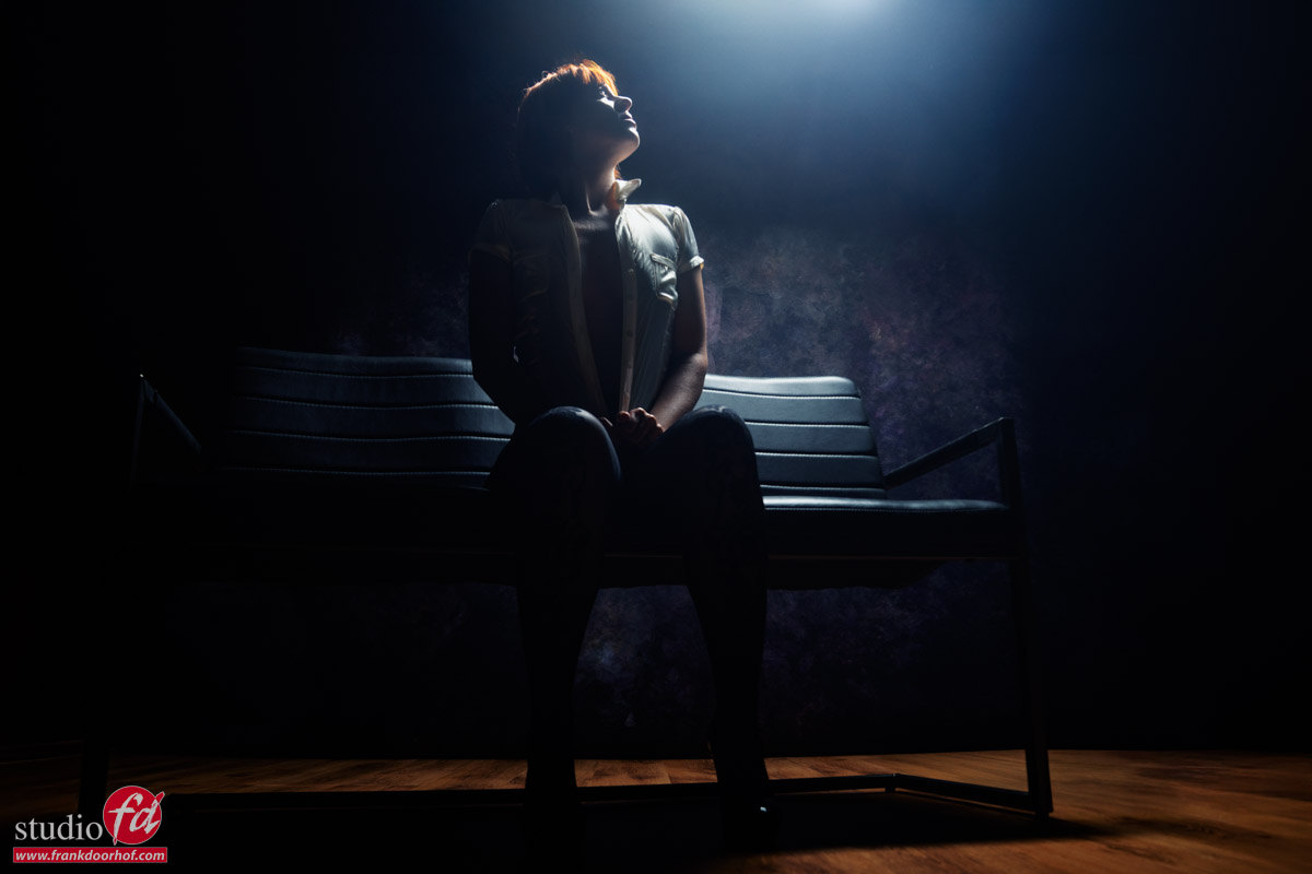
Today part II in my favorite glamour lighting setups
In the previous article we talked about a more flat light setup, today we are going the opposite direction. As mentioned my favorite photographers were often working with high contrast and low key setups. So today I want to share one of the most awesome setups for glamour in my opinion. And you don’t need a lot.
For the main light it works best when you use a striplight, it can be done with a small softbox and grid, but if you want that nice “beam” of light effect a striplight works best.
In this setup I’m using the Geekoto 48″ striplight. I started with the smaller 36″ version but to get the light the way I wanted from feet to head I ended up using one step longer. The nice thing about these two Geekoto strips is that they are both the same width, so you can really mix and match them in setups without losing focus on the model.
The same effect can also be done with the Rogue “Frank Doorhof” Flashbender in stripligh configuration. Meaning you can always use this setup on location or in the studio with just one strobe and a very portable light source.
The trick is to place the light behind the model aimed slightly forward, now change the height for the area the light will hit, higher means the area lit will be wider, placing the light closer means the beam of light will get narrower. The angle and the depth of the grid determines the light hitting the background. If you have the perfect setup but need more or less light on the background and you can’t solve it with angles or grids… keep everything the same but just move the model and the light backward (more light on the background) or forward (less).
The effect is great and really nice for body scapes and moody shots.
Shot during a recent workshop with Claudia.
And of course always include some extra images where you walk around your model.
Sometimes it works, sometimes not and sometimes it will surprise you… but that’s a story for the next blog post.


You must be logged in to post a comment.