MacBookPro M4 Pro Display performance nano texture
The new MacBookPro M4 Pro: It’s gorgeous
I was 100% happy with my MacbookPro M1 Pro. (see my review here)
It was lighting fast and even when screencapturing Photoshop I didn’t see any hiccups.
But when Apple showed the new screens I was already looking for my laptop to order a new one.
The biggest frustration with the MacbookPro for me was the very annoying glare on the screen, it could drive me nuts when travelling, if you need a mirror…..
The nice thing about Apple is that you often don’t have to wait too long and indeed today I got the new MacBookPro M4 Pro with Nano Texture 14″, 1 TB, and wanted to share the first experiences with it, mainly focussing on the screen.
And the screen is indeed absolutely gorgeous and kills the reflections better than expected. It’s something you have to see to believe case 😀
I also opted for the space black color and also here I can say I’m glad I did, I love the normal color of the MacBookPro but the space black is my new favourite.
Ok till now it’s been more like an unboxing, and as you know I’m not really the person for that kind of posts 😀
So let’s dive into the interesting stuff.
Shine a light on me
Let’s do a quick test
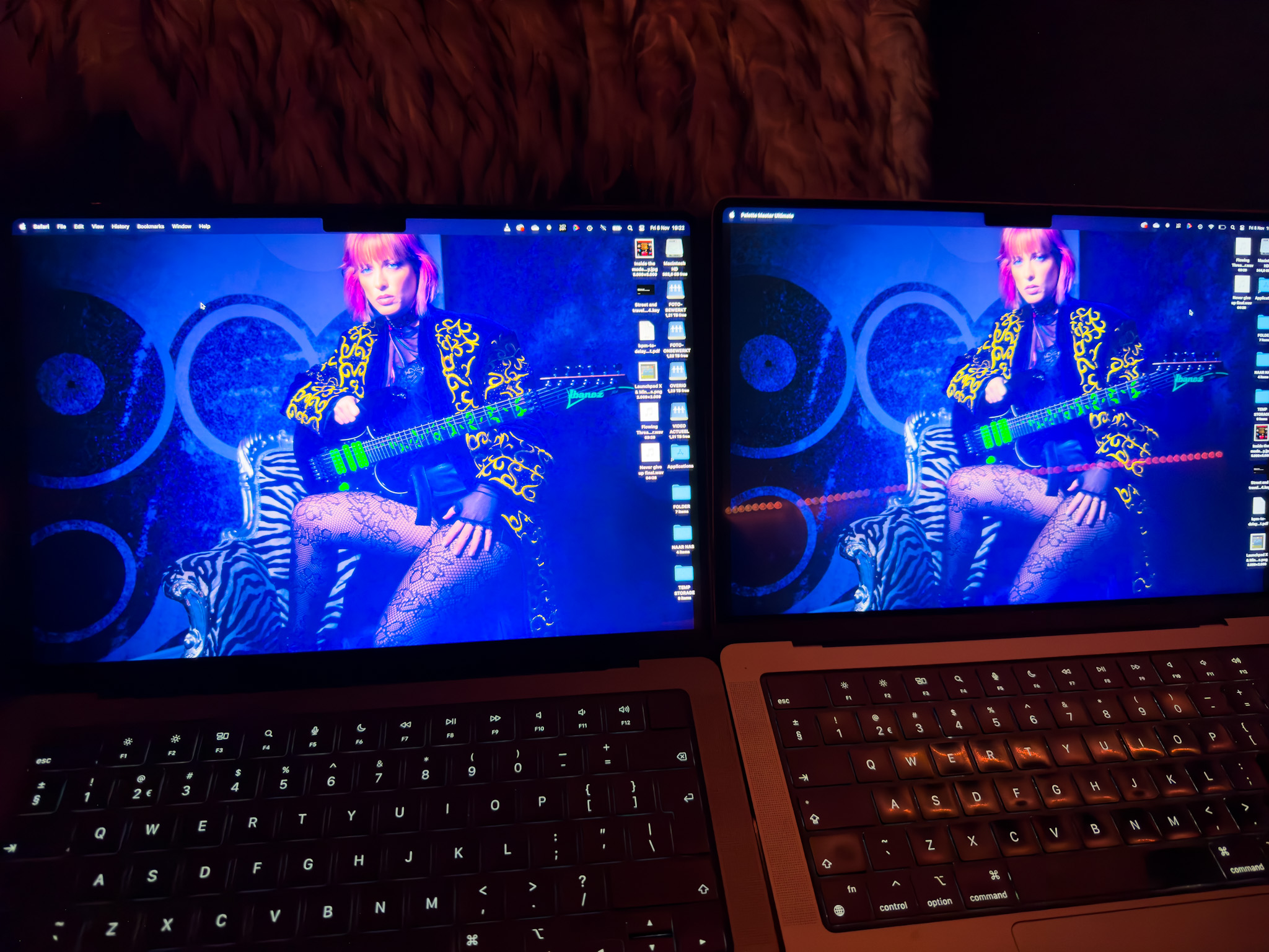
Left is the….really?
As you can see there is a huge difference. On the previous screen you can clearly see the reflection of our led lights, on the new screen there is nothing visible. And remember the reflection of the previous screen was even worse in some older generations. I’m really glad with this outcome because the screen was my main reason to upgrade.
Now when you see this we want to see something more extreme of course.
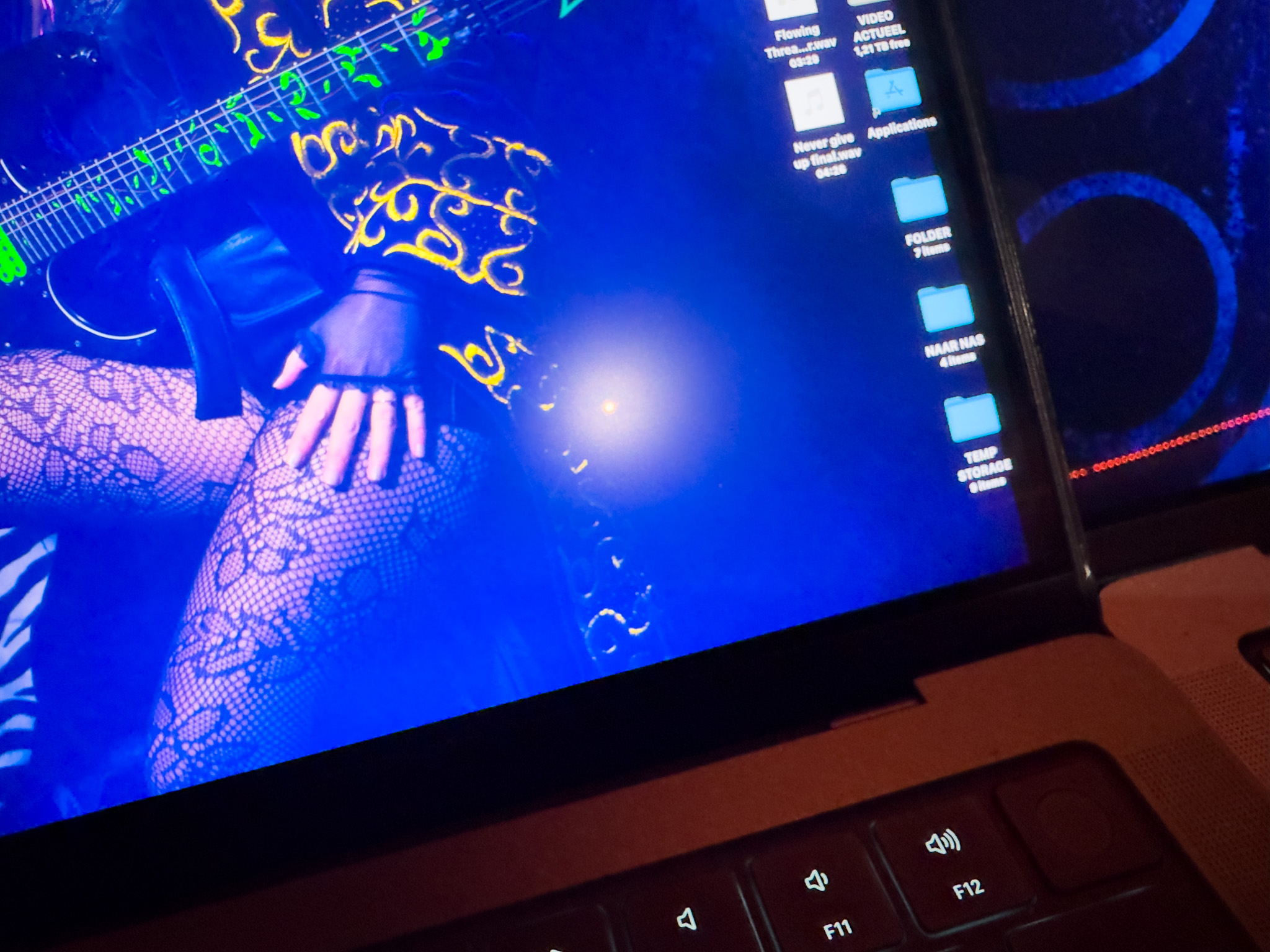
So we used the flashlight of the iPhone on full power.
On the previous screen you can clearly see the light and its a pretty large circle and you can see the light actually breaking down in RGB.
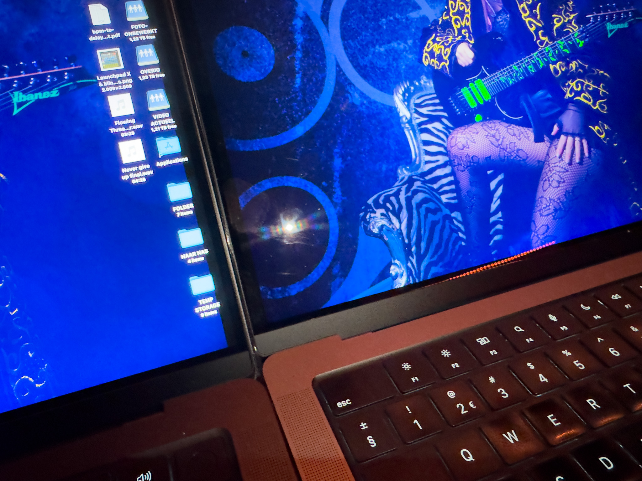
Now on the new screen it might seem that the circle is also large but thats probably not what you’re seeing.
This is an extreme example, shining a very bright flashlight right on the screen from 20cm distance.
The little circle in the middle is what you also see in the image above but a lot smaller and much less intens.
The “glow” around the circle is probably the Nano texture doing it’s anti light reflective work, when the lightsource is less extreme this would mean it totally takes out the reflections, as you can see in the first example.
In other words, wow.
Performance of the MacBookPro M4 Pro with Nano Texture
As creators we of course demand the absolute best from our screens.
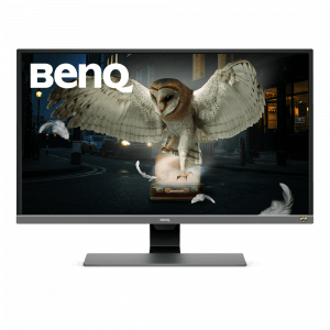
Of course it’s always better to use a dedicated monitor. For example the BenQ monitors I use have a hardware calibration option and are tracking very close to the AdobeRGB colorspace. (and they have a great anti glare coating :D) but does that mean that you can’t use your laptop screen for editing ?
Well decide for yourself, I will post the validation of the screen in a moment.
It really depends on how color critical your work is, but in all honesty when I look at the results I would not hesitate to edit my work on the MacBookPro, as long as I’m able to check it on the BenQ before it goes to the client.
Calibration
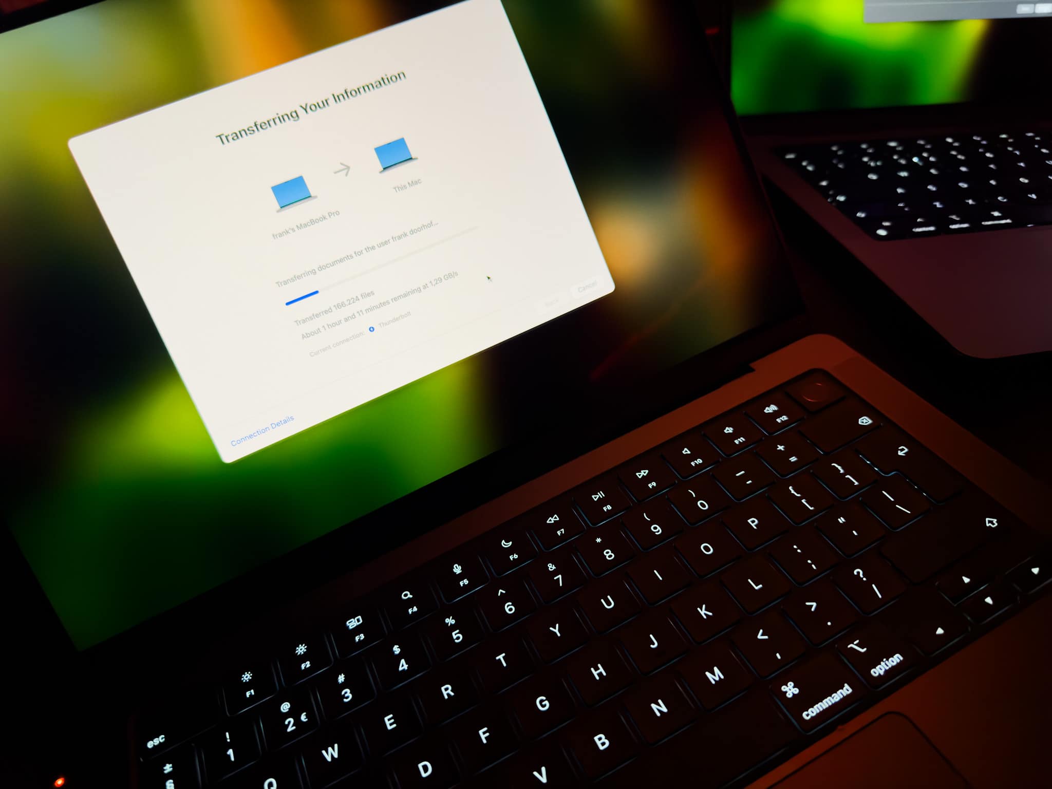
The first thing I do when I get a new laptop is make a 1:1 copy from my old laptop (I love the way the Mac does this).
This mostly takes an hour or slightly longer, in that time I keep my screen on at my preference light output.
When my whole system is up and running, this often means the screen has been on for a few hours.
Now it’s a good time to do the first calibration (and repeat this after a few days).
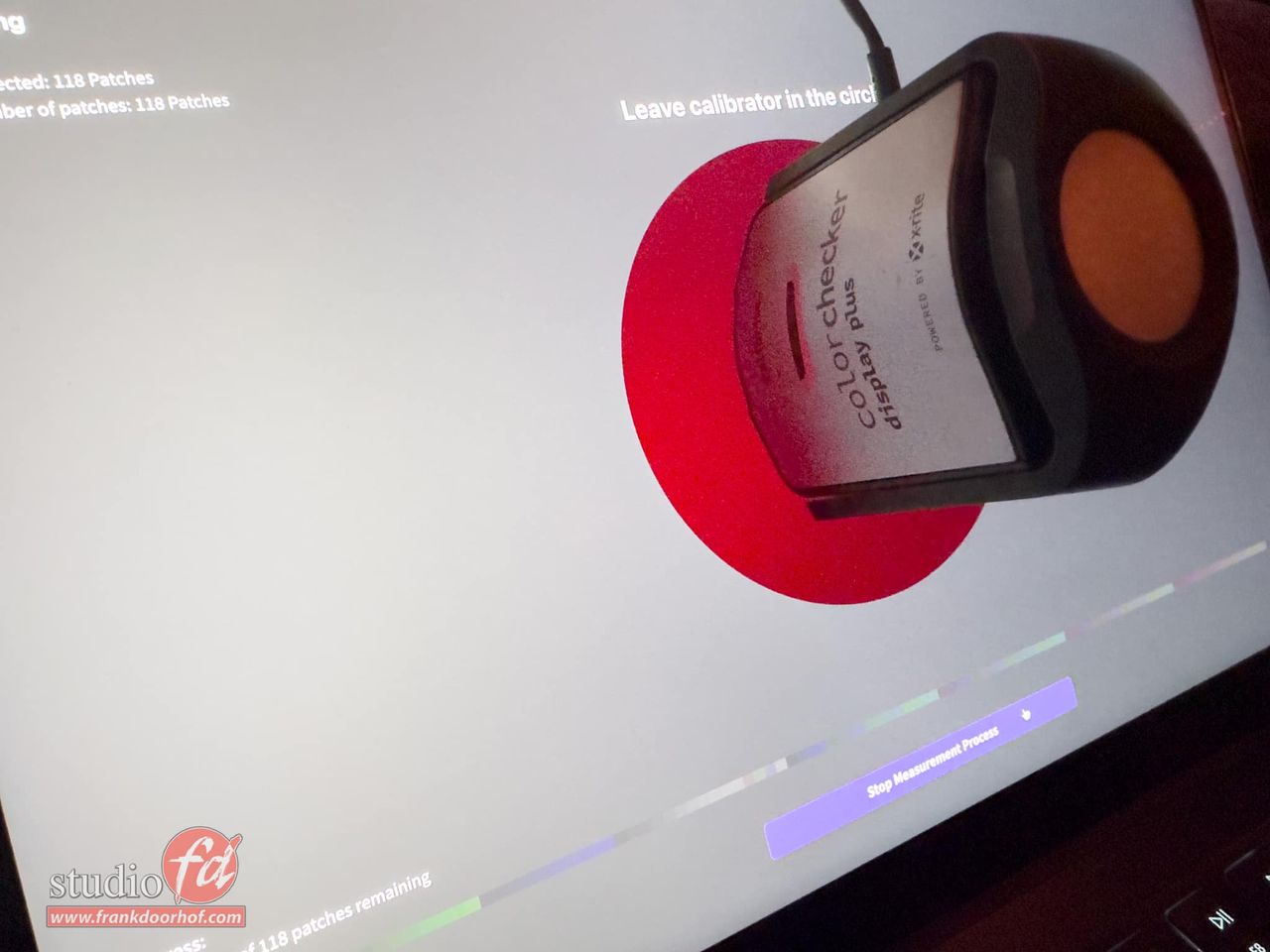
Do make sure you use the proper analyser for the XRD screens.
We highly recommend the Calibrite HL series due to the high luminance output of the screens.
On the photo you still see an older analyser which was handy for the moment, calibration should be done with the HL series by preference.
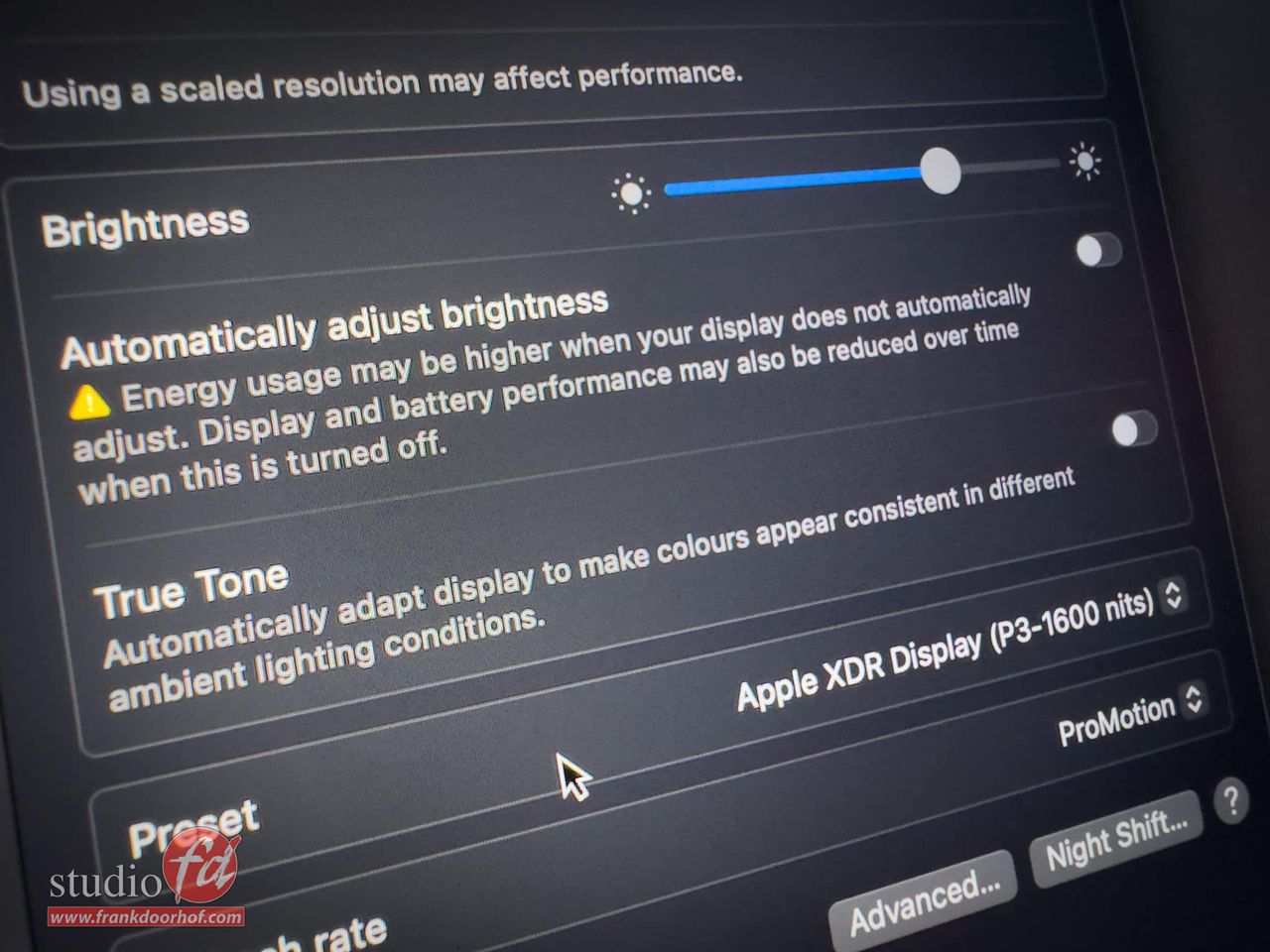
With MacOs you do have to make sure that you check your display settings and disable the two settings you can see in this image, these settings can really mess up your calibrations.
After the calibration is done it’s possible to run a validation of your screen.
I’ve setup the screen to the brightness I normally use in a bright room, this is brighter than my BenQ which is in a controlled environment.
I highly recommend calibrating at the brightness you use the most. You can always go up or down 1 click.
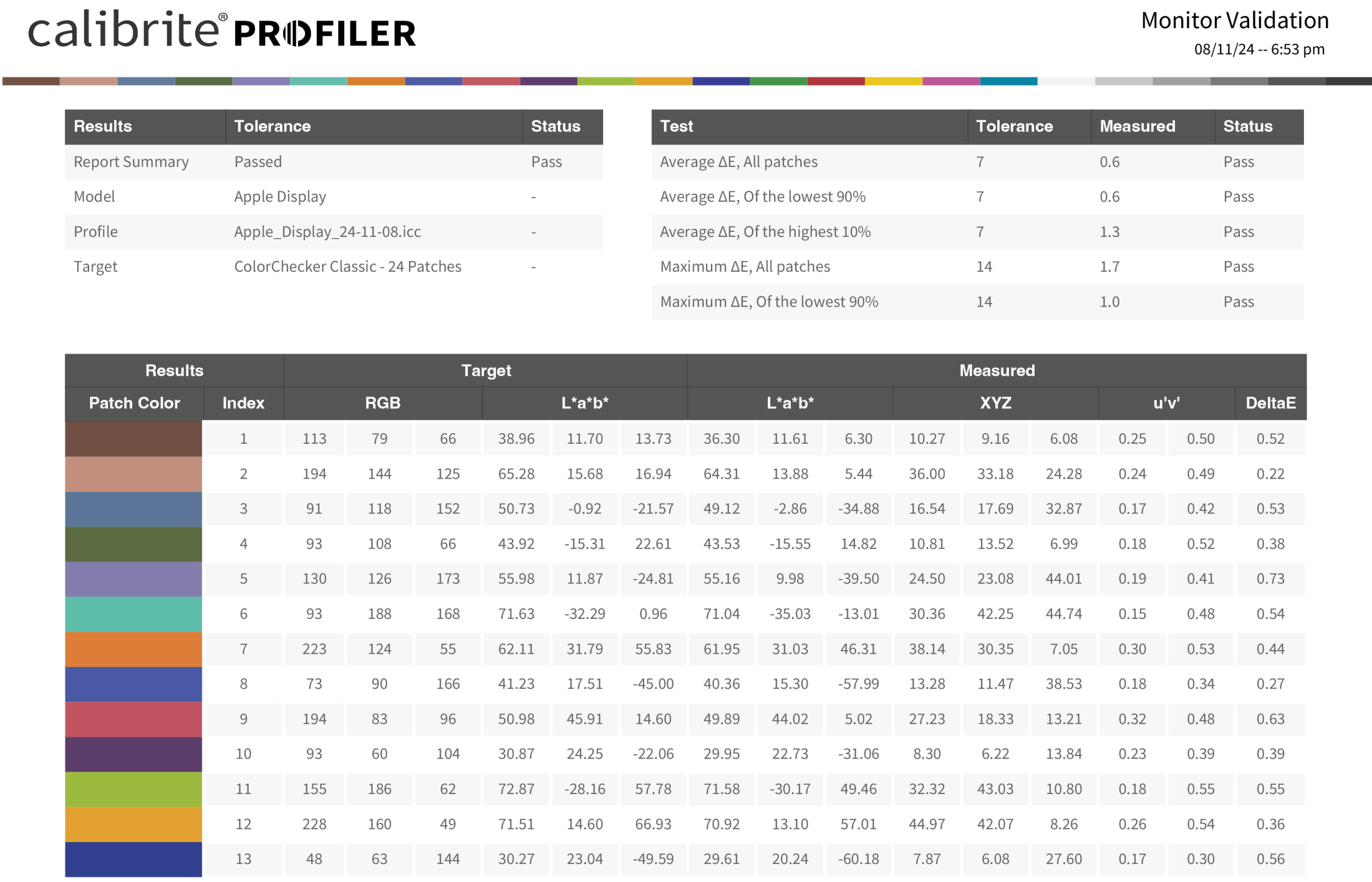
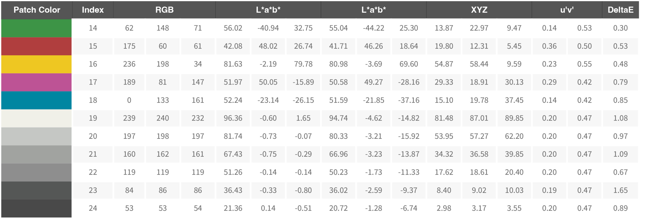
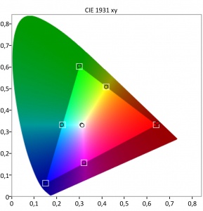
As you can see the performance of the screen is actually pretty good 😀
I’ve been working on the MBP for a few hours now and coming from the M1 Pro I can say that especially plugins like Luminar Neo and BorisFX are running a lot faster. That doesn’t mean that the M1 Pro was slow. But the M4 Pro is clearly a lot faster.
Conclusion, should you buy the MacBookPro M4 Pro with Nano Texture screen?
There will be a lot of reviews about the speed of the new MacBooks, for me it was already clear I would get more speed than I would probably ever really need. However the screen is one of the most important things on a laptop for me. We travel a lot and having a screen that functions like a mirror is insanely annoying. To be honest the screen alone was worth the upgrade. But a good screen should also be able to show proper shadow detail, don’t clip the whites and have a proper performance for color “critical” work. So in this short review I focussed on the screen and wanted to share the validation of the new MacBookPro 14″ Nano structure screen.
If you are in the market for a great monitor, make sure to check out the BenQ series.
I’ve been using them for years and they always deliver a great price/performance.
For the European customers we have a few 10% discount coupons we are allowed to give away. (Email)
Check this link for more info about BenQ SW monitors

You must be logged in to post a comment.