Tag Archive for: rogue

The differences in posing and how to coach

Posing should be natural (I think)

When I started out one of the first things I bought was a so called “posing guide”
Well that was a waste of money.
Every person is different and in all honesty most of the poses in those books are… well very posed.

I like the more natural poses and over the years found some ways to always get fresh poses out of my models.
Today we do something slightly different on the blog.
Normally during a shoot you select the best images from a setup, maybe 1, maybe 2 and sometimes a bit more.
You don’t want to overload your model with images, and always remember you are often as strong as your weakest image.
So selecting the right images is vital I think. Only select the real winners.

So how do I do it?

I will always start out with a standard pose, just to get the lighting right and the overall look of the shot.
But right after that I will start coaching the model not how to pose but more giving compliments, pushing his/her energy up.
If you don’t tell your model what to do but only adjust slightly you will always get awesome and unique poses.
How many models/photographers do you know/recognise due to the poses?

To keep the energy high I want to shoot fast.
I would rather do 4 sets of 10 minutes than one set of 60 minutes to push for perfection.
In all honesty if you can’t shoot the correct image in 10-15 minutes after the lighting setup it’s better to continue. Exceptions are possible of course, we have also worked for a hour on one shot but those are exceptions (for me at least).

But when do you stop?

For me it’s a matter of first getting a really good shot.
As soon as I see I’ve got it I will tell the model “One more” and shoot 4-5.
If in these 4-5 there is one that’s better I shoot another 4-5 etc.
The models energy stays high, and because I always say “one more” and keep shooting (speek enthusiastic) the model really thrives and gives me great shot after great shot, sometimes it’s hard to stop.

So let’s take a look at a series we shot with Lois recently during a workshop.

Lighting

This setup was done with 2 softboxes
The first one was a Geekoto 36″ softbox
The second one was the new Geekoto Lantern
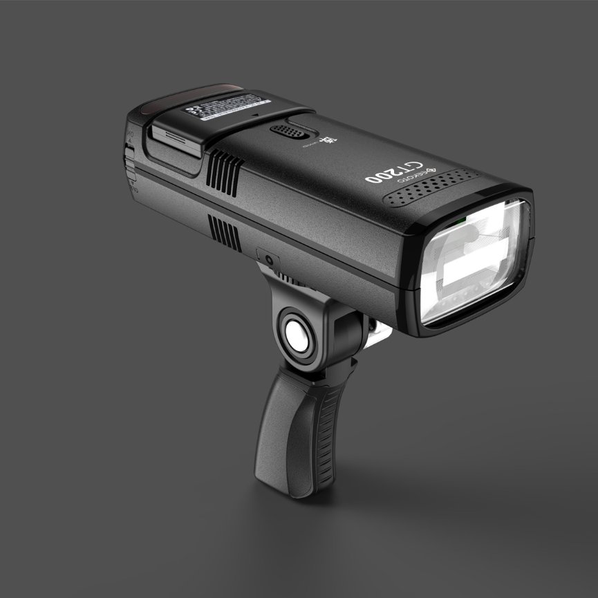
Both on the Geekoto GT400

The lantern gives a nice soft quality of light and reaches a lot more of the set.
The 36″ is slightly more focused.
In this setup the difference is mostly seen in the light fall off in the back but as you can see both softboxes can be perfectly used for fashion shots 😀

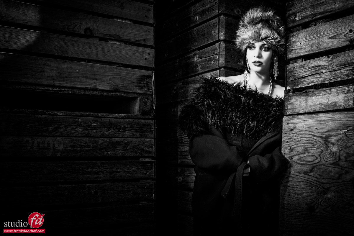
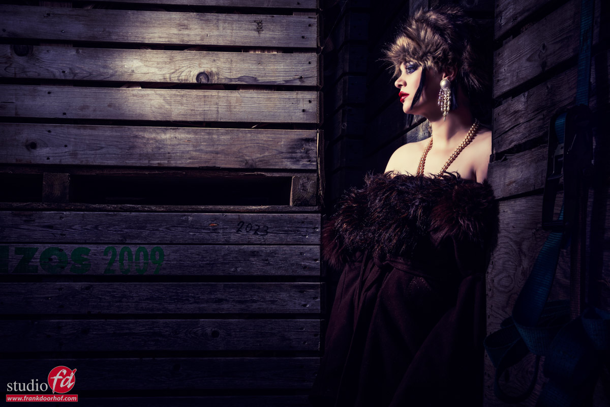
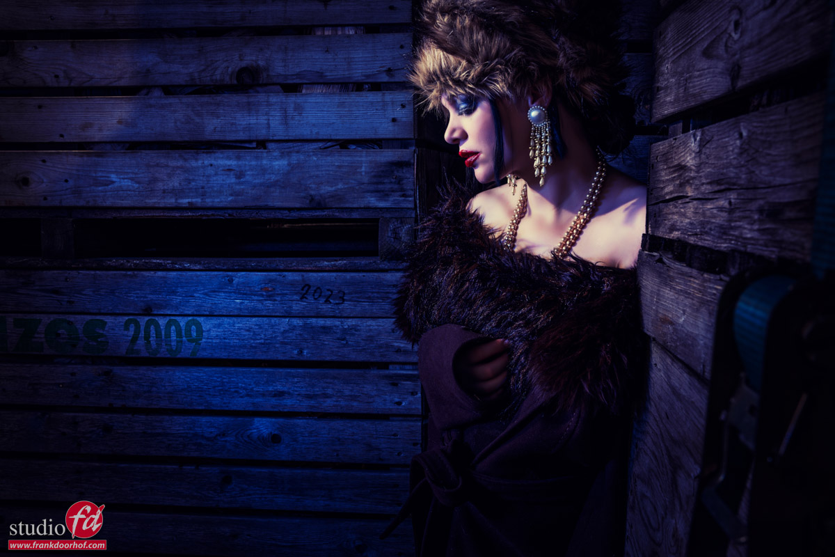
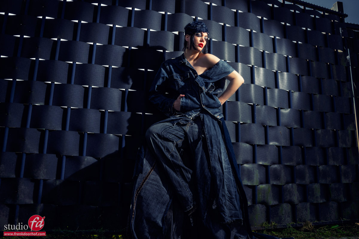
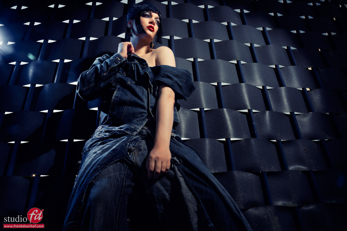
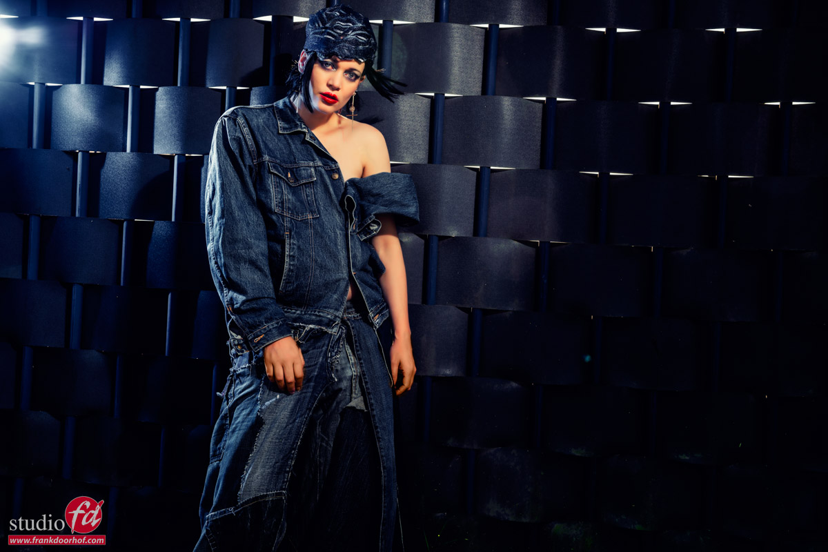
As you can see Lois is a great model, but as you can also see there are many different poses and lines in the shots.
I always look for a nice flowing line, and sometimes this means tilting the head slightly to the left, or the right depending on the rest of the body.
When the lines “flow” you automatically get a much easier to look image.
As you can see in these results some poses just look better and more easy, find the curves/lines and remember the “flow” and try to incorporate them in your next shoot, probably ti find out that it will differ per model, but the base is always the same. Just like with landscapes, find the “leading” lines and shapes and coach the model with slight adjustments to get the pose you like.

This is something that will take some practice but at one point you will find out it becomes much easier.

Want to visit a workshop?

Most of the workshops are taught in Dutch, but if you mail us a few weeks in advance we can switch to English.
Visit fotografie-workshops.nl for more info and bookings.

A surreal set and loads of colors

Workshops are always different

Want to know more about colors?
Check the following blog posts about color and color manipulation.
part I
Part II

One of the most important things for me when I teach workshops is that I have to keep challenging myself but also the attendees of the workshops
This means I’m always looking for new creative way to use light, color, backgrounds, sets etc.

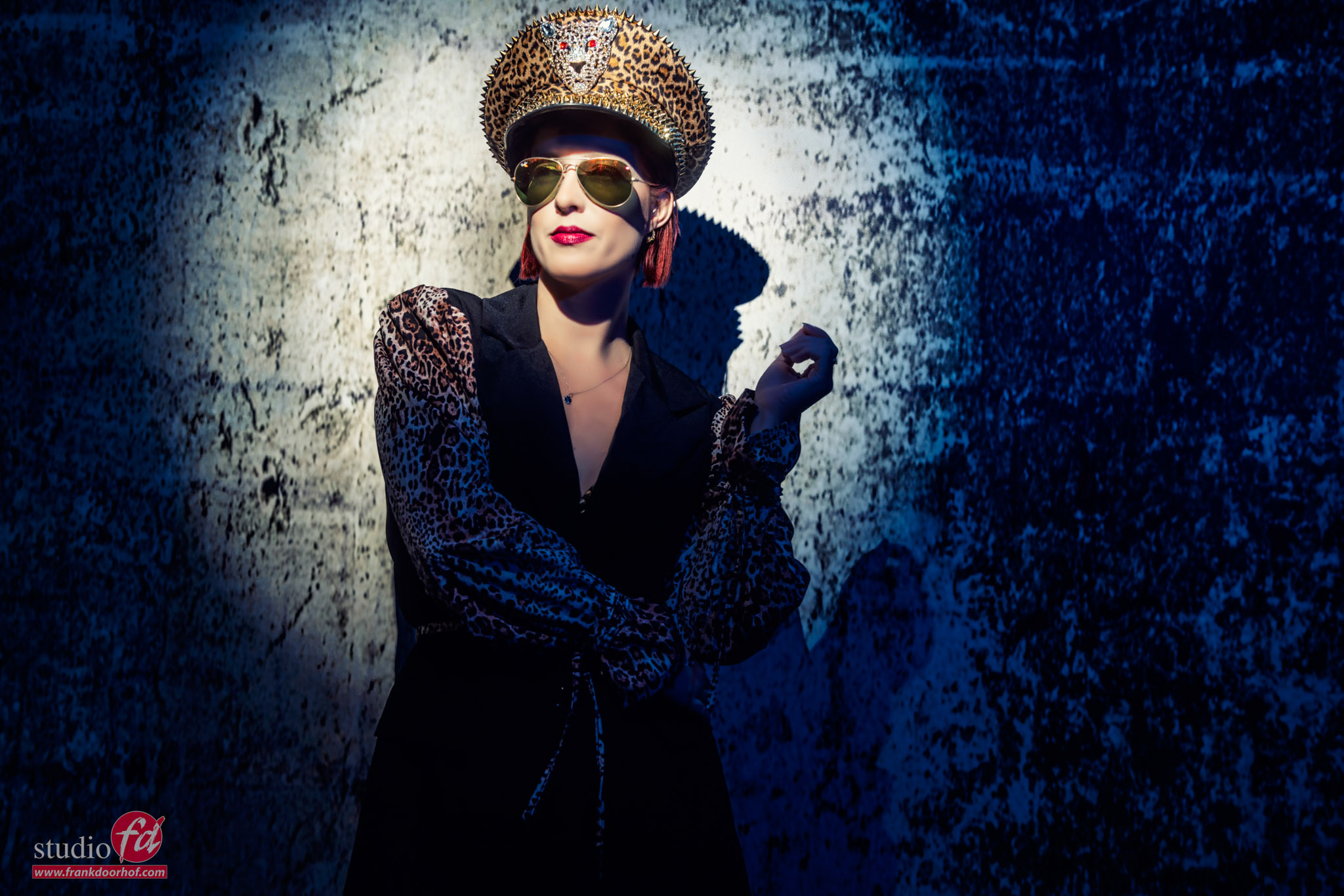
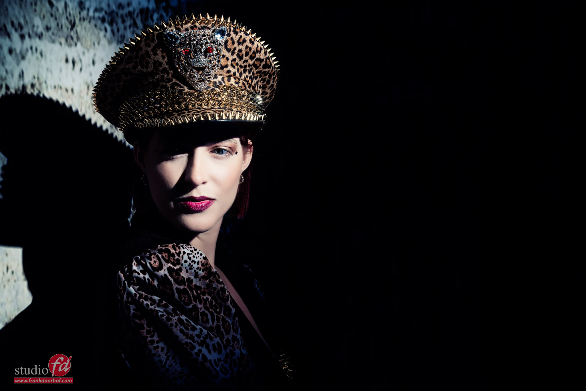
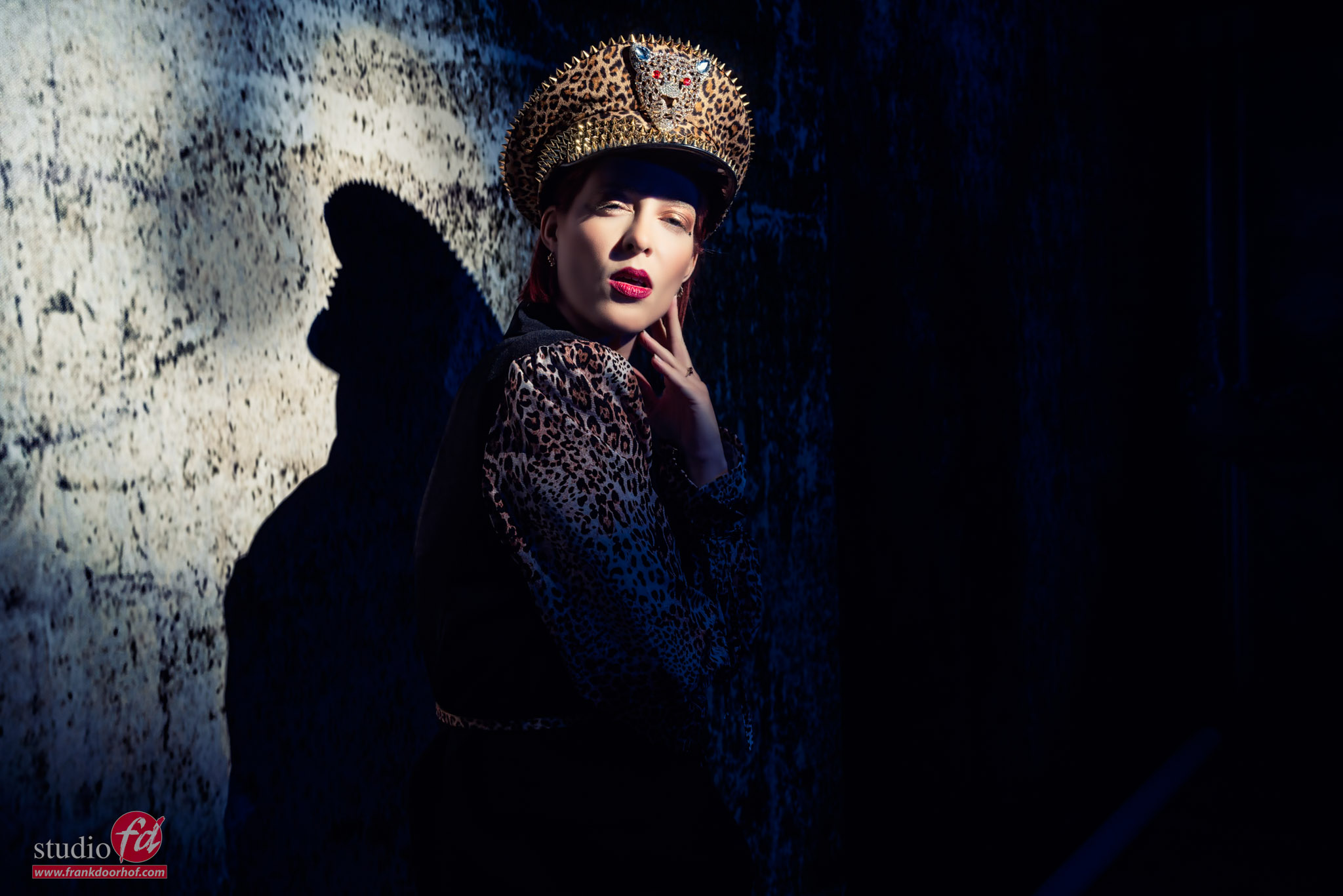
Today some images we shot during a workshop with our model Claudia.
The lighting setup might look familiar.
I’m using two Geekoto strobes with a red and blue gel as accents.
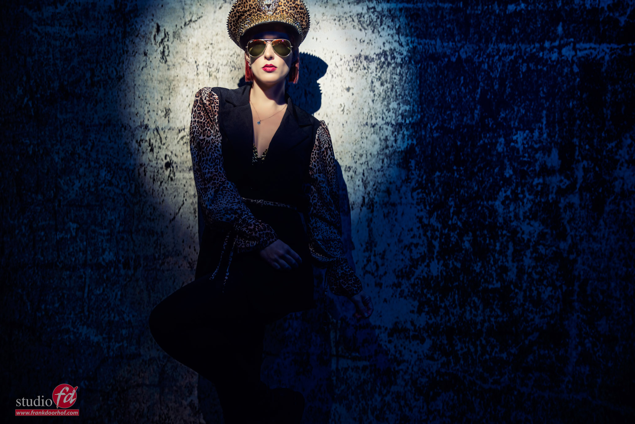
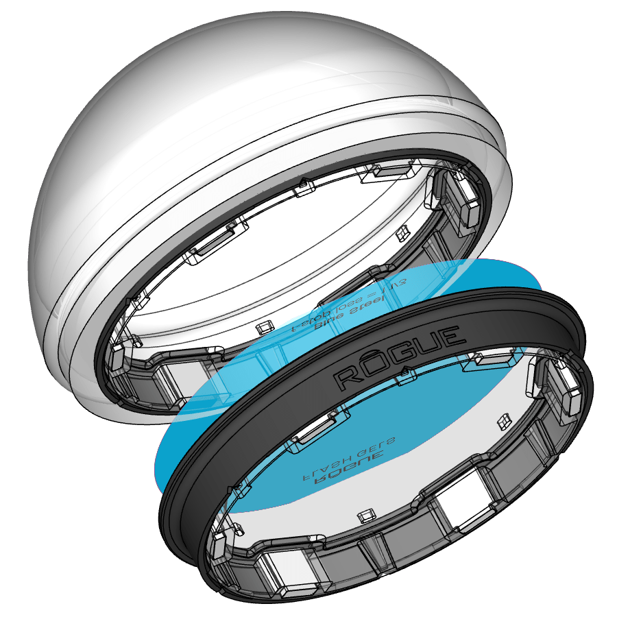
To get the lensflare and blue light on top I’m using a Geekoto GT200 with a Rogue blue gel from the magnetic system.
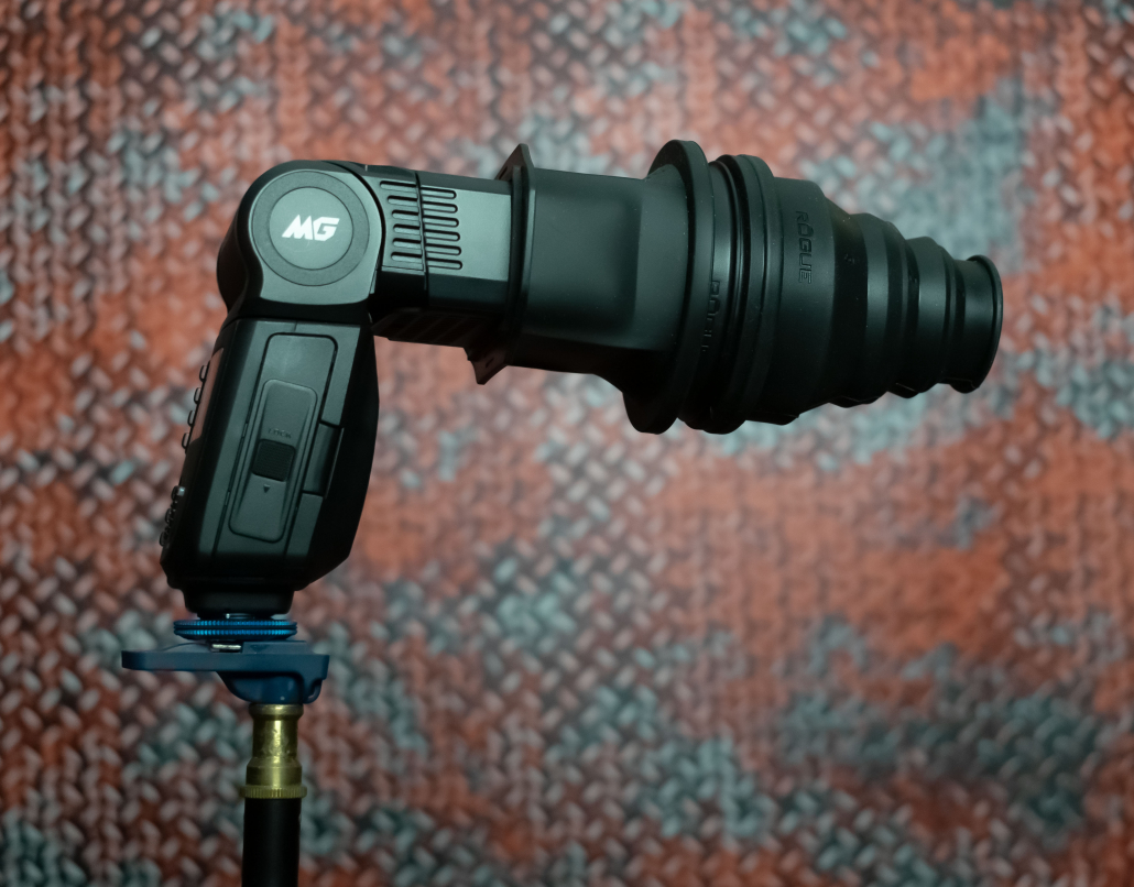
On the model I’m using the awesome Rogue collapsible snoot with a green gel.

To help the lensflare I’m using a black diffusion filter on my lens (Sony A7RIV with 24-70 f2.8)

The set was build with 2 clickbackdrops backgrounds and a floor part.
Add some props and a very cool model + outfit and you just have to find the right angle 😀

And of course we had to take some closeups.

Now let’s take a look at the lighting setup.

Want to visit a workshop?

I teach the workshops in our studio in Emmeloord mostly on Saturday.
The workshops are in Dutch but when you let us know a few weeks in advance we can switch them to English.
Visit fotografie-workshops.nl for more info

An extra tip

As you have read Key is the luminance of a color.
This means that if you don’t have a correct exposure of your shot the colors will not look accurate.
Now of course sometimes you want a more moody look, but it’s important to understand the basis of color to be able to manipulate them the way you want.

To be able to judge your colors correctly you need a proper workflow.
For me this contains a lightmeter and colorchecker.
This means I get my exposure correct and with the colorchecker I can create a profile and white balance for that series.
And do remember this is just to get all the images looking the same so that all the presets you run or anything else in your workflow has an expected outcome.

On the side of the monitor I’ve been using BenQ monitors for years and can highly recommend them.
They have a great line up of professional monitors and a great line of P3 colourspace monitors (in between sRGB and Adobe RGB) for very affordable prices.
Besides great quality most BenQ’s also support hardware calibration. Which means you don’t calibrate your operating system but straight into the monitor.
This is a much better way of calibrating your screen than via standalone software and of course the software is delivered for free.
We have a few 10% discount codes for our European vistors, please contact me for more info.

Getting outrageous skies without Photoshop but with gels

Color manipulation is fun, get outrageous skies without Photoshop

Today another part in our series on color and color manipulation.
part I
Part II

We all love easy to do tricks of course, so I thought today would be the perfect time for just such a tip.

When we look at the color triangle we can see that all colors are connected through the white point.
We talked about this in the first blogpost in this series.

This also means that we can manipulate our white point by choosing a whitepoint that is way off the black body curve and choosing this as a new white point.
So let’s take a look at how this works in real life.

Look at those skies

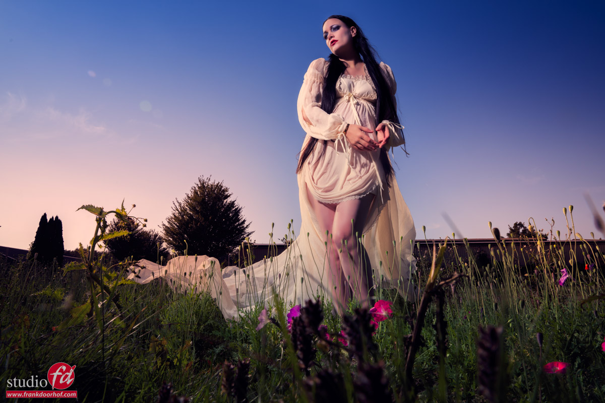
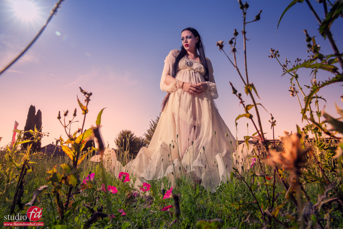
Let’s take our model Lois on location.

Yeah, well….
There is nothing wrong with this shot but it isn’t really popping right?

So first let’s add some strobe power.

Ok that’s a LOT better, love the sky and the model really pops out.
But what if….we want to push the creative factor up.
Let’s add a green gel to our strobe.
You can use the Rogue magnetic system for this.

Of course it’s vital to shoot a color checker for this.

Now click on the whitebalance part and look at what happens.

Don’t you just love the effect.
In essence it’s very easy what happens.

Normally the white point is on the black body curve.
By using a green gel on the strobe we are now placing the white point above the black body curve, by correcting this to the correct white point everything else drops down, meaning white becomes more magenta. Enhance the colors a bit in your favourite editor and you can have loads of fun with it.


An extra tip

As you have read Key is the luminance of a color.
This means that if you don’t have a correct exposure of your shot the colors will not look accurate.
Now of course sometimes you want a more moody look, but it’s important to understand the basis of color to be able to manipulate them the way you want.

To be able to judge your colors correctly you need a proper workflow.
For me this contains a lightmeter and colorchecker.
This means I get my exposure correct and with the colorchecker I can create a profile and white balance for that series.
And do remember this is just to get all the images looking the same so that all the presets you run or anything else in your workflow has an expected outcome.

On the side of the monitor I’ve been using BenQ monitors for years and can highly recommend them.
They have a great line up of professional monitors and a great line of P3 colourspace monitors (in between sRGB and Adobe RGB) for very affordable prices.
Besides great quality most BenQ’s also support hardware calibration. Which means you don’t calibrate your operating system but straight into the monitor.
This is a much better way of calibrating your screen than via standalone software and of course the software is delivered for free.
We have a few 10% discount codes for our European vistors, please contact me for more info.

Combining 3 gels for awesome results and even white light

Colors can be mixed, Color Manipulation part 2

In the previous blog post you could see that colors are all connected.
So today we are going to play with this.

Additive and Subtractive colors

Often this leads to a lot of confusion about what primary and secondary colors are.
For photography and video we are using Red Green and Blue to create the color we see.
A printer uses CMYK to print the colors we see.

These are two different ways of working with colors we call those additive and subtractive.
Additive colour is created by mixing light. Subtractive colour is created by mixing materials.

For today we are going to work with 3 colors Red, Green and Blue.

And I mean that literally

When we combine a Red, Green and Blue gel and aim it at a subject we will get an awesome effect.
You will see a mix of the colors in the shadows, but the fun thing is that where all 2 colors overlap you get a “white” light.
This is how gels actually work, so you can create some truly stunning shots with this.

In this setup I’m using three strobes with gels.
Let’s first take a look how it looks without green.

As you can see it doesn’t really look right. There is a harsh shadow line and it doesn’t really pop.
So let’s throw in the green.
The green strobe is aimed directly on the model, while the red and blue are coming from the sides.

Now let’s start to play a bit with poses but more importantly our own position.

As you can see by changing the angle under which the model poses and where you shoot from you can play with the colors and get very different results.
This is without a doubt a very creative solution, but… do remember this is not something you shoot for a client without showing the result before hand, I love it, but it’s not for everyone 😀

An extra tip

As you have read Key is the luminance of a color.
This means that if you don’t have a correct exposure of your shot the colors will not look accurate.
Now of course sometimes you want a more moody look, but it’s important to understand the basis of color to be able to manipulate them the way you want.

To be able to judge your colors correctly you need a proper workflow.
For me this contains a lightmeter and colorchecker.
This means I get my exposure correct and with the colorchecker I can create a profile and white balance for that series.
And do remember this is just to get all the images looking the same so that all the presets you run or anything else in your workflow has an expected outcome.

On the side of the monitor I’ve been using BenQ monitors for years and can highly recommend them.
They have a great line up of professional monitors and a great line of P3 colourspace monitors (in between sRGB and Adobe RGB) for very affordable prices.
Besides great quality most BenQ’s also support hardware calibration. Which means you don’t calibrate your operating system but straight into the monitor.
This is a much better way of calibrating your screen than via standalone software and of course the software is delivered for free.
We have a few 10% discount codes for our European vistors, please contact me for more info.