Tag Archive for: Blogpost about styling in a photoshoot.

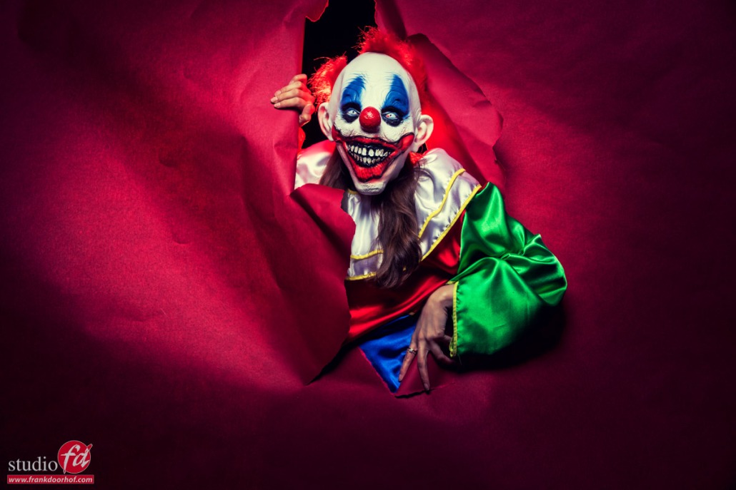
A horror clown in our studio (in color)

Storytelling with a horror clown (in color)

For me, storytelling is always a vital part of my photography.
Even when I photograph a CEO or artist I always try to dive into the person/product/company to get something that really fits their company/person perfectly.

And sometimes you just go all out.

The fun with workshops

Teaching workshops is one of the things I love the most. Working with a group towards a result and in between explaining all the techniques, and ideas, work with styling, poses, and of course props. The images you are going to see today might not be something you shoot every day, but… and that’s the thing a lot of people miss.

If you can walk 10 km with ease, it’s no problem to walk 2-3 km.
This might sound a bit weird, but this works for many things.
If you can shoot super creative situations, and know how to handle your lighting, poses, and how to coach your model to do the most bizarre, weird, or awesome stuff it becomes MUCH easier to coach a CEO or to shoot a super creative image for a product.

Storytelling

In today’s blog post the results from one set with our model Felisa.
And although you don’t recognize her, the choice of model is vital for these kinds of shots.
One might say, she is just wearing a clown suit and props, so what’s difficult?

When you take away the expression in the face, it’s all about body language, and believe it or not this can be incredibly difficult for a model, and photographer to pull off.

I think she did great.

So let’s take a look at some images first, and then I explain a bit more.
storytelling

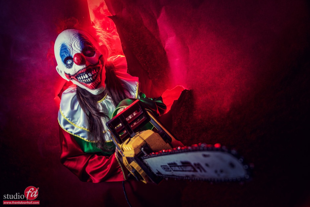
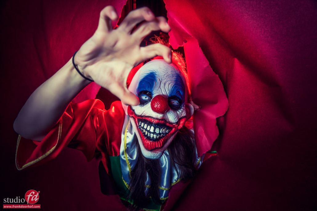
let you model try to grab the camera and it looks really scary
storytelling

The idea of this shoot with the horror clown (in color)

I don’t really like to repeat myself, but sometimes ideas are just so much fun and open for changes that you can repeat them with a fresh outcome.
Many years ago I was invited to introduce a new Phase One 101MP camera in a studio in New York.

Let me first say I love New York so the prospect of shooting in a studio there is always exciting.
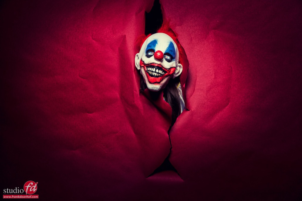
The problem was that I “had” to use a gray seamless background for some images and that day I didn’t feel like using that so I decided to just place the model behind it, cut a hole, and let the model just stick her head through and later hold the camera. Great shots and loads of fun.

A few years later I did a similar thing during a trade show in the UK. Both were more fashion and fun-related.
For this workshop, we wanted to do something completely different, and as a horror fan, the idea quickly popped into my head that it would be awesome to shoot it with a killer clown.

Getting props to tell the story

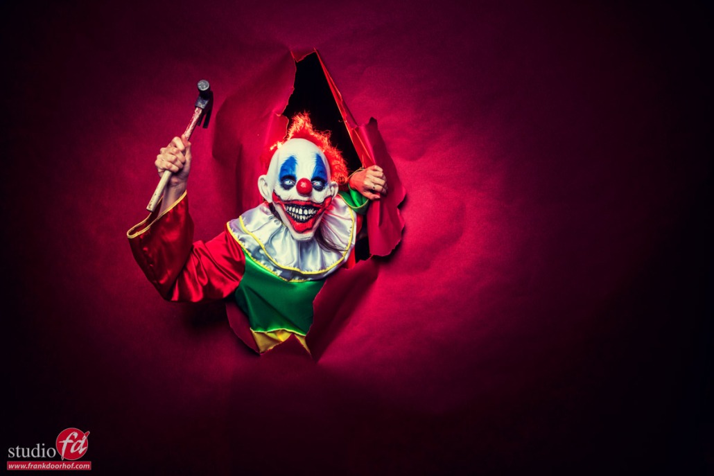
I already did something with a big knife in the past so this time we wanted to do something a bit more “big”.
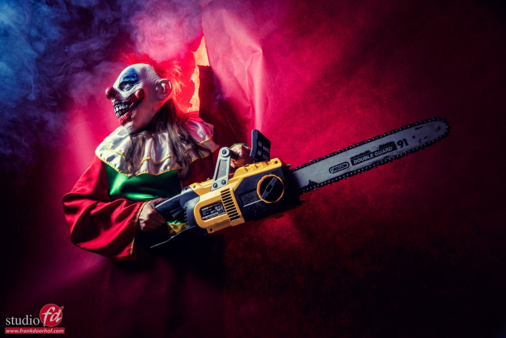
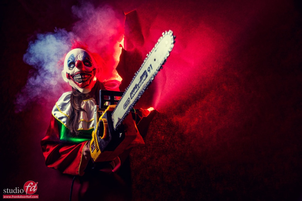
A hammer is fun, but what about a chainsaw, with a little bit of a hint to my all-time favorite actor and character Bruce Campbell/Ash.

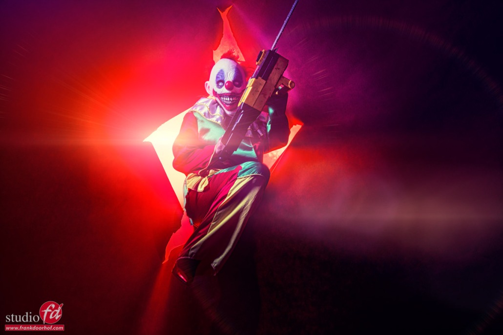
Of course, we needed some backlighting and smoke.
So I used a Geekoto GT400 in the back with a large reflector and red gel.
The reason I’m using a large reflector is because I needed a lot of light due to the seamless paper. If you would use a gelled softbox it would not emit enough light to pull this off.

In the front we experimented with a softbox and a striplight with a grid, you can probably spot which is which 😀

So let’s take a look at the rest of the images.

If you also want to visit one of my workshops and learn all about light and storytelling? Check www.frankdoorhof.com or www.photography-workshops.eu
We will be in The Netherlands, Belgium, and the UK this year for events and workshops.
storytelling another angle storytelling with a horror clown (in color)


Read the blog about the Outside Fashion Shot for Sunglasses with model and stylist Nadine

This blog is about Working creatively with seamless paper 

This is the blog about a recent workshop: storytelling to set the mood 

 

Outside fashion shot for sunglasses with extreme styling and flash Part III : let’s talk storytelling

This is it

I think we can all agree that gear, lighting, styling, location etc. are all important for a successful shoot. Although during this workshop series we already saw that the location can be transformed quite easily from ok to wow by choosing the right angles and lighting/styling etc.

If you missed the previous ones you can read them here (highly recommended)
Let’s talk about the flash
Let’s talk about gear

Ok so now it’s about story telling, and what do I mean with story telling.

When we look back into history, even as far as the cavemen, the main reason to create “art” was to tell stories. Ranging from one man killing a Bison in the caves to whole paintings containing scenes from the Bible, and everything in between. Now of course there are also still lives and landscapes but I hope you know what I mean 🙂

When we look at what we see online today it’s a boatload of selfies, photos of food or things I can’t mention here. We are bombarded with a huge amount of images every single day. But when is the last time you really stopped to look at something? or when was the last time you were really impressed with an image?

Most of them probably have have the same element

And that’s story telling.
Now story telling can be done in just one image, but also in a series.

During the workshop on location in Emmeloord we find locations that are not immediately awesome, but I show the attendees how, together with an awesome model and styling in this case, you can transform those locations to something great with choosing the right lighting and shooting angles.

This is the second set of that workshop.
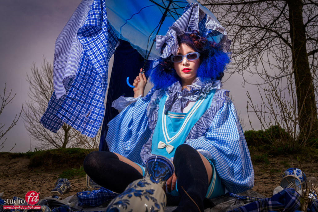
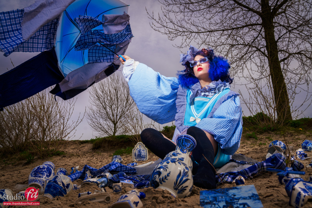
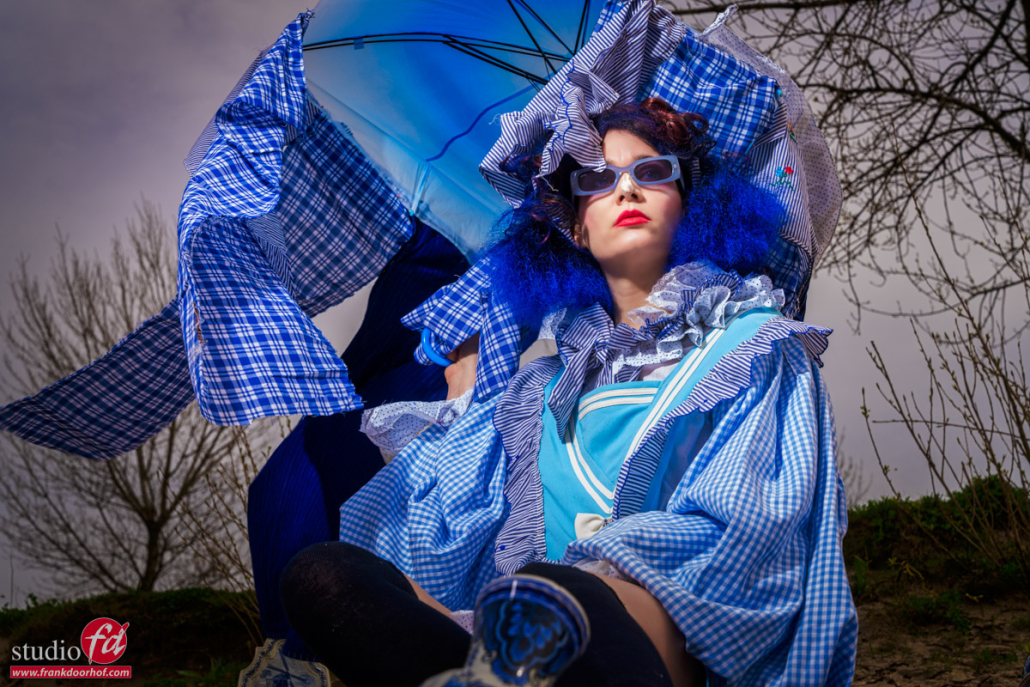
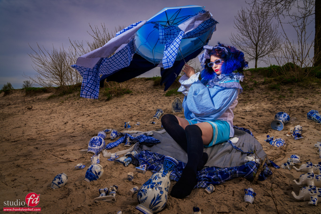
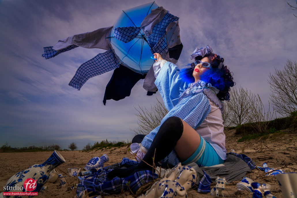
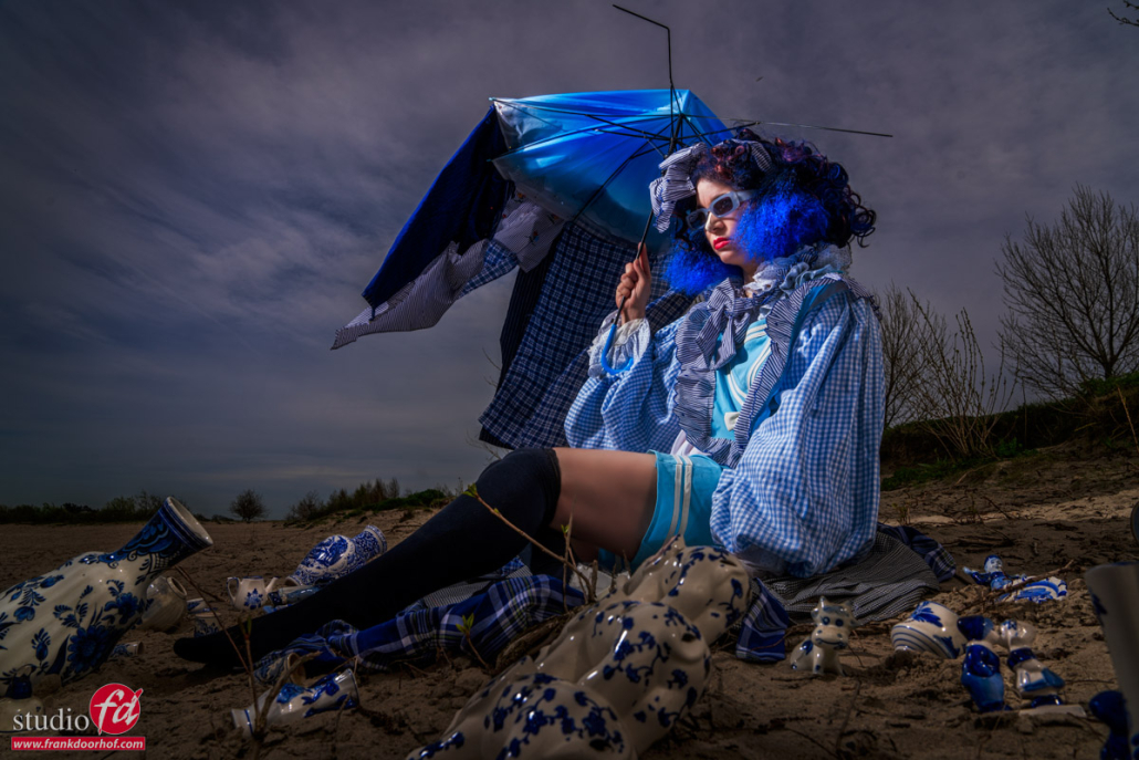
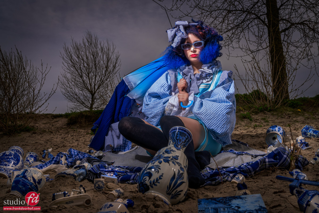
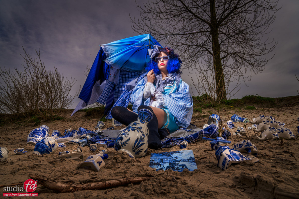
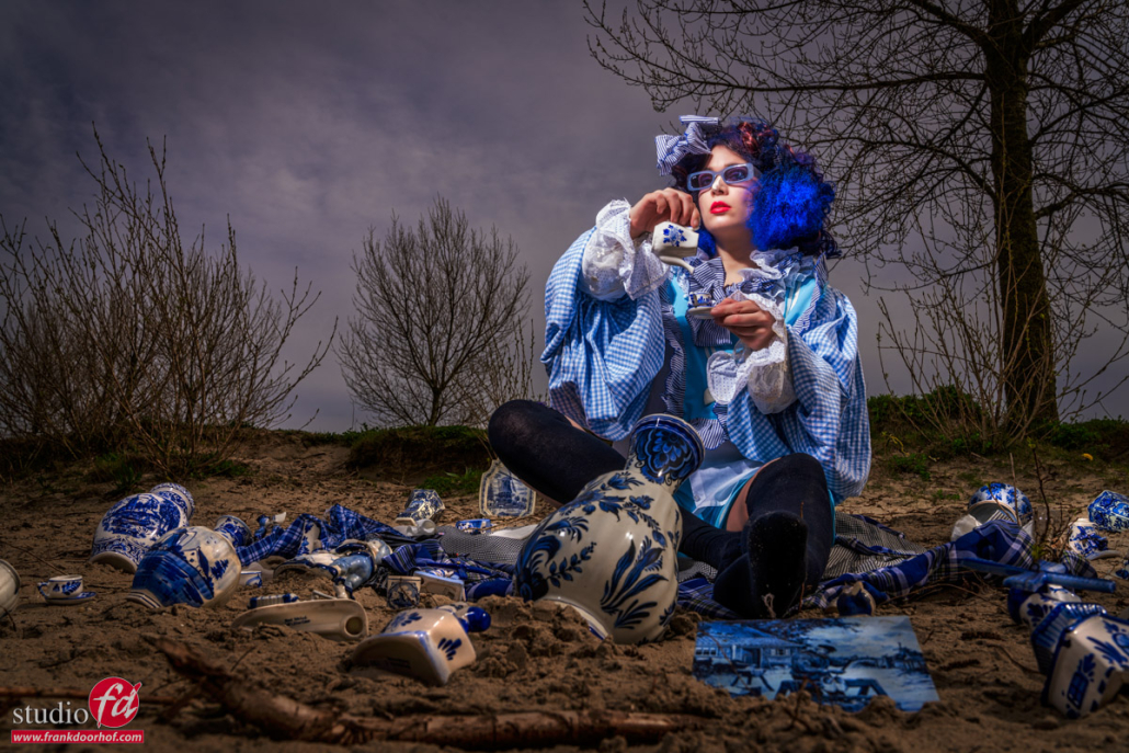
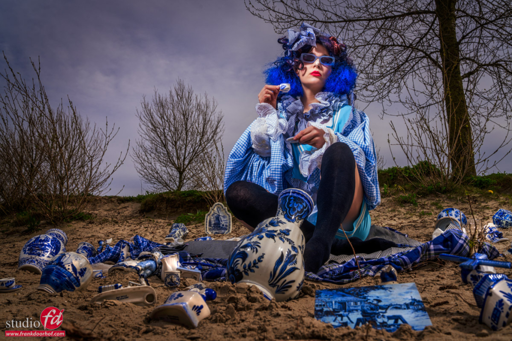
For this setup we went to the local beach, we chose a location with some trees behind Nadine and a slight rise.
Nadine brought a lot of Delfts blue we used as props spread around her.
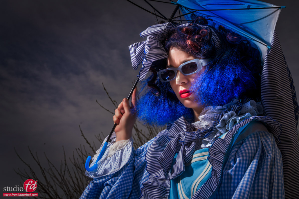
Now the styling on it’s own already did a lot but when I saw that the umbrella was breaking down I decided to also use something else.

Manipulate the sun/ambient light

We talked about this technique a few times in the blog and during digital classroom episodes.
Dragging the shutter.
What I do outside to get the look I like :

  1. First I make sure my cameras EVF is in emulation mode
  2. I will set my camera to “manual” mode and the shutterspeed to 1/125 (when shooting without HSS) and the lowest ISO.
  3. Now I will look through the display and adjust the aperture till I think the scene looks like I want.
  4. Now I will set it ONE stop darker.
  5. Take the Aperture you see in camera for the look you like
  6. Use a lightmeter to meter the strobe at the aperture you liked
  7. start shooting with a shutter speed of 1/60 but with the set aperture

You might wonder why I shoot at 1/60
It’s very easy to explain luckily.
When shooting without HSS I can not shoot faster than 1/125 (sometimes 1/200) this means when I shoot with strobes and I think the background should be darker I have to adjust my strobes, or when I want to experiment I end up with different apertures, meaning different looks due to depth of field. This breaks the total look of a series and can sometimes work and sometimes not.

By adjusting the strobes one stop higher than I thought was perfect and lowering the shutter speed by 1 stop I’m getting the exact result I liked at the start with an added bonus. When I want the background darker I can raise my shutter speed to 1/125 or sometimes 1/200 and get a much darker background, but because I’m shooting with strobes I can also go as a low as 1/30 and sometimes even 1/15th this gives me a nice dynamic range to work with without breaking the look of the shot.


The weather

I’m nog just using this technique to adjust the look of the shot, but also to be able to react to changing lighting on location.
And in this case for story telling.
The following series was shot within 5 minutes, so the lighting didn’t really change, however because the umbrella was breaking down I decided to raise the shutter speed and make the whole scene look darker the more the umbrella broke down.

As you can see in the next series, changing the look of a scene by the shutter speed is fast and easy and has a huge impact on the photo. I love to use it.

Let’s first take a look at the gear used :

Annewiek is holding the lightstand on which the Geekoto GT200 is mounted with a large reflector aimed at the model.

And that’s all actually.
So let’s take a look at the results.

Model/Styling : Nadine
Sunglasses : Sparks

www.fotografie-workshops.nl for the Dutch workshops
www.frankdoorhof.com/shop for my gear

Wait before you throw something out

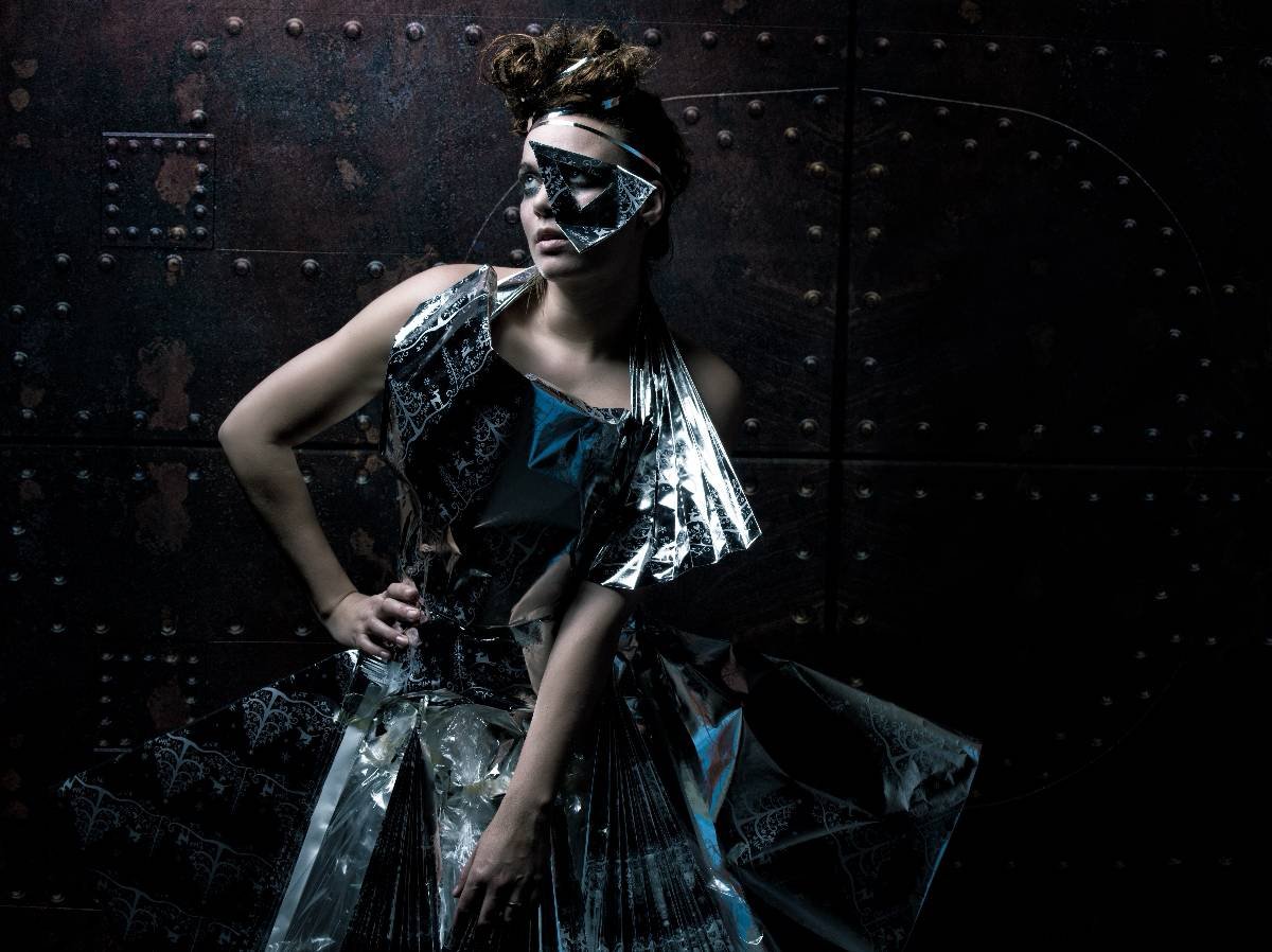
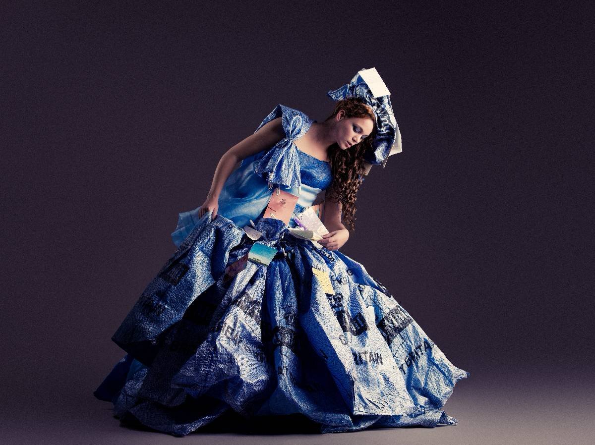
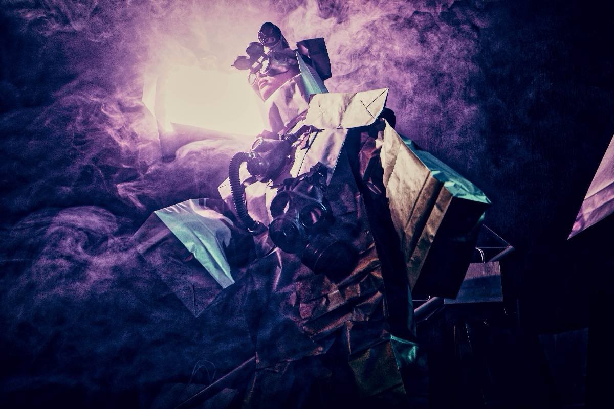
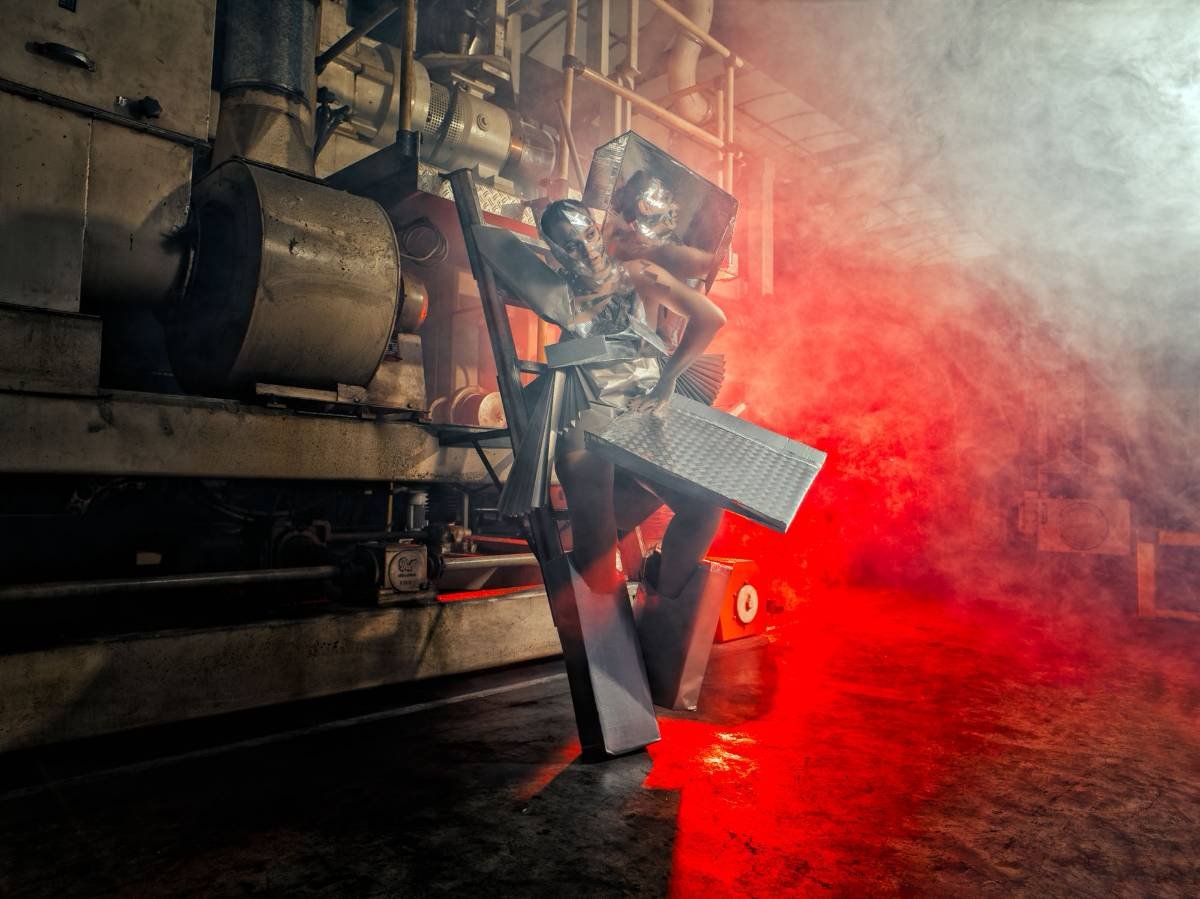
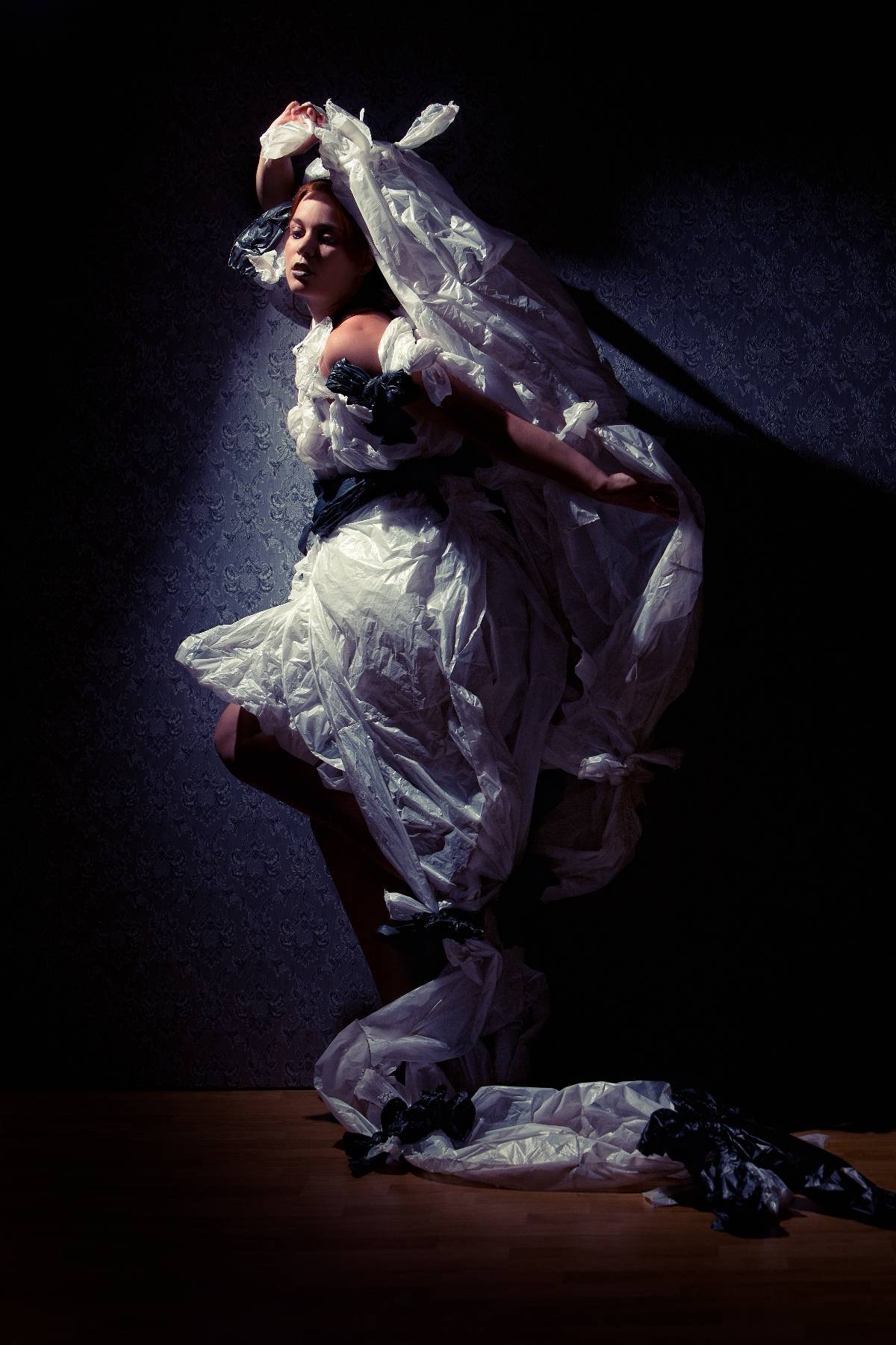
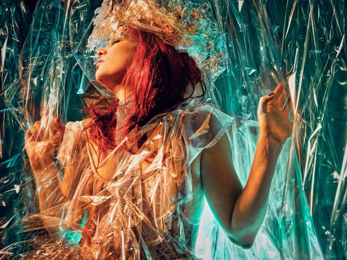
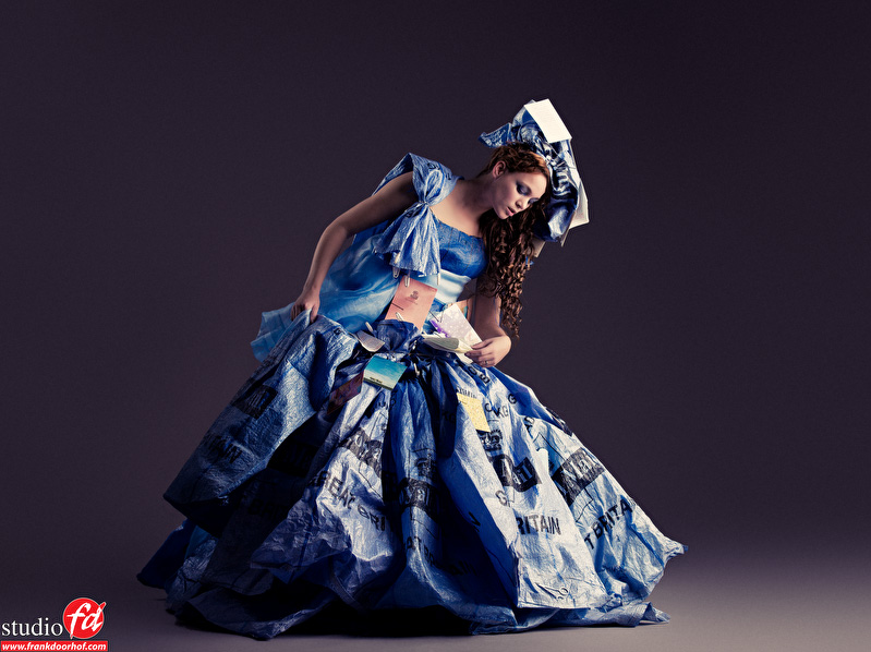
Don’t just throw stuff out. It can be awesome material to make clothing or accessories

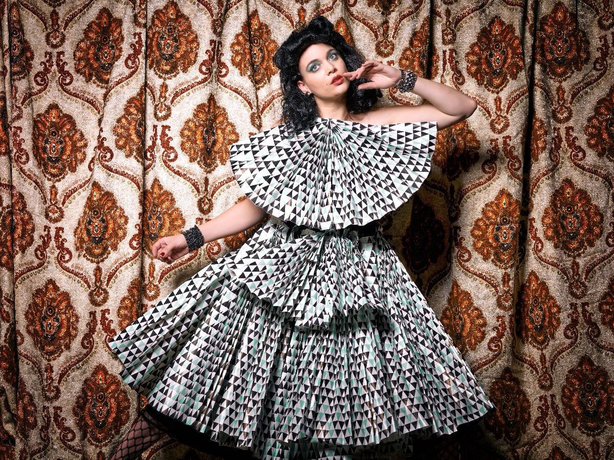
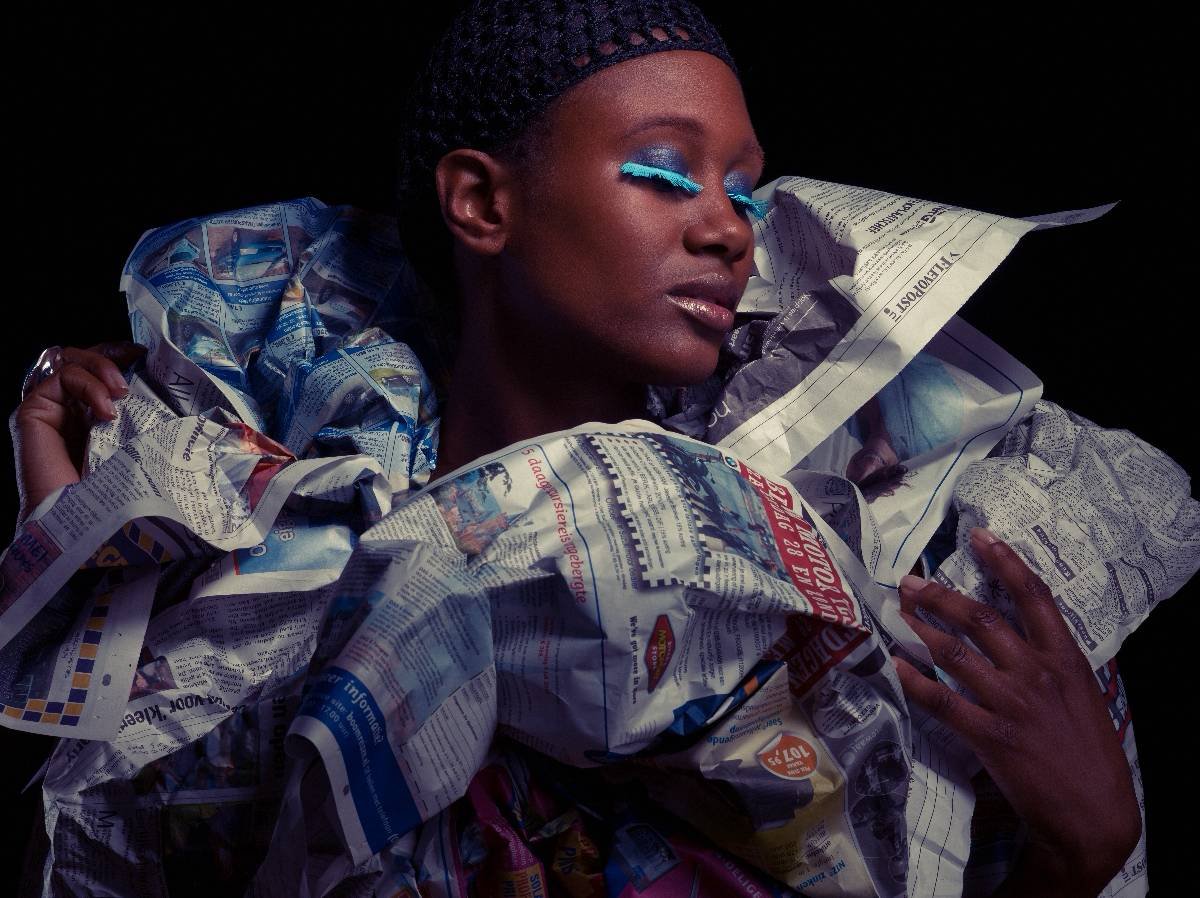
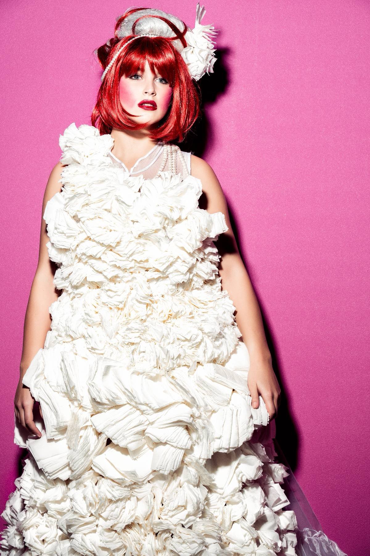
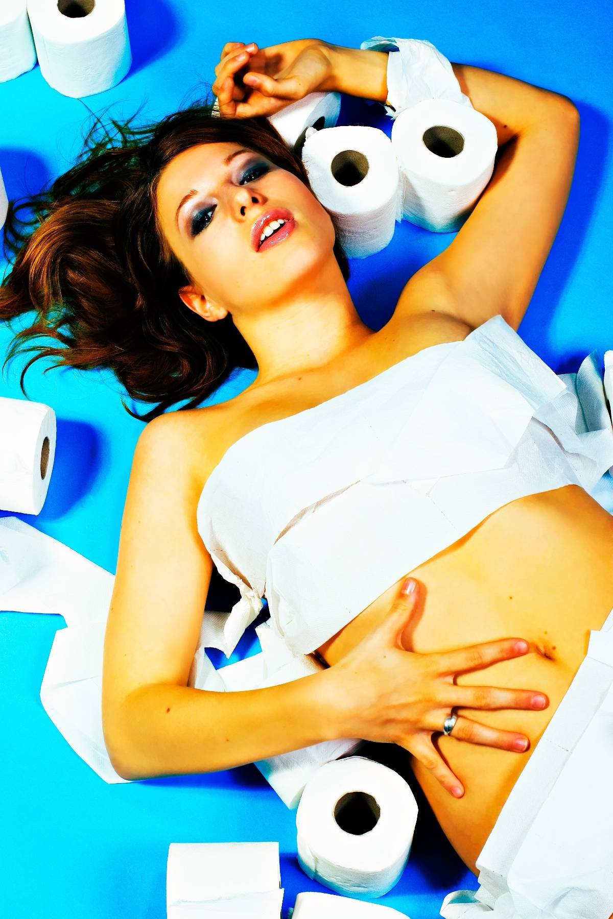
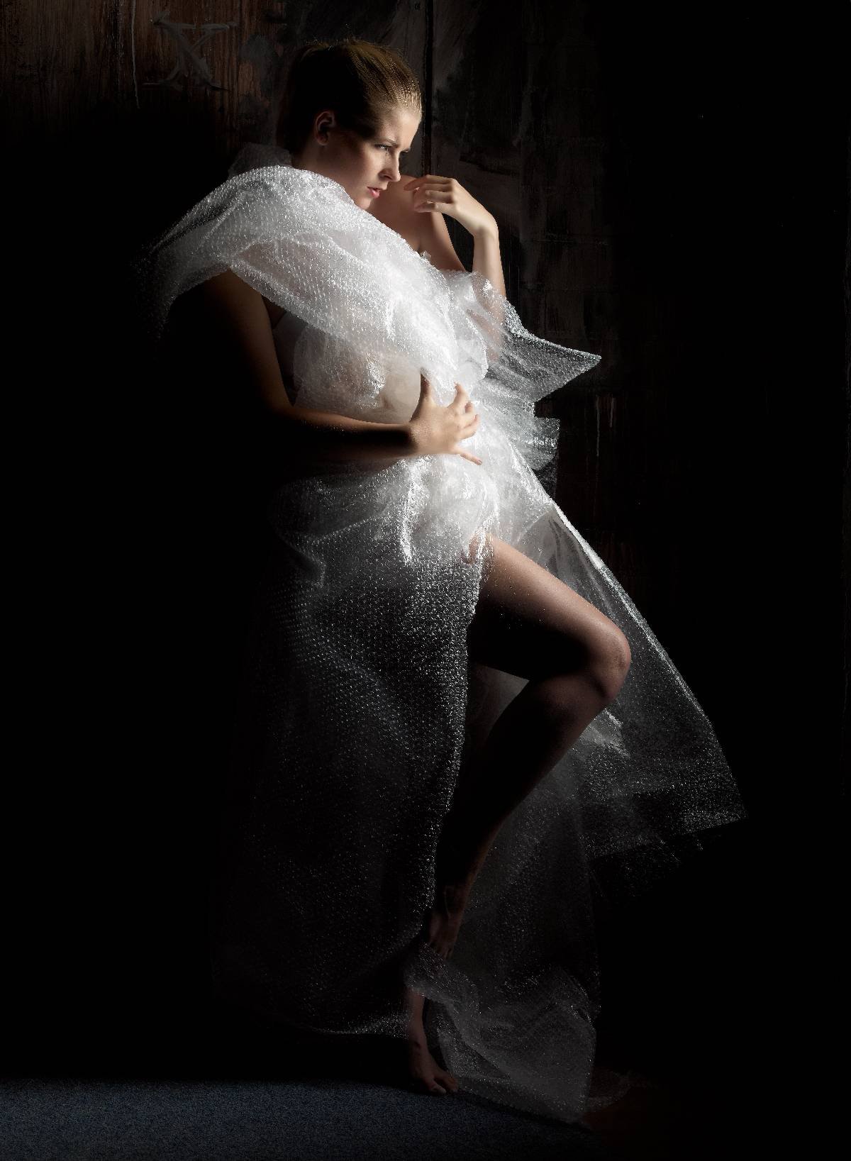
Over the years I’ve shot some bizarre clothes and accessories all made out of material that you would never expect in a photoshoot. Ofcourse it helps to have a crazy creative stylist and model like Nadine 🙂 the images in this blogpost are a mix of styling by myself and Nadine.

For example think about some packing paper and old curtains

Or for example some Christmas paper

But also postal bags work

But one of my favorite must be this heavily inspired by the 50s pulp SF movies shot which is almost completely build up from paper bags

Staying in SF what about a robot all made out of cardboard

But it can also work with a newspaper of course.

Or what about handkerchiefs

And when we are on that route… Some toilet paper ?

And sometimes a lot of fun after the shoot with bubble wrap

And staying in plastic, what about some thrashbags? Not possible? Oh yeah it is

And finally (although I have loads more) what about using some plastic material and don’t use it as clothing but as background

What did you use as a creative solution?

Styling

One of the things that is often overlooked in a photoshoot is styling.
One can argue that styling is often expensive and that a good stylist is hard to find, however I disagree. Yes a good stylist is very hard to find, however why not at least try it yourself. Daily I get images from photographers asking me how I like their images, and some images are indeed nice or even cool, often however they are in my opinion “not as good as they could have been” due to a lack in styling. Or in other words, great lighting on a great location but the model is standing there in just jeans and a top…. in this blog post a few pointers to do the styling yourself or with your model without much budget.

Read more