Reviews on gear and software

Samsung Galaxy S22 Ultra first camera test

It’s not secret that companies promise you the world when they want you to buy their products.
I remember one for the first smartphones I bought and the response from the seller was “you’ll never need another camera anymore, yes it’s that good, I don’t use my DSLR anymore”

Now this was many years ago when the quality of the photos always made me wonder if it was night all the time or if there was some weird snow or rain falling in the shots, in other words, muddy shots with loads and loads and repeat loads of noise.

Ok, when you shoot under perfect conditions there…. no I’m not even going to try they just plain sucked.
And in all fairness not a lot has changed, look at the presentations from Apple, Samsung etc. and they all promise you the perfect camera experience and better performance than before (yeah it would be weird if they said, it’s worse than last year)

I love gadgets and smartphones so most of the times I will upgrade almost every year when the latest and greatest is released and in all honesty I’m mostly highly disappointed. Up until I got my first Huawei phone… wow now that was a difference, it was far from perfect but for the first time I owned a phone that I would label as a hobbyist camera. In other words if I walk around without a real camera I’m more than happy with the smartphone images. But the UI and operation of the camera was… well it’s a smartphone you probably know what I mean right? It just doesn’t feel like a camera.

This changed when I got my Sony Xperia 1 II
Now when we talk about a real camera experience I must say Sony hit the nail on the head and hammered it all the way in. Yes it’s that good. If you ever used one of their amazing Alpha cameras it immediately feels familiar. They do use two apps but when you use the Pro version there is really hardly anyway to go back to the original camera. Also the dedicated shutter button is absolutely genius and works like a charm, the camera is super snappy and switching between the three lenses is fast and easy, even with gloves. The whole experience is a big 10+, The output is also very good in RAW, especially under ok lighting, as soon as it gets to dark the Sony really dives down in quality, and this is something I did miss dearly on the Sony, the Nightmode I got so used to on the Huawei series. But as a photographer I’m honestly more interested in RAW output without any tinkering than a nightmode… but still….

Well if you saw the Samsung presentation one might get the impression that they finally solved all the problems, this is the camera that can also make calls…..Because I did need a new smartphone I decided to take the jump and ordered the Samsung Galaxy S22Ultra 256GB. So lets make clear that I paid full price for my phone and I’m not at all associated with Samsung in anyway.

I’m totally going to skip the Android part, the only thing I can say is that I’m always pretty easy in switching OS and get used to things very easily, but some things I do want to point out.

Most people are active on social media and this is also where a lot of our images end up (when is the last time you printed your images?) so the sharing menu for me is incredibly important that it’s fully customisable and easy/fast to use. This is something that a lot of phones can improve and Samsung did do it right here by making it possible to have a lot of destinations in custom order meaning I can just follow the same order every time I post something I can’t express how important that is.

So up to the cameras
Specs are impressive for a smartphone with a 108MB (binned) main sensor, a 12MP Ultra Wide and 2 10MP tele lenses (3x and 10x).
When looking at the main camera app almost everything is there that you would want (and again fully customisable) we have standard modes for video and photography, a pro mode for both, panoramic mode in wide and ultra wide (nice), nightmode and some more cool things including a ONE SHOT.. (which takes one shot in all the modes you select, now that’s cool).

The standard camera app supports RAW (which is a surprise and awesome) and saves both RAW and JPG files (like most), only on the mainsensor you can opt for the binned output of 12MP or the full 108MP output.

If have to be honest the files coming out of the main camera app are pretty decent and have a lot of play room.
Samsung also has an Expert RAW app which you have to download separately (why not just include it), this app is pure aimed at the pro (they say) and has some real magic going on behind the scenes, 16bits RAW files are already impressive but they also work some internal magic with combining several shots to get some really sharp images that will rival pro cameras.

So is this all true?
Let me start that on the screen of the Phone the images just made my jaw drop on the floor and bounce back a few times. I’m not easily impressed but wow this is something else. But after loading them into Lightroom and looking at them on my 12.9″ iPad Pro there are already some issues, but still they look more than decent, I would even say impressive).

Where it all just gets a lot worse is when you open the images on a desktop.
Where the Sony RAW files exhibit plenty of detail and enough dynamic range to do some proper editing the Samsung files in expert RAW do have the same or slightly better dynamic range (especially from the main sensor) but it does cost you dearly.

When zooming in on a proper calibrated BenQ monitor it’s clear that Samsung needs to go back to the drawing board and do some fine tweaking for people like me.

I’m not saying the images are bad, oh far from.
But they suffer from an insane amount of sharpening that should NEVER EVER happen in a RAW file, in Lightroom I have to lower the sharpness all the way to zero to get some of the ringing out of the shots but it’s never totally gone. Now I have to be honest I did not held back in my test images, which you can see at the bottom of the review. Loads of small cables from the boats and of course a high contrast backlit sky. So in most normal situations this will be a non issue or not noticeable but hey we are doing a proper review not a consumer point and shoot review 😀

Where it gets worse is in the combination of images. Somehow you can see that the AI messes up considerably by adding the images together, again I chose some pretty difficult things to shoot, but not that difficult. Some areas of the images are very nice and detailed but a bordering detail can be very painterly or not even sharp, it’s a weird combination of sharp areas and painterly blotches.

Today I intentionally only used the 108MP sensor in the normal camera app and the other images were all shot in Expert RAW, I’ll repeat the test very soon by using only the main camera app in RAW to see if that “stacked” problem is less obvious there.

JPG vs RAW
Where I do have to give a lot of credit to Samsung is the quality of the JPGs.
As you can imagine I’ve seen a lot of different cameras and smartphones but man when looking at the pure JPGs coming from the Samsung one REALLY starts to wonder if shooting RAW is actually worth it. In the gallery I did add some images that are both JPG and RAW, where I have to be honest I do like my RAW processing more because I feel the Samsung is overdoing it a bit/a lot BUT that being said for most users I think they will prefer the JPGs, and on social media I honestly feel the JPGs do a tremendous job and I would not advise using RAW for that kind of usage. Of course if you want a bit more… RAW is the only way I think.

But let’s just for fun already compare two shots.

After my text it’s easy to spot the JPG (second one) but you can also see something else when you take the original files.
Samsung does a lot more than just play with shadows and highlights. I tried to get the exact same look in Lightroom and I just couldn’t without using some kind of masking so for a smartphone this is I think very impressive. The question is do you like it…..?

For who is this phone/camera?
And is it like the Sony a camera that can do other things, or is the Samsung a Phone that can take images?
Well it most definitely doesn’t come close to the UI and dedicated shutter button of the Sony, you can start the camera/expert RAW by double clicking the power button and use the volume buttons as shutter but this is very unnatural, the volume buttons are on the left top side of the phone and ALL cameras (as far as I know) have their shutter buttons on the right side. Meaning I’m always covering my screen when taking a shot, or I have to force myself to use my left hand, which for me feels incredibly unnatural.

That being said, I think the output is very impressive.
During day time the Sony wins hands down when using RAW and 12MP. The files are much cleaner and can be pushed more than enough. The Samsung however wins hands down with special modes like nightmode (which I love), one shot, more range with tele etc.

So… when walking around and shooting images for social media the Ultra 22 might actually be a total overkill camera, the quality is insanely good and it’s almost a shame to post the images on social media only, but that’s where the problem also arises, they are so nice on the smaller screens that you are almost disappointed when you look at them on the big screen, loads of painterly effects, way to much sharpening etc.
Conclusion for now
One could say this is more a review about the Expert RAW app which I absolutely love. Giving all the freedom to the photographer for shutter speed, ISO, focus (with peaking :D) etc. is essential if you want me to take product serious, but RAW for me is RAW meaning a total readout of the sensor without ANY interference that could be labeled as preference. Working with the Ultra S22 leaves me literally split in the middle.

For social media I think this is without a doubt the phone to beat, it crushes everything I saw so far in options, 10x tele might seem useless but the quality is so good it actually does make sense, HOWEVER I’ve seen several reviews that zoom in from the main app, this is not using the tele lens as I understand it (also explaining the very bad quality they show) you really have to switch between lenses, and than the tele lenses are very very good for a smartphone.

For professional use, I would love for Samsung to change some things in the expert RAW app, PLEASE turn down that bloody sharpening and noise reduction, it’s insane we can do that ourselves in Lightroom so if you label something expert don’t treat the users like dummies, we know what to do 😀 I think if Samsung would dial down on those settings you’ll get a lot more noise in the images but I’m 100% sure that Lightroom can do it a lot better than what I see now.

Still I have to be fair towards Samsung, this is one bloody good camera and maybe it’s totally unfair of me comparing it to a real SLR but hey if you claim it, you better make it so and although this is a really really good smartphone camera it’s nowhere near the quality you could get out of a $700 SLR. But putting that into perspective it’s now finally getting to the point where someone (like me) can say “it’s good enough”.

I would however love it when Samsung somehow made it possible to switch between the standard camera app and the expert raw possible within the apps itself. I find myself constantly switching and that means I can use one app without starting my phone and if I want to use a feature from the other one I have to close everything and open up the phone. It would be a huge deal if that wasn’t necessary and there would be a switch (like switching between selfie and front) that would just switch between the apps.

I do have to add one more thing.
In the Ultra22 Samsung did something that I think is really smart, they replaced the Note series. One can argue that the phone is too bulky or squared off and I agree, but a smaller phone doesn’t give me the options I need to edit the images easily, and my case will make it more rounded and easier to hold, so it’s a large phone…. we know. The thing I however feel would really draw creators in is the inclusion of the S-pen, now talk about something insanely handy and professional.

I could do a whole review on how to use the S-pen to take photos from a distance, or make it follow you with the camera, but most of the times I use it to retouch images on the screen, using the healing/clone tool in Lightroom with your fingers is terrible, on the iPad Pro it’s awesome with the Apple Pencil but the Samsung S22 ultra with the S-pen strikes it perfectly with the balance between the pen (not too small) and the screen size, retouching on the iPad Pro 12.9 is still a lot easier but for on the road the Samsung with S-pen will do just fine and will really be a part of the package that photographers/creators will fall in love with.

Here you can find some images in the gallery.
I also enclosed the original files for you guys to play with, it’s a hefty 500MB download so make sure you sit tight.
Download the file here.

I’ll do a follow up if necessary with the stock camera app and nightmode.
If there is anything you want me to test just ask.

Weird lines…

I do want to add one more remark. When starting the phone and using the fingerprint sensor I see some weird colored bars on the screen. Also it seems the proximity sensor doesn’t work as it should with taking screenshots. Let’s hope this will be solved by a firmware upgrade.

Back to Mac…. or not

A few years ago I was totally disappointed by Apple.
Not just because their lack of support for the iPad Pro but mostly because they literally destroyed my favourite work beast, the MacBook Pro. For years it was my companion during travelling, demos, workshops and of course private use, it was almost always with me.

However… Apple decided it was time for “progress” and killed the MacBookPro to make it a FashionBookNO.
So I switched to a Dell XPS which gave me exactly what I wanted, except…. well it was running Windows, but that was no real issue seeing in the studio I already replaced my MacPro with a windows PC because… well the same reason… Apple killed the MacPro by actually making my laptop render video faster than the MacPro itself….

I however always said that I would love to turn back, but only when Apple was releasing a workhorse again and not a Fashion statement.

2021 What have they done….
Well let’s be honest, if you didn’t get goosebumps during the presentation there must be something wrong (just kidding), that low voice “What have we done….” followed by “what can you do with it”…

Well what have they done. To be fair a lot.
To be even more fair, they shouldn’t have taken it out at the first place.

Magsafe : can’t tell you how often it saved my MBP
Cardreader : what were they thinking by removing a card reader from a creators laptop
HDMI : also something that is so stupid to take out of laptops that are used for presentations constantly
Keyboard : man that new keyboard was bad in a whole new league

And… it’s all back and how.

The new MBP is a beast.
Running the new M1 pro chipset does make me wonder what Apple is planning because when you get the fastest version… I can’t imagine when you would run into performance issues with one of those, and because I’m more real (and have to pay for it myself) I opted for the 14” 10/10/16GB and 1TB of storage which we got in yesterday, so let’s give you a small headsup.

Problems, problems, problems
The first M1 MacBook we got had some serious issues and was send back immediately, but the new one….
It’s not as bad as the first one, although we still have some serious issues, but for now I’ve decided to keep it.

Let’s start with the good
The display is GORGOUS, just like the iPad Pro it’s bright, colourful and the blacks are amazing.
The sound is insane for a laptop, I’ve never heard such sound quality from any laptop or mobile device (I can’t imagine how the 16″ would sound).
The keyboard is finally back to good, it’s not stellar (yet) but it’s miles ahead of the recent series, in fact it’s even better than my Dell keyboard, but I still feel the older MacBook Pros were a bit better, that being said, it’s a great keyboard.
The whole machine flies like crazy, startup is insanely fast, working with apps and dragging windows is super fast.

So far everything is installing fine, but that’s also the problem area.
The M1 pro chipset is NOT ready for everyone.
Loads of gear will not work, especially older hard/software can be a real problem if you need it, so please make sure you check it out before buying, for us it means I have to invest quite a bit of money to get my music setup running again because whatever I try the Yamaha 01v96v2 is not working, but this is almost vintage gear so I’m not really complaining. However also some Line6 gear has serious issue and also Native Instruments has several solutions that are not working.

Overall however it’s ok and we have to do it one day, and I really feel the new MBP is worth the switch, luckily they did solve the external monitor issue (now you can run 2 external screens or 3 on the Max version).

There is however one thing I still can’t get to work and I hope some of you can help me out with this….
For 3 things we really need Windows, and for now I’m running a trial version of Parallels DESIGNED for the M1 and Windows 11, so one would expect that if you follow their guides it would work right? well that’s not true. Yes I can install Windows 11, yes I can run my software that I need, but…. whatever I try I can’t get USB to work reliable, the startmenu sometimes works but 99% of the cases not, same with almost everything in the menubar, also when browsing the web it’s a weird experience, start the browser and it seems nothing works (checked the DNS etc) I almost gave up when I decided to open a second tab and to my surprise it worked, so every time I have to go online I just open the browser and immediately a new tab and from there it works. Now I don’t need Windows a lot but I really hope they solve this because this looks more like a hack someone does at school to impress the teacher than a professional company selling the software. But I guess it’s because the MBP is hardly on the market yet so I’ll wait patiently for the updates (unless someone still can get me a Windows 10 ARM version I can install (yes I have all the licenses).

Some things that caught my eyes and ears
One of the things that frustrated the heck out of me with the Dell was the constant whining and noise in the speakers, connect the power and it was almost impossible to record music without that annoying tone (remember something that’s really soft will add up to an ear piercing noise when adding tracks together), the MBP is…. silent, very… silent, no whining through the speakers, no noise (even on full blast without any sound it’s quiet through the studio monitors, WOW).

Also the headphone jack is amazing for on the road when working with music.

Another cool thing is without a doubt of course the way that Apple is integrating the iPad Pro (they promised, it’s not yet there), and I think that’s actually the part that pushed me over the edge, being able to shoot tethered to the MBP and just drop the files to the iPad Pro for retouching and back again to the MBP without using airdrop would be absolutely a game changer, can’t wait for that to be released and finally making that workflow seamless (it’s already very good now).

The future
Both Windows and MacOs are great, I can’t understand people that still claim that Windows is buggy or crashes all the time. In all those years I hardly ever had Windows crash on me (unless I asked for it), same with the Mac by the way, where I have to add, IF there is a problem with Windows it’s much easier to solve than under MacOs due to the closed operating system, so I’m 100% 50/50 in my preference. But I have to add the new MacOs looks dropdead gorgeous.

Overall conclusion
with the M1 chip Apple made something cool, awesome and fricking fast.
The M1pro and Max are in my opinion just insane for a laptop and opens up so many possibilities my head just spins, we are already planning something with a 360 tour through the studio for example, and also the new Digital Classroom streams will all be done via the MBP which I hope won’t top out at 90% anymore (Dell i9).

The 14″ form factor is a TOTAL hit for me.
I never really liked the 13″ and the 16″ is just too big to travel with (in my opinion) the 14″ however is absolutely great for form and weight, I would almost dare to say it’s the perfect size for someone like me, and I think most content creators will chose the 14″, especially when normally you are using an external monitor. There is still a lot I have to test and experiment with but so far I’m deeply impressed with the 2021 MBP and I think that Apple is finally back where it’s best at, giving us creators machines that can handle everything we throw at it and boosting a great battery life combined with insane speeds (even without being connected to the wall) add to this the new display and you can imagine that I’m very enthusiastic about the new MBP.

If you want me to test something just let me know.

UPDATE

Read this if you have USB problems on the new MacOs or M1 mac’s.

I’ve been pulling my hair out why some of our hubs including a fully certified #owc dock was not working.

It seems that if you change your security settings (necessary for some software like paragon and certain USB devices) my docks where not working at all or “stuttering” making typing and live streaming totally impossible.

After a few frustrating hours I think I figured it out. Everytime I change the security settings back to “apple security” it all works flawlessly as soon as I switch it back to “also other manufacturers” I run into variable problems. Ranging from “seems ok but sometimes freezes” to “not working at all (not even an apple keyboard with USB)”

Please share and retweet (or whatever) because you see a lot of people struggling with this and it might be the solution especially if you changed that setting months ago and forgot about it.

Let me know if it solves your issues?

The best dock for your desktop?

One of the main reasons I switched from the Mac back to the PC was very simple.
It had nothing to do with the fact I did not like MacOS, but it was the fact that my workhorse, the MacBookPro, was severly butchered by Apple. Taking away the magsafe, bad keyboard, no more ports like HDMI, standard USB and taking away the card readers…. and raising the prices again to an “insane” level….

But we are a few years further and Apple has done some very cool things.
Over the last year I’ve been using an iPad pro almost exclusively for all my work, including video and photo editing, but also creating and recording music, consuming media etc. it’s just an awesome device, but…. there is also a huge problem with the iPad pro if you want to use professionally.

With the release of the M1 chip things have changed a lot for me, and we are even thinking about getting the new MacBookPro for me when it’s released lated this year (or next year), but that also brings me to the reason for this review.

More and more I’m using my iPad pro, and where I in the past would only use it on my lap it’s now also often found on my desk connected to a wired network connection (for the NAS), an external monitor, keyboard and mouse and of course a nice audio interface. It’s actually quite impressive to see what you can do with the iPad pro, and also a bit frustrating that Apple still limits the usage on an external monitor to a the iPads aspect ratio, meaning black bars on the side, but let’s hope things will change soon. In fact when you look at the new way the Mac connects to the iPad as a second display and knowing both are running the same chips (language) I think (if Apple doesn’t close it all off) the future is very bright for creatives using Apple gear, and it’s one of the things that really drives me back to the Mac (although I love my Windows setup).

Anyway back on topic
One of the issue I run into almost daily is connectivity.
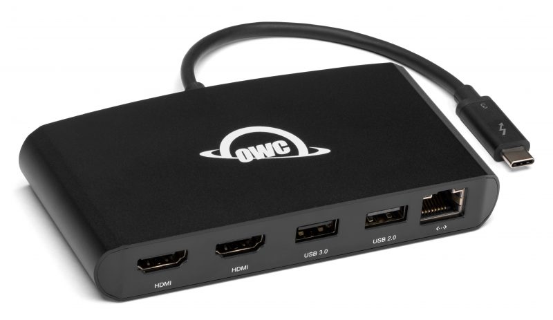
When working on the coach or in the RV it’s not a big deal, you simple connect an external Harddrive and when I need to use something else with USB you can use a USB dongle or just get a small convertor/dongle that supports several connections like for example something like this.

And trust me they work ok.
But they don’t do everything you need.
I actually have several of these kind of dongles and when I combine them all, I can attach everything, but I never found one that did it all (without problems), for example I have one that supports USB, USB-C, HDMI and Network, but…. that one can’t charge my laptop or iPad, so I’m limited to my battery life (which is pretty ok, but still). Now when we travel it’s not really a big deal, we use the dongles only a short period during for example a presentation, or to connect an audio interface.

But when I’m home or in the studio I want a solution that makes my iPad pro or MacBookPro completely capable to do whatever I want, without thinking about charging, network or whatever.

As mentioned before I’ve tried several solutions and never found one that did it all, without issues.


Enter the OWC Thunderbolt dock 3
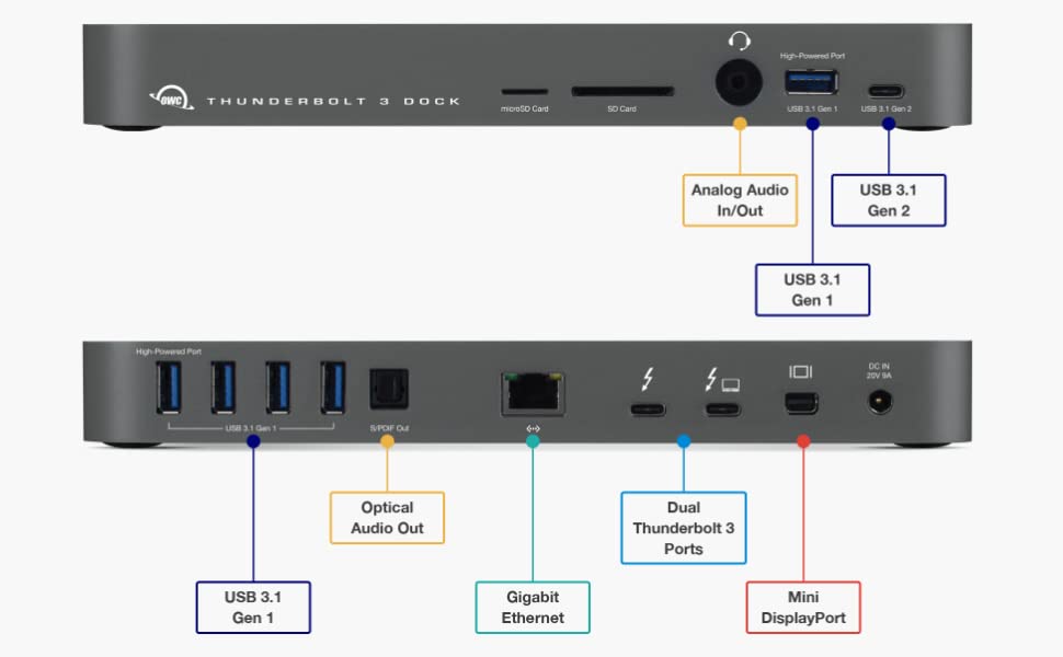
First thing you have to realize is that this is not a portable device. It’s build like a tank, and it has a pretty large powerbrick. So this is really a device for the desktop, but that’s exactly what I need. So lets first take a look at the unit itself.

Ok as you can see, we have more than enough options here, including a working powersupply for a MacBookPro and also my iPad pro works like a charm, however I have to add that I cannot get my Dell XPS 9570 i9 to work with the dock, this could be a problem with my thunderbolt drivers, we are still looking into this issue, and I’ll update the review when I solved it.

The dock is very complete with I think almost everything you’ll ever need, and I love the idea that the dock is powered, somehow I never trust passive docks in the long run when recording music for longer stretches.

The main advantages from docks like this is that you can place it on the desk and forget about it. Just run one Thunderbolt Cable from the dock to your laptop or iPad and you’re done. For me this is an insanely handy option because with one cable I now litterally keep my whole setup in tact, same keyboard/mouse/monitor/network/external drives etc. as on the laptop, meaning it’s a very seamless experience switching between devices.

So how does the dock work
Well what can you say. You connect the power, and connect all the hardware you need and…. well that’s it.
What I really like about this dock is however that on the front I can find a cardreader for both SD and MicroSD, an analog audio in/out and of course a standard USB3.1 and a USB3.1 Gen2 connection. This makes it really easy to quickly connect an external harddrive or of course empty your cards.

The speed is very good, compared to some of my previous dongles it now finally feels like I’m working on an SSD instead of an old spinner drive (ok I do overreact a bit, but it’s just a lot snappier), also with my previous dock I had to reset my audio interface sometimes because it just doesn’t want to keep the clock correct (sample rate), on the OWC I did not yet experience this, big tumbs up.

For video you are able to connect a monitor running up to 4K60 which is very nice for a dock. Do remember that unless you are a gamer 4K60 is more than enough for both videoediting as working on your photo’s. 4K30 would also not be a problem, but personally I rather have the 60hz version.
Power to the laptop or iPad is 85W, which will keep your MacBookPro charged constantly even under a heavy load, and trust me you don’t want to see your battery running down while streaming live (yes it happened to us).

Ofcourse you can daisy chain your Thunderbolt port, and the front USB port even charges your phone or tablet when connected.
Also the headphone/mic connector on the front can be very handy when doing zoom meetings (and we all do those a lot recently).
Now wired network might not be a big deal when you don’t copy large files, but try copying 30GB over wifi and get back to me… when you’re done, and now do the same thing over a wired connection… you never want to go back (and we use a lot of data stored on the NAS).

Can it be improved?
Heck yeah, of course, everything can.
One of the things I read a lot online is the fact OWC opted for a mini display port instead of the more standard availablee HDMI connector. Well I agree and disagree, for me personally it’s not a really big deal. Most monitors will also be outfitted with a mini display port and for example BenQ (the monitors I use) in most cases also delivers the cable in the box. If you don’t have a cable you do have to take into account the extra cost which is under 20.00 euros, depending on the option you choose (do make sure you get the 4K version and not a full HD version)

One thing I do really would have loved to see changed is the delivered Thunderbolt cable, with 50cm that is really way too short if you want to be able to place the dock a bit more freely on your desk or for example a bit higher than the connected device, and changing that cable… well is a bit more expensive, for a good cable you really have to add between 40-50 euros to the costs of the dock, but if you can use the 50cm version that’s not necessary of course, in my situation it’s matter of switching some places on the desk and it worked, but it’s tight. Luckily you can easily switch the cable, just make sure you get the right cable and not a cheap USB-c Cable.

Conclusion
It’s not possible to deny that now a days you really need a dock.
It’s a simple fact of life that laptops and tablets are getting less and less connectivity while we as users need even more than in the past. Luckily companies like OWC don’t only think about the “consumer” part, where wifi is fast enough, but also about the pros using their gear.

The OWC Thunderbolt 3 dock is not the cheapest on the market, but for what you get… it’s worth every penny I would say, although for us it would be cents 🙂
If you’re like me running a laptop and tablet as your main devices, just skip all the cheaper solutions, I think I spend over 300.00 on docks and dongles that simply don’t work in the home situation, the OWC Thunderbolt 3 dock does and it’s also very complete with all the connections one could wish, plus it charges with 85W which is a big deal when you really push your gear.

I would say “Highly Recommended”
Thx to OWC for giving me the oppertunity to test the TB3 dock.


Tourbox NEO review

How often did you think.
“man I would love something that replaces my keyboard for shortcuts”
If that’s you, this might be of interest for you.

As you guys know I’m always 100% honest in my reviews. So let’s start by stating that this product was send to us for review, but that will not for even 1% influence my opinion. So let’s start.

What is it?
Tourbox is a small but very well build (and heavy) external device with buttons and dials that can be “freely” programmed to replace shortcuts. Now there are several solutions out there and some fall in the catagory “total junk” and “genius”. Let me start with stating that the tourbox is very close to the segment “Very usable to genius”. Let me explain.

These kind of devices are a mixed bag for me and a lot of people.
When we have a keyboard in front of us we can learn the shortcuts and for example order a small keyboard that you lay on your lap or next to you while working, or one can just chose to operate everything with a mouse/trackpad, and in all honesty for a lot of software this is still my prefered way of working, for example take lightroom, I’ve never found a product that actually speeds up the trackpad/mouse workflow, for the simple reason that Lightroom has a very clear structure and you can work from top to bottom setting everything up and seeing you also skip certain settings working with the mouse/trackpad is just very very easy also because when you use local adjustments you already need a mouse/trackpad/tablet.

So although it does work flawlessly in Lightroom I would probably never use it myself for this, no matter what others say 🙂
Now let’s look at Photoshop.

The more you work in Photoshop the more you are almost using shortcuts blindely, for the simple reason you use them all the time, and also Photoshop is a totally different program than Lightroom. For me Lightroom is really based on a mouse/trackpad workflow where Photoshop is really aimed at a tablet/pen control surface PLUS shortcuts on a keyboard, you actually hardly to never touch the mouse/trackpad, and in that case…. man this is genius.

We all have our favorite shortcuts.
For me it’s always the following I program.
Brush size, Rotate canvas, switch for/background (X), Curves, Levels, Saturation, zoom in and out, 100%, fill and of course the usual Space, CRTL, SHIFT etc.
And those can all be programmed in the Tourbox, and this makes it very usable for Photoshop and other software that is really based on shortcuts and non mouse/trackpad operation.

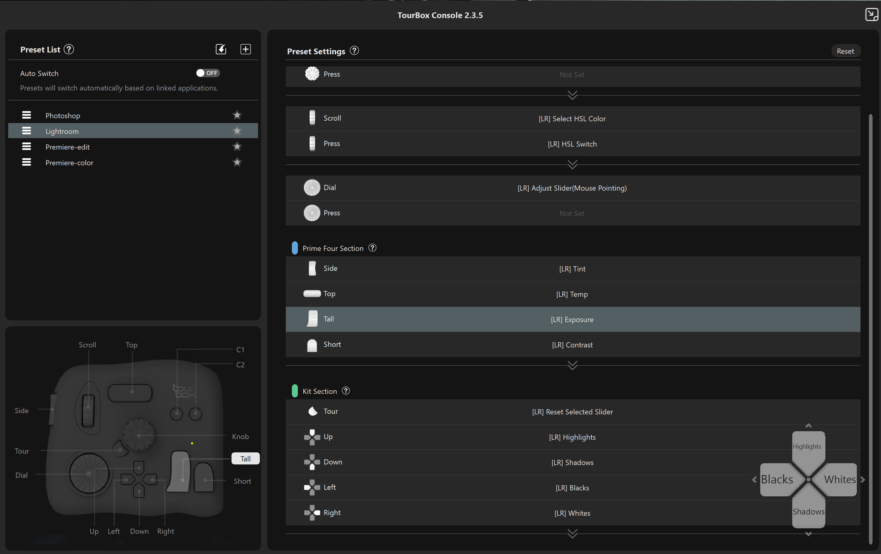
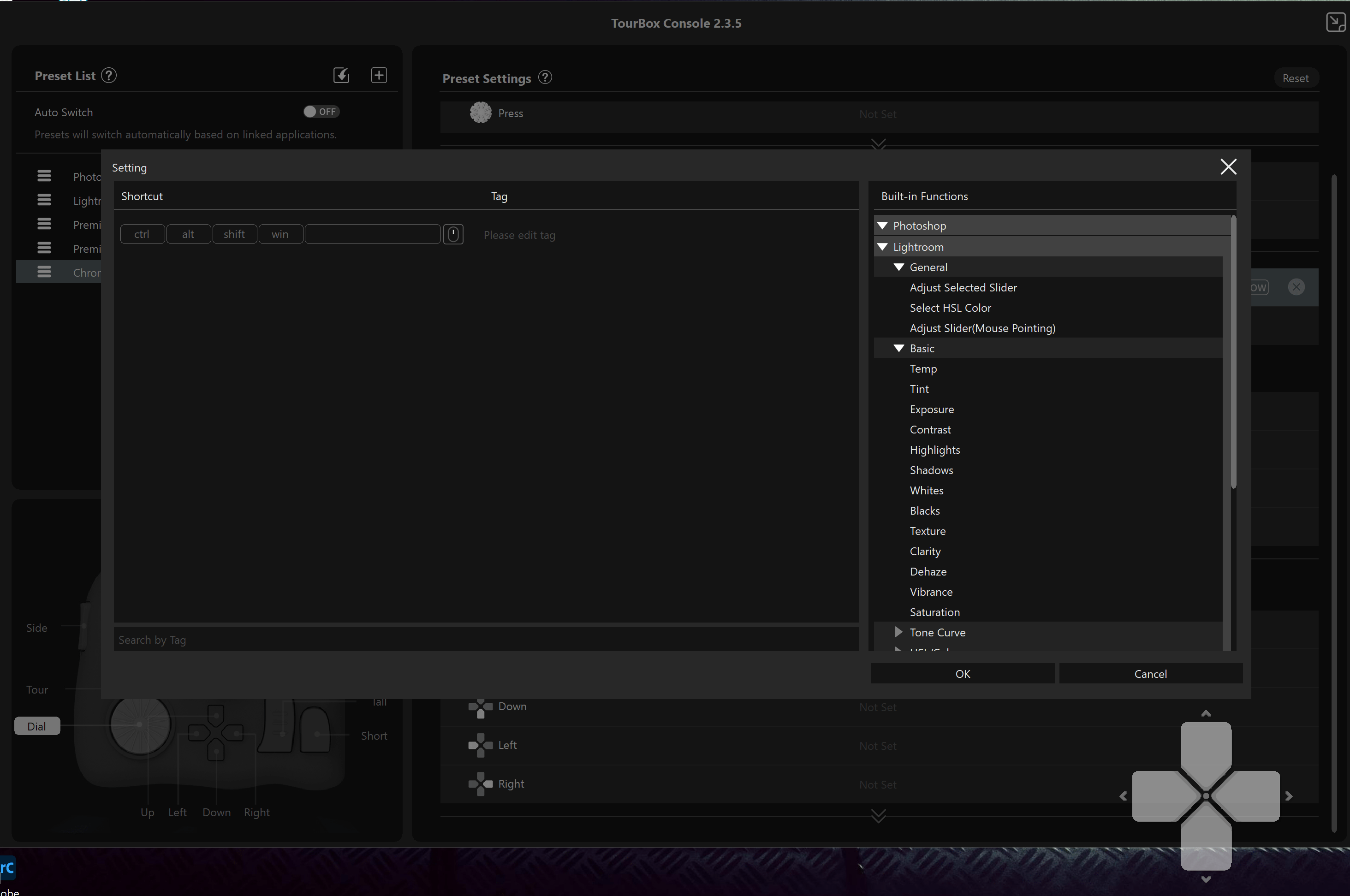
So let’s take a look at the software itself so you get an idea about what’s possible (and it’s a lot)

First of all, don’t worry that you have to do a lot of work before using the tourbox, there are several presets available in the software right after the installation. So when you use Photoshop and Lightroom you’re already covered. But what about if you want it differently (what I would do without a doubt). Well that’s very easy.

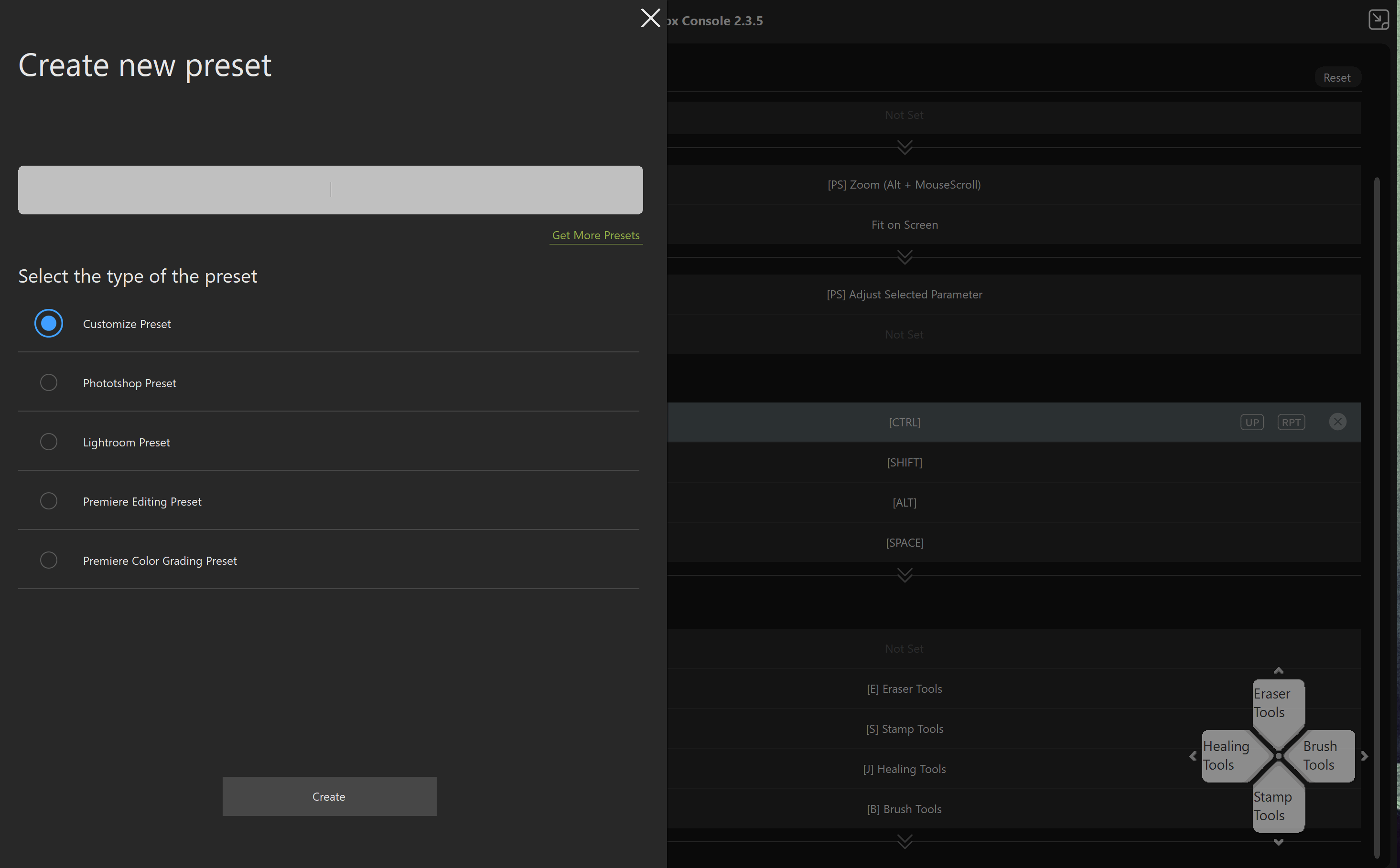
It’s very easy to create a new preset, and after that the fun really starts.
Of course you can emulate the normal keystrokes, but also combinations with SHIFT, CRTL etc.
But… and that’s actually very cool, you can also combine keys on the tourbox, for example the normal dial changes brushsize, but if you hold the side button you can use th same dial for screenzoom for example. And that makes the tourbox A LOT more usable, you are literally not limited to the keys you see (well actually you are, but you can also combine the keys making it a lot more usable).

Now this sounds awesome, but it also brings in a problem I experience almost everyday, “where the heck did I …..”, and with so many options it can indeed very quickly become very confusing. It also doesn’t really help the device is black including the keys (later more on that).

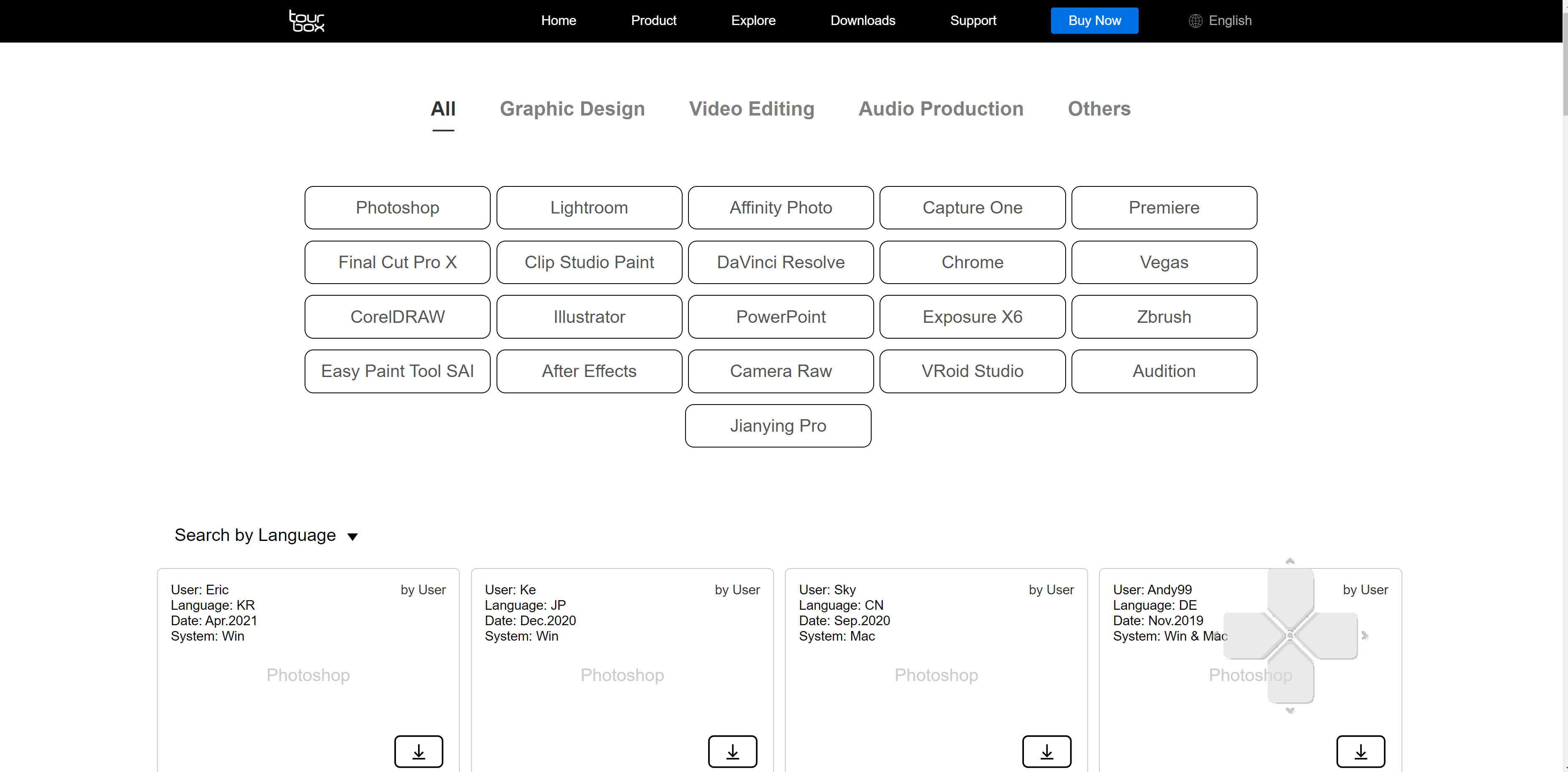
Now loads of people will program the Tourbox the way that they use it, and the nice thing is that you can download those from the TourBox website. Just search for the program you want to use and download the presets.


Luckily you can always call up the hub and see what’s programmed.
And if you don’t know all the shortcuts, don’t panic, the TourBox software helps you out by the build in functions menu. This makes programming literally a breeze.


Conclusion
Ok, so how does it work in reality.
Let me start with the positives.

First off all the device is build very nicely, it’s heavy enough to not drift around the table or your lap, but not too heavy you can’t travel with it. Also size wise it’s a very smart size, it’s not too small and certainly not to big, plus a BIG plus…. it uses USB-C, I still don’t understand why manufactores still release gear with other connections than USB-C.

Also there is so much flexibility that it’s almost impossible that there is a situation where you can’t use it.
So overall I’m very positive about the TourBox. But let’s also take a look at the negatives.

First of all one could argue that it should be wireless, and I start with this one because I agree and disagree. You do have to realize the price point of the TourBox, compared to some competitors the TourBox is A LOT cheaper and when you add wireless you will need a battery and of course BT or WiFi board which will drive the price up and also the stability, I’m actually mostly a fan of devices that also have the option to be used with a wired connection because I hate batteries that run out, or connections that are instable (and yes that happens a lot).

Ok so what can they improve
Now do realize that some of these options will add some costs or are not possible in this product.

First off all I think the TourBox is genius for Photoshop but also when recording and editing video and music, and especially for music it’s awesome to be able to start recording/punch ins with just a quick tap on a button instead of reaching out to the keyboard or using the mouse/keyboard, and while editing zooming is just plain awesome…. “Hey Frank this is positive, not negative buddy…” yeah I know, now when I record music or edit photos/videos I’m a bit of “batman” I’m editing in a dark area and in most cases there is just not enough light to see the pure black TourBox, this is also the reason I’m using keyboards with backlit keys. I would love for them to add a light behind the keys, just to see where the keys are and not having to trust my fingers in the dark. Now not everyone will be editing in a “batcave” but if you do this is really a negative thing about the TourBox, I love black gear, but man it’s hard to see in the dark.

Now adding backlights would be pretty easy I guess, just place a ledstrip in the housing and it will show through the side of the keys, it doesn’t have to be disco ball but just outlining the keys would help a lot. The next step would be a small display that shows what you programmed under the keys, I don’t see a lot of products that use this but in all honestly it would make it worth double the price for me personally, because especially when you use the TourBox in 4-5 apps it can be VERY confusing where what is. In all fairness on my XP-Pen tablets after hours and hours of use I know most of the buttons, but still…. I’m using console tape next to the keys with the functions because the most used keys I know where they are but keys you don’t use a lot can still be confusing, and these kind of devices are build for speed and easy workflow, the fact that most keys are shaped differently does help a lot, I’ve tested several solutions that use the same buttons (just a lot of them) and I never really used them for the simple reason I just lost track and eventually interest. By using different shapes it makes it 10x easier to remember.

The thing that I would LOVE to see, and I really think it should be added is support for iOS.
Now bare with me for this one.
I know most of you still edit on desktops or laptops, but you can’t deny that the iPads are making huge waves at the moment and for me the iPad pro 12.9″ M1 actually fully replaced my laptop and for 90% my desktop, and indeed that means I use the iPad for everything from photography to video editing and media consumption.

Now on a desktop and laptop you already have a keyboard an a mouse/trackpad connected but not on an iPad, the only reason I have a keyboard connected when editing is for certain shortcuts which I find easier than using the touch interface, and for that I would not connect a keyboard but would literally LOVE a solution like the TourBox, in fact I would use it almost daily seeing more and more app makers are adding loads of shortcuts, and editing with a keyboard next to me is possible but I would love the TourBox (or another solution) connected to the iPad.

When talking to manufactorers I often hear they don’t look at the iPad pro as a serious device and I strongly feel they were right 2-3 years ago, however when we now look at what Adobe is doing with Lightroom and Photoshop, but also apps like LumaFusion, Cubasis, Beatmaker3, affinity photo etc. I really feel they are very wrong to not take the iPad pro serious, and luckily soon Capture One will be released on the iPad pro M1 which I think will break open the way for more software makers. And let’s be honest with the new M1 it should be pretty simple for TourBox to port their software to the iPad.

So should you run out and buy a TourBox?
Well if you compare it to the price of a normal keyboard… no absolutely not.
BUT…. that’s not fair, it’s a totally different product and well worth it’s price especially when compared to other solutions.

So when you find yourself looking for shortcuts in software and would wish there was a way to have this all easy accessable the TourBox might be the perfect solution for you. I’ll keep using it behind the desktop we record music on and do the editing when I’m home, and this has nothing to do with the quality but the simple fact in the studio we use XP-Pen tablets that already have more than enough shortcut keys. But if you are using a tablet that doesn’t have enough hardkeys (most don’t have enough) combining your tablet with the TourBox I can HIGHLY recommend and I mean HIGHLY, it will make your life a lot easier. But do make sure you have a little but of light in your workarea. Or wait for TourBox to release a special Doorhof white version with backlighting (just kidding).

If you also want a TourBox, get them (or anything else :D) via this link and also support our work.
https://amzn.to/3wTPihQ