
BenQ EW3270U and what is P3 for you?
Most of the times I do reviews via video on our YouTube channel (www.youtube.com/frankdoorhof) however sometimes I review products that are better reviewed in written text, not because they are less interested, but because there is some technique behind the product that translates better in the written word than in a video.
As you all know probably I love the more technical parts of products, because let’s be honest a review where only specs are listed…. well that doesn’t tell you anything right? I think that a review should literally make it clear if a product is for you or not, so let’s start the review for the BenQ EW3270U monitor and let’s see what kind of monitor this is, and why I think it’s an awesome product for photographers.
Colorspaces
We all have heard the term colorspaces?
Let’s start by explaining what a colorspace is, and don’t worry I’ll keep it really simple
A colorspace is a fixed space in which you work.
When we look at colors we can bring it down to 3 primaries (Red, Green and Blue) and 3 Secondaries (Cyan, Magenta and Yellow). In a color space we work with 3 settings knowing Hue, Saturation and Luminance, often called x,y,Y connected to these colors is a white point and a gamma curve. ok ok, I promised to keep it simple, but it’s important to understand this.
The most used colorspaces we know are sRGB, Adobe RGB and ProPhotoRGB.
sRGB being a smaller colorspace that is often used for internet, and some prints (if you want to make sure it works)
Adobe RGB is a pretty large colorspace and covering almost anything you will ever need for photography, including for example inkts from good printers like the Epson top series.
ProPhotoRGB is a huge colorspace and in all honesty, it’s a colorspace I used in the past but over the years I’ve drifted more and more towards just using Adobe RGB and there is a good reason for that.
Let’s first look at why we need colorspaces
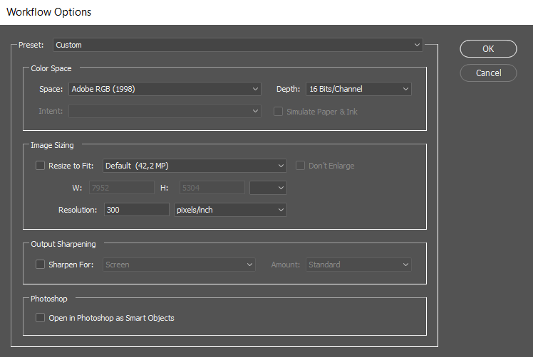
When you take a photo you don’t shoot in one of the above-mentioned colorspaces, you are actually shooting in a totally different colorspace…. the camera colorspace, this is the case as long as we shoot in RAW, this is because RAW is an “open” format straight from the sensor and we can change everything after the fact like exposure, colorbalance etc. as soon as we, however, go to another format like TIFF, PNG, JPG or whatever things get defined. Now we have to choose a colorspace. You can see this clearly when you for example go to the settings from Photoshops Adobe Camera RAW, when you open a photo in Photoshop you will be greeted with the ACR dialogue and right under need in very small print, you find these settings.
as you can see here it’s set on Adobe RGB, 16 bits TIFF for my computer.
Standard it’s mostly setup as Adobe RGB, 8 bits TIFF and I highly recommend changing this to 16 bits, without going too much in depth, it gives you 65536 steps of range instead of 256, so I think you can clearly see that working in 16 bits gives you a LOT more headroom to play with those curves and adjustments so much less chance on banding and other weird things.
If you use Lightroom or Capture One or any other RAW developer you have to check your preferences to see how external files are handled, in most cases it’s set up pretty bad, I’ve seen loads of examples of people (without knowing it) working on their files in sRGB 8 bits jpg instead of TIFF 16 bits Adobe RGB but still being under the impression they were because they SAVED as 16 bits TIFF Adobe RGB.
So it’s important to understand that when you edit you’re NOT editing the RAW file, you are editing something else, and what that else is, you have to set up in your RAW converter as Export, External editor, or whatever term your RAW converter uses. For example, in Lightroom you see this.
The reason for this is simple.
When we are in RAW we are in the camera sensor range, but as soon as we start to edit we have to have a set format, being a colorspace, in other words as soon as we start to edit the software has to know the coordinates (remember 3D colorspace) of Red, Green, Blue, Cyan, Magenta and Yellow. This is also why for example people complain that the shadows and highlights in Photoshop are much less effective than in Lightroom… well yeah that’s easy to understand now, in Lightroom you’re working on the RAW, as soon as you go to Photoshop you are working in a defined colorspace meaning your white and black point is now fixed and all detail that is below that point (what you could recover in RAW) is now gone, so you can still use shadows and highlights but only for the data that is within the defined colorspace and settings you did in your RAW converter.
This is also why it’s incredibly important to use your RAW converter to create a file that you really like, and I often advise to use a little extra shadow and highlights recovery, the reason behind this is that if you are editing and you run a filter that clips the blacks or whites a bit you will be happy with that little extra headroom because in Photoshop the same goes as in all edit suites when something is gone… it’s gone, there is no RAW fall back (well ok you can run ACR as a plugin with a smart object… but let’s keep it simple for now).
So why this information.
It’s important to understand that we shoot in RAW and define a colorspace after this.
Monitor, printer etc.
Well now that we know we have colorspaces we have to go one step further.
It’s nice that my file now has the colorspace Adobe RGB but what do I see on my monitor?
Oops… yep your monitor also has a colorspace, we often call this the native colorspace, and trust me, this is never a perfect sRGB, Adobe RGB or whatever. It’s literally like the RAW files in the camera the colorspace your panel can show. But don’t worry we just learned that you can “transform” a file into colorspace via your RAW convertor because the coordinates for the colors are fixed in the definition of a colorspace, with this knowledge it’s of course also clear that we can do the same thing for the monitor, because when we know where Red is supposed to be and we know where Red is displayed on the monitor we know how to correct this. We call this calibrating a monitor.
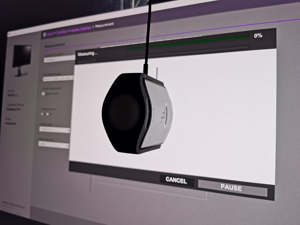
Calibration is actually very simple.
You just place a coloranalyzer in front of your screen, you run the software and voila everything is done….well….we now have an ICC profile for our monitor that is loaded and……. ok read on.
This where I have to give you one more vital piece of information.
In a perfect world both camera and monitor fit exactly in the Adobe RGB colorspace and the correction files make both fit exactly together. Well the world is not perfect (far from) meaning that there will always be some mismatched colors. But don’t worry, we often get very close.
You have to have an Adobe RGB monitor for photography
For years we have heard this conversation, if a monitor does not have the label Adobe RGB it’s not fit for Photography. Now that label Adobe RGB can be very misleading, you always have to look for another part of information namely the percentage, in the case of most really good monitors this will be in the 98-100% Adobe RGB, and in all honesty everything above let’s say 98% will be so perfect that you will never notice any difference.
Now when you read forums and listen to sales people (and often reviews) you are let to believe that if your monitor does not hit that 98% Adobe RGB mark it’s useless for photography, and in essence they are/were right. In the past you could almost split the monitor into two parts, the professional monitors and the gamers/office/the rest market. For professional monitors often the lightoutput was a bit lower than for a gamers/office/etc monitor (meaning deeper blacks after calibration and correction to the normal levels of 120-150cdm for editing hence more contrast ratio) and the colorspace of course.
The problem for most photographers…. the price.
If you want a good/ok Adobe RGB monitor you pay a lot more money than for a normal sRGB monitor.
So often photographers that started out (including me) start out with a sRGB monitor, which you can often pick up for under 200.00 for a relatively good one, and let’s be honest when Adobe RGB monitors are three/four times that amount you really have to think twice if you spend your money on that new lens or on that monitor that will show you more colors… and although most people want that monitor the price difference can be a bit extreme.
But there is a solution.
P3 monitors
A while ago you might have noticed that some monitors started to use different “colorspaces”
You might have seen monitors claiming to be REC709 compatible for example, you might think this is better than sRGB right? (it sounds more fancy) but don’t be fooled, the main difference between REC709 and sRGB is in the gamma curve and although the colorspaces are slightly different it’s not something to be too enthusiastic about for photography (for video it’s another thing all together)
But you might have also seen something else, the P3 colorspace.
So what is this P3 colorspace and why is it actually one of the best things to happen for us Photographers.
When we look at the P3 colorspace vs the AdobeRGB colorspace we see the following representation.
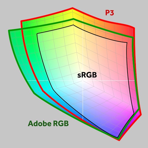
image from creativepro.com
Now as you can see the sRGB colorspace fits nicely within all colorspaces, this is the smallest colorspace. But as you can also see both AdobeRGB and the P3 colorspace are a lot larger and will indeed cover almost everything you need, meaning a P3 compatible monitor is actually very nice for photography work. But does this mean you don’t need an Adobe RGB monitor or that it doesn’t matter that much….
I did not say that.
Remember those fixed colorspaces?
When we convert our RAW files into the files we work on in Photoshop or store for the future we often work in Adobe RGB meaning a monitor that covers Adobe RGB as closely as possible is the best way to work, as you can see in the image for example P3 shows more in the Red and Yellows, Adobe RGB shows more in the Greens and towards Cyan.
And one might say “wow so I see even better reds…” yeah well no. Sorry.
When we calibrate we calibrate for a certain colorspace, meaning the analyzer shows Red on the screen and corrects THAT Red towards the Red from the colorspace it’s calibrated in, meaning when you look at the image a P3 colorspace will loose the top end in Red and Yellows (corrected towards Adobe RGB) and will not be able to show the deepest greens from the Adobe RGB monitor. So one might say that for quality and usability (when editing in Adobe RGB) a P3 monitor lies somewhere in between an sRGB monitor and an Adobe RGB monitor. But there is more.
BenQ EW3270U
When we look at monitors aimed at photographers I already discussed the fact that there is a big difference between a gamers monitor and a monitor to edit on. When I edit I want a monitor that I can trust to give a representation of what my work will look like on many different devices. This means when I edit in Adobe RGB I need a representation of Adobe RGB, this way I know that when I convert my work to for example sRGB it will be done correctly and not shift any colors. This is also why I still advise to calibrate monitors (if you have the choice) to represent Adobe RGB or sRGB (if you have an sRGB monitor). You might miss some of the deepest colors that your monitor can show but at least (again) you know that conversions are done correctly.
When I play a game I just want bright colors, the lowest possible latency and of course BRIGHTNESS and preferably I would like to see “too much” shadow detail so when an opponent is hiding in a dark area I can see them. Edit on a monitor I setup for gaming and…. well you will probably lose a client 🙂
When we look at the BenQ EW3270U we get a very complete monitor.
It’s a 4K 3840×2160 panel measuring 32″. Trust me, once you are used to 32″ it’s very difficult to go back. For me personally I like 27″ a lot for most work, but when it gets crowded on my screen I just like the 32″ space a bit more (even with the same resolution) Especially in programs like Capture One and Photoshop the added size off the 32″ just makes life a bit easier.
The monitor covers 95% of the P3 colorspace which makes it a lot larger than sRGB but a bit away from Adobe RGB (I would say nicely in between) and also supports HDR….
HDR
now with HDR I have to make a more serious note. HDR is a little bit of a magic word the last few years. HDR means High Dynamic Range and is pretty loosely defined by the standard. In essence there are two standards:
STANDARD 1: More than 1,000 nits peak brightness and less than 0.05nits black level.
STANDARD 2: More than 540 nits brightness and less than 0.0005 nits black level.
The second standard is almost only possible with Oled screens, but standard 1 is also achievable with Led displays. In my personal (read PERSONAL) opinion it’s literally the minimum a display should be able to do, real HDR for me starts with 1500nits and a really low black level. But luckily I didn’t make the standards and that’s why you see a lot of displays with the label HDR while in essence they are reaching the standard it’s not “real HDR” in my opinion. The problem is a lot of consumers don’t know that the HDR label doesn’t mean HDR=HDR, HDR is defined very very loosely and in essence this is great because every new set you buy means you can re-watch your old HDR titles and see more dynamic range but it also means that consumers can get confused and think that if a set is labelled HDR you get HDR.
When we look at the BenQ monitor it has the label HDR and that means it’s compatible with HDR content and HDR settings, just don’t expect the same stunning quality you get from a high-end Oled tv set with Dolby Vision and HDR 10+ but nevertheless you will be able to show this content on the display (and that’s a big plus of course).
The cool thing is that BenQ uses a system where you can set the levels for the HDR signal and adjust the experience to the material you’re watching, this is something you also find on Home Theater projectors and some consumer displays and it’s a great solution until we get displays that can show a lot more dynamic range, and don’t worry this is not something that is just BenQ, it’s just something that often is not told in reviews because the HDR system is pretty “complicated” due to its minimal specs and no real fixed specs. And let’s be honest with 3000:1 dynamic range and a smart mapping of dynamic that multiplies this BenQ really gives you a very nice HDR experience, in fact much better than other displays in this price range.
The other cool thing about this monitor is that it really serves 2 markets.
For the gamer we have a good light output and a really nice low latency (something BenQ really masters) and for the Photographers we can set the monitor up for a really good editing experience, add to this the 95% DCI-P3 color space with HDR compatibility and also the video editor can set this monitor up for a good editing environment.
Connections
Add to this USB-C and of course more than enough connections like HDMI, Display port and a headphone jack and you know we’re talking about an all-round monitor for a lot more than just editing.
Smart Focus
Another cool thing for media consumption is the smart focus. You might never have heard about this, but it’s really cool. It’s a technique that makes it possible to really focus on what you want to see and take away distractions, but let’s show you an image, it makes it easier to understand.
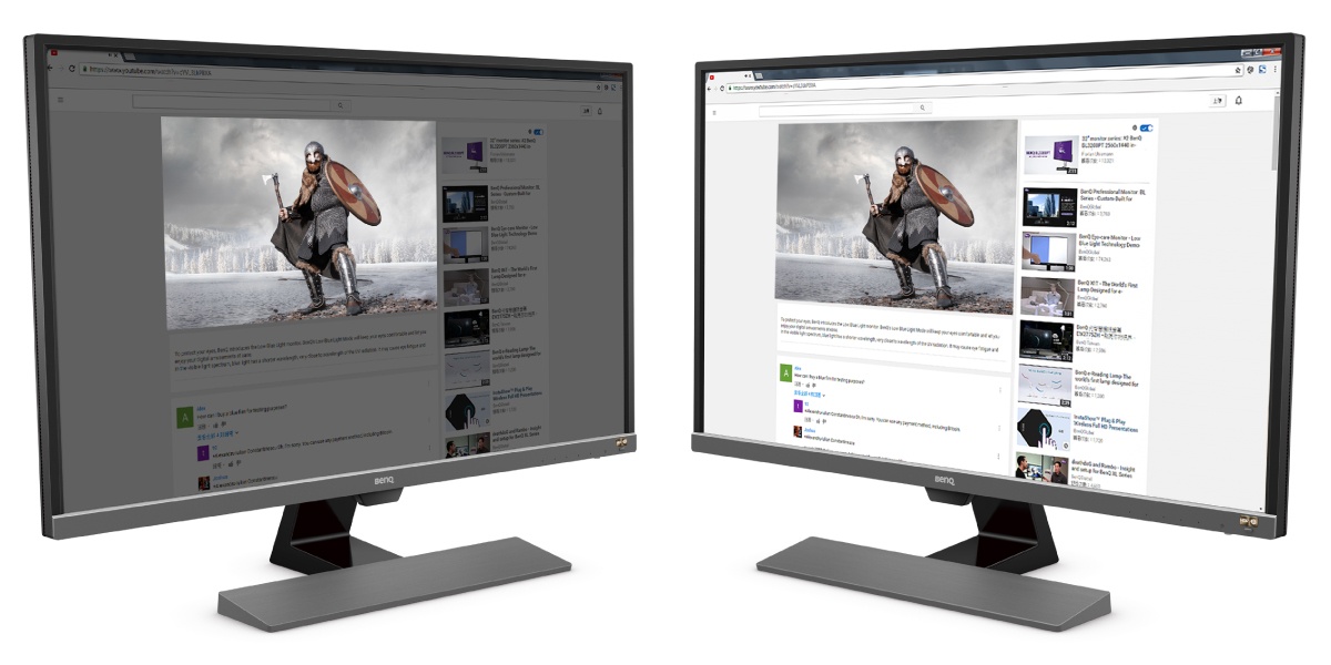
As you can see a real handy feature.
Super resolution
The monitor also supports super resolution.
Personally, I’m always a bit sceptical about this kind of “enhancements” but it does work. Feed a 4K monitor a 1080P stream and you can really add some detail to the image by using smart scaling and interpolation instead of just using line doubling or quadrupling. This can really make a game look a lot better (and I mean a lot) but for us photographers it’s not something we should use for the simple reason we feed a 4K signal into a 4K screen so everything you add to this will mean you loose pixels with real information, so when working on images or video I would really advise to never ever use this kind of settings. However, when watching media or playing games it can really enhance the experience.
178 degrees of view
With 178 degrees of view angle, the BenQ is a good monitor for almost any installation.
AMD Freesync
For the gamers, this is a well-known term, and it’s great that it’s available on this monitor. it makes the gaming experience a lot better with smoother gameplay because I mainly focus on photography/video I won’t spend more time on this subject, except to say… it’s cool that it’s on there for gamers.
The same goes a bit for
Eyecare
This is really important on smartphones, tablets and what, not more, really don’t underestimate this, you should really always use this. Eye strain is a serious condition that our generation was introduced to and the new generation grows up with and if we don’t do something about it we could end up with generations of eye problems. (yes it’s really that bad). What you see in smartphones/tablets and also in this BenQ monitor is that the monitor will adjust to the surroundings, meaning it will change the color temp and light output depending on the situation.
I also have to make a note to this.
Although I’m a HUGE supporter of this technique I also HIGHLY recommend to turn it off.
EXCUSE ME FRANK!!!!
Yep, turn it off but…..
Turn it off when you’re editing your images or video.
Turn it off when you’re watching a movie.
The reason is simple
When we edit an image we want a steady reference monitor, showing a clear D65 grayscale with a gamma of 2.2/2.4 and an output of 120-150cdm. If the monitor itself changes this constantly we never get the same results day after day, week after week. For editing purposes, I always advise (strongly) to create an environment where you have no direct light hitting your screen (that’s why the more expensive monitors come with sun hoods) and (and this is just as vital) have a constant lighting environment. Meaning it’s always the same.
The same goes for movies.
The creator of a movie determines the look and feel of the movie via tinting, shutter times etc. but just like us photographers do this on a fixed set of specs, for HD this was REC709 2.2/2.4 gamma and for UHD this is BT2020/P3 gamma EOTF, if we watch these movies on a properly calibrated set we don’t want the display to change the look of the content.
That being said.
If you are not a movie buff like me and love to see it exactly how the creator intended, please use eyecare.
And everything that has nothing to do with movies and/or editing PLEASE always engage eyecare, you will really thank BenQ (and me :D) in the future.
Conclusion
Pffff it’s become a long piece.
The reason for the long piece has everything to do with that P3 colorspace, I really wanted to give proper attention to this. Although the monitor does not show 98% Adobe RGB monitors that show a large chunk of the P3 colorspace are the perfect in-between choice for photographers/videographers between an sRGB and Adobe RGB monitor, in fact one could argue why a hobby/enthusiast would ever need a monitor showing more than sRGB, because on the net (Instagram, Facebook, MeWe etc.) we all use sRGB, this often meant that the choice was made for a cheap monitor, never realizing that those monitors were not designed for photography so the user would end up with a wrong representation of their work, even if the monitor would show sRGB.
With the new batch of P3 compatible monitors, we finally have a great choice for photography/video.
It’s a lot better than the sRGB monitors and it comes close enough to Adobe RGB to make a viable setup work and interact with people that do more serious editing and are more critical about their work. As you could have read between the lines, a good monitor is not defined by just the colorspace, there is a lot more going on, and this BenQ hits all the points that I think are important for the majority of creators. And I highly recommend it.
Is there anything negative…..
Yeah, one thing
The base of the monitor is a bit “simple” I love to be able to change the height of a monitor, but with this base it’s only possible to tilt the monitor, it’s not a dealbreaker, of course, you can always use something underneath the base if you really need it higher, and it’s understandable seeing the price point, but hey you asked for something negative 😀
In Europe you can find the EW3270U for app 450.00 euros
Get it via Amazon.com: https://amzn.to/2Ez3uEK
or Amazon.de: https://amzn.to/2MayuRK
for Amazon.uk.co : https://amzn.to/2VQv46k
By doing so you also support our work


Comments are closed.