Guestblog Achim Meurer
Today a guest blog by Achim Meurer, well actually he did such a great post I decided to put into two parts online.
During one of my “critique” days on G+ and Twitter I got an amazing interior shot, and because I loved that one so much I asked for a guestblog which you can read today, so without wasting more space here it is….
First of all thanks to Frank for that guest blog post. To look at other photographers is a very important part of my daily learning. Not to copy them, but to get new inspiration and ideas! So guest blog posts are always a good way to do that 😉 There are two motifs I‘ve uploaded to the „Get a short feedback from Frank on G+“: some HDR indoor images from the opera house in Graz/Austria (where I live now) and some portraits.

These two are a good example of how I work – minimalist equipment, always on location.
So first let us talk about HDR images and why I love them!
Realistic HDR – what is realistic?
Talking about realism in photography is always a discussion point. Very often people look at an HDR-Photo and their impression is, that those pics are not realistic. Are other pictures realistic? No! Every picture is unrealistic, or let us say, manipulated. The photographer (and I mean EVERYONE, not only the professionals) manipulates the picture by choosing the perspective, the framing, the focus, the lens, the camera, … – I could go on with this list, but I think you get the point. So even when you take a picture with a very simple camera, you are manipulating the photo by clicking on the shutter-release button. So not only professionals do photo manipulation, everyone does! And everyone decides to take a picture in a special way, consciously or unconsciously, to emphasise the situation, the motion, the whatever. So do I by creating HDR images. It is for me the best way to show the scenario I see and feel at that moment. Like one of those old masters and their oil paintings.

Pictures with emotions
A client of mine said recently, as I tried to explain the difference between an HDR and a „normal“ picture, that those HDR images are the ones with „more emotions“. Well, that was a very cute description and I like it. Because this is always the aim, to evoke emotions If you look at a picture.

But it is not all about the technique or equipment you‘re using. The most important point is that you SEE the image when you are on location. If you can imagine what to bring out of the scenario you are looking at, then it is „only“ a question of choosing the right tools for that. So every start of an excellent picture is to observe, discover and focus on the essence and get rid of the rest you don‘t need.

Workflow, editing and tools
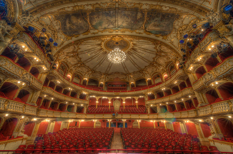
You can read a „How to create a HDR image“ on many blogs, so this is not, what I want to tell you here. I will show you some small steps in the editing of the opera house image. This HDR is made out of 9 different exposures. I decided to take 9, because the range from the brightest to the darkest point is so high. Also the richness of details in the opera house was a reason. So far so good, but the more exposures you take and process the more problems and mistakes you‘ll get.
I use Photomatix for generating the HDR images. Just a few tips for the sliders in that app:
– Be careful with the colour saturation, mostly under 50 in my presets
– choose the white point and the black point correctly, so that nothing is too bright or too dark (in the range you want of course!)
– play around with the microsmoothing
– try to bring the detail contrast slider to the right side, but be careful and adjust the luminosity to brighten the picture
– take control over the shadows, that there is less noise
And this was my result coming direct out of photomatix:

So you see the problems here. The advantage of an HDR is to bring out more details. But this is also a source for mistakes and undesirable parts. The noise is in general not the problem, there‘s an app for that 😉 But there are some unwanted reflections, some strong blue colour spots and the ceiling is too grey. The overall colours are to bright and flashy. So a bit of editing work here. The editing tools here are Photoshop and some plug-ins from TopazLabs. So first I started with retouching every unwanted part out of the image. Therefore I used the healing & stamp tools and some colour correction layers with a mask on it.

In the second step I worked on the noise reduction, contrast and sharpness. This I managed with Topaz Adjust and Denoise. These plugins are very efficient and saving me a lot of time. The third step was the correction of the ceiling. By using Topaz Remask it was very easy to mask the ceiling around the lustre, so that I could adjust the brightness and the colour.

the mask for the ceiling made with ReMask

the photoshop layers without the corrections of the ceiling and the spots…
 …and with the corrections
As you can see in my photoshop screenshot I always import every single exposure and the HDR file into one photoshop file for better control in the editing process. Sometimes you need a part from a single exposure. By stacking them all as layers it is very easy by using masks to bring in some special details or parts. Also I always make copies of layers. If I think this point in the editing is a major step I group them together and make a copy of that group. So if you going in a wrong direction with the new adjustments you always have full control over the past steps. Of course there is the history function in photoshop, but this is sometimes not enough. If you only need one single layer out of the history it is much easier to copy this layer from the old group in the current group. I‘m sure, there are other workflows, but this works for me very well and keeps my iMac still running fast 😉 After all these retouching I made some final adjustments started with Topaz Adjust. I used that plug-in for adjusting the contrast, details, brightness and the noise reduction.
One little annotation to the plugins: Always try to find you own adjustments. The presets coming with the software are only there to give you an idea, what is possible! So you maybe start with a preset, but go on and find your own. My last adjustments I always do within Apple‘s Aperture. Specially for the overall colourcorrection, contrast, definition and the cut-out. Here I create the final look.


So as you can see, I do a lot of small corrections in the editing process. Some corrections I do several times at several points. Why, hmm, I‘m not sure. But, for example, the contrast and details corrections you can do at different steps depending on the picture is one thing. There‘s no hard and fast rule for me like „first you have to retouch, second always correct the colours, third…“. This is a very dynamic process without any rules.
But one thing you have to keep in mind – what is the goal you are aiming for? You need to know before you start editing. Without having an idea, how the image should look like you don‘t need to start!
Tomorrow part II from Achim Meurer

Excellent stuff… however, I just can’t help myself for a joke… is that theater set for a live “porn” performance?
Just had to ask LOL
LOL! Well actually this was the stage setup for Macbeth 😉 But thanx for the compliment
WOW those Opera photos are amazing! where can we see some more of your work?
Thanx! You can see more of my HDR images on my hdr-blog: http://hdr-fotograf.at
Awesome pics !!