What happens if you change your photo to Black and White?
The choice between black and white, or color can be tricky.
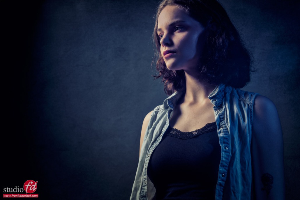
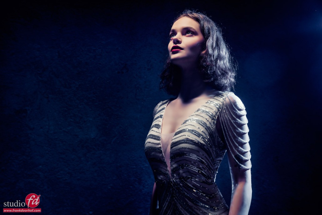
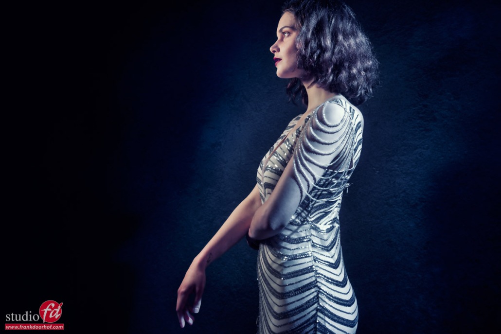
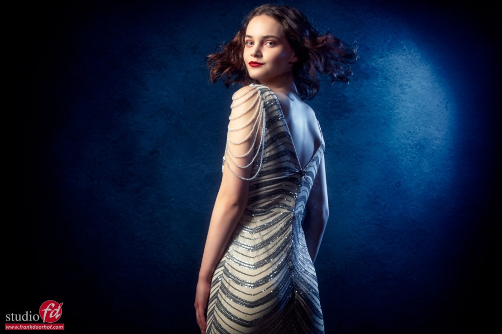
For me personally I sometimes shoot something with the intent to make it black and white. But then when I see the results I often keep it in color, because I just love the way it looks. And what happens if you change your photo to Black and White?
Sometimes you might shoot something that is very colorful and you don’t even think about black and white. That’s why I post this today. Luckily with digital, we can of course do both 😀
The horror clown is back!
Well she was here just 2 days ago, so she was not really gone 😀
But as you could have seen in the previous blog post about the horror clown, the color was pretty colorful. So this is the kind of set where you might not immediately think about a black-and-white conversion, but…. think about this.
Black and white doesn’t just mean we take out the color.
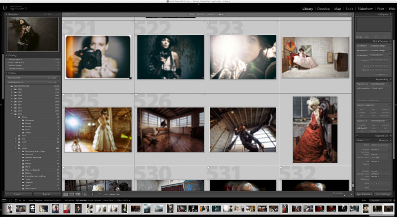
In fact, you can still manipulate the colors via the H(S)L adjustments in Lightroom. A bit like in the old days photographers did with filters. We can now manipulate images to our hearts’ content in our RAW convertor.
The idea of black and white in this setting is not to take out color but to inject a lot of mood and make the images more creepy. And that’s the cool thing about black and white. I sometimes make the joke
“if you mess up a shot, add a lot of contrast and noise, make it black and white, and voila instant art”
It sounds weird, but it’s really true.
If we look at a color image that is just slightly out of focus or has a shadow that’s not 100% correct in color we immediately see this as “bad”. But make it black and white and we see it as mood, or we don’t even notice it. Now that doesn’t mean that all my images that are black and white are “bad” images of course. But some street photography images have been “saved” that way in the past 😀
But let’s first take a look at the original blog post about the horror clown.
Now that you have seen the color versions, let’s go to black and white.
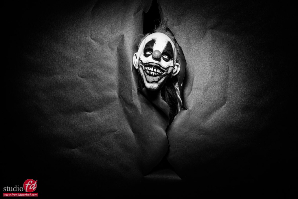
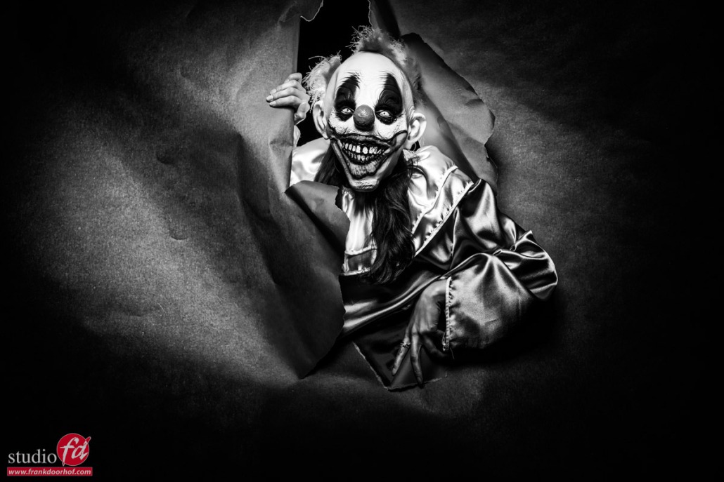
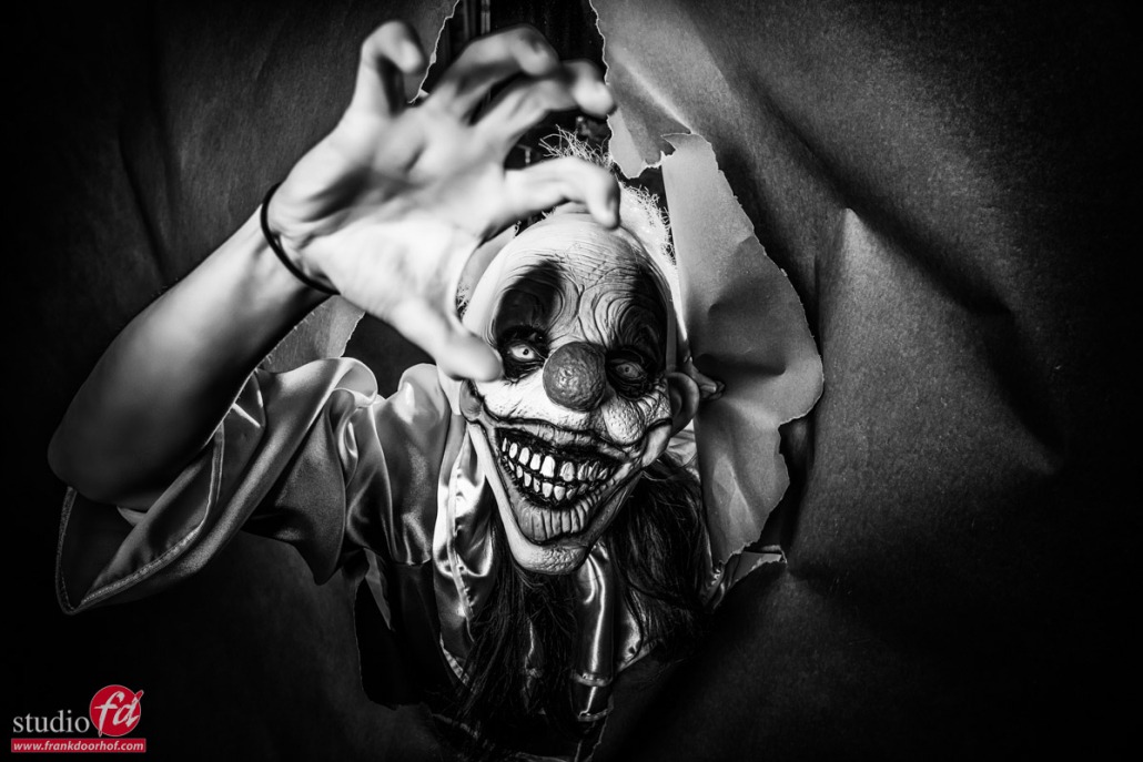
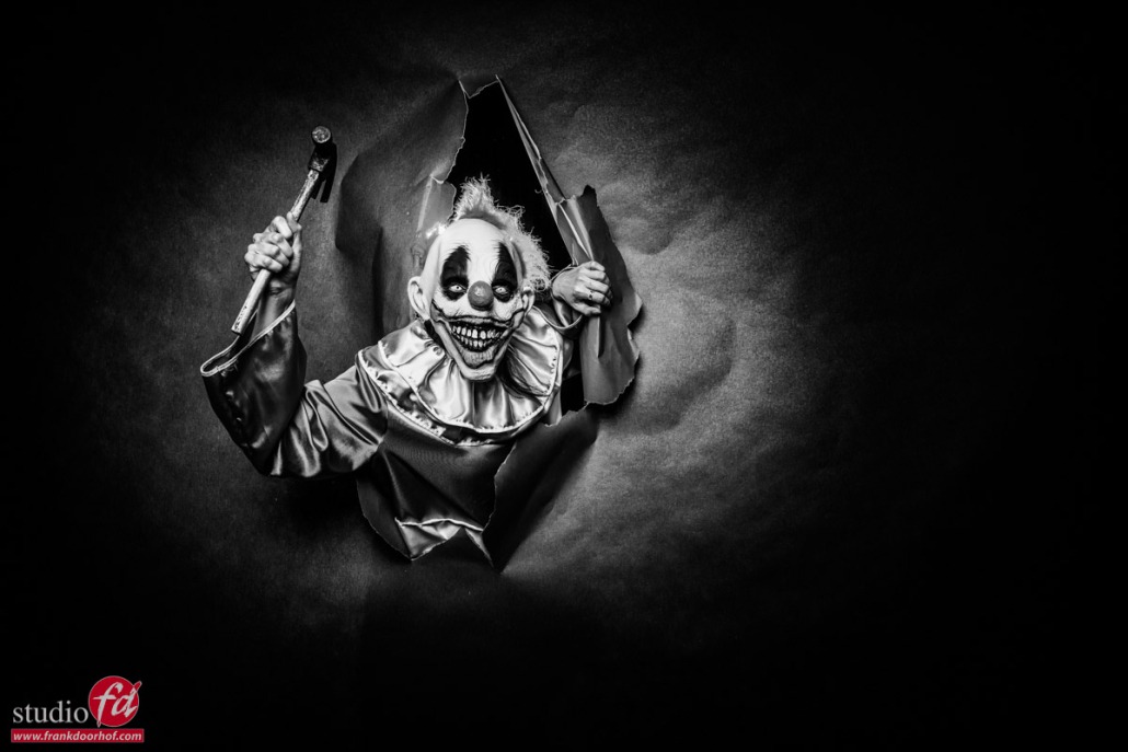
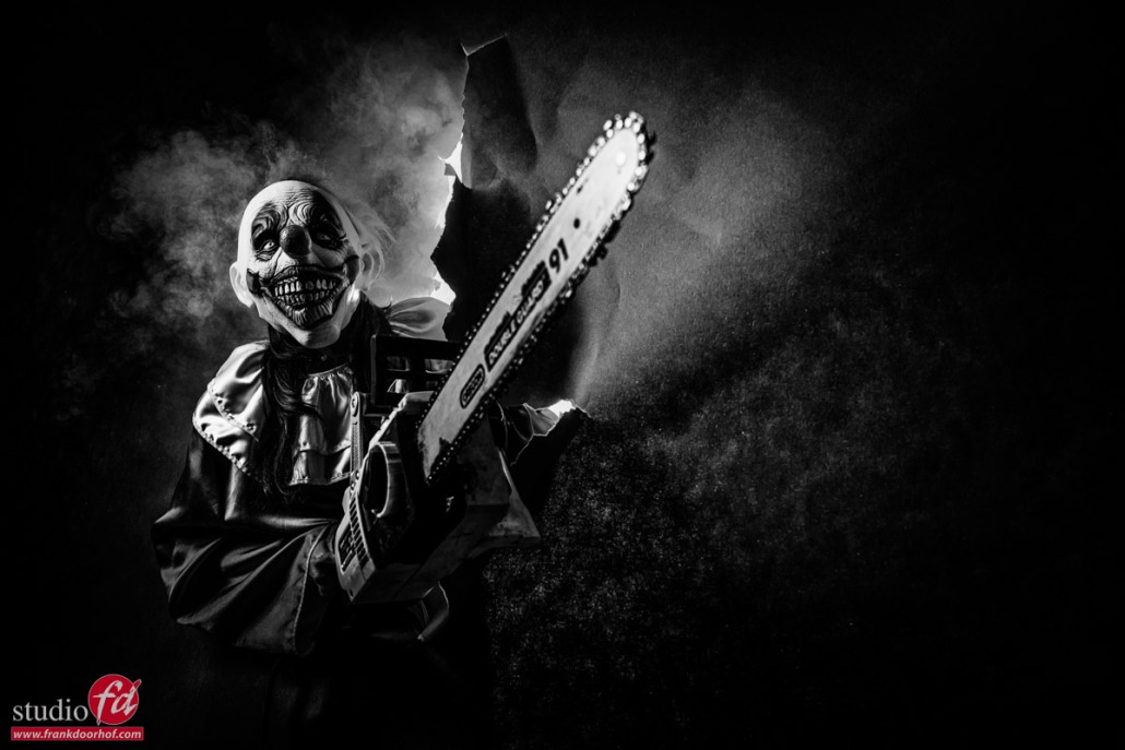
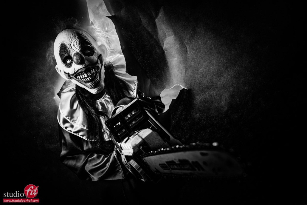
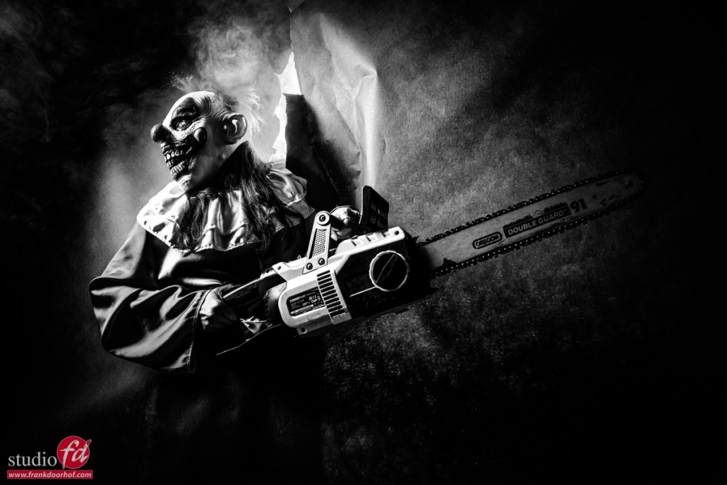
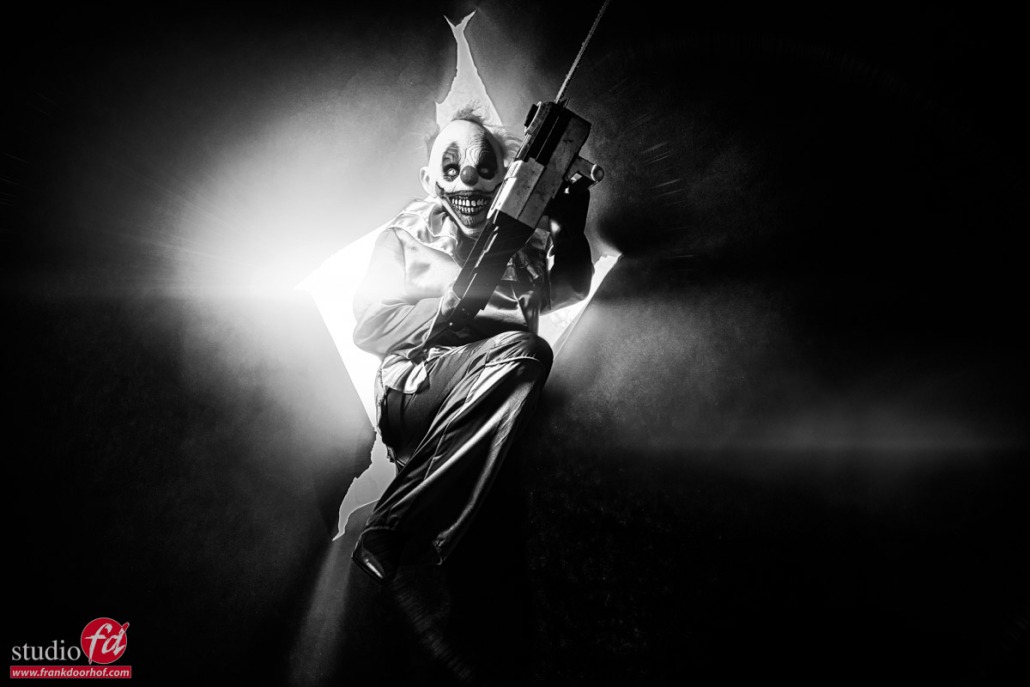
As you can see the images get a totally different vibe and look.
For me even more creepy than the color versions.
Learning all about lighting in our workshops
For me teaching the workshops is not all about lighting.
Personally, I think there is a lot more than just lighting or a cool/fitting backdrop.
A good photo is a cooperation between the model and the photographer. So coaching and making a model feel at ease is vital. But after that, the real creativity comes into play, and during the workshops, I try to focus at least 80% on creativity.
This can be with lighting, but also with the storytelling part.
As mentioned in the previous blog post, working in “super creativity” model can enhance your skills way above the level you would achieve if you only shoot what you are hired for. Plus if you can shoot images that your client is not used from you it could very well be that he/she asks for something a bit more creative.
Visit www.frankdoorhof.com and www.photography-workshops.eu for the workshops in Dutch and English.
Like this:
Like Loading...




You must be logged in to post a comment.