Tag Archive for: model

Getting outrageous skies without Photoshop but with gels

Color manipulation is fun, get outrageous skies without Photoshop

Today another part in our series on color and color manipulation.
part I
Part II

We all love easy to do tricks of course, so I thought today would be the perfect time for just such a tip.

When we look at the color triangle we can see that all colors are connected through the white point.
We talked about this in the first blogpost in this series.

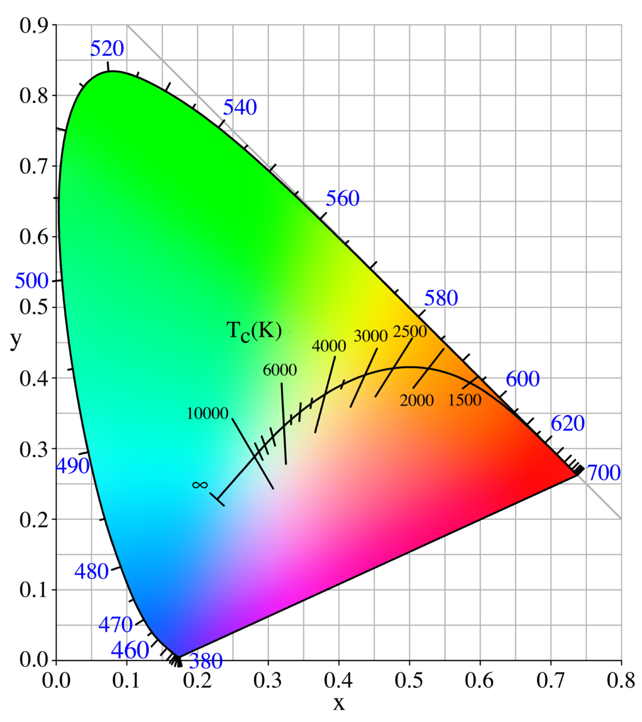
This also means that we can manipulate our white point by choosing a whitepoint that is way off the black body curve and choosing this as a new white point.
So let’s take a look at how this works in real life.

Look at those skies

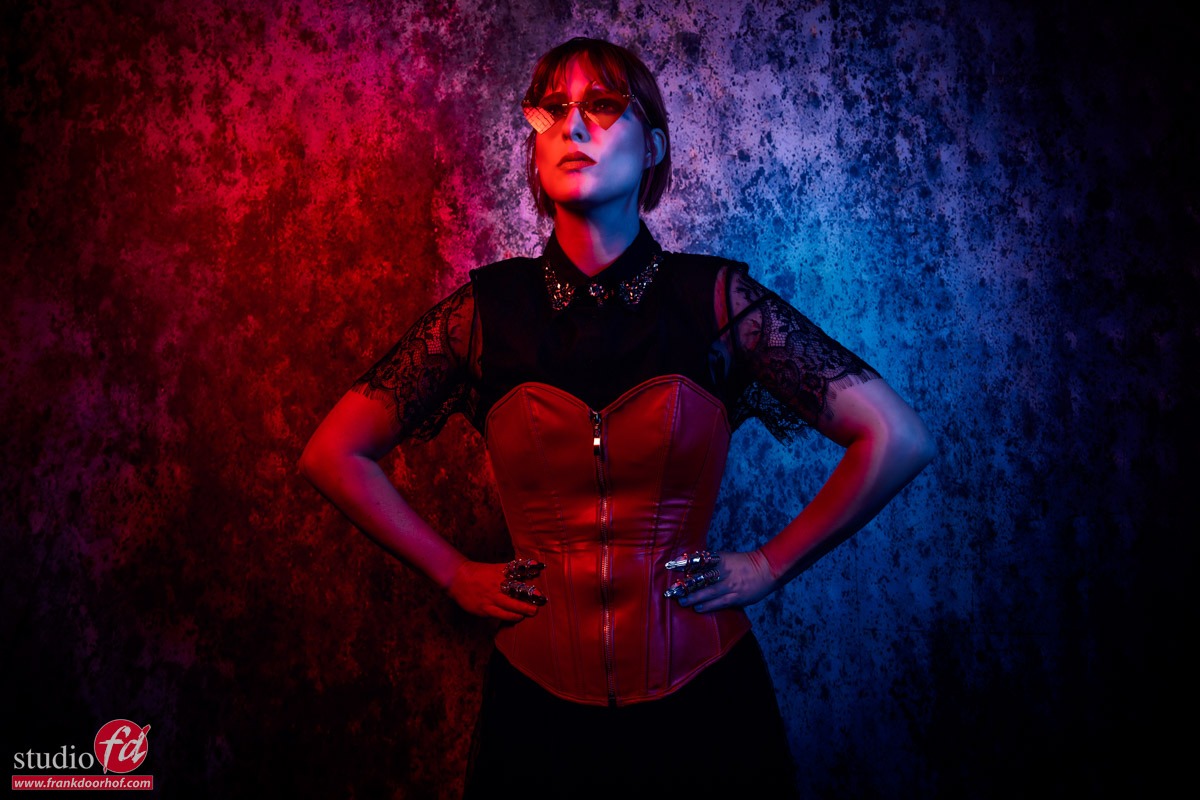
Let’s take our model Lois on location.

Yeah, well….
There is nothing wrong with this shot but it isn’t really popping right?

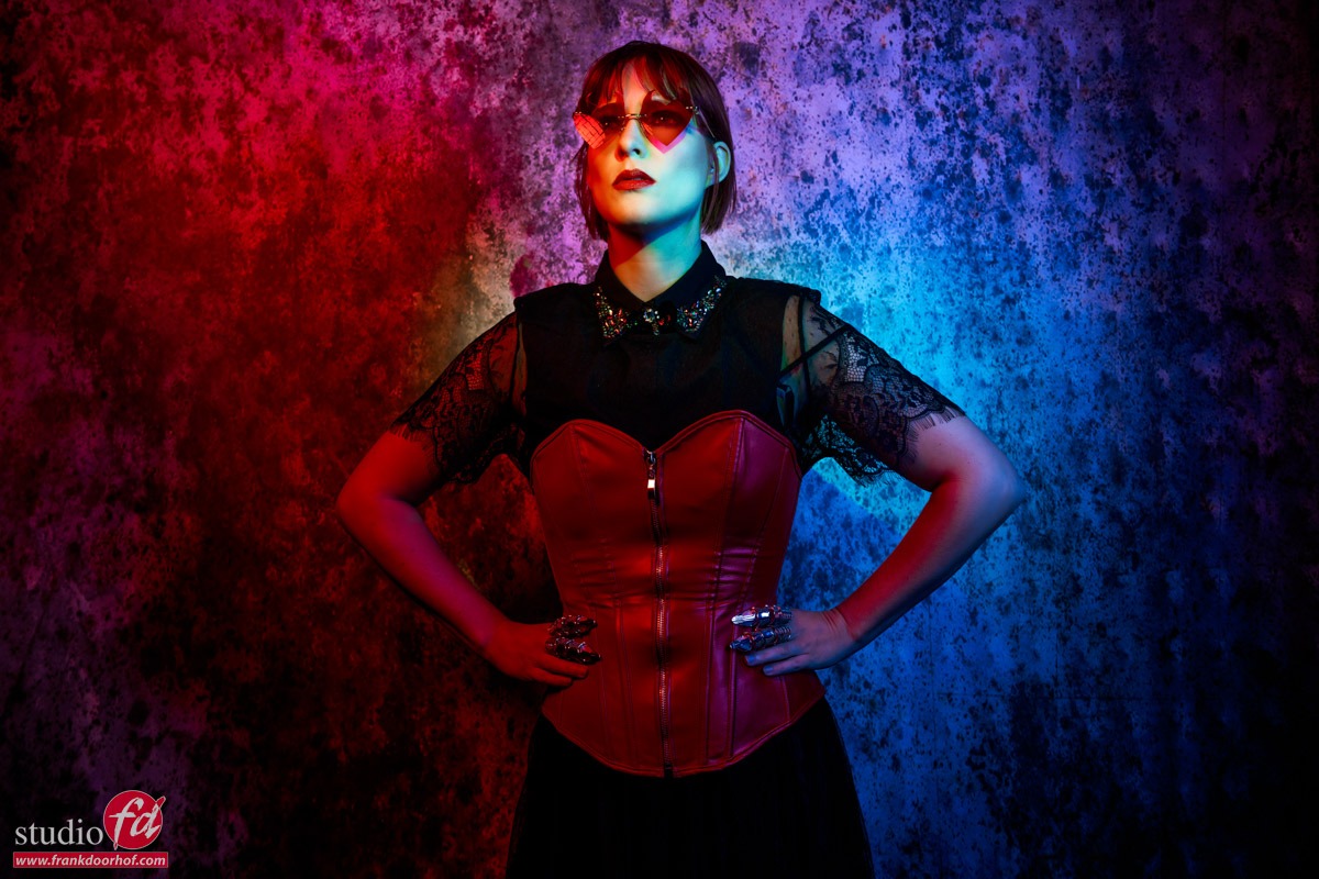
So first let’s add some strobe power.

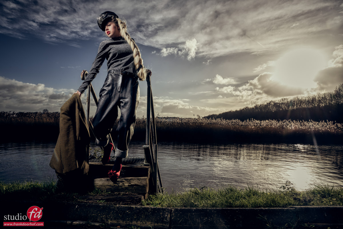
Ok that’s a LOT better, love the sky and the model really pops out.
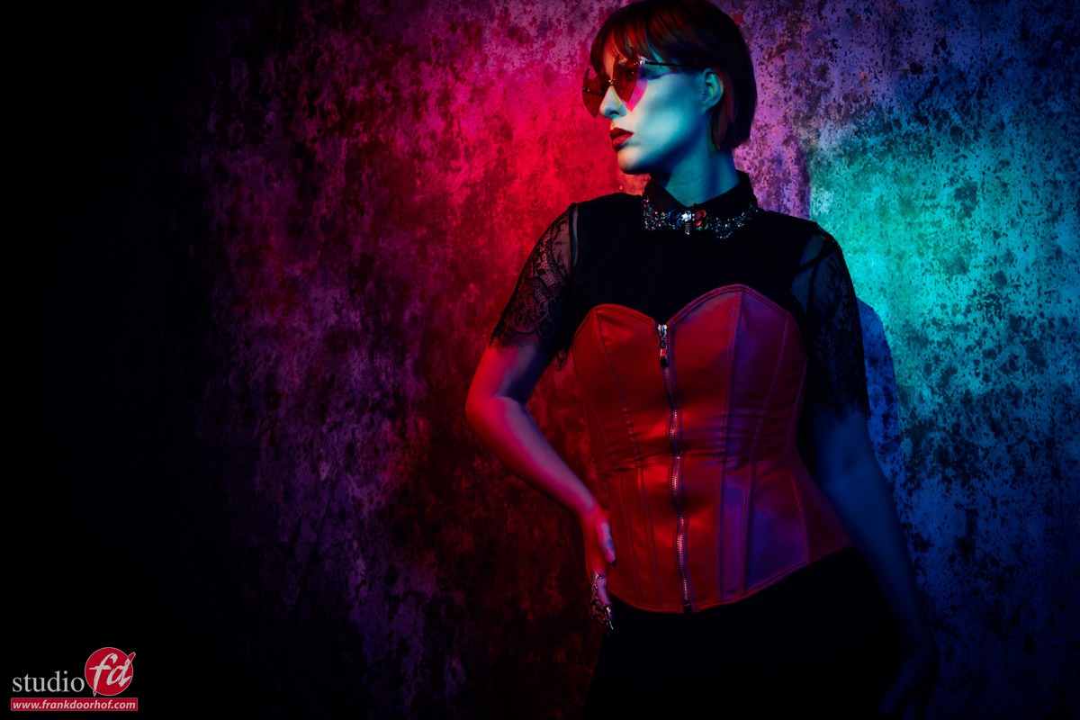
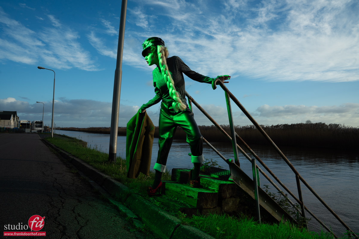
But what if….we want to push the creative factor up.
Let’s add a green gel to our strobe.
You can use the Rogue magnetic system for this.

Of course it’s vital to shoot a color checker for this.

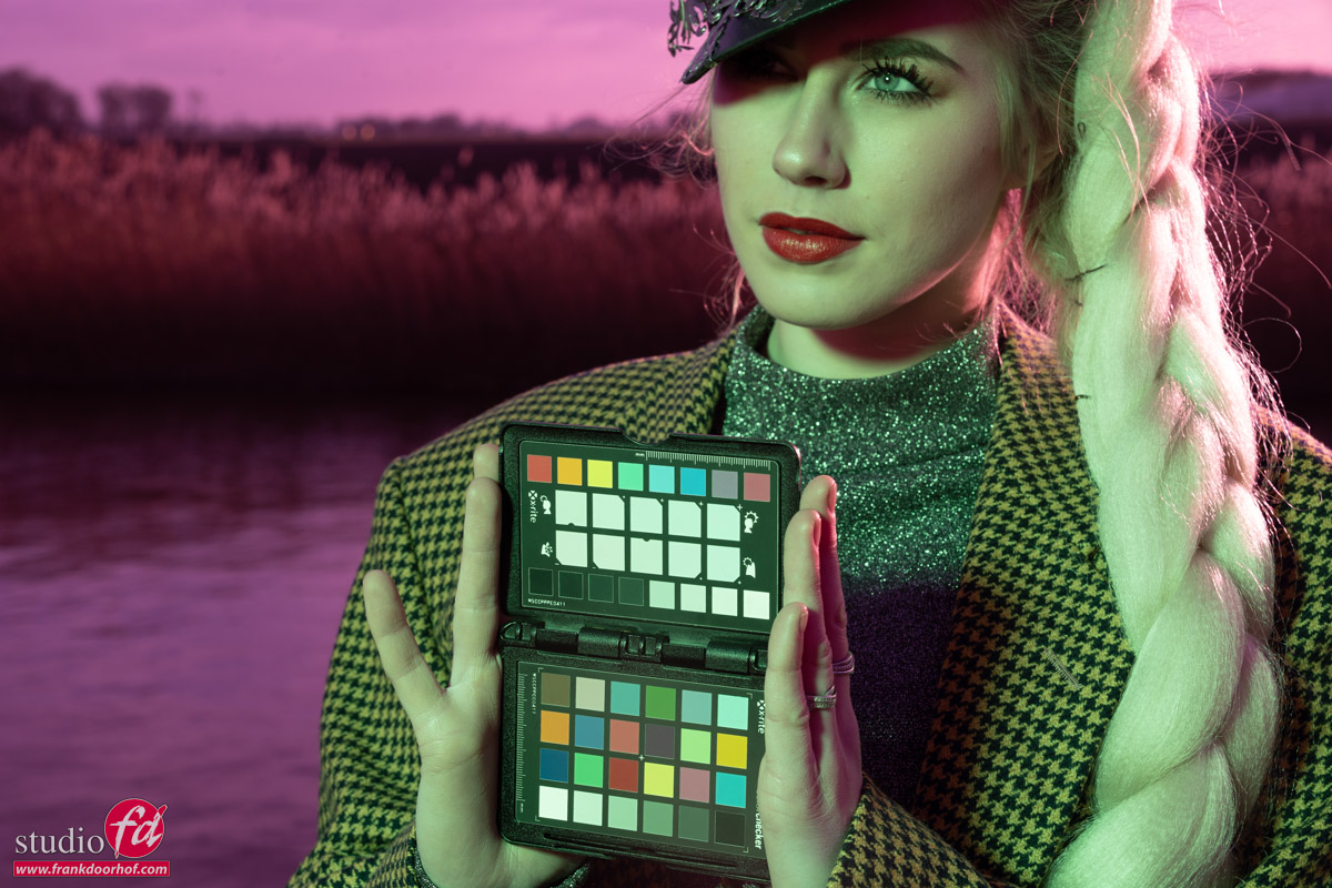
Now click on the whitebalance part and look at what happens.

Don’t you just love the effect.
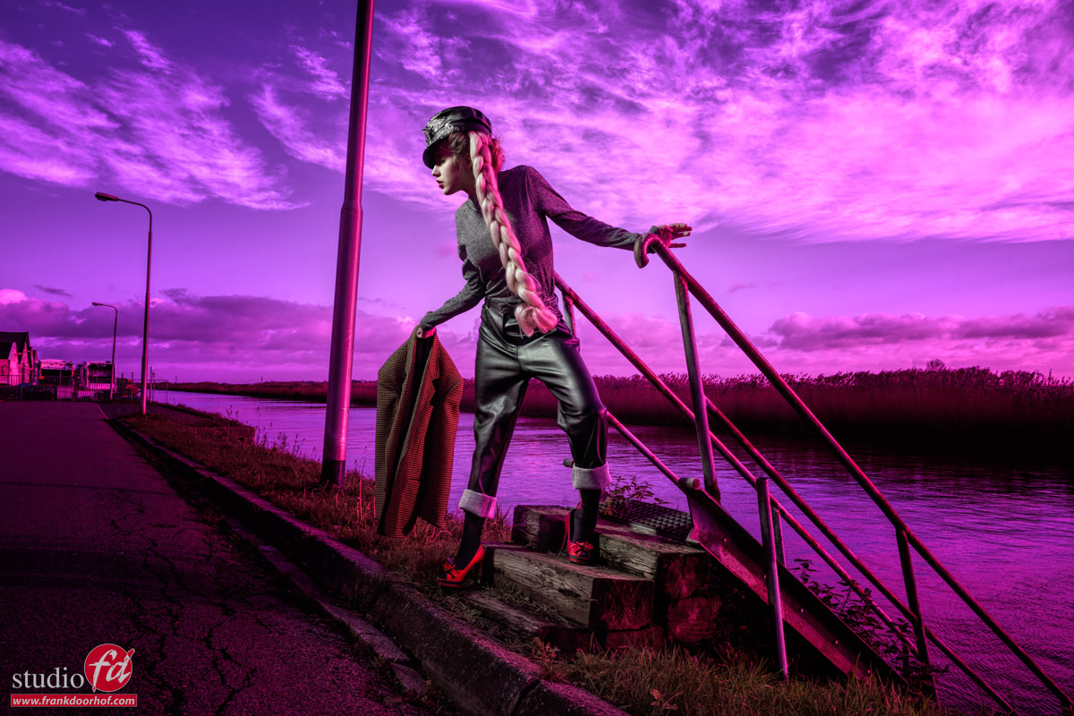
In essence it’s very easy what happens.

Normally the white point is on the black body curve.
By using a green gel on the strobe we are now placing the white point above the black body curve, by correcting this to the correct white point everything else drops down, meaning white becomes more magenta. Enhance the colors a bit in your favourite editor and you can have loads of fun with it.


An extra tip

As you have read Key is the luminance of a color.
This means that if you don’t have a correct exposure of your shot the colors will not look accurate.
Now of course sometimes you want a more moody look, but it’s important to understand the basis of color to be able to manipulate them the way you want.

To be able to judge your colors correctly you need a proper workflow.
For me this contains a lightmeter and colorchecker.
This means I get my exposure correct and with the colorchecker I can create a profile and white balance for that series.
And do remember this is just to get all the images looking the same so that all the presets you run or anything else in your workflow has an expected outcome.

On the side of the monitor I’ve been using BenQ monitors for years and can highly recommend them.
They have a great line up of professional monitors and a great line of P3 colourspace monitors (in between sRGB and Adobe RGB) for very affordable prices.
Besides great quality most BenQ’s also support hardware calibration. Which means you don’t calibrate your operating system but straight into the monitor.
This is a much better way of calibrating your screen than via standalone software and of course the software is delivered for free.
We have a few 10% discount codes for our European vistors, please contact me for more info.

Combining 3 gels for awesome results and even white light

Colors can be mixed, Color Manipulation part 2

In the previous blog post you could see that colors are all connected.
So today we are going to play with this.

Additive and Subtractive colors

Often this leads to a lot of confusion about what primary and secondary colors are.
For photography and video we are using Red Green and Blue to create the color we see.
A printer uses CMYK to print the colors we see.

These are two different ways of working with colors we call those additive and subtractive.
Additive colour is created by mixing light. Subtractive colour is created by mixing materials.

For today we are going to work with 3 colors Red, Green and Blue.

And I mean that literally

When we combine a Red, Green and Blue gel and aim it at a subject we will get an awesome effect.
You will see a mix of the colors in the shadows, but the fun thing is that where all 2 colors overlap you get a “white” light.
This is how gels actually work, so you can create some truly stunning shots with this.

In this setup I’m using three strobes with gels.
Let’s first take a look how it looks without green.

As you can see it doesn’t really look right. There is a harsh shadow line and it doesn’t really pop.
So let’s throw in the green.
The green strobe is aimed directly on the model, while the red and blue are coming from the sides.

Now let’s start to play a bit with poses but more importantly our own position.

As you can see by changing the angle under which the model poses and where you shoot from you can play with the colors and get very different results.
This is without a doubt a very creative solution, but… do remember this is not something you shoot for a client without showing the result before hand, I love it, but it’s not for everyone 😀

An extra tip

As you have read Key is the luminance of a color.
This means that if you don’t have a correct exposure of your shot the colors will not look accurate.
Now of course sometimes you want a more moody look, but it’s important to understand the basis of color to be able to manipulate them the way you want.

To be able to judge your colors correctly you need a proper workflow.
For me this contains a lightmeter and colorchecker.
This means I get my exposure correct and with the colorchecker I can create a profile and white balance for that series.
And do remember this is just to get all the images looking the same so that all the presets you run or anything else in your workflow has an expected outcome.

On the side of the monitor I’ve been using BenQ monitors for years and can highly recommend them.
They have a great line up of professional monitors and a great line of P3 colourspace monitors (in between sRGB and Adobe RGB) for very affordable prices.
Besides great quality most BenQ’s also support hardware calibration. Which means you don’t calibrate your operating system but straight into the monitor.
This is a much better way of calibrating your screen than via standalone software and of course the software is delivered for free.
We have a few 10% discount codes for our European vistors, please contact me for more info.

Behind the scenes during a photoshoot

Behind the scenes is always fun

Digital classroom is our online educational live stream.
Once a month we have a 2 hour broadcast from our studio where I explain different topics and lighting setups, always fun and interesting.

Today a digital classroom with Claudia.

Working with colors and gels is fun

Colors evoke emotion

Today is the first blog post in a series about color and color manipulation in photography.
We are going to talk about color theory, how to manipulate colors, and how to use gels in a super creative way.
So keep coming back and subscribe to the blog. This part I

Color manipulation

Colors are all around us and are for a large part responsible for how we experience a product or scene.
Think about the movie Titanic in normal colors, instead of the fitting brownish tint.
Or how about the tinting used in The Matrix where green was used inside the Matrix?

Now think about this.
When you are 5 miles below sea level in a concrete bunker,  you turn on the light.
What color is that light?

Most people will answer Blue or are in doubt.
In essence, you don’t have to doubt, you are in a concrete bunker so the light is… well just the same color/temperature as it would be above water.
So why is the Abyss, and almost every underwater movie filtered blue?

Easy to explain, we immediately get a feeling that we are indeed underwater.
And you probably also feel cold 😀

Colors evoke emotion.

Learned or emotional

Now the following is not scientific (I guess) but I use it all the time during workshops.
When we talk about colors and emotion we can expect the following.

Red

Hate, warmth, love, warm, cozy, danger, etc.
The funny and interesting thing is that Red covers both emotions that trigger us, hate and love.

Blue
Cool, distant, uncertain, future, empty, sterile

Green
Now with green, I have to be honest that I don’t have a real emotion.
Of course, we have associations like envy or nature and some people will say calm.

Red is special

This is also why I love using the color red in my photography.
And you can even find it back in our logo. It’s a color that is very versatile.


Today we take a look at some images we took from Lois during a recent workshop where I’m using a blue gel as an accent light


As you can see I’m using “normal” white light as my main light and as an accent I’m using a Rogue Blue gel on our magnetic system.
The advantage of these gels is that they are thick and give a beautiful deep saturated color, which makes the trick I’m using a lot easier.

Which trick?

When we look at the color triangle we see the colors Red, Green, and Blue.
And in the middle we see the so-called black body curve.
This is where the “white points” are located, a lower color temperature is a warmer white, and a higher color temperature means a more blue color tint.
For calibrations, we use D65 for most photography/video applications.

color manipulation

Just for fun. When you draw a line from the primary color (RGB) through the white point you end up on your secondary color (CMY).
You often see CMYK and K is actually the Key of that color, meaning the brightness, in printers, this often means a Black module, but the K is actually called Key.

By knowing how colors interact we can do some really cool things.
Today I’m showing you something really easy that you can do yourself.

Use one light source with white light and one accent color preferably blue or red.
Now the only thing you have to do is change the color balance in your RAW convertor and you can get some really funky effects like these below.

Because you are using white light and a deep blue you can create a beautiful mix. But if your client doesn’t like the “cool” look you can always go back. This is not possible when shooting with 2 gels.

Color Manipulation color manipulation

An extra tip for color manipulation

As you have read Key is the luminance of a color.
This means that if you don’t have a correct exposure of your shot the colors will not look accurate.
Now of course sometimes you want a more moody look, but it’s important to understand the basis of color to be able to manipulate them the way you want.

Must-have for color manipulation is the right gear

To be able to judge your colors correctly you need a proper workflow.
For me, this contains a light meter and color checker.
This means I get my exposure correct and with the color checker, I can create a profile and white balance for that series.
And do remember this is just to get all the images looking the same so that all the presets you run or anything else in your workflow has an expected outcome.

BenQ

On the side of the monitor, I’ve been using BenQ monitors for years and can highly recommend them.
They have a great lineup of professional monitors and a great line of P3 colorspace monitors (in between sRGB and Adobe RGB) for very affordable prices.
Besides great quality, most BenQs also support hardware calibration. This means you don’t calibrate your operating system but straight into the monitor.
This is a much better way of calibrating your screen than via standalone software and of course, the software is delivered for free.
We have a few 10% discount codes for our European visitors, please contact me for more info.


Check this link for part II about Color Manipulation

In our latest video: Inside the Model Shoot we also work with colors and manipulate them