Tag Archive for: inspiration

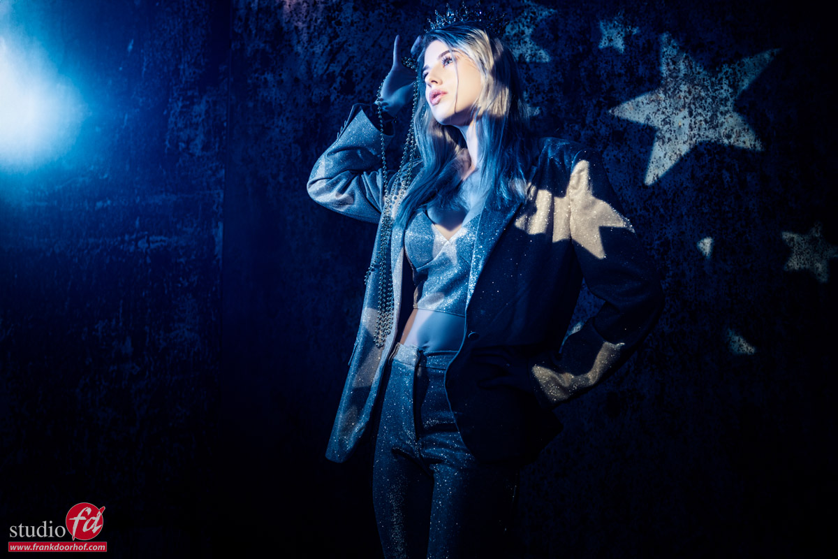
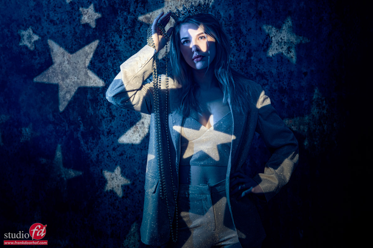
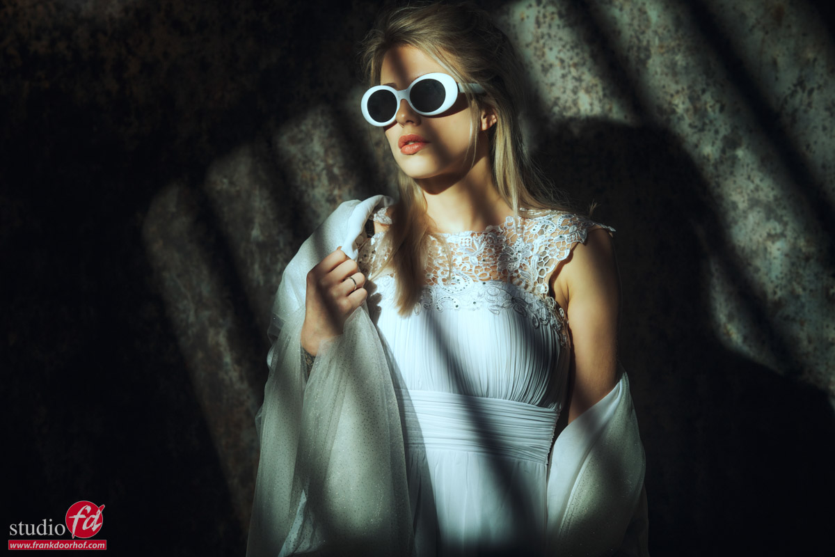
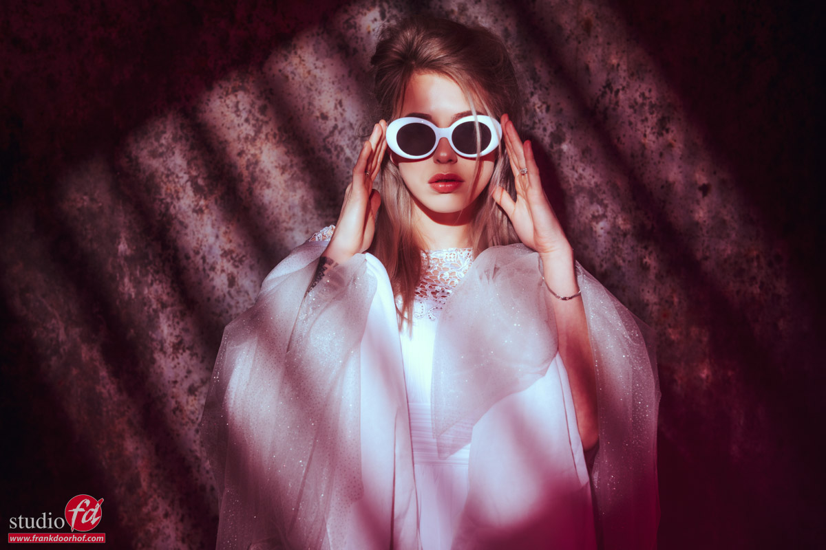
A step by step workshop with Nadine and using Geekoto strobes outside

Workshop outside with Geekoto strobes

What do you teach?

Probably one of the first questions people ask when they want to know more about my workshops.
And let’s immediately take the bull by the horns. It sometimes seems everyone is teaching workshops and the quality is often not what people expect. A guided photo shoot is NOT a workshop. I’ll teach you lighting with Geekoto strobes (but any brand will do). Continue reading more about using Geekoto strobes in a workshop outside.

For me, there are a few things important during the workshop.

  1. A small group
    I love to work with groups varying from 3-12 attendees. This way I can give a 1:1 experience to all the attendees and we all have enough time to shoot portfolio material.
  2. Theory
    Knowing how the light works is essential and will immensely help you understand what happens during a shoot. How to place the lighting quickly and solve problems. In essence, lighting isn’t that hard (no really), it’s the creativity and getting the right shot that’s an everlasting journey of learning.
  3. Creativity
    The theory is essential, but after that, it’s all about creativity, how to style a set, how to find the right angles, how to coach the model, etc., etc. this is in essence what makes or breaks the shot
  4. How to work with the model
    You can’t take a perfect shot (if that’s even possible) if the model doesn’t feel at ease, so during the workshop, there is always attention to coaching the model and also how to prepare for the shoots.
  5. Workflow
    Understanding your gear and software takes away so much stress and means you can focus 100% on the session and your subject.
  6. Q&A
    Believe it or not, I hardly prepare my workshops, but I’ve taught a lot of them over the years, and at the moment I start all the workshops with a Q&A. In this part, the attendees can ask whatever they want. I will answer the questions immediately for the theory part and create a set (or make it part of the set) during the workshop. Do you have a problem with a white background? Then we create one set with a white background. This way attendees always get what they want and expect.

Themes of our workshops

All the workshops do have a theme.
For example, Cosplay, Classical Masters, Glamour, Gels, etc. but the content will be different every single time due to the Q&A which keeps it fresh and challenging for me but also for the attendees that visit several workshops a year.

One of the themes a lot of photographers struggle with is using strobes on location effectively.
So let’s take a look at the workshop “On location in Emmeloord” with Nadine.

All shots were done during the workshop outside with Geekoto strobes

During the workshop, we worked with the Geekoto GT200 and a large metal reflector for most shots.
These reflectors add some extra light output to the strobe which helps a lot outside when it is really bright.
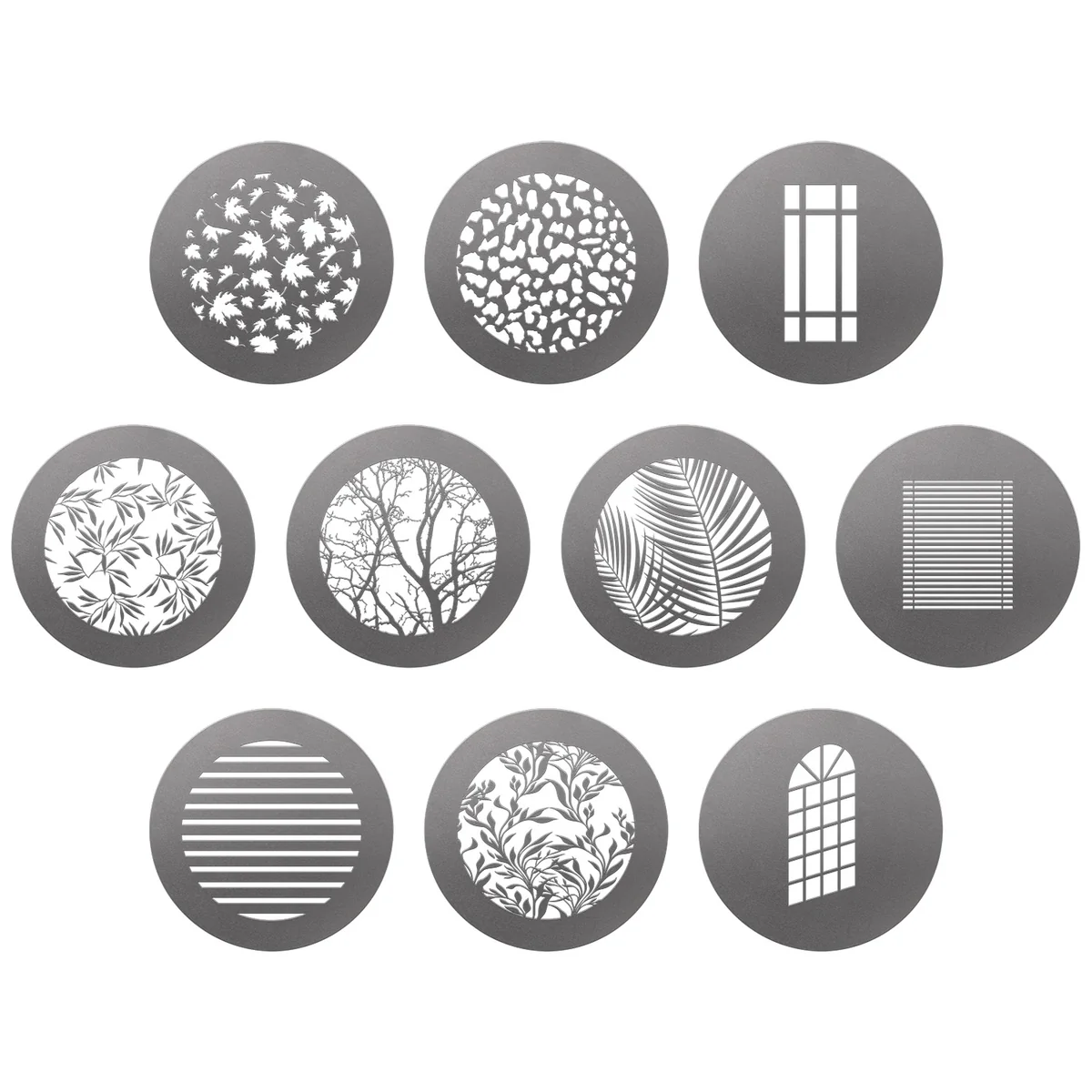
On the second Geekoto GT200 I used the Rogue magnetic system for some added color or a grid with the reflector for color.

The Geekoto strobes support ETTL and HSS but for the workshops, I have to limit the strobes to full manual mode.
The reason for this is that all cameras operate via a different radio system. This means that if you use a camera that is not supported you cannot shoot which of course is not the idea of a workshop. So we are using so-called “dumb” triggers that work on all cameras. The only limitation is that I have to shoot at a max shutter speed of 1/125 which means we shoot with rather small apertures. When I shoot commercially or for myself I’m using HSS for a much shallower depth of field. As you can see in some images.

Outside with Geekoto Strobes, set 1

After the Q&A it was time to go outside.
The idea of this workshop is that the attendees have to find interesting locations around our studio. In other words, you don’t have to travel far to find awesome locations. And always remember, seeing it through the lens and with strobes it’s a totally different scene.

The first set was right next to our studio.
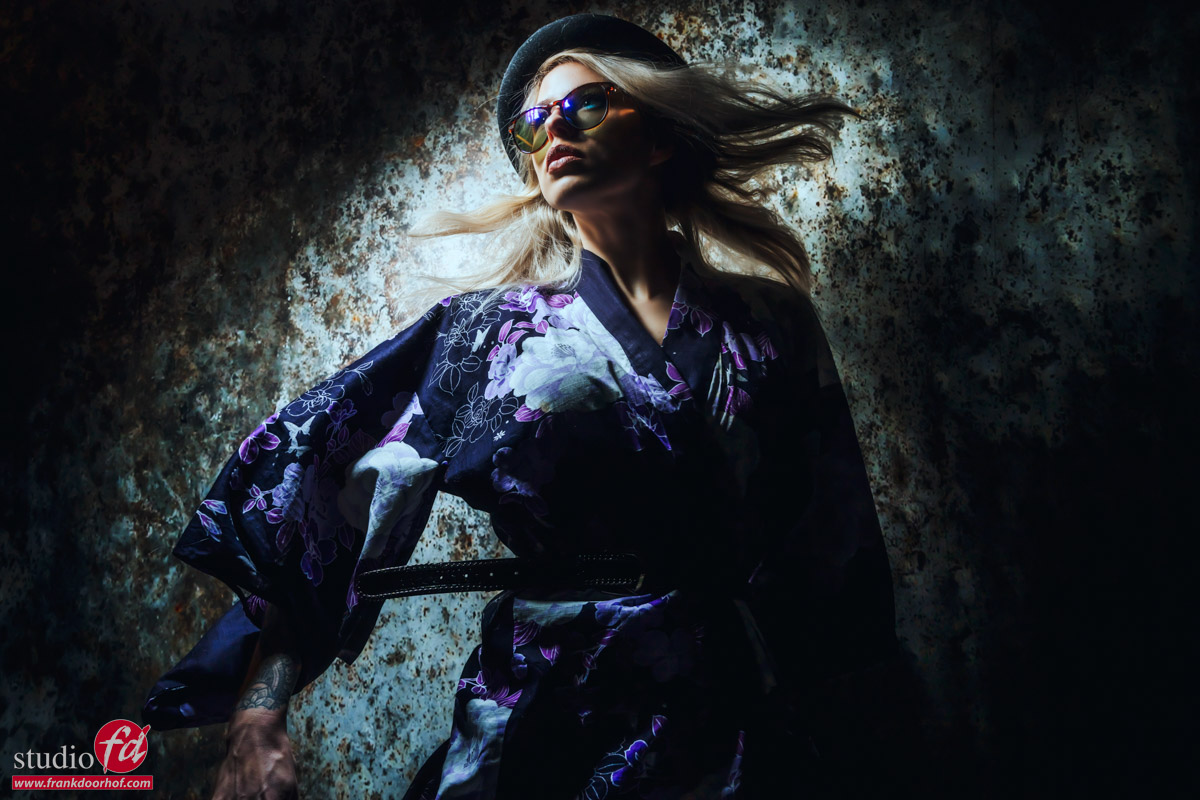
Our neighbors use a closed fence. The clothing Nadine was wearing worked flawlessly with the fence.
I started using the reflector straight on the model but to create a more interesting look I added a blue gel from the side.
By experimenting with angles and the balance between the strobes you can quickly change looks on location. Even without the client noticing.

outside with Geekoto Strobes. with on the left a blue magnetic gel

Outside with Geekoto strobes, set 2

For the second set, we found a few large onion boxes that were stacked up and Nadine had the perfect outfit for this.
I started out with just the reflector on Nadine. But soon we switched this over for a Rogue grid as the main light on Nadine’s face and the reflector with a blue gel top opened up the shadows with a blue tint for a totally different look. And of course, as you can see you can change the output of the blue strobe to create totally different looks without losing the focus on the face of your subject.

outside with the geekoto strobes

Outside, set 3

You probably will notice it with these shots but….
Nadine is pregnant. So for the next set I wanted to shoot her pregnancy shots. Well some of them at least, because I think we will do some more at a later stage.

For this set I wanted something a bit more bright and airy.
In front of our studio there was an old building. Great for photography (one of my signature series backgrounds is actually from that wall) but they recently demolished it. And now there is a large field right in front of the studio… not a disaster 😀

I used the Geekoto GT200 with the large reflector for a harsher quality of light.
This is the set I also shot on HSS as you can see 😀
The part of this shoot was to not only find the location but also find the right angles. And how you can change the look of a scene and shot by changing your perspective, using material in front of the lens and of course maybe angling the camera slightly or…. Well let’s take a look at the different options I chose from this set.

Oustide with Geekoto strobes, creating a lens flare with a second strobe Workshop outside with Geekoto Strobes, shooting from a very low angle Workshop outside with Geekoto Strobes, photographing from a higher angle

Outisde, set 4

This location was at the edge of Set 3. and the last one in the workshop outside with Geekoto Strobes
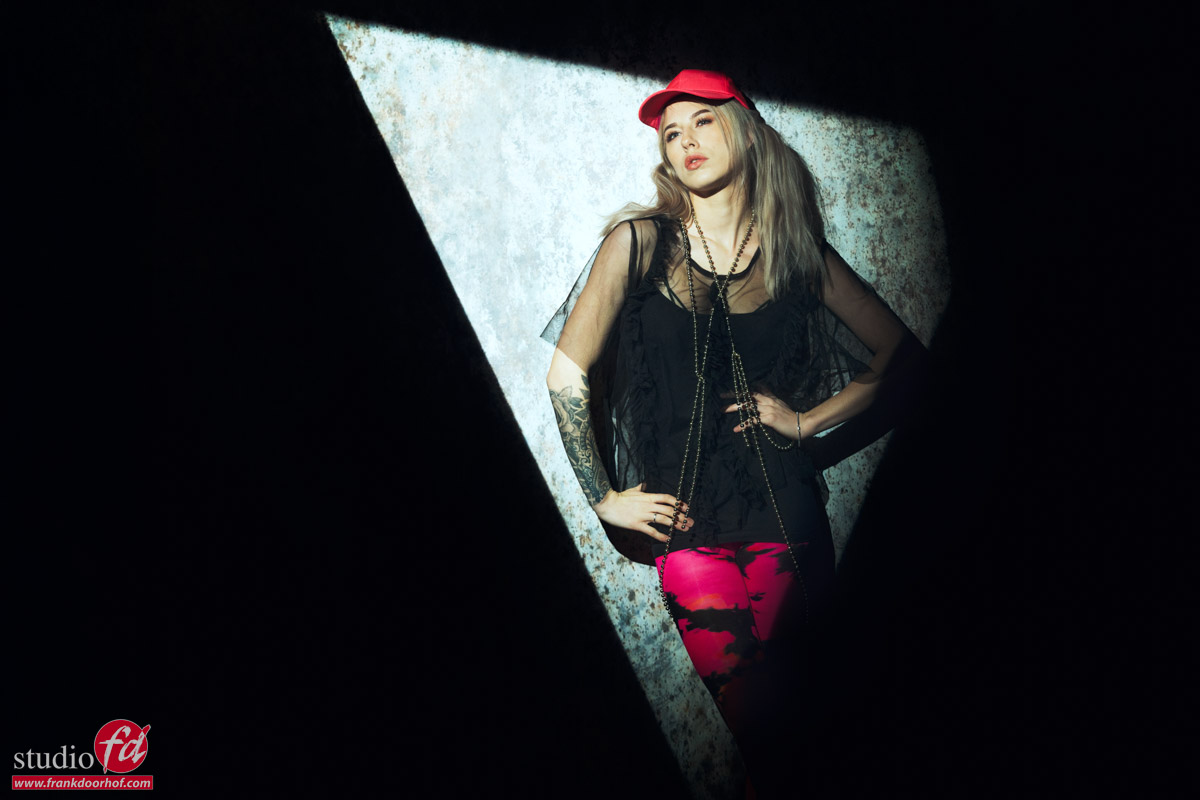
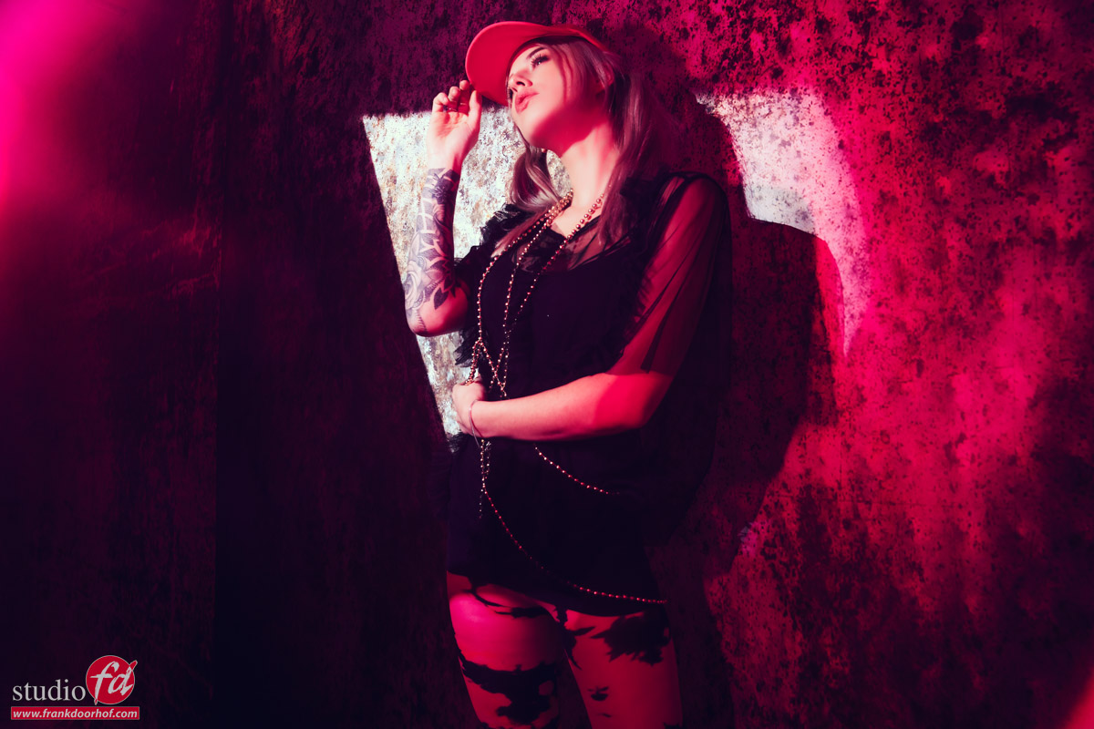
I used the Geekoto GT200 as main light and the reflector with a blue gel in the back.
Choosing a lower angle gave me a cool triangle in the back which I feel gives the image a nice flow.
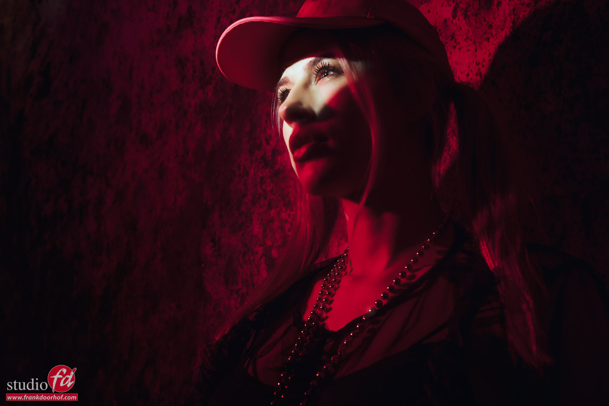
And of course a more close up shot is part of the setup. This was the time we changed batteries on Geekoto Strobes.

Workshop outside with Geekoto Strobes and making day to night images

Also want to visit a workshop?

Today I showed you the results and different sets we did during the workshop outside with Geekoto strobes “on location in Emmeloord” with Nadine.
During the workshops I always try to use 3-4 different setups explaining different techniques and of course it’s a great way to get a good addition to your portfolio.

If you think “that’s for me”
Than visit photography-workshops.eu for the Dutch workshops.
But if you are not living in the Netherlands or don’t speak Dutch we also have other options.
If you let is know 2 weeks in advance I can teach the workshop you want to visit in English.
Or if you can’t travel to our studio we also now offer the option to get a full 1:1 experience with 5 different camera angles, lightroom/Photoshop view and a talkback channel, you also get all the raw files and retouched results from the workshop. Visit our online workshops page for more info.

Colors and how they connect

Colors evoke emotion

You probably have been hearing me say that a lot.
And that’s because color is incredibly important to give images/video/film a certain mood. But also for logos, design, cars, buildings, interiors, clothing, colors are used everywhere to get a feeling, or make you feel a certain way. This article is about how colors connect in photography.

Accurate colors

So for us as content creators, it’s vital to make sure that our designs, photos, videos, etc. all look accurate.

So when someone orders a red scarf and a red sweater they look the same as in the brochure or website.
Luckily this is pretty easy.
You probably heard the term calibration regularly on this blog, my books, and videos.
With calibration, you make sure that your camera, printer, monitor, etc. are showing you the most accurate colors.

Because this is a topic that I’ve explained a few times in other blog posts. But always in connection to a technique. I thought it would be interesting as a reference to just explain a color space and the pure basics of calibrations, in a later blog post this week I’ll go deeper into the process and settings.

Primary versus Secondary colors

First, we have to make sure we know that divide the main colors into 2 sections.
The primary colors are Red, Green, and Blue
The secondary colors Yellow, Cyan, Magenta

Now how does this work in practice?

Color temperature

The first thing we must know about the colorspace and calibrations is the color temperature.
When you look at your strobes, sunlight, shade, continuous lighting, etc. you will probably know they all have different color temperatures. And when we talk about calibrations we call this the blackbody curve and a point on or close to that curve.

But when we look at the curve you can see that it runs from blueish white to reddish white.
The blue part has a very high color temperature, whereas the red has a very low color temperature.
Think for reference about a piece of metal you throw in a fire and you will see that the hotter it gets the more it will shift from red to blue.

We agreed upon the value of D65 for the reference white point. (6500 Kelvin)
When we calibrate our monitor or projector you should calibrate to the value of D65.
In some cases, 5400K is demanded. But if you need this, you don’t need this blogpost explaining colorspacee, probably.

how colors connect in photography

When we look at the color triangle above you can see that the 6500 degrees point is slightly reddish. This means that people sometimes have to get used to calibration at first because white will look a bit reddish, but trust me, this is very short.

Colorspace

Now that we know how the color temperature works, how do we get there?
As you can see in the next image there are different colorspaces with different levels of saturation (larger colorspace = more saturated colors)

colors and how they work together

In this diagram you can see that the primary colors Red, Green, and Blue create the color triangle.
And you probably also notice that the colors are located in different locations.

Luckily for us, those coordinates are known for every colorspace.
Each color has 3 coordinates.
x,y, and Y.
To manipulate these colors we use the settings Hue, Saturation, and Luminance (Y)
You probably know these from Lightroom already.
During the calibration, you are in essence pushing and pulling the colors around till they are in balance with the colorspace you chose. And those corrections are stored in the ICC, DCP profile.

Because for every colorspace we know the coordinates for the primary colors you might wonder, “Where do the secondary colors come in?”
That’s actually simpler than you might think.

How colors connect in photography

This is how colors connect in photography

When we draw a line from the primary color through the white point we end up with the secondary color of that color.
So Red connects to Cyan, Green connects to Magenta, and Blue finally to Yellow.
You probably understand that this is a very fine balance and if one of these colors or the white point is not correct the whole colorspace will shift slightly or even “collapse” meaning you can’t trust your workflow.

Gamma

There is one thing I didn’t mention yet and that’s gamma.
When we look at for example a 10-step grayscale we want to make sure that all steps are visible but also are visible equal in brightness difference. This is done with the so-called gamma correction, in most cases we use a value of 2.2 or 2.4.

Conclusion on how colors connect in photography

The primary colors Red, Green, and Blue connect through the white point with the secondary colors Cyan, Magenta, and Yellow.
Colors have 3 coordinates, x,y, and Y, and are adjusted by Hue, Saturation, and Luminance, corrections needed are stored in the ICC/DCP profile.
Each colorspace has pre-determined values for Gamma, Colors, and white point. This means the only thing you have to do is make sure your images and monitor show the correct colors, which they never do, so they need to be corrected.

Now that we know how complicated it is, it’s time to tell you the calibration itself is super simple.
For the monitor, I highly recommend the calibrite series of products. The process can be done fully automated and takes between 5-15 minutes.

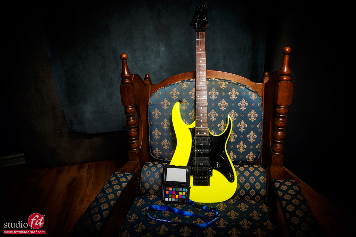
For the camera, I’ve been using the calibrite colorchecker passport for years. It’s easy to create a profile and the results are very good.

In later blogposts, I will focus on these devices separately.
But one I have to mention right away because it’s essential.

The light meter

When we calibrate the monitor we are guided through the software by a very easy-to-follow workflow. The software actually asks you to adjust the contrast/brightness till it hits a target.

Now the reason we do the calibrations is to create a stable workflow that makes it possible to get constant results in all different lighting situations. As you can see one of the coordinates of the colors is the big Y or in other words Luminance.
Seeing the calibration of the camera is done with a ColorChecker we must shoot the ColorChecker with a light meter and as flat as possible.
I mostly place a large softbox on 3 mts distance when I create a global profile, when I create a profile for a specific set I just make sure there are no gels on the strobes and the ColorChecker is still lit as flat as possible with the main light, even if that means the model has to turn and I shoot it from another angle. Otherwise, the calibration will not be accurate.

If you are in the market for a good light meter make sure to check out the Sekonic range. I’ve been using several over the years and they all performed perfectly in every possible situation. I’m now using the 858 but their whole line is top-notch.

I hope you now better understand how colors connect in photography and if you have any questions, feel free to reach out.
If you’re in the market for a new monitor with hardware calibration options, I can recommend the BenQ line up. For EU customers we have some 10% discount codes available just drop me an email.


Working with colors and gels is fun 

How to read the Light Meter? 


Geekoto softboxes compared: results from the Digital Classroom with Jannaika

Geekoto Softboxes


In today’s blog the results from the Digital classroom episode with Jannaike in which I explained the differences between Geekoto softboxes.

Remember that these were shot during a live broadcast with loads of ambient light so it’s a bit harder to set the light perfectly.
But I’m very happy with the results.

Geekoto softboxes compared, ditigal classroom with model Janaika Geekoto softboxes compared: Quicky20 Geekoto Softboxes compared, this is whit a striplight (SQ36) Geekoto softboxes compared, result of the Digital Classroom with Janaika


If you missed the episode, here it is in full.

the Geekoto Softboxes

Living in the US? and interested in Geekoto? check this Frank Doorhof Geekoto link

Read this post about our first shoot with Janaika 

In the Previous Digital Classroom, we shot Claudia with a Harley Davidson 

Sometimes 15 minutes is enough for a commercial photoshoot. Because our Geekoto flashes have a pistol grip, Annewiek can hold them easily (this is with the S26, if we should do it again, we probably take the even smaller Quicky20)


That setting that drives you nuts during the calibration process on Mac (and windows)

Calibration is important

I think most of us will agree on this. If you want proper colors and happy customers (depending on the assignment of course) it’s very smart to calibrate your monitor at least once a month, but preferably before every important retouching job. But what are the important settings during calibration?

Calibrating your monitor is super easy.

I’ve been using Calibrite (X-rite) products for years. They are easy to use and compatible with the hardware calibration options inside my BenQ monitor. This is a big plus because although the software from Calibrite is great, hardware solutions are always better, of course. Most professional and semi-professional monitors support hardware calibration.

By the way, if you are in the market for a new monitor and you live in the EU drop me an email, I have a few 10% discount codes from BenQ
They have been supporting my work with Digital Classroom for years and love to give you guys a nice discount.

Anyway back to the story.
Even with easy software, it’s sometimes easy to get an error that… well you can’t fix.
You checked everything, and although you know your brand new monitor should really be perfect, it’s far from.
Or maybe you don’t know how to read the rapports and just wonder why there is so much fuzz about professional monitors.

Step 1

This one is for all systems.
When you are using the HDMI connection make sure your monitor is set for 0-255 or FULL RGB.
If it’s set up for 16-235 (video) you will get all kinds of weird behaviors, very noticeable in the dark and bright areas, but in essence, your whole image looks way off.

When you are using USBc, TB, or Display port you don’t have to check this.
Those connections automatically select the right output.

So is HDMI bad… absolutely not, it’s just as perfect for what we do as USBc and Displayport, you just have to check that one setting.

Step 2

And that’s the nasty one.
In the Mac, there is one setting that will almost certainly have you scratching your head and probably a little bit in panic mode.

If whatever you do, you can’t pass the final certification from your calibration and the errors are constantly changing per calibration, there is probably one setting you forgot the turn off. You can find it under “Displays” in Mac OS.

important setting during calibration

This one will give you A LOT of issues when you want a stable and trusted display.
So turn it OFF.
This goes for all settings with labels like “auto”, “Enhancement”, “Super”, “Real”, “natural” etc.

Just turn everything off and run the calibration software.
You will see that you will pass the certification without any problems now 😀

Don’t forget this important setting during calibration!

If you have any questions, feel free to leave them below, or reach out via our social media.

Read more about colors in this blog about Working with Colors