Photoshoot Yves
Although most of what I shoot is of the female gender I do love to work with male models, and when I get the chance to shoot a model and theme that really fits my needs for my portfolio I of course jump to the occasion.
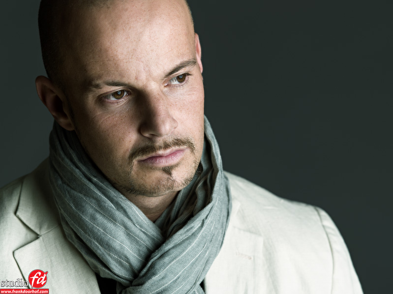
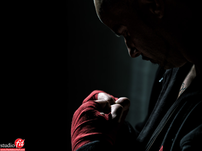
When Scott Kelby asked me if I knew some good models for his Amsterdam Seminar in the “Light it, shoot it, retouch it” tour I decided to search for a male model, because to be honest good female models I have plenty but good male models is a lot more difficult, from the responses I got Yves was without a doubt my first choice, part of the deal was that he would also got a shoot with me in our studio and you can imagine that I loved doing that. As a theme we decided to make a mix between boxing and fashion. In this blog post the result from that photoshoot.
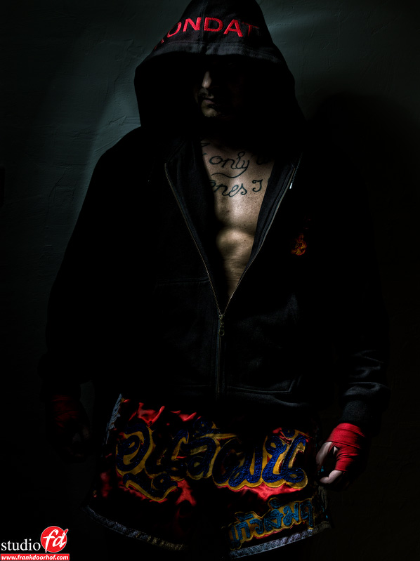
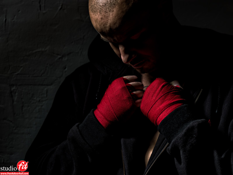
For the most I choose a very contrasty light setup, actually all were shot with just one strobe coupled with the deep octa and some with a reflector and grid. Do remember that most of the time it’s best to start with one strobe and often you will find out that you really don’t need much more. Sometimes you can open up the shadows by the addition of a second strobe that is set a few stops lower than the main light source and is just used to open up the shadows. For this purpose I always use the 1.90 Elichrom octa.
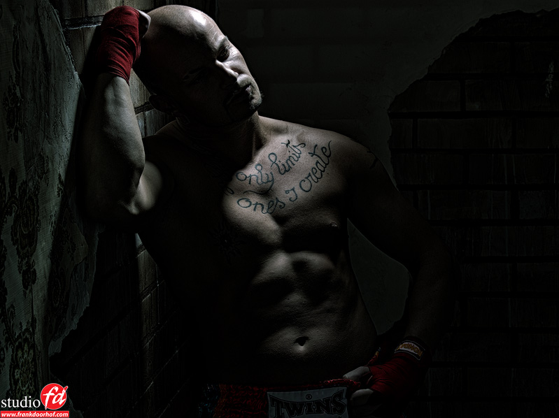
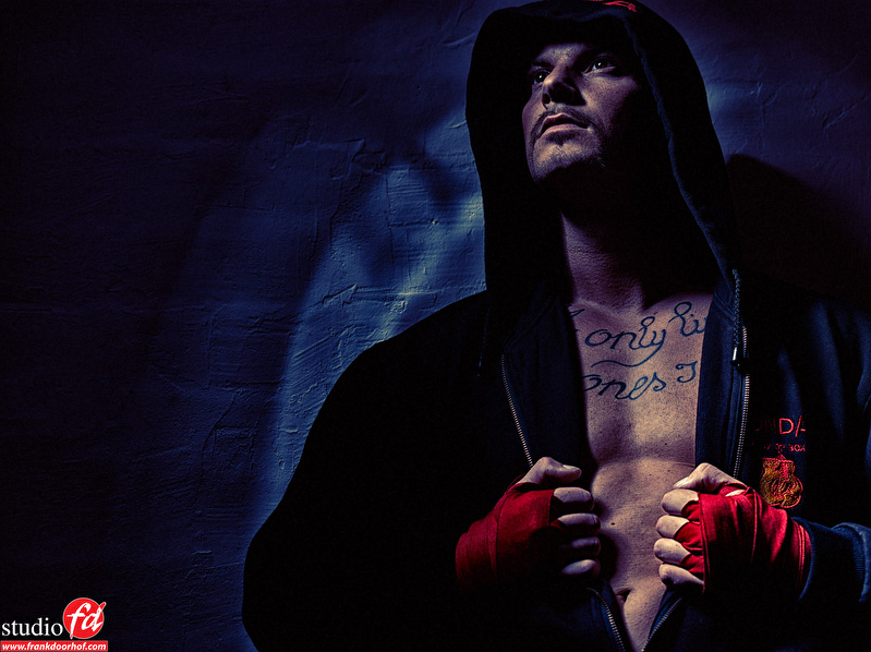
I always think an image should tell some kind of story, with the following image I let Yves hit the wall, like he just lost a fight”, the main thing for this is that because he really hits the wall you will notice that the image works better than if we would have just posed Yves. The muscles just look different when something really happens instead of a static pose, this is something that can lift an image just to a slight higher point in the story telling department. Overall I love to add some motion in the images but because there is no motion in this image one would very quickly be tempted to just pose the shot, but try it both ways and you will see the difference very quickly 😀
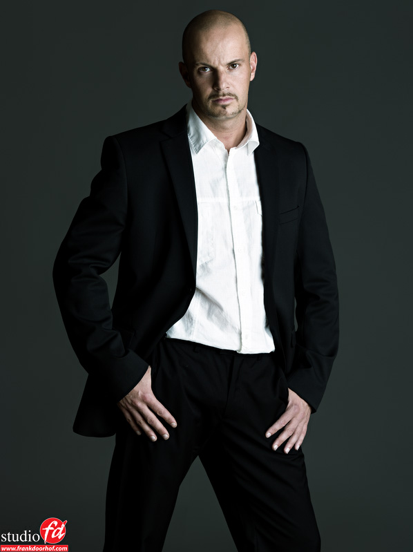
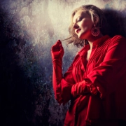
For the fashion shots I used a setup I just love, the 1.90 octa from Elinchrom used from the side against a middle gray background, the light hitting the background is just enough to lift the luminosity to let the model stand out but not being too obvious.
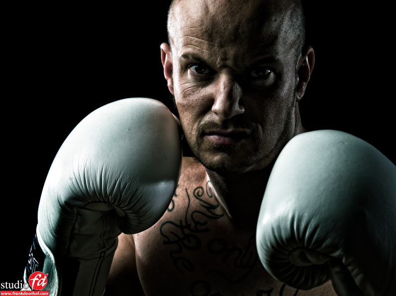
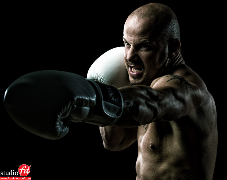
For the final setup we went back to the boxing theme.
For these images I used the Elinchrom Maxilight with a honeycomb grid. I still have the grid that is not a 100% fit for the Maxilight and it gives a very “funky” reflection on the wall which I love to use sometimes (the new perfect grid is being sold now and on it’s way to me, but I will hold on to this one).
Feel free to ask questions or share the post.
If you like what we do here, and want to support the blog please buy from our affiliate companies by following the links or the links below.







I see you’ve put your new studio walls to good use 🙂 – I love the boxing image, the lighting is sublime. Were you using strip soft boxes?
On most of his shots reflectors with/or without grids.
Hi Frank, fantastic work as usual. I was wondering, on the higher contrast, grittier looking shots, how much of that comes from post. It would be cool to see how contrasty it looks in camera, because I know you often do that, then to see after post, to help see where you need to be in camera before doing any post.
I’m off to Kelby Training to re-watch one of your tutorials.
Thanks for inspiring.
Jonathan
It’s a mix of both, without proper lighting it will simply put not work (look fake), when you light correctly it’s a matter of seconds/minutes in Photoshop.
Maybe one day I will do something on workflow, however… when you (indeed) surf to http://www.kelbytraining.com you can see in the video I did on Photoshop a lot of the techniques explained.
My fav is the second image 🙂 Nice portfolio album for Yves.
this is awesome frank not only is it good but its also done differently to most other male shots you see
Great to see a shoot of a male on your website, Frank. I really like this style! Thanks for sharing all this information.
I must admit: On some pictures this guy really scares the sh*t out of me… Don’t wanna get in a fight with him! 😉
Great to see a shoot of a male on your website, Frank. I really like this style! Thanks for sharing all this information.
I must admit: On some pictures this guy really scares the sh*t out of me… Don’t wanna get in a fight with him! 😉