The power of composition PtII the crop
Yesterday we looked at some composition tips, let’s take it one step further today.
As explained yesterday cameras shoot in fixed aspect ratios, but….we are free of course to crop later in Photoshop.
To crop or not to crop, that’s the……
Let me start off by saying that I’m a strong advocate of shooting the images as they SHOULD be, so when I crop it’s never because I shot it wrong, when I crop it’s an artistic choice so to say. In other words I’ll never crop to the same ratio, because that’s something you should have done in camera. If you learn this you will actually cut down on your retouch time considerably.
So when do I crop?
I often crop for impact.
Now what is impact?
I love movies and one of the things you will very quickly notice when you see movies is that there are different aspect ratios in movies too.
It all started of course with the 4:3 ratio also known in movie land as 1.33:1 (actually the standard is 1.37:1) As soon as TV’s started to appear there was a problem for the cinemas and they changed to different aspect ratios, the most used are 1.85:1 and 2.35:1 which are both much wider than the original academy standard of 1.37:1.
For the “freaks” there was also a 1.19:1 aspect ratio for a short while when film started to add sound tracks, but this was quickly changed.
So why do movies use a wider aspect ratio?
It’s not only to compete with the TV of course, there is more.
Story telling is seeing the scene
One of the things movie makers understand very well is the power of vision.
As soon as you see a western for example you see the wide open areas and the small cowboys on their horses in this vast landscape…. often the aspect ratio 2.35:1 is used for this meaning you will have a very wide area to use but not that much height, meaning the aspect ratio is awesome for wide open spaces. Now when you film something in tight spaces (think a horror movie in a cabin for example) it’s often more suiting to shoot it with a less wide aspect ratio so the filmmaker will probably choose the 1.85:1 ratio meaning he will have less width so he can “focus” in on the main character more and show just enough of the area to scare the living day lights out of you when something appears in the frame.
Now this is of course not a fixed rule, every film maker is free to use whatever aspect ratio he/she wants, but overall the choice will be highly depending on the material shot and what the film maker wants to show you. The limitation of the filmmaker is that he/she is forced into one format…. we as photographers are not.
By cropping your images into more wide areas you can really draw your viewers in.
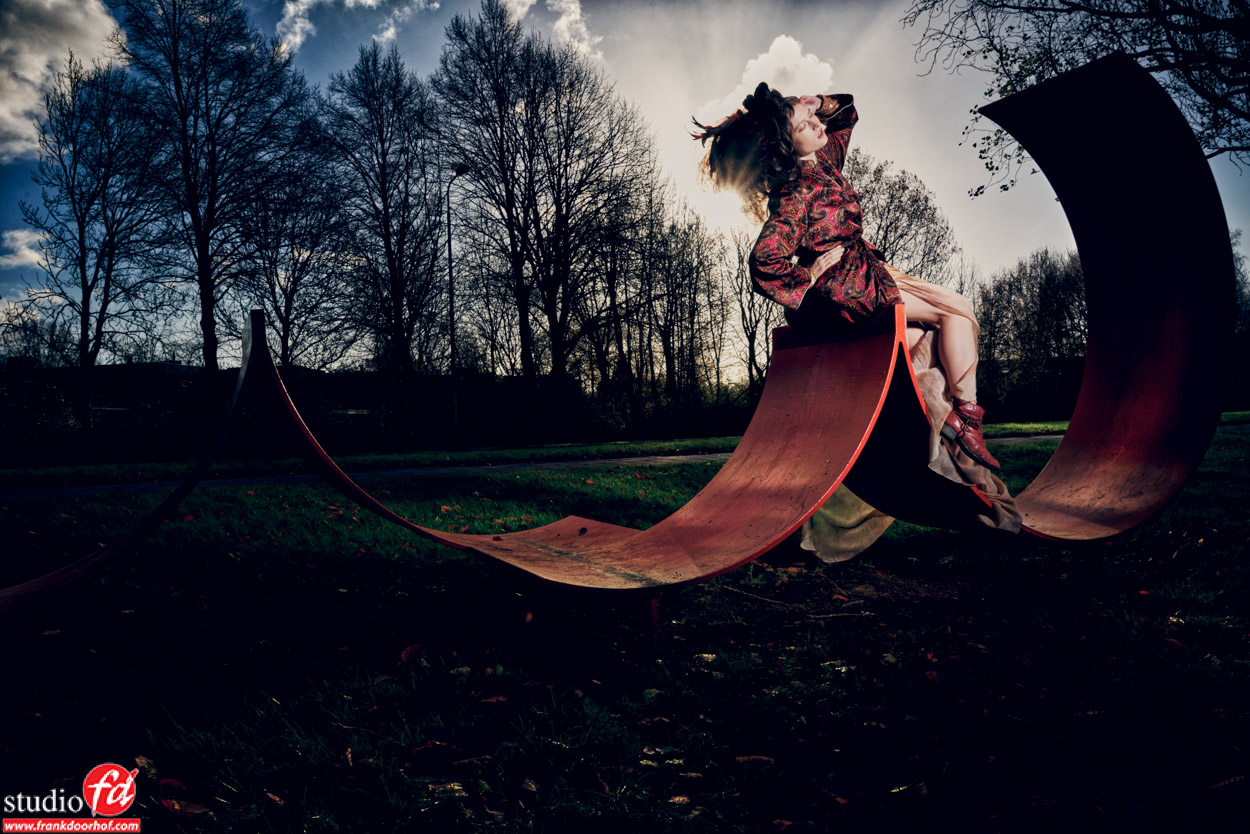
Let’s for example take this shot from Manon.
This was shot like the shot you see here, the front is however not really adding to the image. It does lead the eye of the viewer towards the model so it’s not WRONG, but if I want a bit more attention to the model and the artwork I could have also cropped it like this.
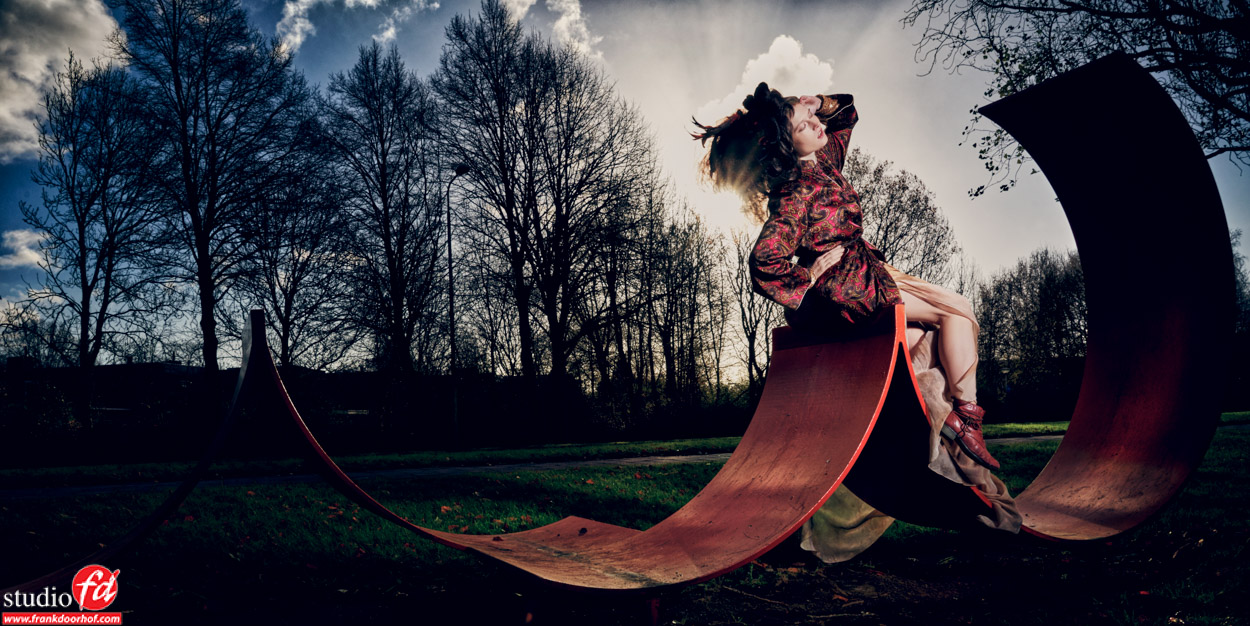 Now this is a totally different look right?
Which one is better?
Well that’s hard to say, in the end it’s a matter of personal taste but that’s with everything photography related of course.
I personally like the uncropped version for the simple fact that it draws your eyes towards the model a bit more, the cropped version I love for the way the artwork wraps around the model.
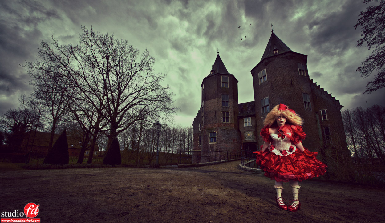
With the next shot I choose the crop very intentional.
I love shooting this kind of shots with a wide angle and when cropping it to a wider aspect ratio you really get a sense of a movie still, the choice of red in the clothing (model/styling : Nadine) really helps to draw your attention to the model, by lowering the ambient light and using a vignette on the shot I made the shot a bit more moody.
But can I print?
This is one of the most heard remarks when you crop wide.
People often think that because the papers are a certain aspect ratio one has to stick to that aspect ratio, and in essence this is true. When you send your images to a printing lab used by consumers (or pros) that is forcing you into their standard sizes, it’s indeed a wise decision to keep your images to that aspect ratio. But in all honestly when you crop like this you will probably do it for 1-2 shots that are “dear” to you, the “artworks” of the series so to say, and when you print those you will probably not go for the small prints, and as soon as you start printing big there is (with most labs) no limitations to size and aspect ratio, to be absolutely sure make sure you always check with your lab of course.
The only thing that can be wise is if you want to frame the shot to make sure there are frames in that size, or choose a custom frame builder. Most prints now a days however on different materials that are hung without frames. So don’t let yourself be limited by that.
So try to crop a bit more like a filmmaker and really draw your viewers into the story you’re telling.
Want more in-depth information on model photography, lighting, retouching, coaching the model, reading the meter and much much more?
Check out my book “mastering the model shoot” or the instructional videos on this site and of course on www.kelbyone.com


You must be logged in to post a comment.