Tag Archive for: calibrite

MacBookPro M4 Pro Display performance nano texture

The new MacBookPro M4 Pro: It’s gorgeous

I was 100% happy with my MacbookPro M1 Pro. (see my review here) 
It was lighting fast and even when screencapturing Photoshop I didn’t see any hiccups.
But when Apple showed the new screens I was already looking for my laptop to order a new one.
The biggest frustration with the MacbookPro for me was the very annoying  glare on the screen, it could drive me nuts when travelling, if you need a mirror…..

The nice thing about Apple is that you often don’t have to wait too long and indeed today I got the new MacBookPro M4 Pro with Nano Texture  14″, 1 TB, and wanted to share the first experiences with it, mainly focussing on the screen.

And the screen is indeed absolutely gorgeous and kills the reflections better than expected. It’s something you have to see to believe case 😀
I also opted for the space black color and also here I can say I’m glad I did, I love the normal color of the MacBookPro but the space black is my new favourite.

Ok till now it’s been more like an unboxing, and as you know I’m not really the person for that kind of posts 😀
So let’s dive into the interesting stuff.

Shine a light on me

Let’s do a quick test
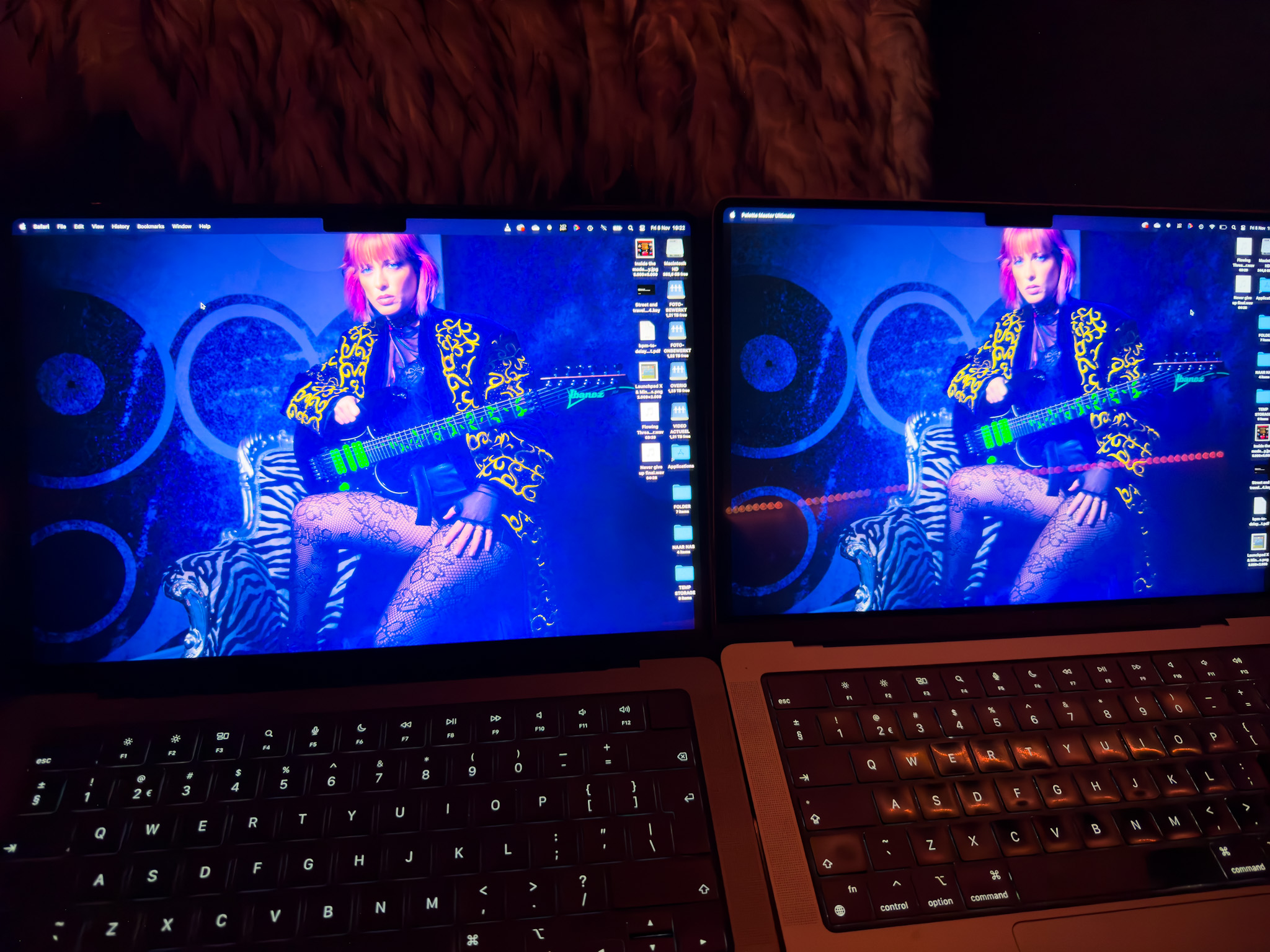
the MacBookPro M4 Pro

Left is the….really?
As you can see there is a huge difference. On the previous screen you can clearly see the reflection of our led lights, on the new screen there is nothing visible. And remember the reflection of the previous screen was even worse in some older generations. I’m really glad with this outcome because the screen was my main reason to upgrade.

Now when you see this we want to see something more extreme of course.
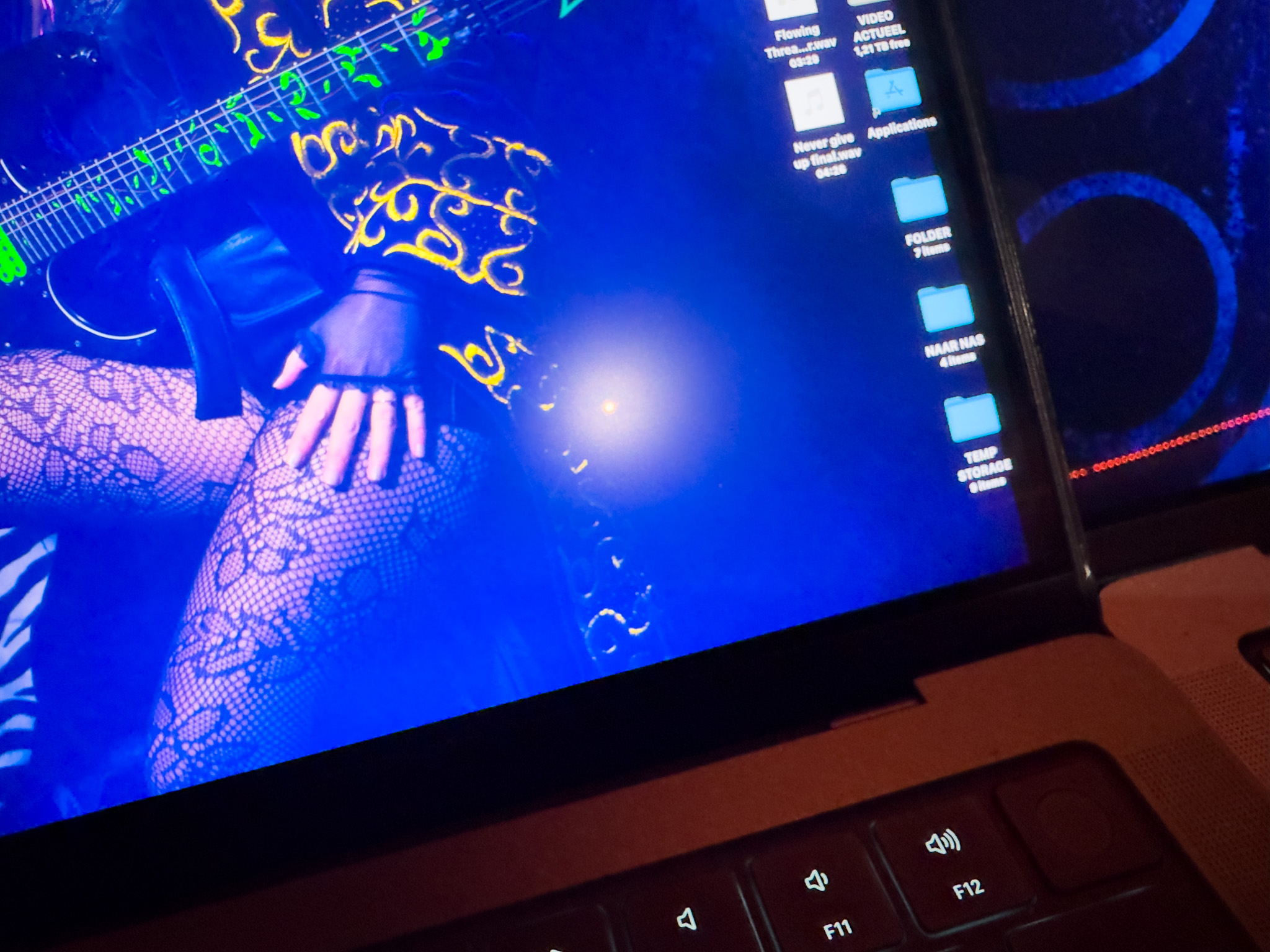
So we used the flashlight of the iPhone on full power.

On the previous screen you can clearly see the light and its a pretty large circle and you can see the light actually breaking down in RGB.
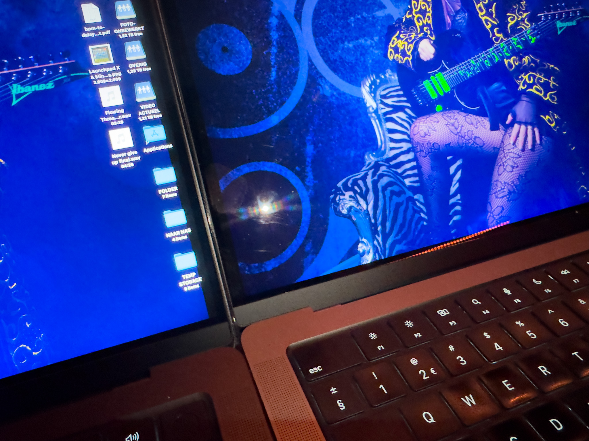
Now on the new screen it might seem that the circle is also large but thats probably not what you’re seeing.
This is an extreme example, shining a very bright flashlight right on the screen from 20cm distance.
The little circle in the middle is what you also see in the image above but a lot smaller and much less intens.
The “glow” around the circle is probably the Nano texture doing it’s anti light reflective work, when the lightsource is less extreme this would mean it totally takes out the reflections, as you can see in the first example.

In other words, wow.
Performance of the MacBookPro M4 Pro with Nano Texture

As creators we of course demand the absolute best from our screens.
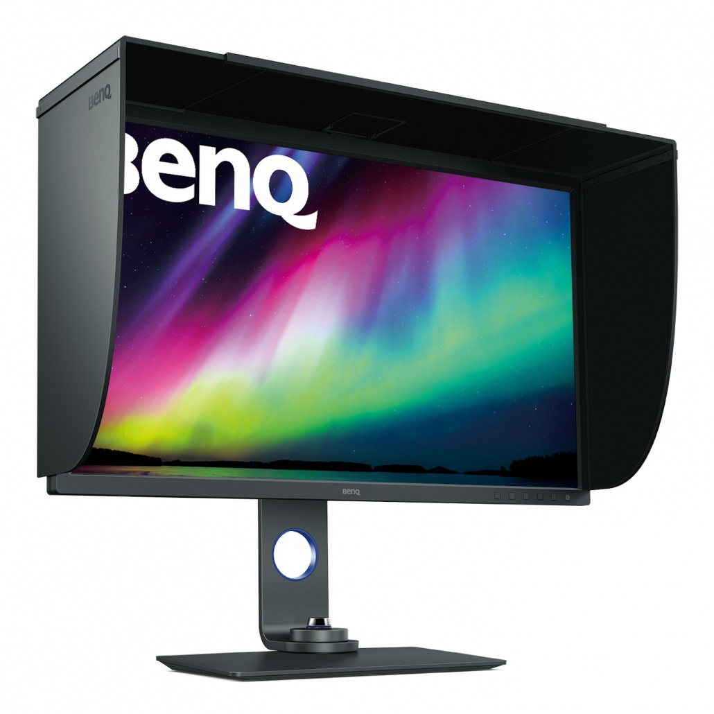
Of course it’s always better to use a dedicated monitor. For example the BenQ monitors I use have a hardware calibration option and are tracking very close to the AdobeRGB colorspace. (and they have a great anti glare coating :D) but does that mean that you can’t use your laptop screen for editing ?

Well decide for yourself, I will post the validation of the screen in a moment.
It really depends on how color critical your work is, but in all honesty when I look at the results I would not hesitate to edit my work on the MacBookPro, as long as I’m able to check it on the BenQ before it goes to the client.

the MacBookPro M4 Pro

Calibration

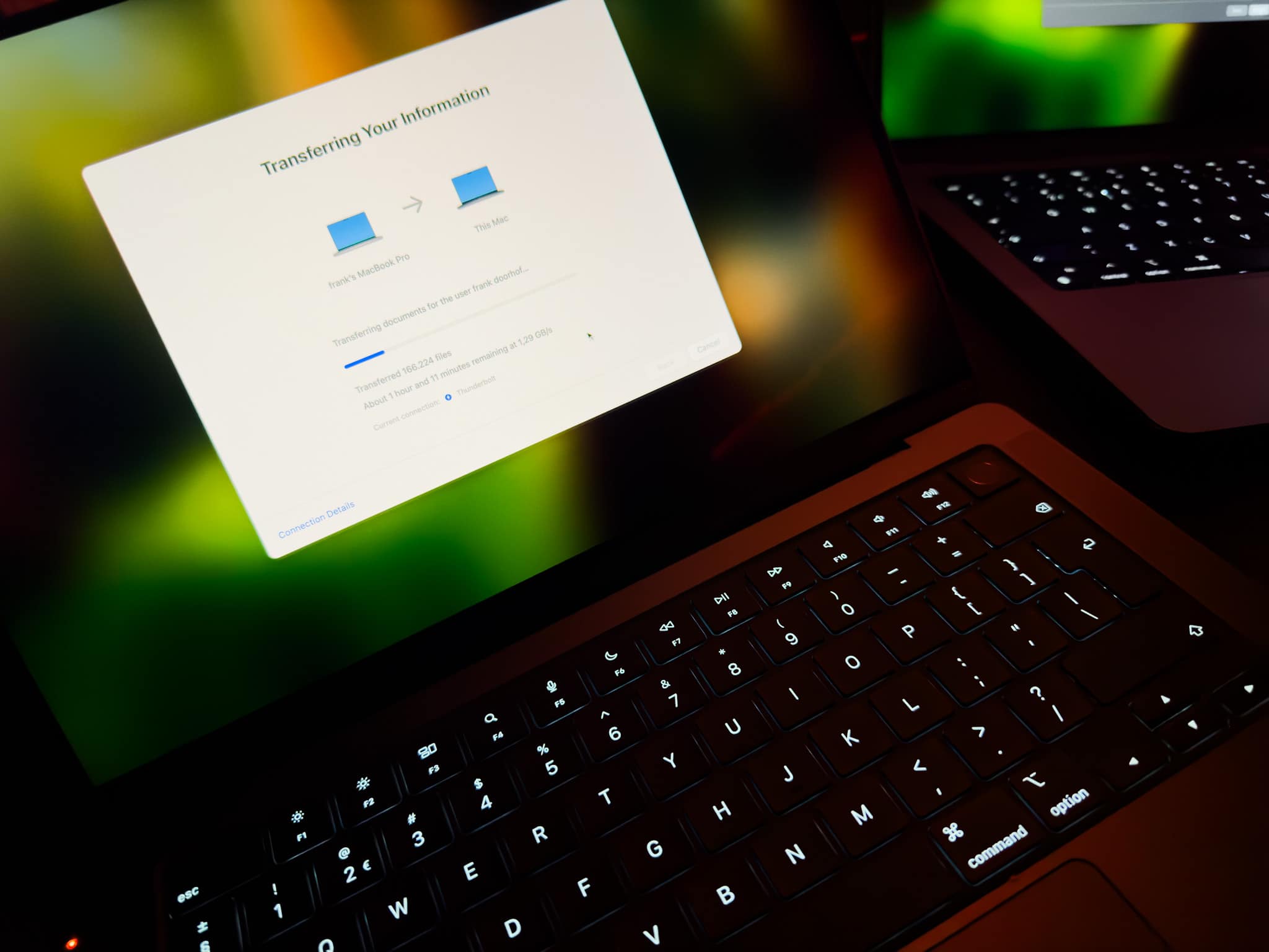
The first thing I do when I get a new laptop is make a 1:1 copy from my old laptop (I love the way the Mac does this).
This mostly takes an hour or slightly longer, in that time I keep my screen on at my preference light output.
When my whole system is up and running, this often means the screen has been on for a few hours.
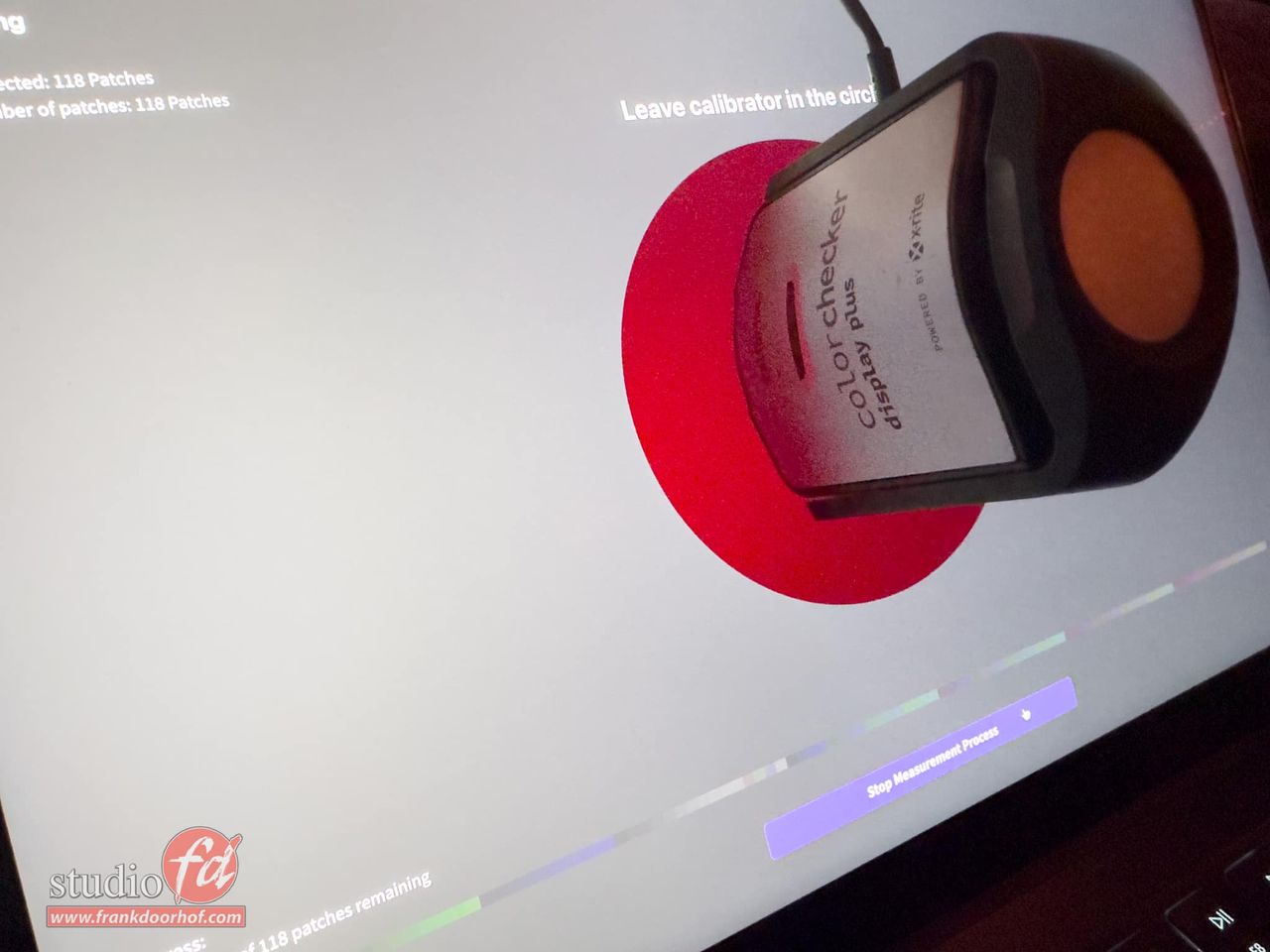
Now it’s a good time to do the first calibration (and repeat this after a few days).

Do make sure you use the proper analyser for the XRD screens.
We highly recommend the Calibrite HL series due to the high luminance output of the screens.
On the photo you still see an older analyser which was handy for the moment, calibration should be done with the HL series by preference.

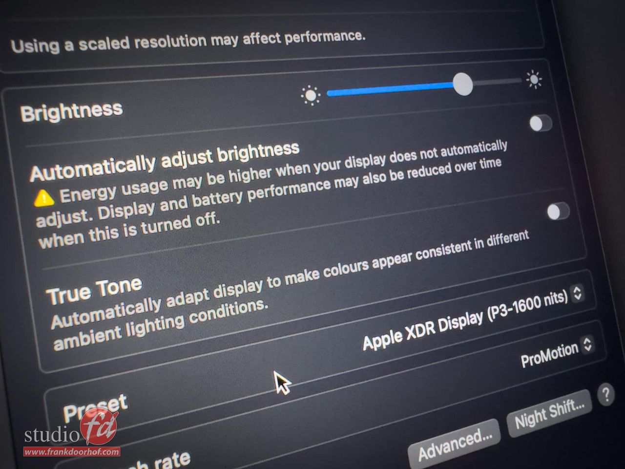
With MacOs you do have to make sure that you check your display settings and disable the two settings you can see in this image, these settings can really mess up your calibrations.
the MacBookPro M4 Pro

After the calibration is done it’s possible to run a validation of your screen.
I’ve setup the screen to the brightness I normally use in a bright room, this is brighter than my BenQ which is in a controlled environment.
I highly recommend calibrating at the brightness you use the most. You can always go up or down 1 click.
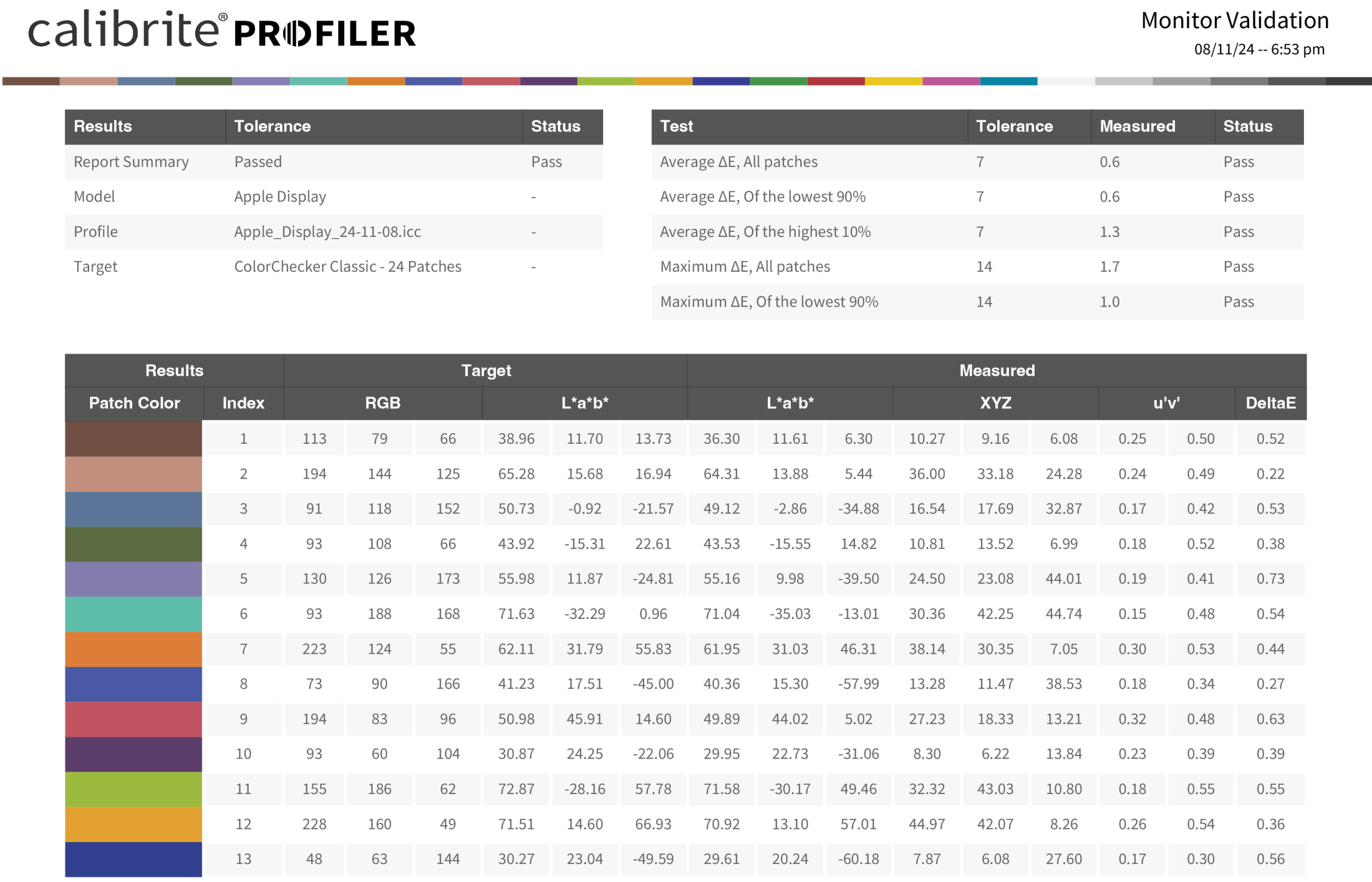
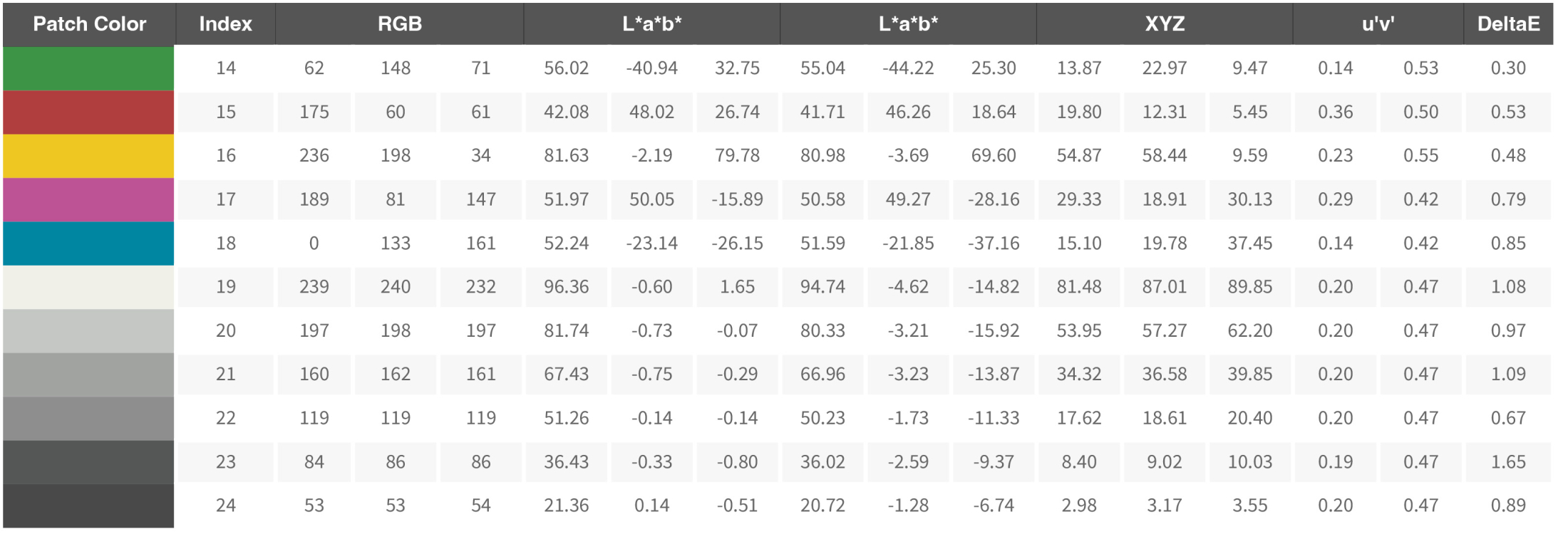
 

As you can see the performance of the screen is actually pretty good 😀
I’ve been working on the MBP for a few hours now and coming from the M1 Pro I can say that especially plugins like Luminar Neo and BorisFX are running a lot faster. That doesn’t mean that the M1 Pro was slow. But the M4 Pro is clearly a lot faster.

Conclusion, should you buy the MacBookPro M4 Pro with Nano Texture screen?

There will be a lot of reviews about the speed of the new MacBooks, for me it was already clear I would get more speed than I would probably ever really need. However the screen is one of the most important things on a laptop for me. We travel a lot and having a screen that functions like a mirror is insanely annoying. To be honest the screen alone was worth the upgrade. But a good screen should also be able to show proper shadow detail, don’t clip the whites and have a proper performance for color “critical” work. So in this short review I focussed on the screen and wanted to share the validation of the new MacBookPro 14″ Nano structure screen.


If you are in the market for a great monitor, make sure to check out the BenQ series.
I’ve been using them for years and they always deliver a great price/performance.
For the European customers we have a few 10% discount coupons we are allowed to give away. (Email)

Check this link for more info about BenQ SW monitors


Check out my YouTube video about retouching on the iPad 

Exciting news from BenQ

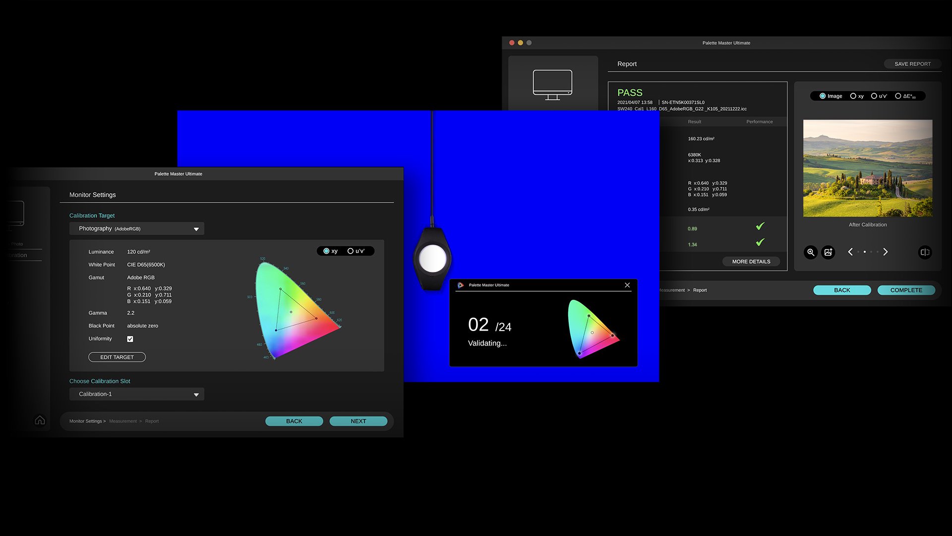
Hardware calibration using BenQ’s Palette Master Ultimate (PMU)

We have some exciting news to share about the AQCOLOR ecosystem! The BenQ SW series can be hardware calibrated using the Palette Master Ultimate software. Now the PD series is also able to be software calibrated with PMU

The importance of calibration

When we capture our images you might expect that the camera will do everything just fine. But in reality, the camera just “guesses” and not all cameras, lenses, and sensors are the same.
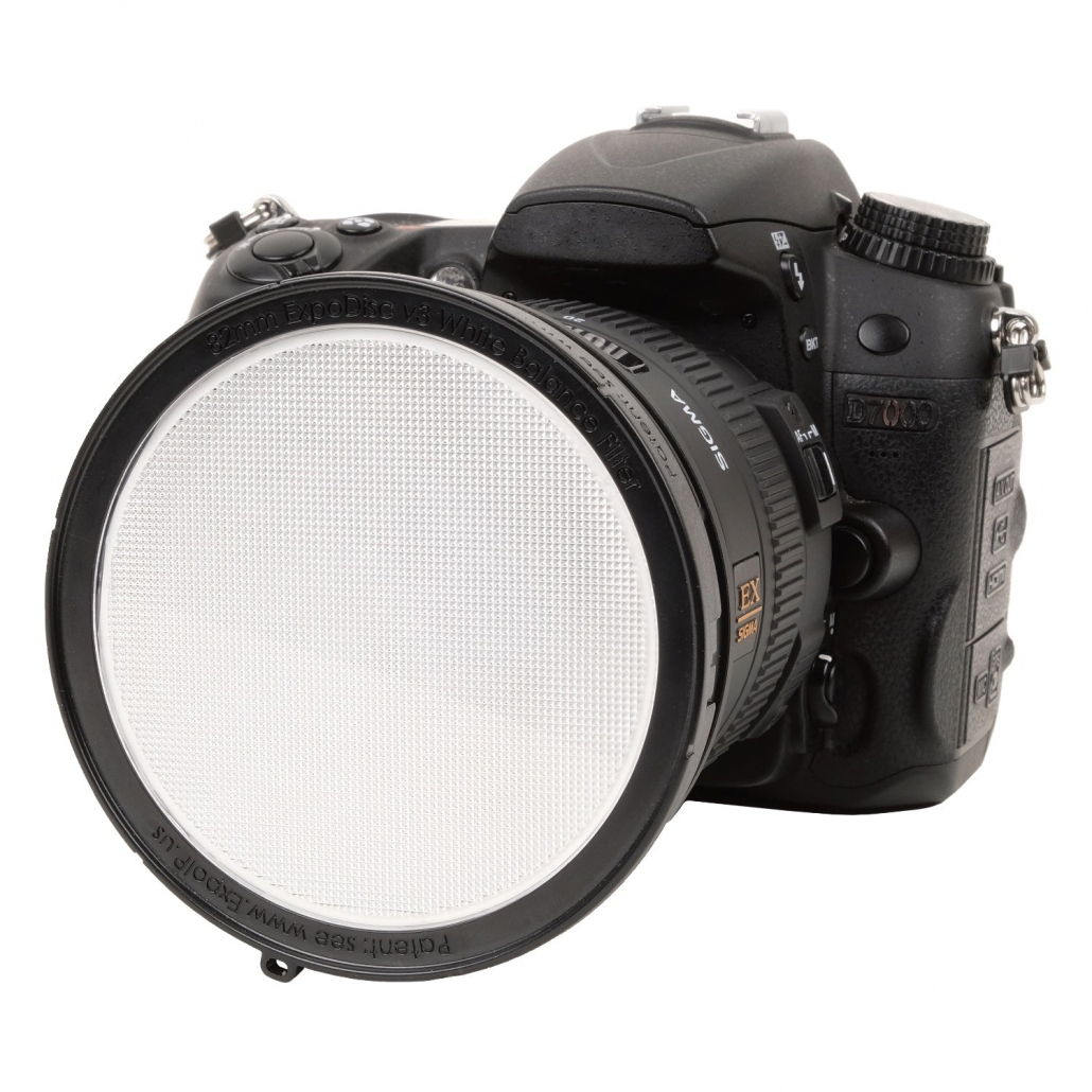
Of course, we all know the Rogue ExpoDisc and the Calibrite ColorChecker series for white balance. And we must not forget the light meter.

de nieuwe ExpoDisc v3 voor de lens van een camera

Of course, it’s also important to make sure that the display you use can show you the colors as accurately as possible.
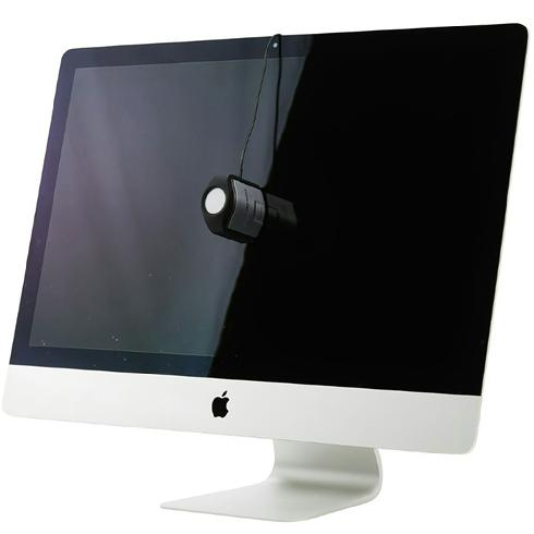
To make sure this is done as accurately as possible you have to calibrate your monitor with a so-called color analyzer.
This is a small metering device you put in front of your monitor and just follow the steps the software asks.

More ways to calibrate

As with most things, there are different ways to do this.
One of the things most people will do is follow the operating system. Often you are shown different patterns and squares and you have to adjust some sliders till they look right. In essence, there is nothing wrong with this. And if it’s the only thing you are willing to do, please do this at least.

But it doesn’t really make your screen more accurate for proper color judgment, it just takes out some clipping and major problems.

For a proper calibration, we can’t trust our eyes.

To calibrate you need tools

I’ve been doing high-end calibrations since 1997. And can say that even with all that experience, and spotting problems almost immediately, I’m not able to do a perfect calibration without using tools.

But also when doing it right there are several options

When we look at the calibration of your monitor we roughly have two options:
1. The first one is calibration via software.
This is where you use the software delivered with your hardware analyzer. By the way  if you want something really simple but that works like a charm check out the new Calibrite123.
When you use the software the calibration is done via the operating system, it will create a so-called ICC profile. The profile is loaded when the OS starts. And is used when the software supports the use of color management.

There is nothing wrong with software/OS-based calibration, but there is a way to make it even better.
2. As an alternative, we also have something called Hardware calibration.

With hardware calibration, we use the software that is delivered with your monitor. In the case of the BenQ, this software is called Palette Master Ultimate and has recently been revamped to be easier and much much faster, and more accurate. The main difference is that the calibration is not done via the OS but inside the monitor.

In practice both calibration methods are great.
With the hardware calibration you are working with the monitor software aimed at that monitor and the calibration is in essence done inside the monitor. This means that the results will be slightly better in gradients and the whole process is more streamlined for that specific screen yielding faster and often better results.

The disadvantage of hardware calibration

The main disadvantage is price.
To get hardware calibration you need for high-end screens. It’s hardly ever found on the screens that are one step below the top-line. Or it’s a limited version of the high-end line. So for hardware calibration, you do need to spend a little bit extra in most cases.

BenQ Palette Master Ultimate

But now we have a great in-between option: BenQ Palette Master Ultimate

As the topic title probably already spoiled it, BenQ has now released the news that now not only does the SW series support Palette Master Ultimate but also the PD series is now able to use Palette Master Ultimate. Which is a huge update for these already very attractive monitors. This means a workflow that is fine-tuned for your monitor and is familiar if you already own a SW series monitor.

When someone asks me which monitor to buy I’m always honest in my reply, we have been working with BenQ for many years and every monitor I review is very nicely priced and has a great performance. With the PD series now also supporting Palette Master, I think my advice to check out BenQ can be changed to “don’t look further get the SW or PD” 😀

Oh and by the way, if you live in the EU region we have a cool discount for you.

BenQ has been supporting Digital Classroom almost since season 1. So,  every year we have some nice deals for you guys. And this year it’s the best yet. If you live in the EU region and drop me an email we have a 10% discount coupon for the BenQ photography/video/design monitors. And with this new update, I think BenQ will sell a lot of new screens to starting photographers because the PD series is I think one of the best ways to get into the more professional monitors.


Calibrations demystified

Calibrations are essential and easy

Let’s first take a look at what a calibration is.
I’m writing this blogpost in English.
I chose English because I know that most people in the world understand English better than Dutch. And the fact I don’t speak any languages as good as Dutch and English.

So because I’m writing this in English everyone reading this understands me.
And this is because we use rules and letters in combinations that we agreed upon as the English language.

And with calibrations it’s the same.
We have many different devices ranging from your camera, to your printer, monitor and scanner.
Some devices are capture devices, some are output devices, but they all use different techniques, and still you want your images to look exactly the same on all devices right?

Luckily there is a solution for this.

Home Theater

When we look at the home theater market calibrations are done to get the optimal image quality out of your tv or projector setup. During these calibrations high-end calibration devices and software are used costing thousands of dollars, and in most cases there is no auto-mode 😀

Now you might wonder, “what is optimal image quality?”
Is this “max light output?”, “the best colors?”
And what is best, or max?

Well luckily there are rules for this.
For most TVs and projectors we use the REC709 colourspace for SDR material (normal HD material) and BT2020 or P3 for the new HDR material.
For the correct colors in the ISF (Imaging Science Foundation) setup we use the D6500 standard.

During a calibration for a tv or projector we look at the following settings.
User settings like Contrast and Brightness to set the perfect dynamic range.
Grayscale for the correct color temperature
CMS (Color Management System) for the correct colors per colourspace.
Gamma for the brightness curve
Extra features like sharpness, iris, motion flow etc.

Because the same rules the calibration follows is also followed by everyone that makes professional movies we can now see the movie exactly as the director intended on our projectors or TVs. And we all know that color evokes emotion, so seeing the correct colors and colortone can have a huge impact on the movie experience.

For Photography and video

Now for Home Theater the process can be complicated and you need to know what you’re doing (I’ve been doing it since 2001 and still have to learn every new format and display) but the workflow is very basic and simple. We just follow what the movie industry follows. For photography it’s the other way around almost.

For photography the process itself is super simple but we have a lot of different devices and things we have to take care off to get it all working together.
So lets take a look at what we can encounter.

First off we have the input devices

Cameras, scanners etc are input devices. This means we have a file that has to be used as our reference file.
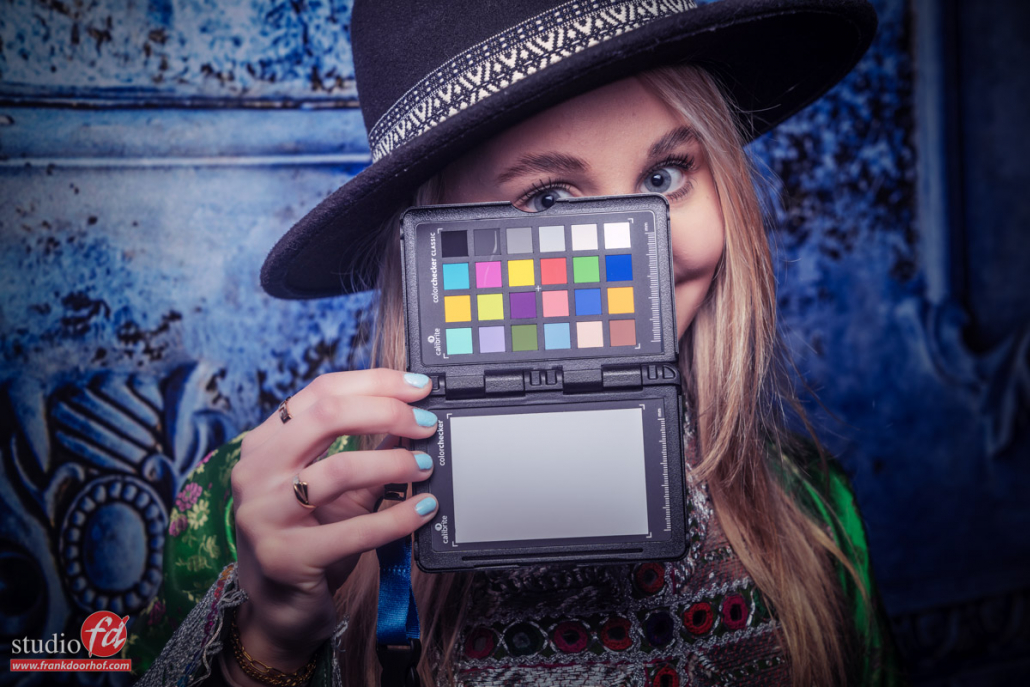
One of the tools that’s essential for a fast calibration is the Calibrate Colorchecker passport.
The process is very simple, you just shoot the colorchecker with proper lighting (use a lightmeter) and you can use the included Lightroom plugin or the standalone version.

Now we have to make sure we follow the workflow
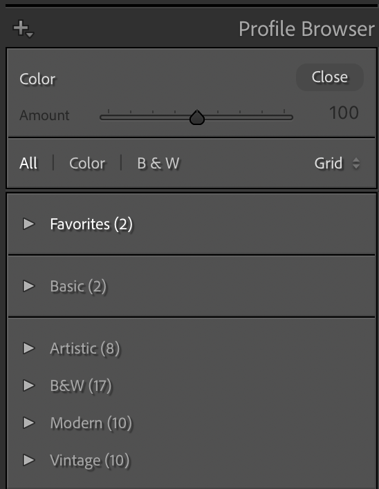
After you restart Lightroom you select the colorchecker profile you created from the custom profiles and sync this to the rest of the images you shot with this setup. And indeed when you use the colorchecker with your camera it’s highly recommended to shoot a new colorchecker image with every change in your setup. If you are not incredibly critical you can also create one profile for your camera/strobe combination. It will not be 100% correct but it will be close.

One thing I always do is when I select the profile from the menu you see here, just before syncing I’ll do a quick colorbalance with the colorbalance tool in Lightroom.

Now lets look at the output devices

Output devices can be for example a monitor or printer.
Now we already looked at the colorchecker for the input devices and believe it or not for the output devices we use a similar technique with one difference, now we need a device to meter what the monitor or printer outputs.

I personally really like the Calibrite products due to their ease of use and quality, plus they work with the hardware calibrations on the BenQ monitors I use.
But you can also use other brands of course, just make sure you replace your analyser every few years because they will deteriorate over time.

For the printer we need a so called spectroradiometer and for the monitor we can use the same technique but also a much cheaper solution like for example tristimuls meters. But without getting to technical.

The calibration is very simple.
I’ll walk you through the more advanced version.

You start the software.
Use the following settings:
Color Temp D6500 (some setups depend on D54 but you will know if that’s you)
Gamma 2.2 (2.4) depending on your preference and room.
Lightoutput 110-130cdm depending on your ambient light conditions.
Profile V2

These are the settings you will find in almost all software, and will give you a perfectly calibrated screen.
Now the software will ask you to activate this profile and send you a reminder after X weeks, please don’t ignore that because calibrations do change over time. After you activate the calibration you’re done.

Different profiles, so now what?

By now we have created several profiles.
The colorchecker creates both DCP (Adobe) and ICC profiles.
The monitor calibration creates an ICC profile etc.
But luckily we don’t have to worry about them anymore. The profiles are now exactly where they should be. In the operating system for the monitor and in Lightroom for your camera where you can now select it and sync to the photos shot with that combination.

Why do I mention this?
A lot of people ask me which profile to use when opening files in Photoshop from Lightroom, the monitor profile or the camera profile?
Well both are wrong, how weird it might sound, you can’t use any of them.

When you open up a file in Photoshop you should always select the colourspace that you want to work in, being sRGB, AdobeRGB or ProphotoRGB.
If your monitor is capable of showing 99% AdobeRGB, thanks to the calibration you will now see all the colors as close to accurate as possible, but also when you have to work in another colourspace the monitor and calibration will make sure you are still seeing the correct colors.

Some things to make sure are in place

For a correct and easy workflow there are some things you have to take care off.
When using HDMI make sure your monitor is setup for 0-255 as dynamic range. (16-235 is for video)
Make sure there is no light hitting your monitor, BenQ delivers a nice hood with most of their photography monitors and these can make a huge difference.
As mentioned before a color analyser deteriorates over time, so make sure to replace it every once in a while. The same goes for the colorchecker, and for the colorchecker you can extend it’s life a lot by keeping it out of the sun when not using.


This is one part in the series on calibration and colorprofiles, make sure to check the blog for much more.
If you’re in the market for a new monitor, we have some 10% discount codes for BenQ monitors for European customers, mail us for more information.


Colors and how they connect

Colors evoke emotion

You probably have been hearing me say that a lot.
And that’s because color is incredibly important to give images/video/film a certain mood. But also for logos, design, cars, buildings, interiors, clothing, colors are used everywhere to get a feeling, or make you feel a certain way. This article is about how colors connect in photography.

Accurate colors

So for us as content creators, it’s vital to make sure that our designs, photos, videos, etc. all look accurate.

So when someone orders a red scarf and a red sweater they look the same as in the brochure or website.
Luckily this is pretty easy.
You probably heard the term calibration regularly on this blog, my books, and videos.
With calibration, you make sure that your camera, printer, monitor, etc. are showing you the most accurate colors.

Because this is a topic that I’ve explained a few times in other blog posts. But always in connection to a technique. I thought it would be interesting as a reference to just explain a color space and the pure basics of calibrations, in a later blog post this week I’ll go deeper into the process and settings.

Primary versus Secondary colors

First, we have to make sure we know that divide the main colors into 2 sections.
The primary colors are Red, Green, and Blue
The secondary colors Yellow, Cyan, Magenta

Now how does this work in practice?

Color temperature

The first thing we must know about the colorspace and calibrations is the color temperature.
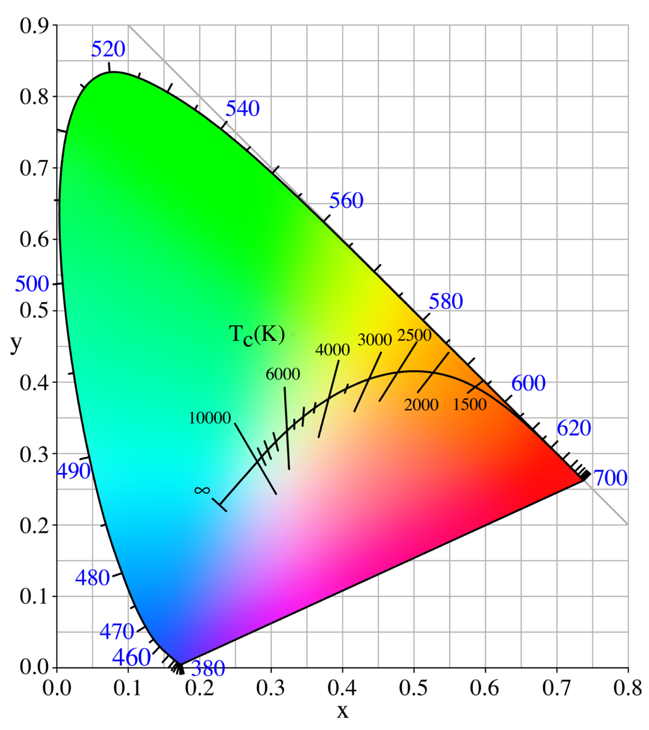
When you look at your strobes, sunlight, shade, continuous lighting, etc. you will probably know they all have different color temperatures. And when we talk about calibrations we call this the blackbody curve and a point on or close to that curve.

But when we look at the curve you can see that it runs from blueish white to reddish white.
The blue part has a very high color temperature, whereas the red has a very low color temperature.
Think for reference about a piece of metal you throw in a fire and you will see that the hotter it gets the more it will shift from red to blue.

We agreed upon the value of D65 for the reference white point. (6500 Kelvin)
When we calibrate our monitor or projector you should calibrate to the value of D65.
In some cases, 5400K is demanded. But if you need this, you don’t need this blogpost explaining colorspacee, probably.

how colors connect in photography

When we look at the color triangle above you can see that the 6500 degrees point is slightly reddish. This means that people sometimes have to get used to calibration at first because white will look a bit reddish, but trust me, this is very short.

Colorspace

Now that we know how the color temperature works, how do we get there?
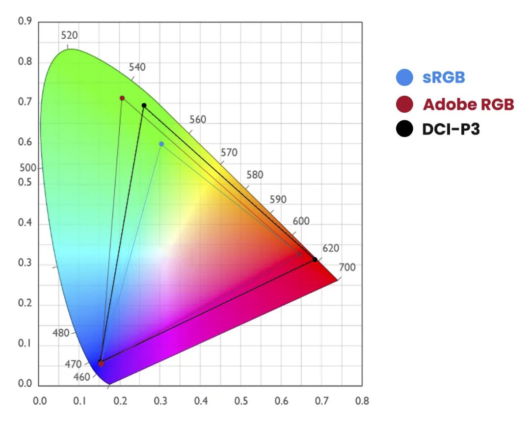
As you can see in the next image there are different colorspaces with different levels of saturation (larger colorspace = more saturated colors)

colors and how they work together

In this diagram you can see that the primary colors Red, Green, and Blue create the color triangle.
And you probably also notice that the colors are located in different locations.

Luckily for us, those coordinates are known for every colorspace.
Each color has 3 coordinates.
x,y, and Y.
To manipulate these colors we use the settings Hue, Saturation, and Luminance (Y)
You probably know these from Lightroom already.
During the calibration, you are in essence pushing and pulling the colors around till they are in balance with the colorspace you chose. And those corrections are stored in the ICC, DCP profile.

Because for every colorspace we know the coordinates for the primary colors you might wonder, “Where do the secondary colors come in?”
That’s actually simpler than you might think.

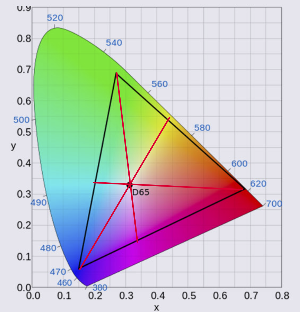
How colors connect in photography

This is how colors connect in photography

When we draw a line from the primary color through the white point we end up with the secondary color of that color.
So Red connects to Cyan, Green connects to Magenta, and Blue finally to Yellow.
You probably understand that this is a very fine balance and if one of these colors or the white point is not correct the whole colorspace will shift slightly or even “collapse” meaning you can’t trust your workflow.

Gamma

There is one thing I didn’t mention yet and that’s gamma.
When we look at for example a 10-step grayscale we want to make sure that all steps are visible but also are visible equal in brightness difference. This is done with the so-called gamma correction, in most cases we use a value of 2.2 or 2.4.

Conclusion on how colors connect in photography

The primary colors Red, Green, and Blue connect through the white point with the secondary colors Cyan, Magenta, and Yellow.
Colors have 3 coordinates, x,y, and Y, and are adjusted by Hue, Saturation, and Luminance, corrections needed are stored in the ICC/DCP profile.
Each colorspace has pre-determined values for Gamma, Colors, and white point. This means the only thing you have to do is make sure your images and monitor show the correct colors, which they never do, so they need to be corrected.

Now that we know how complicated it is, it’s time to tell you the calibration itself is super simple.
For the monitor, I highly recommend the calibrite series of products. The process can be done fully automated and takes between 5-15 minutes.

For the camera, I’ve been using the calibrite colorchecker passport for years. It’s easy to create a profile and the results are very good.

In later blogposts, I will focus on these devices separately.
But one I have to mention right away because it’s essential.

The light meter

When we calibrate the monitor we are guided through the software by a very easy-to-follow workflow. The software actually asks you to adjust the contrast/brightness till it hits a target.

Now the reason we do the calibrations is to create a stable workflow that makes it possible to get constant results in all different lighting situations. As you can see one of the coordinates of the colors is the big Y or in other words Luminance.
Seeing the calibration of the camera is done with a ColorChecker we must shoot the ColorChecker with a light meter and as flat as possible.
I mostly place a large softbox on 3 mts distance when I create a global profile, when I create a profile for a specific set I just make sure there are no gels on the strobes and the ColorChecker is still lit as flat as possible with the main light, even if that means the model has to turn and I shoot it from another angle. Otherwise, the calibration will not be accurate.

If you are in the market for a good light meter make sure to check out the Sekonic range. I’ve been using several over the years and they all performed perfectly in every possible situation. I’m now using the 858 but their whole line is top-notch.

I hope you now better understand how colors connect in photography and if you have any questions, feel free to reach out.
If you’re in the market for a new monitor with hardware calibration options, I can recommend the BenQ line up. For EU customers we have some 10% discount codes available just drop me an email.


Working with colors and gels is fun 

How to read the Light Meter?