Behind the scenes
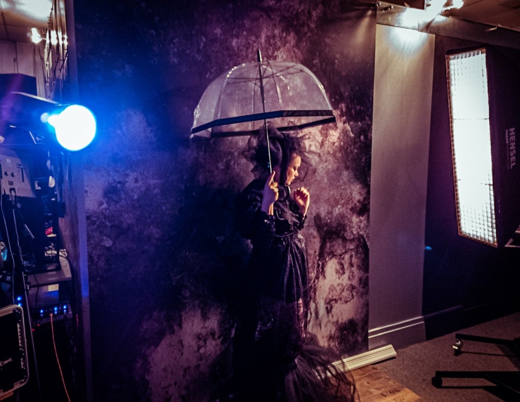
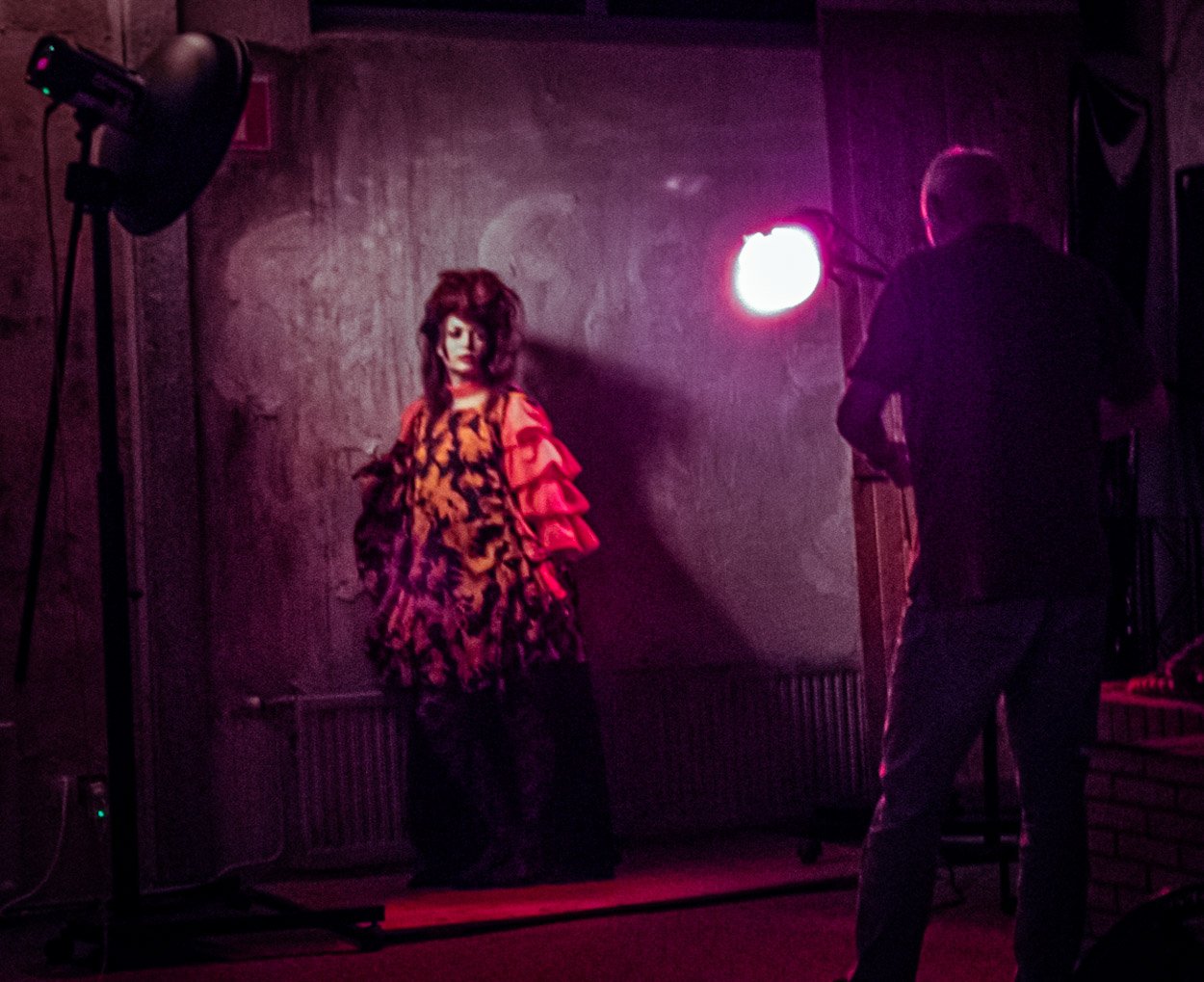
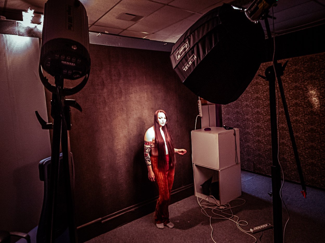
Today some behind the scenes images from the workshop last week with Nadine
Shot with my phone in a very dark studio so it can be a bit rough. But it’s about the setup and feel 😉

My blog, although I don’t see myself as a blogger but as a Photographer I will try to blog some interesting material during the weeks.
Expect at least 2 updates a week.
How often did you think.
“man I would love something that replaces my keyboard for shortcuts”
If that’s you, this might be of interest for you.
As you guys know I’m always 100% honest in my reviews. So let’s start by stating that this product was send to us for review, but that will not for even 1% influence my opinion. So let’s start.
What is it?
Tourbox is a small but very well build (and heavy) external device with buttons and dials that can be “freely” programmed to replace shortcuts. Now there are several solutions out there and some fall in the catagory “total junk” and “genius”. Let me start with stating that the tourbox is very close to the segment “Very usable to genius”. Let me explain.
These kind of devices are a mixed bag for me and a lot of people.
When we have a keyboard in front of us we can learn the shortcuts and for example order a small keyboard that you lay on your lap or next to you while working, or one can just chose to operate everything with a mouse/trackpad, and in all honesty for a lot of software this is still my prefered way of working, for example take lightroom, I’ve never found a product that actually speeds up the trackpad/mouse workflow, for the simple reason that Lightroom has a very clear structure and you can work from top to bottom setting everything up and seeing you also skip certain settings working with the mouse/trackpad is just very very easy also because when you use local adjustments you already need a mouse/trackpad/tablet.
So although it does work flawlessly in Lightroom I would probably never use it myself for this, no matter what others say 🙂
Now let’s look at Photoshop.
The more you work in Photoshop the more you are almost using shortcuts blindely, for the simple reason you use them all the time, and also Photoshop is a totally different program than Lightroom. For me Lightroom is really based on a mouse/trackpad workflow where Photoshop is really aimed at a tablet/pen control surface PLUS shortcuts on a keyboard, you actually hardly to never touch the mouse/trackpad, and in that case…. man this is genius.
We all have our favorite shortcuts.
For me it’s always the following I program.
Brush size, Rotate canvas, switch for/background (X), Curves, Levels, Saturation, zoom in and out, 100%, fill and of course the usual Space, CRTL, SHIFT etc.
And those can all be programmed in the Tourbox, and this makes it very usable for Photoshop and other software that is really based on shortcuts and non mouse/trackpad operation.
So let’s take a look at the software itself so you get an idea about what’s possible (and it’s a lot)
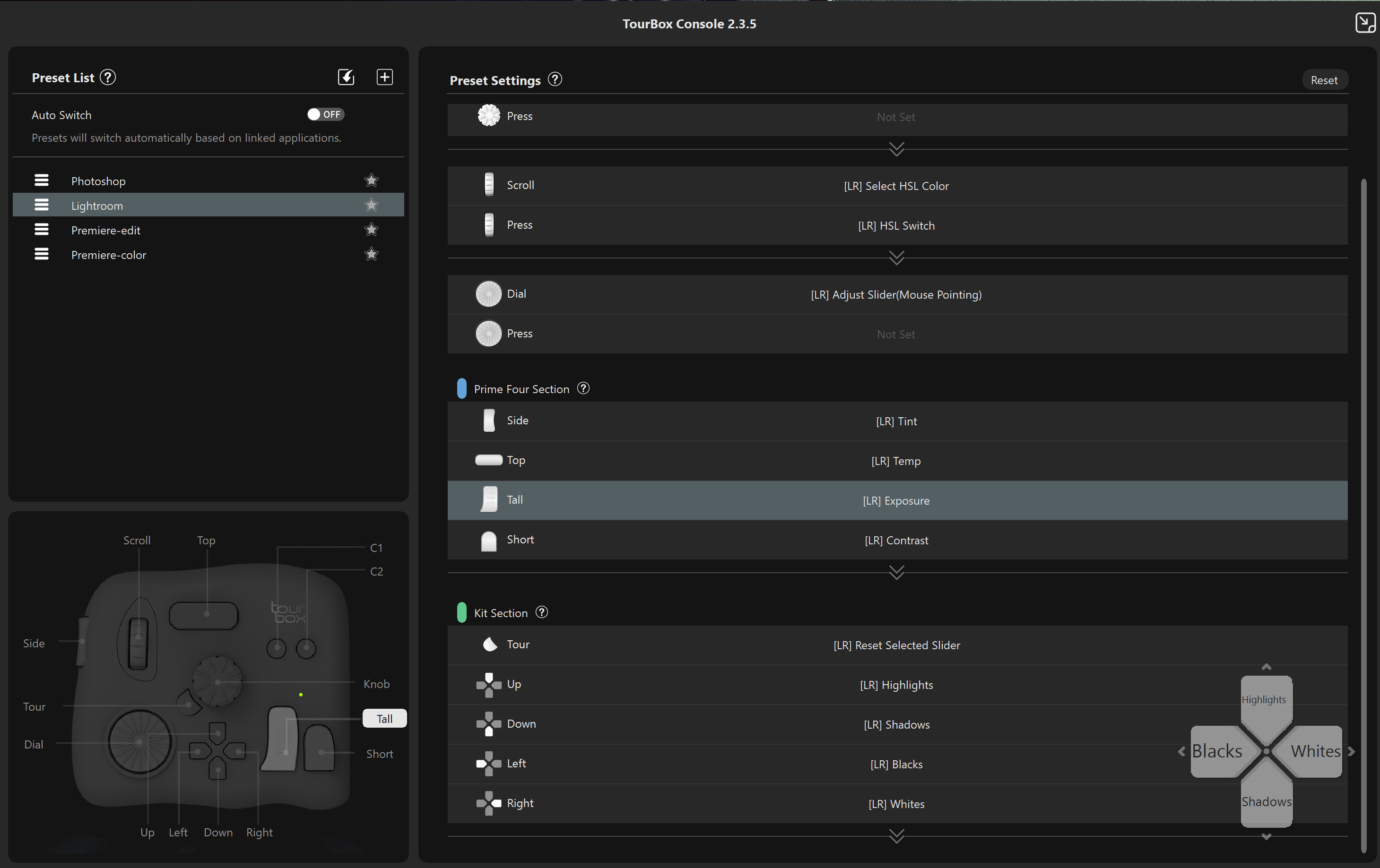
First of all, don’t worry that you have to do a lot of work before using the tourbox, there are several presets available in the software right after the installation. So when you use Photoshop and Lightroom you’re already covered. But what about if you want it differently (what I would do without a doubt). Well that’s very easy.
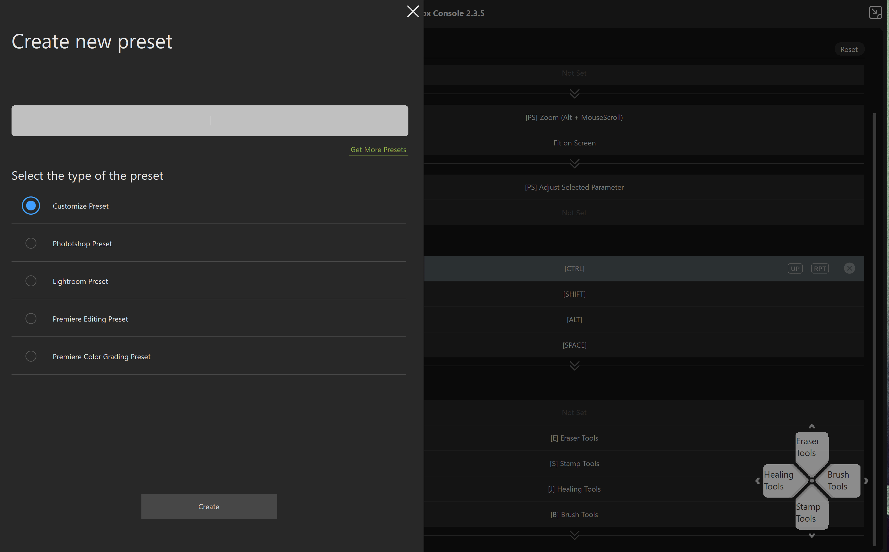
It’s very easy to create a new preset, and after that the fun really starts.
Of course you can emulate the normal keystrokes, but also combinations with SHIFT, CRTL etc.
But… and that’s actually very cool, you can also combine keys on the tourbox, for example the normal dial changes brushsize, but if you hold the side button you can use th same dial for screenzoom for example. And that makes the tourbox A LOT more usable, you are literally not limited to the keys you see (well actually you are, but you can also combine the keys making it a lot more usable).
Now this sounds awesome, but it also brings in a problem I experience almost everyday, “where the heck did I …..”, and with so many options it can indeed very quickly become very confusing. It also doesn’t really help the device is black including the keys (later more on that).
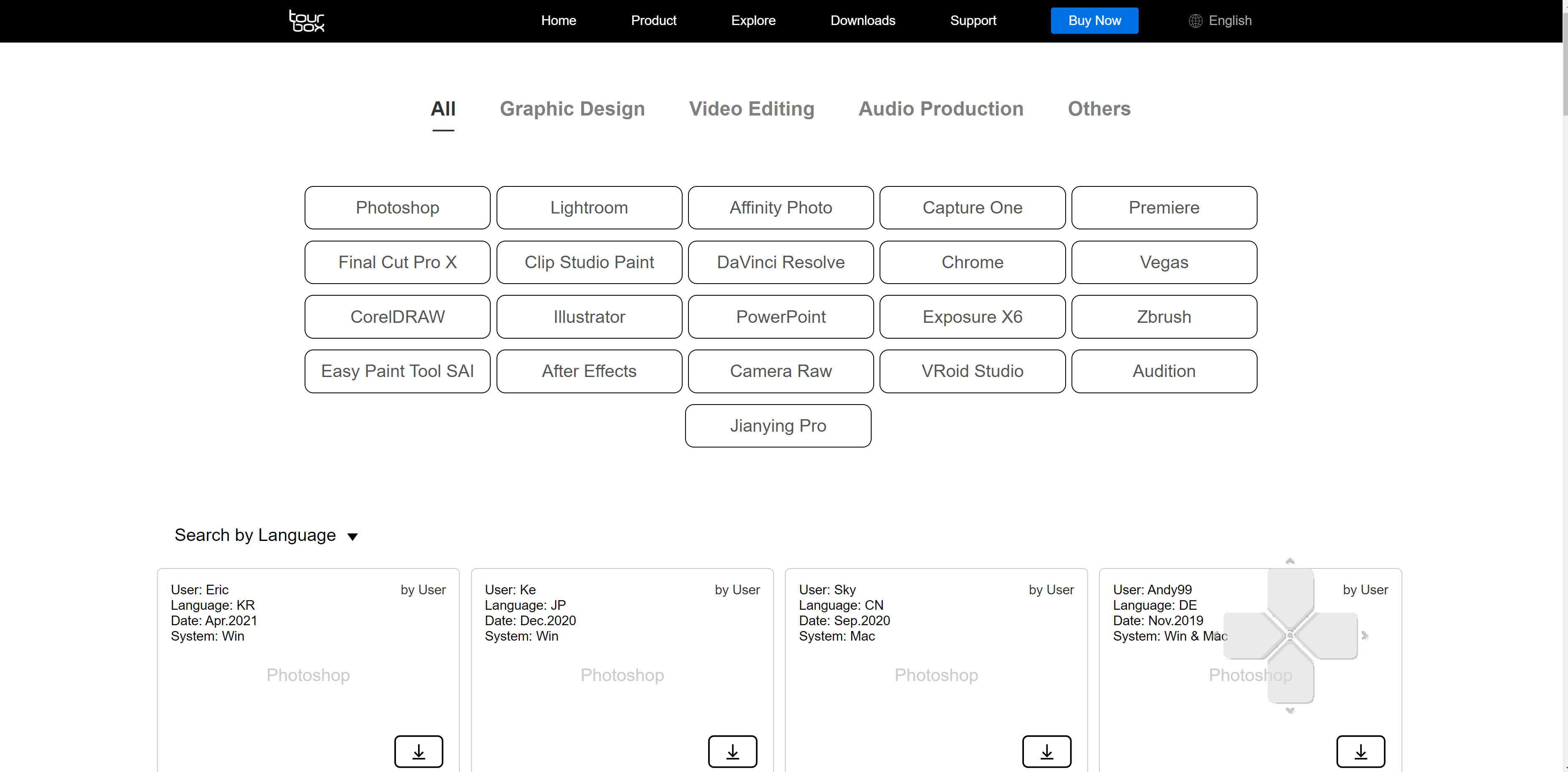
Now loads of people will program the Tourbox the way that they use it, and the nice thing is that you can download those from the TourBox website. Just search for the program you want to use and download the presets.
Luckily you can always call up the hub and see what’s programmed.
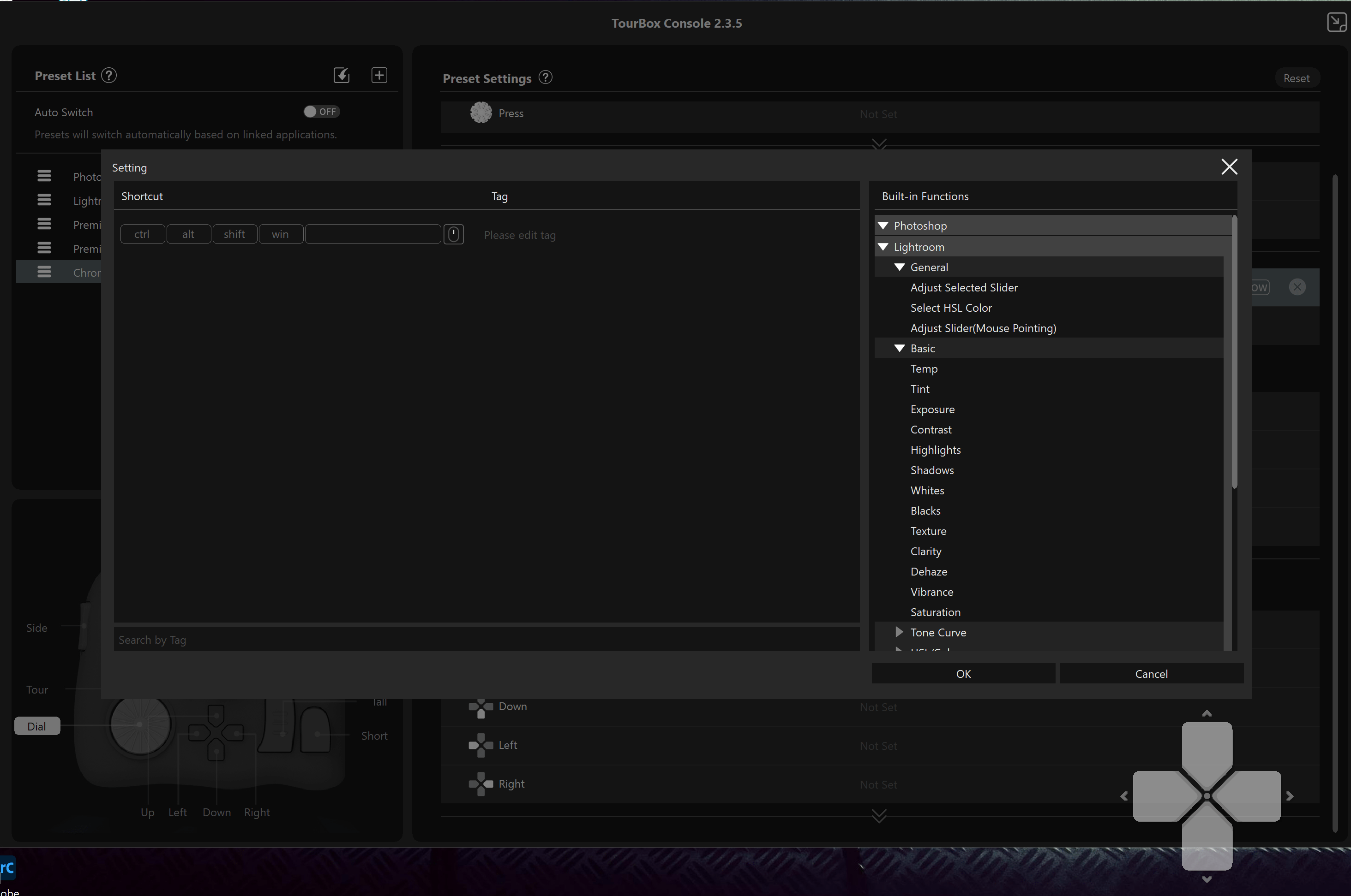
And if you don’t know all the shortcuts, don’t panic, the TourBox software helps you out by the build in functions menu. This makes programming literally a breeze.
Conclusion
Ok, so how does it work in reality.
Let me start with the positives.
First off all the device is build very nicely, it’s heavy enough to not drift around the table or your lap, but not too heavy you can’t travel with it. Also size wise it’s a very smart size, it’s not too small and certainly not to big, plus a BIG plus…. it uses USB-C, I still don’t understand why manufactores still release gear with other connections than USB-C.
Also there is so much flexibility that it’s almost impossible that there is a situation where you can’t use it.
So overall I’m very positive about the TourBox. But let’s also take a look at the negatives.
First of all one could argue that it should be wireless, and I start with this one because I agree and disagree. You do have to realize the price point of the TourBox, compared to some competitors the TourBox is A LOT cheaper and when you add wireless you will need a battery and of course BT or WiFi board which will drive the price up and also the stability, I’m actually mostly a fan of devices that also have the option to be used with a wired connection because I hate batteries that run out, or connections that are instable (and yes that happens a lot).
Ok so what can they improve
Now do realize that some of these options will add some costs or are not possible in this product.
First off all I think the TourBox is genius for Photoshop but also when recording and editing video and music, and especially for music it’s awesome to be able to start recording/punch ins with just a quick tap on a button instead of reaching out to the keyboard or using the mouse/keyboard, and while editing zooming is just plain awesome…. “Hey Frank this is positive, not negative buddy…” yeah I know, now when I record music or edit photos/videos I’m a bit of “batman” I’m editing in a dark area and in most cases there is just not enough light to see the pure black TourBox, this is also the reason I’m using keyboards with backlit keys. I would love for them to add a light behind the keys, just to see where the keys are and not having to trust my fingers in the dark. Now not everyone will be editing in a “batcave” but if you do this is really a negative thing about the TourBox, I love black gear, but man it’s hard to see in the dark.
Now adding backlights would be pretty easy I guess, just place a ledstrip in the housing and it will show through the side of the keys, it doesn’t have to be disco ball but just outlining the keys would help a lot. The next step would be a small display that shows what you programmed under the keys, I don’t see a lot of products that use this but in all honestly it would make it worth double the price for me personally, because especially when you use the TourBox in 4-5 apps it can be VERY confusing where what is. In all fairness on my XP-Pen tablets after hours and hours of use I know most of the buttons, but still…. I’m using console tape next to the keys with the functions because the most used keys I know where they are but keys you don’t use a lot can still be confusing, and these kind of devices are build for speed and easy workflow, the fact that most keys are shaped differently does help a lot, I’ve tested several solutions that use the same buttons (just a lot of them) and I never really used them for the simple reason I just lost track and eventually interest. By using different shapes it makes it 10x easier to remember.
The thing that I would LOVE to see, and I really think it should be added is support for iOS.
Now bare with me for this one.
I know most of you still edit on desktops or laptops, but you can’t deny that the iPads are making huge waves at the moment and for me the iPad pro 12.9″ M1 actually fully replaced my laptop and for 90% my desktop, and indeed that means I use the iPad for everything from photography to video editing and media consumption.
Now on a desktop and laptop you already have a keyboard an a mouse/trackpad connected but not on an iPad, the only reason I have a keyboard connected when editing is for certain shortcuts which I find easier than using the touch interface, and for that I would not connect a keyboard but would literally LOVE a solution like the TourBox, in fact I would use it almost daily seeing more and more app makers are adding loads of shortcuts, and editing with a keyboard next to me is possible but I would love the TourBox (or another solution) connected to the iPad.
When talking to manufactorers I often hear they don’t look at the iPad pro as a serious device and I strongly feel they were right 2-3 years ago, however when we now look at what Adobe is doing with Lightroom and Photoshop, but also apps like LumaFusion, Cubasis, Beatmaker3, affinity photo etc. I really feel they are very wrong to not take the iPad pro serious, and luckily soon Capture One will be released on the iPad pro M1 which I think will break open the way for more software makers. And let’s be honest with the new M1 it should be pretty simple for TourBox to port their software to the iPad.
So should you run out and buy a TourBox?
Well if you compare it to the price of a normal keyboard… no absolutely not.
BUT…. that’s not fair, it’s a totally different product and well worth it’s price especially when compared to other solutions.
So when you find yourself looking for shortcuts in software and would wish there was a way to have this all easy accessable the TourBox might be the perfect solution for you. I’ll keep using it behind the desktop we record music on and do the editing when I’m home, and this has nothing to do with the quality but the simple fact in the studio we use XP-Pen tablets that already have more than enough shortcut keys. But if you are using a tablet that doesn’t have enough hardkeys (most don’t have enough) combining your tablet with the TourBox I can HIGHLY recommend and I mean HIGHLY, it will make your life a lot easier. But do make sure you have a little but of light in your workarea. Or wait for TourBox to release a special Doorhof white version with backlighting (just kidding).
If you also want a TourBox, get them (or anything else :D) via this link and also support our work.
https://amzn.to/3wTPihQ
Normally you chose one of the images you shoot as the best. And that one you give all the love during retouching of course.
But often there are a lot of extra images that are also cool but normally are never shown.
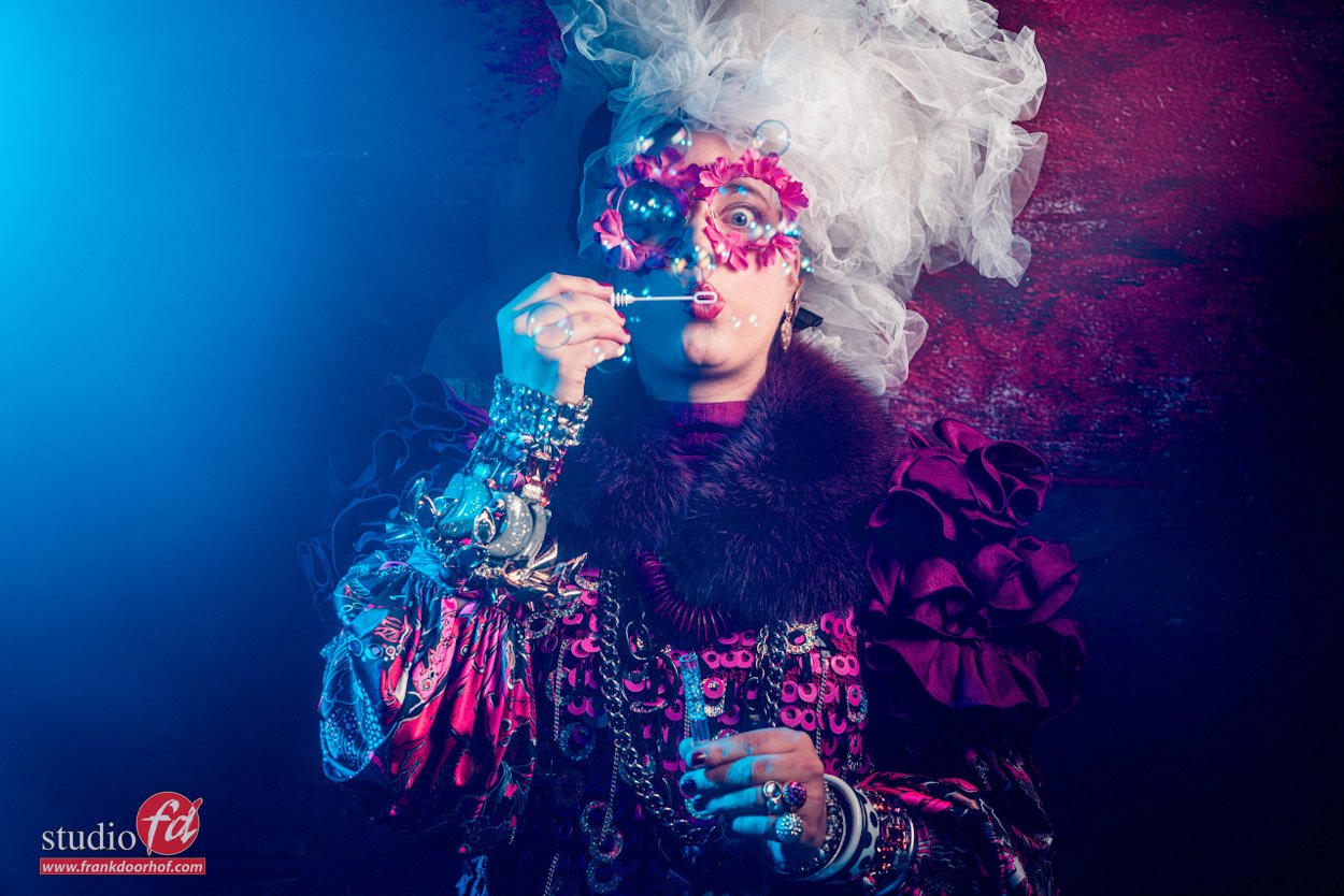
During photofair I shot several images with Nadine while she was posting with a pedal by our friends at RJ-amps. And Nadine is really a super flexible model with loads of expressions so I thought it would be fun to show some of the images you normally don’t see.





Studio Frank Doorhof:
Constructieweg 8
8305 AA Emmeloord
The Netherlands
+31-6-14522327
Or Email : [email protected]

You must be logged in to post a comment.