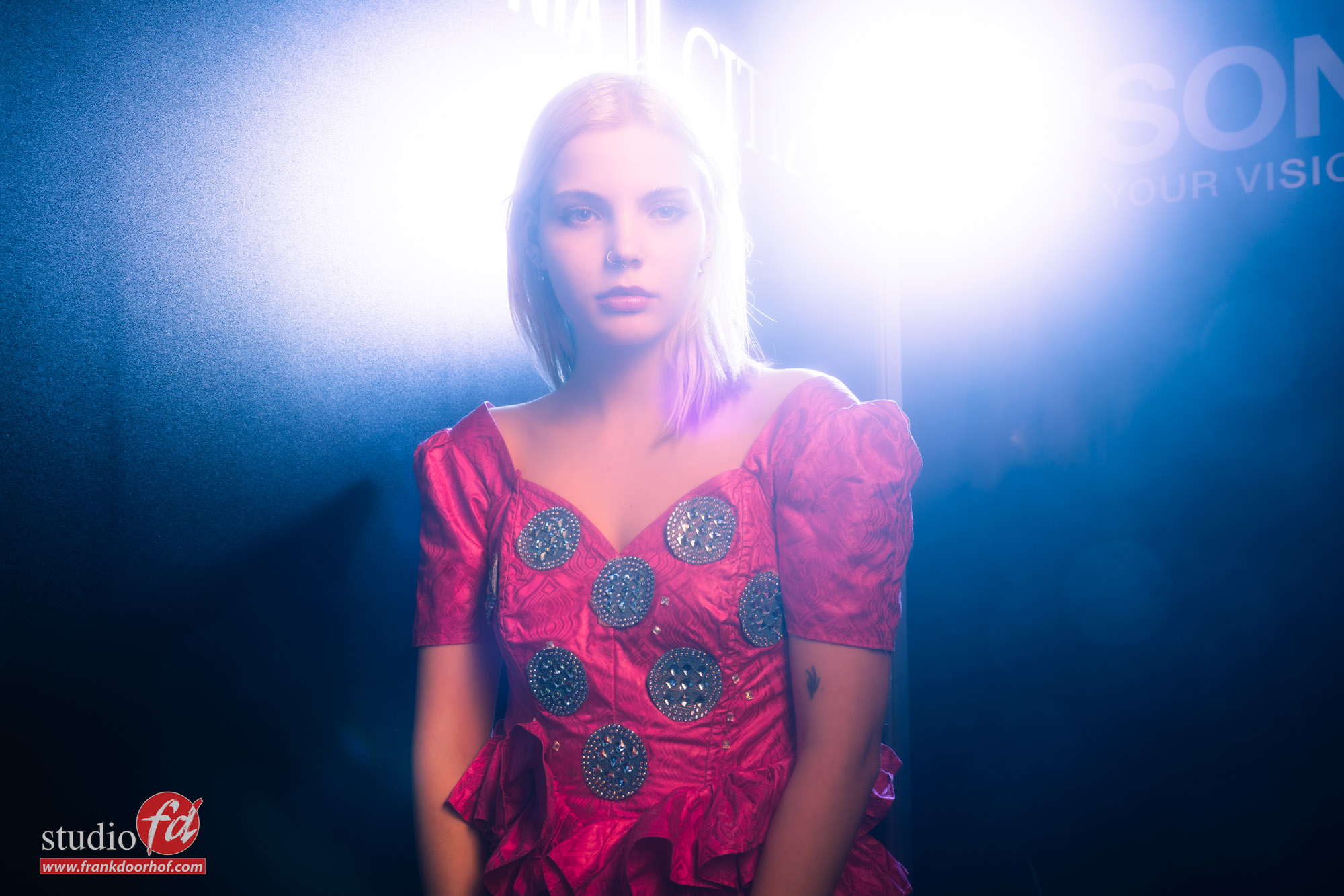
Ellen during Photodays part I
Tradeshows are always special places.
It’s awesome to meet up with people, hold new gear and of course visit demos and presentations. It goes without saying that both me and Annewiek absolutely love trade shows. For the Photodays in Belgium we were asked to teach small workshops on the Fidak booth.
Fidak is a dutch company specialised in printing, from large to small, from standard paper to even chrome. It’s pretty awesome to be working as a photographer on the booth with so many printers, so I think it’s no surprise that we now have a nice collection of prints at home 🙂
During the Photodays we were joined by Ellen as our model, and of course we got some nice dresses from Nadine (always cool).
One of the main challenges is of course to shoot “ok” images in a very small space during 20 minutes demos, teach some cool tricks to the attendees and deal with the whole trade show experience. But hey I wrote a book about shooting in small or difficult locations so one might expect that it’s easy for me… right?
Well not really to be honest.
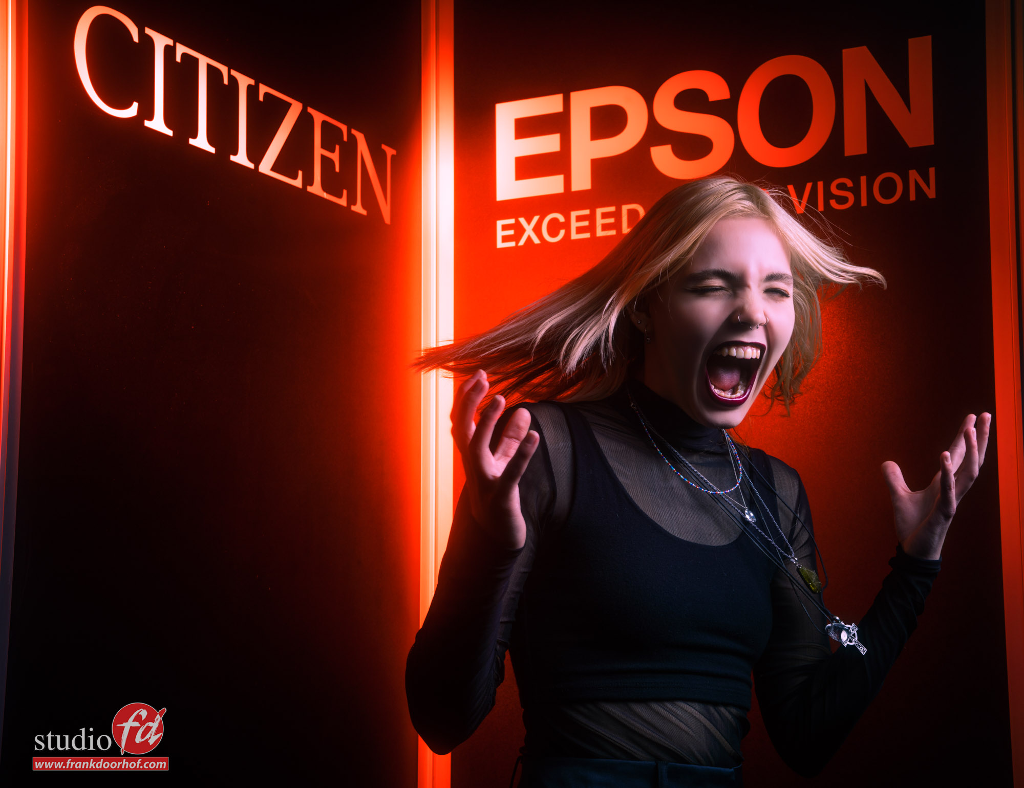
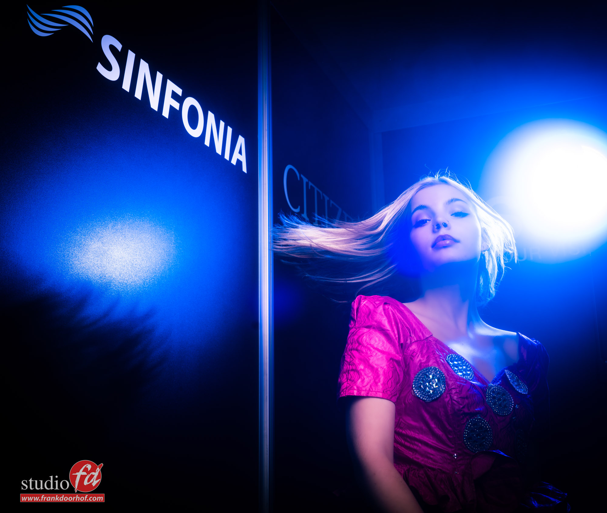
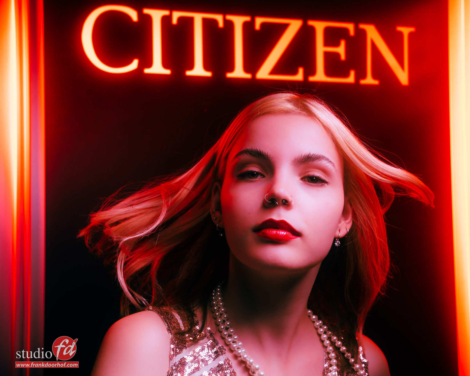
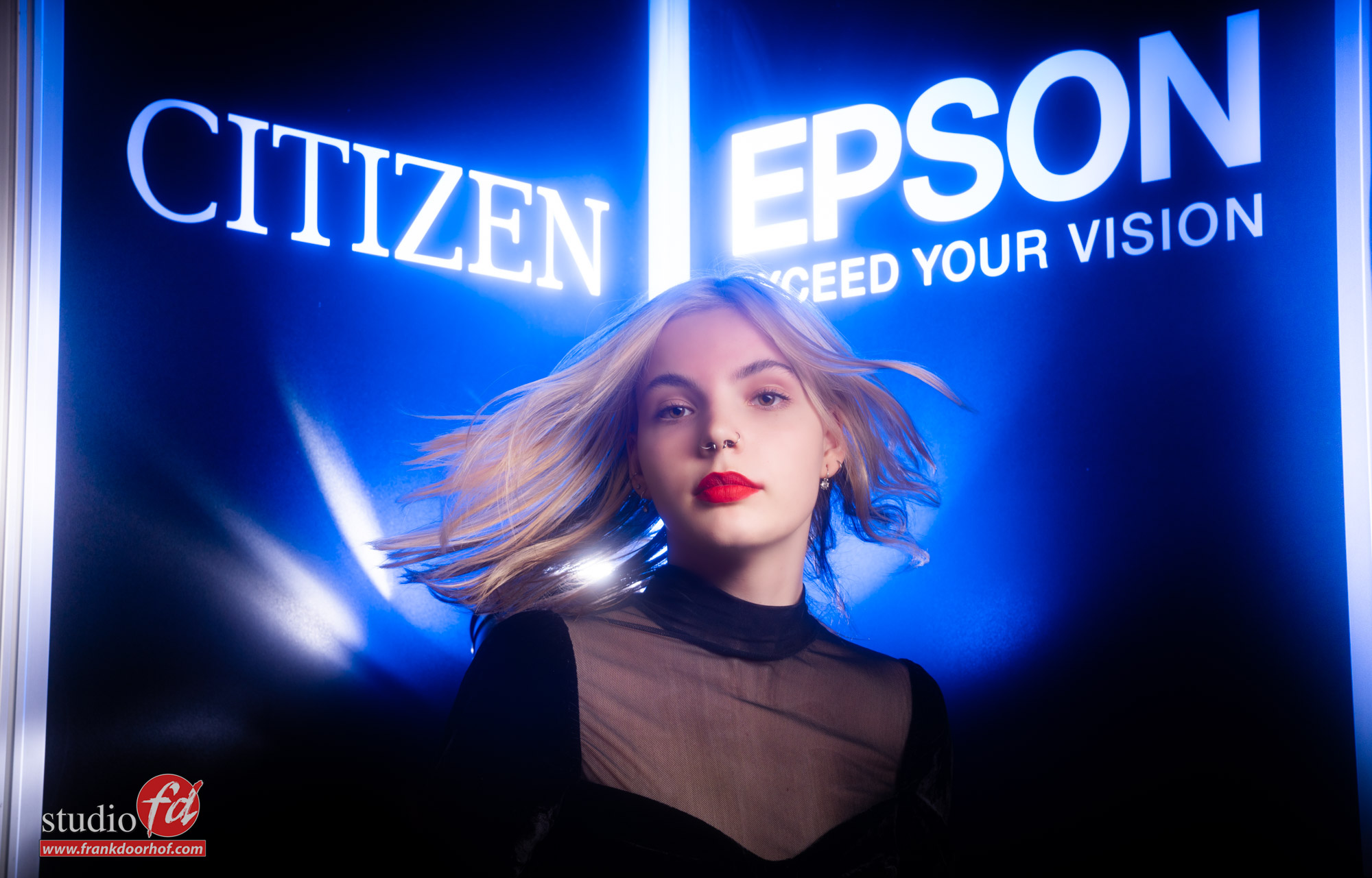
A trade show area is worse than most “bad locations”, but for me it becomes a real challenge to still create something cool, and this time my eyes were drawn to the aluminium strips in the booth. The booth was build with black panels held together with aluminium strips and somewhere on 3/4 the different brands were placed on each panel. A bit like every normal trade show booth.
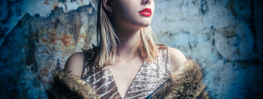
I started out with some images against a Lastolite backdrop, like you see on top of this blogpost. And although I could have filled all demos with this I always like to challenge myself and give the attendees something to go back for to see how I develop the idea, because this is actually what happens during trade shows. I set myself a challenge and during the days I try to build that idea to something that is actually cool to show.
Ok long story short.
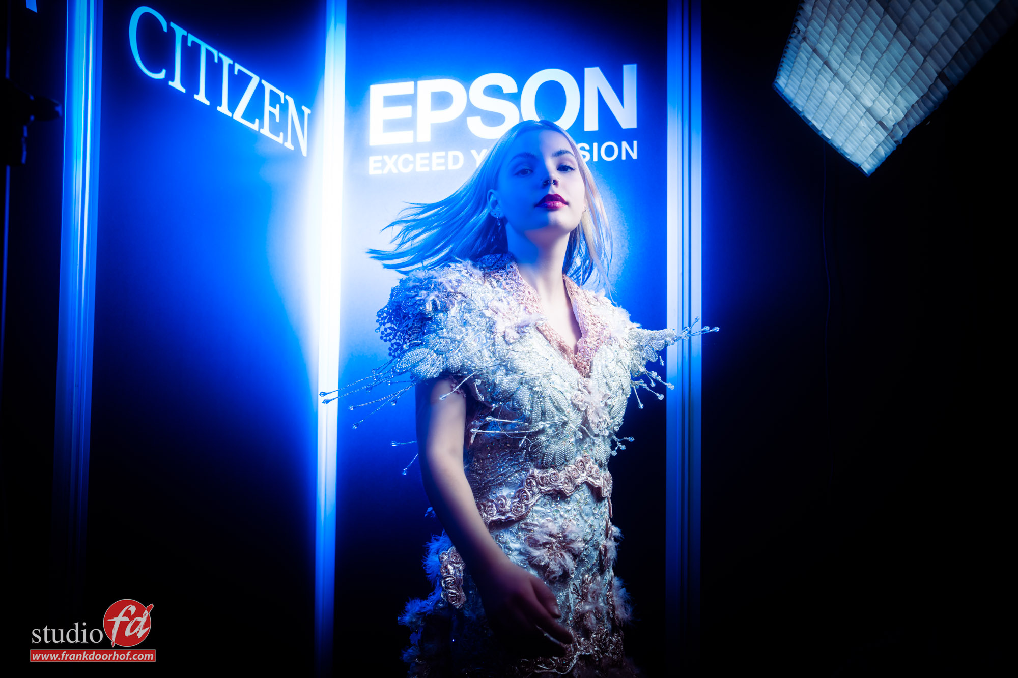
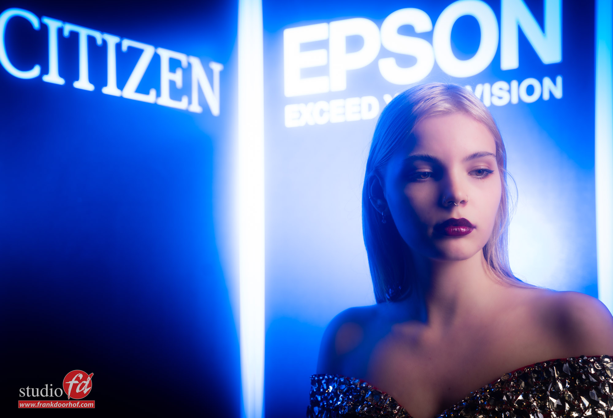
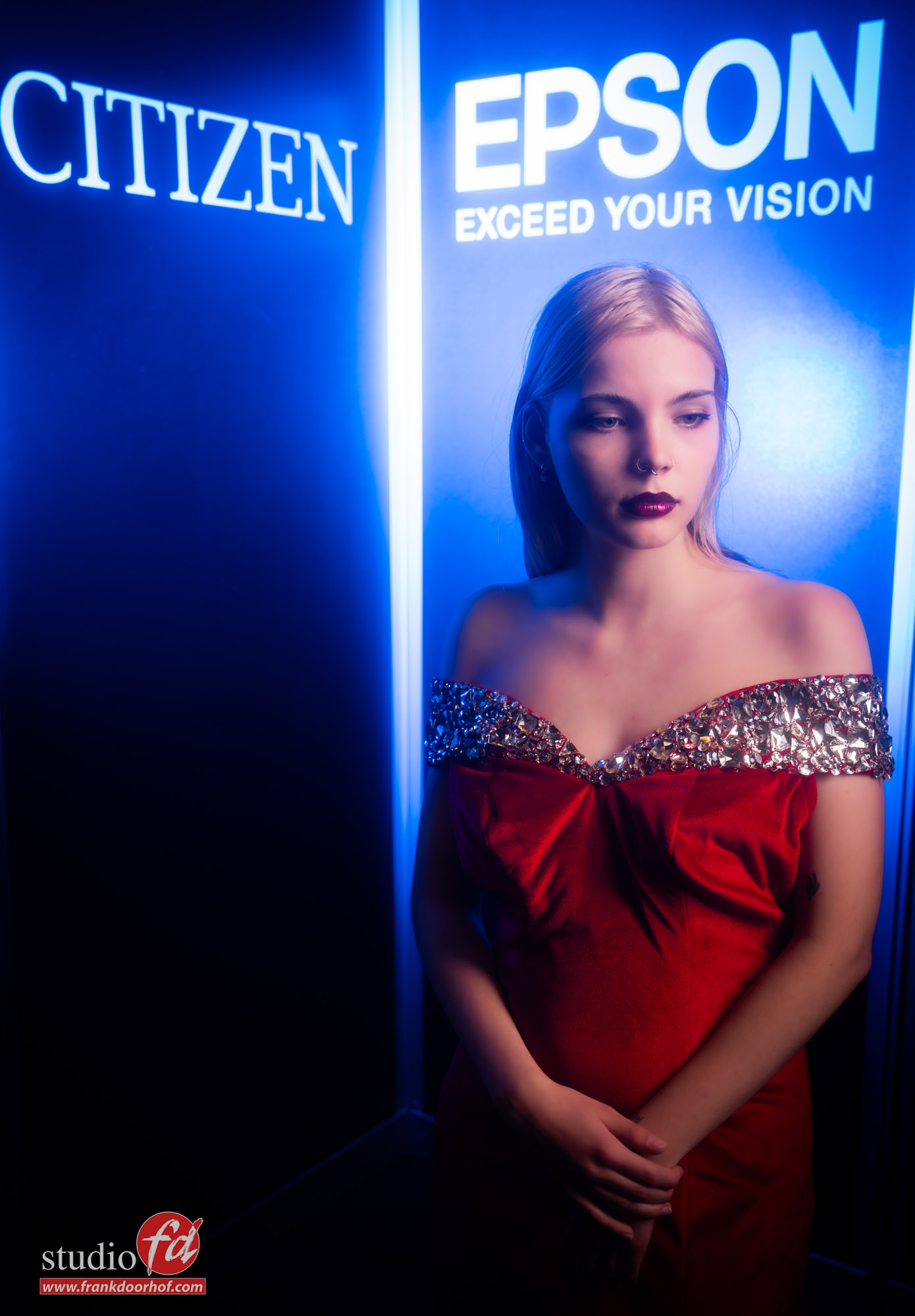
I saw the strips and the black backdrops with white letters, Fidak asked me if I could take some simple shots with the model in front of the panels and the logos, now in all honesty I hated the strips, but during workshops (and in the book) I always tell people that if there is something in a set that really annoys the heck out of you but you can’t take it out….. make it part of the story, make it bigger and use it. And…. well that’s exactly what I did. I started adding the blue gel feathered across the wall and place the model in a corner, later I tried it with a red gel, and eventually we even shot some images against wall (although the corner was my favourite).
The nice thing about this setup is that it almost looks like a neon setup, so let’s take a look at some of those shots, there are a lot that I included to show you how many different ways I tried, normally I will cut it down for publication, but this time I thought it would be fun to show a bit more to see the idea grow.
KEEP READING AFTER THE IMAGES
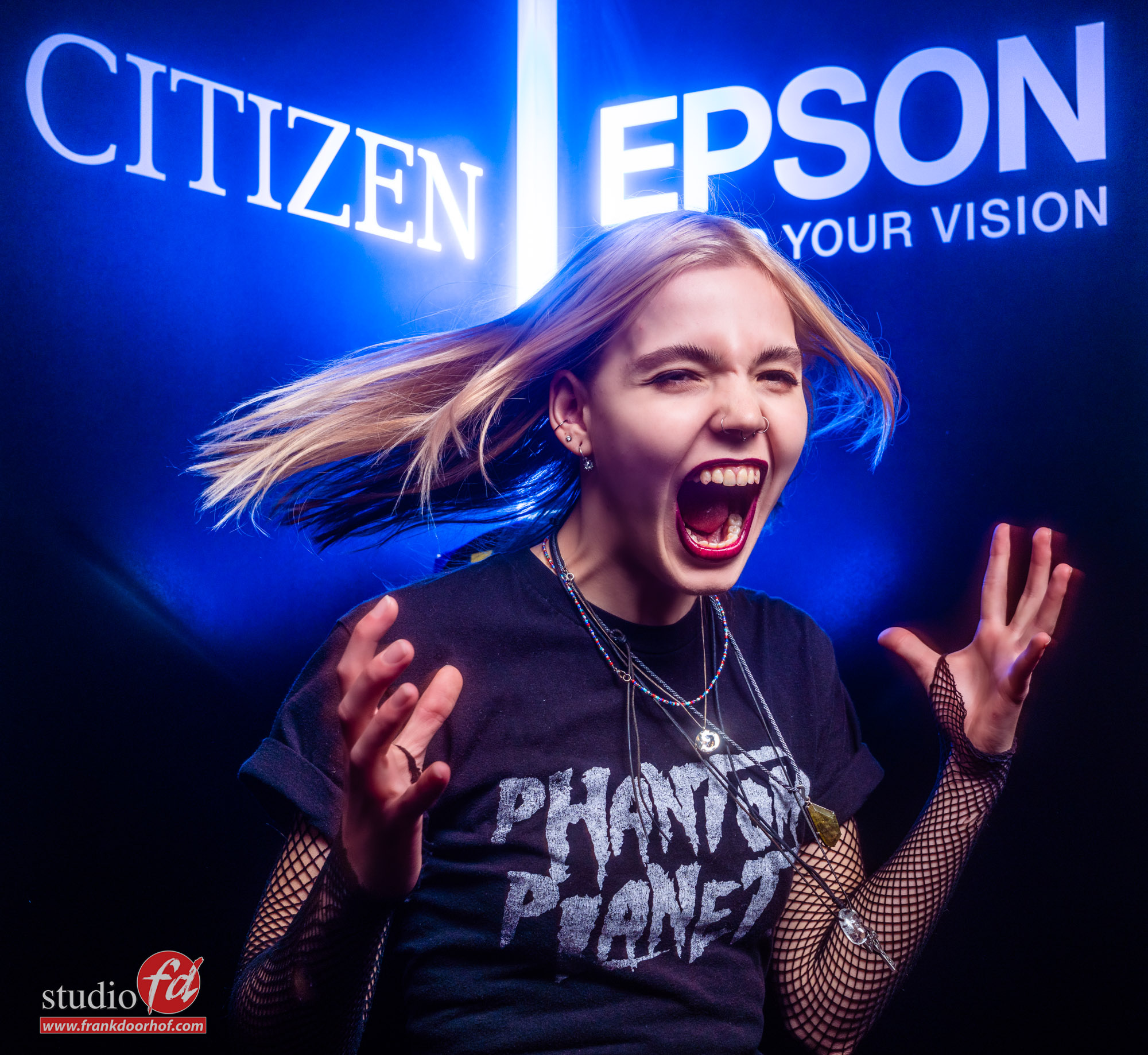
And of course we also did some other ideas with this setup.
This one I really liked, so let’s close the blog with that one for today, and tomorrow share some more images.
