About calibrations and the new X-rite products
If you have been following my work for a while you probably already know that I’m a huge advocate for calibrations. And although I feel it’s one of the most important things when you set everything up, it’s often a bit of shock to me how many people are actually NOT using any form of calibration. In my opinion this isn’t just standing in the way of your own progress but also isn’t fair to your clients. But let’s first take a look at what this whole calibration thing is.
What is a calibrated workflow
In essence it’s not that hard to understand, and I hope that after this piece you will start adapting the whole calibration thing yourself.
When we look at the world around us it’s quite quickly clear that we see color and contrast. Color is pretty obvious but contrast? Let me explain.
When we look at the colors we in fact only see three colors, Red, Green and Blue, and with those 3 colors the billions upon billions of colors are created and make the world appear as colorful as we experience it. But what is that contrast? Well when we look at how colors work you have to have a basic understanding of this first.
Colorspace
When we look at colors in the digital world we have to make one thing clear to start with. Every single device will show colors slightly different, every single device will capture or print colors slightly different. But how do we make sure if every device “just plays with colors” that in the end we as a viewer see what we need to see, for example when ordering a scarf and a sweater that look the same on paper we have to also of course make sure that when those two items arrive with the customer they also have to be the same right? (and how often did you order something that was different in color than you expected?, leave comments below).
This is why there are so called color spaces in the digital world.
In these color spaces we have fixed coordinates for our colors, now remember that contrast thing I was telling you about? Well a color space is often drawn on a 2 dimensional way, but in reality a color space consists of 3 coordinates, namely x,y and Y. Meaning the Saturation of a color, the Hue of a color and the Luminance of a color (often referred to as Key (yeah the K in CMYK))
I already told you that we only see 3 colors (RGB) but still a lot of people know the other colors Cyan, Magenta and Yellow and that’s correct, those are also very important. We call RGB the primary colors and CMY the secondary colors, when we look at a standard often used colorspace REC709 (HD TV standard) you can see that RGB are on the points of the triangle and CMY are somewhere “in the middle” but you also see a curve in the centre of the colorspace. We call this curve the “black body” curve. We thank Kelvin for something really cool and important for that, that curve in the middle represents different white points, those white points range from reddish white (low colortemp for example 2800Kelvim) to blueish white (high colortemp for example 9000Kelvin). And now comes the fun part.
If you draw a line from one of the primary colors through any chosen whitepoint you end up with the secondary color on the other side, in other words, all coordinates are fixed and in balance with the chosen whitepoint. Now when we look at a 2D representation of this colorspace it all looks pretty simple, you just have an x and y coordinate. But remember that term contrast? well there we go. The image doesn’t tell you “anything” in reality color spaces are three dimensional meaning they are not just fixed in x and y but they also have a Y coordinate, meaning luminance. And when we look at a colorspace you will find that those coordinates are fixed for that colorspace in only 2 coordinates namely for example Adobe RGB is fixed at Red 0.6400×0.3300 Green 0.2100×0.7100 and Blue 0.1500×0.0600 so where does this luminance come from?
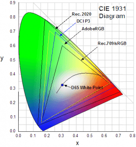
Well let’s keep it simple
It’s calculated from the white point which is set for a certain colorspace.
Let’s look at AdobeRGB, just a fun fact AdobeRGB shows app 50% of the visible colors according to the CIELAB colorspace (but you can forget that for now, or forever). To meet the AdobeRGB standard your display has to be able to show the colorspace of course but also meet a certain light output AND blacklevel (remember contrast)
For AdobeRGB this is
White point 160 cd/m2
Black point 0.5557 cm/m2 (or 0.34731% of the white point luminance)
Contrast ratio 287.9:1
For example for Adobe RGB you need a white point at 152.07(X) 160.0(Y) and 174.25 (Z)
But also a black point at 0.5282(X) 0.5557(Y) and 0.6052 (Z)
To get everything in order, and also support displays that do not fit this criteria we work with a gamma curve, mostly this is between 2.2 and 2.4.
When we combine all these values together we have a sort of “web”, I always use the term web because it’s easy to visualize, think about how Dexter always uses little pieces of robe to show patterns? well see it as that. This “web” is connected together and is exactly under tension everywhere and also gives the colors their Y value for that colorspace and “limits” of the display/device. If there is a mistake anywhere in this “web” and one of the connections would be “too tight” or “too loose” you could end up with really weird issues.
So what does a calibrator do?
I’m an ISF certified calibrator, meaning I am certified to do calibrations (manually) on almost any display, but am also able to get for example a video wall “totally” uniform.
Well no display is perfect, no camera is perfect and no printer/paper is perfect. So we always have to work with what we got, and a calibration tool does exactly that, and seeing the previous part it would be a bit more easy to understand now.
The first thing we normally do with calibrations is setting the white and black point.
In essence one could say “just set the white point as high as possible” and although that sounds like a good idea, especially if your monitor doesn’t have nice blacklevels, in reality it’s a really really bad idea. First off you will tire your eyes and second of all you will probably clip all white detail in a scene. What I often advise is to use a 10 step grayscale and set the contrast of your monitor first at 130-160cd/m2 and check if you see all the steps, if this is not the case lower the contrast of your display till you can see all the steps and don’t worry if you drop below that 160-140cd/m2. Just do it.
Now we have to set the blacklevel.
You might think again “just put it on zero to have max blacklevel” well no.
When you set it to zero there is an almost 100% chance you destroy your shadow detail and over light output of your display. My advise is (again) to use that 10 step pattern and just set the brightness so that you can still the black detail in the pattern and than set it one click higher when you see it doesn’t get any darker.
Now repeat contrast (yeah those two are connected).
Ok now that we have set our contrast range (max white, max black) it’s time for the rest.
Second up is grayscaling.
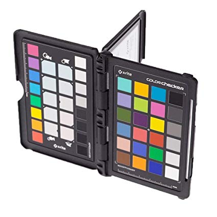
This is in essence what you also do with the colorchecker passport, you choose a gray square and balance on that so all three colors in your RAW convertor read the same number (for example 128.128.128). In the calibration process however it’s a bit more complicated. With a simple calibration we often choose 30IRE and 70IRE and set the values for RGB to make sure they meter equally on a spectrometer/tristimulus meter. In more advances setups we start with the 2 point calibration and than use a 10 or 20 step calibration to make the “grayscale” as flat as possible, but taking into account the gamma curve. For these kind of calibrations we use the D65 (6500Kelvin) whitepoint as reference. This is also the whitepoint I advise any photographer and video editor to use.
Third is the CMS.
CMS is called Color Management System and dictates where the colors are, in other words you are now in the realm of determining in which colorspace you want your display to display the images. For example when we look at hometheater applications we calibrate on both REC709 for normal hi-def material but we also do a calibration on BT2020 or P3 for UHD/HDR material (with another gamma curve for both). So in essence when someone plays a BD with normal HD material the colors are as intended, but when you drop in a HDR disc the display shows you the larger colorspace. And CMS is the tricky part. Now we have to calibrate the colors with that third coordinate (which we also use in the grayscale 10-20 steps btw) we take a meter reading of the black of the display and the white and from now on with those two known we can calibrate the colors, the x and y are always fixed but the Y (Luminance) is connected to the contrast ratio/options of your display.
Now that we are done…. let’s start again, for the simple reason ALL these settings are connected to each other and can/will interact. Sounds like a lot of work? Yeah it is, but it’s fun… and luckily for you guys you don’t have to do it like I do 😀
Enter the calibration tool
Although the essence of calibration is exactly the same, the way you have to slave for it isn’t.
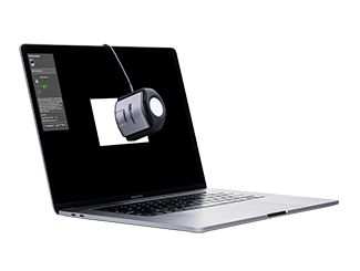
When you order a so called calibration tool you’ll get a small/larger device you can hang in front of your display and software that (with some input) will do the work for you, and this…. saves you a TON of work and calculations. The cool thing about this is that now you don’t have to worry about max this or min that, or gamma etc. you just type in what you want and the software makes your monitor look as good as possible.
Settings I advice:
White point : D65 (also sometimes called 6500K, 65K, D6500, 6500 Kelvin)
Blackpoint : Native
Colorspace : Native or Adobe RGB (there has been some bugs with certain monitors failing validation if you don’t calibrate them as Native)
Gamma : 2.2 or 2.4
Profile (VERY IMPORTANT) choose V2 NOT V4
Lightoutput : aim for 130-160cd/m2 When you print a lot I would go a bit lower so between 120-140cd/m2
Now just sit back and enjoy the show.
And remember to repeat this every 2-3 weeks, or (which I prefer) before every major retouching session, do remember to let the monitor warm up for at least 30 minutes before doing the calibration.
So what do I use?
Well I’ve experimented with a lot of analyzers over the years but somehow always ended up with X-rite. They have a great lineup of tools for every level of work and they have some more stable software than the competition, although both have their share of problems in the past depending on which platform you are on. (Do remember that calibration is not playing a game, it can get pretty complicated especially when there are bugs in third party software like for example Adobe, Affinity, Skylum etc). But overall I found that with the X-rite products I experienced hardly to no problems over the years.
So which one should you get?
Well are you lucky, because X-rite just released a totally new line up.
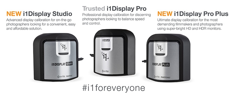
First up we have the
i1 Display Studio
This one is perfect for the starting photographer, but it will also be a good tool for the pro who just want everything to work and not to tweak too much him/herself, one could say it’s a no brainer if you start out with calibrations and will do a fine job for almost everyone.
When you want something more we have the
i1 Display pro
This is more aimed at the pro photographer, this one also delivers the i1 Profiler software, and from this model up you also be able to use the Pantone optimization.
And finally we have the
i1 Display Pro plus
This is the perfect tool for pro photographers and filmmakers, this is the only analyzer in this series that can handle the high light outputs needed for HDR work, and don’t worry as a photographer you don’t really need it (yet).
The Pro plus can meter up to 2000 nits and has very high accuracy in darker areas with a new (what they call) black current subtraction method. It also supports the important BT1886 gamma curve which is vital for HDR and HDTV. This one is also USB-C compatible.
So which analyzer should I buy Frank?
Personally I would opt for the i1 Display pro, it will give you all the options you’ll ever need and it’s a very solid performer, if you want to save $100 go for the Studio version it will server you very well and let’s be honest for most applications where you just need a proper calibrated monitor it will do just fine.
Monitors?
Ok now of course you will ask “what monitor do I advise?”
Well I’m a huge fan of the BenQ range of monitors, they deliver a lot of different options tailor made for gamers, video editors, designers and photographers and they understand that all these need different things that are important. But one of the main things I love about the BenQ range (and you also see this with other high-end monitors) is their option to skip the software calibration but do it right in the monitor. Now this is something I did not yet explain, but normally you do the calibration in the OS you’re running and it’s stored as a ICC profile. With a hardware calibration in monitor you’re using a look up table inside the monitor and this means you get a great response and a calibration with much smoother gradients and more tailor made for that monitor. So this is something I HIGHLY recommend.
But…. (now I got you) my customer doesn’t calibrate, so why should I?
Well very simple.
The customer is used to his/her monitor, so whatever they see they are used to how it looks. Now let’s take for granted that most pro’s do calibrate their monitors (I hope) your client is used to that look, if you deliver something that looks different you might lose that customer. Also remember I told you guys about that “web”? well if you have a calibrated device everything should be connected the right way, meaning even if you edit on a well calibrated sRGB monitor or even worse, the images will look fine on a proper aRGB display, for the simple reason the conversion is done correctly because you have everything in order from your side.
This is something that a lot of people that DON’T calibrate just don’t seem to get, but it’s really important to remember. If YOU don’t calibrate it doesn’t mean your client won’t see something’s wrong on his/hers uncalibrated display. In fact think about this…. what if you have your brightness set too low and your client too high… this could get really awkward with that cable you didn’t see on your monitor but your client does on his/hers 😀 So ALWAYS calibrate.
And how about the rest?
Well we talked about monitors.
But you can do the same thing for your camera…. use a colorchecker passport and create a profile with the software
And also for printers, but now you need a spectrometer that can read the test chart your printer prints (and those are not cheap)
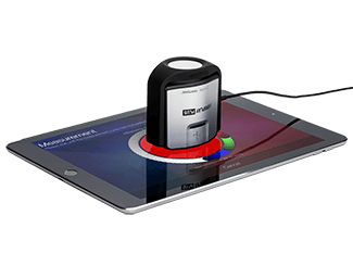
In essence you can even calibrate your phone or tablet with the Mobile profiling software from X-rite, BUT watch out… this is not supported by most (almost all) apps.
Conclusion
Calibration is a key ingredient for a successful workflow and continued success. There is absolutely NO reason to not calibrate your display or to think you can do it by hand. Oh and those papers you get with your monitor that claims the display is calibrated in the factory……well that looks nice but in essence you have to calibrate it as soon as you hook it up. In fact you should calibrate every 2-3 weeks. So don’t just wave that piece of paper around a 3 year old monitor and claim it must be my eyes that see weird colors 😀
The new analyzers from X-rite are released together with their new 64bits software.
And just between you and me…. that software also works with the previous generation, but I highly recommend the new ones if your analyzer is older than 2 years (you should replace your analyzers every so often, depending on the brand and type and which kind of filters they use inside).
Hope this article helps.
I would really appreciate a share.
Want to support our work?
Join our Patreon at www.patreon.com/frankdoorhof for a lot of goodies, portfolio reviews etc. and it starts at $1.00 a month.


