Results styling workshop Part II
Today the final results of the styling workshop we did with Nadine and Manon.
This one I saved because I want to give some tips about lighting in this one.
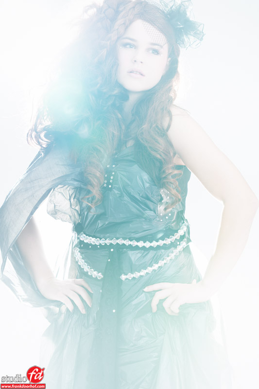
The creation itself is 100% recyclable and took Nadine a few minutes to put together on the spot (was not prepared).
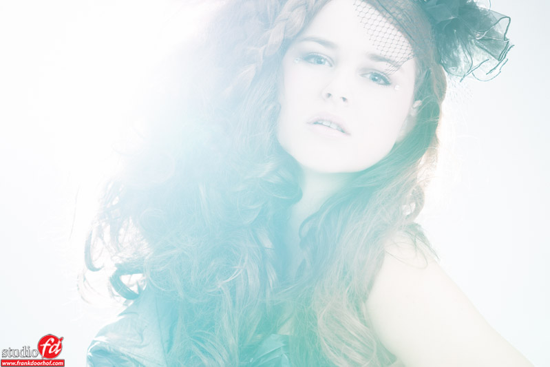
Lighting wise I always advise people to not do it too safe. In this case we used very strong backlights to create a “haze” on the image and get a more “distant” feel in the image, it blends everything together so to say.
 Adding a little bit of motion always helps a lot and creates a totally different look.
 Now most photographers will only shoot setups like this full body (because you want to show all the work right?).
My opinion is very simple, also shoot the portraits and 3/4 bodies because in the end it all boils down to getting good shots, don’t forget the full bodies of course but make sure you don’t only shoot full bodies. Make your shoot as complete as possible.
In this case the very strong backlight also creates a mood in the image that I really like.
Getting the lights this way is not easy and is not easily shown in a diagram, it’s moving around with your camera and looking very closely through the viewfinder, the EVF of the Sony A99 really helps in these kind of setups, but also with a OVF it’s easily seen by looking for the lens flares.


Frank; so how does the A99 help in these severe backlight setups?
Not more or less than the Canon.
But it does work flawless 😀
I love too 3/4 pose. It fills the frame and is much more “intimate”!
it’s just ted too bright for my taste. she did pretty good with the “dress” though 🙂
It’s a very personal taste in this I guess, personally I never liked it before but I’ve been playing with it and started to like it more and more.
Complicated lighting set up, but I see it too bright.
Wondering the camera can give sharp image.
The images are razor sharp, too bright is very personal. It’s a “look” 😀
Everyone their own taste, something to liking this is very personal, to me the (pretty) face is washed out too much and there is nothing to “grab” onto in the picture. However I must say that my eyes are drawn to the dress contrary to the usual behavior of be drawn to the lightest spots. So somehow you did the right thing, playing tricks with my eyes. Let’s say I’m confused, was that the purpose?
Lighting a set like this seems to me more trial and error then metering the light?
Love the creative use of the fabric tough!
The idea was to get the attention to the clothing and overpower the “image” it’s a very personal look and taste, somehow I’ve started to really like it. Don’t worry it’s not something I will do a lot 😀 but it’s just something I really like.
It’s pretty easy to meter, especially with a spot.
Amazing pictures and I also like the “bright” look. Some photographers use photoshop to create that look, but you the master create it on the camera. Keep doing it more often. I like it.
I like to do it in camera as much as possible, somehow it always looks nicer for me.