Critique day results
On Monday I asked people on twitter if they wanted to tweet an image for critique by DM.
The responses were more than expected so I guess we’ll do that again.
When I saw some of the images I thought I could not just let them be part of twitter alone and disappear after that, so I decided to ask a few photographers to send their image to me with a small description to be featured on my blog.
This is that post.
Feel free to comment, share or ask questions, the photographers will be online also and if they want they can answer your questions.
Jonathan Ryan
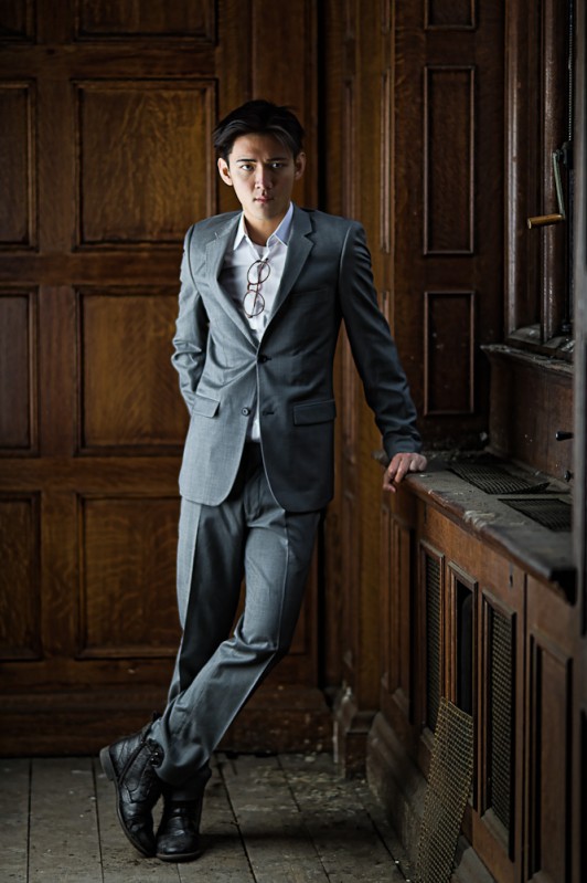
I love this shot for the postprocessing, but also the small details like the glasses and the area the model is standing. But I have to add, as you can see in some more of the selected shots I love this look, so if you want to score with me 🙂
You can find Jonathan Ryan online at : http://peoplebyryan.com/
About the picture.
This was one of the first shots from a long day’s shooting at an abandoned building in London (I’d best not say exactly where). I set up in the corner of a dusty room and took a couple of test shots. There was some gentle sunlight coming on from a window to the right and I used a location flash head with big octa box to balance it from camera left. The idea was to use the octa to gently fill the shadows. Almost the instant Ben was ready, the light outside dropped dramatically (it had just started raining) and I decided to reverse the lighting – slightly more light from the left and use the window light to fill. The octa was feathered towards the camera to stop too much light falling on the panelling at the back. Any spill at the front hit the window and came back for a little more fill.
Ben’s new to London but not to modelling and I talked him through a number of relaxed poses. One hand in the pocket and one on the shelf worked well because I liked the folds and creases it put in the jacket.
Technical info.
Nikon D3S with 105DC at f2 and 1/100s defocus set to rear f2. The high res shows just a little movement from the slow shutter speed but shooting a number of frames gave some acceptable ones.
Editing.
I actually shot this in black and white so that I could concentrate on the tones and contract on the LCD. Lightroom doesn’t understand Nikon B&W so it dropped it back to colour and I liked the warmth of the wood against Ben’s skin tones. A little bit of Topaz Adjust to accentuate the creases in the jacket and bring out some of the grain in the wood and a quick tidy of some marks on the wall and floor.
Frank Hatcher
This image I loved for the used light, getting the attention to the model is something that is often overlooked when using flash outside. Frank gives an example here that for me really worked.
You can find Frank at http://www.azproimage.com/
About the image….
We recently launched a new side of the business to focus primarily on boudoir, glamour, lingerie, beauty etc. The main business has been about families, seniors and so on. I rented a nice location here in Phoenix and we photographed three different ladies for site content. This was Ambers first time in front of the camera and she did a great job! She is a figure competitor and looks amazing. Hair and makeup were by Lorri Mitchell.
We were lucky enough to have a great sunset this evening and I wanted to take advantage of it and the warm tones. A bonus for us was the lingerie went well with the plants/flowers on the property. I used a single Elincrhom 600rx with skyports to light the scene. I love the Elinchrom system! Having color consistency from the strobe and being able to adjust the power of the light from the camera is invaluable. I made the switch from Pocket Wizards a couple of years ago and have not looked back. For the modifier I used the Elinchrom 53″ octa, it was double diffused. The light is so soft and provides such a great look. Camera was the Canon 5D2 and the lens is the Canon 85L MK2.
I placed Amber with her back to the sun, the strobe was about 4-5 feet from her. I then metered the ambient light to see where we’re at. I wanted the background to be slightly underexposed so I adjusted the f-stop to where the scene was about 1/3rd of a stop under. I then metered my light until the exposure on Amber looked where I wanted it. I think I ended up on F/13 to capture the shot. Plenty of depth of field to capture all the details in the scene. In this particular location we had to work fast as the ambient light was changing quickly with the setting sun. Amber hit a bunch of great poses and this series turned out to be one of my favorites from the day.
Erwin Zavala
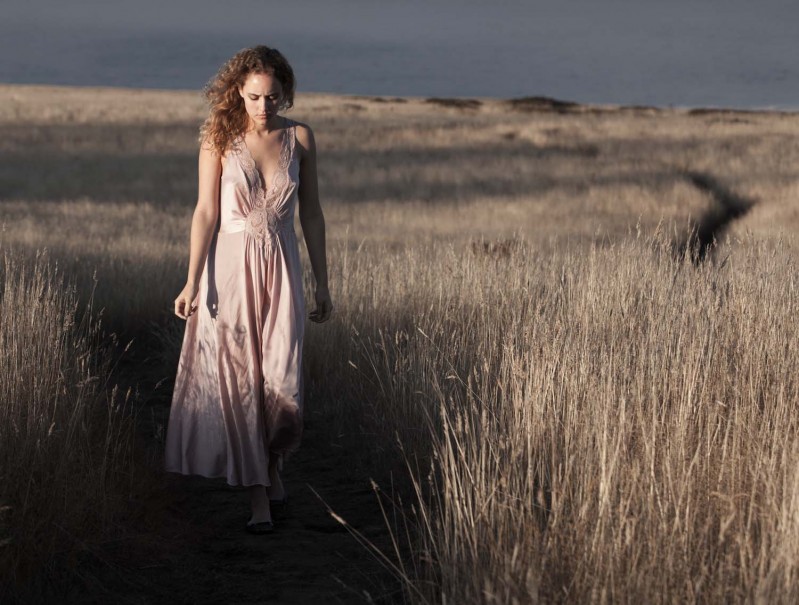
I loved this image because it shows very clearly what you can do with a natural looking image, sometimes people overuse flash (which I also love) but forget about telling the story, and as photographers we are storytellers, for me this image works composition wise, light and pose. And shows that you don’t need extreme poses, extreme light or what so ever to make a rocking image.
You can find more about Erwin at Ezrstudio
A little background of me:
I´m Erwin Zavala, from Mexico City. I am currently creative director on our family based company that manages creates directs and trains political campaigns my duties then are the official candidate portrait, tv spots and the training of the photographers covering the day a day campaign. I dopped college to pursue a underwater diver career, became master scuba instructor and have 10 000+ dives worldwide. My very first camera was a Nikonos V 35mm film underwater camera. Self taught me to shoot underwater, became also underwater photographer instructor and gave me a strong base on how to shoot in an enviroment that does not allow you to recompose, you can´t modify your surroundings or disturb wildlife and also to think frame wise you have only 36 shoots per dive! make them count.
The evolution came as Darwin stated, evolved from marine life straight to a different kind of sharks! so from shooting underwater, started to shoot politicians with digital cameras, and some books from Scott Kelby, and online tutorials here and there. I knew right away that I needed to craft my skills a lot more and also faster! so the natural next step was a workshop,but where to start? found out that one of my favorites photographers had workshops at his own studio up north in Mendocino, California so it was a dream shore line vineyards and upmost Greg Gorman!!! I can now say that was money well invested, so good that I came a year latter for more!
So far there are some phrases that are a basis that everyone should remember, Learn to SEE the light, no matter how well lid the picture is, shadows make the picture more interesting, leave always the viewer wanting to know more, why fake it when you can create it ( sounds familiar?), I choose to be a photographer over being a retoucher, and finally one out from the elders measure twice cut once. I am a believer that you are always learning so after watching Frank Doorhof at Kelbytraining.com the next logical step is to enroll in one or two of his workshops
So about this picture, it was shot last September, shore line in Mendocino California early morning sunrise She is a real trooper since it was windy and very cold! camera settings : Canon EOS 5D markII 1/500seg at f6.3 ISO 200 lens 70-200mm f2.8 IS capture in RAW color management X-rite passport, retouched in lightroom, crop, white balance 4850k, contrast +42, exposure -0.58, vibrance -58 saturation +8
the story, girl wandering wearing night gown thinkfull and cold…… Whats on her mind?
Marc Duiker
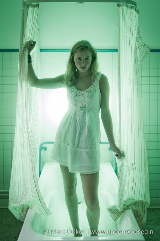
Talking about telling a story and getting the toning right. You can of course always use photoshop to just tone an image funky and think you can get away with it, but that doesn’t work for me. In this case everything just fits, the only comment I gave was that ‘maybe’ I would have placed the backlight a bit more to the right and moved the model a bit more to the back to see a little more feet, but that’s just looking to give a comment to be honest, I loved this one.
You can find Marc on http://www.underexposed.nl/
About Marc
For years I have a passion for shooting in abandoned places, the so called Urbex photography. Because I wanted to try something different I asked a model to go with us to a special location, an empty psychiatric hospital in Belgium. Because I also wanted to try some strobist techniques I brought a flash, some colored gels and a reflector. After shooting in different rooms and hallways we eventually ended up in a bathroom where there also still was a curtain. Because it was a relatively boring background I thought it was time to start experimenting with a green gel on the flash aimed at the model. She’s not a professional model but I think a natural. The location without a doubt helped in getting the look and feel of this shot. In total we spend almost 4 hours at the hospital and we were both exhausted but it was a great day and I learned a lot so we’ll repeat this without a doubt.
Lightsetup
1x Canon 580EXII flash on 1/4th with a green Honl gel aimed at the wall behind the model, I used a gorilla pod for mounting it. A silver reflector was placed on the camera left aimed at the model to lighten up her face, the flash was triggered with the Cactus V4.
Retouching
I used lightroom to enhance the contrast with curves to make the mood a bit more dramatic, I also lowered the saturation to weaken the green because I thought this was a bit too much. The eyes and face are lightened up a bit.
Peter Burkwood
Well I can be short on this one, just love it.
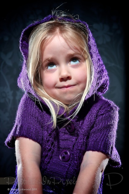
The original had a bit too much blue in the eye white and Peter changed that for this version.
You can find Peter at http://www.picturesinpixels.co.uk/
About the image
“This is my daughter Robyn looking way more angelic than she actually is. For this shot I used 3 x Nikon SB-900’s. One was placed on each side of her, slightly to the rear to give a rim effect and one in front just above head height.”
Joost de Wolf
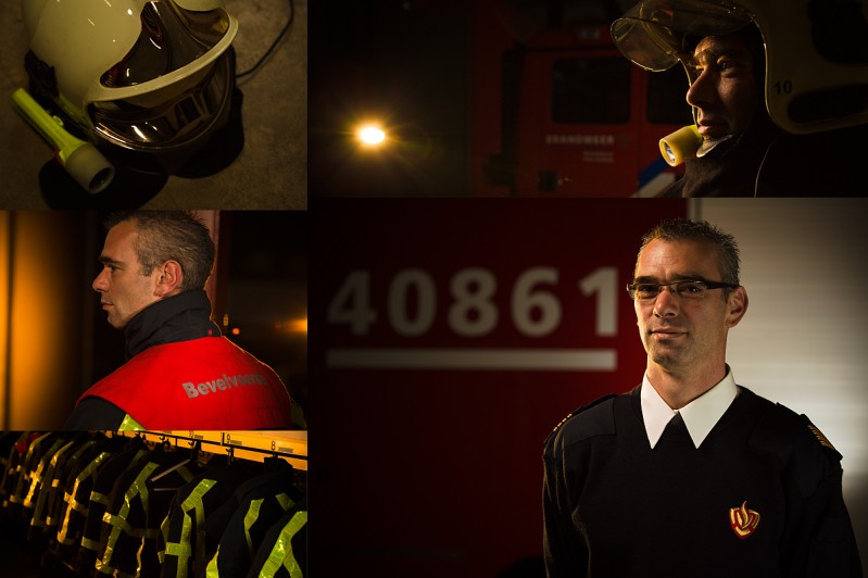
Shooting images for companies can be done boring and can be done interesting. The funny part is that most company shots are done the boring way, that’s why I loved this collage and asked Joost to tell a bit about this.
You can find Joost online at http://www.jdwfotografie.nl/
Link to collage
http://www.jdwfotografie.nl/portfolio_show/slideshow_100624_01/
Would you like to criticize these images?
That was my question a few days ago when Frank through Twitter announced that it was “Critique day today ” and asked if he could criticize work of colleagues. After I sent a tweet with a direct link to this collage, Frank responded a few minutes later. And although these images editorial pictures and not high fashion beauty and glamour, they fell in with Frank and his first reaction was:
“Really nice collage, I love this kind of photography when it’s done like this, chapeau”
As a professional photographer it is always difficult to be assessed.
Customers (art directors) judge your work, but often when running a command we already knew how the images will look like. The assessment is then often a single comment on the composition. And the expression of the subject, is in many cases the deciding factor in adopting one of the images. Before the meeting with Daniel, commander of the volunteer fire department took place, it was obvious that the images had to be special. There needed to be drama and the drab barracks should not appear into the images. After having discussed some ideas it soon became clear that I could enjoy again the use of my flash equipment and that was the beginning of a beautiful portrait session …
Upon arriving at the location it is always an art to see quickly where my ideas can work. The first setting that I had in mind was the casual portrait at the right of the collage. For this image it was necessary to have sufficient distance to firetruck and model. Fortunately there was enough room in the barracks and we didn’t had to move vehicles. My second setting was shooting between two firetrucks with a very warm light that came from behind, creating beautiful reflections left and right on the firetrucks. Eventually there was too much space between the two trucks and I adjusted my shooting angle, I used the left truck as my background. (See the picture in the middle left)
The portrait with helmet right above is also a result of changing my shooting angle which gives automatically a more dramatic portrait picture. This technique is highly recommended if you want more creativity from your base setting. By turning round the model, whether or not the model turns along, leave the light setting as it is. This creates images that are generally less “safe ” but very nice because light will fall in a different way on the model itself. For this shot I used my favorite light source for location shooting. I used an Elinchrom Quadra with a small silver 44cm (17.3”) beauty dish. I also used an Elinchrom golden Deflector resulting in a beautiful warm light on the model. This beauty dish is left high, relatively close on the model. As a fill light (the casual portrait lower right), I used at the right a small shoot through umbrella. The hard warm light (accent light) coming from left behind is a snooted Canon 580EX speedlight with double full CTO Filters on it. And behind the model there is also a Canon 430EX to give the truck a little bit of light too.
Despite the lack of high fashion models by Frank, I hope you liked to read this post and let the images provide inspiration for your own photography. And if you have the opportunity to have your work criticize, do not miss it! It helps, inspires. Thanks for reading.
Frank, many thanks for the invitation to your blog. It’s a honor.
Huub van den Hengel
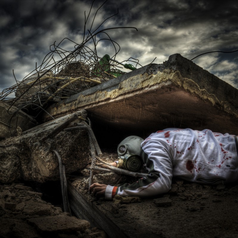
I just love this image, IF I had to pick a winner of this batch it’s this one without doing less justice to the other ones of course. It tells a story and it’s shot with care, there is attention for the styling and composition and retouch, overall a great shot that would stand out in any portfolio.
More from Huub on : http://www.flickr.com/photos/huubvandenhengel/
About the shot
I got the idea for this shot when I walked over the recently demolished Sinai clinique http://www.flickr.com/photos/huubvandenhengel/4860799350/. This was my first Urbex shoot and even during the break down, together with my dad, I went back in between the demolishers and machinery to make some shots, yeah the link is made easily :D.
When a building next to my place of work was demolished I took out a jacket and put red paint on it, handed this to a colleague and asked him to wear a gasmask (well know urbex item) and lay down between the rubble. I don’t have to tell you we had loads of fun that day, after the shoot however we were send away by the owner and to be honest it was indeed very dangerous.
I’m working in a creative sector (designer) but I’m often bound by budgets and deadlines, photography for me is the perfect way to fullfil my own creativity.
Conclusion
I’m stunned by the quality of images I got from just a simple tweet, I did not give much attention to it but still there were a lot of responses. In this post as mentioned at the start I tried to show you my personal favorites. You the readers are invited to respond, give your opinions and ask questions, I will ask the photographers featured here to check in regularly during the next few days to answer any questions you might have.
Let me know if you like this concept and it will be a returning subject.



Dear Frank, thanks for being posted in your blog but also to be in a post next to great pictures! Could not ask for more.
Thank you and you’re more than welcome 😉
Very nice pictures.I am wondering why you don’t seem to use the beauty dishes Frank?They seem to be so popular with fashion and glamour photography not that I have used them.
It’s a bit personal I think.
When someone uses them and their images are great, everyone will buy em and start using them. I saw the same thing when I started using the deep octa and maxi lights 😉
A beauty dish can be great bit for more personally I like my lights to be a bit more focussed so I often choose the maxi light or the maxi light with grid for outside. Inside I love the deep octa with or without the light tools grid.
With these two I get the look I love, when I use a beauty dish it will also look nice of course but it’s different 😉
Really appreciate you taking the time to do something like this Frank. All the images are amazing! So glad you enjoyed my shot enough to post it.
All the best!
Hatch
Thanks, I’ve gotten a lot of positive responses to this so it will be something that will be done on a regular basis. Most of all the credits needs to go to the photographers, thanks to their images and stories the visitors have a great read.
very good idea frank i think i got to start using twitter because i missed it. Some awesome images here
@Anthony,
Twitter is great (if used correctly).
During photoshoots we always twitter backstage images and sometimes small videos.