 https://frankdoorhof.com/web/wp-content/uploads/2024/09/Screenshot-2024-09-23-at-16.27.54.png
860
1080
Frank Doorhof
https://frankdoorhof.com/web/wp-content/uploads/2015/03/studioFD_Logo-1FV.png
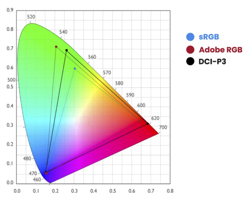
Frank Doorhof2024-09-24 18:00:022024-09-24 14:08:35Colors and how they connect
https://frankdoorhof.com/web/wp-content/uploads/2024/09/Screenshot-2024-09-23-at-16.27.54.png
860
1080
Frank Doorhof
https://frankdoorhof.com/web/wp-content/uploads/2015/03/studioFD_Logo-1FV.png
Frank Doorhof2024-09-24 18:00:022024-09-24 14:08:35Colors and how they connect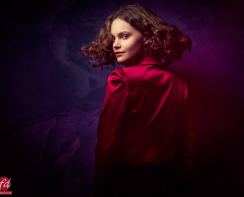 https://frankdoorhof.com/web/wp-content/uploads/2024/09/Jannaika-45-September-18-2024-Edit.jpg
800
1200
Frank Doorhof
https://frankdoorhof.com/web/wp-content/uploads/2015/03/studioFD_Logo-1FV.png
Frank Doorhof2024-09-23 18:00:032024-09-23 10:06:31Geekoto softboxes compared: results from the Digital Classroom with Jannaika
https://frankdoorhof.com/web/wp-content/uploads/2024/09/Jannaika-45-September-18-2024-Edit.jpg
800
1200
Frank Doorhof
https://frankdoorhof.com/web/wp-content/uploads/2015/03/studioFD_Logo-1FV.png
Frank Doorhof2024-09-23 18:00:032024-09-23 10:06:31Geekoto softboxes compared: results from the Digital Classroom with Jannaika https://frankdoorhof.com/web/wp-content/uploads/2024/09/Untitled.png
2048
2048
Frank Doorhof
https://frankdoorhof.com/web/wp-content/uploads/2015/03/studioFD_Logo-1FV.png
Frank Doorhof2024-09-21 18:00:542024-09-19 13:36:18That setting that drives you nuts during the calibration process on Mac (and windows)
https://frankdoorhof.com/web/wp-content/uploads/2024/09/Untitled.png
2048
2048
Frank Doorhof
https://frankdoorhof.com/web/wp-content/uploads/2015/03/studioFD_Logo-1FV.png
Frank Doorhof2024-09-21 18:00:542024-09-19 13:36:18That setting that drives you nuts during the calibration process on Mac (and windows)[recentblog columns=”3″ cat_slug=”blog” readmore_text=”Continue reading” excerpt_length=”15″ date=”true” comments=”true” title=”true” description=”true” post_type=”” pagination=”true” limit=”9″]
