Guestblog Torsten
Today a very special guestblog by Torsten.
Torsten works for the German magazine Pictures and will tell you today what an editor looks for, I think this will be very interesting for you guys….
The strange guy on the other side of the fence
You all know me in a way – at least if you’re familiar with Hollywood movies. I’m the guy with the big cigar, rolled up shirt sleeves and braces, yelling at the poor sods working for me, always running for the big story. Yes, I’m the boss, the editor in chief – in our case of a photo magazine.
Well, this picture most of us have in mind is more or less surreal and does not match reality fully. Not only that I don’t wear braces and don’t smoke cigars, it’s not even me on the cover shot. That’s Dave Clayton, shot by Glyn Dewis. I do smoke a pipe though, so I might fit in the cliché a tiny bit. But all in all most ideas people sport about being the editor of a magazine are as cliché as the editor Dave impersonates so well on this shot.
So who am I? I’m not a pro photographer nor am I an outstanding photoshop artist. Or, to quote Dave Clayton’s recent guest blog for Scott Kelby: “I’m not a photographer but one day hope to be within touching distance”. Compared to Frank and other artists I’m only shooting on a fairly amateur level, still learning about all the stuff. So what am I doing in this blog full of amazing photography and huge knowledge? Well, I love photography, I enjoy seeing stories being told and depicted in an inspiring way. That’s what I’d like to achieve one day too and that’s what got me running a photography magazine. In a way I also feel myself situated on the other side of the fence, as I’m not only Torsten, the amateur photographer but also the one chasing for pictures and stories for our readers.
Our magazine, Pictures, is fairly new on the German market, so you’d probably call it a start-up if we’d be an internet business. “Oh no, not another magazine”, I hear you say. “Aren’t there already enough photo magazines out there? Isn’t print far too old school these days?” Well, I could wash a ton of marketing lines on you now, but since we’ve got no marketing department to deliver the brainwash lines I’d rather like to give you a little insight why we – we, that’s our publisher, another editor and yours truly – decided to create this magazine. I consider us being a bit unusual, as we’re not a big company but people enjoying photography. We did not start off with a market research or sales figures. If you’re a controller by heart you better stop reading now, as all that’s following now is about emotions and passion, no numbers involved.
Then there’s the ‘old school’ argument. I agree, photos look great on the iPad. But as soon as you’ve printed your first picture you’ll agree that photos need to be printed. They evolve when you add the feel of good paper or play with the effect a different surface can have. And the next best thing beside a huge gallery print still is a magazine. Of course it’s old school – in the same way as photography is old school in itself, no matter if there’s a digital sensor in the camera now.
How it all started
But let’s get back to the story I wanted to tell you. A while ago, during some dinner, we talked about the consumer magazines we read being the amateur photographers we are. Strangely enough we found that we all shared the same experience: after a phase of reading most of your usual photo magazines we started to dislike the ongoing page spreads of camera and lens test tables often leaving us with no real information on how this certain piece of equipment would work in real life situations. Also, in the days of immediate technical information available on the web these listings seemed a bit outdated to us. On the other hand the things we’re really interested in, the pictures, the inspiration, the artwork of really good photographers seem to miss out. Too often we encountered a fantastic cover shot, bought the magazine only to find thumbnail sized prints you barely can recognize. Also we often missed the photographer’s comment on his motivation or way of work. So we all dropped reading photo magazines regularly after a while. We wanted a magazine to show more pictures in bigger size, delivering hints, tipps and inspiration from photographers. In a video clip for Kelbytraining Scott Kelby once mentioned something along the lines of “… it makes me feel to grab my camera and shoot.” Now, that’s what a magazine should do. We agreed we had to create a magazine simply by adding what we would like to read ourselves and leaving out the stuff we dislike.
Photography is passion
Here’s the point where I need to thank Frank Doorhof for his amazing support, as Frank was the first photographer we approached for a cover story and he’s been extremely helpful and open to the idea. I’ve had the pleasure to visit Frank in Emmeloord and although he had tons of work on his table he took the time to sit through a long interview. Following the idea of not being your usually cluttered magazine we started off “Pictures” with Frank’s shot of Marieke on the cover. It really made the first issue outstanding and set the mark for all following issues.
Photography is passion. Passion to tell stories, passion to show new, inspiring and touching views. That’s what makes the difference between a snapshot of uncle Bert’s last birthday party and a photograph as a piece of art. This does not mean the snapshot is less or bad, it simply is different. I use snapshot and photograph as terms here in lack of better words to draw a line. Please read them as very general tags for two genres of photography, not as a quality marker. While a snapshot can have a very special meaning to the person who took it, it might not have a similar value to a viewer not involved in the situation. A photograph on the other hand forces the viewer to think, to compare his view of the world to the one the photographer is showing him. It does not mean the viewer has to like a photograph, but he has to recognize a certain “value” in terms of a story or style.
What does make a great shot?
Unfortunately a lot of submissions you get and even more photography on the internet is probably not exactly what you’re looking for when you try and pull together a magazine. It’s not that the photos are not good (well some are) or the subject matter is not interesting, but we always have to create a good mix of various topics and styles, so finding two or three good landscape photographers might be a nice thing, but you probably won’t be able to have all three in the same issue. Thus you need to figure out what kind of pictures will go together well, what kind of different portfolio spreads you can combine to have a good mix of styles and genres in the magazine. Here you need to be strict and cut out some photographers. Some of them end up on a backlist for future reference though.
As editor you spend some time checking out photographers’ sites till you have compiled shots you like. Of course personal likes and dislikes come into play here. I’d lie if I’d say we judge pictures only in scientific manner. If I dislike a photo, it’s probably not going to make it, be it a good shot or not. Having our list of photographers we now need to make sure they won’t have the same pictures in another magazine that’s just out – after all you want to present a unique magazine, not a me-too product. So the list get’s cut down again.
At this point you’re finally on your way to contact the photographers, explain the magazine and to develop a business relationship. Here the matter of budget is crucial too. For a pretty young magazine it’s key to find talented photographers to work with on a nearly non-existent budget. So our way is to get into a mutually beneficial relationship and to create something that has value for the photographers as a promo or tear sheet they can use to show their potential clients. At its best the photographer likes the idea to not only share his pictures but also his knowledge and you run a short interview. If you’re really lucky you’ll get some shots matching some cues in the interview and you’re finally ready to roll.
From this point on the layout designer is involved too. We usually ask the photographer for a selection of 10 to 12 shots so the layout guys can compile a first draft, picking the shots best suitable for the layout. We discuss this draft, tweak it a little and at this point the photographer gets a PDF with his pages. This is what we call a complimentary step, as here the photographer has a chance to comment on the layout and suggest changes or swap a picture. This whole process is of course done parallel for all the portfolio spreads, so about three to four times at least, usually within a pretty narrow timeline, as – like Christmas – the deadline always is reached surprisingly early.
Is there a rule for a good photograph? I’d not say there’s a rule but considering that we’ve only spend a few moments when first looking at a photographer’s portfolio it certainly helps if something catches my eye immediately – a certain style, an interesting theme or anything else that sets this photographer apart. On a technical level it also helps if I can easily navigate the site and find pictures fast and without too many sub-menus or categories I’ve to look in. Then it only has to ‘click in’, fitting in my vision of the next magazine.
So what’s my job?
Basically I’m looking for stories and pictures and have to judge if these might fit in the magazine’s concept. Will they inspire the reader? Will they help or challenge them to improve their photography? What’s the story behind the pictures? As far as Photos are concerned I don’t draw a line between pro shooters and amateurs – you find pro photographers side by side with amateur shooters in the magazine. Sometimes you’d find it hard to tell who is who without consulting the additional biographical data.
The odds in this: we get a lot of contributions from our readers and although there’s a huge amount of great photos we only have limited space and have to reject a lot of entries. Space is indeed a crucial element – in contrast to popular believe we can’t just expand the magazine and add two or four pages, as magazines are printed on huge spreads of multiple pages. So I’m also the one having the role of the cliché badass again not printing a reader’s shot or cutting down a text. I don’t yell at them though.
Besides chasing photographers, making sure we have all the shots in the right size and right profile – that’s the fun part – being an editor is as dull as any office job. I’ve to plan the contents, find last minute replacements if a contributor suddenly can’t make it in time, proof read layouts, get usage rights cleared, sit in meetings with potential advertisers, reading press releases and so on.
Pulling together a portfolio spread, picking and placing the shots and allowing them as much space as possible really is the best part of it. As we strongly dislike thumbnail prints we try to print as much pictures as possible in full page or at least half page size.
But you get all the gear for free
Hunting down (begging would be an appropriate term too sometimes) companies for test equipment is part of the job too. I honestly love playing with new things from time to time. Strangely enough not all companies are really enthusiastic in handing over test samples. While software companies usually very seldom are concerned about sending a test product, the hardware guys can turn out pretty painful, especially when you’re not on the VIP list. Trying to get a loan camera for a couple of days can turn out like the hunt for red October. And no, we definitely have no locker with all the latest and greatest cameras. These days no manufacturer gives anything away for free, they watch carefully to get their stuff back in time so the next journalist can have a go too. In fact buying stuff before reviewing is less tedious than trying to get a test sample in time to fit in the production schedule.
I love it
Here you have it – the editor in a nutshell. And honestly, even as I’ve just depicted some of the less glamorous moments, it’s still an amazing job and strikes me as one of the best things a guy like me can probably do. I simply love to see a finished portfolio spread, I enjoy readers asking questions and most of all I like photographers being happy about their images being presented in a proper size. Still we’re far from perfect and try to push our boundaries a wee bit in trying new things and give the best for our readers and the photographers.
Thanks for reading, especially as it was not at all a real photography topic. Basically I wanted to let you know that we appreciate your work as photographers and your support as readers and contributors – we could not do this kind of magazine without your passion for photography and visual storytelling.
[[BIO]]
Torsten Kieslich is a freelance journalist and editor in chief of “Pictures Magazin”.
He lives in Neuss, Germany, with his wife and three cats. His work can be found at: www.facesofvegas.com

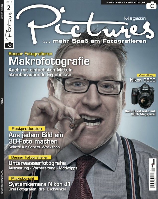
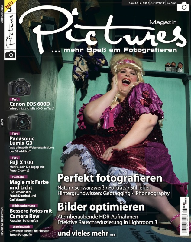
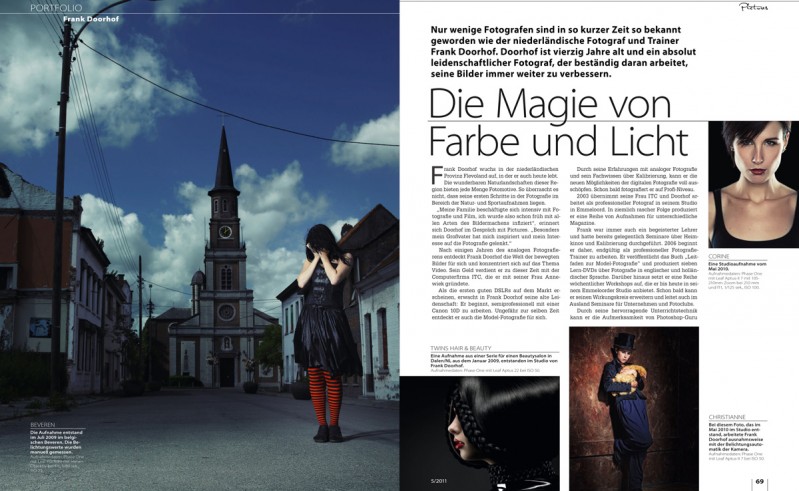
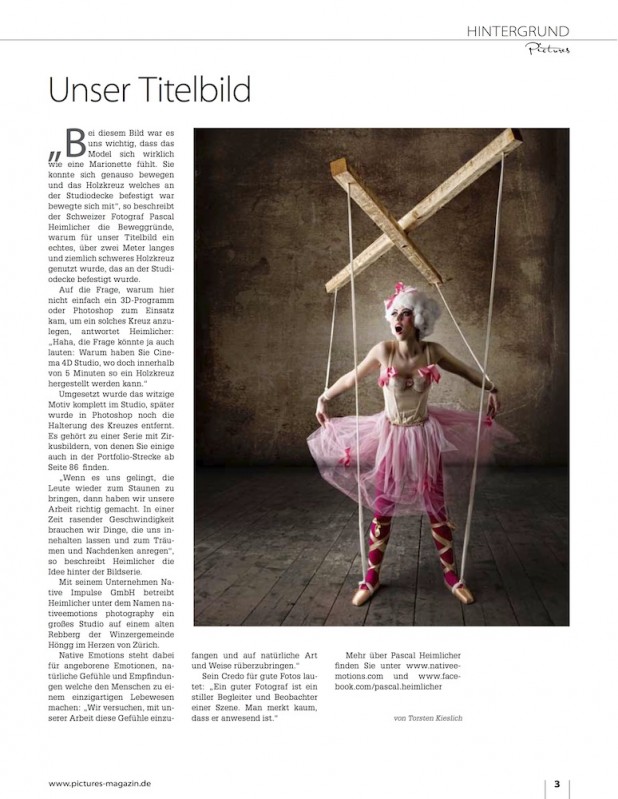
“… On the other hand the things we’re really interested in, the pictures, the inspiration, the artwork of really good photographers seem to miss out.”… “…Also we often missed the photographer’s comment on his motivation or way of work.” … “We wanted a magazine to show more pictures in bigger size, delivering hints, tipps and inspiration from photographers. In a video clip for Kelbytraining Scott Kelby once mentioned something along the lines of ‘… it makes me feel to grab my camera and shoot.’ Now, that’s what a magazine should do.”
+1 & Excellent. Finally a magazine about what matters: PHOTOGRAPHY, not mainly about gear or tempting buy new gear.
I like that it is in hardcopy because it is point and lovely to see things printed. However, for us not in Germany, I very much appreciate if consider to offer a PDF version in English. I will be happy to pay for such a subscription.
Personally I am an expat, right now in Shanghai, but tomorrow or next month I may be in another place, thus PDF is regrettably preferred (if I am to keep a magazine).
Best regards,
Anders