BenQ SW321c review and opinions
Some reviews are easy and some reviews are hard.
To be honest writing a review about a monitor can be quite easy, but also incredibly hard, actually the better a monitor gets… the more difficult it gets writing a review. When for example a monitor has color issues, or luminosity errors you can explain what it is and why it’s important to take note of that. This often means that writing reviews for cheaper monitors is a blast, loads of things to explain so to say.
So why do I start this review with this small note…
Well you have to know a bit of history.
Years ago during an UK tradeshow I met the guys from BenQ for the first time, at that moment they told me they were starting to promote specialty monitors for video/DTP and photography and they wanted to really make a dent in the market to deliver high-class, great specked monitors for very affordable prices. Now from any other company I would probably just thought “yeah, sure and who are you again” because let’s be honest the market had been very tightly controlled by only a hand full of brands, and in fact at that point most photographers only edited on 2 brands if they were serious about their work.
So why did I take BenQ serious from the Get-go.
When you look at companies there is always a history, and what most of you probably already know is that before we took on photography full time Annewiek and I ran a PC-company for over 20 years (with great success) and one of the things we always experienced is that if a gamer entered the shop it was always …. BenQ. We’ve sold pallets of BenQ monitors to the gaming community in our area, but also CD drives and the nice thing from the BenQ products was great support and they hardly ever broke down, and on latency for gamers…. well if negative was an option they would probably add this too. So this is a company that didn’t just appear out of nowhere, I dare to say that if one company knows how to build imaging display for pro work BenQ absolutely would be on that short list without any doubt. So when they announced the new line I was all ears, eyes and what not more.
My first BenQ monitor was several hundreds of euros cheaper than the monitor I used at that time and to give you an idea about technical knowledge I have to tell you a small story.
The monitor I was using at that moment had a hardware calibration unit.
Now I never got this feature, it metered in a corner, it was a tristimulus meter and was not replaceable and could not be recalibrated. When I asked about this “weird” solution I got some even “weirder” answers.
First off all, the meter was linked to the monitor so it knew the degradation of the panel and adjusted itself, also it was placed in that position because…. well never got an answer to that one.
Well let me burst your bubble for now.
Besides running a PC-shop for many years in 1997 we also started a Home Theater branche (this is also how we worked with BenQ in the past) in 2001 we were in the states (yes during 9/11) and I got my ISF certificate (Imaging Science Foundation) I won’t go into the very technical details, but let me put it this way, I know how to calibrate a display manually and I also understand how an analyzer and a panel works, and how they interact.
It’s impossible to calibrate an analyzer to “predict” the degradation of a panel for professional use. For consumer use you will get close enough, but for critical work it’s absolutely ridiculous to make statements like that, Both panel and analyzer drift over time. For our professional analyzers we send them in every year or two for a recalibration, this is not cheap but it’s necessary for professional grade calibrations. Now both drift, but they won’t drift according to a “plan” we could only wish, no both drift in different ways, also depending on the surrounding area of course, usage and simply put the panel itself.
One could roughly say that for professional use an automated calibration system could work just fine for 2-3 years, after that we go down to consumer level, still ok, but depending on your own nitpicking, not that good anymore.
And than talk about placing, why in the middle or corner or edge?
Well when you look at your monitor you mostly look at the centre, right?
So it makes sense to calibrate that part, so why should you calibrate only a corner or edge?
It just didn’t make any sense at all.
Now one of the main reasons these kind of solutions are actually very good is because those setups use something called hardware calibration. Let me make this really simple. With a normal calibration the software creates a so called ICC profile, this is a profile where you set a goal (for example Adobe RGB) and the software “calculates” from the sensor readings how far certain colors are off and corrects this, so for example you will see R +1, -10, +3, often these calibrations are done on the primaries (RGB) and secondaries (CMY) and often also some shades in between, during the calibration you also see them vary in output, this is mostly used for gamma and to prevent clipping within the colorspace/color.
In all essence it’s not really hard to understand.
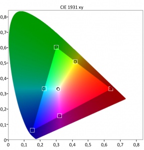
We have a fixed set of coordinates and we have a variable set of coordinates that has to be “guided” towards that fixed set. In most cases you get pretty darn close, but it will never be 100% perfect, the difference is what makes a monitor good, better or worse. This is also why you often see 98% Adobe RGB and 100% srgb, it means that when calibrated to Adobe RGB you will get 98% close, and when calibrated to SRGB you get 100% close.
Now where does it get interesting.
When we do this in software there are limits. Think about what happens when you use curves in Photoshop, when you pull on two sides everything is fine, when you start adding 3-4-5 points you will see huge problems in for example an 8 bits version, and less problems in a 16 bits version. The reason is again simple, with 8 bits you get 256 steps of luminance per color and in 16 bits you get a whopping 65536 tonal values PER color. Don’t confuse this with a 10 bits panel (which the 321C uses). As you can see here the difference between 8 and 10 bits panels.


When we look at the calibration itself we have a few options.
Profiles can be matrix-based or LUT (lookup table) based
both of which include the white point of the device (mostly D65 or 6500 degrees Kelvin)
Matrix-based profiles are small and LUT profiles are larger and also a lot more complex.
- A matrix profile is a mathematical model made up of the three primary colorants of the device and some simple tonal curves, referred to as a 3 x 3 matrix.
- A LUT-based profile contains much more information, consisting of a table of numbers that allows you to find an input value and its corresponding output value.
One could say that simpler devices could use a matrix profile, it’s fast and easy.
But for monitors and printers I’m a huge supporter of a LUT based calibration.
This is also where the monitor comes into play.
You probably heard the remark hardware calibration quite some time when you read my reviews. This actually means that you don’t calibrate your monitor via an ICC profile, there still is one, but it will be “neutral”, all calibration is done inside the monitor. Personally with the BenQ I always choose the 16bits LUT, native panel, V2 (don’t use V4) relative blackpoint (with relative it will keep the gamma in tact, with absolute it will yield a higher contrast ration but gamma is sacrificed a bit) and large. This takes some time but the result is butterly smooth and very accurate.
Now there is one setting missing, and I want to give some extra attention to this, light output?
When a gamer or consumer buys a monitor one of the things we always heard was “light output” and a rule of thumb was… the brighter the better. Well that’s true for those usages, but what about DTP or photography? everyone that ever edited an image on their phones or iPad in a dark room with the brightness on full blast knows this hurts your eyes, but also the results are WAY too dim, in other words as soon as you look at them on a normal monitor it’s just too muddy and dark.
But can’t you just lower the output of the monitor?
Yeah to a certain extend you can, but you do have to realize that there is a limit, at one point the contrast (white point) will keep going down, but the brightness (blackpoint) won’t, you are now entering the danger zone, you are now seriously hurting your contrast ratio, and this…. you don’t want to do.
Seeing we need lower light output for photography (mostly between 80-130 cdm) it’s wise to choose a monitor that has a sweetspot for contrast ratio around that light output, although now a days with HDR this is a bit different, but let’s for now keep that out of this story.
End of the story
So for a good monitor that can be used for photography we need :
Hardware calibration, with a replaceable analyzer (not a fixed one)
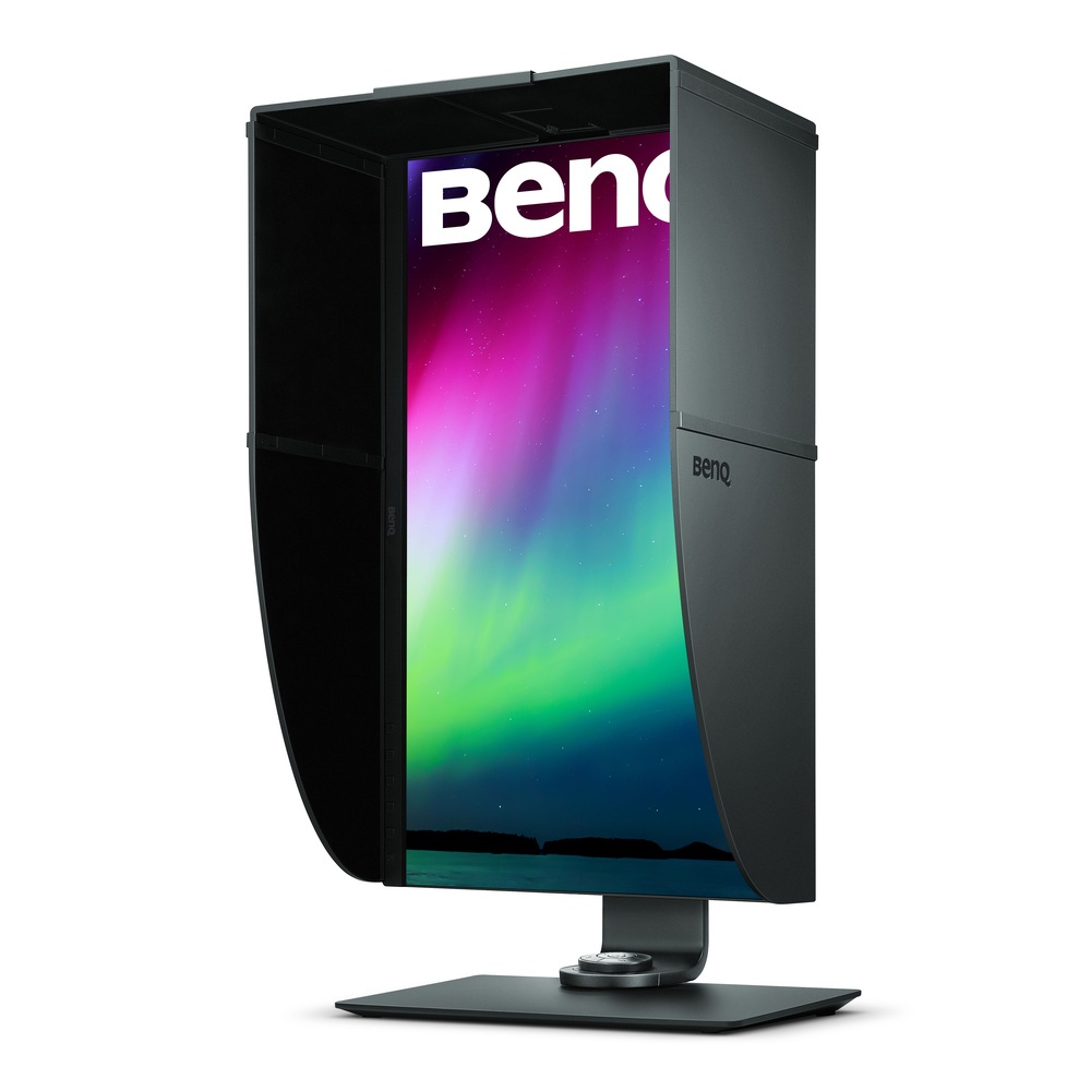
A sunshade (also handy when you have a controlled lighting area)
At least 98% Adobe RGB
A good panel that doesn’t look red on one side and blue on the other (and yes there are a lot of them out there)
A good panel that doesn’t look like a natural vignette (brightness differences, very annoying)
Good service and support
Good price
pffff sounds like a lot of boxes to check.

321C (or like I like to say it 3.2.1 COLOR)
Let’s take a look at the beast that is called the 321C
First off all I appreciate you guys still reading so let’s make this very short.
The 321C checks all the boxes, BenQ really picked a great panel for this monitor.
I could have stopped the review here, or bore you guys with technical details which you can also find on the product page, and I hate those kind of reviews so I’m not spending any time on that, let me put it this way…. it’s very impressive on paper.
However, being impressive on paper doesn’t mean anything when you have the monitor on your desk.
So let’s take a look at some things that REALLY caught my eye.
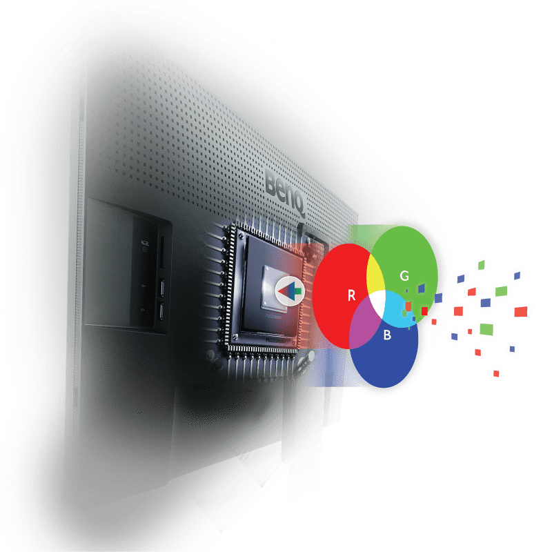
The first thing is of course color. I’ve had several BenQ monitors on my desk over the years and they all are great value for money. I love their P3 series for step in photographers that need a bit more than sRGB but can’t yet afford a full ARGB monitor, but I also love their professional series. Now seeing the pretty steep price difference between them I was very curious to see what this monitor brought more.
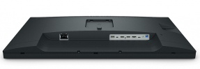
Connections
Let’s do the boring stuff first.
This is a USB-C monitor, and all devices should be by now.
It means no slow ports if you connect to your monitor.
You get
HDMI (v2.0) x 2DisplayPort
DisplayPort (v1.4)
USB 3.1 Hub
USB Downstream x 2USB 3.1 Hub
USB Upstream x 1USB
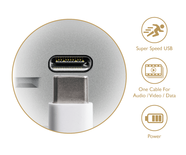
Type-C Yes (PD60W, DP Alt mode, Data)
Card Reader SD/MMC type
Support Format: SD/SDHC/SDXC/MMC
Sharpness
I can’t really put my finger on it exactly but the 321C is a seriously detailed monitor, the first time I connected it without proper calibration I already saw that my taskbar was more defined, looking a bit more 3D, after calibration some “blooming” was gone and it was crystal clear (no pun intended) this monitor is fricking sharp, the panel and coating is one of the most detailed I’ve ever seen in a monitor. Now do be careful, sharpness can also be added digitally, this is however not sharpness, this is “ringing”, do remember that your monitor has a fixed resolution and if you send in that exact resolution you can never ever get a sharper image than without any processing. In projectors and TV sets you do often find sharpening via for example super resolution or 4K enhancement modes, and in movies this can work like a charm, but you always have to realize that you are losing fine details. So for a monitor on which you have to do sharpening for output to a digital billboard, poster or thumbnail it’s vital that the signal is as clean as possible, and from what I can see…. the 321C is pretty close to “honest”.
Coating
Another thing is the coating.
Also here I can’t really find any information on it from a technical standpoint (not important) but it just “feels” different. All the BenQ monitors I used before were pretty similar in appearance and “feel”, this one clearly is different, and in a very positive way. The glare is different (don’t worry these screens are matt and don’t glare like some consumer screens, laptops or iMacs. But still it feels different if you know what I mean.

Paperlike
This is brandnew, and in all honesty, I’m a bit skeptical about this feature.
The main reason you buy a monitor at this price point is of course to be able to judge an image or piece of work on color accuracy and dynamics, so you need a very “honest” preview of what’s to come. Now we all know the frustration that when you send something to your printer it comes out like junk. With paperlike the 321C makes it possible to judge the output of your printer on the screen, sounds awesome right? (and it is) but there are some things you REALLY have to be careful about.
First off all.
You have to make sure you calibrate your monitor before every “judging” round, at least let it warm up for 30 minutes and calibrate, but also your printer has to be calibrated or using a profile that is valid for the kind of paper and inkts you use. We for example use Epson Premium Luster paper almost exclusively, I’ve calibrated my Epson 3800 for this paper and my PC, when Annewiek prints something it looks slightly different, (after I gave her my settings not anymore, so there is a huge BUT there)
In essence paperlike is absolutely fricking awesome.
By using paperlike you can select your printer and paper and see on the monitor what would roll out of the printer. You have realize that a printer has totally different colors than a monitor, we call this subtractive color or additive colors. A monitor emits light and uses RGB as main colors (although you also see some panels using extra Yellow) and a print actually reflects or absorbs light and uses as a base CYMK (K= key). Add to this that also the colorspaces are different per paper and inkt and that in a dark room the monitor will look awesome but the print sucks, and outside the monitor will suck and the print will look awesome…., and here we go…… you get the idea why these worlds can cause so much frustration for you (and me).
Paperlike promises (and does) solve some of these issues.
And let’s be honest, we don’t and never will have exact the same image on screen and on paper, but it has to be as close as possible of course. So what does paperlike, or paper color sync do?
First off all the monitor itself has to be prepared for this, and this is were that new coating comes into play, it’s just a bit more closely to paper so to say. After that it’s actually pretty simple. You can download the free software from BenQ, install it and choose your printer and paper…… yeah…. well don’t know what to say more, it’s really that simple. No voodoo or magic, it’s actually a very smart thing they did, and I can’t imagine why this wasn’t released earlier.
Now one could say…. “he Frank we have a softproofing in Photoshop and Lightroom?”, and indeed yes you do (well spotted), but see this as a WAY WAY more accurate way of doing that softproofing, I advise everyone to use softproofing when you shoot for important work where color accuracy and gamma are vital, and Photoshop comes a long way, but if you want it “perfect”….. well you really should think about the 321C.
Now as mentioned you do have some severe limitations, and it’s up to BenQ to see how this will work in the future.
The limitations are actually to be expected and should also be there, this is NOT negative, in fact it’s 100% POSITIVE, if they would have released a one size fits all solution it would be just a slightly better version (or worse) of Photoshops proofing.
What they did (and still do) is take into account readings from papers, printers, ink AND the monitor and throw them into profiles. This is a proven and very accurate way of working, heck it’s how we all look at our monitors displaying Argb when we edit, it’s just measurements and profiles, nothing more. To make a monitor and print look similar this is however not an easy task, and a lot of people will be disappointed. Like I mentioned before it’s vital to realize that a monitor is NOT a print and a print is NOT a monitor. Use colorsync in a dark studio and you will wonder why you’re print looks like crap, so for serious judging EVERY print station should be outfitted with a full spectrum daylight bulb/led light. ONLY that way can you really judge a print.
One might wonder, what if a customer……
Well I know your pain.
We’ve had exhibitions where my images looked awesome, and we’ve had exhibitions where I hardly recognized my own work. The key element was light. One gallery used natural light from outside and to put it mildly, some moments they looked ok. And the other gallery had lights mounted on every single piece of work, to be short… that looked right.
But when you have this into place, the results can be shockingly accurate.
Ok so what about that limitation I keep telling you about, that was the light right?….. no sorry.
To make this work you really have to be using the printer AND paper AND ink that is available in the BenQ software, at the moment it’s still a bit limited but seeing they can add profiles very easily I expect this to grow a lot during the coming months.
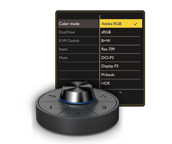
The Puck
With the 321C we find the “famous” BenQ puck.
In all honesty at first I didn’t use it all, and still it’s…. well it’s connected and I do use it occasionally, but there is one thing that is really cool about the puck. You can program two color spaces under the buttons, so with a press of a button you can set your monitor to the sRGB colorspace or to Adobe RGB, this is a very very useful function when you publish a lot for the internet.
But there is one other feature that I think is very useful for some people
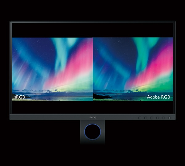
GamutDuo
Connect the BenQ with 2 cables and it’s possible to see an Adobe RGB version next to a SRGB version on the same screen. This is a huge thing for people that will convert to colorspaces a lot and where it’s vital all the nuances are shown.
Multiple monitor accuracy
In the top line of BenQ you can add several monitors together and they will give you a very similar look and feel of your images. This is something that might be very important for video editors, for photography I don’t use that feature but when doing video on 2 monitors I often use one for a preview and one for the time line, having a proper balance between those two is not only easier but can actually be vital for proper color grading and balancing the contrast.
Conclusion
We have arrived at the end, wow you kept reading (or did you skip).
This is not the cheapest BenQ monitor and one might wonder that if you don’t need the Paper color sync software if it’s still the monitor for you? Well let me try to answer that.
In all these years that I’ve edited images/video on a boat load of monitors this monitor really shines above all others I’ve tried. I’m just in love with the coating and the sharpness of the monitor and for me, even without the paper color sync software this warrants the premium price and lets be honest compared to the competition this is actually a pretty standard price for the high-end monitors, in fact taking everything into account one could say it’s not that expensive, although it’s still a lot of money.
I do have to come clean on one part.
I’ve already seen and worked with this monitor since December, I believe the first beta sample was in our studio for the first look and I’m running on one of the first production models. One could ask “why wait so long for a review”
Well the reason is very simple.
Sometimes you see reviews minutes after a product is released, we also sometimes do this and one might wonder “how the heck?” well some products we get a few days or even weeks before the release and with some products you know within hours or days if it’s good or not, but a monitor….. I never trust reviews of monitors that appear right after the release. In my opinion you have to also take into account how the monitor grows on you and how it keeps it’s color. Now even a few months of intensive use is not enough for that last question, I can only say “so far so good”, but that growing part I can be very short about. Over the past few weeks the monitor keeps growing in my appreciation, due to the lock down I’m working a lot from home, on another BenQ monitor (of course), every time I walk into the studio and I work on the 321C I go “aaaaaaah…..” and that’s a good thing, the 321C is a very complete monitor with more features than most of us will ever use. It’s simply put a monitor for the serious pro that demands “everything” from him/herself and also expect the gear to follow that trend. And the 321C can keep up…. it’s awesome.
Add to this that the 321C is verified by Calman (a professional calibration system that I also use) and it’s also Pantone validated and you just know this is not just talk or commercial mambojambo.
During the review I aimed at photographers but I do have to add that the 321C also support HDR10/HLG and supports the native 24/25P frames per second that is important to detect judder during editing.
HIGHLY recommended for pros, or hobbyists that are not satisfied with “it’s pretty accurate”