About monitors and the BenQ SW271C
Writing a review about some gear is easy, and for some gear it’s hard.
One of the things I always love to do however is make my reviews a bit different. If you want specs etc. You can find them almost in seconds if you want a general review… plenty out there, but is it really something you want to read, or do you like to hear how something works in a real-life situation and get some tips in between… well that’s what I try to do with a review, and today it’s time for the brand new BenQ SW271C monitor.
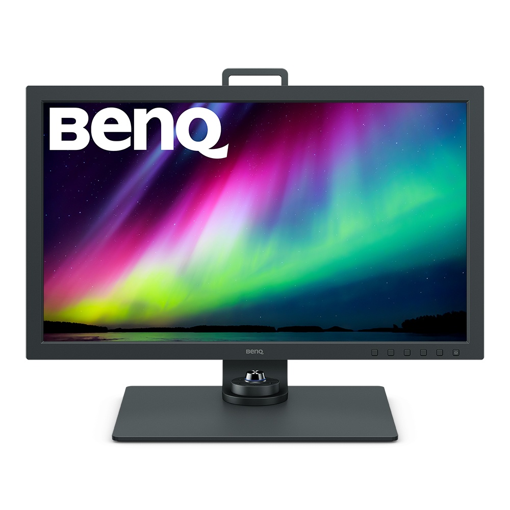
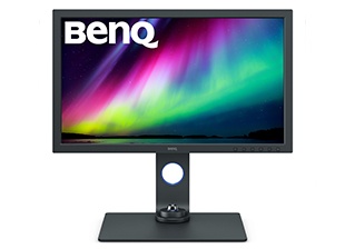
The SW271C is a 27” 4K 99% Adobe RGB monitor with some cool gadgets and tricks up its well-designed sleeve.
Before we start it’s important to add that this display follows the AQColor standard techniques from BenQ and they work together with ICC en ISO to warrant a great performer for your desktop (or wherever you want to mount it)
I’ve had this monitor for a few months now to test out, but the review is very late due to Annewiek breaking her leg, but it did give me more time to think about how to write the review…. so here we go, I hope you get a lot out of it.
I think it’s one of the most asked questions I get.
“Which monitor should I buy?”
And in all honesty, it’s maybe one of the most important decisions we as creators have to ask ourselves. Now don’t get me wrong, your camera, lighting, lenses etc are all very important, but if you really think about it…. your monitor is used the most and is vital for judging and retouching your images, and don’t even get me started on video. A good monitor for me is absolutely essential and might be one of the most important investments you do.
And indeed I call it an investment because a good monitor is not cheap, especially if you want Adobe RGB.
Now let’s take a look at some of the things I find very important in a good monitor for video and photography.
Placement
The first thing you really have to realize is that placement of your monitor is also a vital part of performance. For example, a monitor with a strong backlit area (like a window) will never give you the proper contrast experience, and before you know it you’re delivering images during day time that are totally different from images you’re editing during nighttime. (Due to the changing intensity of the window).
But also lighting in the studio/workroom is important.
You have to make sure there is no direct light hitting the monitor. But working in a total blackout room is also not healthy. So most of the times I advise to place a DAYLIGHT lamp behind the monitor if you work in a really dark room, in a normally lit room (without direct light hitting the screen) you can also decide to place this light behind the monitor but in all honesty, they are not that cheap and when you have enough ambient light in the room it doesn’t really add anything to the relieve of eye strain, but you can always experiment with this of course.
Now in most cases there will always be a little bit of “scatter light” light that bounces around the room and can infect the image on the monitor, luckily for these kinds of situations, there is a great solution, the “hood” (and I don’t mean Arrow :-)). With loads of monitors this is an extra added cost which due to that reason a lot of people don’t buy, but later have to add anyway, and even in our studio with controlled lighting the hood gives a lot of extra contrast experience for the simple reason it creates a sort of “shadow-box”. Now this is one of the things I love about the BenQ series of photography/video monitors, you don’t have to think about buying it…. it’s included in the box, and works for both landscape as portrait settings (awesome)
Portrait or landscape
In all honesty for 99.9999% of my usage, it’s landscape mode.
But… I know several designers and photographers that love to work in portrait mode. This means in essence that you can turn your screen from landscape to portrait and it will “scale” the content of the screen to fit the chosen position of the screen. If this is important for you… the SW271C is able to be used in both modes. (Like most BenQ screens)

Calibration
It’s no secret for most of you that I talk about calibrations a lot.
And let’s take a look at why I think this is so important and in fact everyone should be much more interested in it.
With the calibration of your monitor you are actually doing the following, you make sure that the colors on the screen are as close as possible to the “real” colors. And this is a bit of a problem. So let me explain a bit more.
First off all forget that sentence “real” colors first. And read it slightly different.
For photography and video we use so called color spaces.
These colorspaces are 100% fixed and contant of course the coordinates for the colors, but also the so called Gamma curve and white point. Already dizzy? Well don’t worry the only thing you have to remember is that there is actually a LOT going on with this calibration and as you probably know from Photoshop, the more you push and pull on your images the more problems you can get with normally smooth gradients. Do it really aggressive and you will literally start to see your image breaking up before your eyes.
To prevent this “breaking up” it’s important to chose a monitor that supports so called “hardware calibration” or LUT tables.
So what is this, and why is it so important?
Let’s first take a look at colorspaces.
The ones you probably know are sRGB and AdobeRGB.
sRGB is mostly used online and when you have a great monitor and printer you can really benefit from using AdobeRGB. The difference is in the “size” of these spaces. For example sRGB is a real 8 bits colorspaces, it’s small, not that spectacular and very compatible (even with pretty bad screens), it doesn’t mean it will always give you a great images, but at least it will look ok (if you did your work that is, and you feel it coming, that needs to be done on a calibrated screen).
When we look at AdobeRGB we are talking about a much larger colorspace, it’s still “compatible” with 8 bits (meaning you can use JPG for storage) but it’s really pushing the limits. The first thing you will notice when you switch from sRGB to AdobeRGB is that colors can be more intense, but in essence the “balance” between the colors should be app equal between colorspaces, so red shouldn’t change to orange of course, however in a lot of cases this does happen.
To understand this it’s vital to understand that when you are editing images you are constantly changing gamma, colors, balance between the colors, whitepoint etc. Now you might say “hey, buddy you just told us that colorspaces are 100% defined… so what?”
Lol yeah I know.
Let’s make it really simple.
In a colorspace Red, Green and Blue contain 3 coordinates, x,y and Y.
Hue, saturation and Luminance.
But that’s just for the colors, we also have the so called grayscale, meaning if you create a gradient from black to pure white you want this to be 100% gray and not running from slight red to slight blue, it has to be gray in every step. In photoshop one could say we go from 0.0.0 to 1.1.1 to 2.2.2 etc. All the way up to 254.254.254. Now we have a perfect grayscale, but we also have to make sure that the difference between these steps is also equal, you don’t want to go from deep black to middle gray in 2 steps and in 20 steps to pure white, and this is where we use the gamma curve. Now one could say… ok we are there… let the computer do it’s work.
Well yeah… not yet.
Just for your realization, in essence if we really simplify it we have 6 colors with 3 coordinates and 254 steps for brightness who all have to be picture perfect to give you a proper calibrated image…. add to this also the gamma which has to be set for every single color and be in balance with all the other colors and … well you get it, take an aspirin and continue after taking a break.
Ok you’re back.
Let’s simplify it.
When we do a calibration on a projector or TV it’s often possible to get a proper grayscale performance by adjusting only 3 colors (RGB) on 2 positions. It will not be perfect but it’s more than good enough for serious editing. But sometimes a display cannot be corrected with these 2 points, and now we have to start using 4-5-10-20-etc points. And this is were problems can occur.
Again think about Photoshop, when you use a curve and only pull/push on 2 points there is not a real problem, you can go pretty extreme, however start to use 3 or 4 points and you can almost immediately see problems when working in 8 bits and you get a lot better performance when working in 16 bits, which is absolutely logical because there is a lot more “room” in 16 bits.
Now that we get this clear it’s possible to explain the next part very fast.
The hardware calibration part II
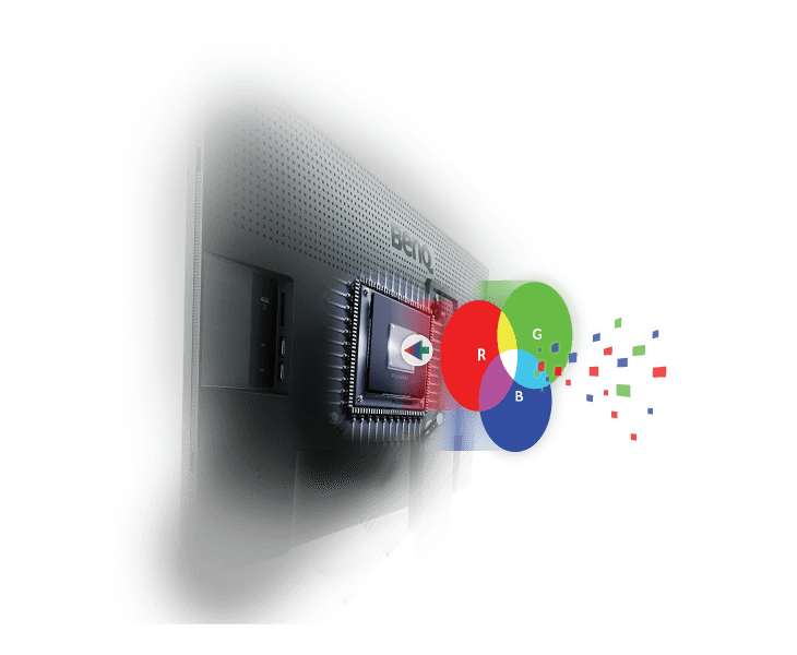
When we talk about hardware calibration it means that the monitor manufacturer already calibrated the screens in the factory to make sure they are as close as possible to the specs of the monitor, do realize that this calibration report is 100% useless in your setup, you really have to do the calibration yourself in your setup with your soft/hardware and lighting situation. But by using a screen with this option it actually means that the monitor does the whole calibration internally with it’s own stored LUT table (16 bits in the BenQ), in other words the monitor “knows” the max performance of the display and also how to calibrate it perfectly. It’s a bit like buying an ikea twin bed with a manual or without. In both cases you probably can get the end result but I’m afraid that without the manual it will not be without some defects, and maybe when the kids really jump up and down it will collapse. Because even with a manual it can be pretty tricky.
The BenQ SW271C supports the hardware calibration via the same software as the previous monitors and it works pretty well. My advise is to actually calibrate your screen to native and not Adobe RGB if you want the best performance but after that it’s actually a rock solid solution. Because the screen covers most of the Adobe RGB colorspace setting it up for Native it will give you great results (on average less the 2dE which is very good for photo and video work)
The Puck
Most BenQ monitors support the use of the BenQ puck.

So what does the puck do?
The puck can be used to for example switch between colorspaces or for example see an image in black and white. Now in all honesty the black and white function I never use, but being able to quickly switch between colorspaces can be pretty refreshing to see what the impact is, and can save you some problems with customers. It’s not something I would give the stamp “you really need this”, but it can be incredibly handy in some situations.
Coloruniformity
One of the biggest frustrations is if a monitor shows you an image that is reddish on the right and blueish on the left. And trust me, this happens a lot and not only on cheap monitors, we see this in almost every screen, monitor, projector etc. So fixing this is vital for a display you can trust. Now let’s make one thing 100% clear, just as with calibrations you can never ever get it 100% right with todays technology, but that being said, I’ve used plenty of BenQ monitors the last few years and BenQ really got this down. In the PhotoVue series I’ve not yet encountered a screen that has a problem. That said, when you display a 100% white screen you can always see some slight differences if you look really good, but these are not important for the reliability for your work so don’t worry, but if you see huge areas with blue or red infections your are in trouble, and most cheap (non photography, and even some photography monitors) will show you small to huge discolorations over the screen and that’s a problem if you need to tint or color correct an image.
Pantone and CalMan certified
One of the main reasons I started looking at BenQ was that they are very focused on color and most of all throughout your whole workflow, and BenQ really got this right. They don’t only make sure your screen is “perfect” but most people now a days also work with several screens next to each other, and nothing is more irritating than seeing a small or big difference between the two screens, BenQ calls this Multi monitor color consistency and I can tell you that it really works and setting up 2 screens is a breeze.
But it doesn’t stop there.
Another huge problem is print.
Many photographers struggle with getting images looking good on prints, now the first thing you have to realize is that a monitor is a totally different medium than print, so if you judge your print in a dark room next to your screen you WILL be disappointed, but when you walk with this print outside it will really come alive and if you would take your monitor outside it will probably fall flat on its face, so both mediums are not the same and judging them next to each other is tricky. And this is why BenQ created a completely new (and unique) solution.
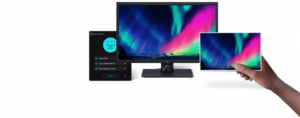
Paper color sync
With paper color sync BenQ takes out a huge part of the guess work, there are of course limitations.
To get it working correctly you need to be sure that your printer and paper type is in the database (growing constantly), if you however work with a compatible combination it’s a very well though out system that will not guarantee a fool proof solution, but let me put it this way, it takes away at least 80% of the guess work and will speed up your workflow A LOT and save a lot of wrong prints (good for the environment). It’s without a doubt worth it when you print a lot, and I would almost label it as essential for every serious photographer that uses their own printers. But I also have to add that I’ve worked for years without and after initial huge frustrations (which I wish I could have skipped) I now know my printed almost by heart, but when I switch I will have to start over, and than Paper Color sync will be awesome.
For video
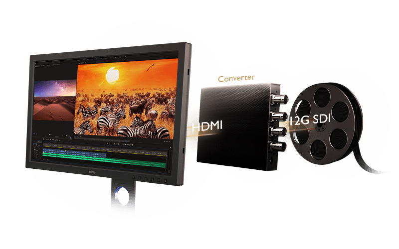
If like me you are also into video it’s good to know that the SW271C is also very good for this part of your work.
Of course the display supports HDR10 and HLG, but it also has a special list of compatible SDI-HDMI converters for a very solid workflow to your screen. Add to this support for film and video frame rates including 24/25/30/50/60frames per second and you can see that it’s a very complete monitor for both video and photography.
Connections
What do you need in a monitor you might ask.
Well in all fairness just HDMI or Display port would be enough to connect your Mac or PC.
But out of experience I can tell you that it’s very handy to also have USB connectivity, first of all because of the hardware calibration, but it’s also very handy to quickly connect a harddrive or camera instead of diving behind your machine or use external hubs.
Well the SW271C is very complete and has something cool for us 😀
First of all you have 2x HDMI and a display port.
On the USB side we have 2x USB and 1x a 60W USB-Connection.
and….. yes a card reader supporting SD/SDHC/SDXC/MMC so that’s pretty handy and saves some clutter on your desk.
Experience
Of course the most important part of a review.
How does it perform.
And I can be pretty short about this.
I have used and owned almost all BenQ displays in the PhotoVue series, and without a doubt it’s my favorite series. BenQ delivers monitors for a very competitive price and has some awesome specs, what do you think for example about 99% Adobe RGB, 90% P3, 100% sRGB.
But most of all I love the material BenQ uses for the screens itself, it’s hard to explain exactly but compare it to another monitor and you can clearly see that the BenQ has less glare (reflections) and their screens are literally razor sharp without ringing, in other words, you get a fricking awesome and accurate screen for your money.
Also one of the main advantages I think is the fact you can use an external calibrator instead of a build in, now don’t get me wrong, at first the build in analyzers work fine, but after 2-3 years you will find that the results will start to drift, with an external calibrator you can just replace the unit and have 100% accuracy again.
Working with photography means you are focusing on small details in both color and detail, a display should be “transparent” and give you as the creator the full freedom and accuracy you need to do proper color correction, now you might say “hey Frank, don’t you use the X-rite color checkers for that?” And the answer is “yep and no”.
Yes as in, you always have to use something like a white balance card or Color checker if you want a proper base (starting point), but after that it’s all about fine tuning, adding some cool looks etc. And for that work it’s vital you can trust your display, and without a doubt I would say…. I trust my work with BenQ PhotoVue displays, and I’m pretty picky as you guys now.
Oh and if you want to play a game in between… with 5ms it’s not that bad I would say 🙂
So if you’re in the market for a kick ass awesome accurate monitor, make sure to check out the SW271C, you will love it.
Plus in some countries BenQ gives you a 6 months pixel warranty.
If you have any questions, feel free to ask below.