My blog, although I don’t see myself as a blogger but as a Photographer I will try to blog some interesting material during the weeks.
Expect at least 2 updates a week.

The DOORhof is always open EP4

This weekend I released “The DOORhof is always open” Episode 4.
In this second (and previous released first) part of the PhotoshopWorld Las Vegas tips/tricks episode I interviewed several of my friends/instructors at PSW and combined them in this 2 part episode. So today the final part of this series. You can find it on www.youtube.com/frankdoorhof and iTunes.


The next episode of “the DOORhof is always open” will contain some cool information about styling by Nadine and of course some photoshoots with the final results.
PLUS we will be starting a small critique test. If you want to be in this first critique part send me your best 2 (max) shots and I will try to squeeze the most interesting ones in the program.

My new class on Kelbytraining

Today a small blogpost about my new class on KelbyTraining.


“The art of dance”
This class is I think one of the best classes I did with big flash (there will also be a small flash class soon), in almost 2 1/2 hours you will be taking through the preparations of the shoot, two totally different shoots PLUS the Photoshop of the images. This is REALLY a complete “tour” so to speak.


The images are spectacular, the technique explained in detail and the models are great dancers, so make sure to check out the class at “Art of dance”
And here is the trailer.

Guestblog on color

Today we have a very special guestblog by Martin de Bouter.
He is specialized in color, something where without a doubt my heart is, and is often forgotten by many starting/pro photographers. So I think this blogpost will be a very interesting read for many.


Back in the old days
First let me introduce myself. I own a commercial stock-site with Dutch images, I am picture editor and photographer.


Long, long time ago, before they invented digital photography, there was a profession that we called lithographer. Yes, I know I sound like an old man now, but this isn’t about the ancient times of Fred and Wilma, etching in stone tablets. This is about what you loose when your wonderful picture is sold and printed on paper. Not the beautiful paper they use for musea (we can only hope to reach that kind of exposure), but the paper they use for magazines or newspapers. Oh what a disappointment is waiting. Not only for us, the photographers, but also for our costumer! All these beautiful colors, looking like they’ve been using the wrong washing powder…


Back in the old days (here I go again ;-), there was a professional who translated the colors of your photo or your slide material into printing colors. The colors that are used by an old-fashioned slide had to be translated to the printing colors Cyan, Magenta, Yellow and Black. Nowadays (sorry) there is almost no lithographer left, nowadays we’ve got colour profiles!


Well, I’ll make things short. This means photographers are expected to deliver images that can be reproduced in printing colors. And photographers? They want color! The more, the better. Beautiful blue tones, a lot of saturation and even HDR images. Looking wonderful on the screen, sparkling, bright, and a selling argument!


Okay, let’s see what happens.
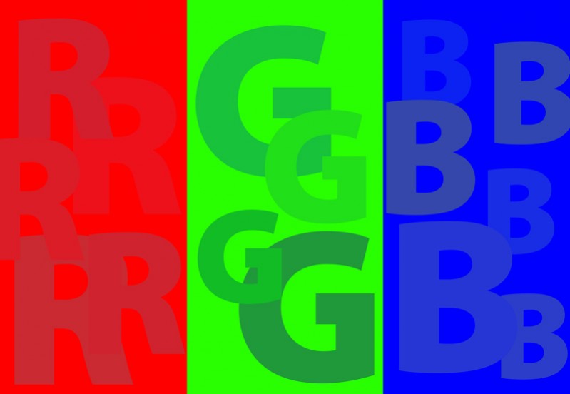
The first image is in RGB (made in Adobe RGB with the profile removed) and the second image is in CMYK (and set back to RGB to make viewing possible in your browser).

Read more

Some soccer images

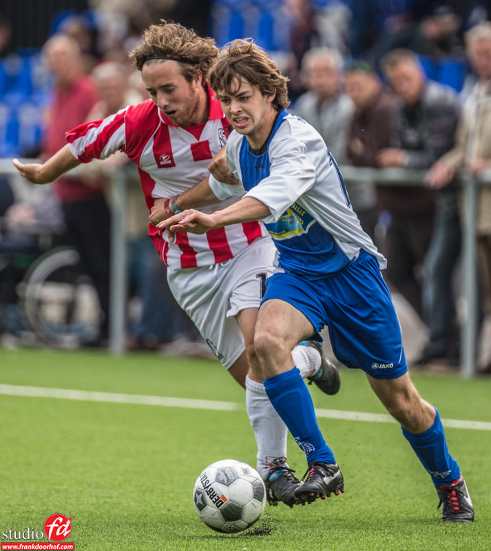
As many of you already know I love to shoot sports, however due to time I hardly have had time for it the last few months, because I took a small rest break after PhotoshopWorld and before Photokina I finally had some time to visit our local soccer team SCE and took some quick shots from the side line. It was not a real interesting game so I ended up with subpar results but I still love to share these.

Read more