Guestblog on color
Today we have a very special guestblog by Martin de Bouter.
He is specialized in color, something where without a doubt my heart is, and is often forgotten by many starting/pro photographers. So I think this blogpost will be a very interesting read for many.
Back in the old days
First let me introduce myself. I own a commercial stock-site with Dutch images, I am picture editor and photographer.
Long, long time ago, before they invented digital photography, there was a profession that we called lithographer. Yes, I know I sound like an old man now, but this isn’t about the ancient times of Fred and Wilma, etching in stone tablets. This is about what you loose when your wonderful picture is sold and printed on paper. Not the beautiful paper they use for musea (we can only hope to reach that kind of exposure), but the paper they use for magazines or newspapers. Oh what a disappointment is waiting. Not only for us, the photographers, but also for our costumer! All these beautiful colors, looking like they’ve been using the wrong washing powder…
Back in the old days (here I go again ;-), there was a professional who translated the colors of your photo or your slide material into printing colors. The colors that are used by an old-fashioned slide had to be translated to the printing colors Cyan, Magenta, Yellow and Black. Nowadays (sorry) there is almost no lithographer left, nowadays we’ve got colour profiles!
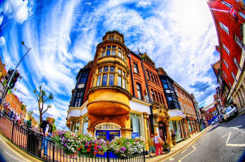
Well, I’ll make things short. This means photographers are expected to deliver images that can be reproduced in printing colors. And photographers? They want color! The more, the better. Beautiful blue tones, a lot of saturation and even HDR images. Looking wonderful on the screen, sparkling, bright, and a selling argument!
Okay, let’s see what happens.
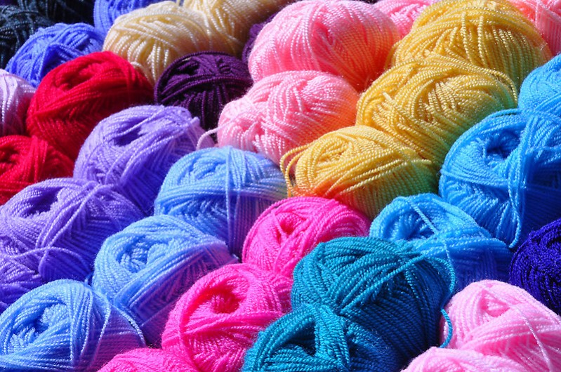
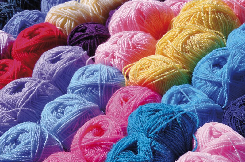
The first image is in RGB (made in Adobe RGB with the profile removed) and the second image is in CMYK (and set back to RGB to make viewing possible in your browser).
As you can see, all gradations in the main colours are completely lost. This is not because I used some peculiar profile to translate the colors, I just used the European standard FOGRA27 profile. In Japan and the USA this may be slightly better (because they use different inks), but still the result is terrible.
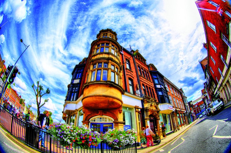
These images loose a lot in brilliance, and your cliënt will be disappointed with the result. A second example is a (I admit) a little over the top HDR-image. Great on screen, but printed – although still very nice – a lot less powerful.
So here’s grandpa’s advice: Before selling/delivering your images, why not take a look at the CMYK translation. Just press ‘Command Y’ (on Mac’s) or ‘Control Y’ (on PC) and get a preview in CMYK. Is this what you had in mind? Or do you have to make some adjustments?
PS I know this story is a black&white, and everything depends on the used profiles and the way – perceptuel, colorimetric – the translation is made. But nevertheless, I experience that photographers don’t bother these kind of technical bullshit and costumers get disappointed. So managing the expectations, might just help to be the one who delivers. The better photographer, the partner you can trust…





Interesting read , but I was kind of waiting on tips/tricks on how to improve color in print. The verification in CMYK is a good tip, but what to do when the result does not look as what is expected? (What would be the use of a colorchecker if only used for screenviewing and the print still turns out sh#tty.) Guess I am one of the few photographers who does care about the technical BS and does want to have good prints. 🙂 So, Frank/Martin; could we have a part II?
Hi
For me the colorchecker or spyderchecker is part of my workflow, as is a calibrated monitor, without that it’s very difficult to have a completely controlled workflow.
Maybe its better to convert your RGB to CMYK with a function that tells you more, instead of make it CMYK.
I always use EDIT – convert to profile, in this case you can select the CMYK profile (Not depending on your color settings)
and the rendering intent.
(Not may people set their color settings correct)
But still you will not see whats really going on in CMYK printing, therefor you could use Proof setup – custom
and select your printer output profile or an offset / iso profile
But still you need a very good display for that, another trick is to show “out of gamut” colors to visualize where the problem areas are in your soft proof picture output
And never trust images in browsers, because they don’t respect input profiles at all.