Composition, creativity etc. Part II
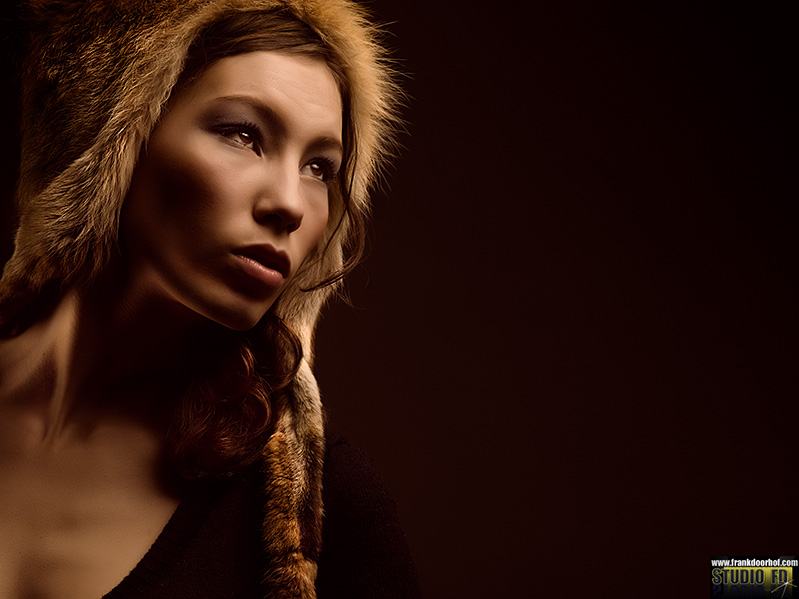 Today the second part in this series about creative and composition.
I’m a strong advocate for making the composition in the camera, meaning I don’t believe you should crop later in Photoshop. There are of course exceptions but when you have the chance I think you should shoot the image the way you want it to be in the end results. During the Scott Kelby seminar in Amsterdam I shot several images from Corine and explained the difference between shooting in the portrait mode and landscape mode. For me personally the landscape modes creates much more interesting images and draw the viewer more into the image. However after the seminar I did receive a mail from one of the participants asking me why I threw away so many pixels and did not shoot my images with the model full screen, so let me explain …..
Composition is one of the most important things in a shot. You can have a funny scene, a great story, amazing light or a beautiful model/subject, however if your composition is not correct the image will not have the impact it could have had. Let’s take the image above and show it without the “loss” of pixels
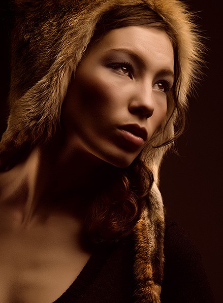 Although it’s still a nice image I personally prefer the first one a lot more. Now one could argue that I can add the space to the right in Photoshop but I strongly believe that we have to train ourselves to “SEE” compositions and not create them afterwards. The first thing you will notice when you “train” yourself to see the composition is that you will be a stronger photographer and create images that come out of the camera they way there are supposed to be and you don’t need time behind the computer to do Photoshop (and I love Photoshop, don’t get me wrong). You will however also find that you are becoming a much stronger photographer when shooting outside. In the studio one can always add space when you use a seamless background, however when you don’t know how to make an interesting composition during the shoot you will run into problems when shooting outside…..
Placing in the frame
When I teach I see a lot of my students placing the model deadcenter in the frame.
Somehow they think that is correct, the funny thing is that they see the images on the big screens in the studio so they see the composition I use, when I ask the students why they throw away so many pixels on top of the model and cut off the neck/breast area it’s interesting to see that 80% of the students look at my image and their image and really have trouble seeing what I mean. This gave me a solid foundation to claim that “seeing” composition is something that REALLY has to be trained and is not something that comes naturally.
What you can do for example to train yourself is take an image from a magazine and try to recreate this 100% crop and composition wise, but not in Photoshop but in camera. You will find very quickly that it’s very difficult to re create this, this is however learning to see compositions and finding the correct angles.
Take for example the following image.
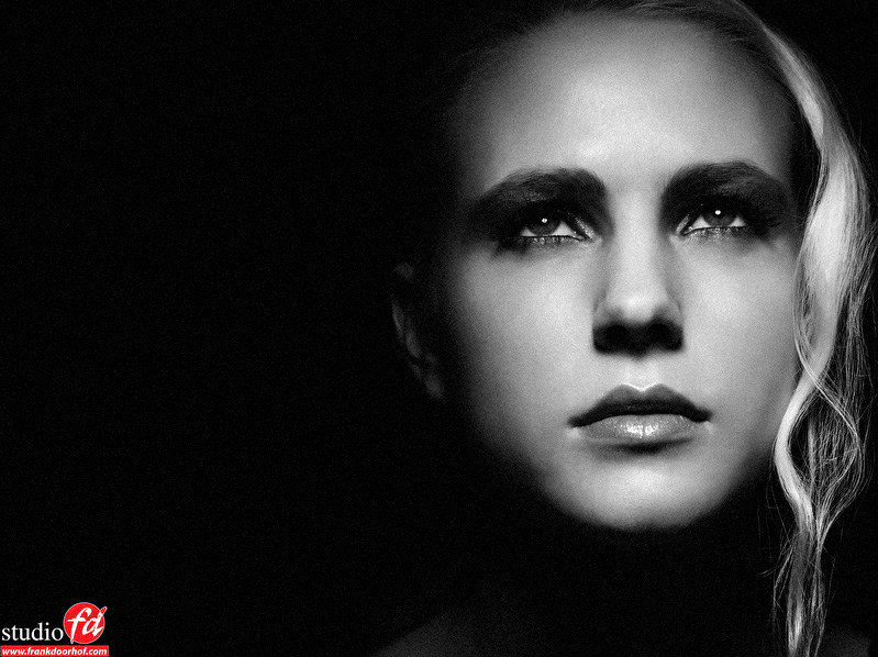 I used a light setup where only the face was lit, and I placed the face to right side of the frame to create tension. By cropping off the top of the head the attention of the viewer is drawn to the eyes. However in the next shot I choose a more centered approach.
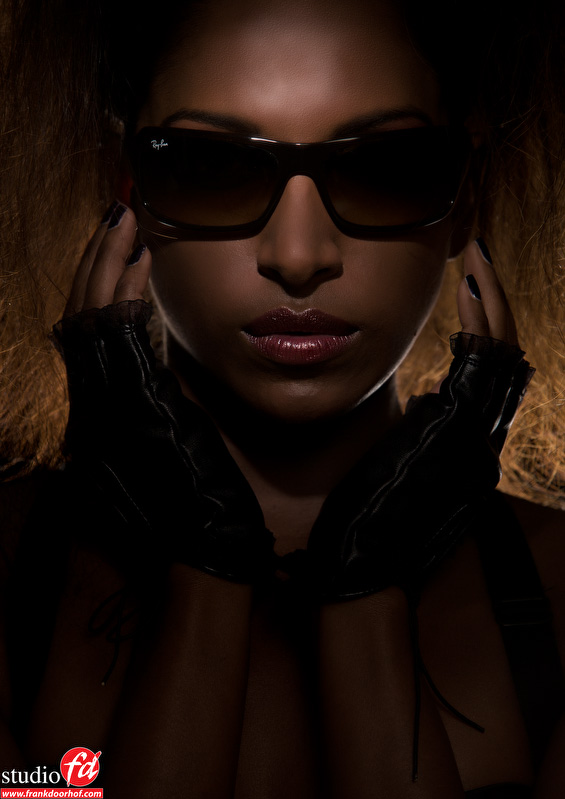 It will all depend on the “vision” you have for the shot, however I always try to “engage” my viewer to be drawn into the image and keep looking at it just a bit longer than they would normally do.
Rule of thirds or golden ratio
Over the years people have been trying to find ratios which would be a 100% success in composition.
The first option I will look at it the Rule of thirds, with this method you divide the frame into 9 frames and if you place the subject you want the attention of the viewer to go to on the green dots you will create an interesting image. Many photo camera have focus screens that include the rule of thirds.
This is one of the easiest things to do and will almost always give you a very nice image, however as I always say the most interesting work is done when you understand the theory and rules and than break them to your advantage.
So here we have the rule of thirds
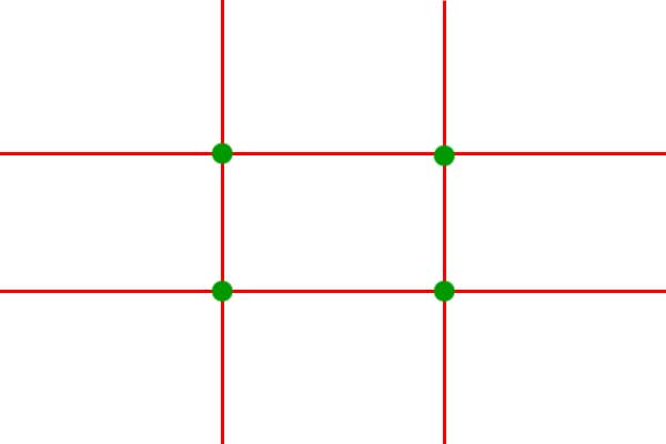
According to some people the Golden Ratio is equal to the rule of thirds, some books even call these the same thing, they could not be more wrong. For me the golden ratio is much more interesting. Let’s first show you the simple way to visualize the golden ratio.

As you can see there is similarity but when you look closely you see that the difference is there.
The ratio of the golden ratio refers to how one distance relates to another. The ratio formed is 1:1.618 or in other words the ratio of bc to ab is the same as ab to ad. If you divide each smaller window again with the same ratio and join their corners you end up with a logarithmic spiral. This spiral is a motif found frequently throughout nature in shells, horns, flowers etc. but also in the human body… one could say it’s natures design.
 And yes we don’t have focus screens with these lines….
However it’s important to know about these two rules because they make it possible for us the recognize patterns and understand why we find images interesting and why some images work and some don’t. The fun thing is that you will probably not have many images that fit these patterns, but that have elements of both. For me for example I hardly ever have a “hard” rules of third image, but I always somehow shift the subject slightly away from the rules of third points, when you look at the first diagram for the golden ratio you will see that they much more fit that part.
Don’t over think
I love to understand what I’m doing.
However I also strongly believe that someone should not over think everything. When you shoot it should come naturally. I do use a focus glass in my Canon to align the horizon because I often shoot in lower positions and have to act quick, and the lines sometimes really help with this, however I will try to frame my images naturally and not think too much about golden ratios or rules of thirds…. in the end however I find these patterns a lot in my images….. so take a break now and look at your own images. Take the ones you like the best and see which of the diagrams fit.


Good info as usual Frank! Keep up the great work my friend!
Awesome info Frank. Post more often. =)
Oh my, more ?
Give me any blog that posts more technical info on this (daily) schedule, run by one person and I will see what I can do 😀
Haha! I just want more because it’s so good. Just like twinkies. Keep up the great work man, it’s very inspiring!
I really don’t know who came up with the rules of whatever, but it seems like human eyes adjust to things better when it is told not because they are mathematically correct or something. Even with the lights there are “rules”… I hate rules in art, I prefer “guidelines” better.
My opinion is that the rules are created because people loved something and repeatedly and started to wonder why…. so for me rules are great to learn to understand how something works, after that someone should make their own work of course. But rules as guidelines can’t be wrong.
Following such rules for a while is a good way of training the eye to see good composition. Later it becomes something you do without consciously thinking about it. Remember, they are natural rules that have been observed by people who express their view of the world through maths, they are not “man-made” rules to be obeyed.
I think its important for photographers to understand them specifically because the physical nature of a camera encourages beginners to centre their focus on the subject (like a sniper taking aim)
I always have trouble with comp and posing thanks!
Well said. 🙂
Is there a typo in the first Golden Ratio diagram, Frank? I don’t see c or d, but I do see S.
It’s the diagram that uses different lettering indeed.
Thanks Frank! I really appreciate your simple explanations.
Hi Frank,
When I first learned about the golden ratio I noticed that it had an aspect ratio very close to that of my screen. 16:10 and quite close to the new HD tv standard 16:9.
My camera shoots 3:2 but for the past few months, if I can, I shoot to crop to 16:10 or 16:9 and apply the golden ratio.
Once I knew about it I started to see it in other photographers work. In addition to yourself, Joe McNally frequently uses it for his portraits.
Thanks for sharing,
Clive
Movies are often shot in 1.85:1 or 2.35:1 which for us also has a nice “viewing” experience. Combine that with a good composition and you’re really getting some drama/story telling.
I never really like the movies in 4:3, however photography I do.
Early last year I came across an alternative to the Rule of Thirds – the Diagonal Method (http://www.diagonalmethod.info/). It’s an interesting theory and well worth looking at.
I’m looking forward to the rest of your posts on the general topic of creativity. So many photographers teach great lighting, post-processing and photography skills, but finding material that delves into the area of creativity isn’t easy. I’ve often wondered if this is the “magic ingredient” that many photographers hold back that differentiates them from those they teach all the other skills to!
I think it’s hard to explain for a lot what really drives them to produce a good image.
good article Frank. as an experiment i took a photo today of my wifes cousin and showed her the photo. while i ddint think it was a great picture she loved it and keps looking back and forth. i composed it like your first photo there but her facing to the left towards the ” logo ”
The golden rule, rule of 3rds, fibonacci spiral and the diagonal methode.
These rules can make a difference on how a photo will impact the audience.
As said, rules are there to be broken, but actually, all strong photo’s will have one or two of these rules in it.
But is it because one of the rules apply to the photo, or because the rules are created in such way that at least one of them will always fit?
I do like the Golden Crop tool for CS http://goldencrop.sourceforge.net/
(Hwever, if you select all, one rule will likely always fit 🙂 )
The best thing is if you don’t have to think about it anymore, just shoot what feels right and later realize the rules applied.